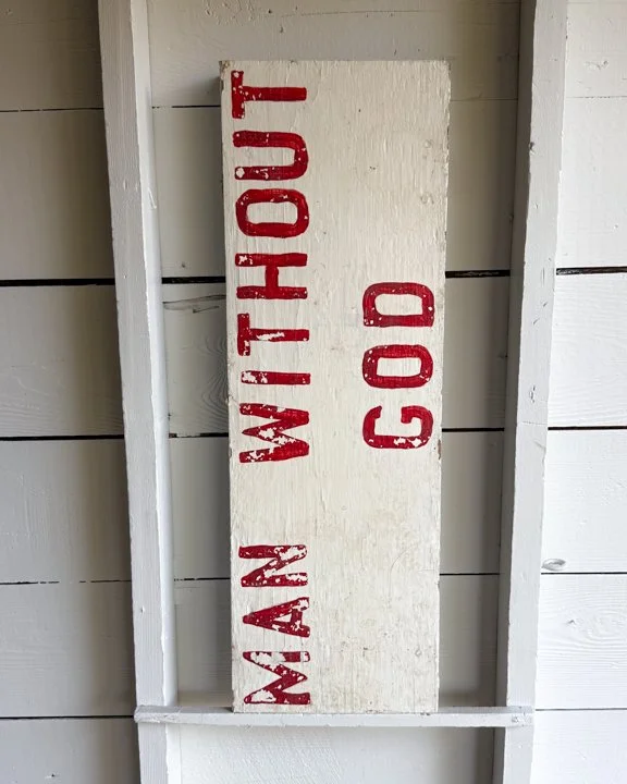
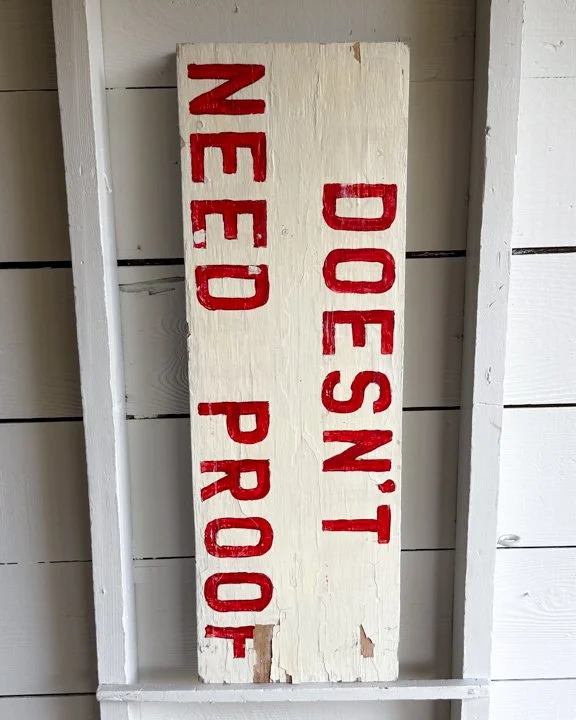
This double-sided wooden road sign once carried a louder message than its modest size lets on. Hand-painted in bold red block letters against a weathered white field, it reads on one side: “DOESN’T NEED PROOF” and on the other: “MAN WITHOUT GOD.” Likely part of a larger set of roadside religious announcements, it feels equal parts sermon and Americana. The words are laid out with the unpolished confidence of a sign painter who believed in message over perfection—each brushstroke slightly uneven, the red pigment having bled into the grain of the wood over decades of exposure.
There’s a directness to it that’s hard to ignore. No graphics, no softening—just language meant to catch you in motion and linger a second longer than expected. The surface shows its time outdoors: sun fade, small chips, and a dryness to the wood that speaks to years of weather. It doesn’t try to persuade with polish, just presence.
Category History
In the first half of the 20th century, before vinyl and neon took over, a good sign was as much about the hand as the message. Most small businesses relied on local painters or sign makers who worked with wood panels, house paint, and a steady eye. The result: one-of-a-kind pieces where every letter carries a bit of personality—slightly off, sometimes bold, sometimes improvised, but never generic.
These weren’t precious objects at the time. They hung outside in the weather, took on sun fade, rain streaks, and the occasional repaint. That’s part of the appeal now. The layered paint, ghost lettering, and uneven brushwork tell you exactly how they lived.
What stands out is the balance between function and instinct. The maker wasn’t chasing perfection—they were chasing readability, speed, and impact. And in doing so, they created something far more human. Each sign feels like a handshake from a past business owner, direct and unfiltered.