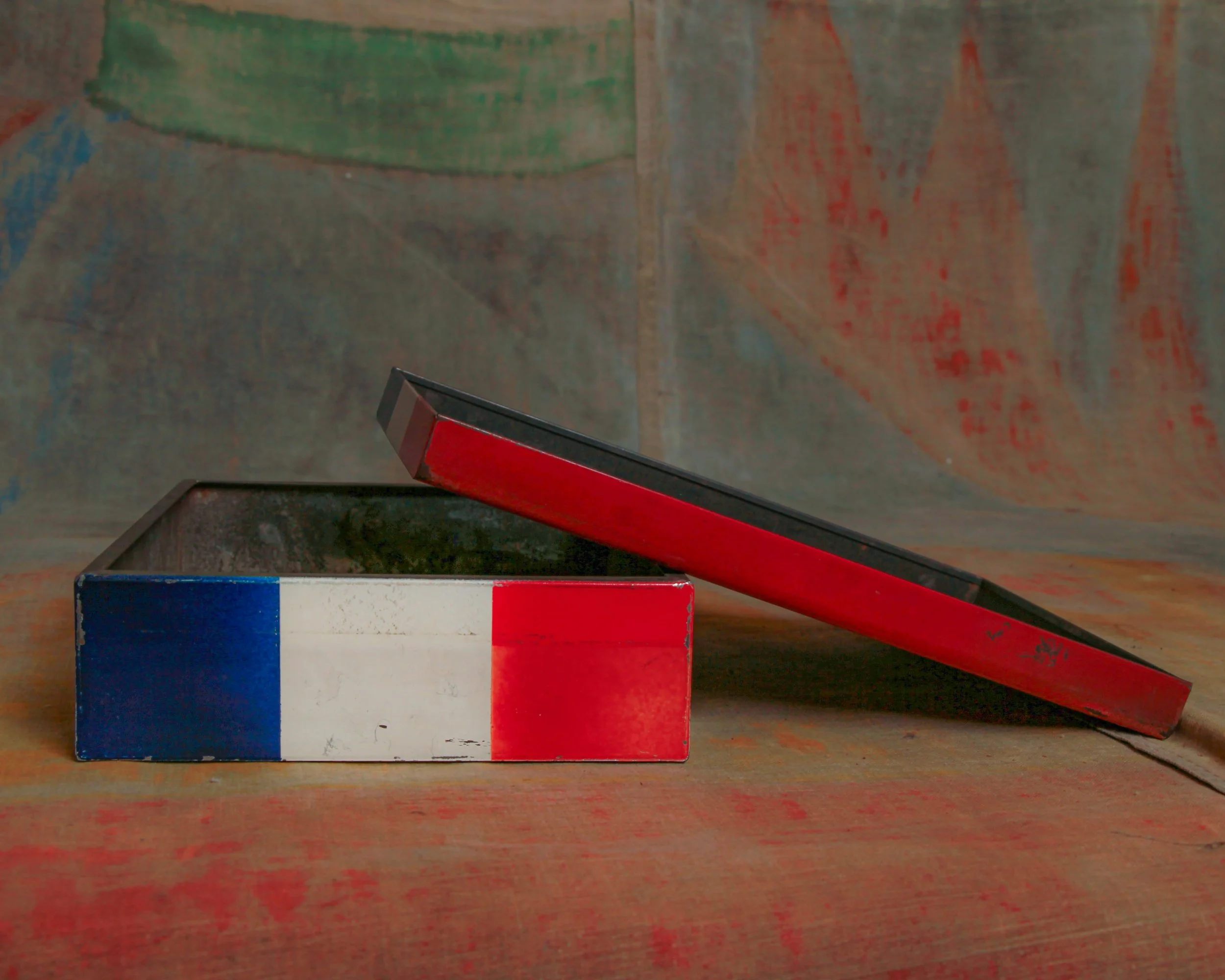
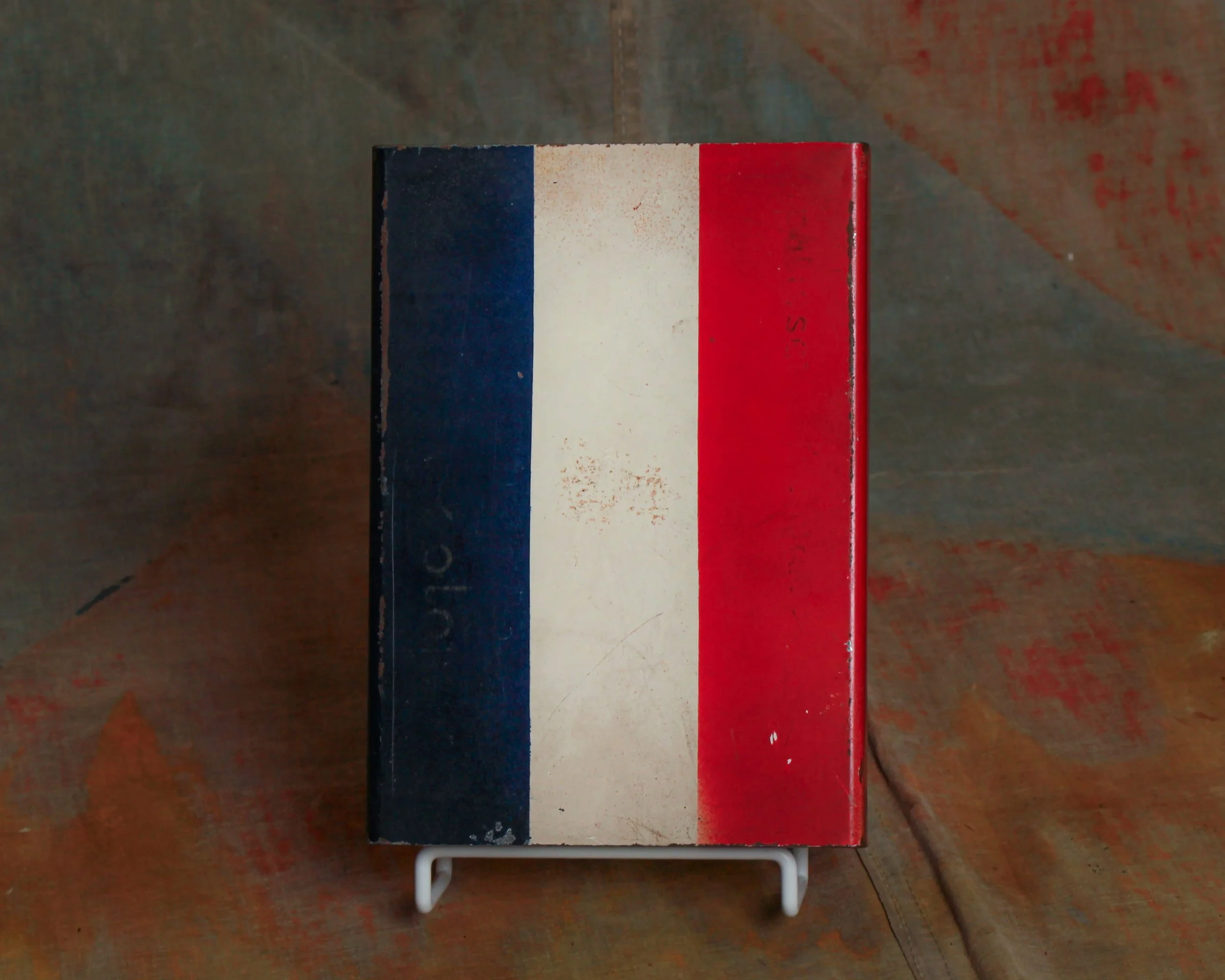
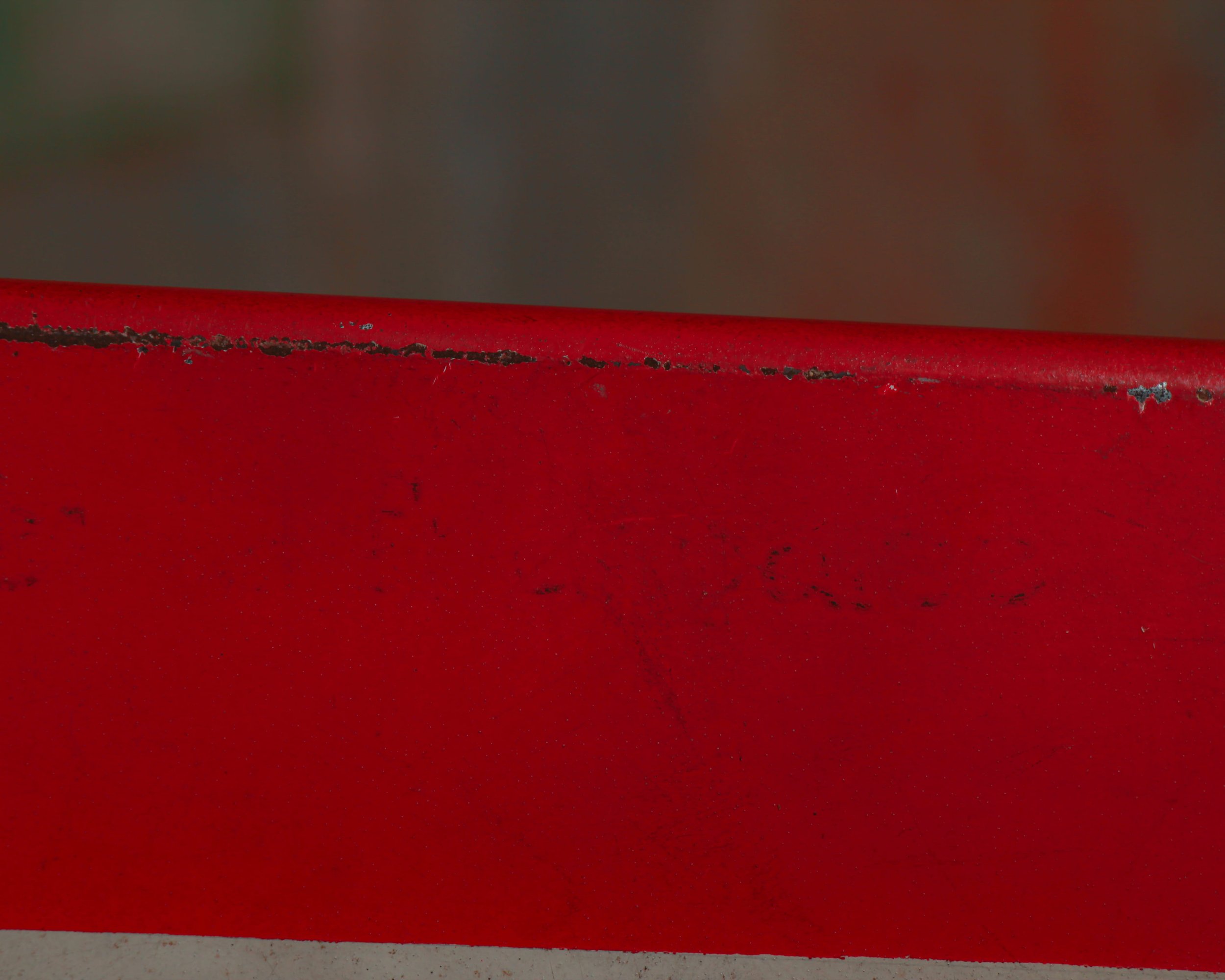
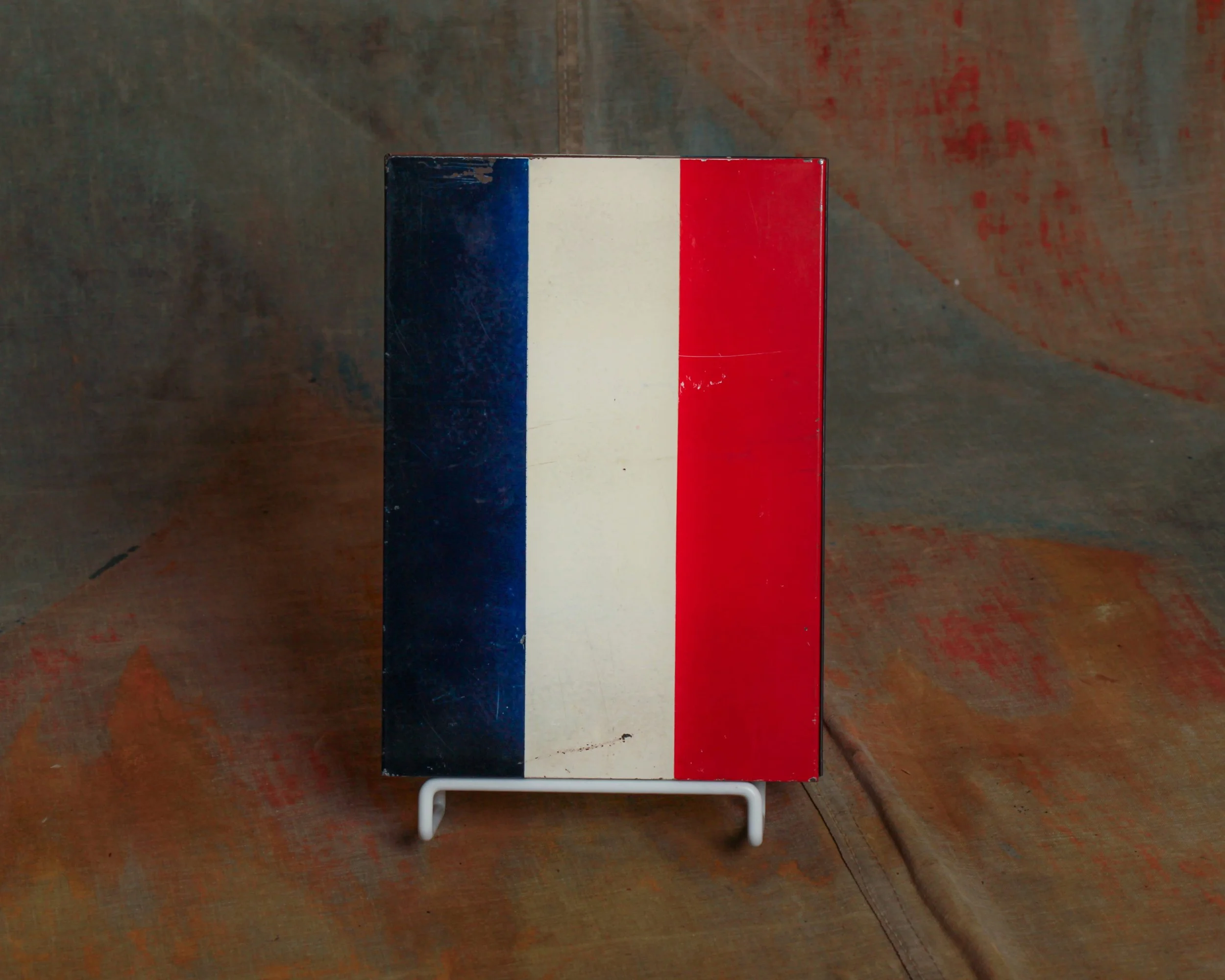
At first glance it looks unmistakably French. The bold vertical stripes in blue, white, and red immediately read like the French tricolor, the sort of graphic shorthand you might expect from a Parisian pâtisserie window. Clean, confident, and just a little bit stylish without trying too hard.
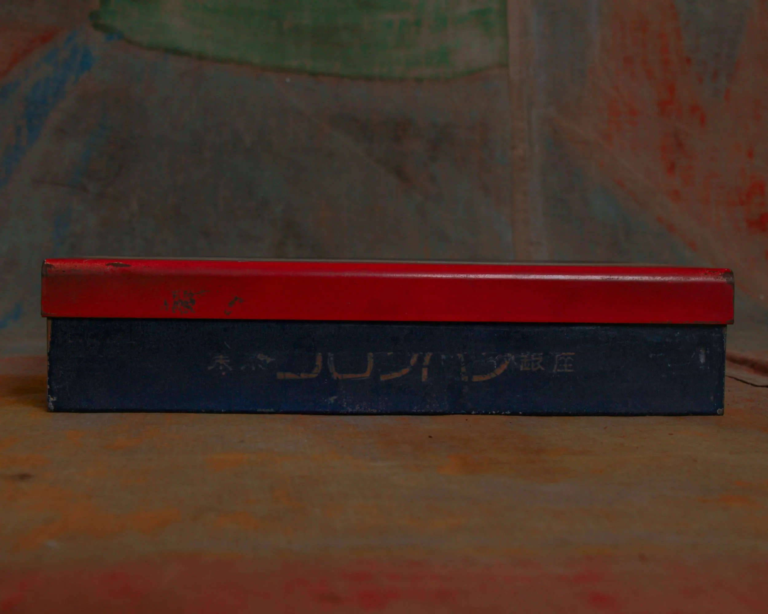
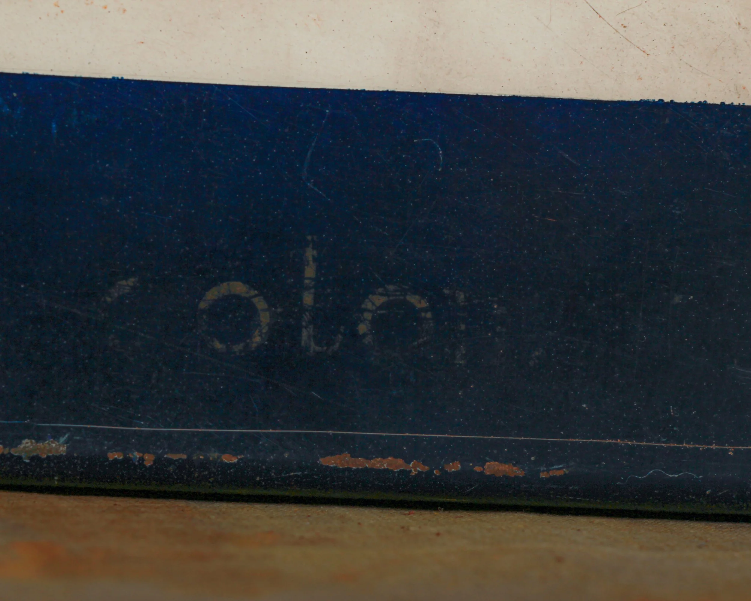
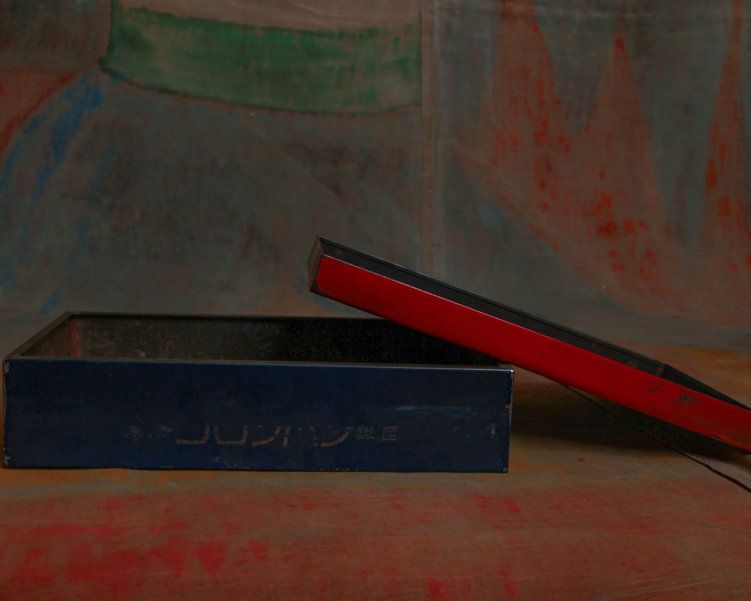
But look closer and the plot thickens. The sides carry Japanese lettering, hinting that this box likely came from a Japanese bakery inspired by French pastry culture, circa mid-20th century.
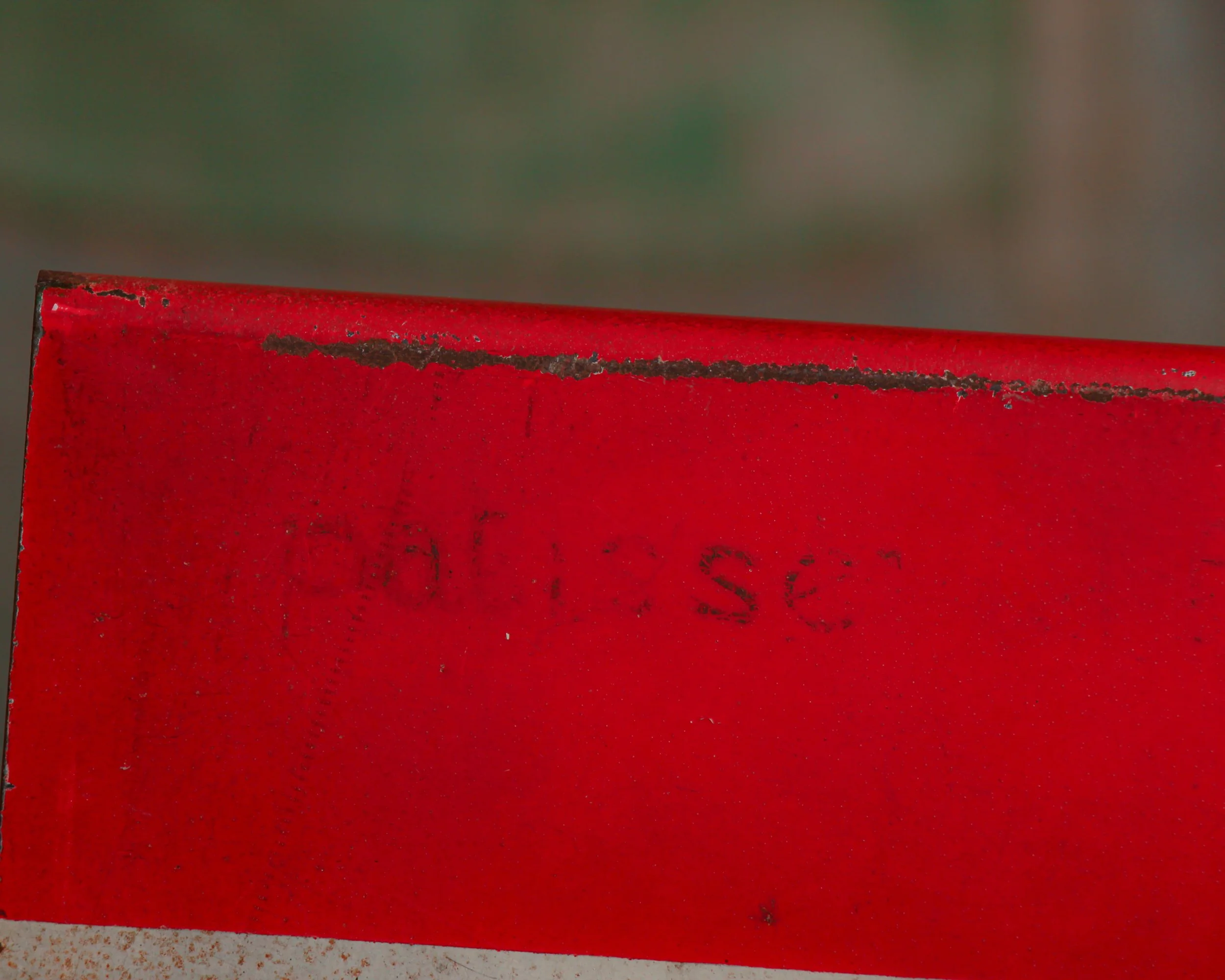
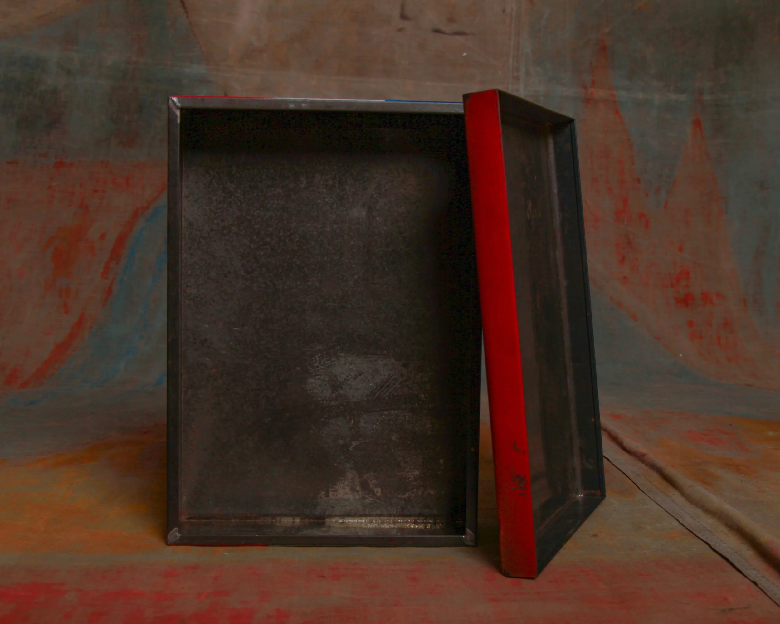
The tin itself has a wonderfully honest, mid-century feel. Simple folded steel construction, a snug-fitting lid, and crisp painted graphics that were meant to catch the eye across a bakery counter. Time has done its work in the best possible way. The surface shows scattered scuffs, small scratches, and gentle wear to the paint along the edges. The colors are still bold, but softened just enough to remind you this box lived a real life rather than sitting on a shelf.
What makes it especially appealing is that perfect mix of graphic design and cultural crossover. French pastry tradition filtered through Japanese design sensibility, all wrapped up in a practical bakery tin.
Category History
French patisserie in Japan is less import than interpretation. After World War II, French techniques—laminated doughs, custards, precise baking—made their way into Japanese culinary schools and shops. What followed wasn’t imitation so much as refinement. Bakers adopted the structure and discipline of French pastry, then adjusted it to local taste—lighter textures, less sugar, cleaner finishes.
Presentation became just as important as flavor. Display cases read like small galleries, each piece carefully proportioned and detailed. Seasonal ingredients and packaging add another layer of attention.
What makes it compelling is the balance. You can recognize the French foundation, but the execution feels distinctly Japanese—precise, restrained, and quietly inventive, with a focus on craft over excess.
At first glance it looks unmistakably French. The bold vertical stripes in blue, white, and red immediately read like the French tricolor, the sort of graphic shorthand you might expect from a Parisian pâtisserie window. Clean, confident, and just a little bit stylish without trying too hard.
But look closer and the plot thickens. The sides carry Japanese lettering, hinting that this box likely came from a Japanese bakery inspired by French pastry culture, circa mid-20th century.
The tin itself has a wonderfully honest, mid-century feel. Simple folded steel construction, a snug-fitting lid, and crisp painted graphics that were meant to catch the eye across a bakery counter. Time has done its work in the best possible way. The surface shows scattered scuffs, small scratches, and gentle wear to the paint along the edges. The colors are still bold, but softened just enough to remind you this box lived a real life rather than sitting on a shelf.
What makes it especially appealing is that perfect mix of graphic design and cultural crossover. French pastry tradition filtered through Japanese design sensibility, all wrapped up in a practical bakery tin.
Category History
French patisserie in Japan is less import than interpretation. After World War II, French techniques—laminated doughs, custards, precise baking—made their way into Japanese culinary schools and shops. What followed wasn’t imitation so much as refinement. Bakers adopted the structure and discipline of French pastry, then adjusted it to local taste—lighter textures, less sugar, cleaner finishes.
Presentation became just as important as flavor. Display cases read like small galleries, each piece carefully proportioned and detailed. Seasonal ingredients and packaging add another layer of attention.
What makes it compelling is the balance. You can recognize the French foundation, but the execution feels distinctly Japanese—precise, restrained, and quietly inventive, with a focus on craft over excess.