
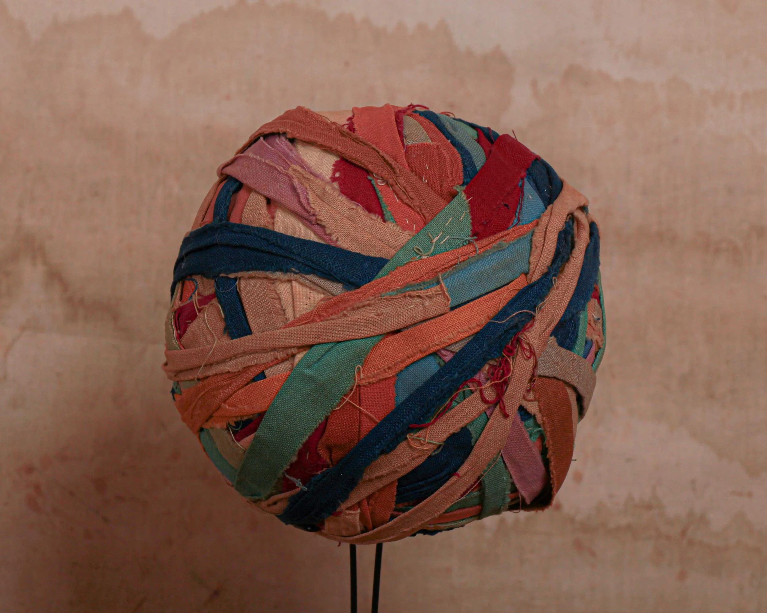
Antique Objects + Found Objects
The part of the collection that resists easy categorisation. Antique objects sourced from estate sales, private collections and forgotten places.
This is where the Heimwee collection gets harder to define. Our antique objects page brings together a broad range of vintage collectibles and unusual antiques that reflect the full scope of what Humberto finds on the road. Antique photography, antique clothing, antique furniture and antique curiosities all find their way here, alongside objects that simply do not fit neatly anywhere else.
That is not a limitation. It is the nature of collecting seriously. The most interesting antique objects are often the ones that sit outside established categories, pieces that were made for a specific purpose, used for a lifetime and have arrived here carrying everything that history with them. Unique antique objects with no obvious classification are frequently the ones that stop people in their tracks.
The vintage objects in this collection span a wide range of periods, materials and functions. Antique household objects produced for everyday domestic use sit alongside antique collectibles of a more decorative nature. Early antique photography including cabinet cards and tintypes appears alongside antique clothing and wearable artifacts from the same period. Antique furniture and display pieces turn up when Humberto finds something worth carrying.
Each piece is selected on its own terms. If it is here, it earned its place.
Objects
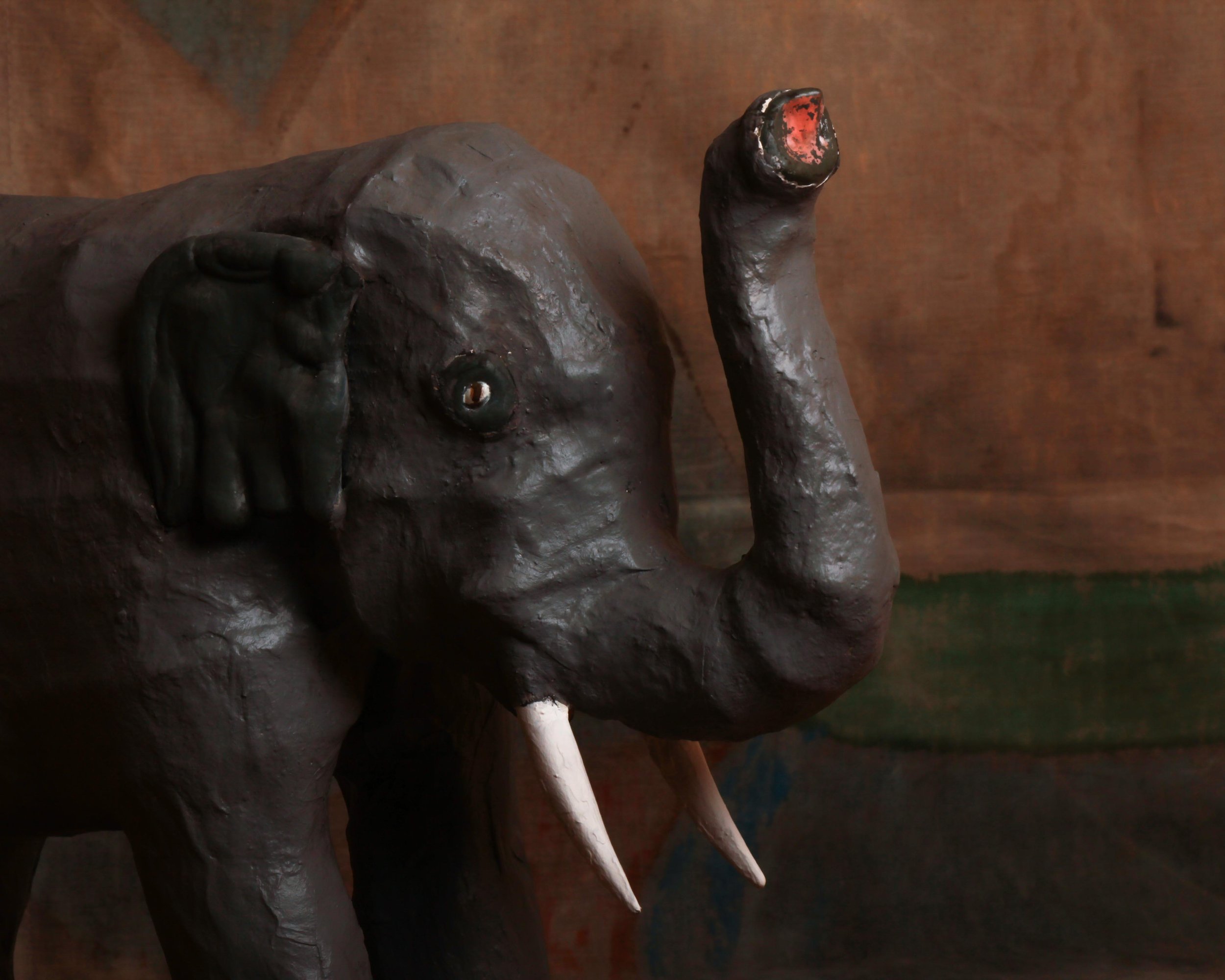
This mid-century papier-mâché elephant has a wonderfully handmade presence, with just enough realism to read immediately and just enough awkwardness to make it interesting. The body is built in a sturdy, simplified form, with thick legs, a rounded back, oversized ears, white tusks, and a raised trunk. The dark gray painted surface has plenty of texture from the papier-mâché underneath, and the slightly uneven modeling gives the elephant a lot more character than a perfectly molded factory piece would have. Small details, like the inset eyes and traces of red paint at the end of the trunk, add to its oddball charm.
What works here is the combination of scale and directness. The elephant is not trying to be zoologically perfect. Instead, it has the blunt, almost theatrical look of something made to be seen from across a room. The raised trunk gives it a celebratory stance, while the rough surface and hand-shaped details keep it grounded in the maker’s process. It is a good example of how humble materials can produce an object with real visual weight and personality.
Papier-mâché has been used for centuries because it is lightweight, inexpensive, and surprisingly strong once built up in layers. By the 19th century it was used for everything from decorative boxes and furniture to masks, toys, theatrical props, and shop displays. The material remained popular well into the 20th century, especially for larger sculptural objects that would have been costly or impractical to make from carved wood or plaster.
Mid-century papier-mâché animals often lived somewhere between toy, display piece, and folk sculpture. Elephants were especially appealing subjects because their heavy forms translated well into simplified construction, and their exotic associations made them natural candidates for circus displays, department-store decoration, children’s rooms, and promotional installations.
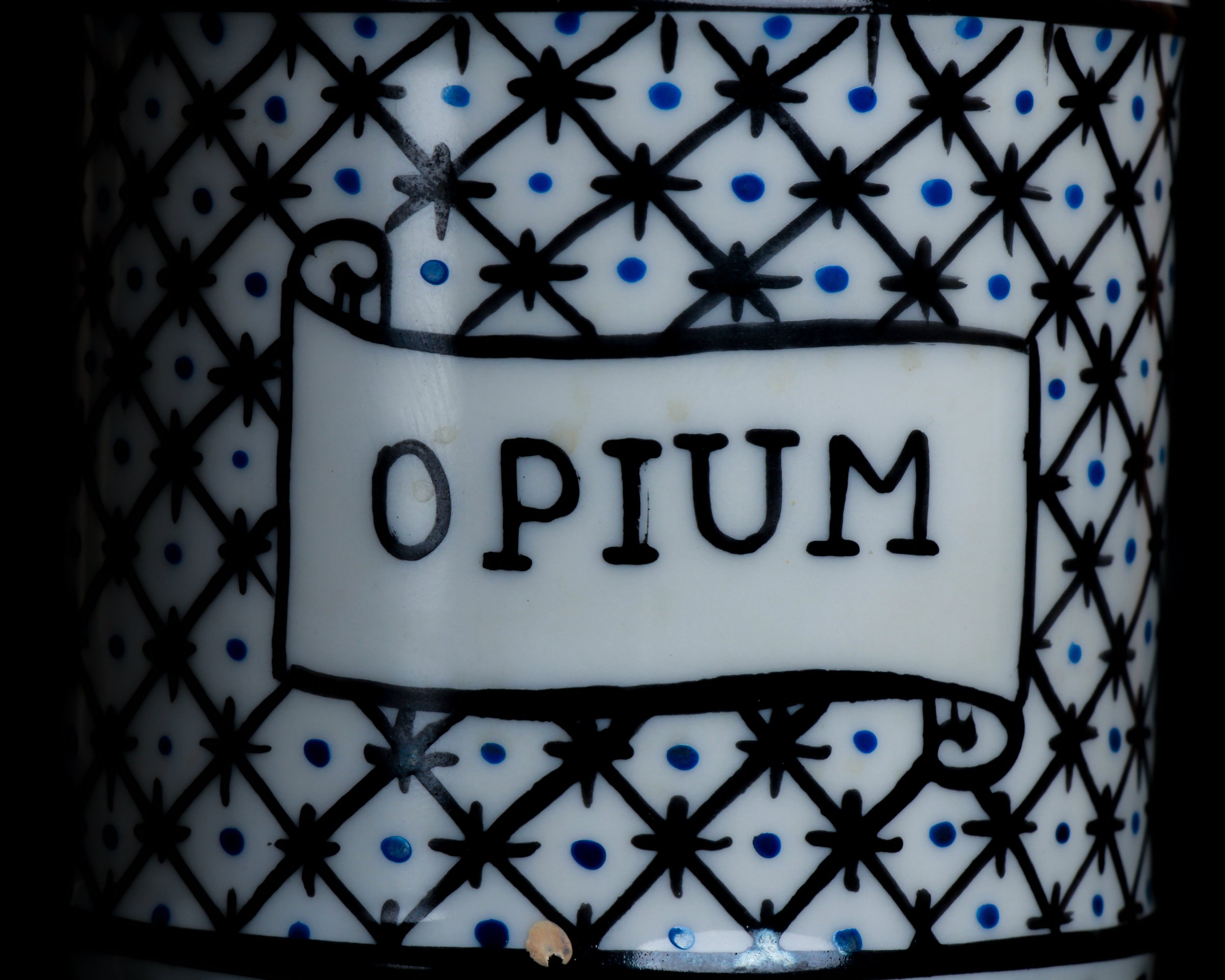
This mid-19th century Limoges porcelain apothecary jar is a terrific little piece of pharmacy history, standing just six inches high but carrying plenty of visual punch. The cylindrical body is topped with a tall, domed cover and rounded finial, giving it the elegant silhouette associated with Continental drug jars of the period. Against the white porcelain, a dense black lattice pattern is punctuated with small cobalt-blue dots, while leafy black borders frame the top and bottom. At the center, a scrolling cartouche is boldly labeled “OPIUM.”
There are a few small chips and areas of wear, all consistent with age and use, but the decoration remains crisp and graphic. The piece is possibly attributable to the Laviolette factory in Limoges, though without a visible maker’s mark that attribution should remain cautious.
Apothecary jars like this were made for pharmacies at a time when medicines were still commonly stored, compounded, and dispensed by hand. Shelves lined with labeled ceramic jars were both practical and theatrical, giving 19th-century pharmacies an orderly, almost laboratory-like appearance.
Opium was an important medicinal ingredient during the period and was widely used in preparations intended to relieve pain, suppress coughing, treat diarrhea, and induce sleep. Laudanum, a tincture of opium dissolved in alcohol, became especially common in Europe and America during the 18th and 19th centuries. Regulations were far looser than they are today, and opium-based medicines could often be purchased directly from pharmacists.
Limoges became one of France’s major porcelain-producing centers after deposits of kaolin were discovered nearby in the 18th century. By the 19th century, numerous factories were producing everything from tableware to specialized pharmacy vessels. Pieces like this sit at an interesting intersection of decorative arts, medical history, and everyday commerce, which is exactly what makes old apothecary jars so appealing to collectors today.
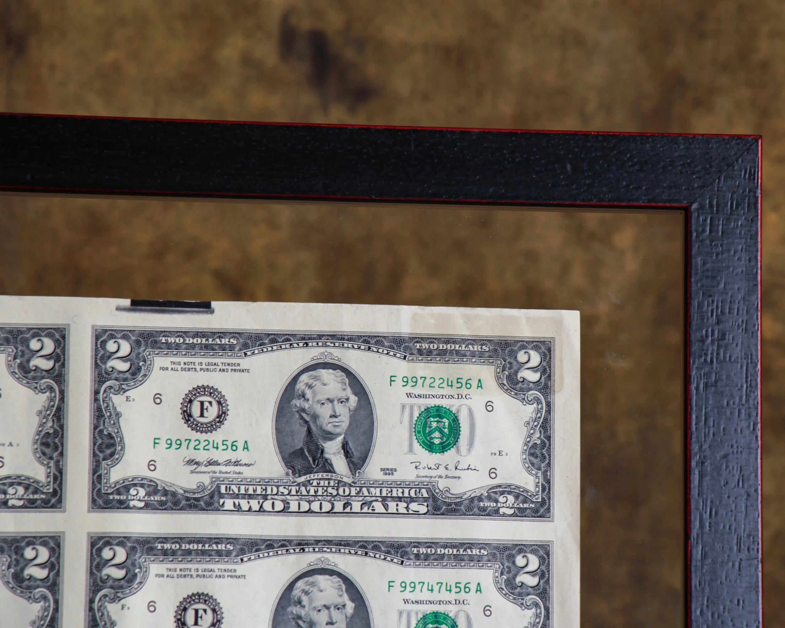
This uncut sheet of thirty-two United States $2 bills is from Series 1995 and presents the denomination in the way it originally existed before individual notes were cut apart for circulation. The full sheet has a wonderfully graphic quality, with Thomas Jefferson’s portrait repeated in a precise grid across the front and John Trumbull’s famous Declaration of Independence scene repeated on the reverse. The serial numbers progress across the sheet, giving it that satisfying mix of bureaucracy, design, and pattern.
The sheet is displayed in a double-sided frame, allowing both sides of the currency to be viewed. It is protected with Tru Vue Optium Museum Acrylic, a high-grade glazing material favored for important works on paper because of its clarity, UV protection, and anti-reflective qualities. The floating presentation also gives the sheet some breathing room and keeps the untrimmed edges visible, which is an important part of its appeal.
The $2 bill has had one of the more curious histories in American currency. The denomination dates back to the 19th century, but it has never circulated as heavily as the $1 or $5 bill. Its relative scarcity in everyday use eventually gave it an almost novelty status, even though it remains legal tender.
The modern $2 Federal Reserve Note was introduced in 1976 as part of the United States Bicentennial. That redesign brought the familiar reverse image of the signing of the Declaration of Independence, adapted from Trumbull’s painting, while Jefferson remained on the face.
Uncut currency sheets occupy a slightly different corner of collecting than ordinary notes. They were sold specifically as collectibles and souvenirs, preserving the bills in their original sheet format before cutting. Seeing thirty-two notes together makes the engraving, repetition, spacing, and printing process much easier to appreciate. Framed this way, the sheet lands somewhere between numismatics, graphic design, and American historical ephemera.
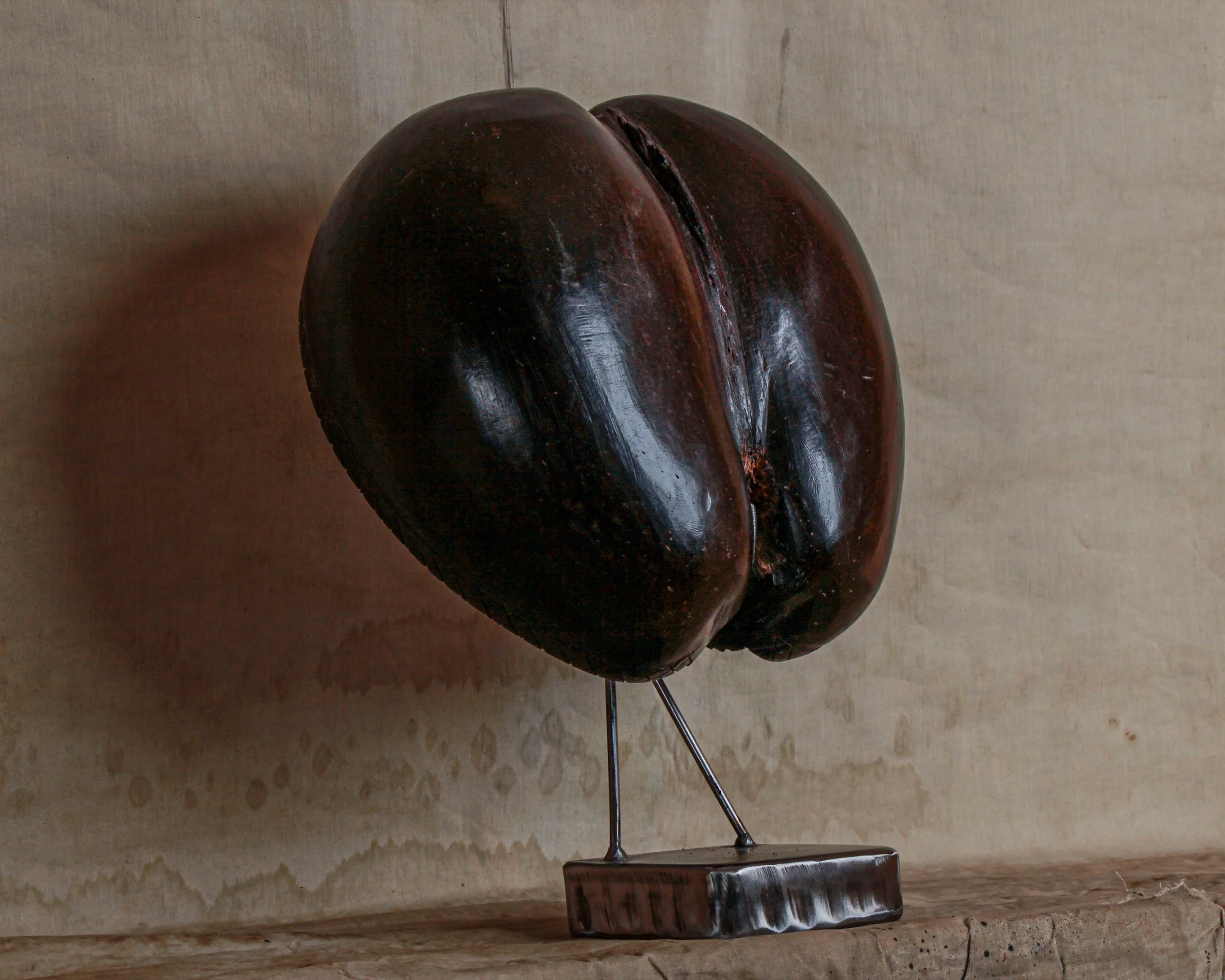
This is a wonderful old coco de mer, the extraordinary double-lobed seed of the Lodoicea maldivica palm, native only to the Seychelles islands of Praslin and Curieuse. Its unmistakable form is almost sculptural on its own, with two broad rounded lobes divided by a deep central cleft. The surface has developed a rich, nearly black-brown patina with reddish undertones, along with scratches, handling marks, and areas of natural wear that give it plenty of character.
This example has also been opened and worked by hand, revealing the beautifully textured interior and a simple incised crosshatched decoration around portions of the edge. Although cut in half, it retains the iconic heart-like silhouette for which the coco de mer is famous. Displayed on its custom metal stand, it reads somewhere between natural-history specimen, folk sculpture, and outright conversation piece.
The coco de mer has fascinated travelers and collectors for centuries. Before Europeans knew where the palms actually grew, the enormous nuts occasionally washed ashore in India, Sri Lanka, and the Maldives. With no known tree to explain them, people imagined they came from mysterious trees growing beneath the Indian Ocean, which helped inspire the name coco de mer, or “coconut of the sea.”
The reality is arguably stranger. Coco de mer palms grow naturally in only a tiny corner of the Seychelles, and they produce the largest seeds in the plant kingdom. Individual seeds can weigh roughly 25 kilograms or more, an astonishing investment of energy for a single seed.
Their suggestive shape has also given the coco de mer a long association with fertility, sexuality, mythology, and good fortune. Over time, polished shells were turned into bowls, containers, decorative objects, and prized souvenirs. Today the species is carefully protected in the Seychelles, making older examples particularly appealing as pieces of both natural and collecting history.
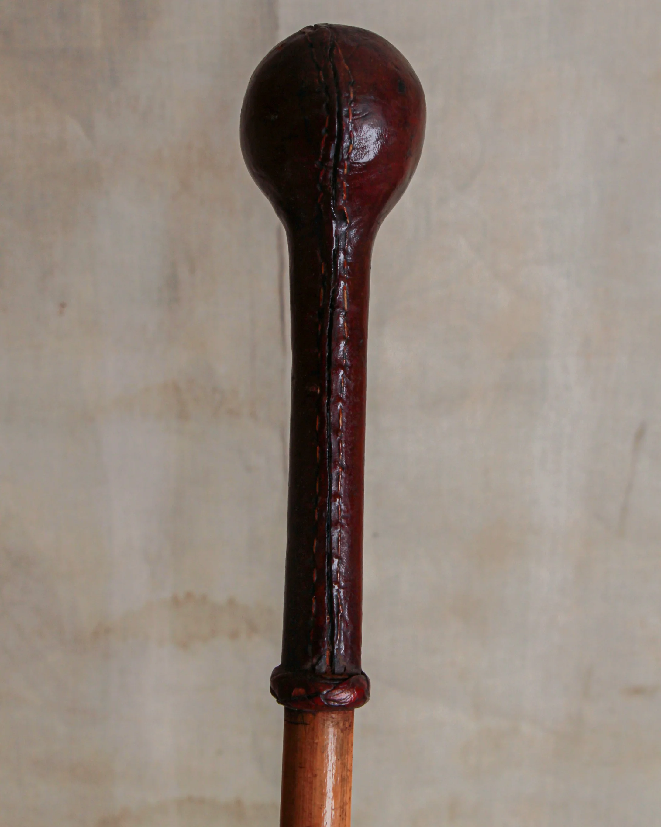
This antique walking stick has a wonderfully simple construction, with a long, slender wooden shaft topped by a dark brown leather-covered handle. The handle is especially nice, shaped with a rounded bulb at the top and a long narrow grip below, all finished with visible hand stitching running along one side. A small wrapped leather collar marks the transition from handle to shaft and gives the whole piece a slightly more finished look.
At the opposite end is a dark metal ferrule, fitted over the tip of the wooden shaft to protect it from wear. The wood has developed a warm honey-brown color, with scattered marks, scratches, staining, and surface wear from use. The leather has darkened considerably with age and shows creasing, scuffs, and irregularities along the stitched seam, all of which give it a pleasantly well-used character.
Walking sticks became especially fashionable during the 18th and 19th centuries, when they moved beyond being purely practical objects and became part of everyday dress. By the Victorian and Edwardian periods, a gentleman’s cane could say quite a bit about its owner. Handles were made from an enormous range of materials, including horn, silver, ivory, wood, leather, and occasionally far more eccentric choices.
Leather-covered grips were practical as well as attractive, providing a comfortable surface in the hand while allowing makers to shape handles without relying on expensive materials. Some examples were made for everyday walking, while others were associated with sporting, military, equestrian, or country pursuits.
This example is refreshingly understated. There is no elaborate silver mount or carved decoration, just good materials, honest construction, and evidence of years of handling. The stitched leather top gives it just enough personality, while the slim proportions and old surface make it an appealing piece of functional history.
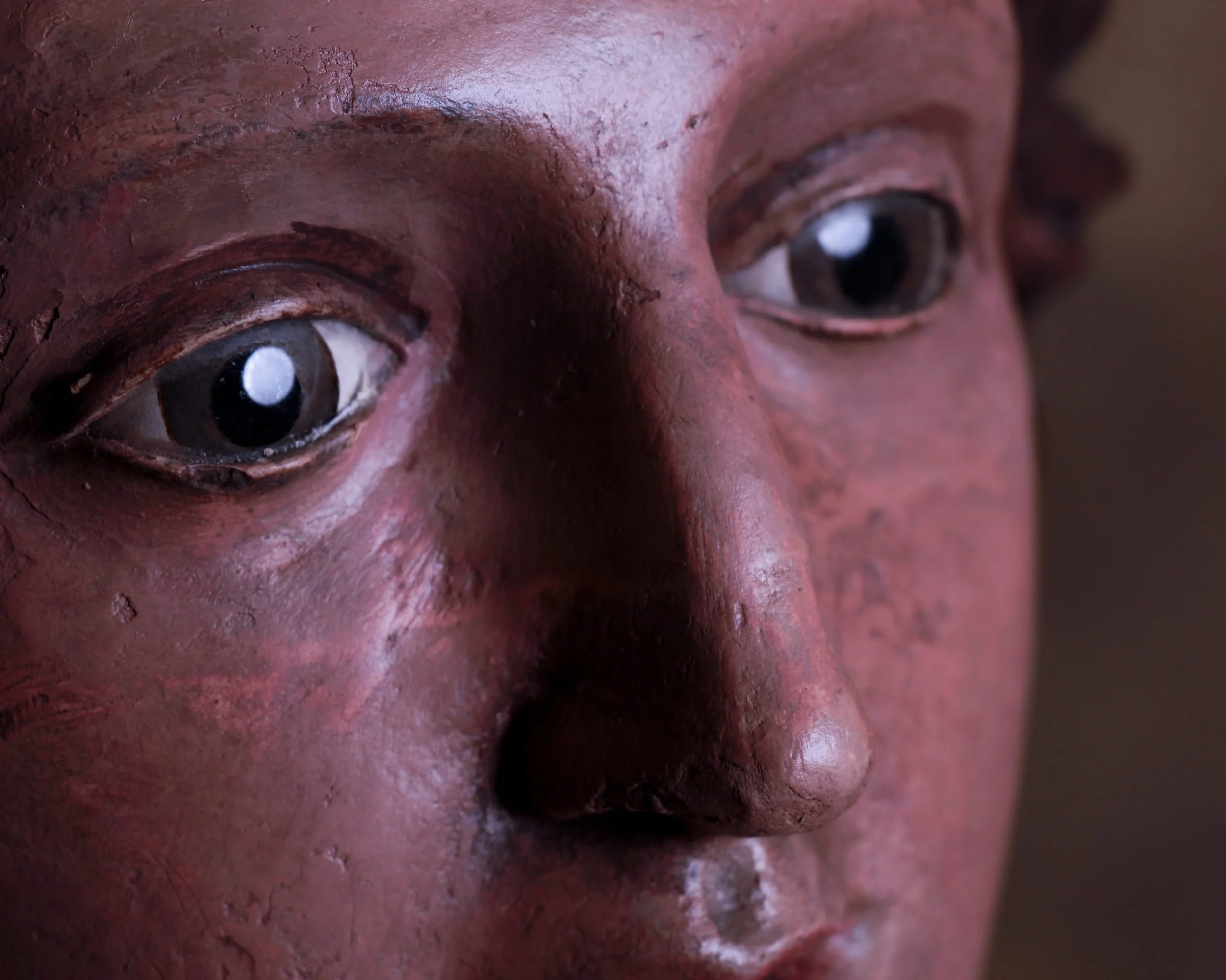
With her softly modeled features, flowing hair, and remarkably expressive glass eyes, this early 19th-century terracotta bust possesses the rare ability to hold a room without demanding attention. At first glance, she appears serene and composed. Spend a little more time with her, however, and the expression becomes harder to define. Curious, contemplative, perhaps even slightly amused. The ambiguity is part of the charm.
Hand-sculpted and painted more than two centuries ago, the bust retains a surface rich with age and character. The original polychrome finish has mellowed beautifully over time, developing a warm, earthy palette that complements the terracotta beneath. Fine craquelure, scattered losses, and areas of wear are not distractions but rather evidence of a long life well lived. They give the piece the kind of authenticity that simply cannot be manufactured.
The glass eyes are particularly captivating. Unlike many period sculptures whose gaze feels fixed or distant, these eyes create an immediate sense of presence. They catch the light, animate the face, and lend the bust an almost startling realism. It is easy to understand why religious and devotional figures of this period were often fitted with glass eyes; they transform sculpture into something that feels unexpectedly alive.
Mounted on a wonderfully primitive wooden base, the contrast between refined craftsmanship and rough-hewn support only adds to the appeal. The weathered block elevates the bust both literally and visually, creating a presentation that feels sculptural, balanced, and entirely honest.
Whether originally intended for a domestic altar, chapel setting, or devotional display, the piece now functions just as comfortably as a decorative object. It sits beautifully among folk art, religious artifacts, and classical sculpture alike.
Measuring 19 inches high overall, with the terracotta bust standing 11.5 inches high and resting on a 7.25-inch wooden base, this is a piece that rewards close inspection. The longer you look, the more personality emerges, which is perhaps why it remains so compelling after all these years.
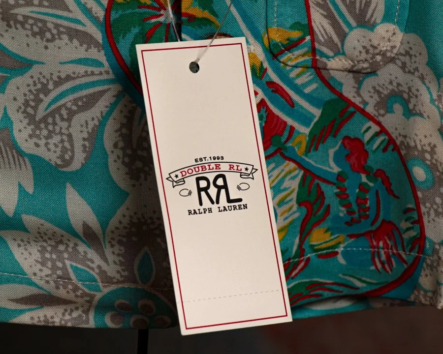
There’s a certain charm to this piece that’s hard to resist. At first glance, it looks like a child-sized Hawaiian shirt fresh from a beachside shop. Look a little closer and you realize it’s something much more unusual: a meticulously produced miniature collectible inspired by the scaled-down samples carried by traveling salesmen in the early 1900s.
Before sales reps hauled full inventories across the country, many relied on miniature versions of their products to demonstrate fabrics, construction, and design. This RRL collectible tips its hat to that tradition while celebrating one of the brand’s standout modern designs: the Tropical-Print Camp Shirt.
Executed in miniature but with remarkable attention to detail, the shirt faithfully reproduces the original garment’s relaxed island character. The pattern itself was inspired by a hand-painted Hawaiian shirt, and it shows. Large-scale tropical florals drift across a vivid turquoise ground, punctuated by bold red accents and layered botanical motifs. The result feels equal parts vintage Waikiki souvenir, mid-century resort wear, and artist’s sketchbook brought to life on cloth.
What makes this piece especially appealing is that Double RL treated it with the same seriousness as a full-sized garment. The proportions are carefully considered, the stitching is crisp, and even the coconut shell buttons have been faithfully incorporated. Rather than feeling like a novelty, it reads as a genuine object of craftsmanship, simply reduced in scale.
Presented on its custom display stand and accompanied by its original presentation box, the piece was issued as a limited edition of just 100 examples. The edition number is hand-stamped on the box, and this example is numbered 18 of 100, adding another layer of collectibility to an already scarce release.
Part advertising sample, part folk object, and part design study, it occupies a wonderfully unusual corner of the collecting world. Whether displayed alongside vintage Hawaiian shirts, Ralph Lauren ephemera, or Americana, it delivers exactly what the best miniatures do: all of the character, craftsmanship, and storytelling of the original, distilled into something delightfully small.
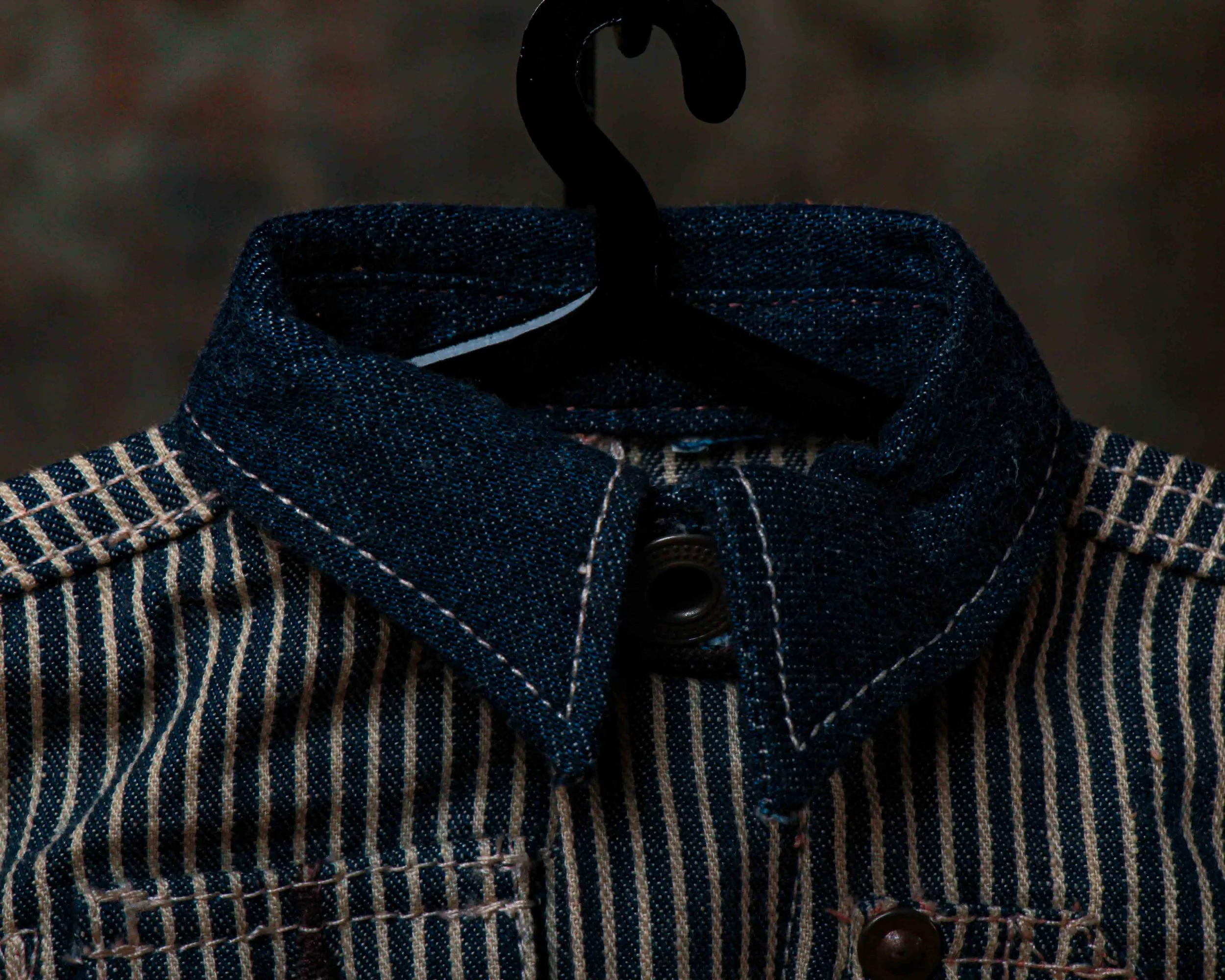
Miniature set of railroad-striped workwear, built with the same seriousness and attention to detail as the full-sized garments that inspired it. At first glance it looks like a child’s coverall, but it’s actually a collectible rooted in a much older tradition: the miniature samples carried by travelling salesmen in the early 1900s. Before catalogs were common and before buyers could browse products online, sales representatives often arrived with scaled-down versions of their wares, giving customers a tactile preview of materials, construction, and style.
This example comes from Ralph Lauren’s Double RL line, a brand known for its deep appreciation of American workwear and frontier history. Produced in a limited edition of just 191 examples, it faithfully recreates the details of a classic railroad-era coverall in miniature form.
The fabric alone is worth a closer look. Constructed from indigo-dyed washed cotton twill with a traditional hickory-stripe pattern, it carries all the visual appeal of vintage workwear. The Japanese indigo cloth collar, cuffs, and waistband provide subtle contrast, while the true indigo dye gives the piece the same character and aging potential as its full-sized counterpart. As with vintage denim, some color transfer is possible.
What really makes it shine are the details. A straight collar with buttoned throat latch, concealed button placket, metal hardware, buttoned side adjusters, chest pockets, hammer loop, tool pocket, reinforced knees, and five-pocket styling have all been scaled down with remarkable precision. Even the interior retains its “RRL Union-RLs” label.
Measuring 12.8 inches high by 7 inches wide, it occupies that sweet spot between collectible and design piece. Displayed on its custom stand (included) and accompanied by its original signature presentation box, it feels less like merchandise and more like a tiny monument to American workwear. A small object, certainly, but one with an outsized amount of charm.
Circa first quarter 21st century.
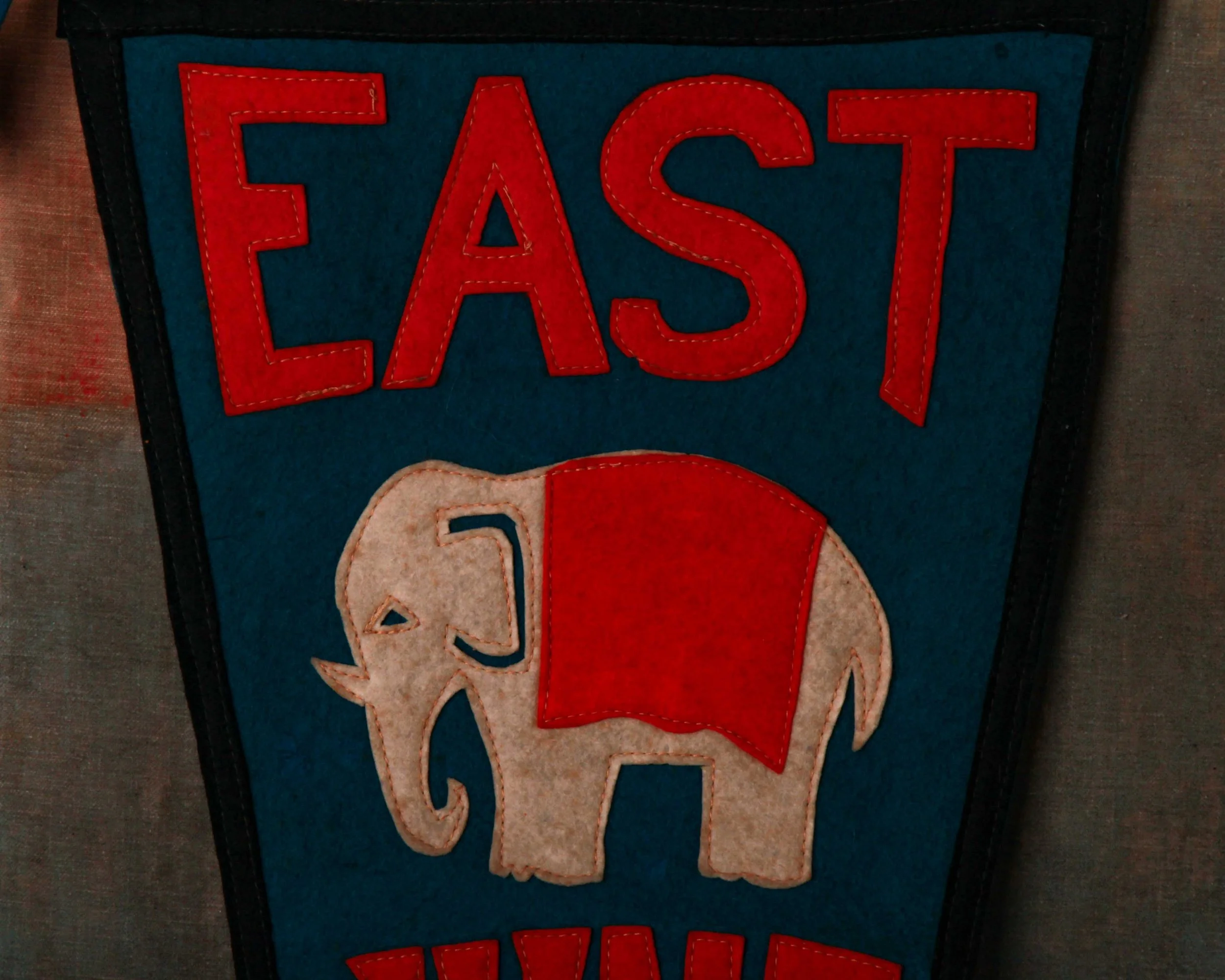
There’s something deeply charming about old school pennants, especially when they weren’t made for tourists, collectors, or nostalgia dealers. This one was made for somebody who actually went there. A student, a proud parent, maybe someone headed home after a game on a cold Ohio night with this rolled under their arm.
Made for East High School in Akron, Ohio, this felt pennant carries all the graphic confidence that 1920s school spirit seemed to produce so effortlessly. The colors do most of the heavy lifting: bold orange lettering stitched against a deep blue ground, framed by black trim that sharpens the whole silhouette. And right in the center, an elephant mascot that somehow manages to look both tough and slightly polite at the same time. It’s great.
The lettering has that unmistakable handmade athletic feel too. Slightly irregular, stitched rather than printed, full of character in a way modern reproductions rarely get right. “EAST” across the top lands with real presence, while the oversized “29” running down the tail gives the pennant a strong vertical rhythm that reads beautifully on the wall.
What really makes this one work, though, is the material itself. Felt pennants age in a very particular way. They soften. The colors mellow slightly. The edges relax. Instead of feeling worn out, they start to feel lived with. This example still retains remarkably strong color throughout, with only light age and handling wear that adds exactly the right amount of honesty.
Flip it over and you get the ghost image of the stitched lettering and elephant showing faintly through the back, which honestly might be one of the best details on the whole piece. It reminds you this thing was sewn together by actual hands, not mass-produced by machines trying to imitate character decades later.
Long and narrow at nearly classic collegiate proportions, it hangs beautifully. Equal parts Americana, folk graphic, and small-town memory stitched into felt.
Reach out re: shipping before purchasing at hello@heimweeantiques.com
An early umbrella and cane case, built from warm oak and wrapped in glass, it was designed to turn a practical necessity into a small moment of selection. The half-dome top softens the form, giving it a kind of storefront presence, while the clear panels invite everything inside to stand on display rather than disappear into a corner. This wasn’t storage. It was presentation.
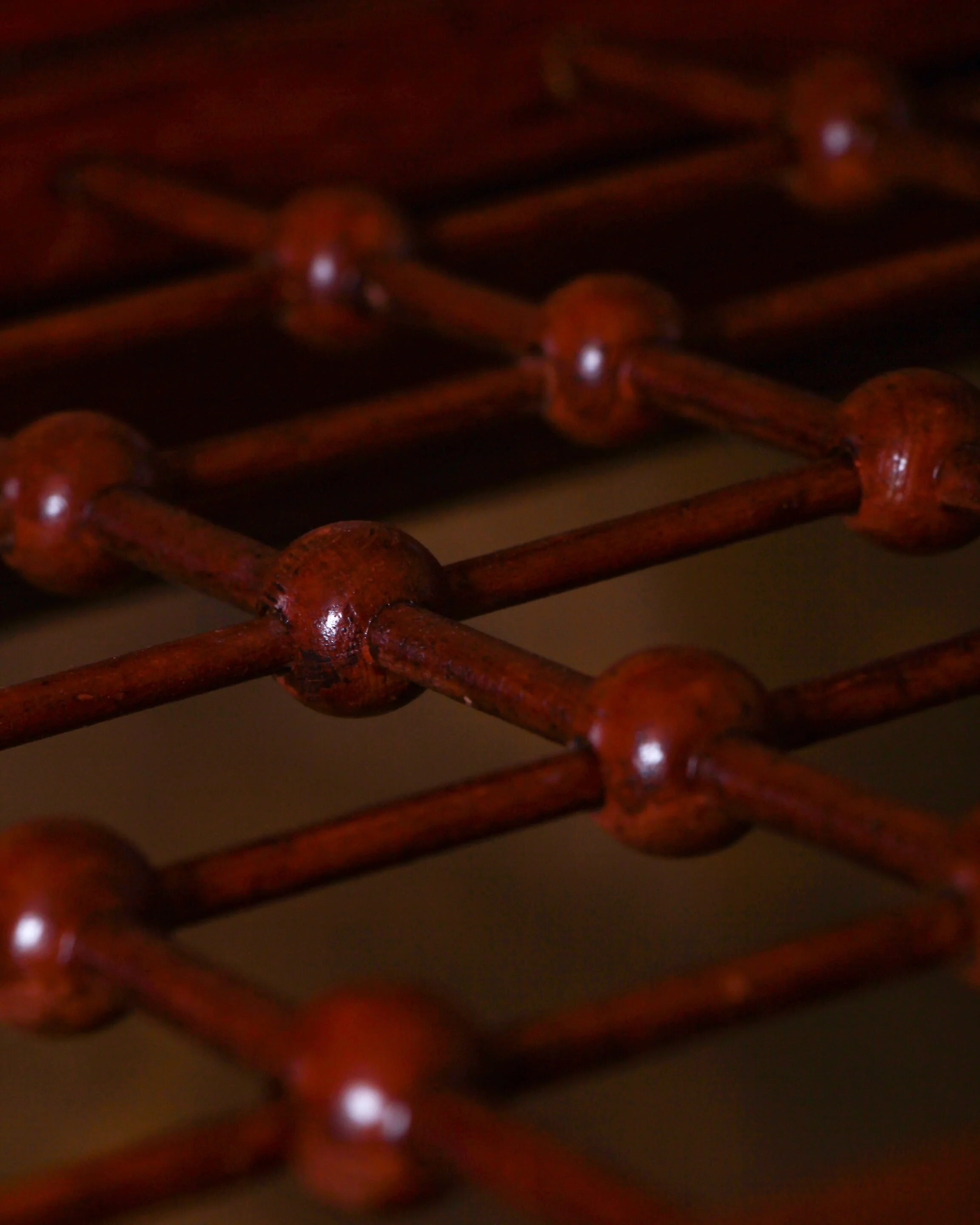
Inside, a neatly ordered grid of turned wooden dividers holds up to 78 canes or umbrellas, each one given its own place. You can almost picture them lined up, handles peeking above the rim, a mix of polished wood, curved crooks, maybe the occasional silver tip catching the light. A whole lineup of choices, waiting for weather or whim.
The painted glass is where it really leans in. “Emporium Style And Quality” stretches across the front in that confident, slightly ornamental lettering, followed by the promise underneath: “Wonderful Low Prices.” It’s straightforward, a little optimistic, and entirely of its time. Retail as both assurance and invitation.
There’s wear throughout, as expected. The oak shows its age with a softened surface and small marks from years of use. The lettering has areas of color loss, giving it that slightly weathered, lived-in look that only comes from sitting in a real shop rather than a display room. Nothing distracting. Just the right amount of history.
At 47 inches high, 38 wide, and 20 deep, it has presence without feeling bulky. A functional object that doubled as a bit of quiet advertising, now standing on its own as both furniture and artifact.
Canes
In the 1920s and 1930s, canes balanced necessity and style. Still used for support, they doubled as personal statements, with carved handles, exotic woods, and even hidden compartments, reflecting an era when everyday objects carried a bit of personality and quiet flair.
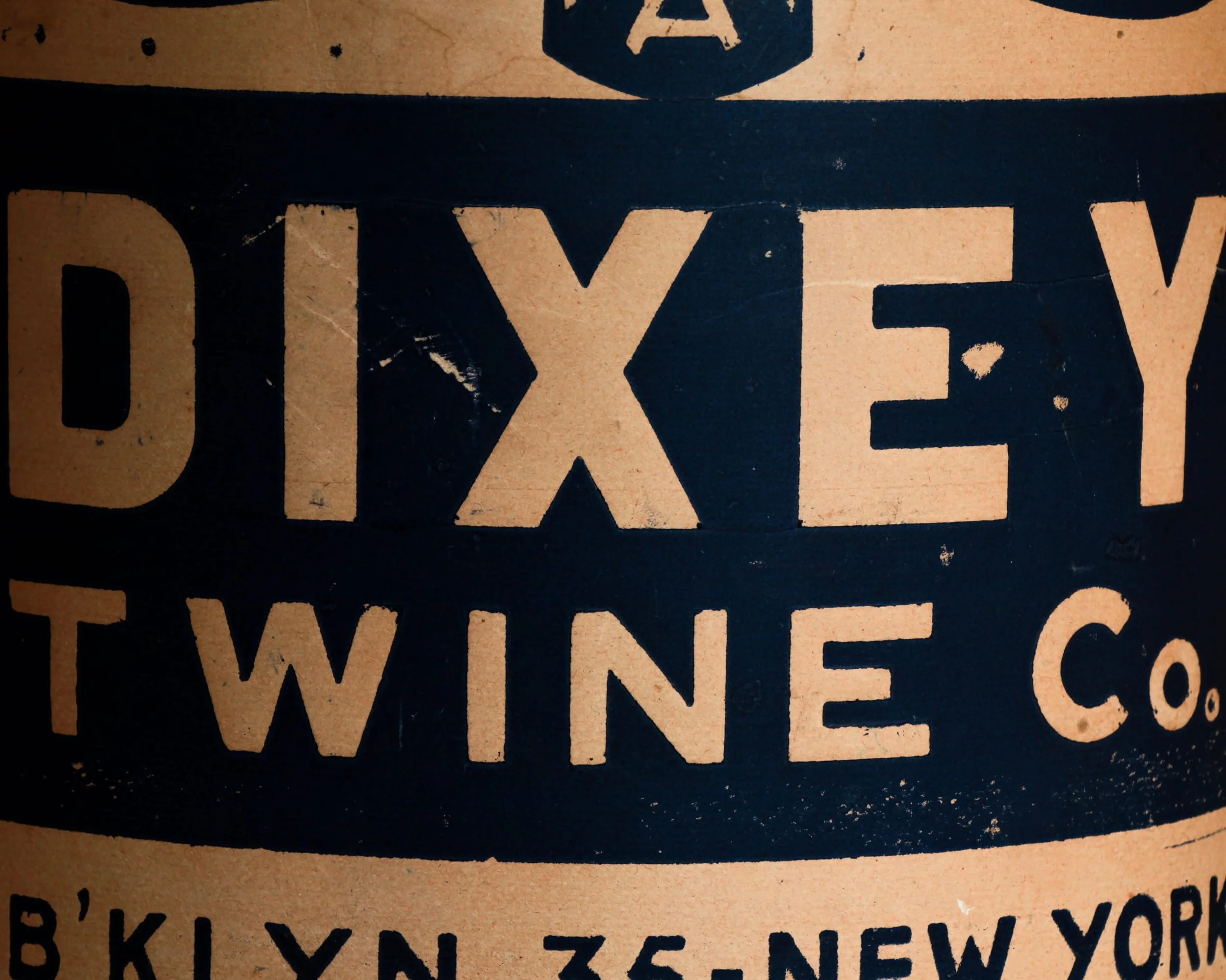
This is a new old stock Dixey Twine Co. spool, still wrapped in its original paper like it’s been waiting a century for instructions. Made in Brooklyn around 1920, it comes from a time when even something as simple as twine carried a bit of graphic confidence. The bold, no-nonsense typography, “Triple A Grade,” “B’KLYN. 35 – New York,” reads less like packaging and more like a statement of intent.
The scale is part of the charm. At over 11 inches tall and a full 10 inches in diameter, this isn’t the kind of twine you toss in a drawer. It was meant for real work, shipping rooms, warehouses, maybe a shop where everything moved by hand and got tied down tight before heading out the door.
What makes this one special is the fact that it never got there. The paper wrap shows age, spotting, and a bit of wear along the edges, but it’s done its job perfectly, preserving the spool underneath in unused condition. It feels like a small industrial artifact that somehow sidestepped time.
Equal parts packaging, object, and design, it sits somewhere between a utilitarian tool and a piece of early 20th century advertising that just happens to still be intact.
Twine
In the 1920s, twine was everywhere, quietly holding the economy together. Before plastic and synthetic cord, natural fibers like jute, hemp, and cotton were spun into strong, affordable line used across farms, factories, and city shops. It bundled newspapers, tied parcels, secured produce, and kept shipping crates in order as goods moved through an increasingly industrialized world. In agriculture, binder twine was essential for mechanized harvesting, especially with the rise of reapers and balers. In urban settings, it was just as vital, a daily tool of grocers, clerks, and warehouse workers. Twine wasn’t glamorous, but it was constant, practical, and indispensable.
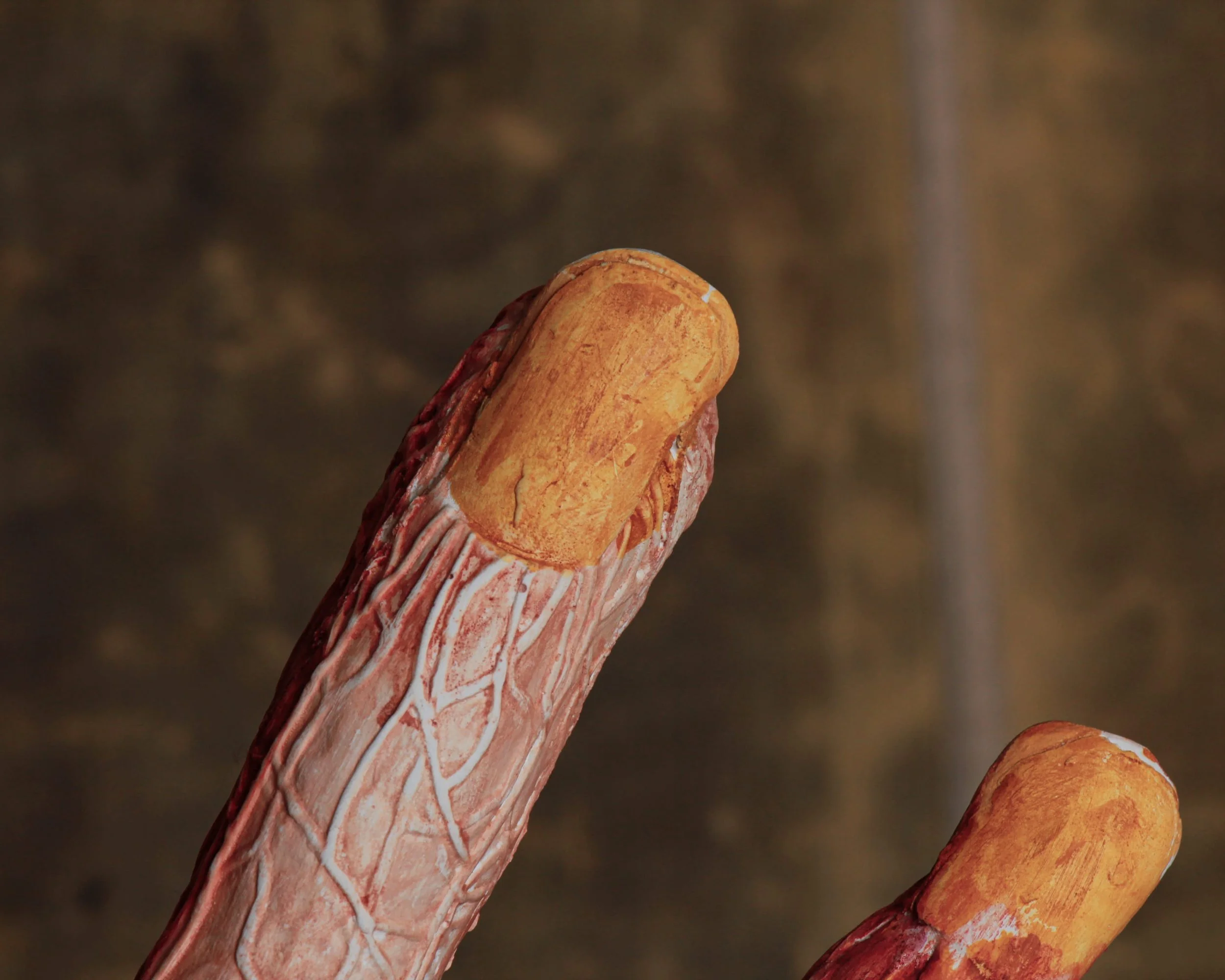
This early 20th century French anatomical hand model was made as a teaching tool, the kind that would have sat in a classroom or lecture hall, guiding students through the mechanics beneath the skin. Muscle, tendon, and vein are all mapped out in lacquered plaster, each layer simplified just enough to teach, but still detailed enough to hold your attention. The color work does most of the talking—deep reds, pale striations, and those winding blue veins that feel almost too alive for something fixed in place.
Mounted on a custom heavy steel stand, it carries itself with a certain presence. Not delicate, not decorative in the traditional sense, but undeniably striking. There’s a sculptural quality to the gesture of the hand itself, fingers extended in a way that feels almost expressive, like it’s mid-explanation.
Possibly attributed to Maison Deyrolle, the Paris institution known for producing educational models of this kind, it fits squarely into a period when learning was tactile and visual. You didn’t just read about anatomy, you stood in front of it.
Condition reflects its working life. Surface wear throughout, small losses, and a repair to one fingernail, all consistent with decades of handling and use. Nothing that takes away from it, if anything, it reinforces the fact that this wasn’t made to sit quietly.
Measures 20.5 inches high, 16.5 inches wide, and 4 inches deep, with an 8 inch square base.
Equal parts study object and conversation piece, it’s the kind of thing that doesn’t just sit in a room, it changes it.
Anatomical Models
In the 1930s, anatomical plaster models like this hand were essential teaching tools in medical schools, especially in Europe. Before widespread access to modern imaging or preserved specimens, these hand-painted forms offered a durable, repeatable way to study musculature and vascular systems. Makers like Deyrolle helped standardize visual learning through craft and precision.
ITEM NOT AVAILABLE IMMEDIATELY—INQUIRE IF INTERESTED hello@heimweeantiques.com
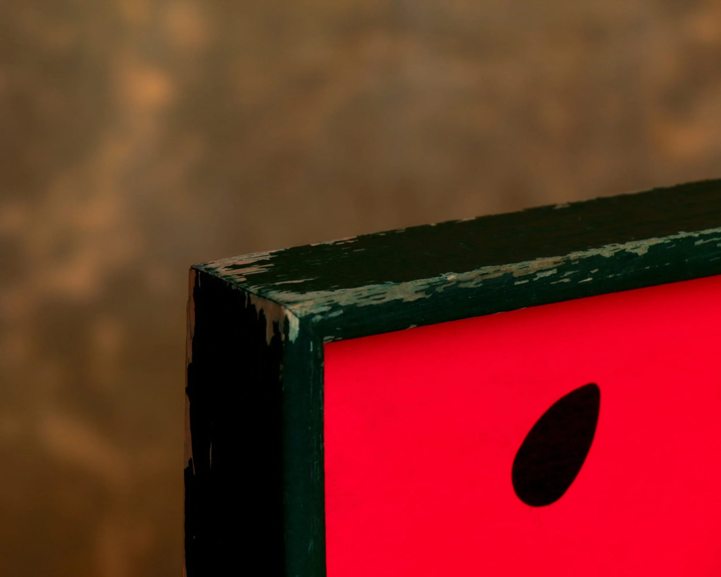
A mid-century serving tray built around a bold, graphic watermelon slice, all clean arcs and saturated color. The composition is simple but confident: deep red field dotted with black seeds, a crisp white band, and that unmistakable green rind fading outward into a darker edge. It’s the kind of design that feels pulled straight from a 1950s picnic ad, where everything was bright, optimistic, and just a little stylized.
The construction leans practical. A solid wooden frame surrounds the panel, painted in a deep green that ties the whole thing together. Cutout handles on either side are shaped with a slight curve, comfortable in the hand and clearly meant to be used, not just looked at. The tray has a good weight to it without feeling heavy, the kind of piece you could actually carry out loaded with drinks and not think twice.
What’s especially nice here is the wear. The edges show honest scuffing, a bit of paint loss along the corners, just enough to soften the graphic sharpness. The surface still holds its color beautifully, with only light marks that come from use rather than neglect. The back is simple, unfinished wood, stained and aged in a way that tells you it’s been around long enough to see a few seasons come and go.
Mid-century trays
Mid-century trays sit at that intersection where utility met a newly confident sense of design. In the 1940s through the 1960s, the idea of entertaining at home shifted. Casual hosting, backyard gatherings, and TV dinners all nudged everyday objects to become more visually engaging. The tray, once purely functional, turned into a kind of portable canvas.
Manufacturers leaned into new materials and techniques. Laminates, molded plywood, fiberglass, and early plastics allowed for bold color, smooth surfaces, and easy cleaning. At the same time, advances in screen printing and lithography made it possible to apply graphic designs at scale. That’s why you see everything from atomic patterns and abstract forms to playful fruit, cocktails, and kitschy scenes.
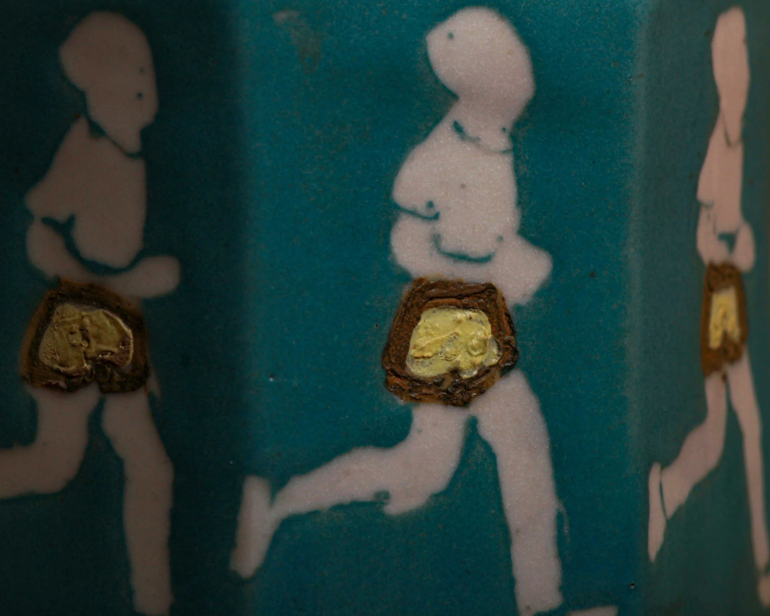
A squat, faceted ceramic jar in a saturated turquoise glaze, topped with a low, domed lid that feels almost architectural in its simplicity. But then your eye catches the figures marching around its sides. A repeating procession of white, stylized runners, frozen mid-stride, arms bent, legs in motion…each wearing what can only be described as a strategically placed pair of raised, textured shorts. The rest is left to suggestion.
It’s playful, a little irreverent, and very much of its time.
Mid-century ceramics, particularly from the 1950s and 60s, often leaned into bold color, clean form, and graphic decoration. But alongside the refined Scandinavian influence and sleek American modernism, there was also a current of humor—objects meant to make you look twice, maybe laugh quietly, maybe raise an eyebrow. This jar sits squarely in that lane. It’s functional, yes, but it’s also clearly meant to entertain.
The glaze is worth pausing on. That rich teal has depth, sitting somewhere between matte and satin, with just enough variation to give it life. The white silhouettes are crisp but intentionally simplified, almost stencil-like, which makes the raised shorts stand out even more. They’ve been applied with a thicker slip or glaze, giving them a dimensional, almost sculptural quality. It’s a small detail, but it changes everything.
The form itself is nicely considered. The faceted sides catch light differently as you move around it, breaking up what could have been a simple cylinder. The lid sits neatly, with a soft lip and a subtle contrast where the glaze shifts tone near the rim. It feels good in the hand, solid but not overly heavy.
Condition shows light, honest wear. Minor surface marks here and there, nothing distracting. The base is signed “BAM,” a mark that adds just enough mystery without tying it down too tightly.
ITEM NOT AVAILABLE IMMEDIATELY—INQUIRE IF INTERESTED hello@heimweeantiques.com
There’s a certain honesty to a tool like this. No ornament, no excess, just a shaped piece of wood that spent its life doing one job over and over again.
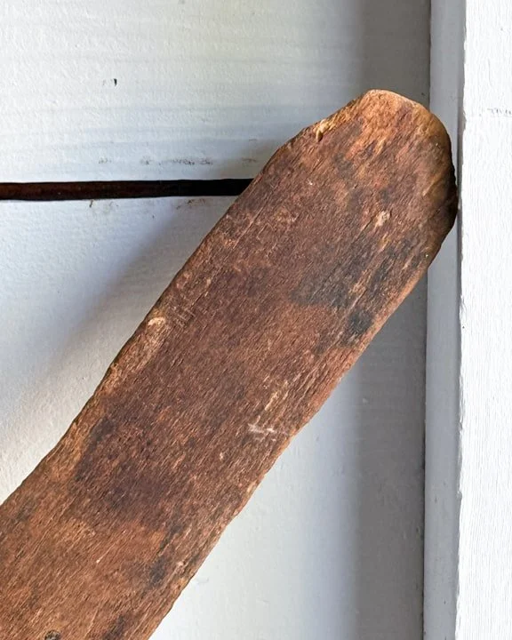
This is an 18th century feather mattress beater, hand-carved from a single length of hardwood, likely by the same hands that used it. Long, flat, and slightly tapered, it was designed to strike, not delicately but rhythmically, against a mattress stuffed with feathers or straw. Before springs, before factory-made bedding, mattresses needed constant attention. Feathers clumped, moisture settled in, dust worked its way through. So they were hauled outside, hung over a line or railing, and beaten back into shape. This was the tool for that job.
You can almost hear it. A steady, hollow thwack echoing across a yard, a daily or weekly ritual that blurred the line between chore and necessity. It wasn’t just about comfort. It was about hygiene, about keeping a household in order in a time when cleanliness took real physical effort.
The surface tells the story better than anything. The wood has worn down to a soft, almost burnished finish from years of handling. There are small nicks, shallow gouges, and darkened areas where hands naturally gripped it. The blade end shows heavier wear, subtly rounded from repeated contact. Nothing dramatic, just the slow, cumulative effect of use. The kind of wear that only comes from time, not from sitting still.
What’s especially appealing here is the form. It has a quiet presence. Somewhere between a paddle, a primitive bat, and an abstract shape you’d expect to see hanging in a gallery. The proportions feel right because they had to be. Every curve and taper is the result of function guiding the hand.
Pieces like this rarely survive with this kind of integrity. They were tools, not keepsakes, and most were used until they split, broke, or were replaced. This one made it through. No repairs, no refinishing, no attempt to dress it up for modern eyes.
It’s a direct line to a different pace of life. One where even something as simple as a good night’s sleep required a bit of effort and a well-worn tool like this hanging nearby, ready to go.
ITEM NOT AVAILABLE IMMEDIATELY—INQUIRE IF INTERESTED hello@heimweeantiques.com
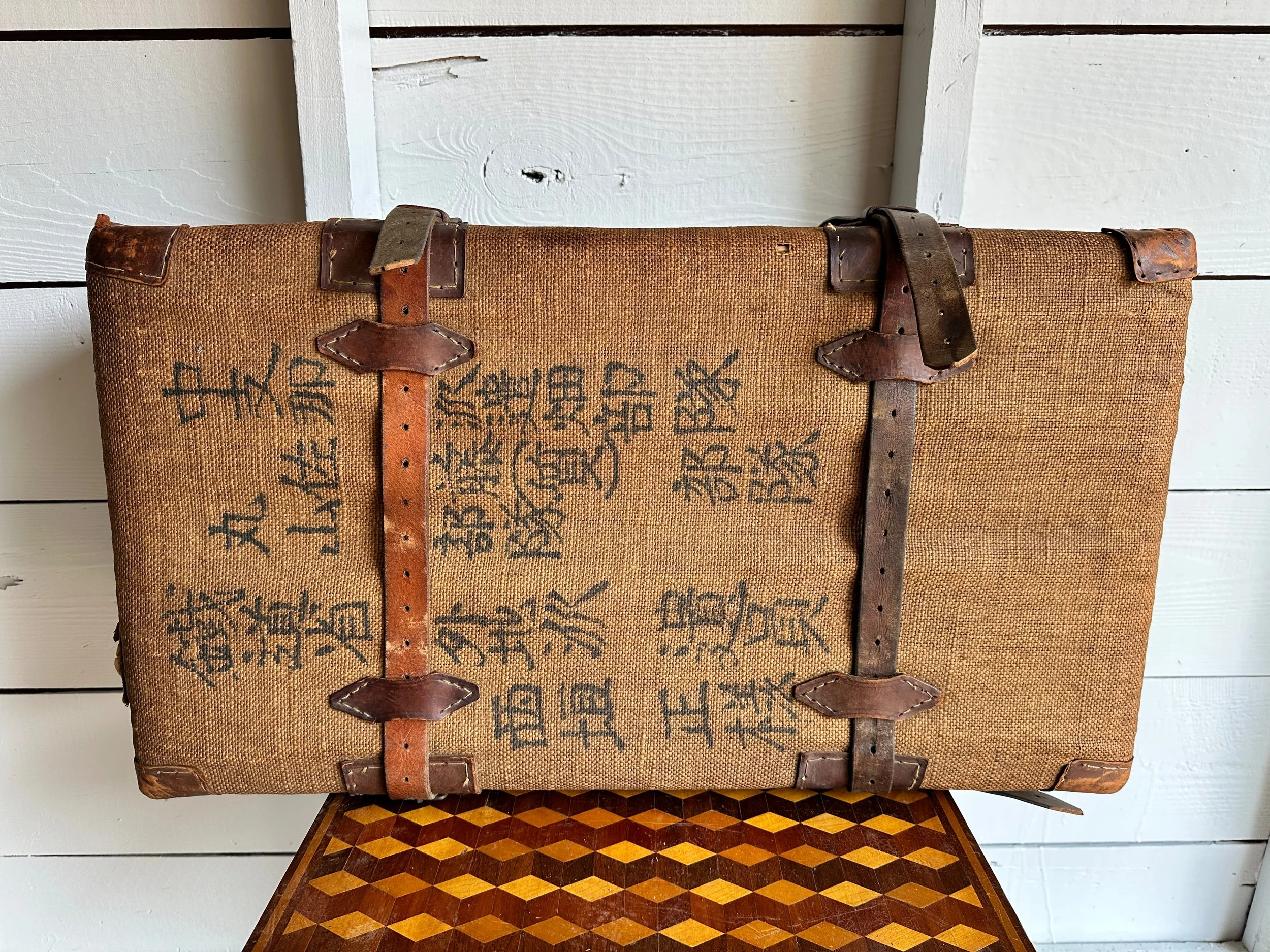
This WWII-era Japanese wicker trunk is handwoven from split bamboo and burlap, it's reinforced with rugged leather corners and buckle straps, all stitched and aged in the best way. The body is painted with bold Japanese calligraphy, likely identifying its original owner or regiment. Inside, it's beautifully lined with tight wickerwork, still intact after decades of wear and travel. Whether it once hauled uniforms, rations, or something more personal, it carries a quiet weight and undeniable presence. A rare survival with both function and soul.
Historical Background
The conflict between the United States and Japan during World War II didn’t begin in a vacuum. By the late 1930s, Japan had already been expanding aggressively across East Asia, occupying large parts of China and pushing into Southeast Asia in search of resources. The United States, watching this unfold, responded with economic pressure, most notably oil embargoes. For Japan, a nation heavily dependent on imported fuel, that was more than a political move. It was an existential problem.
Everything shifted on December 7, 1941, with the attack on Pearl Harbor in Hawaii. The strike was designed to cripple the U.S. Pacific Fleet and buy Japan time to secure territory across the Pacific. It succeeded in the short term, but it also pulled the United States fully into the war. What followed was a long, grinding conflict across vast stretches of ocean, fought island by island.
The nature of the war in the Pacific was different from what was happening in Europe. Distance played a huge role. Supply lines were stretched thin, and battles often took place on remote islands that, on a map, seemed insignificant but were strategically critical. Places like Guadalcanal, Iwo Jima, and Okinawa became names associated with intense, often brutal fighting. The strategy of “island hopping” allowed U.S. forces to bypass heavily fortified positions and focus on capturing key locations that could support airfields and naval operations.
There was also a cultural divide that shaped how the war was fought. Japanese military doctrine emphasized honor and resistance to surrender, which led to fierce defense and, in some cases, suicide attacks like kamikaze missions late in the war. On the American side, the war effort mobilized industry and manpower on an enormous scale, turning the conflict into both a military and manufacturing campaign.
By 1945, the war had shifted decisively. The U.S. had moved closer to Japan’s home islands, and bombing campaigns intensified. The final turning point came with the atomic bombings of Hiroshima and Nagasaki in August of that year, followed by Japan’s surrender. It brought a sudden end to a conflict that had been defined by slow advances, heavy losses, and immense distance, reshaping not just the Pacific, but the global balance of power for decades to come.
ITEM NOT AVAILABLE IMMEDIATELY—INQUIRE IF INTERESTED hello@heimweeantiques.com
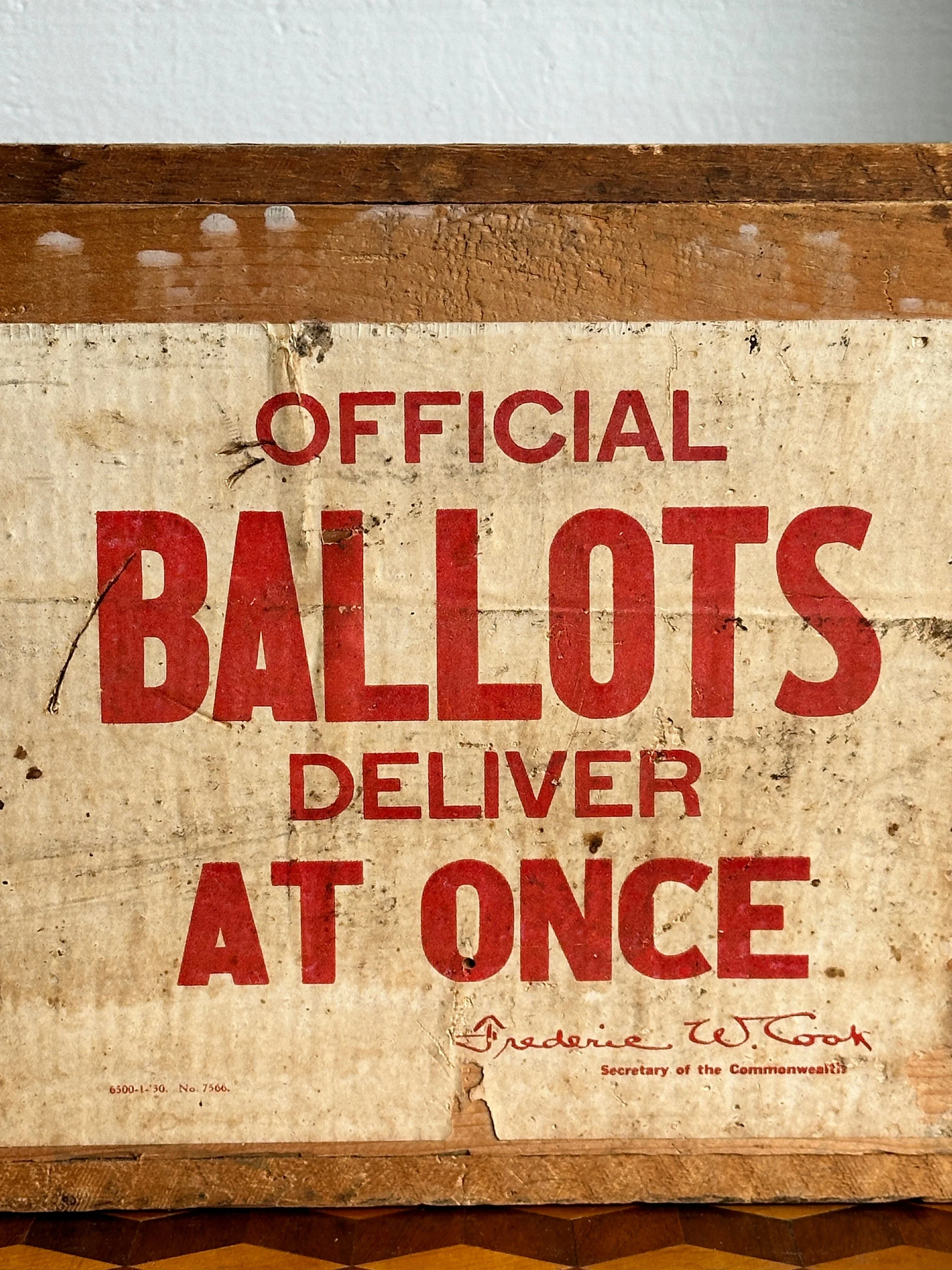
Here's an early 20th-century wooden ballot box from the Commonwealth of Massachusetts, with "OFFICIAL BALLOTS - DELIVER AT ONCE" stenciled boldly on every side, as if it hasn't stopped yelling since 1930. The box was addressed to the Town Clerk of Hubbardston, MA, and is covered in original stencils, hand-scrawled town markings, and even remnants of the old American Railway Express shipping label. One side bears the seal of Massachusetts and the signature of Secretary Frederic W. Cook, who served from 1921 to 1949—so that gives us a nice window into when this box was actively doing its job in democracy's paper trail. The dovetailed construction is solid and shows plenty of wear and grit, which somehow makes it even better. Hard to find and even harder to ignore.
Category History
Ballot boxes from Massachusetts in the 1930s sit right at an interesting crossroads, where older, almost ritualistic voting traditions meet the early push toward modern election systems. By that point, the state had already spent decades trying to clean up and standardize elections, especially after the chaos and corruption that marked 19th-century voting. The introduction of the “Australian ballot” in the late 1800s had changed everything. Instead of party-printed ballots handed out in the open, voters were now given standardized, government-issued ballots and cast them in private. The ballot box became less of a public spectacle and more of a quiet endpoint to a very personal act.
Physically, these boxes were often made of wood or metal, built to feel solid and trustworthy. Many had narrow slots, internal compartments, and locking mechanisms designed to prevent tampering. Some were paired with mechanical voting machines, which Massachusetts began adopting in certain areas in the early 20th century, but paper ballots and traditional boxes remained widely used, especially in smaller towns.
The process itself had a certain choreography. Voters would check in, have their names marked off in large ledger books, and receive their ballot. Privacy booths—simple curtained or partitioned spaces—allowed them to fill it out away from watchful eyes. Once complete, the ballot was folded and dropped into the box, often under the supervision of election officials from multiple parties to ensure fairness.
What’s compelling about these ballot boxes is how much responsibility they carried. They weren’t just containers, they were the physical guardians of trust in a system still proving itself. Every scuff, worn edge, or replaced lock hints at long days of use, local elections, heated debates, and quiet civic participation.
Today, they read as humble objects, but in their time, they were essential. Not flashy, not symbolic in an obvious way, just dependable. Which, in a democracy, is kind of the whole point.
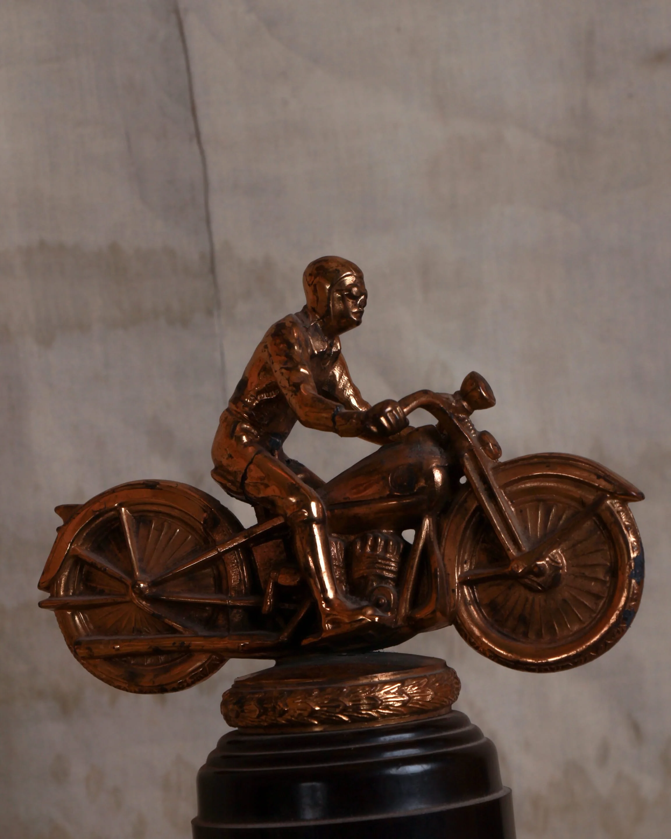
There’s a certain kind of confidence baked into this 1940s motorcycle trophy—the kind that doesn’t need engraving to tell you it was earned the hard way. Cast in a warm, coppery metal and perched on a stepped black base, the whole piece feels like motion paused mid-breath. The rider leans forward, elbows tucked, body low over the tank in that unmistakable racing posture—somewhere between control and chaos.
The detailing is surprisingly sharp for something that was produced as an award rather than a sculpture. You can pick out the engine block, the suggestion of exhaust, the ridged pattern of the wheels, even the slight tension in the rider’s grip. It’s not fussy, but it’s intentional—just enough information to sell the speed.
What really makes it, though, is the surface. The metal has developed a deep, uneven patina over time, with darker areas settling into the recesses and brighter highlights catching along the edges—helmet, shoulders, wheel rims. It gives the whole figure a sense of wear that feels appropriate, like it’s been through a few races of its own.
Mounted on that classic tiered base, it carries the visual language of mid-century trophies—solid, a little dramatic, meant to be displayed proudly on a shelf or in a case. Whether it once marked a local dirt track victory or a club race win, it holds onto that moment of recognition.
Now it reads less as a prize and more as a snapshot—of speed, of craftsmanship, of a time when racing was raw and a trophy like this meant you’d actually held your nerve.
Motorcycle Trophies
Motorcycle trophies are small monuments to speed and nerve. Mid-20th century examples often feature riders frozen mid-race, cast in metal and mounted on bold bases. Awarded at local tracks or club events, they mark victories earned through grit, balance, and a willingness to push just a little further.
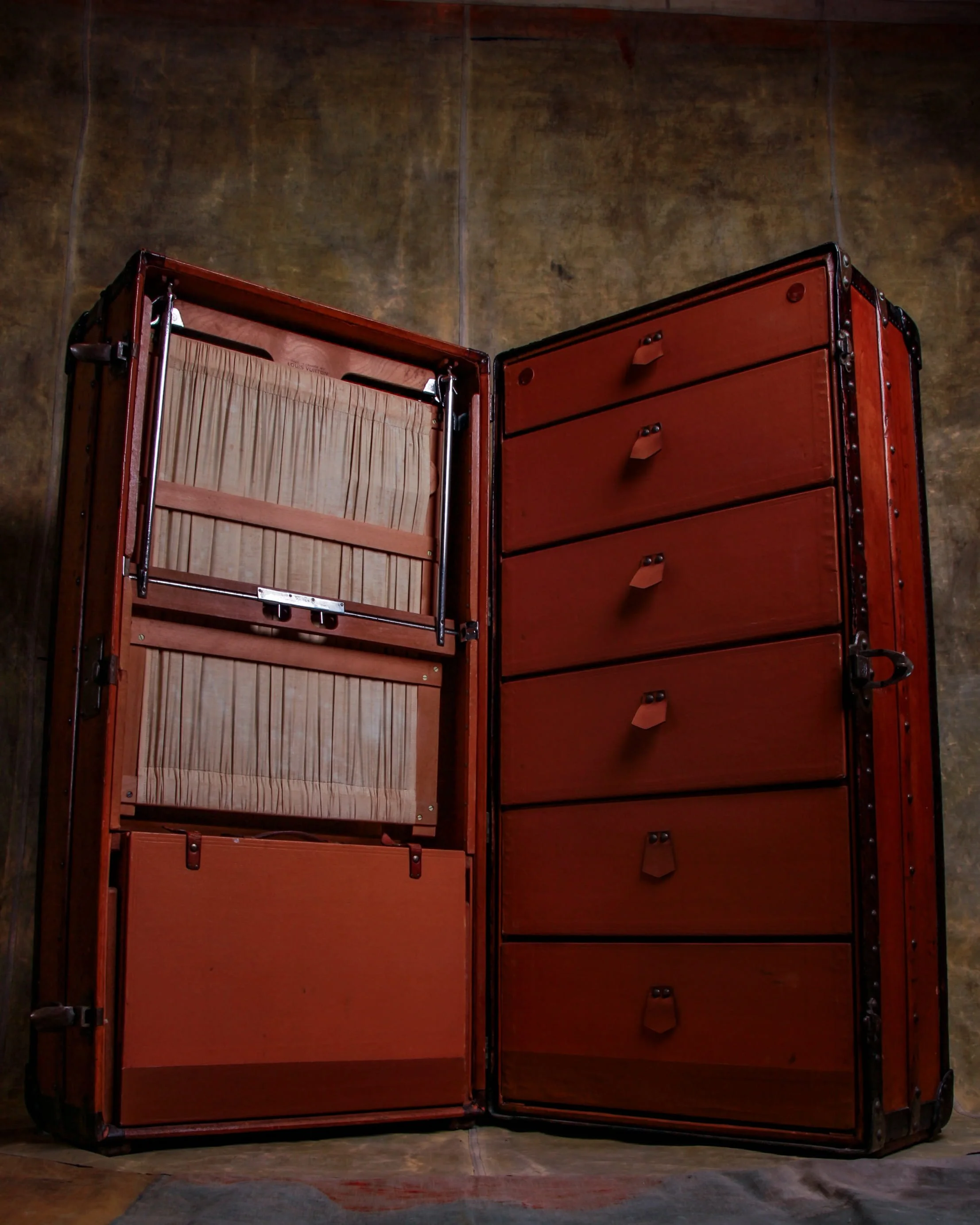
Early 1900s Louis Vuitton orange Vuitonitte wardrobe trunk sporting the initials H.A.W. (Vuitonitte is a coated fabric originally intended for automobile luggage. The waterproof, lightweight, resistant material could even be colored to match the finish of any car body). It features a hanging compartment with a partition, assorted hangers, and a small briefcase-the other side includes six graduated drawers. The large frame of this trunk used to be transported lying down, but would have been used standing on one end. The side on which the wardrobe rests is fitted with slats to raise the body and preserve the handle.
Measures: 44" × 22" × 23"
LV Trunks
Louis Vuitton antique trunks start with travel, but quickly move into something more considered. Founded in 1854, Louis Vuitton built its early reputation on flat-topped trunks designed to stack easily—a practical shift from the rounded lids that dominated before. It was a small design change with big impact, especially as train and steamship travel expanded.
Construction was meticulous. Lightweight yet durable wooden frames, reinforced corners, and layered canvas exteriors made the trunks both functional and resilient. Interiors were often customized—compartments for garments, trays for accessories—turning each piece into a kind of portable system.
What sets these trunks apart is how design and identity intertwined. Patterns like the Damier and later Monogram canvas weren’t just decorative—they helped deter imitation while creating a recognizable visual language.
Over time, these trunks pick up a specific kind of wear. Scuffed edges, travel labels, softened handles—marks of movement rather than neglect. They feel used, and that’s the point.
Today, they sit somewhere between luggage and furniture. Still structured, still purposeful, but carrying the weight of journeys long finished.
They’re not just containers. They’re records—of travel, of craft, and of a moment when getting somewhere required planning, patience, and a well-made place to put your things.
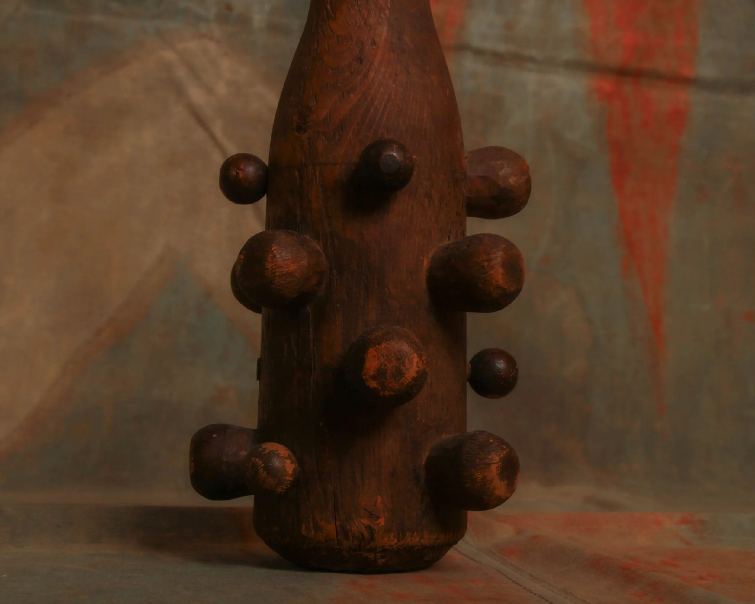
Part weapon, part stage personality, this mid-century wooden club feels like it walked straight out of a play and never quite made it back to the prop room. Turned from solid wood with a long tapering handle and a head studded with rounded “knobs,” it has that slightly exaggerated, almost cartoonish presence you’d expect under theater lights—designed to read from the back row.
The surface shows honest wear, with a rich, darkened patina and scattered scuffs that suggest it saw its share of rehearsals, performances, or at the very least, some convincing swings. Whether it once played the role of villain’s tool or comic exaggeration, it now lands squarely in sculptural territory.
Category History
Old, one-of-a-kind theater props live in that sweet spot between illusion and craftsmanship. Built to read from the back row, they often lean a little exaggerated—slightly larger, slightly bolder, just off enough to feel right under stage lights. But behind that theatrical flourish is real making. Wood frames, carved details, layered paint, stitched fabric—each piece designed to survive rehearsals, quick changes, and the occasional rough handling backstage.
What makes these props stand out is that they were rarely standardized. Unlike film, where duplication is easier, stage work often relied on a prop master or local maker building exactly what was needed for a specific production. That means each piece carries its own logic—how it’s weighted, where it’s reinforced, how it’s meant to be seen rather than closely inspected.
The best examples strike a balance: convincing at a distance, charming up close. You’ll find brushwork left visible, seams that don’t quite hide, repairs layered in over time. They weren’t trying to fool you completely—they were helping tell a story.
After the curtain closed, many were discarded or repurposed. The survivors carry that history with them. Slightly worn, a bit eccentric, and full of character. Not just objects, but fragments of performances that once needed them to exist, and to be believed.
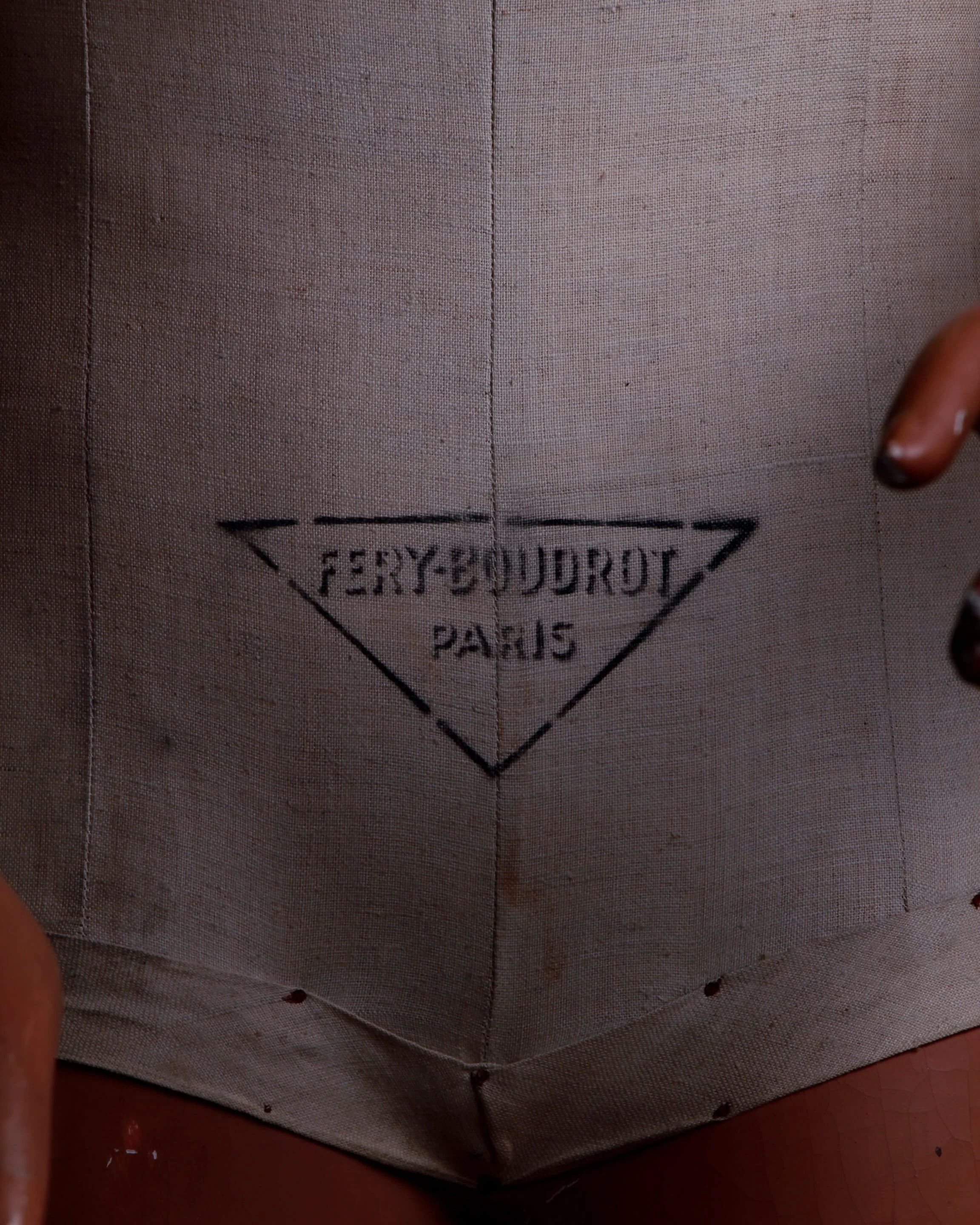
This antique French child's mannequin, fabricated by Maison Fery-Boudrot in Paris during the 1930s, is a captivating piece of artistry. Standing at a petite size, the mannequin exudes charm with its delicate features and lifelike pose. Made from a combination of wood, plaster, rubber, and linen, the mannequin showcases meticulous craftsmanship. Its wooden arms are fully articulated, allowing for graceful movement and posing. The mannequin comes dressed in its leather shoes (and half a sock). A true collector's item, this exquisite piece captures the essence of vintage French craftsmanship and is sure to be a focal point in any antique collection.
Category History
Antique French mannequins by Maison Fery-Boudrot sit at that elegant intersection of retail display and sculptural presence. Produced in the early to mid-20th century, these mannequins were designed for Parisian shop windows, where presentation wasn’t just about showing clothing—it was about setting a tone.
Fery-Boudrot mannequins are known for their refined proportions and distinctive faces. Features are softly modeled but intentional—arched brows, defined lips, and a gaze that feels composed rather than animated. Many were made from papier-mâché or composition, finished with hand-applied paint that gave the skin a matte, almost lifelike quality without chasing realism too closely.
What sets them apart is restraint. They don’t overact. The poses are balanced, the gestures minimal, letting the clothing take center stage while still holding their own as objects. You can feel the influence of French design—controlled, thoughtful, and quietly confident.
Over time, they develop a surface that’s hard to replicate. Fine cracking, softened paint, small chips—evidence of years in storefronts, studios, or storage.
Today, they read as more than display tools. They’re portraits of an era when even retail objects were designed with a certain poise—meant not just to present fashion, but to embody it.
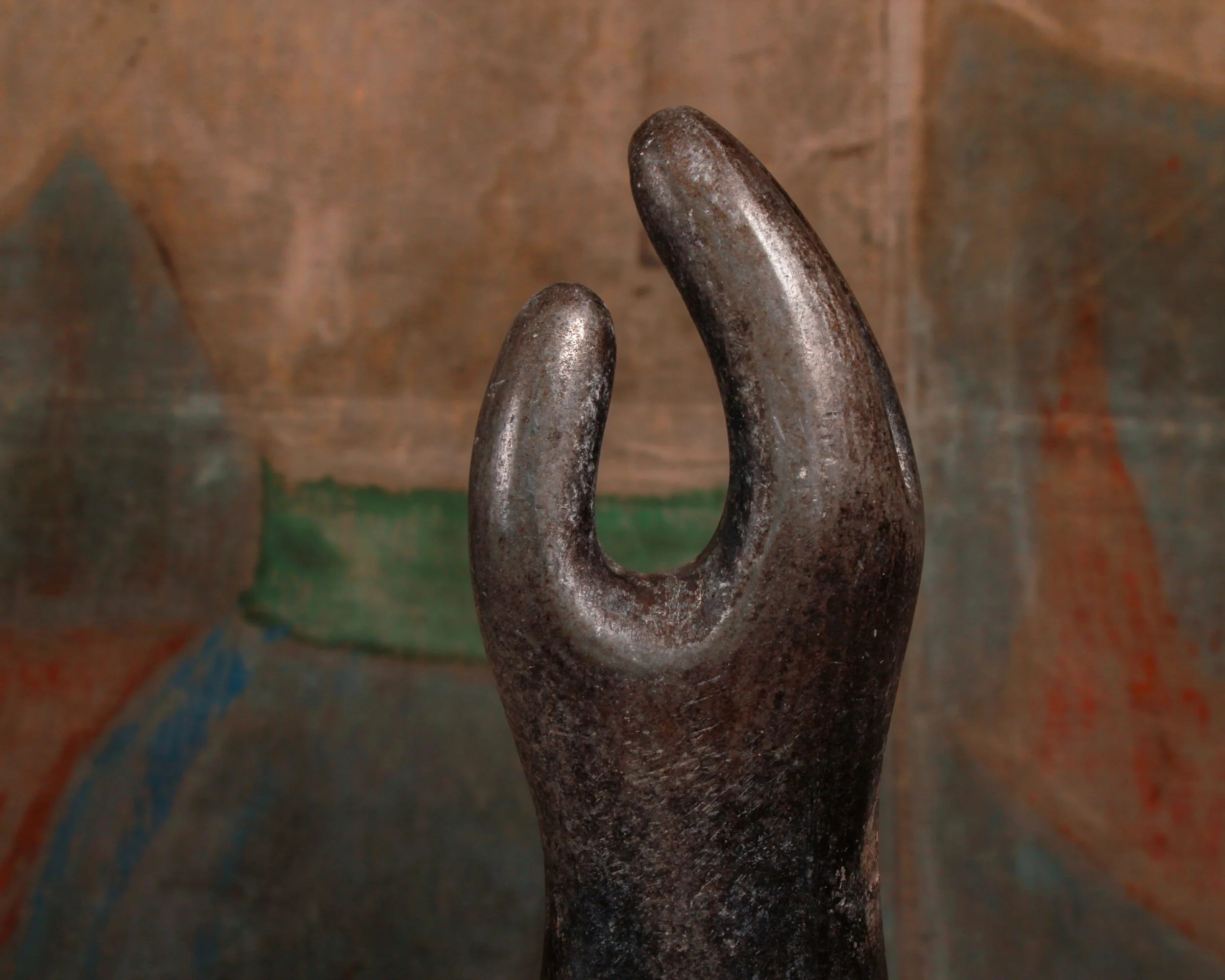
At first glance this piece reads like a small modernist sculpture, but it actually began life with a far more practical job. This ceramic mitten mold was originally used in factories to shape latex mittens. The freshly dipped material would cure around the form, creating the familiar shape of a finished mitten before being peeled away.
The elongated wrist and gently curved “thumb” create a silhouette that feels almost sculptural, somewhere between industrial tool and abstract art. The surface has a wonderful matte, stone-like texture, with subtle wear from years of use that gives it a quiet, timeworn character.
A fantastic example of honest industrial design that now doubles as a striking decorative object.
Category History
Molds are the quiet middlemen of manufacturing—the place where raw material agrees to become something specific. Long before injection molding and precision tooling took over, many industries relied on molds made from wood, plaster, or metal, each chosen for what it needed to endure.
Wooden molds show up early and often. They were easy to carve, quick to replace, and ideal for shaping things like hats, shoes, or even early rubber goods. In glove factories, ceramic or metal hand forms dipped repeatedly into liquid latex built up layers until a finished glove could be peeled away. Popsicles followed a similar logic: metal molds filled with flavored liquid, sticks set in place, then frozen and released with a quick dip in warm water.
As production scaled, metal molds took over—cast iron, aluminum, steel—bringing consistency and longevity. But even then, the process stayed tactile. Heat, pressure, timing. Fill, wait, release. Repeat.
What makes these molds compelling now is how clearly they show the thinking behind the object. Every curve, seam, and vent has a purpose. Many carry scars from use—burn marks, knife cuts, residue from countless cycles.
They’re not the finished product, but they’re where the real work happens. Without them, nothing takes shape.
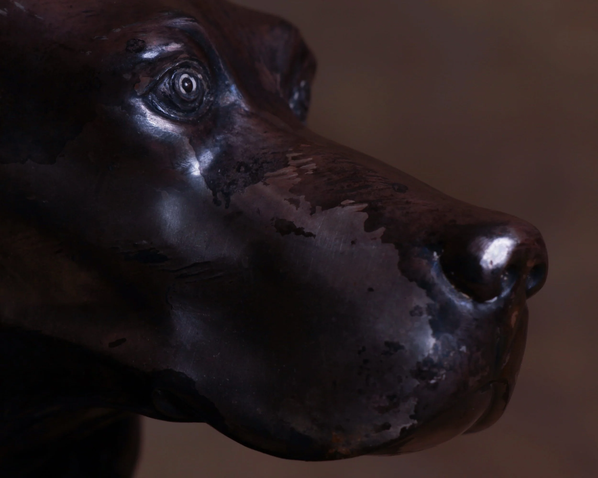
There’s a quiet elegance to these Art Deco Setter bookends that makes them feel less like desk accessories and more like small sculptures. Produced by the Jennings Brothers Manufacturing Co. in the 1920s, each dog is modeled with that unmistakable Deco balance of sleek form and fine detail. The long muzzle, attentive gaze, and beautifully textured ears give the pair a sense of calm watchfulness.
Cast in metal and finished in a rich, dark patina, both are embossed underneath with the Jennings Brothers mark “JB 856.” Jennings Brothers was known for its quality metalwork. Rather than being churned out as simple utilitarian objects, they were produced using a labor-intensive casting process that allowed for the depth and sculptural detail you see here.
Measures 7.5" W × 4" D × 6.5" H.
Category History
Art Deco bookends are small-scale expressions of a big idea: order, symmetry, and modern style distilled into something you can hold. Popular in the 1920s and 1930s, they reflect the broader Art Deco movement’s fascination with clean lines, geometry, and forward-looking design.
Materials varied—cast metal, spelter, marble, onyx, and occasionally wood—but the forms stayed consistent in spirit. You’ll see stepped bases, streamlined figures, stylized animals, and architectural motifs, all arranged with a sense of balance that feels deliberate without being rigid. Even when decorative, they’re grounded in function—built to hold weight, not just catch the eye.
What makes them interesting is that blend of sculpture and utility. A pair might frame a row of books, but it also reads as a composed object on its own. The best examples carry just enough detail to suggest movement or character without breaking the overall rhythm.
Over time, finishes soften, edges pick up wear, and surfaces develop a quiet patina. They age well.
They’re practical, but never plain—designed to bring a bit of structure and style to something as everyday as a shelf.
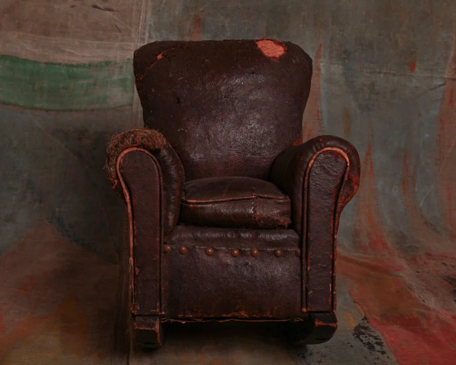
This salesman sample was once a top-tier sales tool, a meticulously crafted miniature meant to convince buyers of the real deal's quality. It's got that classic club chair silhouette—rolled arms, deep seat, and nailhead trim—but time and use have left their mark in the best possible way. The leather has worn down to reveal the raw, fibrous stuffing in places, giving it a rugged, almost sculptural quality. The surface is cracked and aged to perfection, the dark brown leather patina rich with warmth and history.
What once functioned as a persuasive object now reads as something far more tactile and honest—less about selling, more about showing how well something can age when it’s truly been handled and lived with.
Category History
Old salesman samples are small objects with a big job—they were the pitch. Before catalogs and digital images, traveling salesmen carried miniature versions of what they were selling: stoves, tools, furniture, even clothing. Scaled down but carefully made, these samples let buyers see construction, materials, and design without hauling the full-size item around.
They weren’t toys, though they often look like them now. They were working tools, built to demonstrate quality and win orders. Details mattered—hinges that functioned, drawers that opened, stitching that mirrored the real thing.
What makes them compelling today is that balance between precision and charm. They carry the logic of the full-sized object but in a more approachable form. Many show wear from handling—softened edges, small repairs, signs of being passed from hand to hand.
They’re snapshots of commerce in motion, where persuasion relied on something you could hold, inspect, and trust. In many cases, they also doubled as conversation starters, drawing attention in showrooms or on the road. They made abstract ideas tangible, turning a sales pitch into something immediate and memorable, with craftsmanship doing most of the talking.
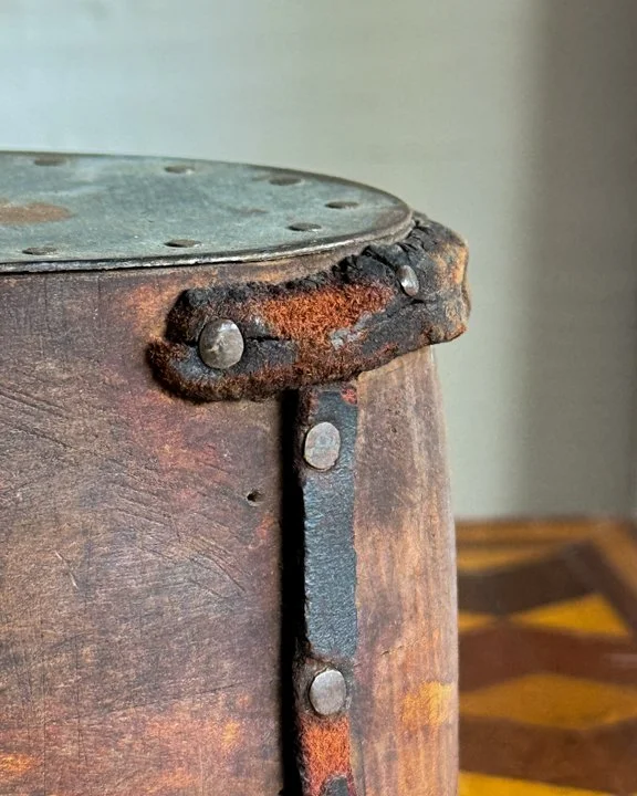
Originally used in a shoemaker’s shop, oversized wooden shoe forms like this were essential working tools. They helped shape and hold leather as shoes were constructed, giving makers a reliable structure to build around. This example is wonderfully large, with a long, sculptural profile that almost reads like a piece of modern design despite being purely practical in origin.
The body is carved from solid wood that has developed a deep, warm patina from decades of handling. Every surface tells you it was used. There are softened edges, old tool marks, subtle dents, and darkened areas where hands likely held it over and over again. The wood has that rich, time-earned tone that only comes from years in a working environment.
What really sets this one apart are the leather details and iron hardware. The stitched leather band wrapping around the heel and the riveted metal plate across the top give it a rugged, almost industrial character.
Category History
Old shoe and cobbler molds and forms—better known as lasts—are the quiet architects behind every well-made shoe. Before factories standardized sizing, each last was shaped for a specific purpose: a right or left foot, a certain style, even a particular client. Carved from hardwood or later cast in metal, they set the proportions before a single piece of leather was cut.
In the shop, they were everywhere—stacked, hung, and labeled—each one carrying the memory of past work. The leather was stretched, tacked, and formed directly over these shapes, locking in fit and structure. Subtle differences mattered. A slightly raised instep, a narrower toe, a deeper heel cup—all decisions built into the form.
What makes them compelling now is how much use they show. Nail holes, inked numbers, worn edges, even small repairs—evidence of repetition and adjustment. They’re not pristine, and that’s the point.
They read as both tool and object—functional, sculptural, and quietly precise. A record of craft that starts with shape and ends with something meant to be worn.
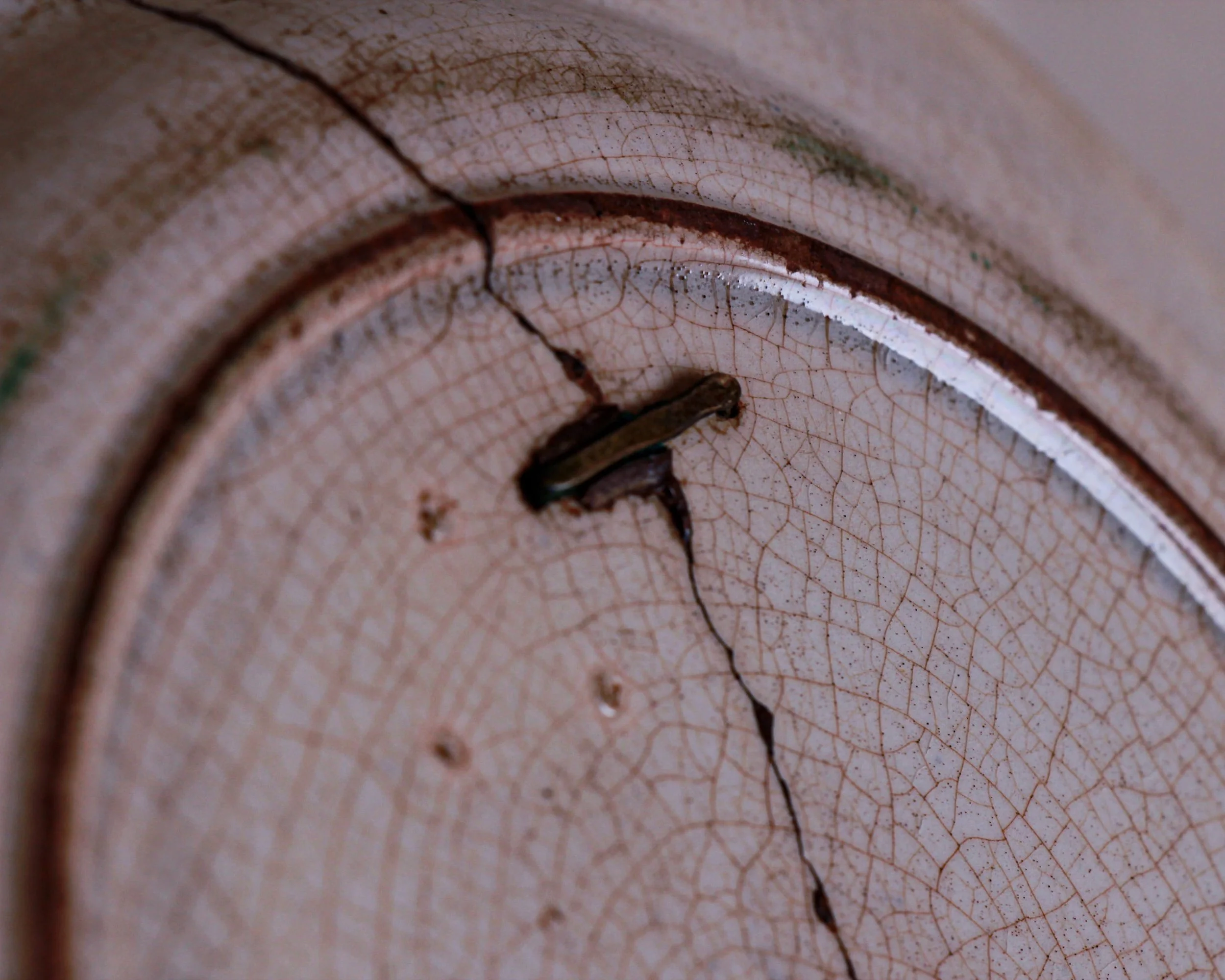
Ceramic dinner plate depicting beautiful blue graphics of a village and flowers—you can clearly see a large crack that goes the entire length of the plate.
The back of the plate reveals 4 staples stabilizing the crack. This was a popular method used to repair treasured porcelain in the days before glue. The plate would have probably been taken to a jeweler or metal smith to be restored. Holes were drilled in the plate using a rod of metal dipped in diamond dust, the holes were used for the metal staples. This favored technique of mending porcelain dates back to the 17th century. It was an elaborate way of reassembling pieces together, so it was usually reserved for expensive china or china with sentimental value.
Circa late 19th c. to early 20th.
Category History
Some of the best objects aren’t the ones that stayed perfect—they’re the ones that refused to quit. Old make-do repairs show up everywhere: a cracked handle stitched with wire, a split board held together with mismatched nails, a ceramic vessel patched with a strip of tin. These fixes weren’t about aesthetics or preservation in the modern sense—they were about getting something back into service, quickly and with whatever was on hand.
There’s a certain logic to them. Repairs often reveal how the object failed and how someone chose to outsmart that failure. A brace added where stress collected, a patch layered over a weak spot, a join reinforced in a way the original maker never intended. It’s problem-solving in real time.
What’s compelling now is the honesty. Nothing is hidden. The repair becomes part of the object’s identity, sometimes more interesting than the original form. You’re seeing two makers at once—the person who made it, and the person who kept it going.
They carry a quiet resilience. Not pristine, not precious—just useful, adapted, and still here.
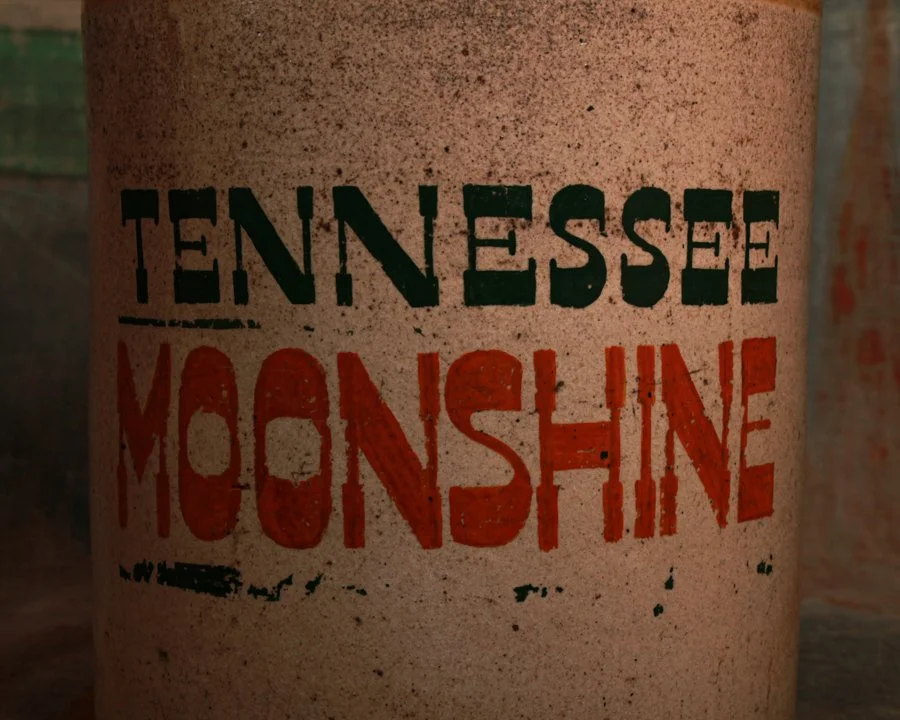
Hefty 19th-century earthenware moonshine jug that doesn't shy away from its past. This big-bellied flagon stands about 18 inches tall and 10 inches wide, with a rich mustardy glaze up top, and a bold stenciled shout of "TENNESSEE MOONSHINE" across the front in deep green and red.
Whether it once rode in the back of a Prohibition-era pickup or sat tucked behind floorboards, it definitely played a role in keeping spirits high. No handle, just a solid lug of ceramic made to be grabbed and poured with purpose. It's got presence. Weight. And that perfect mix of grit and charm.
Moonshine not included.
Category History
Moonshine and Prohibition are tied together by one simple idea: if you outlaw something people want, they’ll just get more creative. When the Prohibition in the United States went into effect in 1920, legal distilleries shut down, but demand didn’t disappear. It moved—quietly—into backwoods stills, hidden rooms, and improvised operations that could be packed up or moved at a moment’s notice.
Moonshine itself wasn’t new. Illicit distilling had been around for decades, especially in rural areas where making your own whiskey was as much tradition as it was necessity. But Prohibition scaled it up. Copper stills, mash barrels, and glass jars became part of a shadow economy, with producers, runners, and distributors forming tight networks.
What makes this period compelling is the balance of risk and ingenuity. Recipes varied, equipment was often homemade, and quality could swing wildly. Some batches were smooth, others… less forgiving.
The cultural imprint stuck. Fast cars built for running liquor later fed into stock car racing, and the image of the moonshiner—resourceful, independent, slightly outlaw—became part of American folklore.
At its core, it’s a story about adaptation. Restriction didn’t stop production—it just changed where, how, and who was involved.
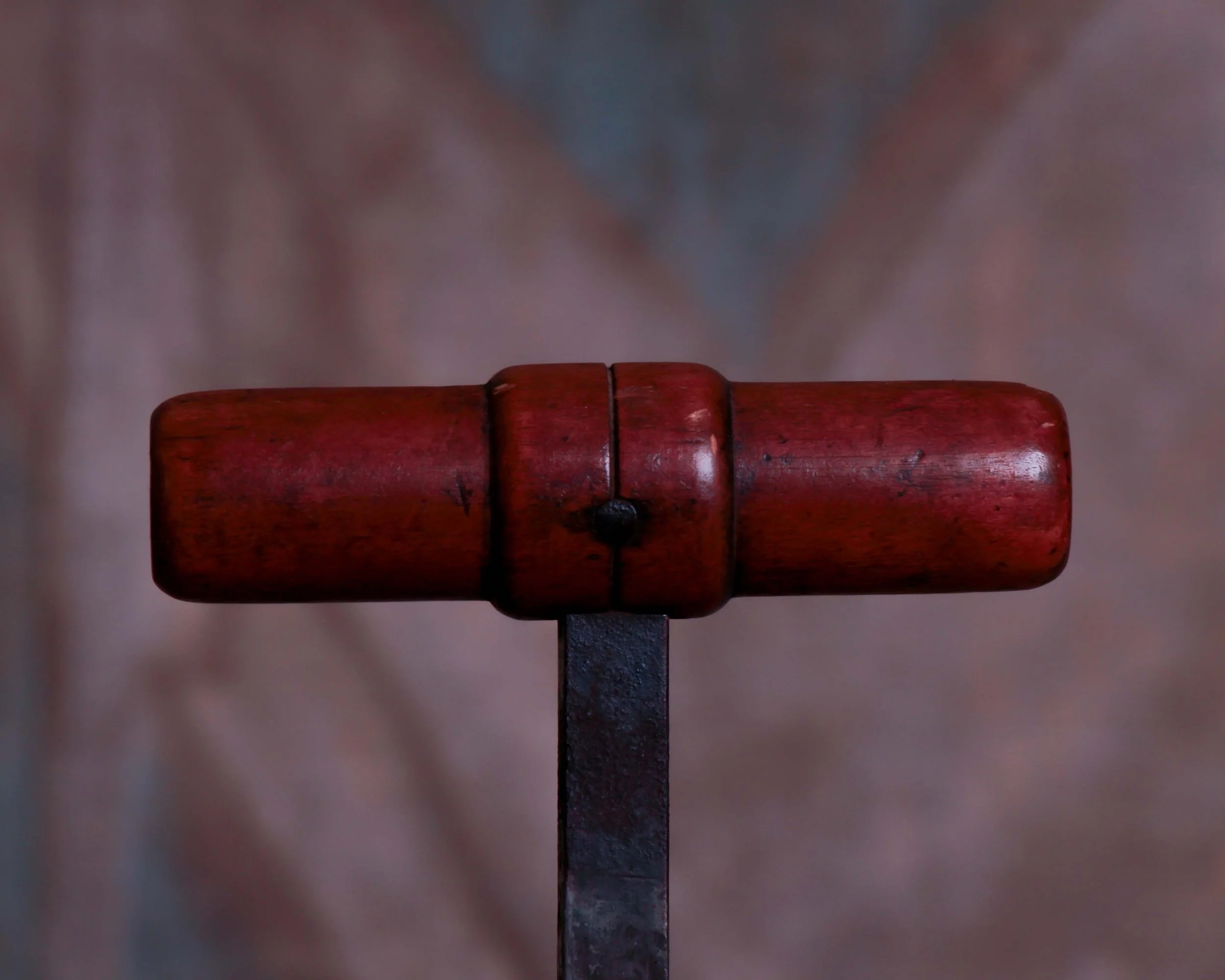
A genuine DuPont dynamite blasting machine, built when the margin for error was slim and the engineering had to be right every single time.
Up top, a steel threaded rod rises through the lid, topped with a turned wooden T-handle that fits perfectly in the hand. Cranking it would have felt deliberate and physical, each turn building charge, each click of the internal gearing doing exactly what it was designed to do.
The brass DuPont plaque on the front is a standout. Oval, warm, and beautifully aged, it reads “Manufactured by E. I. du Pont de Nemours Powder Co., Established 1802, Wilmington, Delaware, U.S.A.” Below it, carved ownership markings add a human layer, grounding this powerful tool in a specific place and set of hands.
Category History
The dynamite blaster sits at the moment when muscle gave way to controlled force. In the late 19th and early 20th centuries, as mining, railroad building, and quarrying expanded, blasting needed to be safer and more predictable. Enter the blaster—a compact device, often a hand-cranked generator or plunger box, designed to send an electric charge down a wire and detonate dynamite at a distance.
Early versions were mechanical and straightforward. A push or crank generated a brief surge of electricity, enough to trigger a detonator cap embedded in the charge. The operator could stand clear, reducing risk and improving timing. It turned blasting from a guess into a sequence—set, wire, test, fire.
What’s compelling now is how physical the process still was. You feel it in the device itself—wooden boxes, brass terminals, heavy switches, all built to withstand rough environments and repeated use. Many show wear from fieldwork: dents, repairs, replaced parts.
They’re not subtle objects, but they’re precise. Tools built to manage something inherently chaotic, giving workers a measure of control over rock, earth, and distance.
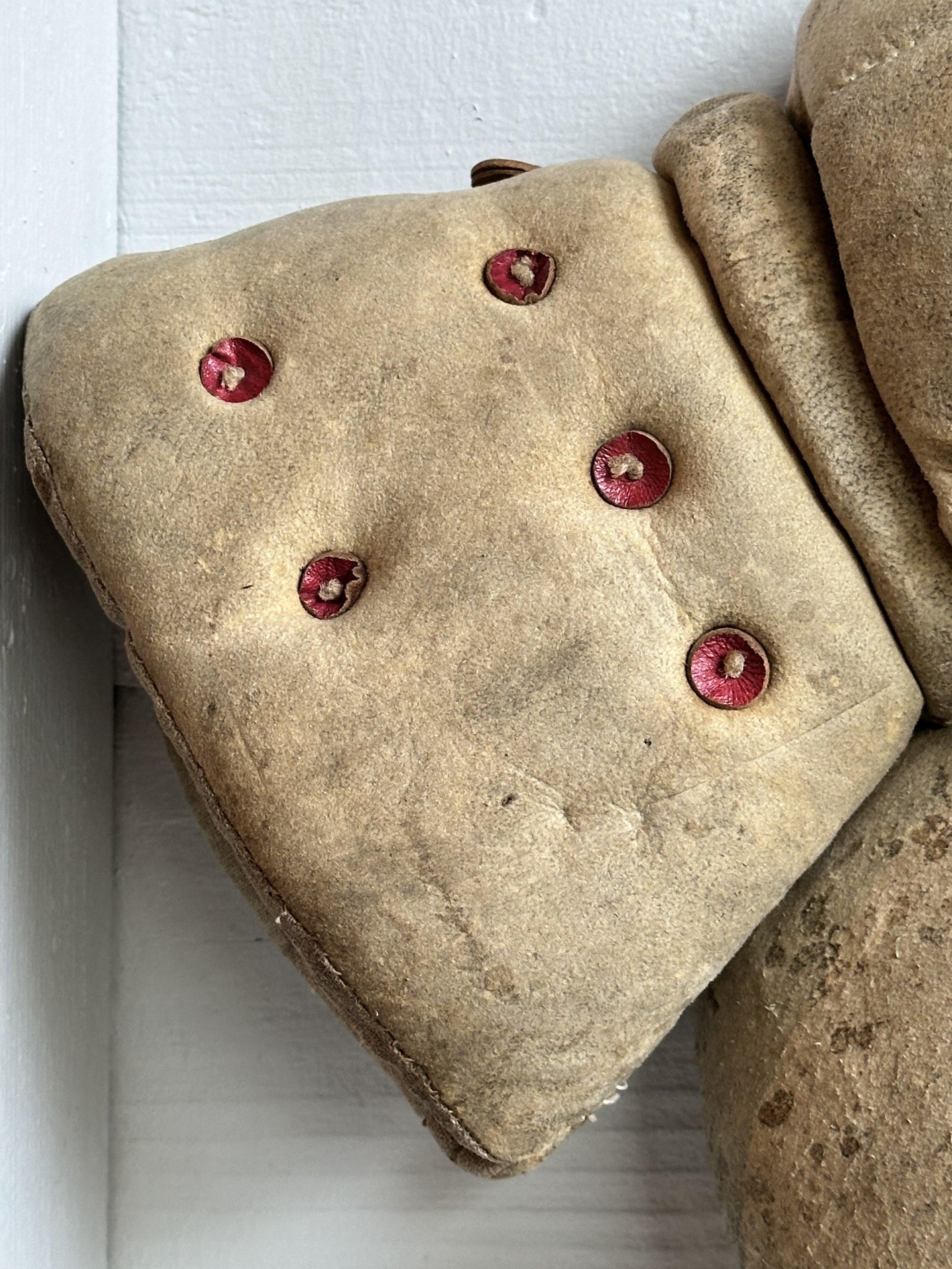
These quirky handmade gloves are something else. Whether they were ever thrown in the ring or just trotted out for a stage brawl, they’ve clearly seen action. Made of soft, worn suede with puffed-out padding and dot-patterned holes stitched in red, these oversized mitts look like they were built less for throwing jabs and more for theatrical haymakers—possibly vaudeville or early stage boxing scenes. They’re stiff and bulbous in that exaggerated way that leans more comedic than combative. You’ll never see these again.
Category History
Old, one-of-a-kind theater props live in that sweet spot between illusion and craftsmanship. Built to read from the back row, they often lean a little exaggerated—slightly larger, slightly bolder, just off enough to feel right under stage lights. But behind that theatrical flourish is real making. Wood frames, carved details, layered paint, stitched fabric—each piece designed to survive rehearsals, quick changes, and the occasional rough handling backstage.
What makes these props stand out is that they were rarely standardized. Unlike film, where duplication is easier, stage work often relied on a prop master or local maker building exactly what was needed for a specific production. That means each piece carries its own logic—how it’s weighted, where it’s reinforced, how it’s meant to be seen rather than closely inspected.
The best examples strike a balance: convincing at a distance, charming up close. You’ll find brushwork left visible, seams that don’t quite hide, repairs layered in over time. They weren’t trying to fool you completely—they were helping tell a story.
After the curtain closed, many were discarded or repurposed. The survivors carry that history with them. Slightly worn, a bit eccentric, and full of character. Not just objects, but fragments of performances that once needed them to exist, and to be believed.
There is more to explore. Browse the full collection.
Frequently Asked Questions
-
This collection brings together a broad range of antique objects and vintage collectibles that reflect the full scope of the Heimwee sourcing practice. This includes antique photography, antique clothing and wearable artifacts, antique furniture and display pieces, antique household objects and antique curiosities that do not fit neatly into a single category. Each piece is sourced individually and selected for its originality and character.
-
Antique photography refers to early photographic formats produced during the nineteenth and early twentieth centuries including cabinet cards, tintypes and albumen prints. These formats were widely used for portrait photography and document a visual record of everyday life, fashion and culture from earlier periods. Today they are collected for their historical significance, craftsmanship and the intimate connection they offer to the individuals and moments they capture.
-
Antique clothing and wearable artifacts generally refer to garments, accessories and uniforms produced over one hundred years ago. This includes workwear, formal dress, military uniforms and everyday clothing from the nineteenth and early twentieth centuries. These pieces are valued by collectors for their construction, materials and the insight they offer into the social and working lives of the people who wore them.
-
Antique furniture in this collection tends toward the functional and the unusual rather than the decorative. Pieces that reflect a specific trade, domestic use or period of manufacture are of particular interest. Display cases, workshop furniture and everyday household pieces from the nineteenth and early twentieth centuries appear in the collection when Humberto finds something worth carrying.
-
The most compelling antique objects are often the ones that sit outside established collecting categories. Objects made for a specific purpose, produced in small quantities or reflecting a particular regional craft tradition frequently do not fit neatly into standard classifications. This is part of what makes them interesting. At Heimwee the collection has always been driven by the quality and character of individual objects rather than by category, and this page reflects that approach most directly.
ITEM NOT AVAILABLE IMMEDIATELY—INQUIRE IF INTERESTED hello@heimweeantiques.com
This antique soapstone bed warmer is a great surviving piece of practical household history, made even better by its unusual fitted wooden case. The warmer itself is a thick rectangular slab of soapstone with rounded corners and a simple wire carrying handle. It fits neatly against a handmade wooden cover pierced with dozens of ventilation holes, allowing the stored heat to radiate while helping protect bedding and hands from direct contact with the hot stone. The wooden case is especially appealing, with a warm, well-used surface, visible nail construction, scratches, stains, and the irregularity you would expect from something made primarily to do a job.
Before heating became common, keeping warm in bed could be a nightly project. Bedrooms were often only lightly heated, if at all, and winter bedding could feel brutally cold. Bed warmers came in several forms, from long-handled brass or copper pans filled with hot coals to ceramic bottles, heated bricks, and slabs of stone.
Soapstone was particularly well suited to the job. Dense and naturally resistant to heat, it warms gradually and retains that heat for a surprisingly long time. A stone could be heated near a stove or hearth, placed inside a protective carrier, and then tucked beneath blankets before bedtime. Similar warmers were also used around feet or carried on cold journeys.
What sets this example apart is the perforated wooden case. Many surviving soapstone warmers are simply bare slabs or housed in metal holders, so an intact purpose-made wooden enclosure is a much less commonly encountered companion.
It is a wonderfully straightforward object: stone, wood, wire, and a little domestic ingenuity. Today, the combination of the rhythmic drilled-hole pattern, aged timber, and wonderfully tactile soapstone gives it an almost sculptural presence, even before you know what it was originally made to do.