
New arrivals ready to be adopted.
Fresh stock waiting for you to snatch it before anyone else does. Sign up to our newsletter to get our latest finds.
This page is updated as we source new pieces from estate sales, flea markets, antique fairs and private collections across the country. There is no schedule and no restocking. When something turns up worth carrying, it goes straight into the collection here.
New arrivals move quickly. If something catches your eye it is worth acting on. Once a piece is gone it will not be replaced.
New Arrivals
ITEM NOT AVAILABLE IMMEDIATELY—INQUIRE IF INTERESTED hello@heimweeantiques.com
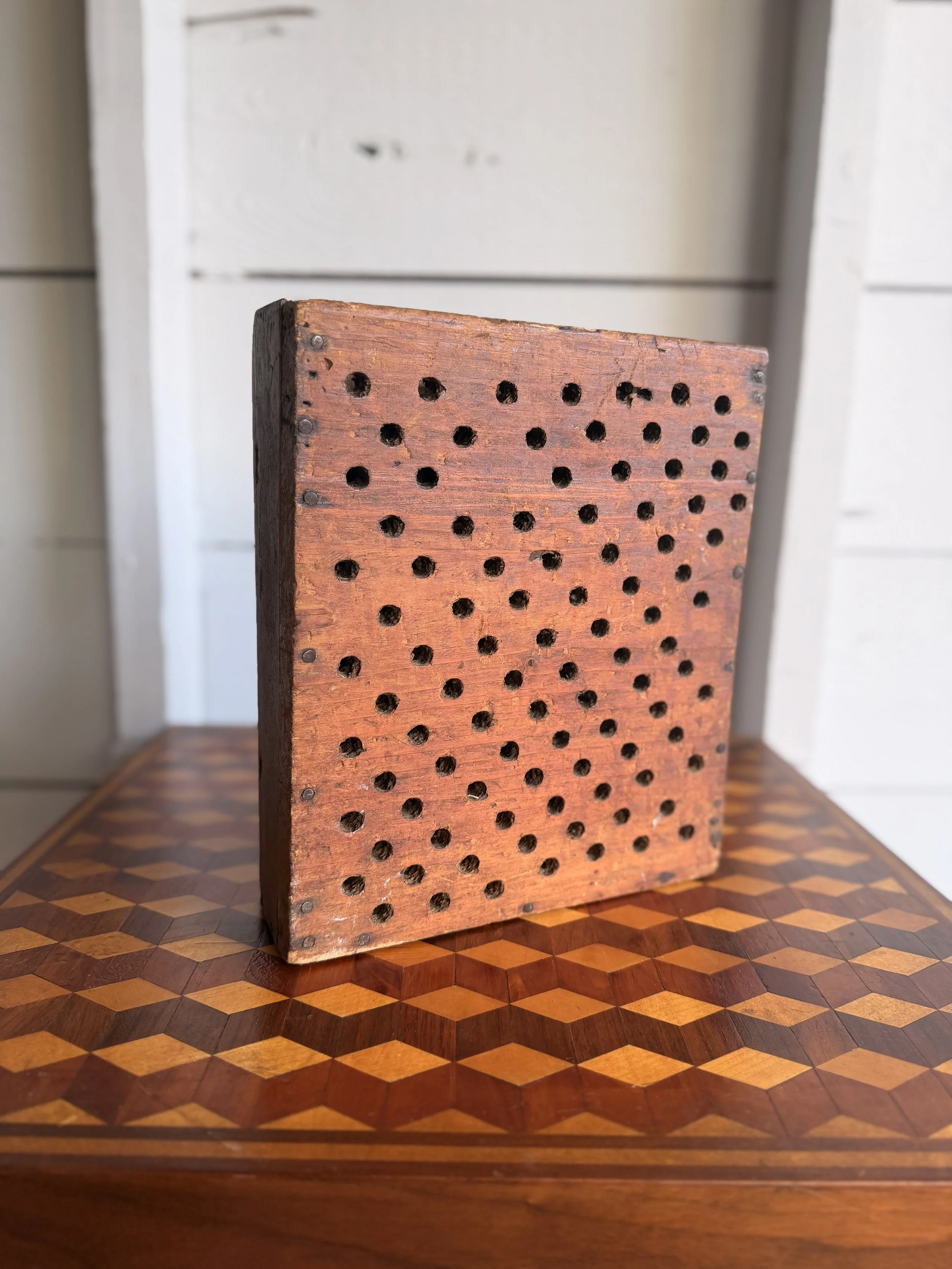
This antique soapstone bed warmer is a great surviving piece of practical household history, made even better by its unusual fitted wooden case. The warmer itself is a thick rectangular slab of soapstone with rounded corners and a simple wire carrying handle. It fits neatly against a handmade wooden cover pierced with dozens of ventilation holes, allowing the stored heat to radiate while helping protect bedding and hands from direct contact with the hot stone. The wooden case is especially appealing, with a warm, well-used surface, visible nail construction, scratches, stains, and the irregularity you would expect from something made primarily to do a job.
Before heating became common, keeping warm in bed could be a nightly project. Bedrooms were often only lightly heated, if at all, and winter bedding could feel brutally cold. Bed warmers came in several forms, from long-handled brass or copper pans filled with hot coals to ceramic bottles, heated bricks, and slabs of stone.
Soapstone was particularly well suited to the job. Dense and naturally resistant to heat, it warms gradually and retains that heat for a surprisingly long time. A stone could be heated near a stove or hearth, placed inside a protective carrier, and then tucked beneath blankets before bedtime. Similar warmers were also used around feet or carried on cold journeys.
What sets this example apart is the perforated wooden case. Many surviving soapstone warmers are simply bare slabs or housed in metal holders, so an intact purpose-made wooden enclosure is a much less commonly encountered companion.
It is a wonderfully straightforward object: stone, wood, wire, and a little domestic ingenuity. Today, the combination of the rhythmic drilled-hole pattern, aged timber, and wonderfully tactile soapstone gives it an almost sculptural presence, even before you know what it was originally made to do.
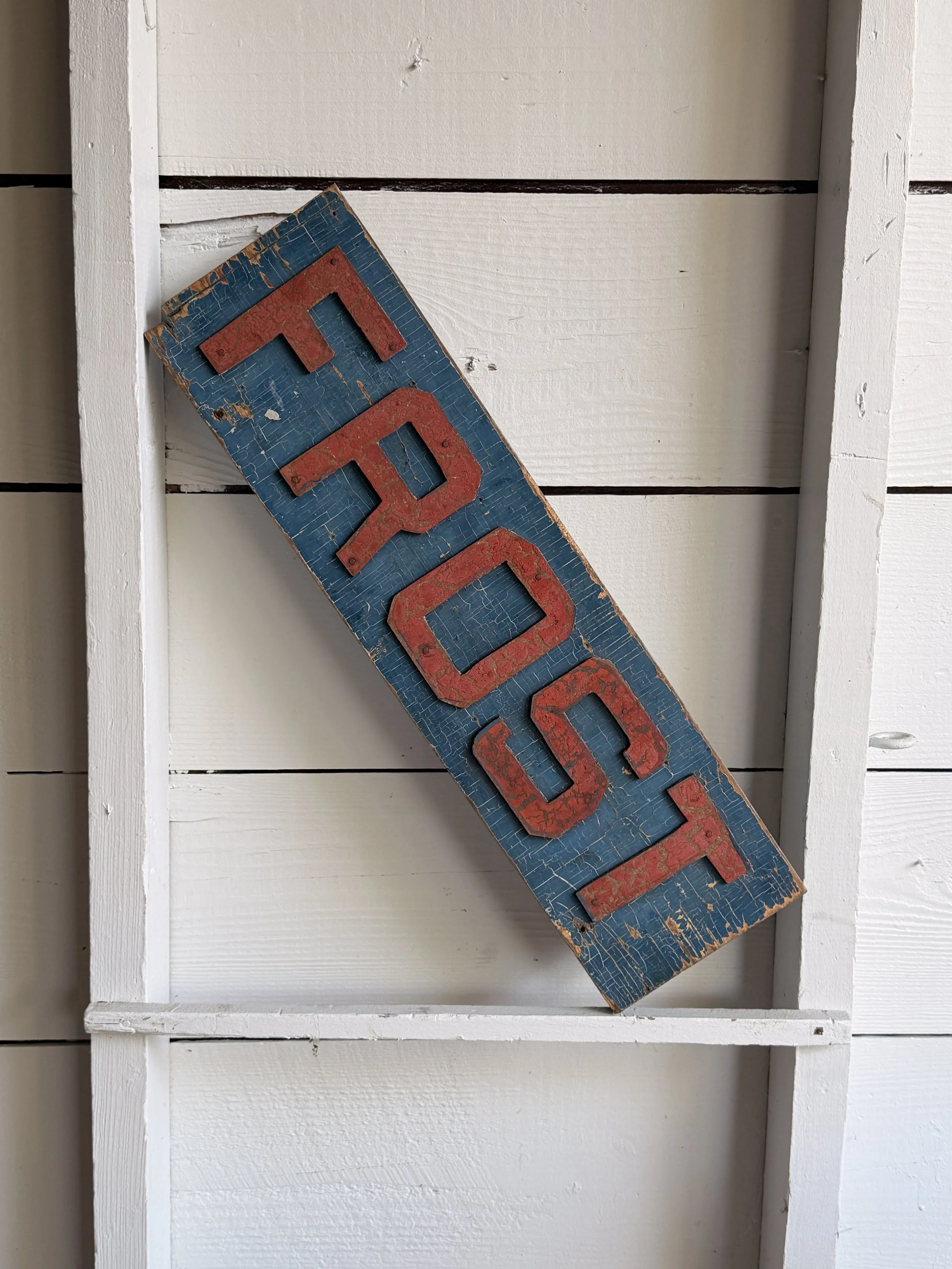
This old single-sided wooden “FROST” sign has a great homemade commercial look, with raised red letters mounted individually over a blue-painted board. The lettering is bold, blocky, and slightly irregular, giving it the feel of a sign made for visibility rather than polish. The blue background has developed a dense network of age cracks, scratches, edge wear, and losses, while the red letters have their own worn surface and chipped paint. Together, the colors have mellowed into exactly the kind of surface that makes old signage so visually appealing.
The letters appear to be separate cut wooden elements nailed or fastened to the board rather than simply painted on. That extra dimension gives the sign a nice shadow line and helps the word read clearly from a distance. The back is unfinished wood and now has a newer metal hanging cleat attached, making display easy while leaving the original face untouched.
Signs like this were common fixtures of small businesses, workshops, roadside establishments, warehouses, farm stands, garages, and local stores throughout the late 19th and early 20th centuries. Before vinyl lettering and inexpensive illuminated signage, painted wooden boards were among the simplest and most practical ways to advertise a name, product, or service. Raised letters offered an inexpensive way to make a sign feel more substantial and easier to read.
Without additional provenance, it is difficult to say exactly what “FROST” referred to. It could have been a surname, business name, product name, or part of a larger sign that no longer survives.
That ambiguity is part of its appeal. Reduced to one strong word, two colors, and a beautifully weathered surface, the sign now reads almost like found graphic art. It has the directness of old advertising, but enough mystery left in it to keep you wondering where it originally hung.
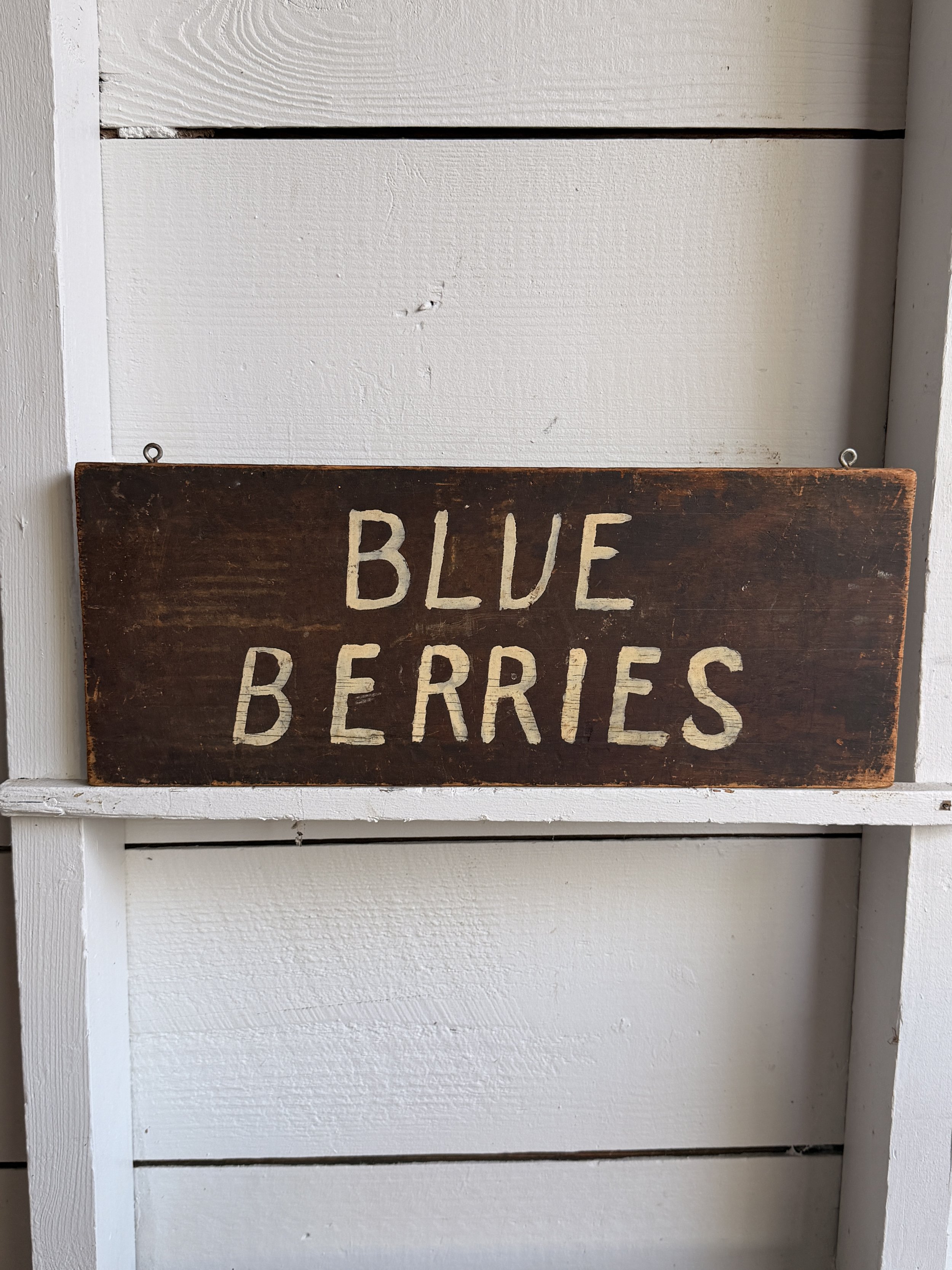
This simple hand-painted “BLUE BERRIES” sign has exactly the kind of straightforward charm you want from an old roadside or farm-market sign. Made from a single rectangular wooden board, it has a dark brown painted ground with large cream-colored lettering applied by hand. The uneven spacing, slightly irregular letterforms, and visible brushwork give it a warm, homemade quality that printed signage simply doesn’t have. The surface shows plenty of age, including scuffs, scratches, edge wear, and areas where the darker paint has thinned to reveal the wood beneath. Two small hanging eyes along the top edge suggest it was originally suspended rather than permanently mounted.
The wording itself is wonderfully direct. No logo, no price, no sales pitch, just “BLUE BERRIES.” That simplicity points to the kind of sign that may have hung at a farm stand, produce market, roadside fruit stand, or seasonal berry patch.
Hand-painted produce signs like this were especially common through the first half and middle of the 20th century, when roadside agriculture and small independent markets depended on bold, readable signage to catch the attention of passing motorists. Farmers often made their own signs using whatever lumber and leftover paint were available, which is why surviving examples can feel so individual.
Blueberries became increasingly important as a cultivated American crop during the early 20th century. Commercial cultivation expanded rapidly after successful breeding work in New Jersey beginning in the 1910s, helping turn what had largely been a wild-harvested fruit into a widely farmed seasonal crop.
Today, signs like this sit comfortably between advertising, folk art, and rural Americana. The spelling as two words, “BLUE BERRIES,” adds another small dose of personality. It is plain, useful, slightly quirky, and beautifully worn.
ITEM NOT AVAILABLE IMMEDIATELY—INQUIRE IF INTERESTED hello@heimweeantiques.com
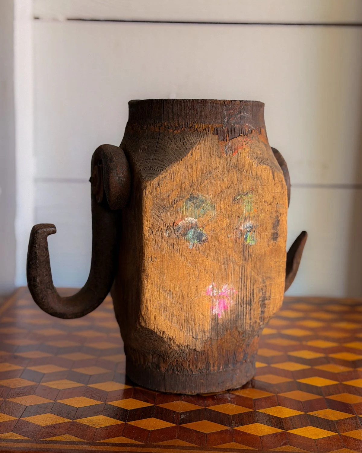
This unusual folk art piece began life as a heavy wooden rigging or pulley block and was later transformed with a painted face on both sides. The thick, hand-worked wooden body has a wonderfully worn surface, with deep tool marks, cracks, old staining and traces of earlier color. On each broad face, someone added a wonderfully simple human expression using touches of green, blue, white, orange and bright pink. The features are now heavily faded, which only adds to its wonderfully odd personality.
Even better are the two large forged iron hooks mounted to the sides. Originally functional hardware, they now read almost like exaggerated arms or ears, giving the whole object an accidental sculptural quality. The iron has developed a dark, crusty oxidation that sits nicely against the warm, weathered wood.
Wooden pulley blocks were essential pieces of equipment in the 18th, 19th and early 20th centuries. Most commonly associated with ships and sailing vessels, blocks allowed ropes to change direction and gave sailors mechanical advantage when raising sails, moving cargo and handling heavy loads. Similar heavy-duty blocks were also used around docks, farms, workshops and industrial settings, so without documented provenance it is safest to describe this example simply as a rigging or pulley block rather than definitively maritime.
Repurposing worn-out tools and utilitarian objects has a long history in American folk art. Once an object had outlived its practical usefulness, its familiar shape could become raw material for something decorative, humorous or personal. Paint, scraps of metal and a little imagination were often all that was needed.
Here, whoever painted the faces clearly saw something human hiding in the old block. The result sits somewhere between found-object sculpture, folk portrait and industrial artifact, with enough wear and mystery left intact to make you wonder who made it, and why.
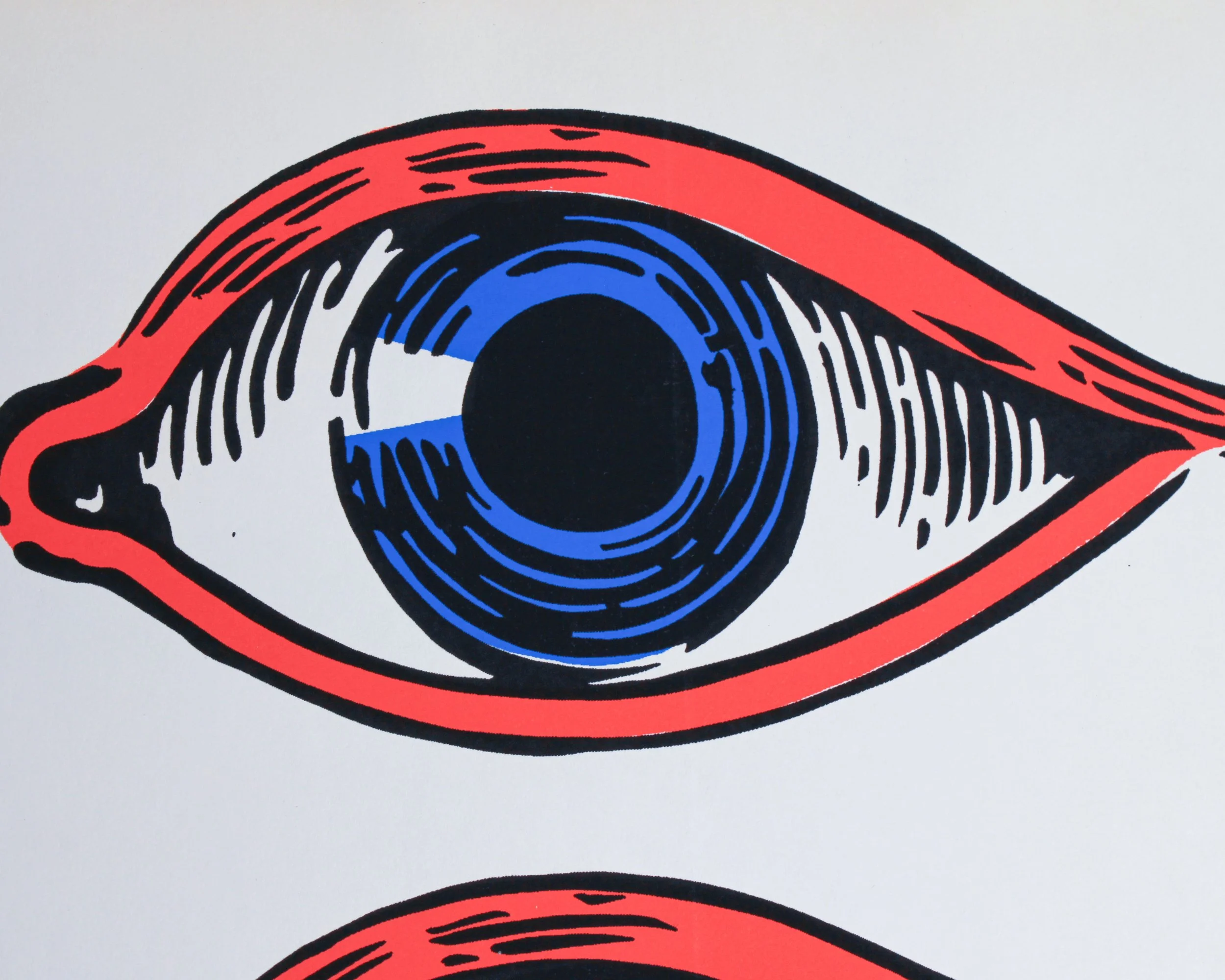
This vintage eye decal sheet has the wonderfully bold, slightly uncanny look of mid-century commercial graphics. Printed on white paper, it features four oversized eyes arranged in two rows, each rendered in a limited palette of bright red, vivid blue, black, and white. Heavy outlines, exaggerated lashes and circular irises give the design a punchy, almost comic-book quality. The repetition makes the sheet especially fun visually, somewhere between an optician’s display, carnival decoration, sign-painter’s stock and Pop Art.
The sheet is new old stock, with the original backing paper still intact. A small circular printer’s or manufacturer’s mark appears near the lower left corner, although there isn’t enough visible information here to confidently identify the maker. Judging by the graphic style, printing technique and color palette, a date somewhere between the 1950s and 1970s feels reasonable, with the 1960s perhaps the strongest visual fit.
Large-format decals like this were widely used throughout the mid-20th century for storefront windows, advertising displays, vending machines, amusement attractions and promotional signage. Before inexpensive digital printing, decals offered businesses an easy way to add bright, professionally printed graphics to glass, metal and other smooth surfaces. Sign shops and commercial printers produced everything from lettering and logos to stars, pointing hands, cartoon figures and, naturally, attention-grabbing eyes.
The eye itself was an especially effective advertising device. It could suggest vision, observation, photography or optical services, but it was also simply hard to ignore. By the 1960s, enlarged eyes had become part of the broader visual vocabulary of psychedelic posters, Pop Art, underground graphics and novelty advertising.
Whatever its original purpose, this surviving uncut sheet works beautifully today as graphic art in its own right. The scale, saturated colors and four staring eyes give it plenty of presence, along with just the right amount of weirdness.
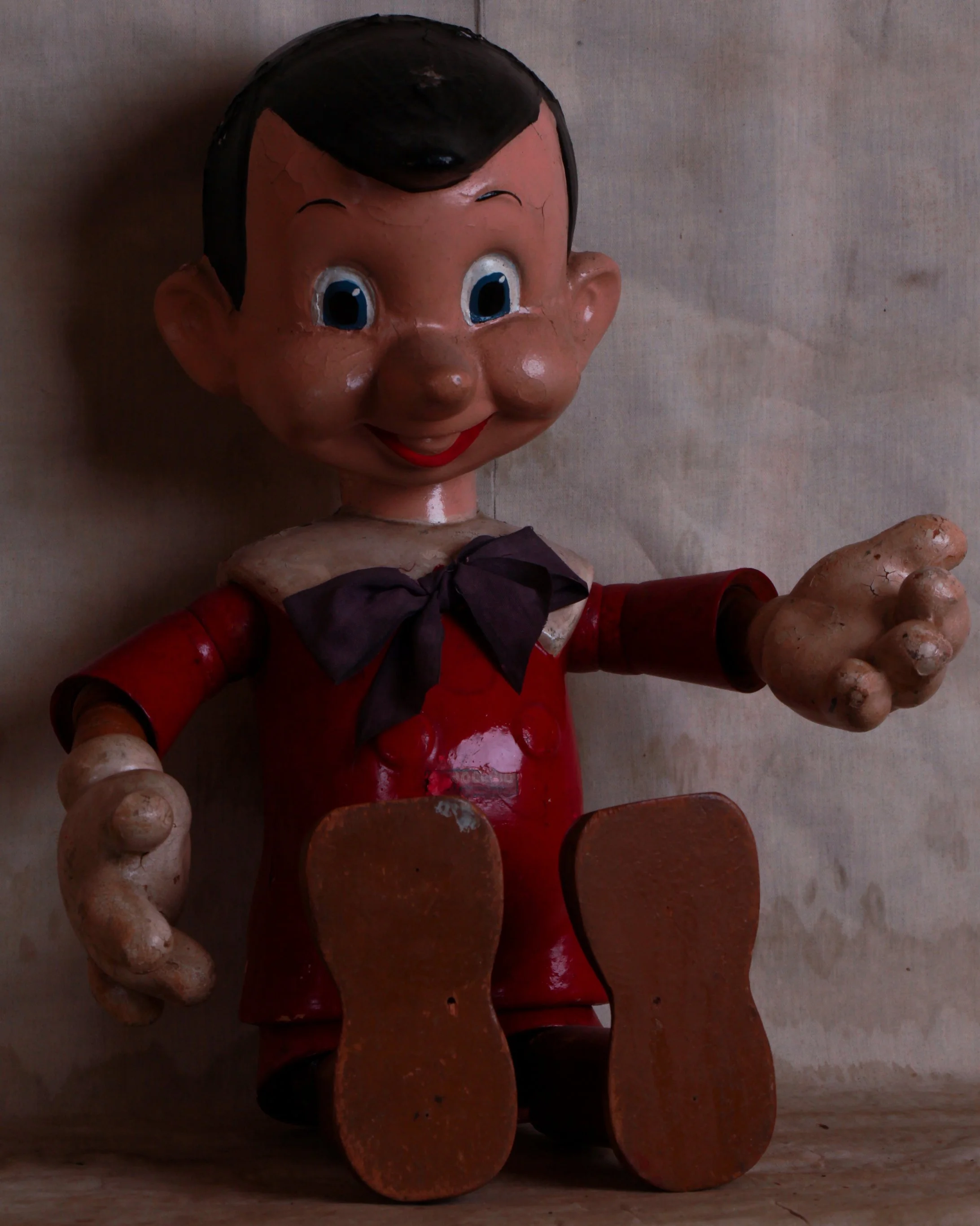
This 1939 Pinocchio figure was made by the Ideal Novelty & Toy Co. and has all the wonderfully odd character you want from an early Disney toy. Constructed from a mix of composition and wood, he has jointed arms and legs, oversized hands and feet, a molded head with big blue eyes and that unmistakable long nose, plus his red-painted outfit, fabric bow, and felt hat with feather. The hat is especially nice to see, since it is often missing on surviving examples.
There is plenty of honest age throughout, including crazing, paint loss, surface wear, small cracks, and general handling marks. Rather than hurting the piece, it gives him the right kind of lived-in look for a toy that is now well over 80 years old. The partial Ideal Novelty & Toy Co. label is still visible on the body.
Pinocchio was already a well-known literary character long before Disney got hold of him. Carlo Collodi’s story first appeared in serialized form in Italy in the early 1880s, but Walt Disney’s animated adaptation, released in 1940, is what turned Pinocchio into a permanent pop-culture figure. Production on the film had been underway for years, and licensed toys began appearing around the time of its release.
Ideal Novelty & Toy Co., founded in New York in the early 20th century, became one of America’s major toy manufacturers. The company was particularly important in the development of character dolls and licensed figures, using materials such as composition, wood, cloth, and later plastics.
Early Disney character toys like this sit right at the intersection of animation history and American toy making. They were produced before character merchandising became the enormous industry it is today, and their handmade-looking construction gives them a personality later mass-produced toys rarely have. Pinocchio feels especially fitting in this form, being a wooden puppet translated back into an actual jointed toy.
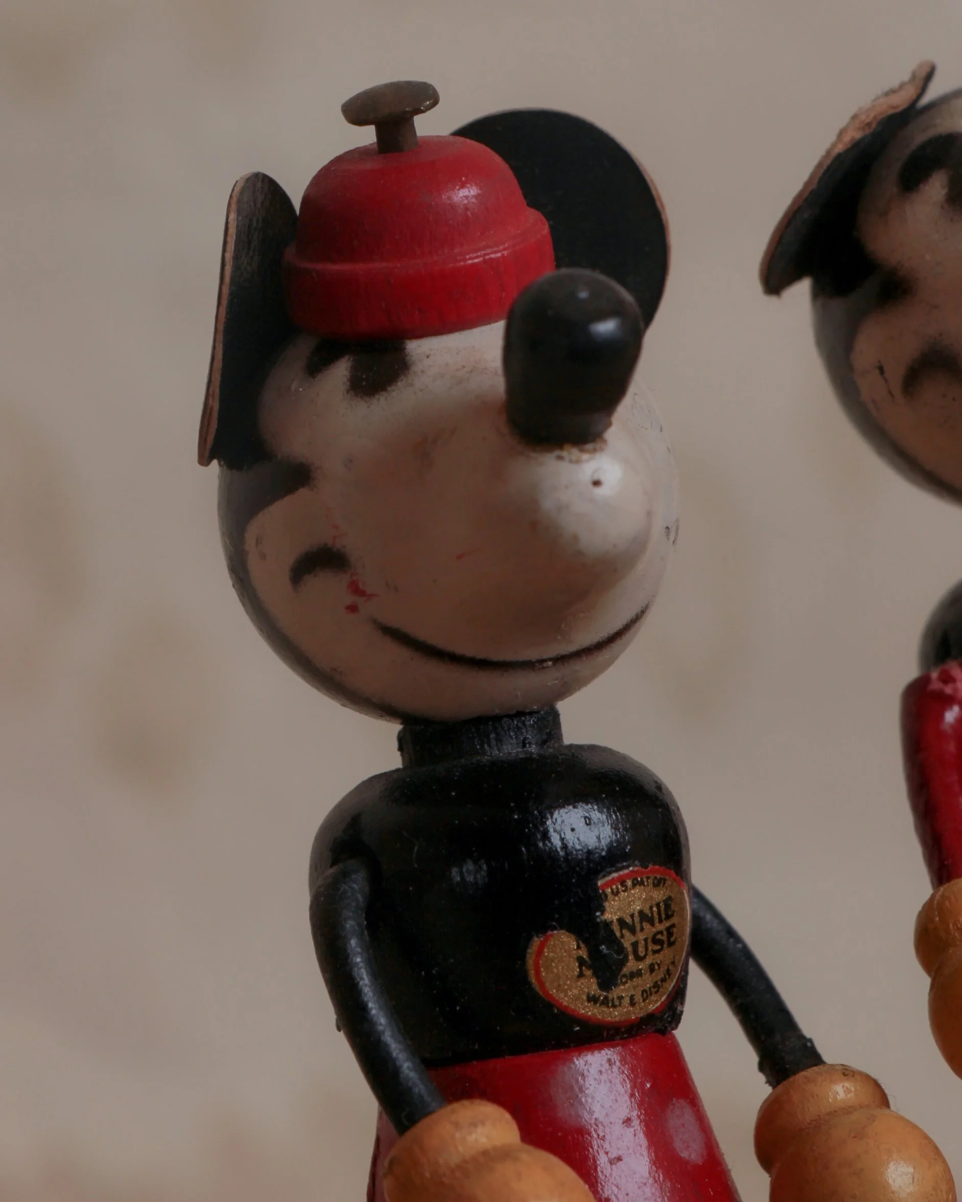
This pair of Fun-E-Flex wooden Mickey and Minnie Mouse figures dates to the 1930s and has the wonderfully quirky look of early licensed Disney merchandise. Both are built from turned and shaped wooden parts, with flexible cord joints at the arms and legs that let the figures be posed. Their oversized round heads, long projecting noses, flat ears, yellow hands, red lower bodies, and black torsos capture the simplified graphic language of early Mickey animation. Minnie wears a small red hat, while Mickey has the familiar two-button detail on his red shorts. Each still retains part of its original paper chest label identifying the character and Walt Disney connection.
The wear is exactly what you would hope to see on toys of this age: rubbing to the painted surfaces, losses along the ear edges, fading, scuffs, and some deterioration around the flexible joints. Nothing feels over-restored or overly precious. They still look like toys that were actually handled.
Mickey Mouse made his public debut in 1928, and his success quickly created one of the earliest large-scale character merchandising phenomena. By the early 1930s, Mickey was appearing on everything from watches and books to dolls, toys, school supplies, and household objects. Minnie followed right alongside him.
Fun-E-Flex figures are especially charming because they sit between doll, toy, and early animation souvenir. Their jointed construction gave children a way to physically pose characters they had previously only seen moving on screen.
That connection to animation is what makes these so appealing today. They are not slick later reproductions of an established icon. They come from the period when Mickey and Minnie were still relatively new characters, and manufacturers were figuring out how to translate those elastic cartoon bodies into three-dimensional form. The result is slightly crude, highly graphic, and full of personality.
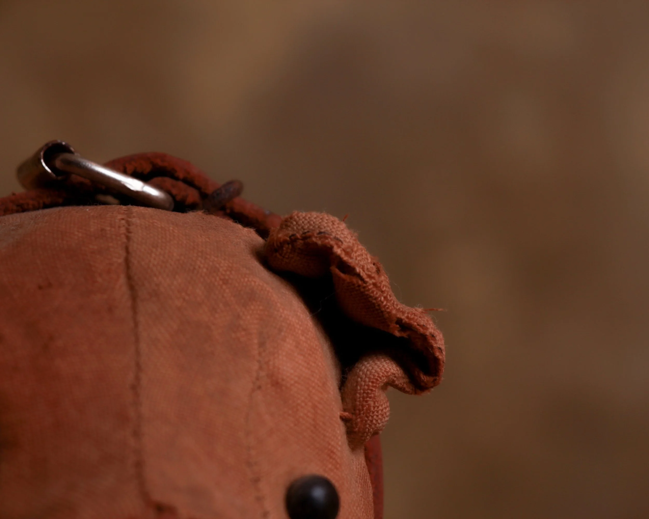
This late 19th pull toy bear has exactly the sort of worn, handmade presence that makes old toys so compelling. The bear is formed from a sturdy brown textile stretched and stitched over a stuffed body, with simple rounded ears, dark button-like eyes, a stitched mouth, and a heavily worn snout where the underlying material shows through. A leather collar with metal buckle circles the neck, while the whole figure stands over a simple iron carriage fitted with four wooden wheels.
The condition tells a good part of the story. There are scattered tears, old repairs, staining, and areas of loss to the fabric, all consistent with a toy that was genuinely handled rather than tucked away. The exposed stuffing and worn seams give it a slightly battered, almost homemade quality that is much more interesting than something pristine.
Pull toys were a major part of the toy world by the late 19th century. Manufacturers in Europe and America produced horses, dogs, elephants, bears, and other animals mounted on wheeled platforms so children could pull them along by a string or cord. Before plastics and stamped metal took over the market, these toys were commonly made from wood, cloth, papier-mâché, leather, and simple iron hardware.
Bears became especially popular as toy subjects around the turn of the 20th century, helped by a growing fascination with wild animals, traveling circuses, zoos, and eventually the teddy bear craze that followed in the early 1900s.
This example feels a bit earlier and more utilitarian than the soft teddy bear type. It sits closer to the tradition of rolling animal toys, with its rigid stance, substantial body, and straightforward mechanical base. The contrast is what works so well: a tough little bear built to move, now softened by more than a century of wear.
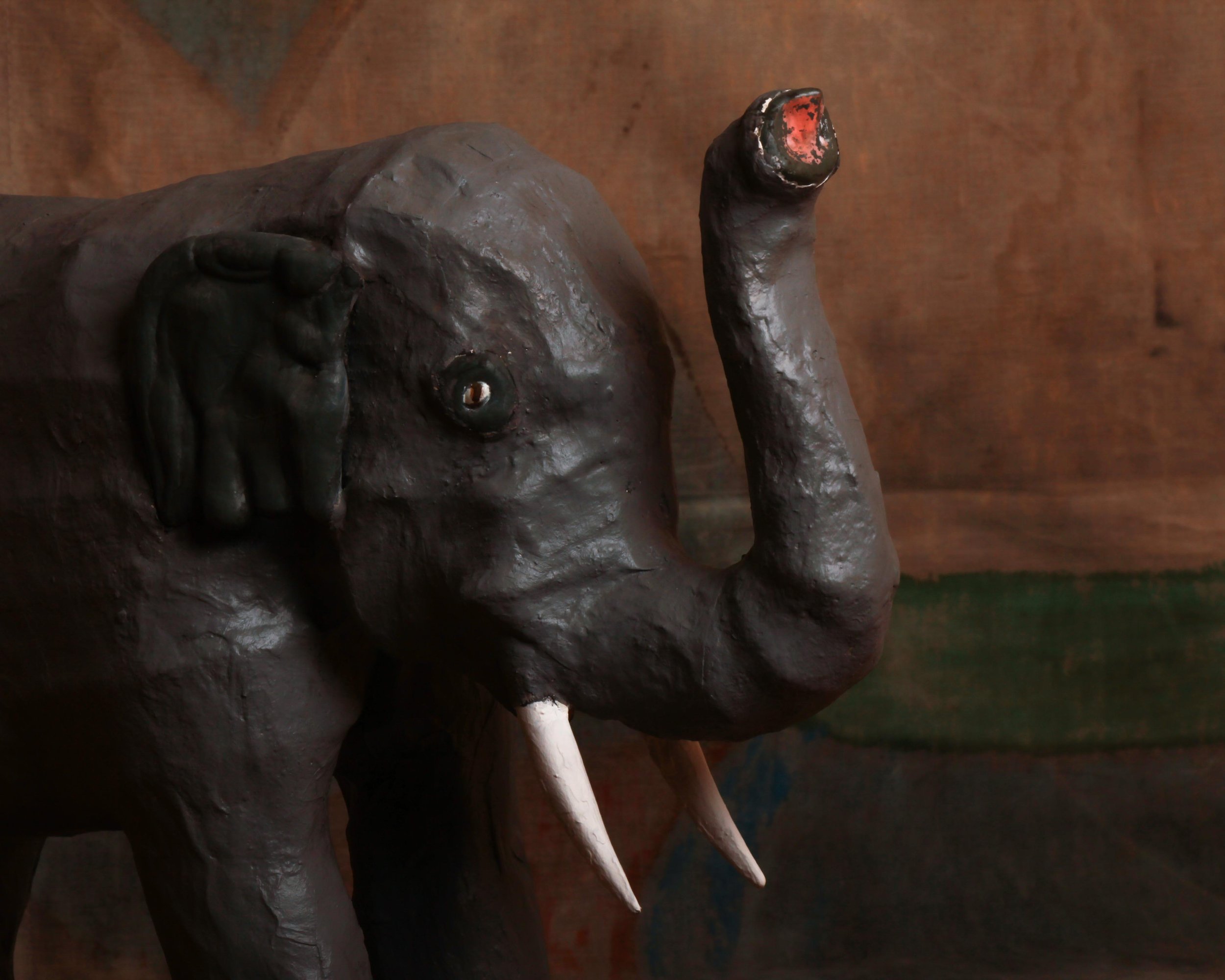
This mid-century papier-mâché elephant has a wonderfully handmade presence, with just enough realism to read immediately and just enough awkwardness to make it interesting. The body is built in a sturdy, simplified form, with thick legs, a rounded back, oversized ears, white tusks, and a raised trunk. The dark gray painted surface has plenty of texture from the papier-mâché underneath, and the slightly uneven modeling gives the elephant a lot more character than a perfectly molded factory piece would have. Small details, like the inset eyes and traces of red paint at the end of the trunk, add to its oddball charm.
What works here is the combination of scale and directness. The elephant is not trying to be zoologically perfect. Instead, it has the blunt, almost theatrical look of something made to be seen from across a room. The raised trunk gives it a celebratory stance, while the rough surface and hand-shaped details keep it grounded in the maker’s process. It is a good example of how humble materials can produce an object with real visual weight and personality.
Papier-mâché has been used for centuries because it is lightweight, inexpensive, and surprisingly strong once built up in layers. By the 19th century it was used for everything from decorative boxes and furniture to masks, toys, theatrical props, and shop displays. The material remained popular well into the 20th century, especially for larger sculptural objects that would have been costly or impractical to make from carved wood or plaster.
Mid-century papier-mâché animals often lived somewhere between toy, display piece, and folk sculpture. Elephants were especially appealing subjects because their heavy forms translated well into simplified construction, and their exotic associations made them natural candidates for circus displays, department-store decoration, children’s rooms, and promotional installations.
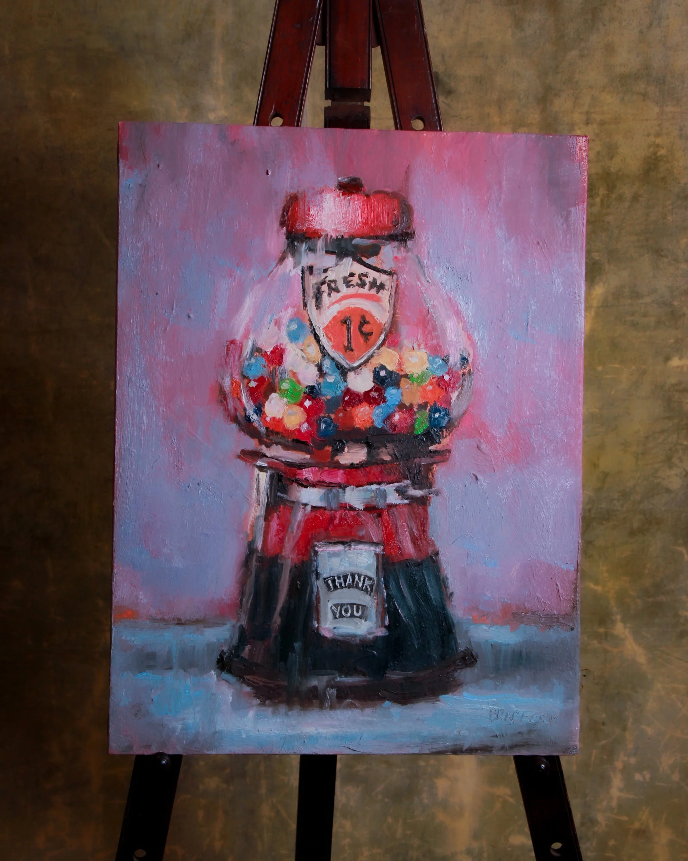
This 2020 oil on canvas by Bradford J. Salamon turns an ordinary one-cent gumball machine into something much more characterful. The machine fills nearly the entire composition, centered against a loose field of pinks, mauves, and cool blue-gray. Inside the glass globe, dozens of brightly colored gumballs are built up with quick, chunky strokes of red, turquoise, green, cream, orange, and navy. The painted “FRESH 1¢” shield and the small “THANK YOU” panel are especially good details, giving the machine the slightly awkward, hand-lettered personality of the original object.
Salamon’s handling is intentionally loose rather than photographic. Edges blur, paint remains visible, and the surface has a tactile quality that suits an object already loaded with nostalgia. The work is signed at lower right, and the reverse is inscribed “Bradford J. Salamon / Oil / 2020.”
Born in Los Angeles in 1963, Salamon is a multidisciplinary artist whose work has included portraiture, sculpture, film, and paintings of everyday objects. His object paintings grew from the idea that a familiar possession can be approached almost as a portrait, with its own age, personality, and history.
That approach makes particular sense with an old penny gumball machine. Coin-operated candy dispensers became common fixtures in American stores, barbershops, arcades, and waiting rooms during the early 20th century. For a cent, a child could turn a handle and receive a small reward, making these machines tiny monuments to impulse buying long before anyone used that phrase.
Salamon’s broader practice has repeatedly focused on the expressive possibilities of both people and humble objects, treating the act of painting as a way of recording time and memory. Here, the humble gumball machine gets the full portrait treatment, and somehow earns it.
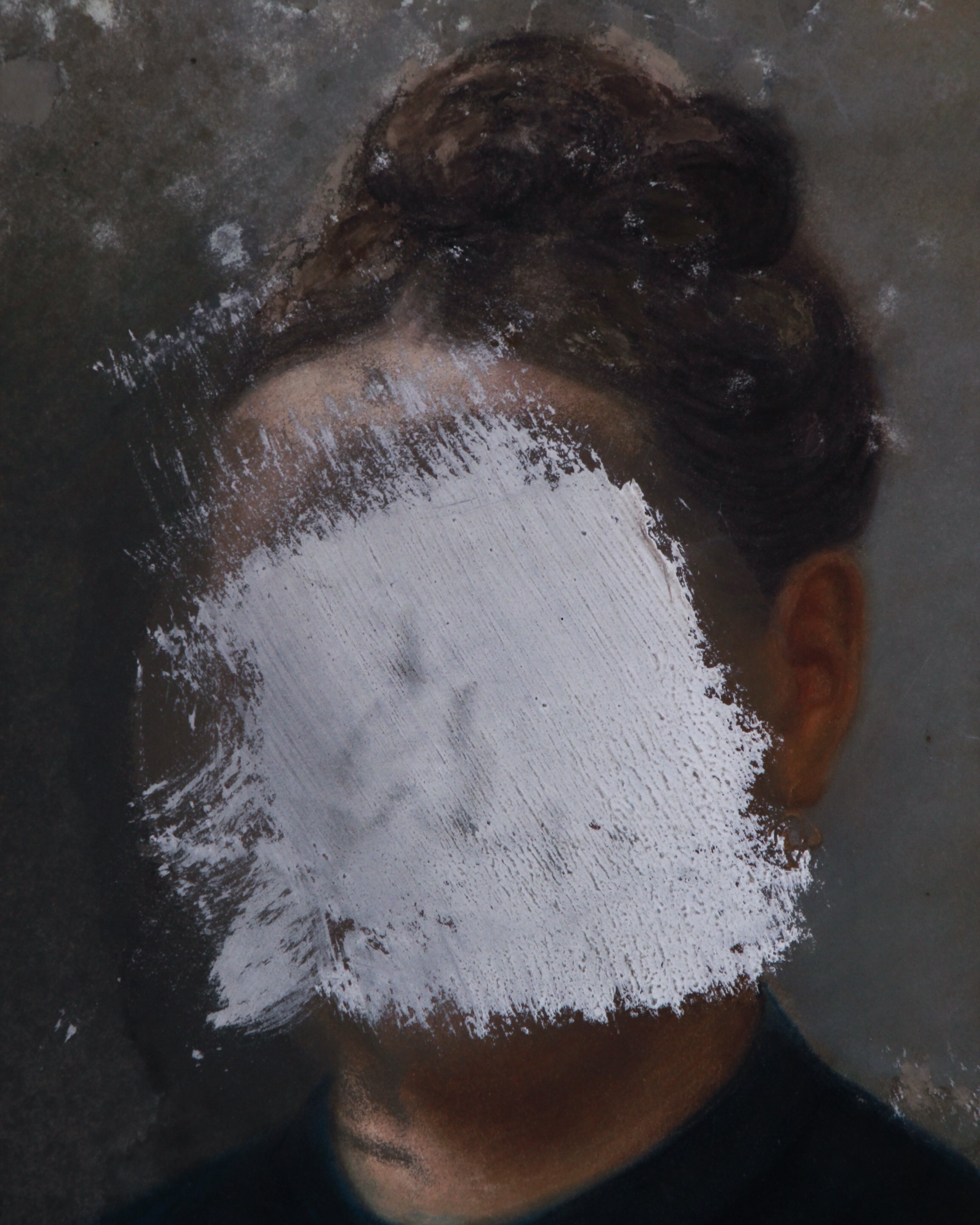
This French school portrait, circa 1870, is executed in pastels on paper, laid to card, and set in a handsome oval frame, but what makes it memorable is not the sitter’s identity. It is the fact that someone later tried to erase her.
The woman is shown in the sober, formal manner typical of the period, dressed in black with her hair arranged high at the back of her head. The palette is restrained and the composition conventional, which makes the intervention across her face feel even more jarring. A broad patch of white paint has been brushed directly over her features, with another smaller area at the bottom of the composition. The surface elsewhere shows age, abrasion, and scattered losses, all of which add to the painting’s strange, layered presence.
Portraiture in 19th-century France was deeply tied to family, status, memory, and respectability. Even modest households commissioned likenesses to mark marriages, inheritances, anniversaries, or simply to preserve a face for future generations. Once painted, these portraits often remained in families for decades, passing through houses, marriages, arguments, deaths, and changing fortunes.
That is what makes deliberate damage so intriguing. Defacing a portrait was rarely neutral. It could be an act of anger, rejection, censorship, embarrassment, grief, or even dark humor. Was the face covered by the painter after a disagreement? By the sitter herself? By a spouse, child, jealous lover, or later owner who wanted the person gone but could not quite bring themselves to throw the portrait away?
There is no way to know, and that uncertainty is really the appeal. The painting began as a straightforward record of one person’s appearance. The later act of obliteration turned it into something else entirely: a portrait not only of a woman, but of a relationship that clearly went wrong somewhere along the way.
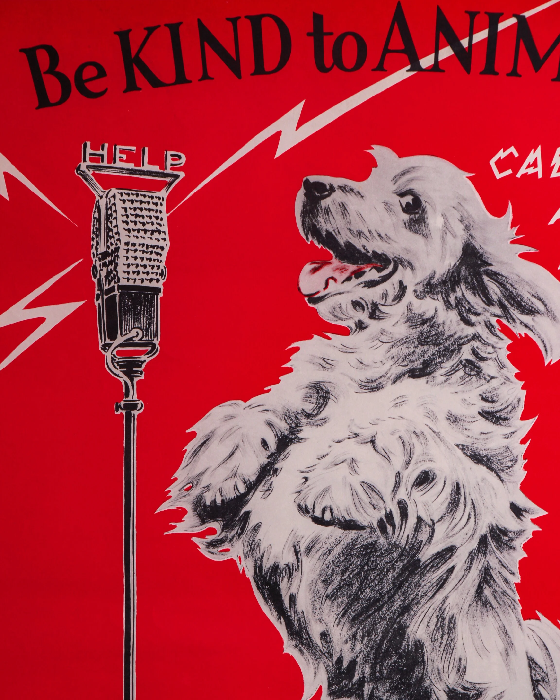
This original 1938 American Humane Association poster by Morgan Dennis has a wonderfully odd mix of sweetness, humor, and graphic punch. Against a vivid red background, a shaggy dog stands upright before an old-fashioned microphone beneath the message “Be KIND to ANIMALS,” while jagged lettering announces that he is “CALLING ALL HUMANS.” Lightning-bolt graphics radiating from the microphone give the whole thing the feel of an urgent radio broadcast, which makes the earnest message surprisingly playful.
The illustration is signed Morgan Dennis and the lower margin is marked “© 1938 A.H.A.,” along with “Published by the American Humane Association, Albany, New York” and “Litho’d in U.S.A.” Measuring 21 3/4 by 16 3/4 inches, the poster shows some expected age and handling to the paper, including light toning and scattered spotting, but the colors remain remarkably strong. It is displayed in a custom wood frame with Tru Vue Optium Museum Acrylic for high clarity and added protection.
Morgan Dennis (1892–1960) was an American illustrator particularly known for his drawings of dogs. Working during the golden age of American magazine and advertising illustration, he developed an easygoing, immediately recognizable style that gave dogs distinctly individual personalities without turning them completely into cartoons.
Humane organizations had been using posters, school programs, pamphlets, and public campaigns since the late 19th century to encourage better treatment of animals. By the 1930s, these messages increasingly borrowed the visual language of commercial advertising: bold colors, memorable slogans, humor, and illustrations designed to stop people in their tracks.
The American Humane Association, founded in 1877, was an important part of that movement. Posters like this were meant to make animal welfare approachable rather than grim. Dennis was particularly well suited to the job. His dog doesn’t lecture the viewer. Instead, he looks as though he has commandeered the radio station for one very important announcement.
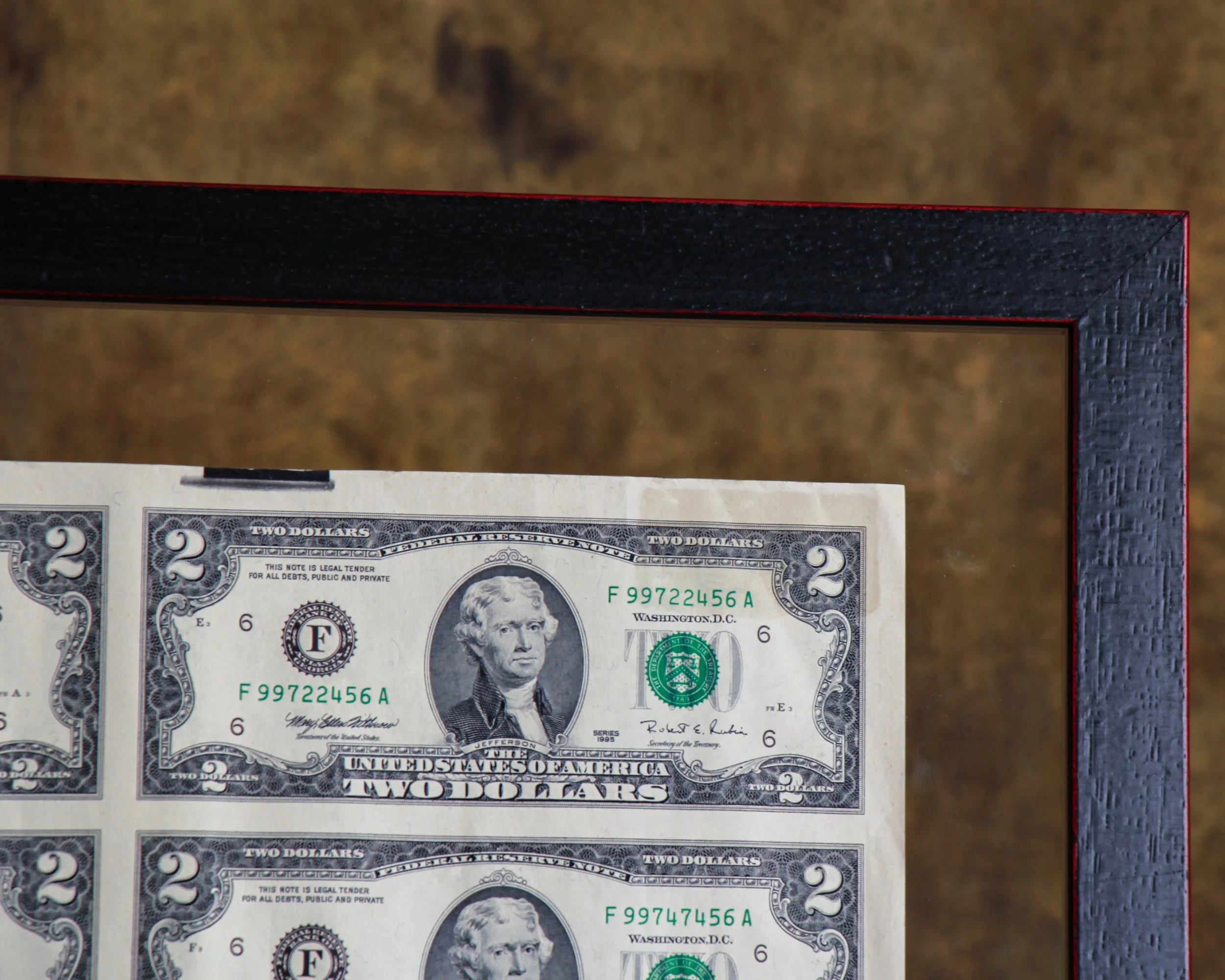
This uncut sheet of thirty-two United States $2 bills is from Series 1995 and presents the denomination in the way it originally existed before individual notes were cut apart for circulation. The full sheet has a wonderfully graphic quality, with Thomas Jefferson’s portrait repeated in a precise grid across the front and John Trumbull’s famous Declaration of Independence scene repeated on the reverse. The serial numbers progress across the sheet, giving it that satisfying mix of bureaucracy, design, and pattern.
The sheet is displayed in a double-sided frame, allowing both sides of the currency to be viewed. It is protected with Tru Vue Optium Museum Acrylic, a high-grade glazing material favored for important works on paper because of its clarity, UV protection, and anti-reflective qualities. The floating presentation also gives the sheet some breathing room and keeps the untrimmed edges visible, which is an important part of its appeal.
The $2 bill has had one of the more curious histories in American currency. The denomination dates back to the 19th century, but it has never circulated as heavily as the $1 or $5 bill. Its relative scarcity in everyday use eventually gave it an almost novelty status, even though it remains legal tender.
The modern $2 Federal Reserve Note was introduced in 1976 as part of the United States Bicentennial. That redesign brought the familiar reverse image of the signing of the Declaration of Independence, adapted from Trumbull’s painting, while Jefferson remained on the face.
Uncut currency sheets occupy a slightly different corner of collecting than ordinary notes. They were sold specifically as collectibles and souvenirs, preserving the bills in their original sheet format before cutting. Seeing thirty-two notes together makes the engraving, repetition, spacing, and printing process much easier to appreciate. Framed this way, the sheet lands somewhere between numismatics, graphic design, and American historical ephemera.
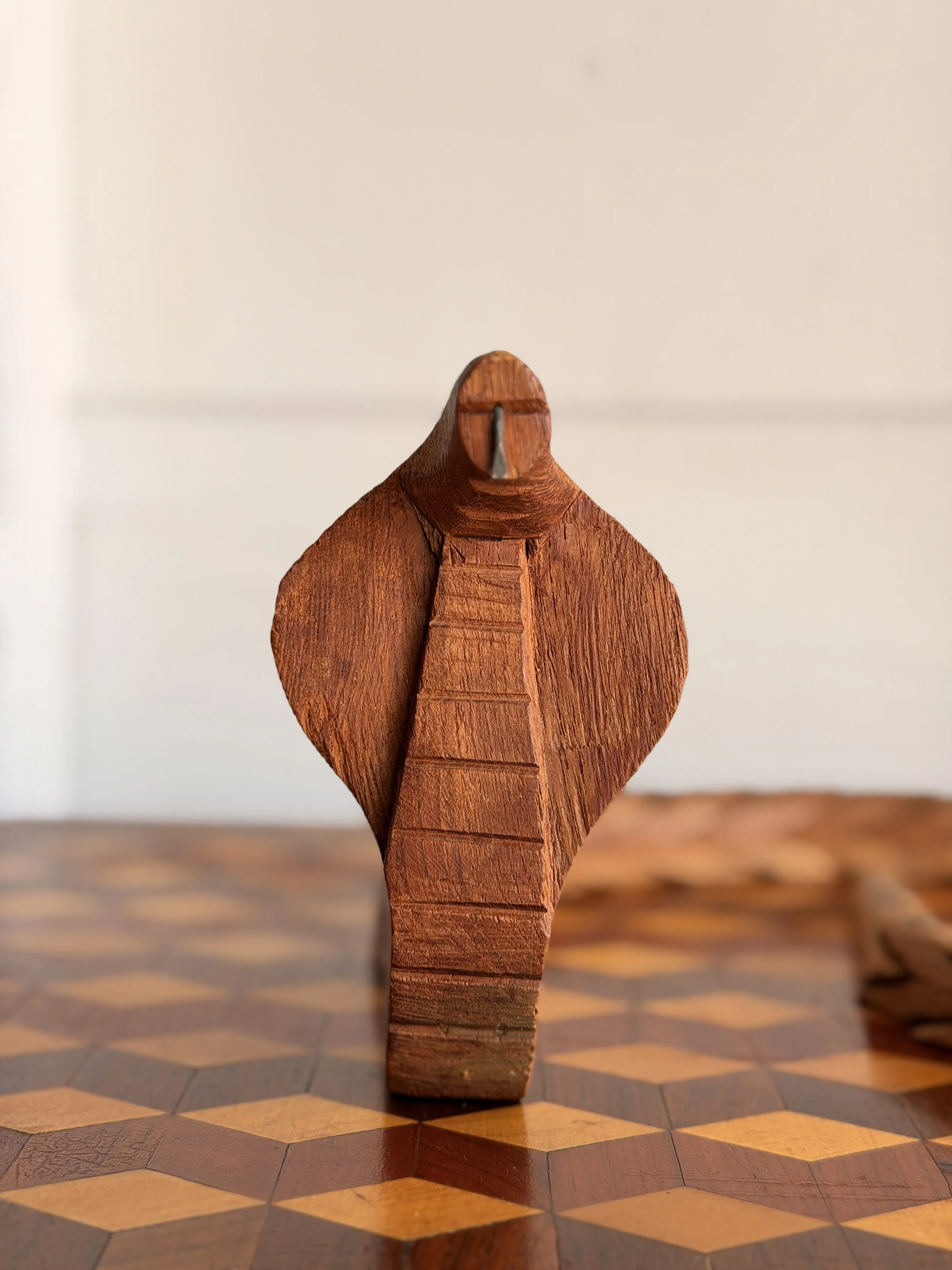
This hand-carved wooden cobra has the kind of clever construction that makes folk art so much fun to study up close. The snake rises upright with its hood spread wide, its simplified head reduced to a few strong cuts and a small metal tongue. Horizontal incisions run down the front of the neck, suggesting the segmented belly scales of a cobra. The carving is direct and wonderfully unfussy, with visible tool marks, an uneven surface, and a warm, dry patina that has developed with age.
The real surprise, though, is the body. Viewed from above it reads as a long, coiling snake, but from the side the construction becomes much stranger and more inventive. The body is made from a repeating series of overlapping carved sections, each shaped almost like a little snake head with an open mouth biting into the one ahead of it. Small metal pins connect the individual pieces, allowing the body to bend and curve while also creating a terrific sawtooth silhouette. It is part sculpture, part mechanical puzzle.
Snakes have appeared in folk and decorative art across cultures for centuries, often carrying several meanings at once. Because snakes shed their skins, they became natural symbols of renewal and transformation. Cobras in particular have long been associated with protection, power, danger, and supernatural authority, especially throughout South Asia and parts of Africa.
Wooden snake carvings also appealed to makers because the animal’s long, flexible form invited experimentation. Carvers could create rigid sculptures, walking sticks, toys, articulated snakes, or ingenious chain-like constructions such as this one. Articulated wooden animals became especially popular as handmade souvenirs and folk objects during the 19th and early 20th centuries, when makers often combined local carving traditions with a bit of mechanical ingenuity.
This cobra fits comfortably into that world: slightly eccentric, handmade, and full of personality, with a construction that becomes more interesting the longer you look at it.
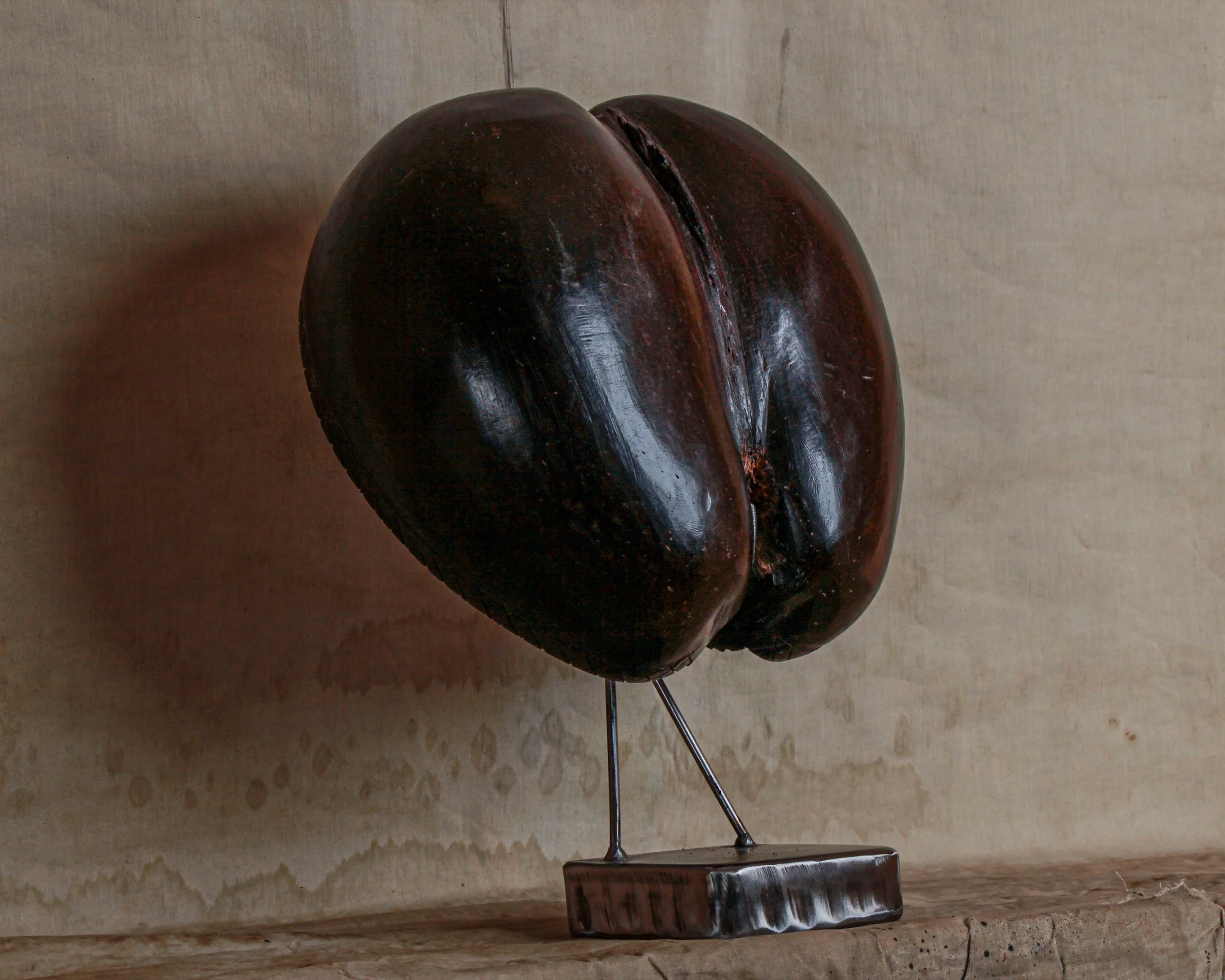
This is a wonderful old coco de mer, the extraordinary double-lobed seed of the Lodoicea maldivica palm, native only to the Seychelles islands of Praslin and Curieuse. Its unmistakable form is almost sculptural on its own, with two broad rounded lobes divided by a deep central cleft. The surface has developed a rich, nearly black-brown patina with reddish undertones, along with scratches, handling marks, and areas of natural wear that give it plenty of character.
This example has also been opened and worked by hand, revealing the beautifully textured interior and a simple incised crosshatched decoration around portions of the edge. Although cut in half, it retains the iconic heart-like silhouette for which the coco de mer is famous. Displayed on its custom metal stand, it reads somewhere between natural-history specimen, folk sculpture, and outright conversation piece.
The coco de mer has fascinated travelers and collectors for centuries. Before Europeans knew where the palms actually grew, the enormous nuts occasionally washed ashore in India, Sri Lanka, and the Maldives. With no known tree to explain them, people imagined they came from mysterious trees growing beneath the Indian Ocean, which helped inspire the name coco de mer, or “coconut of the sea.”
The reality is arguably stranger. Coco de mer palms grow naturally in only a tiny corner of the Seychelles, and they produce the largest seeds in the plant kingdom. Individual seeds can weigh roughly 25 kilograms or more, an astonishing investment of energy for a single seed.
Their suggestive shape has also given the coco de mer a long association with fertility, sexuality, mythology, and good fortune. Over time, polished shells were turned into bowls, containers, decorative objects, and prized souvenirs. Today the species is carefully protected in the Seychelles, making older examples particularly appealing as pieces of both natural and collecting history.
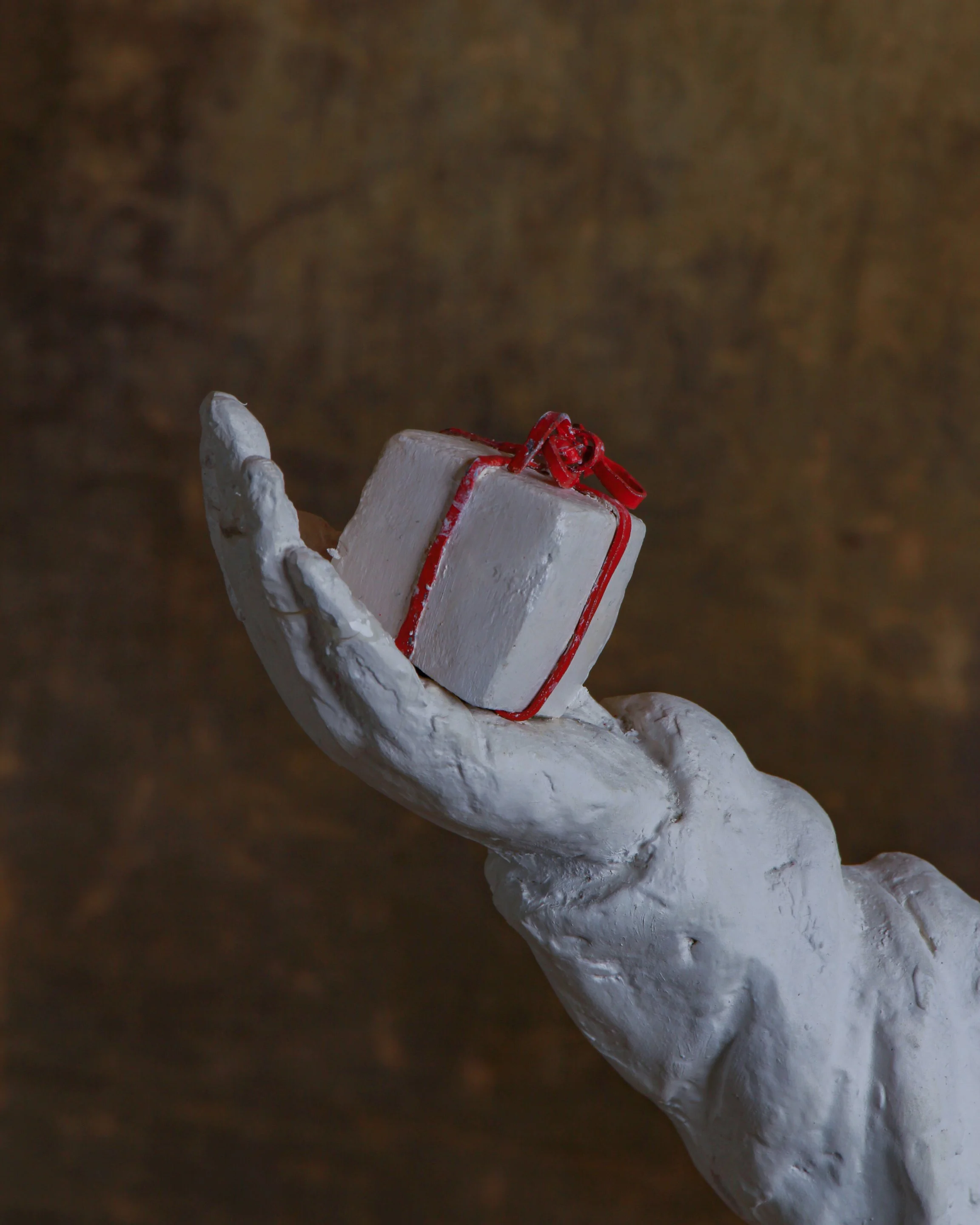
This wonderfully strange Standing Clown sculpture is by British artist Beth Carter, whose work often sits somewhere between mythology, carnival, fairy tale, and the slightly unsettling corners of the imagination. Made from white pigmented resin, the figure stands approximately 41" high x 24.5" wide x 6" deep and is from an edition of 15.
The clown is rendered almost entirely in white, with arms stretched wide, an exaggerated pointed hat, oversized shoes, a heavily textured ruff, and a small gift balanced in one hand. Gold-colored laces provide a subtle flash of decoration at the feet, while the tiny present is tied with a bright red ribbon. The roughly modeled surface is intentionally tactile, retaining marks and irregularities that give the sculpture the feeling of something shaped directly by hand rather than mechanically perfected.
Carter is a UK-based sculptor and Royal West of England Academician whose work frequently combines human figures with animals, masks, performers, and mythological characters. Clowns, jesters, minotaurs, hybrid creatures, and carnival figures appear repeatedly throughout her sculpture and drawings. Her work has been exhibited internationally and is held in museum and private collections. (Beth Carter)
The clown has a particularly long history in visual art. Beyond comedy, clowns and jesters have often represented outsiders, performers, fools, and figures who can move between humor and melancholy. Artists have returned to them precisely because that identity is so unstable: funny one moment, lonely or slightly unnerving the next.
Carter plays with that ambiguity here. The open arms feel welcoming, but the blank white surface, closed eyes, pointed head, and elongated proportions give the figure a quieter, stranger presence. The artist’s own records list Standing Clowns in black, white, and red pigmented resin, each produced in an edition of 15. (Beth Carter)
This example includes its original signed certificate of authenticity, identifying it as edition 3/15.
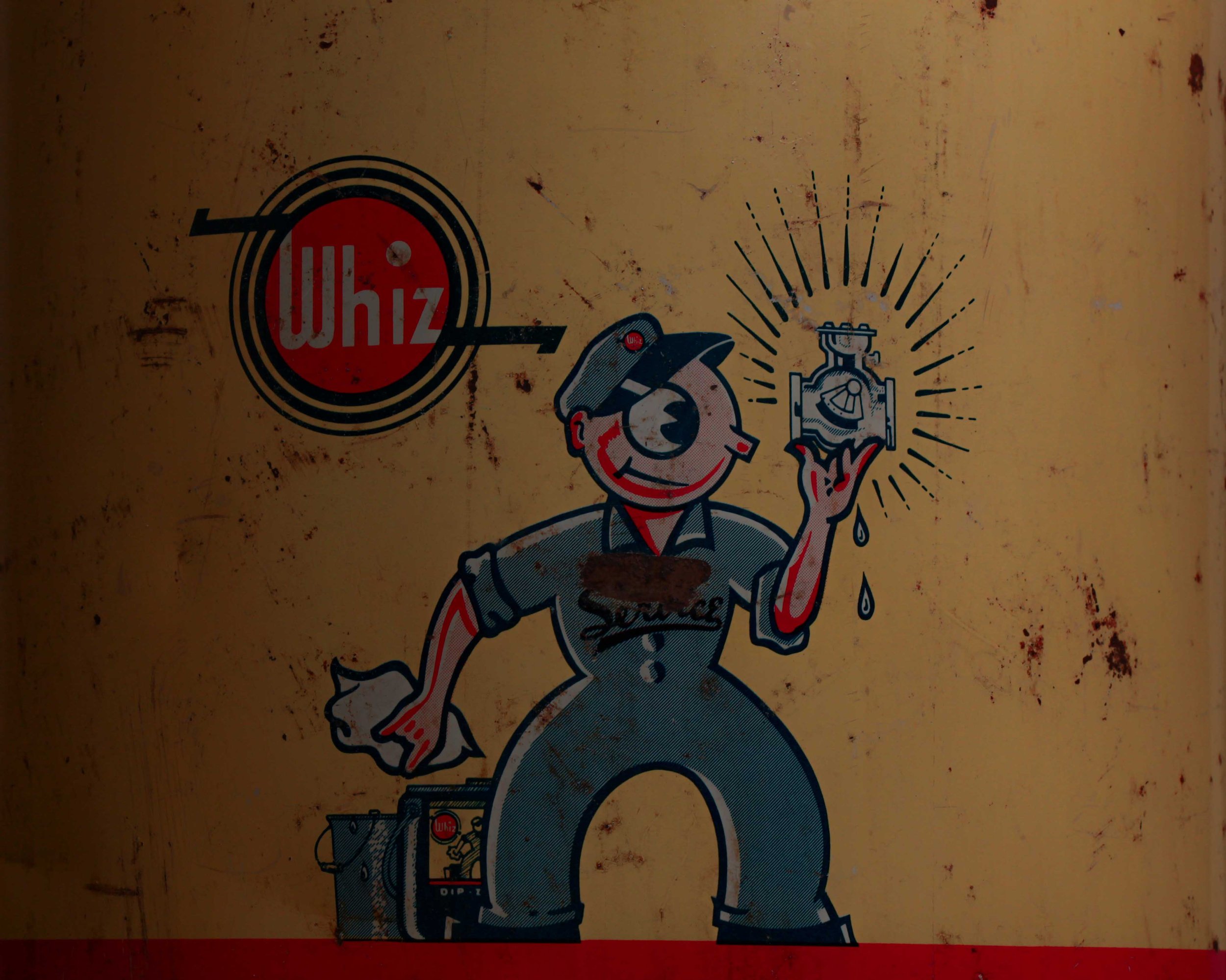
This vintage Whiz Dip-Zof parts-cleaner can is a great piece of old garage advertising, with bold graphics and exactly the kind of honest wear you want to see on something that spent its life around tools, grease, and machinery. The large metal can has a cream and dark navy body separated by a red stripe, a red lid, and its original wire carrying handle with a turned wooden grip.
The front features the Whiz logo alongside a terrific cartoon mechanic proudly holding up a freshly cleaned carburetor, as if it were a shiny jewel. Below, oversized white lettering reads “DIP-ZOF,” followed by its intended use: cleaning small parts, carburetors, fuel pumps, and similar components. The back retains its detailed instruction label from The R. M. Hollingshead Co. of Canada Ltd. The surface has scratches, stains, small areas of paint loss, oxidation, and general workshop wear throughout.
Whiz automotive products have a surprisingly long history. The R. M. Hollingshead Company of Camden, New Jersey was already selling Whiz-branded automobile cleaners and lubricants by 1911, when a Whiz product catalog was published. By the 1920s the company was advertising Whiz automobile specialties nationally, and its range eventually included cleaners, polishes, lubricants, rust preventatives, cooling-system products, and other garage chemicals.
The company formally registered versions of the Whiz trademark during the 1930s for automotive chemicals and lubricating products. Products like Dip-Zof belonged to an era when service stations and repair shops routinely kept large reusable cans of solvent nearby for soaking carburetors and greasy mechanical parts.
Today the cartoon mechanic, strong typography, and wonderfully utilitarian graphics make the can as much an advertising piece as a piece of garage equipment. The years of grime and handling only make that connection to its working life more convincing.
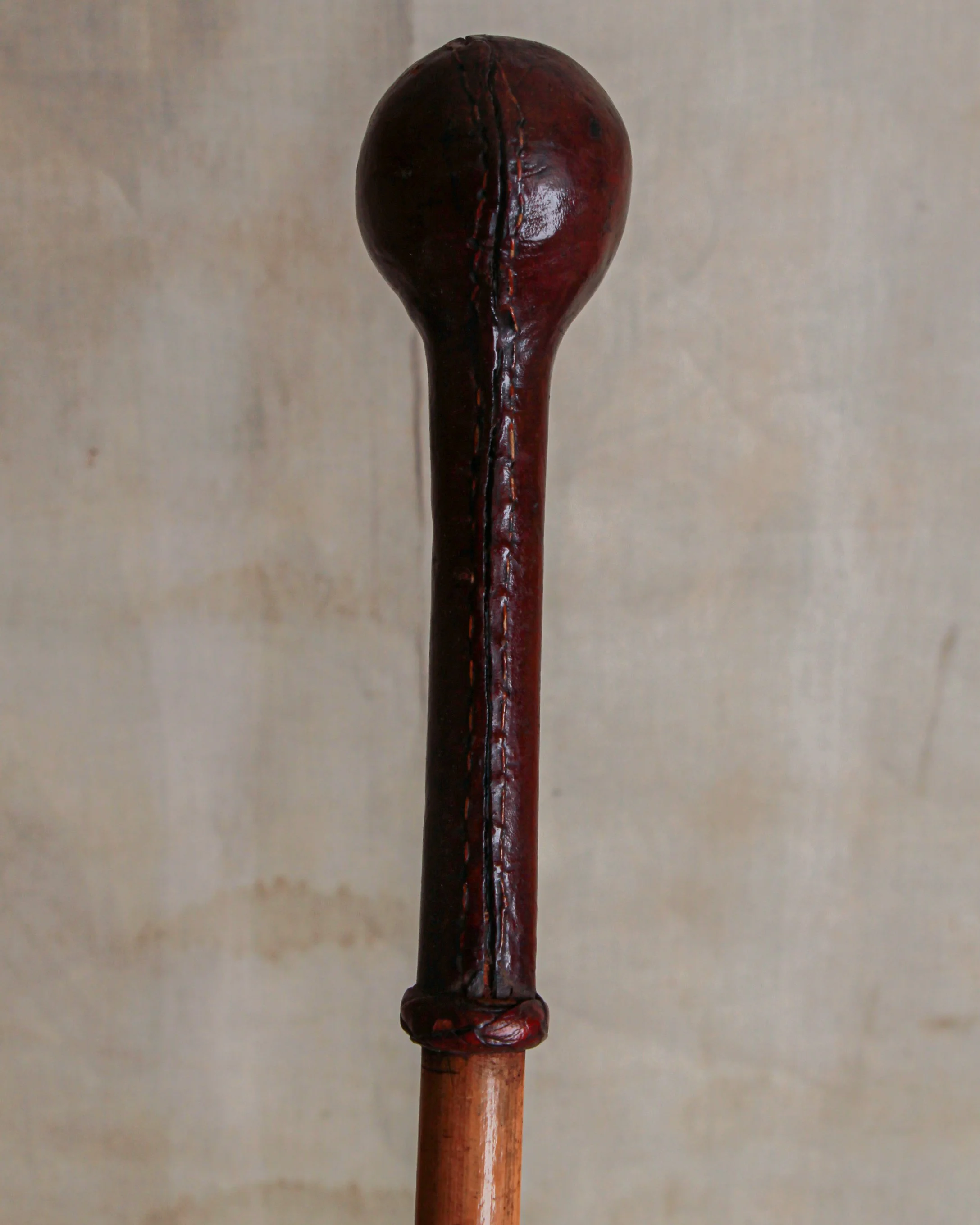
This antique walking stick has a wonderfully simple construction, with a long, slender wooden shaft topped by a dark brown leather-covered handle. The handle is especially nice, shaped with a rounded bulb at the top and a long narrow grip below, all finished with visible hand stitching running along one side. A small wrapped leather collar marks the transition from handle to shaft and gives the whole piece a slightly more finished look.
At the opposite end is a dark metal ferrule, fitted over the tip of the wooden shaft to protect it from wear. The wood has developed a warm honey-brown color, with scattered marks, scratches, staining, and surface wear from use. The leather has darkened considerably with age and shows creasing, scuffs, and irregularities along the stitched seam, all of which give it a pleasantly well-used character.
Walking sticks became especially fashionable during the 18th and 19th centuries, when they moved beyond being purely practical objects and became part of everyday dress. By the Victorian and Edwardian periods, a gentleman’s cane could say quite a bit about its owner. Handles were made from an enormous range of materials, including horn, silver, ivory, wood, leather, and occasionally far more eccentric choices.
Leather-covered grips were practical as well as attractive, providing a comfortable surface in the hand while allowing makers to shape handles without relying on expensive materials. Some examples were made for everyday walking, while others were associated with sporting, military, equestrian, or country pursuits.
This example is refreshingly understated. There is no elaborate silver mount or carved decoration, just good materials, honest construction, and evidence of years of handling. The stitched leather top gives it just enough personality, while the slim proportions and old surface make it an appealing piece of functional history.
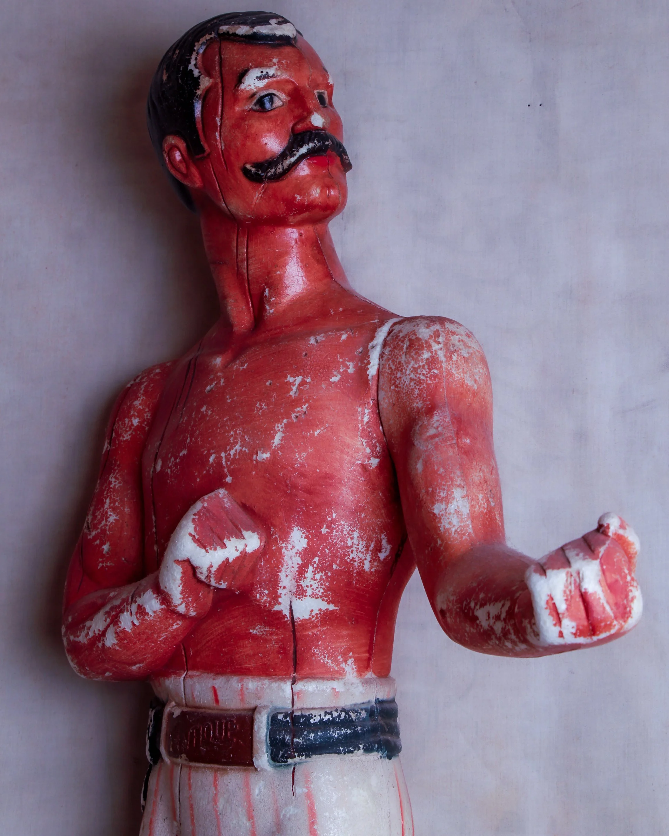
This large vintage advertising figure depicts a mustachioed pugilist posed with both fists raised, ready for a bout. Made from a dense, hard foam material and hand-painted, the figure has a wonderfully direct, almost theatrical quality. He wears white trousers with red vertical stripes, black boots, a dark belt, and a small raised panel at the waist marked “ANTIQUE.” His bright red torso, slick black hair, curled mustache, and exaggerated stance give him the look of an old-time strongman or bare-knuckle fighter.
The surface shows plenty of age, with scattered paint loss, cracking, rubbing, and areas where the lighter material underneath is exposed. The wear gives the piece a terrific, timeworn surface rather than making it feel overly pristine. The left arm is removable, likely part of the original construction or assembly method, and fits into the shoulder joint.
Its exact advertising purpose is unclear, but figures like this were commonly used as attention-grabbing displays in bars, liquor stores, tobacconists, sporting-goods shops, fairs, and other retail settings. Boxing imagery was especially effective because it instantly suggested strength, toughness, masculinity, and competition. Breweries, whiskey brands, cigar companies, and patent-medicine makers all borrowed from the visual language of prizefighting at various points.
From the late 19th century well into the 20th, life-size and oversized advertising figures became a familiar part of storefront culture. Earlier examples were often carved from wood or molded from plaster, while later manufacturers turned to lighter materials such as composition, fiberglass, and expanded foams that were easier to move and manufacture.
Whether this fellow once promoted alcohol, tobacco, or something entirely different, he has exactly what a good advertising figure needed: personality from across the room. The battered paint, exaggerated anatomy, and slightly stern expression only make him more interesting today.
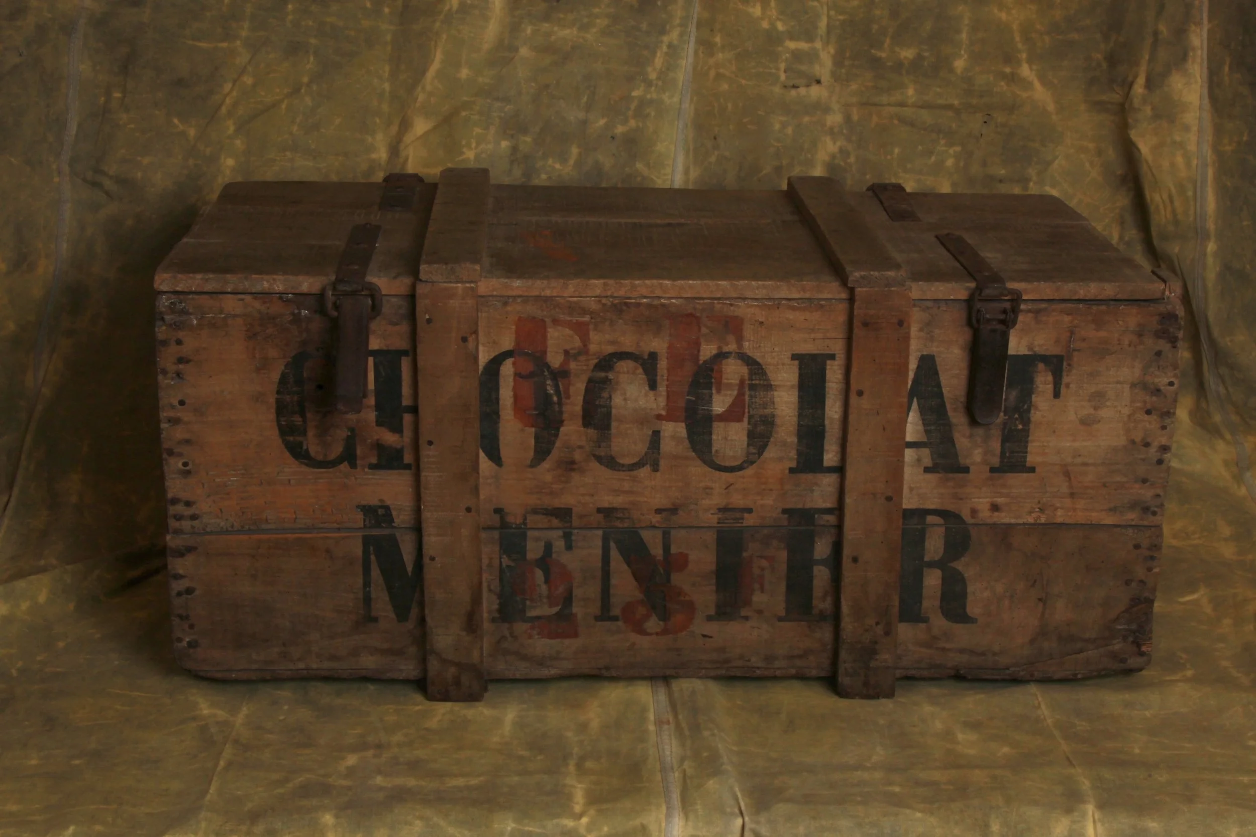
This antique wooden Chocolat Menier shipping crate is a great piece of old French advertising, combining wonderfully bold graphics with the straightforward, no-nonsense construction of a working transport box. It measures approximately 37.4" wide x 19.9" high x 15.2" deep.
The crate is constructed from thick wooden boards with reinforced vertical battens running across the front, back, and lid. Two original metal straps and buckles secure the top, giving the box an especially rugged, well-traveled appearance. The hinged lid opens to reveal a large, uncomplicated storage compartment, with the raw interior boards showing plenty of age and use.
What really makes the piece is the typography. “CHOCOLAT MENIER” is boldly stenciled across both long sides in oversized black lettering, with traces of additional red painted markings still visible underneath and between the letters. The graphics are worn and faded in places, but remain strong and easy to read.
Chocolat Menier was one of France’s most important and recognizable chocolate makers, with a history stretching back to the early 19th century. The company was founded in 1816 by Jean Antoine Brutus Menier, originally producing pharmaceutical powders before chocolate gradually became the main focus of the business.
By the second half of the 1800s, Menier had grown into a major chocolate manufacturer, operating from its famous factory at Noisiel, just outside Paris. The company was especially good at branding, and its name became a familiar sight on posters, shop signs, tins, crates, and packaging throughout France and beyond.
One of Menier’s best-known images was the little girl writing the company name on a wall, an advertising graphic that became closely associated with the brand.
Today, antique Chocolat Menier advertising and packaging is collected for its strong typography, French commercial history, and instantly recognizable graphics. Pieces such as wooden shipping crates are especially appealing because they combine advertising with genuine everyday use.
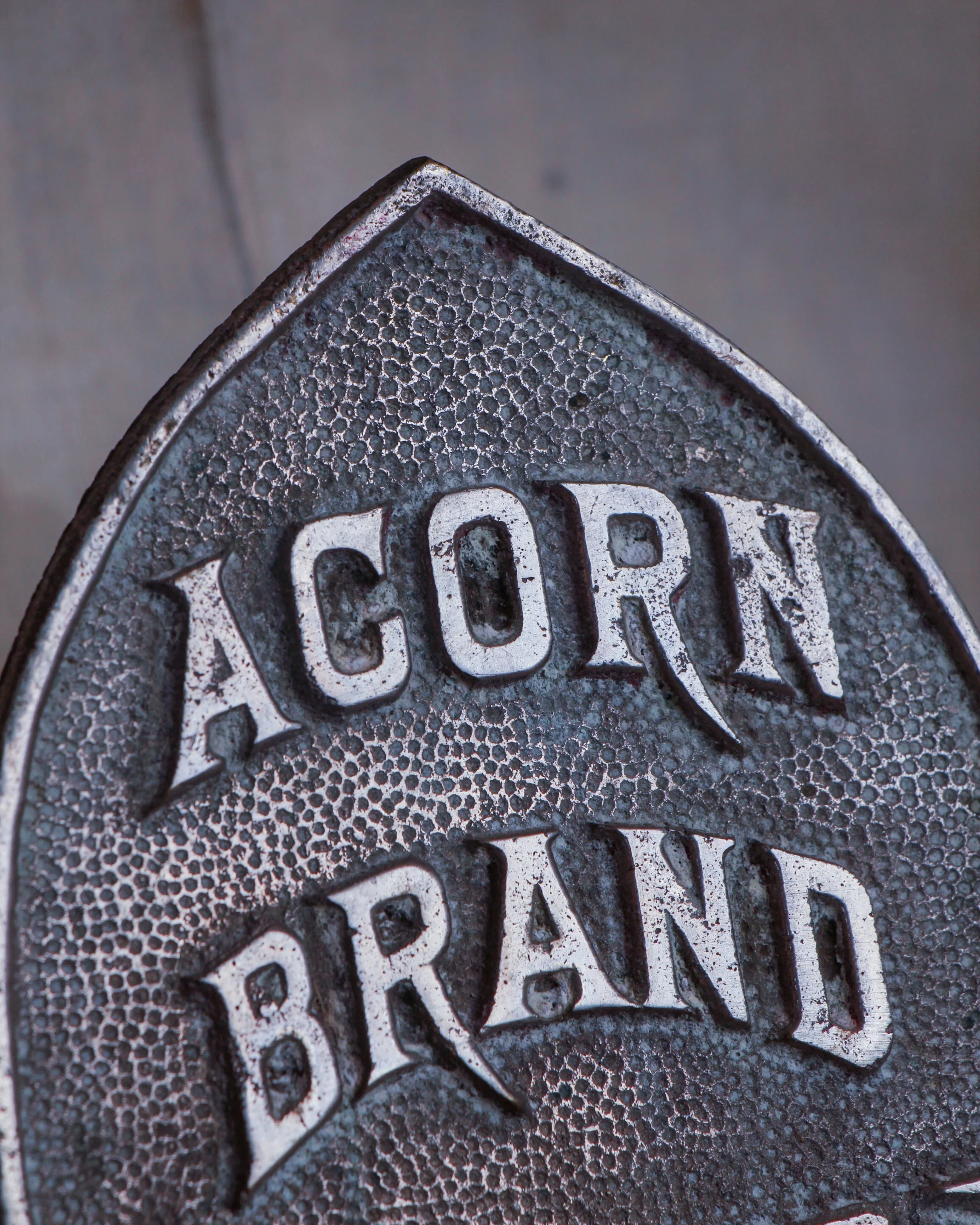
This antique Acorn Brand display rack has a great industrial look and an unusually sculptural shape that makes it interesting even before you figure out what it was originally meant to hold. Made primarily from bent metal rod, the frame rises from a weighted circular base and forms a broad, almost bell-shaped outline, with a series of small metal clips or hooks spaced around the perimeter.
At the center is the best detail: a cast metal emblem in the shape of an acorn, boldly marked “ACORN BRAND” in raised lettering. The lower half of the emblem has a crosshatched pattern that gives it a little extra texture and makes the branding feel surprisingly decorative for what was likely a practical store or commercial fixture.
The rack has a wonderfully spare construction. There is no unnecessary ornament beyond the logo, just the curved metal framework, functional fittings, and central support. The clips are attached individually along the frame and appear designed to suspend or display a number of small items at once. Exactly what Acorn Brand used this particular rack to merchandise would require a little more research, but it has all the hallmarks of an early retail display piece.
Age has given the metal a mellow, darkened surface with scattered oxidation, wear, and discoloration throughout. Nothing feels overly polished or restored, and that untouched character is a big part of its appeal. The wear is consistent with years of practical use.
Beyond its original purpose, it works beautifully today as an unusual wall or tabletop display for small objects, photographs, tags, jewelry, or other collections. There is something especially satisfying about an old commercial fixture surviving long after the products it once displayed have disappeared. Simple, graphic, and a little mysterious, it is the kind of utilitarian object that has become unexpectedly decorative with time.
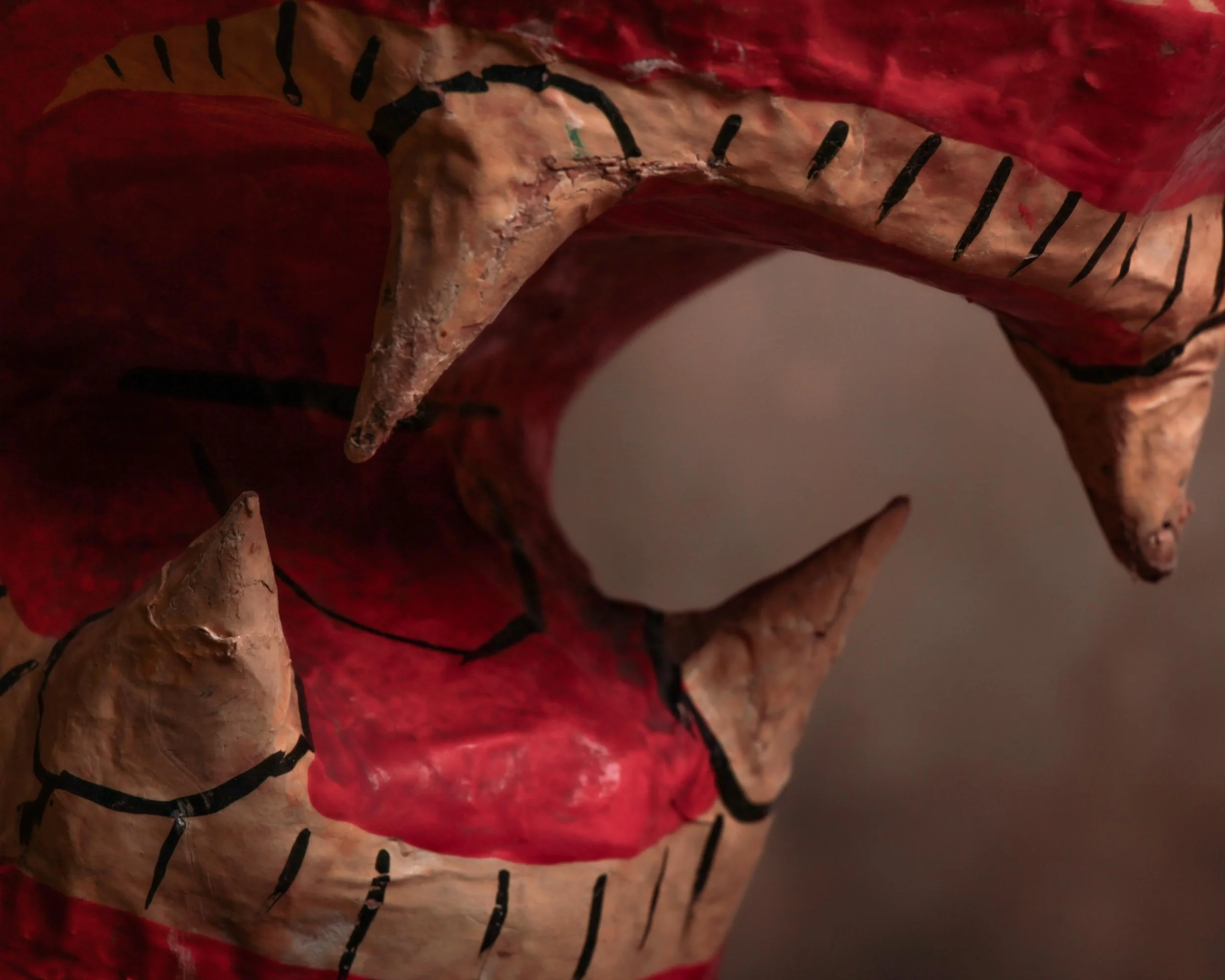
This wonderfully expressive papier-mâché lion dates to around the 1930s and has exactly the kind of personality that makes handmade objects hard to resist. He’s big, slightly awkward, a little intimidating, and somehow still very charming.
The lion is constructed in papier-mâché and finished in a warm reddish-brown paint, with simple black hand-painted lines defining the mane, paws, whiskers, facial features, and body. His oversized head is the main event. The mouth is wide open in a permanent roar, complete with individually formed teeth and fangs, a bright red interior, painted gums, and a wonderfully exaggerated muzzle. The large painted eyes give him an almost animated expression, somewhere between fierce and mildly surprised.
His body is substantial and simply modeled, standing firmly on four broad paws. Rather than trying for anatomical perfection, the maker clearly leaned into presence and character. A braided cord tail hangs from the back, an especially nice handmade detail that adds to the slightly theatrical feel of the piece.
The surface shows plenty of age and use, including scuffs, scratches, areas of paint loss, small cracks, worn edges, and old repairs or touch-ups. There is visible wear around the nose, mouth, teeth, body, and paws. None of this feels out of place. In fact, the imperfections make the construction easier to appreciate and give the lion a much more interesting surface than a pristine example ever could.
Its original purpose is uncertain, but the large scale, lightweight construction, bold paintwork, and dramatic expression suggest it may have been made as a decorative display, theatrical prop, parade figure, or fairground-related object.
A great piece of early 20th-century folk art with a lot of visual presence, handmade charm, and just the right amount of bite.
Few advertising displays capture the spirit of early twentieth-century retail quite like this Marten Hat Company display bust. Produced circa 1930s, it was designed to do a simple job: showcase a fashionable hat in a shop window or department store. Nearly a century later, it has become something far more interesting than the merchandise it once promoted.
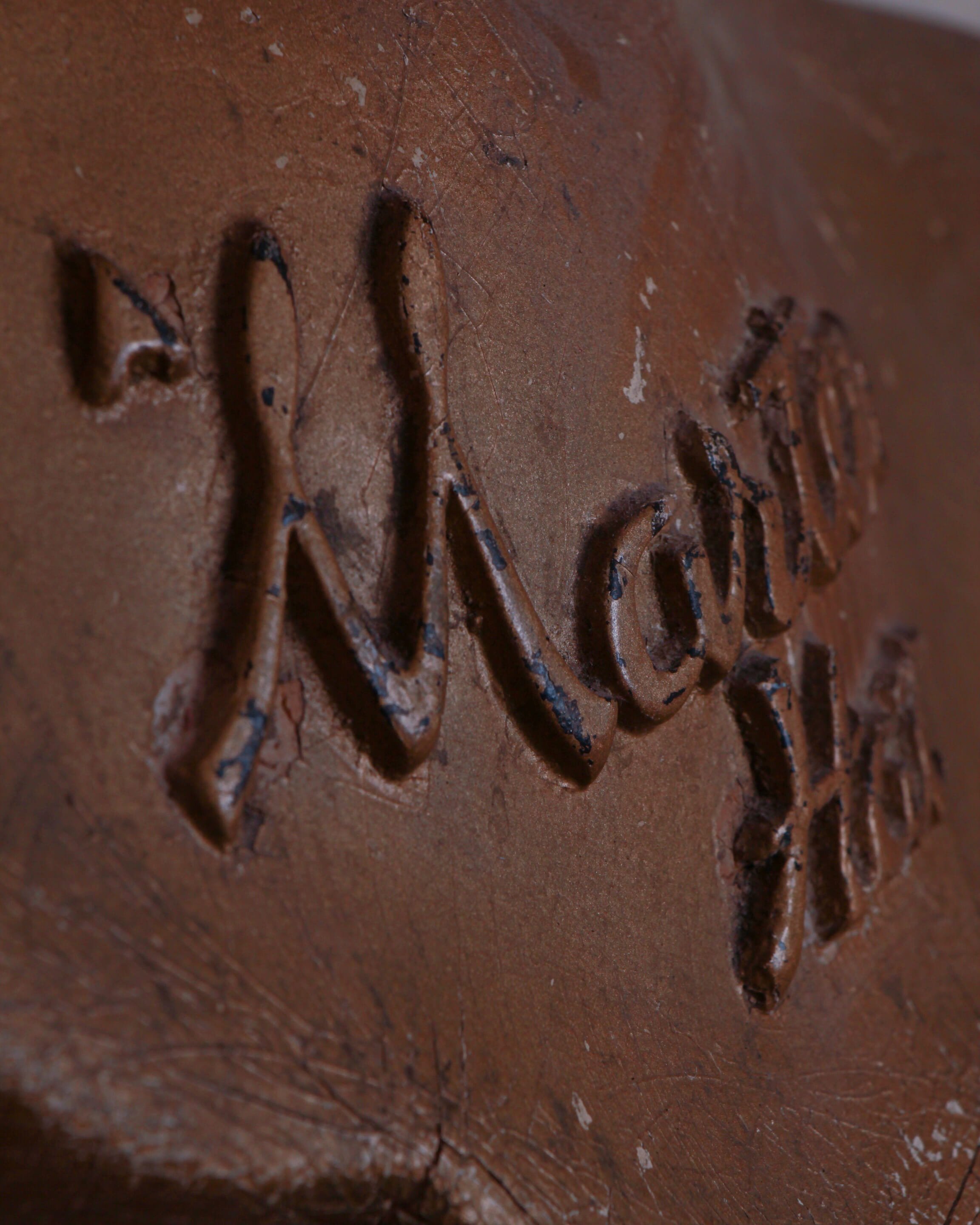
With its graceful proportions, softly modeled features, and elegant tilt of the head, this bust possesses a quiet confidence that feels unmistakably Art Deco. The stylized coiffure, elongated neck, and serene expression reflect the era's fascination with streamlined beauty and modern design. Across the chest, the raised "Marten Hat" lettering serves as a permanent reminder of its original purpose, transforming a utilitarian display piece into a surviving fragment of retail history.
What makes this example especially appealing is its honest surface. Layers of wear, scattered paint loss, craquelure, and countless scratches tell the story of decades spent in storefronts, stockrooms, and display windows. Traces of the original painted lips remain, while the rubbed finish and exposed underlayers create a depth and texture that simply cannot be replicated.
Even without a hat perched atop her head, the bust stands comfortably on its own as a decorative object. Viewed from any angle, the form is balanced and expressive, with the rear coiffure receiving as much attention as the front. It occupies that sweet spot where advertising, folk sculpture, and industrial design overlap.
Made of a composite material.
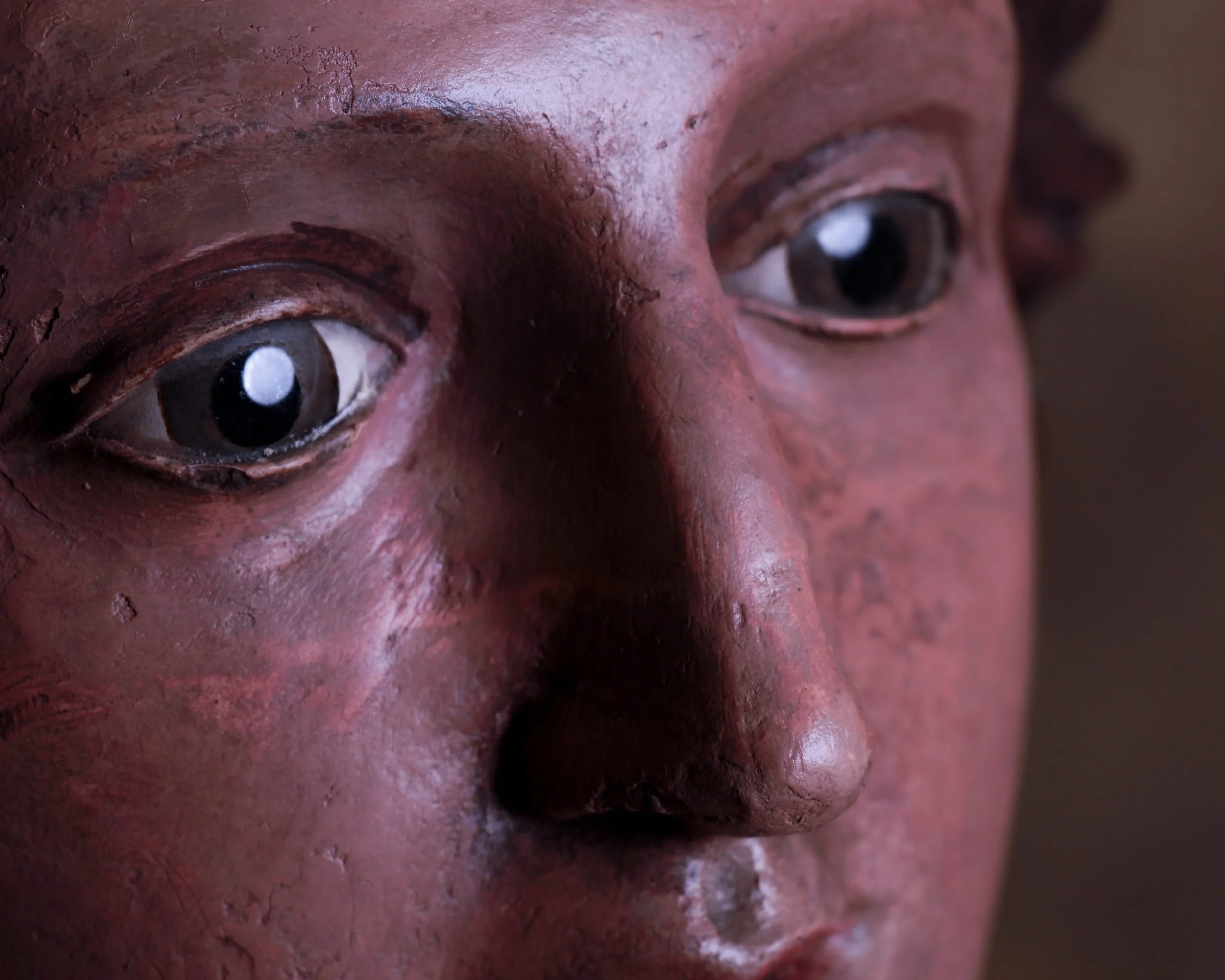
With her softly modeled features, flowing hair, and remarkably expressive glass eyes, this early 19th-century terracotta bust possesses the rare ability to hold a room without demanding attention. At first glance, she appears serene and composed. Spend a little more time with her, however, and the expression becomes harder to define. Curious, contemplative, perhaps even slightly amused. The ambiguity is part of the charm.
Hand-sculpted and painted more than two centuries ago, the bust retains a surface rich with age and character. The original polychrome finish has mellowed beautifully over time, developing a warm, earthy palette that complements the terracotta beneath. Fine craquelure, scattered losses, and areas of wear are not distractions but rather evidence of a long life well lived. They give the piece the kind of authenticity that simply cannot be manufactured.
The glass eyes are particularly captivating. Unlike many period sculptures whose gaze feels fixed or distant, these eyes create an immediate sense of presence. They catch the light, animate the face, and lend the bust an almost startling realism. It is easy to understand why religious and devotional figures of this period were often fitted with glass eyes; they transform sculpture into something that feels unexpectedly alive.
Mounted on a wonderfully primitive wooden base, the contrast between refined craftsmanship and rough-hewn support only adds to the appeal. The weathered block elevates the bust both literally and visually, creating a presentation that feels sculptural, balanced, and entirely honest.
Whether originally intended for a domestic altar, chapel setting, or devotional display, the piece now functions just as comfortably as a decorative object. It sits beautifully among folk art, religious artifacts, and classical sculpture alike.
Measuring 19 inches high overall, with the terracotta bust standing 11.5 inches high and resting on a 7.25-inch wooden base, this is a piece that rewards close inspection. The longer you look, the more personality emerges, which is perhaps why it remains so compelling after all these years.
Inspired by the miniature garment samples carried by traveling salesmen in the early 1900s, this limited-edition RRL collectible pays tribute to a nearly forgotten chapter of retail history. Before catalogs filled mailboxes and digital images filled screens, sales representatives relied on meticulously crafted miniature examples like this to showcase quality, construction, and style to shopkeepers across the country.
Rendered in sturdy Japanese duck canvas, this scaled-down pair of overalls is remarkably faithful to the full-size original. Every detail has been thoughtfully reproduced, from the rich workwear fabric and custom brass hardware to the rugged construction and signature Double RL branding. At 16 inches high and 9 inches wide, it manages to feel both substantial and delightfully compact.
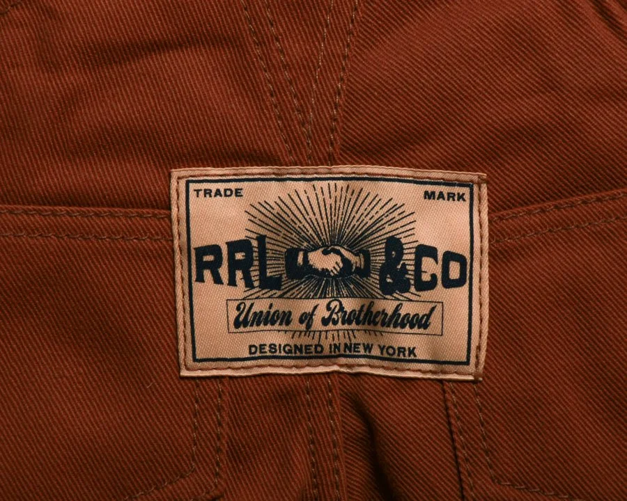
The overalls feature adjustable shoulder straps that fasten at the front with button closures, American-made metal buttons throughout, and buttoned openings at each side. A classic bib pocket anchors the chest, while two angled front pockets and two rear buttoned pockets complete the familiar workwear layout. The back is finished with a custom “RRL & Co.” label, reinforcing the piece’s authenticity and connection to the brand’s Roughwear line.
What makes this collectible especially appealing is the level of care devoted to details that many people might never notice. The stitching, proportions, hardware, and labels mirror the character of a garment built for hard work, even though this version was created purely for display. It is a miniature object with outsized personality.
Issued in a limited edition of just 200 examples, each piece is accompanied by a hand-numbered presentation box. The packaging itself feels like part of the story, echoing the graphics and typography of vintage wholesale merchandise.
Whether displayed alongside denim, workwear, advertising, or Americana collections, this salesman sample captures the craftsmanship, ingenuity, and visual appeal that made the originals such effective selling tools. It's a small piece of retail history that punches well above its weight.
Display stand included.
Circa first half 21st century.
Inspired by the miniature samples once carried from town to town by traveling salesmen, this limited-edition Double RL collectible captures the romance of early American merchandising in a form that fits neatly on a shelf rather than in a closet. Equal parts artifact, display piece, and denim obsession, it celebrates a time when sales representatives relied on scaled-down examples of their wares to secure orders from dry goods stores and outfitters across the country.
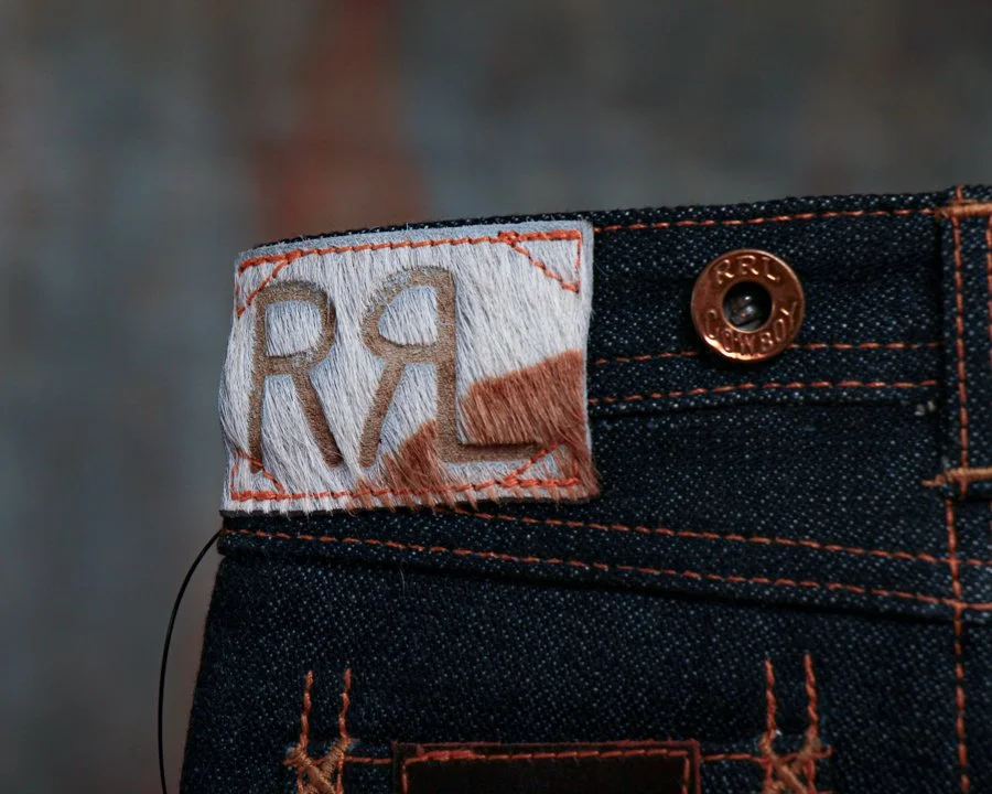
Crafted from exclusive 13 oz. Japanese selvedge denim, this miniature version mirrors the character and construction of its full-sized counterpart with remarkable attention to detail. From the copper-toned hardware and contrast stitching to the branded pocket label and waist patch, every element comes directly from the Double RL denim line. The result is a tiny pair of jeans with a surprising amount of presence.
The back waist features a hair-on-hide patch embossed with the iconic RRL logo, adding texture and authenticity to an already impressive piece. Even the graphics evoke the golden age of Western workwear advertising, with period-inspired typography and cowboy imagery that feel right at home in the Double RL universe.
What makes this example especially desirable is its limited production. Issued in an edition of just 125 pieces, each sample comes housed in a presentation box designed to resemble vintage denim packaging. A custom display stand is also included, allowing the piece to be exhibited as the collectible it was intended to be.
Whether you're a dedicated Double RL collector, a denim enthusiast, or simply someone who appreciates clever design and retail history, this miniature salesman sample hits a sweet spot. It has all the charm of an early 20th-century trade sample, filtered through Ralph Lauren's meticulous eye for craftsmanship and storytelling. Small in scale but big on detail, it's the kind of object that invites a second look and usually starts a conversation.
Circa first quarter 21st century.
Inspired by the miniature garment samples once carried by traveling salesmen in the early 1900s, this RRL collectible captures the romance of the road and the craftsmanship of vintage American workwear in a wonderfully scaled-down form. Equal parts advertising sample, folk object, and display piece, it feels like something that might have been tucked into a salesman’s case while making the rounds from general store to general store nearly a century ago.
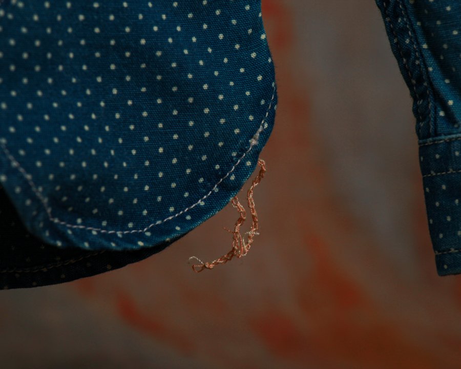
This miniature workshirt draws directly from Double RL’s celebrated shirting line and is constructed from richly textured Japanese indigo cloth. The deep blue fabric is accented with a subtle dotted pattern that recalls early calico and workwear textiles, while genuine mother-of-pearl buttons add a refined touch that contrasts beautifully with its utilitarian roots. The result is a piece that balances ruggedness and elegance with the ease that Double RL does so well.
What makes this collectible especially appealing is the level of authenticity packed into its small scale. The shirt features authentic runoff chain-stitched construction at the side seams, a detail borrowed from workshirts of the 1920s and 1930s. Those intentionally unfinished chain stitches, visible at the hem, are the sort of nuance vintage clothing enthusiasts spend years learning to recognize. Inside, muslin reinforcements further echo traditional garment-making techniques, demonstrating the same commitment to historical accuracy found in the brand’s full-sized garments.
Every seam, stitch, and proportion has been thoughtfully executed, from the sharply pointed collar to the twin chest pockets and curved shirttail hem. Rather than simply shrinking a shirt, Double RL created a miniature object that preserves the character and construction of the original.
Presented with its signature branded box and accompanied by a custom display stand, this piece was made to be admired. Whether displayed alongside vintage workwear, advertising memorabilia, or other Double RL collectibles, it is a conversation starter that rewards a closer look.
A small shirt with a surprisingly large story to tell.
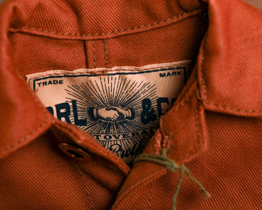
At first glance, it looks like a perfectly broken-in chore coat that might have spent decades hanging on a workshop peg. Then you notice the scale, and the charm of this remarkable Double RL collectible comes fully into focus.
Inspired by the miniature garment samples once carried by traveling salesmen in the early twentieth century, this limited-edition RRL Mini Chore Coat captures everything collectors love about classic American workwear in a beautifully reduced format. Though small in size, it loses none of the character of the original.
Constructed from substantial 12.75 oz. Japanese denim, the coat features a rich turquoise-indigo cast that gives the fabric depth and warmth. Its design draws heavily from work jackets of the early 1950s, an era when utility and durability were woven into every stitch. Double-needle construction reinforces the seams, while the tailored fit through the chest and waist mirrors the proportions of its full-sized counterpart. Even the denim has been sanforized to minimize shrinkage, reflecting the same attention to detail found in authentic RRL garments.
The details are especially satisfying. A classic point collar, buttoned front placket, long sleeves with buttoned cuffs, and three patch pockets create the unmistakable silhouette of a vintage chore coat. American-made metal buttons add another layer of authenticity, while the interior “RRL & Co” label serves as a reminder that this is more than a novelty piece. It is a carefully executed tribute to the craftsmanship and history that define the Double RL line.
Measuring roughly 11” high by 9” wide, the coat comes displayed on a custom stand and is accompanied by its original hand-numbered presentation box. Limited to just 200 examples, each piece occupies a fascinating space between fashion artifact, advertising sample, and collectible object.
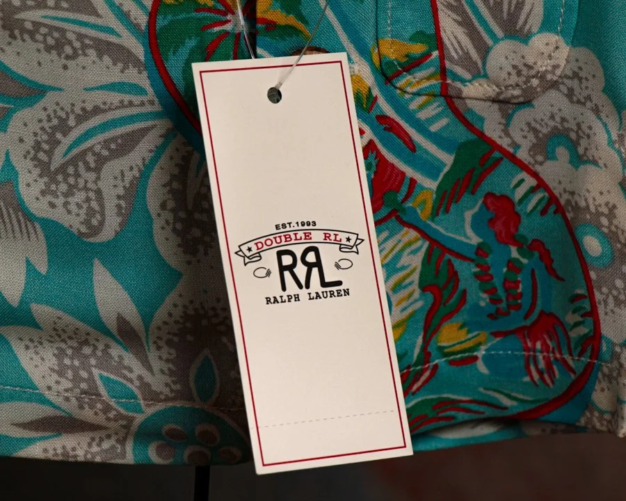
There’s a certain charm to this piece that’s hard to resist. At first glance, it looks like a child-sized Hawaiian shirt fresh from a beachside shop. Look a little closer and you realize it’s something much more unusual: a meticulously produced miniature collectible inspired by the scaled-down samples carried by traveling salesmen in the early 1900s.
Before sales reps hauled full inventories across the country, many relied on miniature versions of their products to demonstrate fabrics, construction, and design. This RRL collectible tips its hat to that tradition while celebrating one of the brand’s standout modern designs: the Tropical-Print Camp Shirt.
Executed in miniature but with remarkable attention to detail, the shirt faithfully reproduces the original garment’s relaxed island character. The pattern itself was inspired by a hand-painted Hawaiian shirt, and it shows. Large-scale tropical florals drift across a vivid turquoise ground, punctuated by bold red accents and layered botanical motifs. The result feels equal parts vintage Waikiki souvenir, mid-century resort wear, and artist’s sketchbook brought to life on cloth.
What makes this piece especially appealing is that Double RL treated it with the same seriousness as a full-sized garment. The proportions are carefully considered, the stitching is crisp, and even the coconut shell buttons have been faithfully incorporated. Rather than feeling like a novelty, it reads as a genuine object of craftsmanship, simply reduced in scale.
Presented on its custom display stand and accompanied by its original presentation box, the piece was issued as a limited edition of just 100 examples. The edition number is hand-stamped on the box, and this example is numbered 18 of 100, adding another layer of collectibility to an already scarce release.
Part advertising sample, part folk object, and part design study, it occupies a wonderfully unusual corner of the collecting world. Whether displayed alongside vintage Hawaiian shirts, Ralph Lauren ephemera, or Americana, it delivers exactly what the best miniatures do: all of the character, craftsmanship, and storytelling of the original, distilled into something delightfully small.
There is more to explore. Browse the full collection.
Frequently Asked Questions
-
New pieces are added to the collection as Humberto finds them. There is no fixed schedule. Stock arrives from estate sales, flea markets, antique fairs and private collections and is listed as soon as each piece has been assessed and photographed. Checking back regularly is the best way to catch new arrivals early.
-
The best way to stay informed about new arrivals is to sign up to the Heimwee newsletter. Subscribers are among the first to hear about fresh stock as it is added to the collection.
-
All pieces are available on a first come first served basis and cannot be held or reserved. Given that every piece in the collection is a genuine one of a kind antique, availability cannot be guaranteed once a piece has been listed.
-
New arrivals reflect the full scope of the Heimwee collection. Any category can appear including antique toys, vintage signs, antique advertising, antique objects and works of art. The collection is driven by what Humberto finds rather than by a predetermined buying plan, which means new arrivals are always varied and frequently unexpected.
PLEASE NOTE THIS ITEM WON’T SHIP TILL EARLY NOVEMBER
This mid-century Italian fireplace screen turns a purely practical object into something wonderfully theatrical. Made of brass and shaped as a large eagle with outstretched wings, it has a sculptural presence even when the fireplace isn’t in use. The eagle’s head, layered feather details, taloned feet, and broad wing outlines are all worked in relief, while the interior sections are filled with finely perforated metal mesh designed to catch sparks without blocking the glow of the fire. The warm, aged brass surface has developed a handsome patina that gives the piece plenty of depth without dulling the details.
Fireplace screens became increasingly decorative during the 19th and 20th centuries, especially as the hearth shifted from being a household necessity to more of an architectural focal point. By the mid-century period, Italian makers were particularly good at blending useful household objects with bold sculptural forms. Brass was a natural fit: durable, heat resistant, visually warm, and easy to cast or work into elaborate shapes.
Animal-form fireplace screens were part of that tradition, with peacocks, roosters, and eagles among the more dramatic designs. The eagle was especially effective because its spread wings naturally created the wide silhouette needed to cover a fireplace opening. It also gave makers a chance to add layers of feathering, relief work, and ornamental detail without losing the object’s function.
This example has a strong decorative quality, but it still reads clearly as a working fire screen rather than a purely sculptural piece. The perforated mesh, hinged wing sections, and freestanding feet all speak to its original purpose.
It’s the kind of mid-century Italian design that lands somewhere between furniture, decorative arts, and sculpture: practical enough to sit in front of a fire, but visually strong enough to hold its own anywhere in a room.