
Antique Advertising + Displays
Original antique advertising sourced from old collections and forgotten places. Every piece unique and one-of-a-kind.
Our collection of antique advertising brings together original commercial art and promotional material spanning the late nineteenth and early twentieth centuries. From antique lithograph signs and vintage brand signage to early printed promotional materials and antique advertisement posters, these pieces represent the visual language of an era when advertising was designed to last.
Vintage commercial art was produced for a wide range of industries including tobacco, food and drink, patent medicines, motor oil and household goods. Many pieces were created by commercial artists whose work was never credited, yet the quality of draughtsmanship, colour and composition stands alongside anything produced in a formal artistic context. Antique promotional material from this period reflects the sophistication of early commercial design at a time when every element was considered and every colour mixed by hand.
Early 20th century antique advertising marked a significant period in the development of visual communication. Lithograph signs and antique advertisement posters from this period were produced using printing techniques that gave them a richness and depth that modern reproduction cannot replicate. Original pieces carry the marks of their commercial lives, the fading and wear that comes from decades of public display.
Today antique advertising is collected for its graphic quality, historical significance and connection to a vanished commercial world. Each piece in the Heimwee collection is selected for its originality, visual character and the story it carries.
Advertising
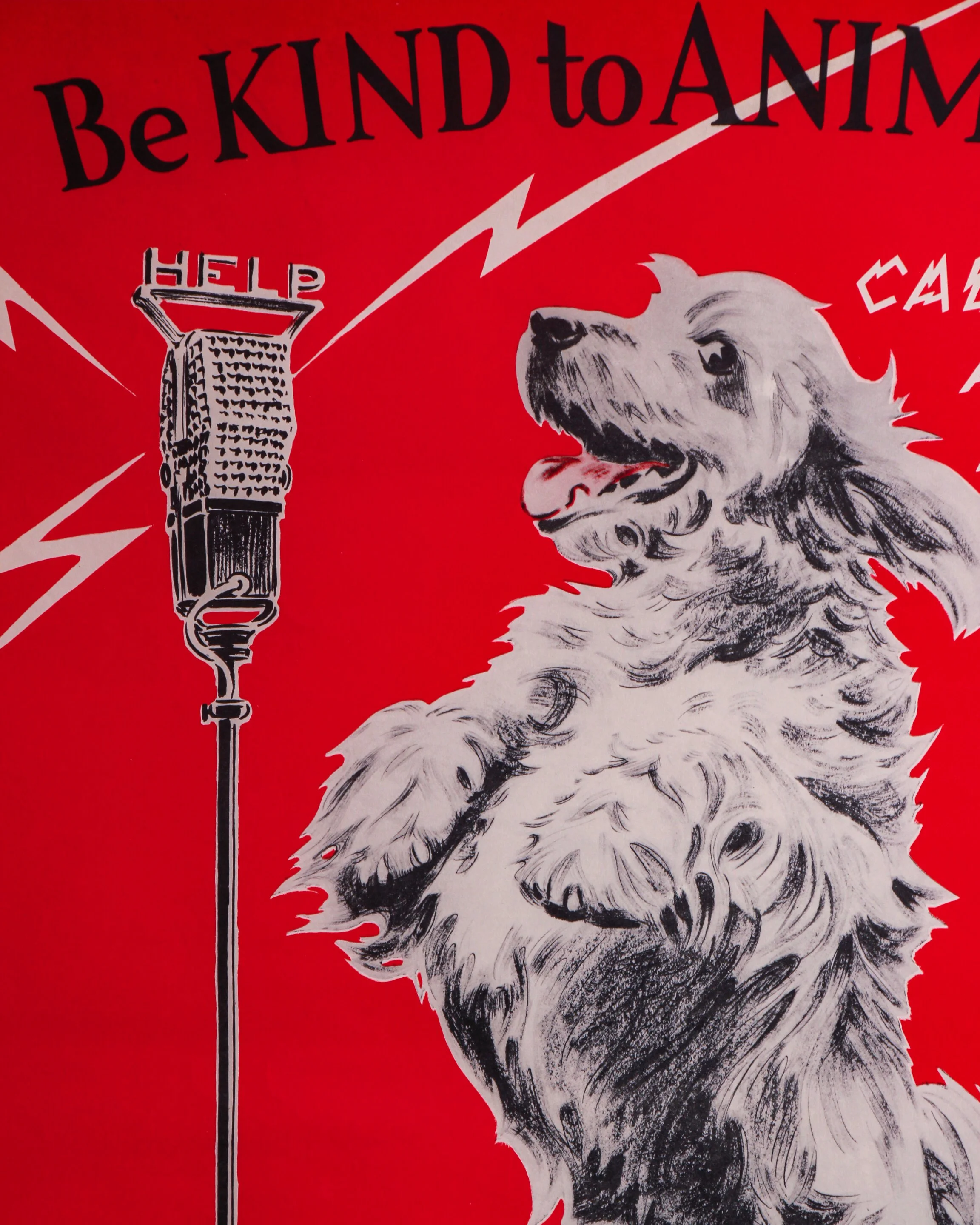
This original 1938 American Humane Association poster by Morgan Dennis has a wonderfully odd mix of sweetness, humor, and graphic punch. Against a vivid red background, a shaggy dog stands upright before an old-fashioned microphone beneath the message “Be KIND to ANIMALS,” while jagged lettering announces that he is “CALLING ALL HUMANS.” Lightning-bolt graphics radiating from the microphone give the whole thing the feel of an urgent radio broadcast, which makes the earnest message surprisingly playful.
The illustration is signed Morgan Dennis and the lower margin is marked “© 1938 A.H.A.,” along with “Published by the American Humane Association, Albany, New York” and “Litho’d in U.S.A.” Measuring 21 3/4 by 16 3/4 inches, the poster shows some expected age and handling to the paper, including light toning and scattered spotting, but the colors remain remarkably strong. It is displayed in a custom wood frame with Tru Vue Optium Museum Acrylic for high clarity and added protection.
Morgan Dennis (1892–1960) was an American illustrator particularly known for his drawings of dogs. Working during the golden age of American magazine and advertising illustration, he developed an easygoing, immediately recognizable style that gave dogs distinctly individual personalities without turning them completely into cartoons.
Humane organizations had been using posters, school programs, pamphlets, and public campaigns since the late 19th century to encourage better treatment of animals. By the 1930s, these messages increasingly borrowed the visual language of commercial advertising: bold colors, memorable slogans, humor, and illustrations designed to stop people in their tracks.
The American Humane Association, founded in 1877, was an important part of that movement. Posters like this were meant to make animal welfare approachable rather than grim. Dennis was particularly well suited to the job. His dog doesn’t lecture the viewer. Instead, he looks as though he has commandeered the radio station for one very important announcement.
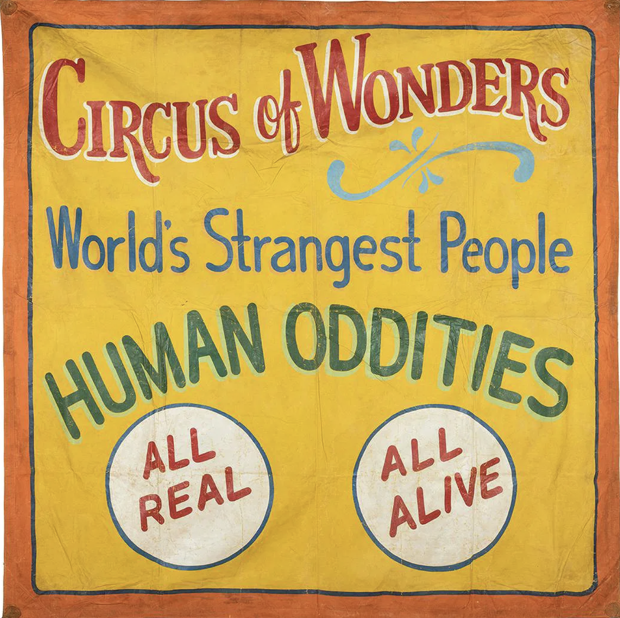
This large hand-painted canvas sideshow banner has everything you want from old carnival advertising: huge lettering, loud color, slightly wonky handwork, and absolutely no subtlety about getting your attention. Against a warm yellow field bordered in orange and blue, it announces “Circus of Wonders,” followed by “World’s Strangest People” and the wonderfully direct “HUMAN ODDITIES.” Two large white medallions at the bottom promise “ALL REAL” and “ALL ALIVE.”
The lettering is especially good. Red, blue, green, white, and pale turquoise are layered to create shadows and depth, while a loose decorative flourish breaks up the typography. Up close, you can see the painter’s hand everywhere: uneven outlines, brush marks, shifts in spacing, and small inconsistencies that give the banner considerably more personality than mechanically printed advertising ever could. The canvas shows expected wear from use and storage, including creases, scattered losses, rubbing, staining, and general surface aging.
Sideshow banners like this were essentially giant roadside sales pitches. Hung across entrances and midway façades, they had only a few seconds to stop someone walking past, so painters relied on enormous lettering, saturated colors, sensational language, and bold imagery. Tampa, Florida became an important center for this work during the mid-20th century, home to banner painters and commercial shops supplying traveling carnivals throughout the country.
This example is unsigned, so a firm attribution would be difficult. Stylistically, however, it fits comfortably within the Tampa banner-painting tradition associated with Snap Wyatt, Jack Cripe, and Sigler & Sons Art Service. Both Wyatt and Cripe worked in the Tampa sideshow world, while Sigler’s shop produced banners for traveling shows on a commercial scale.
Whether painted by one of those recognizable hands or another artist working within the same circle, it survives as a terrific piece of American carnival history, made to shout across a crowded midway and still doing a pretty good job of it.
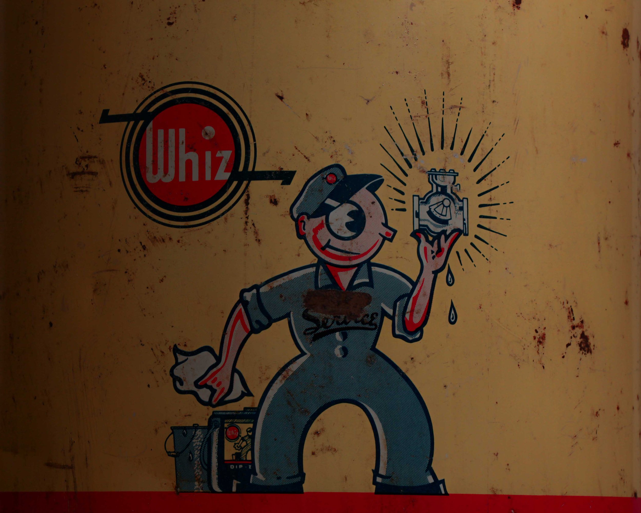
This vintage Whiz Dip-Zof parts-cleaner can is a great piece of old garage advertising, with bold graphics and exactly the kind of honest wear you want to see on something that spent its life around tools, grease, and machinery. The large metal can has a cream and dark navy body separated by a red stripe, a red lid, and its original wire carrying handle with a turned wooden grip.
The front features the Whiz logo alongside a terrific cartoon mechanic proudly holding up a freshly cleaned carburetor, as if it were a shiny jewel. Below, oversized white lettering reads “DIP-ZOF,” followed by its intended use: cleaning small parts, carburetors, fuel pumps, and similar components. The back retains its detailed instruction label from The R. M. Hollingshead Co. of Canada Ltd. The surface has scratches, stains, small areas of paint loss, oxidation, and general workshop wear throughout.
Whiz automotive products have a surprisingly long history. The R. M. Hollingshead Company of Camden, New Jersey was already selling Whiz-branded automobile cleaners and lubricants by 1911, when a Whiz product catalog was published. By the 1920s the company was advertising Whiz automobile specialties nationally, and its range eventually included cleaners, polishes, lubricants, rust preventatives, cooling-system products, and other garage chemicals.
The company formally registered versions of the Whiz trademark during the 1930s for automotive chemicals and lubricating products. Products like Dip-Zof belonged to an era when service stations and repair shops routinely kept large reusable cans of solvent nearby for soaking carburetors and greasy mechanical parts.
Today the cartoon mechanic, strong typography, and wonderfully utilitarian graphics make the can as much an advertising piece as a piece of garage equipment. The years of grime and handling only make that connection to its working life more convincing.
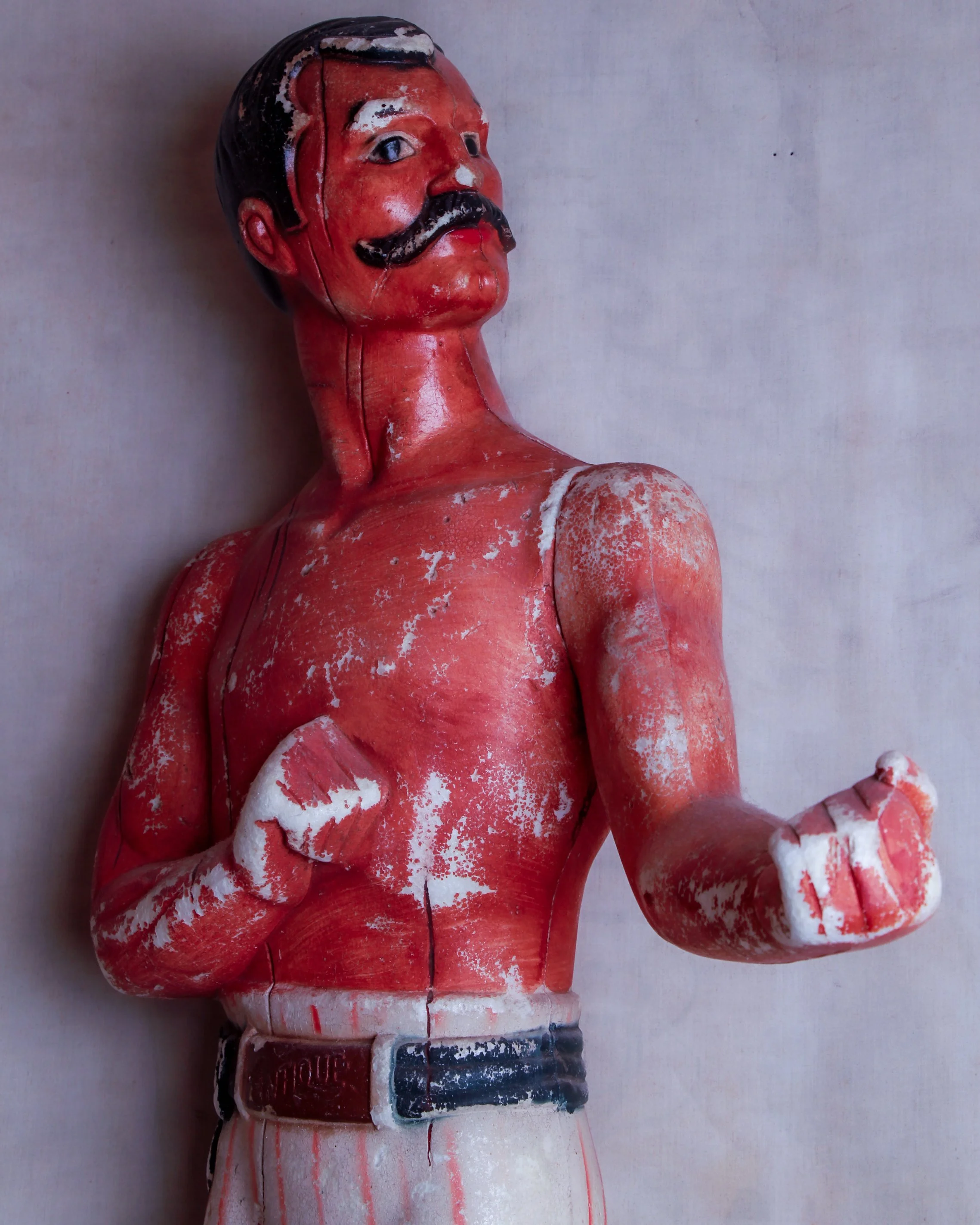
This large vintage advertising figure depicts a mustachioed pugilist posed with both fists raised, ready for a bout. Made from a dense, hard foam material and hand-painted, the figure has a wonderfully direct, almost theatrical quality. He wears white trousers with red vertical stripes, black boots, a dark belt, and a small raised panel at the waist marked “ANTIQUE.” His bright red torso, slick black hair, curled mustache, and exaggerated stance give him the look of an old-time strongman or bare-knuckle fighter.
The surface shows plenty of age, with scattered paint loss, cracking, rubbing, and areas where the lighter material underneath is exposed. The wear gives the piece a terrific, timeworn surface rather than making it feel overly pristine. The left arm is removable, likely part of the original construction or assembly method, and fits into the shoulder joint.
Its exact advertising purpose is unclear, but figures like this were commonly used as attention-grabbing displays in bars, liquor stores, tobacconists, sporting-goods shops, fairs, and other retail settings. Boxing imagery was especially effective because it instantly suggested strength, toughness, masculinity, and competition. Breweries, whiskey brands, cigar companies, and patent-medicine makers all borrowed from the visual language of prizefighting at various points.
From the late 19th century well into the 20th, life-size and oversized advertising figures became a familiar part of storefront culture. Earlier examples were often carved from wood or molded from plaster, while later manufacturers turned to lighter materials such as composition, fiberglass, and expanded foams that were easier to move and manufacture.
Whether this fellow once promoted alcohol, tobacco, or something entirely different, he has exactly what a good advertising figure needed: personality from across the room. The battered paint, exaggerated anatomy, and slightly stern expression only make him more interesting today.
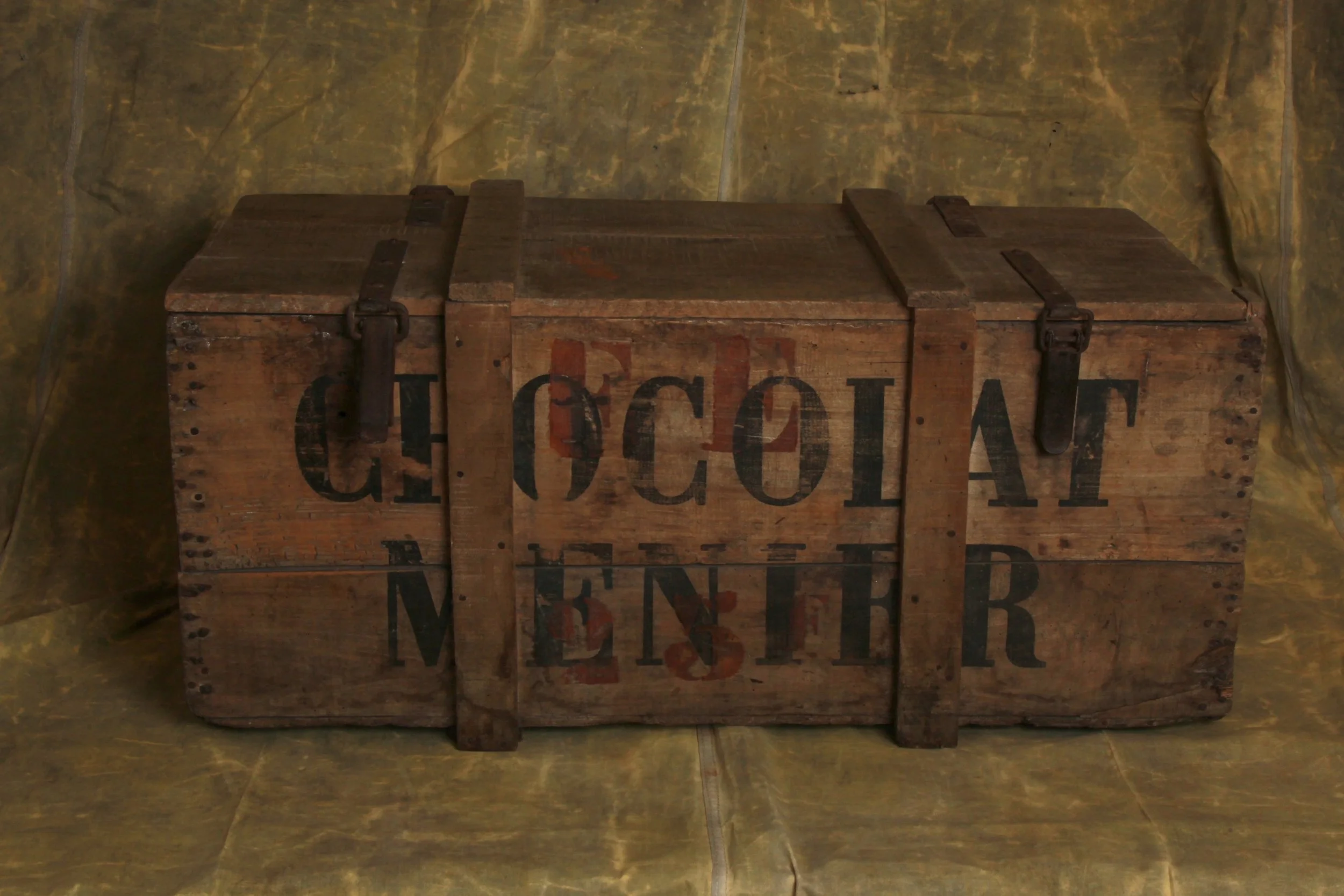
This antique wooden Chocolat Menier shipping crate is a great piece of old French advertising, combining wonderfully bold graphics with the straightforward, no-nonsense construction of a working transport box. It measures approximately 37.4" wide x 19.9" high x 15.2" deep.
The crate is constructed from thick wooden boards with reinforced vertical battens running across the front, back, and lid. Two original metal straps and buckles secure the top, giving the box an especially rugged, well-traveled appearance. The hinged lid opens to reveal a large, uncomplicated storage compartment, with the raw interior boards showing plenty of age and use.
What really makes the piece is the typography. “CHOCOLAT MENIER” is boldly stenciled across both long sides in oversized black lettering, with traces of additional red painted markings still visible underneath and between the letters. The graphics are worn and faded in places, but remain strong and easy to read.
Chocolat Menier was one of France’s most important and recognizable chocolate makers, with a history stretching back to the early 19th century. The company was founded in 1816 by Jean Antoine Brutus Menier, originally producing pharmaceutical powders before chocolate gradually became the main focus of the business.
By the second half of the 1800s, Menier had grown into a major chocolate manufacturer, operating from its famous factory at Noisiel, just outside Paris. The company was especially good at branding, and its name became a familiar sight on posters, shop signs, tins, crates, and packaging throughout France and beyond.
One of Menier’s best-known images was the little girl writing the company name on a wall, an advertising graphic that became closely associated with the brand.
Today, antique Chocolat Menier advertising and packaging is collected for its strong typography, French commercial history, and instantly recognizable graphics. Pieces such as wooden shipping crates are especially appealing because they combine advertising with genuine everyday use.
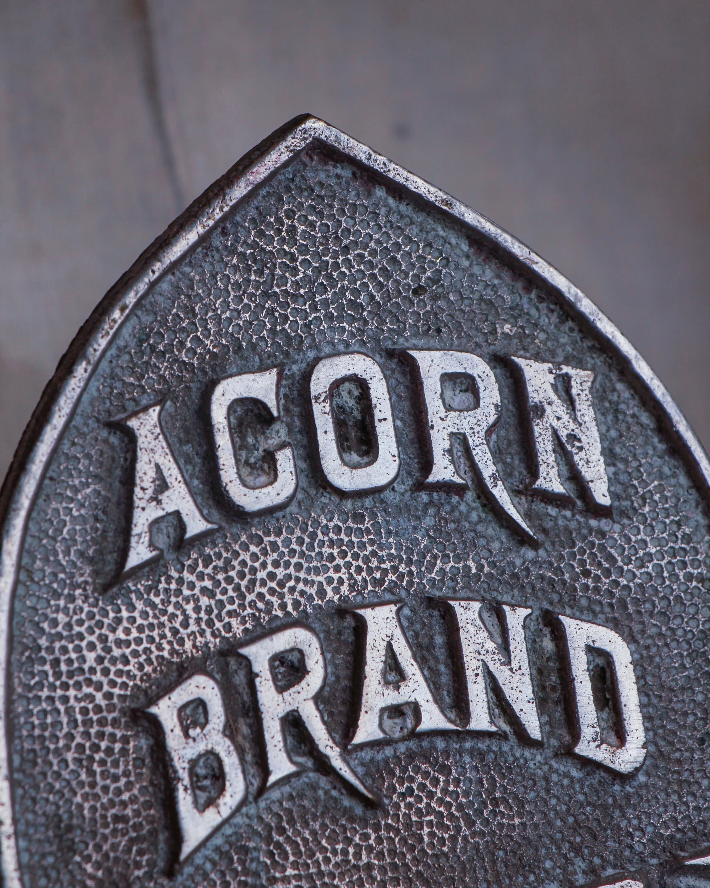
This antique Acorn Brand display rack has a great industrial look and an unusually sculptural shape that makes it interesting even before you figure out what it was originally meant to hold. Made primarily from bent metal rod, the frame rises from a weighted circular base and forms a broad, almost bell-shaped outline, with a series of small metal clips or hooks spaced around the perimeter.
At the center is the best detail: a cast metal emblem in the shape of an acorn, boldly marked “ACORN BRAND” in raised lettering. The lower half of the emblem has a crosshatched pattern that gives it a little extra texture and makes the branding feel surprisingly decorative for what was likely a practical store or commercial fixture.
The rack has a wonderfully spare construction. There is no unnecessary ornament beyond the logo, just the curved metal framework, functional fittings, and central support. The clips are attached individually along the frame and appear designed to suspend or display a number of small items at once. Exactly what Acorn Brand used this particular rack to merchandise would require a little more research, but it has all the hallmarks of an early retail display piece.
Age has given the metal a mellow, darkened surface with scattered oxidation, wear, and discoloration throughout. Nothing feels overly polished or restored, and that untouched character is a big part of its appeal. The wear is consistent with years of practical use.
Beyond its original purpose, it works beautifully today as an unusual wall or tabletop display for small objects, photographs, tags, jewelry, or other collections. There is something especially satisfying about an old commercial fixture surviving long after the products it once displayed have disappeared. Simple, graphic, and a little mysterious, it is the kind of utilitarian object that has become unexpectedly decorative with time.
Few advertising displays capture the spirit of early twentieth-century retail quite like this Marten Hat Company display bust. Produced circa 1930s, it was designed to do a simple job: showcase a fashionable hat in a shop window or department store. Nearly a century later, it has become something far more interesting than the merchandise it once promoted.
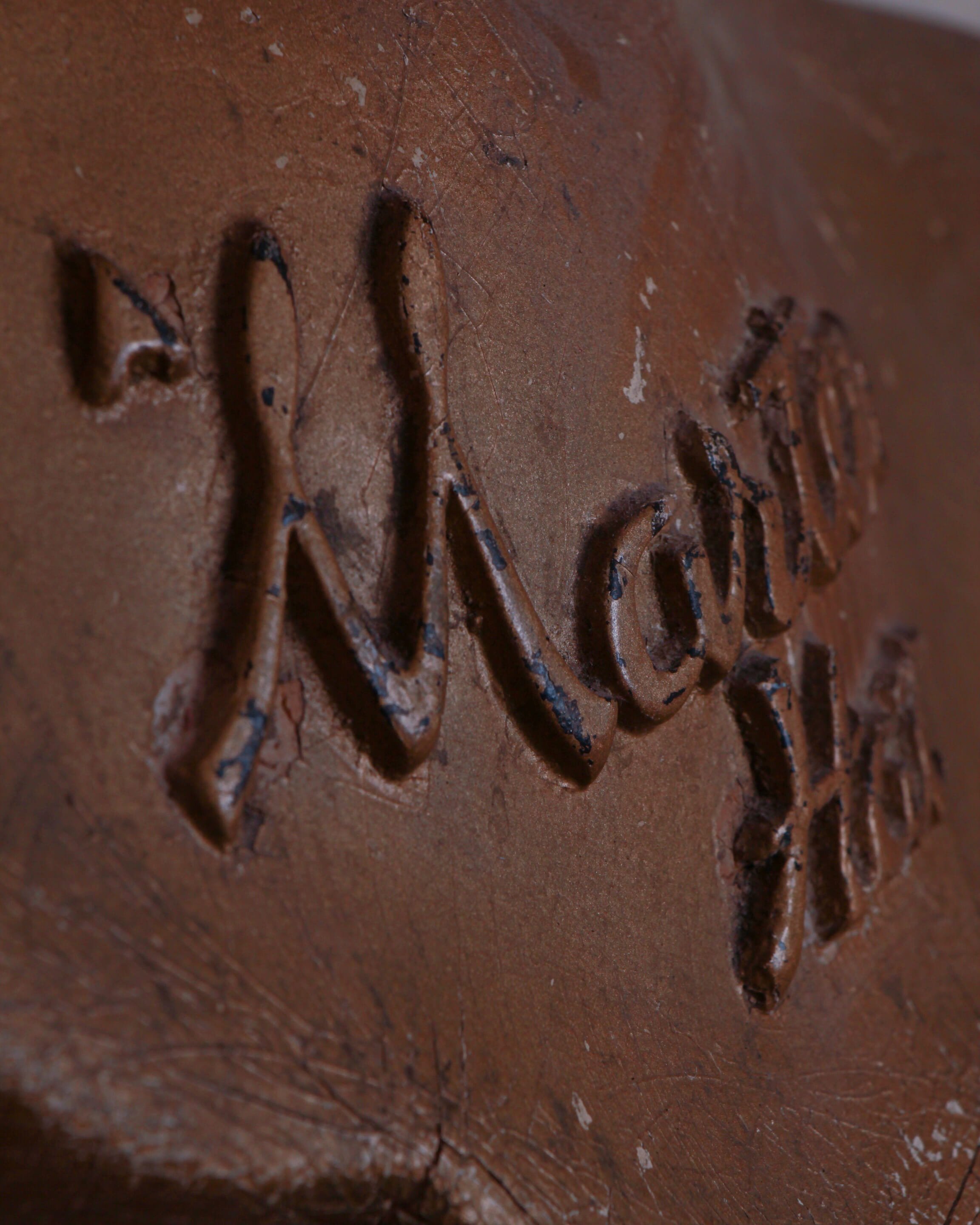
With its graceful proportions, softly modeled features, and elegant tilt of the head, this bust possesses a quiet confidence that feels unmistakably Art Deco. The stylized coiffure, elongated neck, and serene expression reflect the era's fascination with streamlined beauty and modern design. Across the chest, the raised "Marten Hat" lettering serves as a permanent reminder of its original purpose, transforming a utilitarian display piece into a surviving fragment of retail history.
What makes this example especially appealing is its honest surface. Layers of wear, scattered paint loss, craquelure, and countless scratches tell the story of decades spent in storefronts, stockrooms, and display windows. Traces of the original painted lips remain, while the rubbed finish and exposed underlayers create a depth and texture that simply cannot be replicated.
Even without a hat perched atop her head, the bust stands comfortably on its own as a decorative object. Viewed from any angle, the form is balanced and expressive, with the rear coiffure receiving as much attention as the front. It occupies that sweet spot where advertising, folk sculpture, and industrial design overlap.
Made of a composite material.
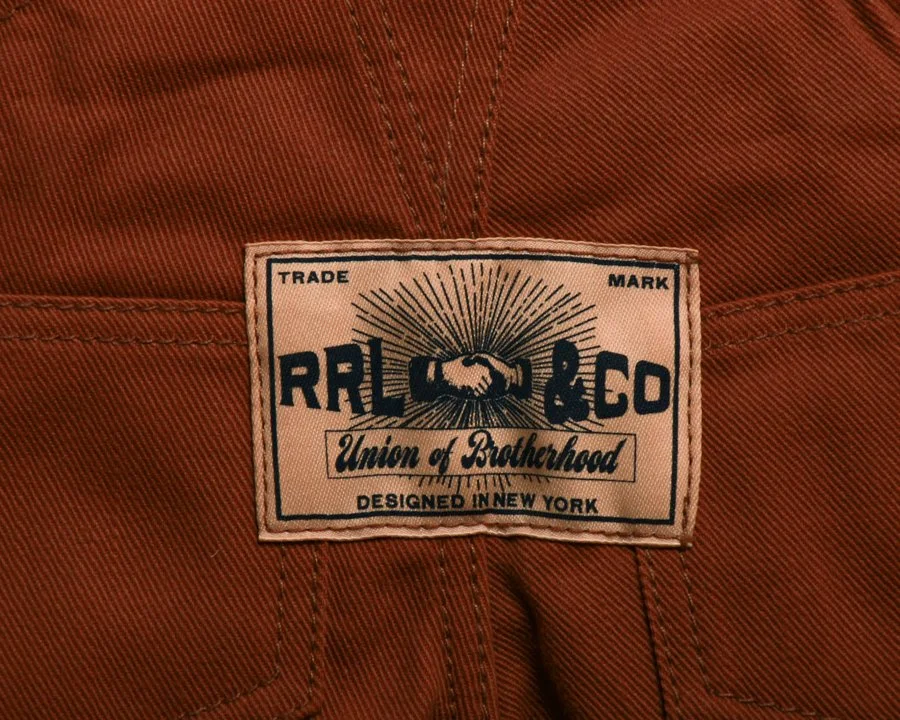
Inspired by the miniature garment samples carried by traveling salesmen in the early 1900s, this limited-edition RRL collectible pays tribute to a nearly forgotten chapter of retail history. Before catalogs filled mailboxes and digital images filled screens, sales representatives relied on meticulously crafted miniature examples like this to showcase quality, construction, and style to shopkeepers across the country.
Rendered in sturdy Japanese duck canvas, this scaled-down pair of overalls is remarkably faithful to the full-size original. Every detail has been thoughtfully reproduced, from the rich workwear fabric and custom brass hardware to the rugged construction and signature Double RL branding. At 16 inches high and 9 inches wide, it manages to feel both substantial and delightfully compact.
The overalls feature adjustable shoulder straps that fasten at the front with button closures, American-made metal buttons throughout, and buttoned openings at each side. A classic bib pocket anchors the chest, while two angled front pockets and two rear buttoned pockets complete the familiar workwear layout. The back is finished with a custom “RRL & Co.” label, reinforcing the piece’s authenticity and connection to the brand’s Roughwear line.
What makes this collectible especially appealing is the level of care devoted to details that many people might never notice. The stitching, proportions, hardware, and labels mirror the character of a garment built for hard work, even though this version was created purely for display. It is a miniature object with outsized personality.
Issued in a limited edition of just 200 examples, each piece is accompanied by a hand-numbered presentation box. The packaging itself feels like part of the story, echoing the graphics and typography of vintage wholesale merchandise.
Whether displayed alongside denim, workwear, advertising, or Americana collections, this salesman sample captures the craftsmanship, ingenuity, and visual appeal that made the originals such effective selling tools. It's a small piece of retail history that punches well above its weight.
Display stand included.
Circa first half 21st century.
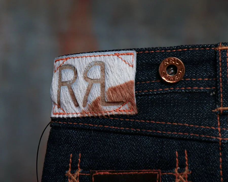
Inspired by the miniature samples once carried from town to town by traveling salesmen, this limited-edition Double RL collectible captures the romance of early American merchandising in a form that fits neatly on a shelf rather than in a closet. Equal parts artifact, display piece, and denim obsession, it celebrates a time when sales representatives relied on scaled-down examples of their wares to secure orders from dry goods stores and outfitters across the country.
Crafted from exclusive 13 oz. Japanese selvedge denim, this miniature version mirrors the character and construction of its full-sized counterpart with remarkable attention to detail. From the copper-toned hardware and contrast stitching to the branded pocket label and waist patch, every element comes directly from the Double RL denim line. The result is a tiny pair of jeans with a surprising amount of presence.
The back waist features a hair-on-hide patch embossed with the iconic RRL logo, adding texture and authenticity to an already impressive piece. Even the graphics evoke the golden age of Western workwear advertising, with period-inspired typography and cowboy imagery that feel right at home in the Double RL universe.
What makes this example especially desirable is its limited production. Issued in an edition of just 125 pieces, each sample comes housed in a presentation box designed to resemble vintage denim packaging. A custom display stand is also included, allowing the piece to be exhibited as the collectible it was intended to be.
Whether you're a dedicated Double RL collector, a denim enthusiast, or simply someone who appreciates clever design and retail history, this miniature salesman sample hits a sweet spot. It has all the charm of an early 20th-century trade sample, filtered through Ralph Lauren's meticulous eye for craftsmanship and storytelling. Small in scale but big on detail, it's the kind of object that invites a second look and usually starts a conversation.
Circa first quarter 21st century.
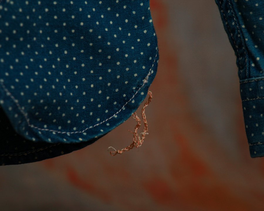
Inspired by the miniature garment samples once carried by traveling salesmen in the early 1900s, this RRL collectible captures the romance of the road and the craftsmanship of vintage American workwear in a wonderfully scaled-down form. Equal parts advertising sample, folk object, and display piece, it feels like something that might have been tucked into a salesman’s case while making the rounds from general store to general store nearly a century ago.
This miniature workshirt draws directly from Double RL’s celebrated shirting line and is constructed from richly textured Japanese indigo cloth. The deep blue fabric is accented with a subtle dotted pattern that recalls early calico and workwear textiles, while genuine mother-of-pearl buttons add a refined touch that contrasts beautifully with its utilitarian roots. The result is a piece that balances ruggedness and elegance with the ease that Double RL does so well.
What makes this collectible especially appealing is the level of authenticity packed into its small scale. The shirt features authentic runoff chain-stitched construction at the side seams, a detail borrowed from workshirts of the 1920s and 1930s. Those intentionally unfinished chain stitches, visible at the hem, are the sort of nuance vintage clothing enthusiasts spend years learning to recognize. Inside, muslin reinforcements further echo traditional garment-making techniques, demonstrating the same commitment to historical accuracy found in the brand’s full-sized garments.
Every seam, stitch, and proportion has been thoughtfully executed, from the sharply pointed collar to the twin chest pockets and curved shirttail hem. Rather than simply shrinking a shirt, Double RL created a miniature object that preserves the character and construction of the original.
Presented with its signature branded box and accompanied by a custom display stand, this piece was made to be admired. Whether displayed alongside vintage workwear, advertising memorabilia, or other Double RL collectibles, it is a conversation starter that rewards a closer look.
A small shirt with a surprisingly large story to tell.
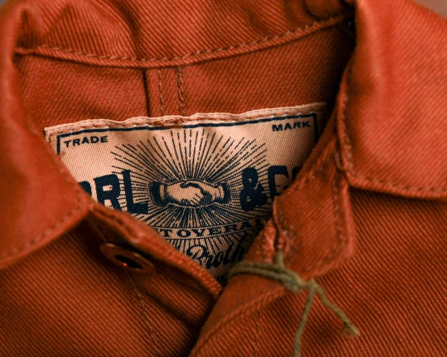
At first glance, it looks like a perfectly broken-in chore coat that might have spent decades hanging on a workshop peg. Then you notice the scale, and the charm of this remarkable Double RL collectible comes fully into focus.
Inspired by the miniature garment samples once carried by traveling salesmen in the early twentieth century, this limited-edition RRL Mini Chore Coat captures everything collectors love about classic American workwear in a beautifully reduced format. Though small in size, it loses none of the character of the original.
Constructed from substantial 12.75 oz. Japanese denim, the coat features a rich turquoise-indigo cast that gives the fabric depth and warmth. Its design draws heavily from work jackets of the early 1950s, an era when utility and durability were woven into every stitch. Double-needle construction reinforces the seams, while the tailored fit through the chest and waist mirrors the proportions of its full-sized counterpart. Even the denim has been sanforized to minimize shrinkage, reflecting the same attention to detail found in authentic RRL garments.
The details are especially satisfying. A classic point collar, buttoned front placket, long sleeves with buttoned cuffs, and three patch pockets create the unmistakable silhouette of a vintage chore coat. American-made metal buttons add another layer of authenticity, while the interior “RRL & Co” label serves as a reminder that this is more than a novelty piece. It is a carefully executed tribute to the craftsmanship and history that define the Double RL line.
Measuring roughly 11” high by 9” wide, the coat comes displayed on a custom stand and is accompanied by its original hand-numbered presentation box. Limited to just 200 examples, each piece occupies a fascinating space between fashion artifact, advertising sample, and collectible object.
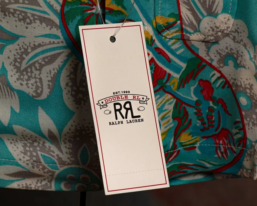
There’s a certain charm to this piece that’s hard to resist. At first glance, it looks like a child-sized Hawaiian shirt fresh from a beachside shop. Look a little closer and you realize it’s something much more unusual: a meticulously produced miniature collectible inspired by the scaled-down samples carried by traveling salesmen in the early 1900s.
Before sales reps hauled full inventories across the country, many relied on miniature versions of their products to demonstrate fabrics, construction, and design. This RRL collectible tips its hat to that tradition while celebrating one of the brand’s standout modern designs: the Tropical-Print Camp Shirt.
Executed in miniature but with remarkable attention to detail, the shirt faithfully reproduces the original garment’s relaxed island character. The pattern itself was inspired by a hand-painted Hawaiian shirt, and it shows. Large-scale tropical florals drift across a vivid turquoise ground, punctuated by bold red accents and layered botanical motifs. The result feels equal parts vintage Waikiki souvenir, mid-century resort wear, and artist’s sketchbook brought to life on cloth.
What makes this piece especially appealing is that Double RL treated it with the same seriousness as a full-sized garment. The proportions are carefully considered, the stitching is crisp, and even the coconut shell buttons have been faithfully incorporated. Rather than feeling like a novelty, it reads as a genuine object of craftsmanship, simply reduced in scale.
Presented on its custom display stand and accompanied by its original presentation box, the piece was issued as a limited edition of just 100 examples. The edition number is hand-stamped on the box, and this example is numbered 18 of 100, adding another layer of collectibility to an already scarce release.
Part advertising sample, part folk object, and part design study, it occupies a wonderfully unusual corner of the collecting world. Whether displayed alongside vintage Hawaiian shirts, Ralph Lauren ephemera, or Americana, it delivers exactly what the best miniatures do: all of the character, craftsmanship, and storytelling of the original, distilled into something delightfully small.
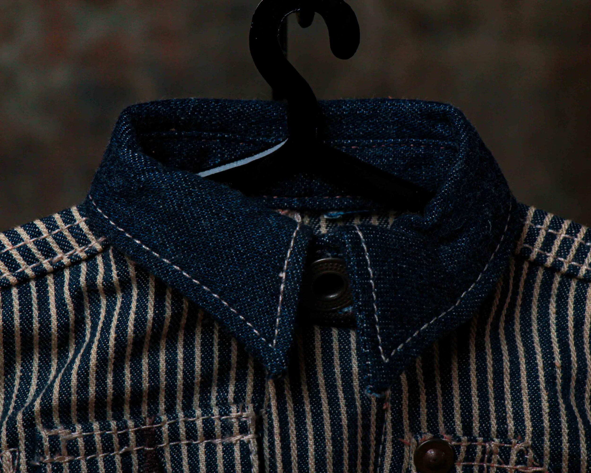
Miniature set of railroad-striped workwear, built with the same seriousness and attention to detail as the full-sized garments that inspired it. At first glance it looks like a child’s coverall, but it’s actually a collectible rooted in a much older tradition: the miniature samples carried by travelling salesmen in the early 1900s. Before catalogs were common and before buyers could browse products online, sales representatives often arrived with scaled-down versions of their wares, giving customers a tactile preview of materials, construction, and style.
This example comes from Ralph Lauren’s Double RL line, a brand known for its deep appreciation of American workwear and frontier history. Produced in a limited edition of just 191 examples, it faithfully recreates the details of a classic railroad-era coverall in miniature form.
The fabric alone is worth a closer look. Constructed from indigo-dyed washed cotton twill with a traditional hickory-stripe pattern, it carries all the visual appeal of vintage workwear. The Japanese indigo cloth collar, cuffs, and waistband provide subtle contrast, while the true indigo dye gives the piece the same character and aging potential as its full-sized counterpart. As with vintage denim, some color transfer is possible.
What really makes it shine are the details. A straight collar with buttoned throat latch, concealed button placket, metal hardware, buttoned side adjusters, chest pockets, hammer loop, tool pocket, reinforced knees, and five-pocket styling have all been scaled down with remarkable precision. Even the interior retains its “RRL Union-RLs” label.
Measuring 12.8 inches high by 7 inches wide, it occupies that sweet spot between collectible and design piece. Displayed on its custom stand (included) and accompanied by its original signature presentation box, it feels less like merchandise and more like a tiny monument to American workwear. A small object, certainly, but one with an outsized amount of charm.
Circa first quarter 21st century.
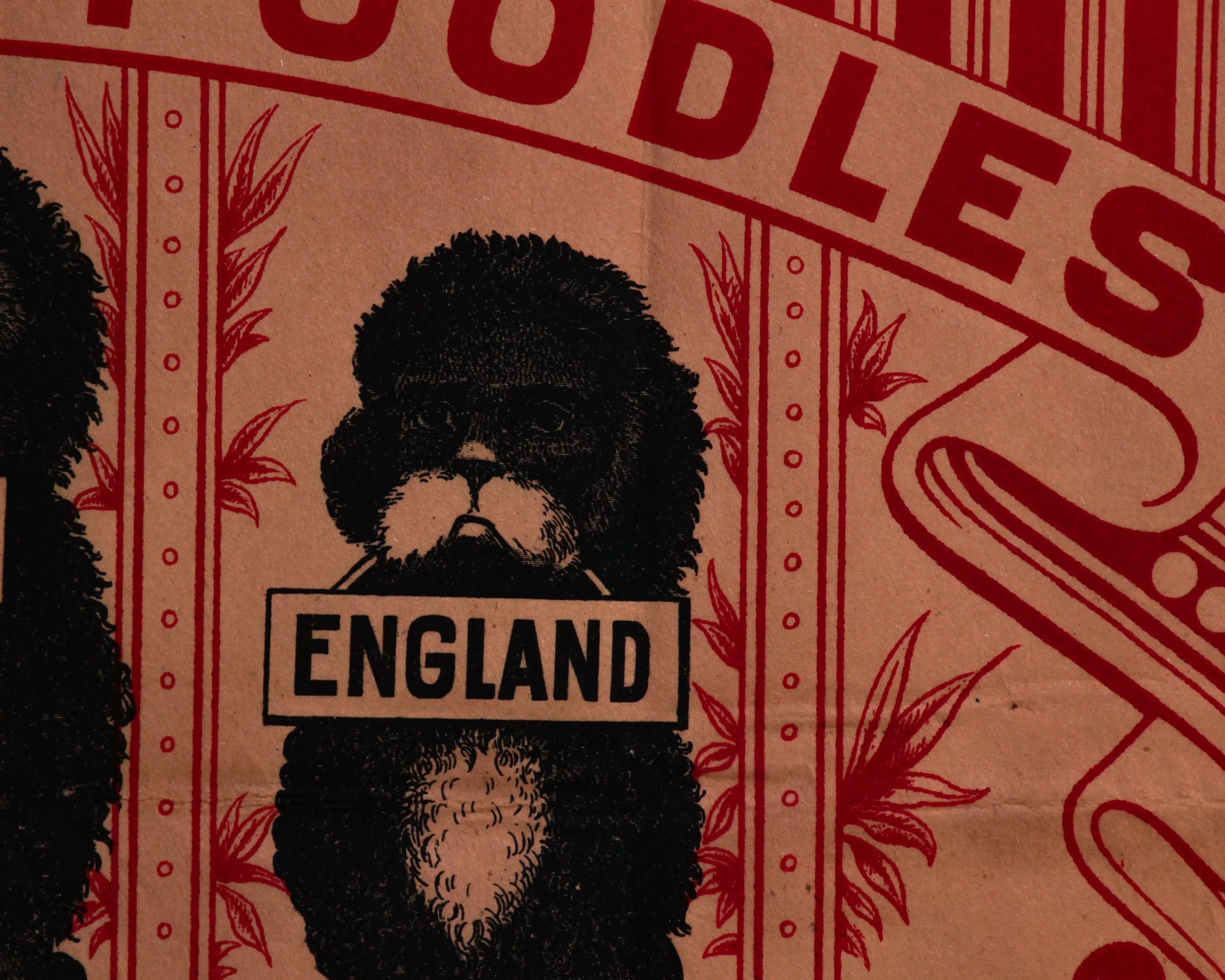
Somewhere between advertising ephemera and outright absurdity sits this fantastic early 20th century crate label for Three Poodles matches, printed in England and impossible to ignore once you’ve seen it. Three black poodles stand shoulder to shoulder like a slightly untrustworthy vocal trio, each holding a placard that together spells out “Made in England.” It’s equal parts formal branding and deadpan comedy, which is exactly why it works so well now.
Originally created as a shipping label for crates of “Impregnated Safety Match” products, the design leans heavily into the bold graphic language that made early commercial printing so effective. Strong reds, dense blacks, looping Art Nouveau-inspired flourishes, striped borders, decorative geometry, all packed into a composition that somehow manages to feel both elegant and delightfully over-the-top. The typography practically shouts at you, while the poodles remain perfectly composed in the middle of the chaos, as if this sort of thing happens every day.
And honestly, the poodles are the whole show. Their shaggy silhouettes are rendered with surprising personality, especially the one on the right with the white chest and slightly judgmental expression. They don’t look cute in the modern cartoon sense. They look serious. Employed. Like they have opinions about import tariffs and tea quality.
Printed on thin paper stock, the label still carries the kind of honest wear you want from surviving packaging material of this era. Fold lines, light creases, and small imperfections remind you this was never intended to live under glass or be treated preciously. It was commercial material, designed to be pasted to crates, shipped out, torn open, and discarded once the matches arrived.
Which makes its survival feel all the better.
It reads beautifully on a wall, especially if you appreciate graphics that land somewhere between Victorian ornament, industrial branding, and complete visual nonsense. A crate label, technically. But also a very convincing argument that poodles once ruled the match trade.

Reach out re: shipping before purchasing at hello@heimweeantiques.com
An early umbrella and cane case, built from warm oak and wrapped in glass, it was designed to turn a practical necessity into a small moment of selection. The half-dome top softens the form, giving it a kind of storefront presence, while the clear panels invite everything inside to stand on display rather than disappear into a corner. This wasn’t storage. It was presentation.
Inside, a neatly ordered grid of turned wooden dividers holds up to 78 canes or umbrellas, each one given its own place. You can almost picture them lined up, handles peeking above the rim, a mix of polished wood, curved crooks, maybe the occasional silver tip catching the light. A whole lineup of choices, waiting for weather or whim.
The painted glass is where it really leans in. “Emporium Style And Quality” stretches across the front in that confident, slightly ornamental lettering, followed by the promise underneath: “Wonderful Low Prices.” It’s straightforward, a little optimistic, and entirely of its time. Retail as both assurance and invitation.
There’s wear throughout, as expected. The oak shows its age with a softened surface and small marks from years of use. The lettering has areas of color loss, giving it that slightly weathered, lived-in look that only comes from sitting in a real shop rather than a display room. Nothing distracting. Just the right amount of history.
At 47 inches high, 38 wide, and 20 deep, it has presence without feeling bulky. A functional object that doubled as a bit of quiet advertising, now standing on its own as both furniture and artifact.
Canes
In the 1920s and 1930s, canes balanced necessity and style. Still used for support, they doubled as personal statements, with carved handles, exotic woods, and even hidden compartments, reflecting an era when everyday objects carried a bit of personality and quiet flair.
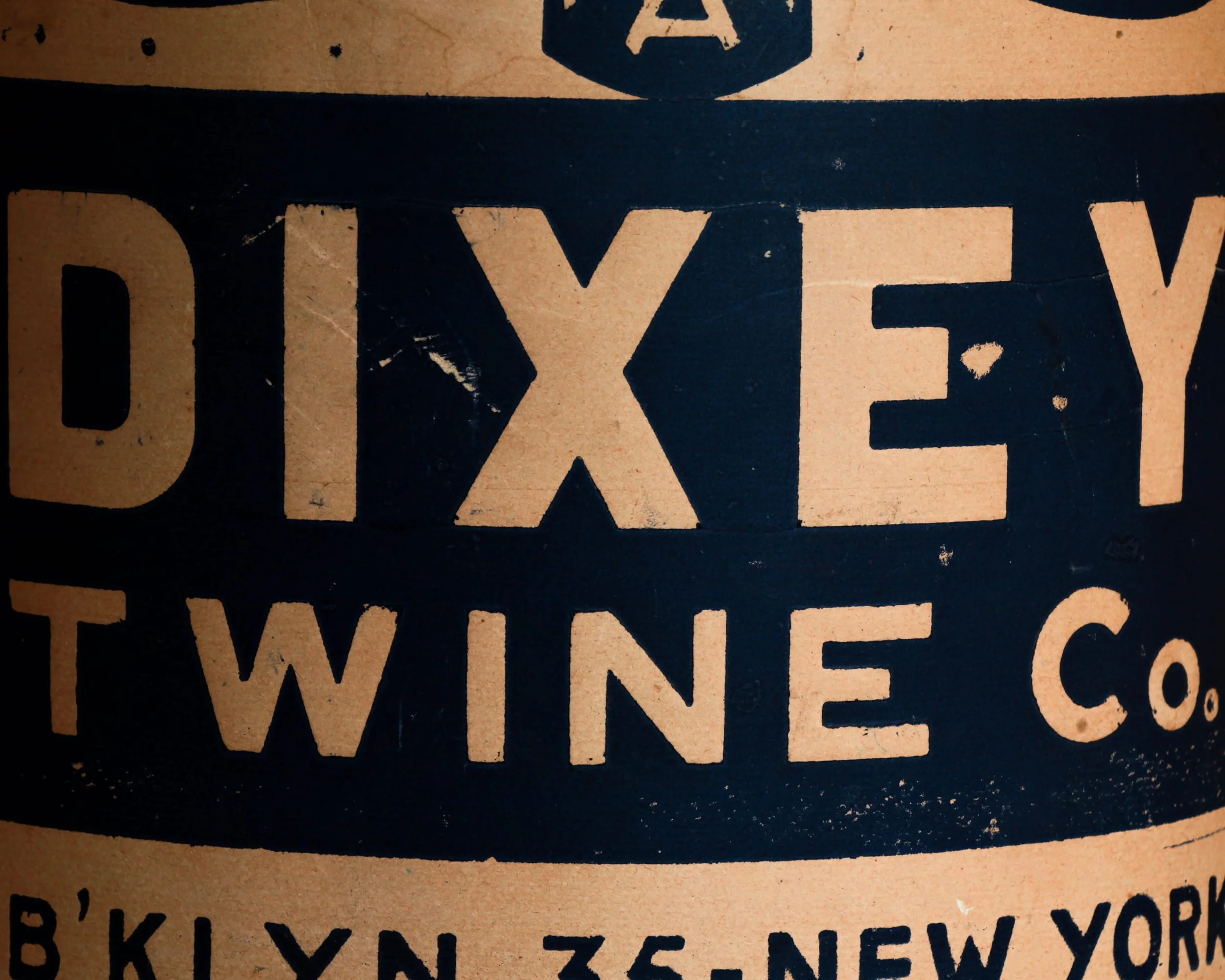
This is a new old stock Dixey Twine Co. spool, still wrapped in its original paper like it’s been waiting a century for instructions. Made in Brooklyn around 1920, it comes from a time when even something as simple as twine carried a bit of graphic confidence. The bold, no-nonsense typography, “Triple A Grade,” “B’KLYN. 35 – New York,” reads less like packaging and more like a statement of intent.
The scale is part of the charm. At over 11 inches tall and a full 10 inches in diameter, this isn’t the kind of twine you toss in a drawer. It was meant for real work, shipping rooms, warehouses, maybe a shop where everything moved by hand and got tied down tight before heading out the door.
What makes this one special is the fact that it never got there. The paper wrap shows age, spotting, and a bit of wear along the edges, but it’s done its job perfectly, preserving the spool underneath in unused condition. It feels like a small industrial artifact that somehow sidestepped time.
Equal parts packaging, object, and design, it sits somewhere between a utilitarian tool and a piece of early 20th century advertising that just happens to still be intact.
Twine
In the 1920s, twine was everywhere, quietly holding the economy together. Before plastic and synthetic cord, natural fibers like jute, hemp, and cotton were spun into strong, affordable line used across farms, factories, and city shops. It bundled newspapers, tied parcels, secured produce, and kept shipping crates in order as goods moved through an increasingly industrialized world. In agriculture, binder twine was essential for mechanized harvesting, especially with the rise of reapers and balers. In urban settings, it was just as vital, a daily tool of grocers, clerks, and warehouse workers. Twine wasn’t glamorous, but it was constant, practical, and indispensable.
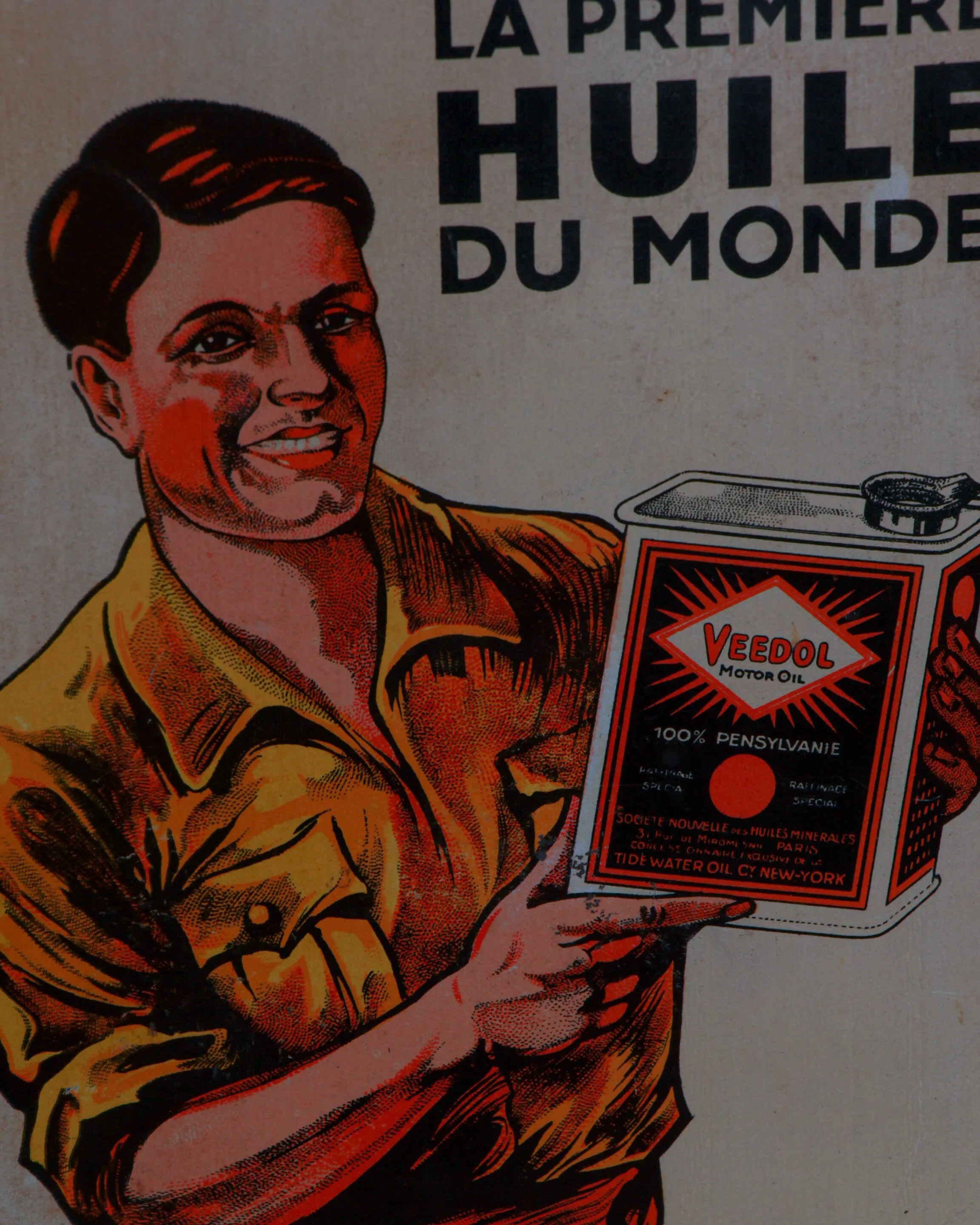
There’s a certain kind of confidence baked into early motor oil advertising, and this French Veedol can wears it like a pressed work shirt. Circa 1930s, two liters of industrial promise wrapped in bold graphics, sharp typography, and one very self-assured mechanic who looks like he’s never met an engine he couldn’t fix.
The front panel is where the magic happens. That “Mechanic” figure, rendered in rich reds, yellows, and deep black linework, feels equal parts poster art and sales pitch. He’s not grimy or worn down, he’s composed, almost proud, presenting the can like it’s a solution rather than a product. Above him, the line “La première huile du monde” doesn’t whisper. It declares. First oil in the world. No hesitation, no qualifiers. Just conviction.
The design language is classic interwar Europe, where graphics started doing the heavy lifting. Strong contrast, geometric framing, and that unmistakable Veedol diamond logo radiating outward like a small sun. Flip to the side panels and you get the more technical personality of the piece. French text listing viscosity grades and applications, laid out with a clean, almost instructional rhythm. It’s practical, but still stylish in a way only early industrial design seems to manage.
The can itself has all the right signs of age. Honest wear along the edges, light oxidation around the seams and cap, small marks that come from being handled rather than hidden away. The original screw cap is still in place, which is never a given. Nothing feels overworked or overly preserved. It reads exactly as it should, used, kept, and somehow still sharp.
What makes this one stand out is the crossover appeal. It’s advertising, yes, but it leans into illustration hard enough that it almost becomes graphic art. It sits comfortably with petroliana collectors, but just as easily in a room that appreciates strong visuals and a bit of attitude.
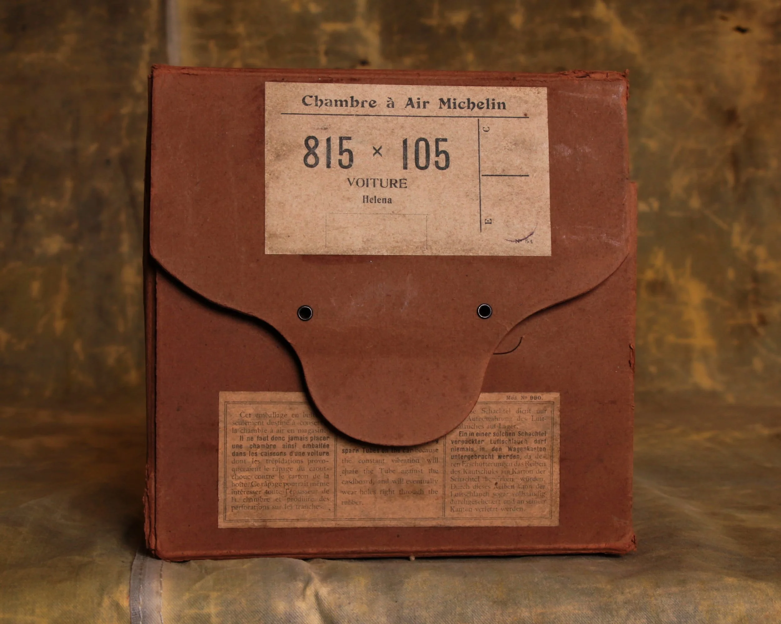
Empty Michelin "Pneu" (Tire) Box, with its striking typography and bold branding, this cardboard packaging once held a Michelin inner tube (chambre à air)—a critical component for keeping early automobiles rolling smoothly. The folded flap closure, complete with original instructions in multiple languages, adds a functional beauty that makes this piece an instant conversation starter.
The paper has taken on that soft, slightly brittle feel that only age can give, with minor creases and edge wear that speak to handling rather than neglect. It’s the kind of packaging that was never meant to last, yet somehow did—holding onto both its graphic punch and quiet sense of purpose.
Michelin Tires
Michelin tires start with a simple idea: make travel smoother, then keep refining it. Founded in 1889 in France by the Michelin brothers, Michelin entered a world where early bicycles and automobiles were still rough rides. Their breakthrough came with the detachable pneumatic tire—easier to repair, more practical, and a major step forward in usability.
From there, innovation became the throughline. Radial tires, introduced in the mid-20th century, changed how vehicles handled and how long tires lasted, setting a new standard that still shapes the industry. Michelin wasn’t just making tires—they were rethinking how rubber met the road.
What’s interesting is how closely the brand tied itself to travel itself. Maps, guides, signage—all part of a larger ecosystem encouraging people to move, explore, and rely on the journey. Even the iconic Bibendum figure turned a functional product into something recognizable and approachable.
The objects themselves—early tires, boxes, repair kits—carry that same sense of purpose. Built for durability, designed for real conditions, and constantly improved through use.
Today, Michelin reads as both manufacturer and storyteller. A company that turned something purely practical into a symbol of movement, reliability, and the long road ahead.
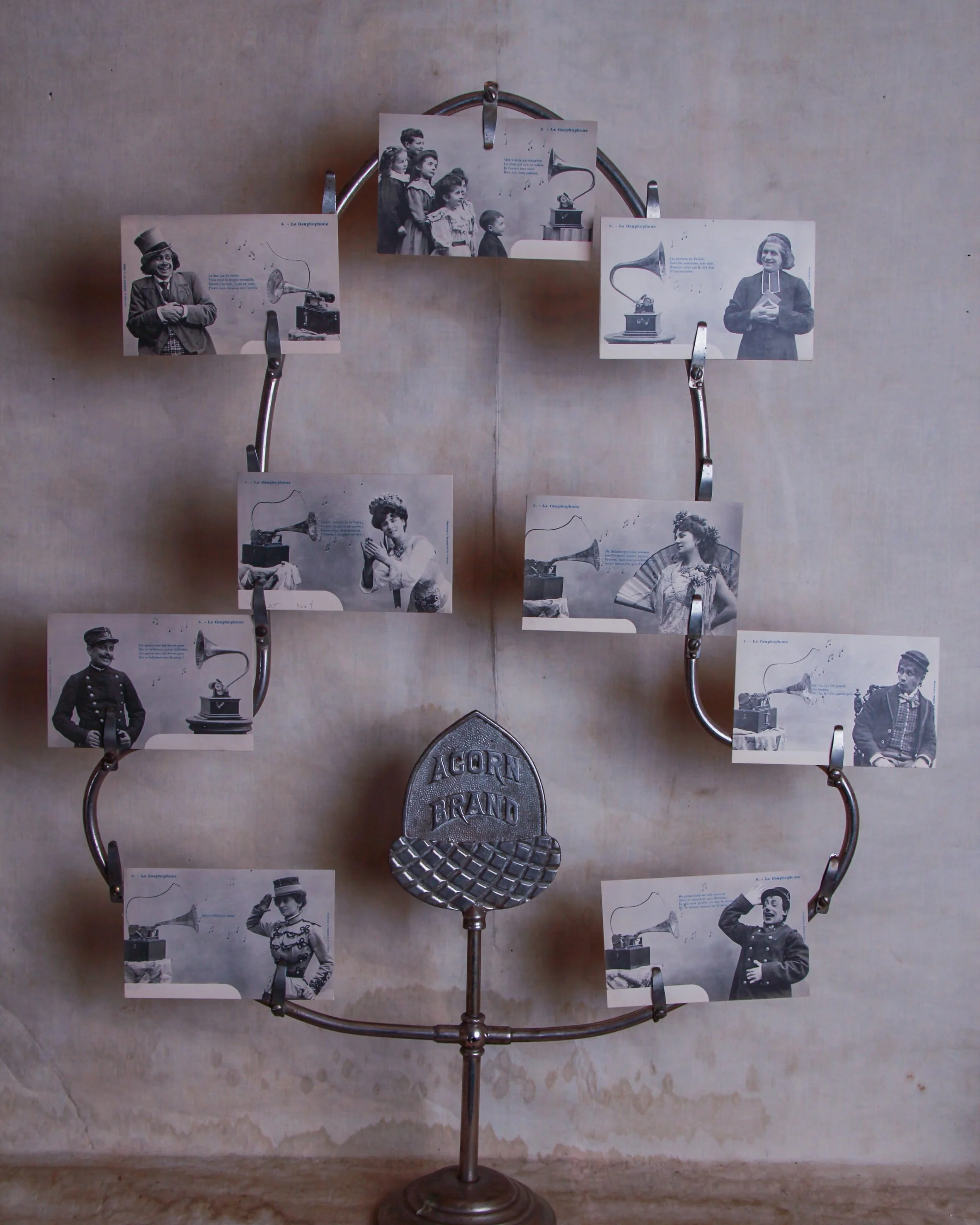
A full cast of early sound-era charm, this complete set of nine French postcards for “Le Graphophone” plays like a paper vaudeville. Each card pairs a gramophone with a different character—soldiers, singers, children, a priest—caught mid-reaction as music spills out of the horn in illustrated notes and snippets of French verse.
Likely produced in the early 1900s, they’re equal parts advertisement and entertainment, capturing that moment when recorded sound still felt a little magical. The imagery is crisp and theatrical, with just enough humor and personality to keep each scene distinct.
Together, the set reads as a narrative series rather than loose singles, which is exactly what makes it so satisfying to keep intact. Light, honest age to the cards, consistent with use and handling.
Display not included.
Graphophone
The graphophone is one of those early machines that feels almost magical in its simplicity—sound captured, stored, and played back with nothing more than grooves and motion. Developed in the late 19th century by Alexander Graham Bell’s Volta Laboratory, it improved on earlier phonographs by using wax cylinders instead of tinfoil, allowing for clearer recording and reuse.
At its core, the process is mechanical. A diaphragm vibrates with sound, a stylus translates those vibrations into grooves, and the cylinder holds that information. Play it back, and the process reverses—grooves become sound again. No electricity required.
Graphophones were used for dictation, business, and entertainment, bridging the gap between invention and everyday use. They brought recorded sound into offices and homes, turning voices into something repeatable.
What makes them compelling now is how visible the process is. You can follow the path from sound to object and back again. The materials—wood cabinets, brass fittings, rotating cylinders—carry a physical presence that modern audio has largely shed.
They’re not just machines, but early attempts at preserving a moment in time—fragile, mechanical, and surprisingly direct.
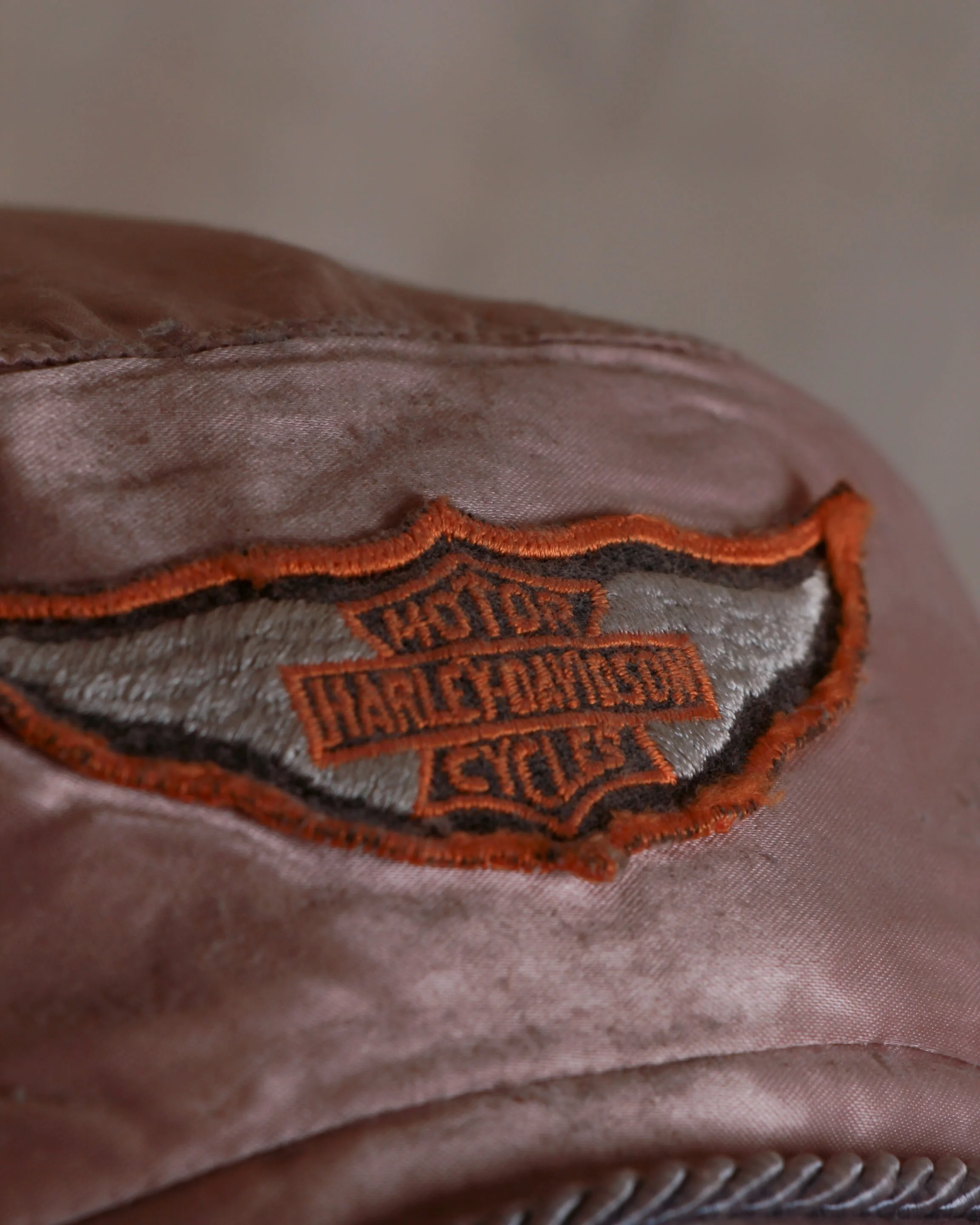
A proper little piece of mid-century road glamour, this original 1950s Harley-Davidson women’s “Cyclette” cap has all the attitude of the open road, just scaled to fit a head instead of a tank. Done in a soft, satiny blush tone with a short visor and stitched brim detail, it carries that unmistakable mix of function and style that Harley always got right.
The embroidered Harley-Davidson Cycles patch up top anchors it firmly in the era, while the tied scarf construction keeps things equal parts practical and cinematic—somewhere between a café stop in the Alps and a long ride through dust and wind.
Shows age and wear consistent with use, including surface marks and patina that only add to its lived-in charm. A rare survivor from a time when riding gear didn’t have to shout to be cool.
Mannequin head and goggles not included.
Category History
Old Harley-Davidson accessories, especially caps for men and women, tell a quieter side of the brand’s story—the part that lives off the bike but carries the same attitude. In the mid-20th century, Harley wasn’t just selling motorcycles; it was building a lifestyle. Riding gear naturally extended into everyday wear, and caps became one of the easiest ways to signal membership without saying a word.
These weren’t throwaway items. Many were made from sturdy cotton, denim, or satin blends, with embroidered or patch logos that echoed what you’d see on tanks and jackets. Women’s pieces, like the “Cyclette” caps of the 1950s, balanced function with a bit of flair—scarves, softer shapes, and a more tailored fit, but still rooted in the same road-ready practicality.
What stands out is how wearable they still feel. The designs are straightforward, the branding confident but not loud. Over time, sun fade, sweat, and miles of use soften the materials, giving each piece a kind of lived-in credibility.
They sit somewhere between gear and identity. You didn’t need to be on a bike to wear one, but it helped. And decades later, they still carry that same sense of motion, even at rest.
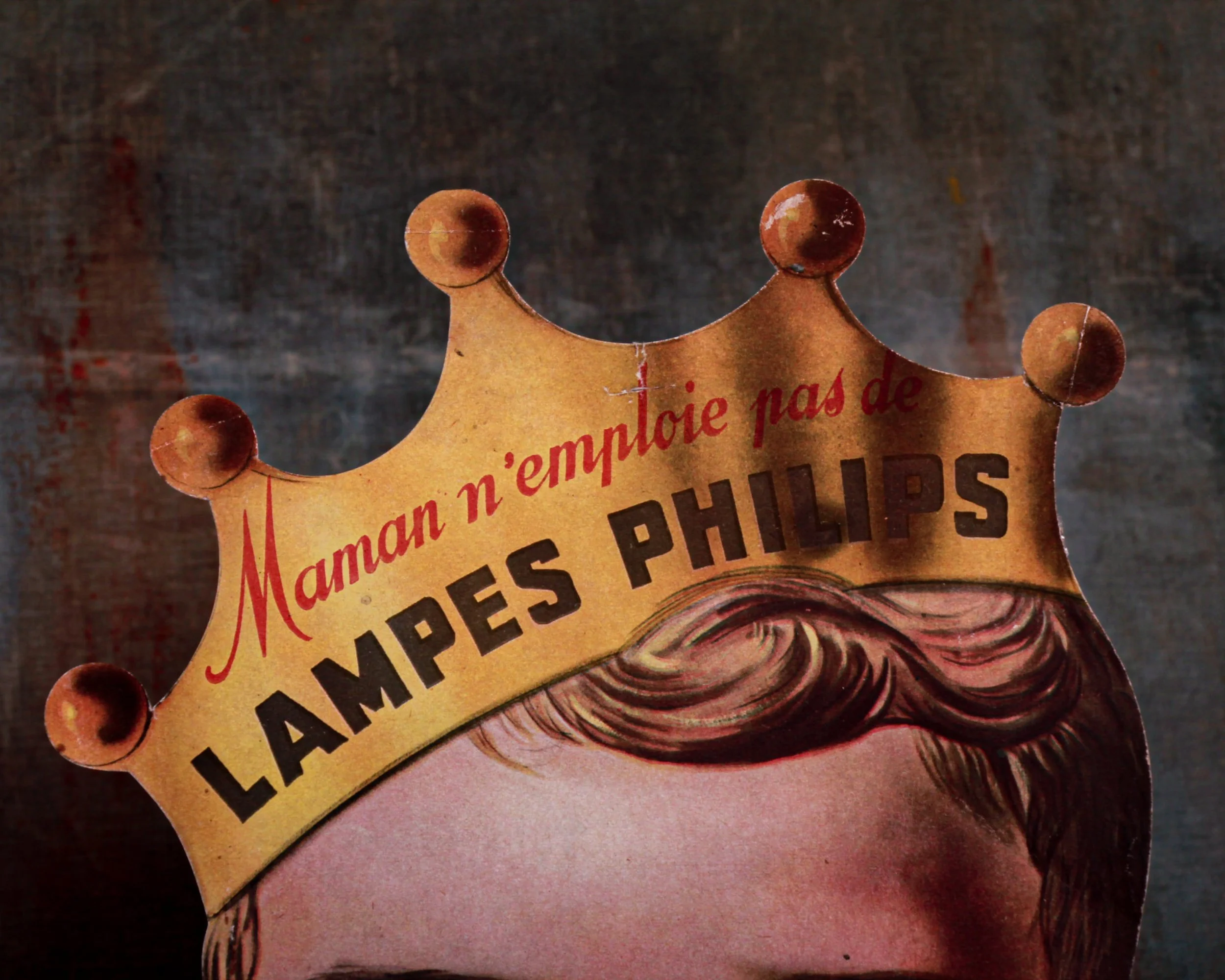
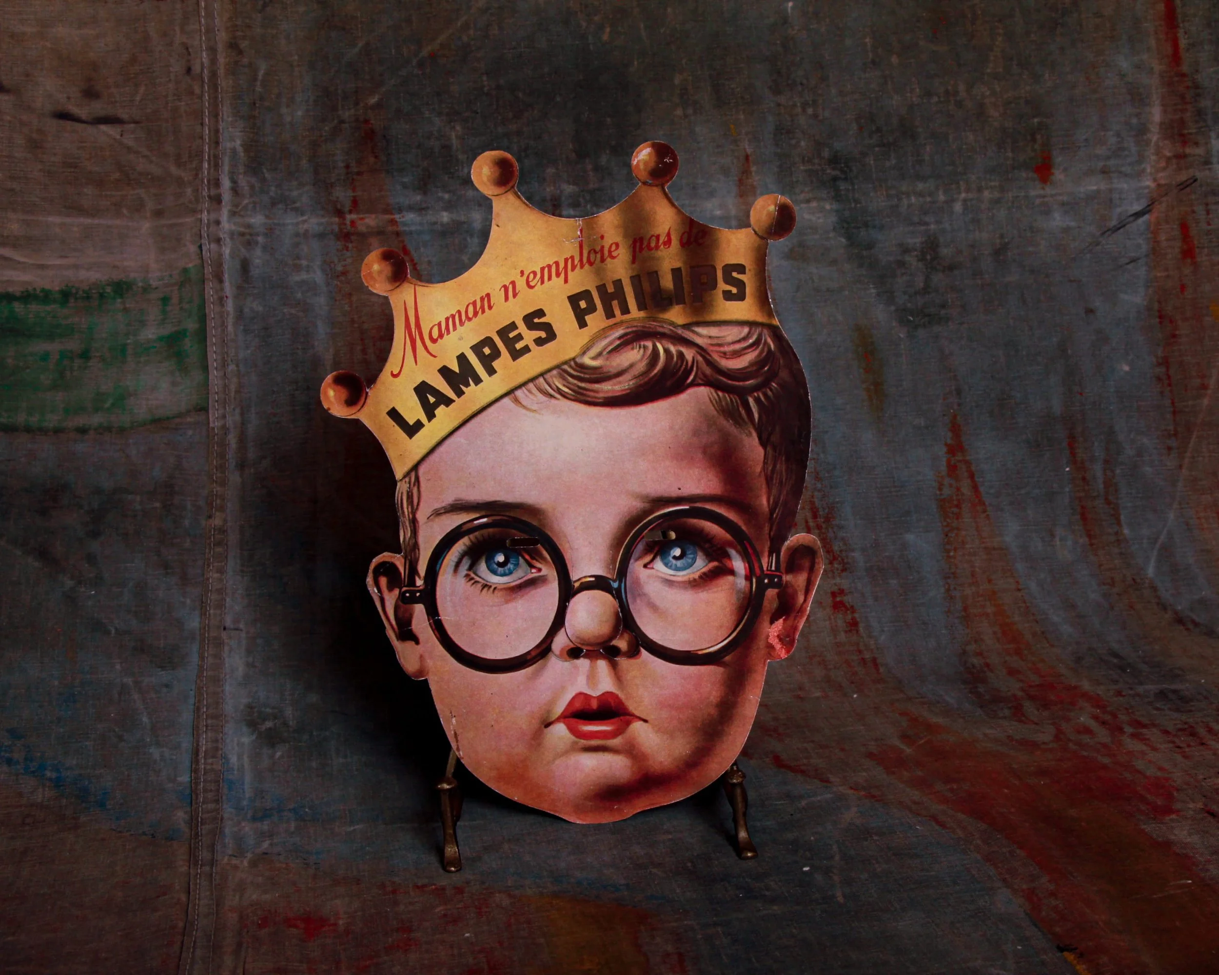
Wildly charming and wonderfully odd French advertising display for Philips light bulbs, shaped like the face of a wide-eyed, bespectacled child wearing a golden crown. The crown reads, in dramatic, slightly guilt-tripping French: "Maman n'emploie pas de LAMPES PHILIPS" ("Mom doesn't use Philips bulbs"). A clever little guilt trip aimed straight at the household lighting decision-maker. This piece is made from die-cut board and was designed to double as a mask, complete with eyeholes and a slit for the nose. It was produced by Gaston Maillet et Cie in Saint-Ouen and marked:
"Modèle déposé - Breveté S.G.D.G." on the back-essentially the French version of "patent pending" from the pre-war era.
Condition-wise, there are a few creases and scuffs from age as you would expect from ephemera this old, but nothing that detracts from the overall impact.
Category History
Philips light bulbs start with a straightforward ambition: make reliable light, then keep improving it. Founded in 1891 in the Netherlands, Philips began with carbon-filament lamps and quickly moved into refining how light could be produced, controlled, and standardized.
By the early 20th century, Philips was helping shape the shift to tungsten filaments and gas-filled bulbs, making light brighter, longer-lasting, and more efficient. Factories scaled up, but the focus stayed on consistency—one bulb behaving like the next, no surprises.
What’s interesting is how much design followed function. The bulb itself became an icon—simple, recognizable, unchanged in silhouette—while packaging and branding leaned into clarity and trust. You knew what you were getting.
Over time, Philips moved through fluorescent tubes, halogen, and into modern lighting technologies, but those early bulbs set the tone. Practical, dependable, and quietly transformative.
They’re easy to overlook, but that’s the point. Good light doesn’t announce itself—it just works, shaping spaces and routines without asking for attention.
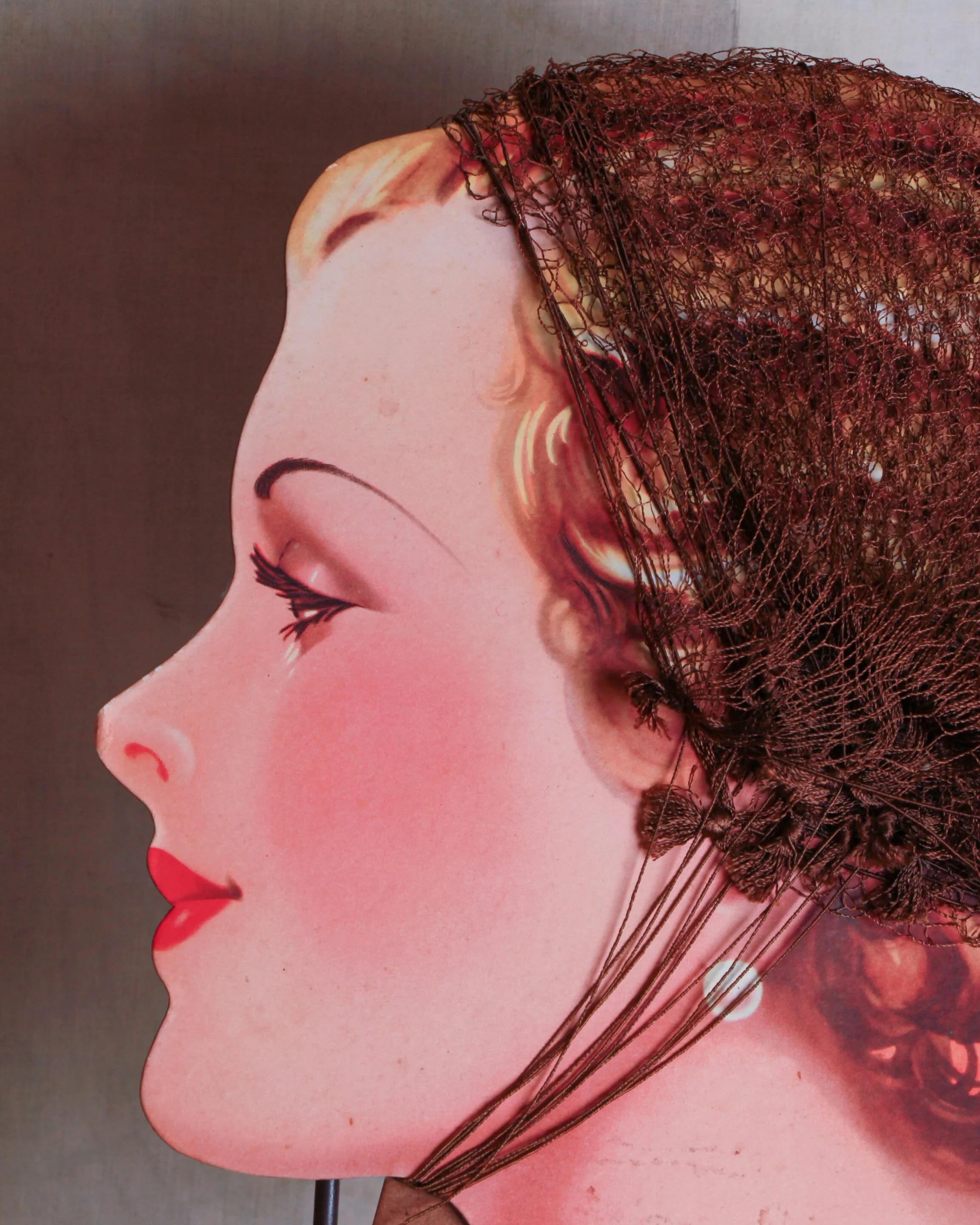
A rare 1920s British showcard advertising "The Elite Net," complete with its original sample hair nets still beautifully draped across a stylized profile. Printed in England, likely meant to sit proudly on a shop counter, coaxing customers into taming their curls with a little class. The vibrant litho colors have held up remarkably well—those rose-red lips and that dreamy gaze still do all the talking. Minor age spots and edge wear here and there, but nothing that takes away from its nostalgic glamour and aesthetic.
Measures 9.8" wide by 13" tall.
Category History
Elite Net is one of those quietly ubiquitous British brands that lived in drawers, dressing tables, and backstage kits without making much noise about it. Produced in England through the early to mid-20th century, these hair nets were designed to do one thing well—hold a style in place while staying nearly invisible.
They were typically made from fine silk or early synthetic fibers, carefully knotted into a delicate mesh that could stretch without losing its structure. The quality mattered. A good net needed to disappear against the hair, not flatten it, and hold everything from soft waves to tightly set curls through a full day.
Packaging was part of the appeal. Small boxes, often with clean typography and understated graphics, reflected a kind of British restraint—practical, tidy, and quietly refined. It wasn’t about glamour in the loud sense, but about control and presentation.
What makes Elite Net interesting now is how it speaks to routine. These weren’t occasional-use items—they were part of daily grooming, especially when hairstyles required maintenance and precision.
They sit somewhere between utility and subtle elegance. Not meant to be seen, but essential in achieving a finished look. A small, nearly invisible object that carried a surprising amount of responsibility.
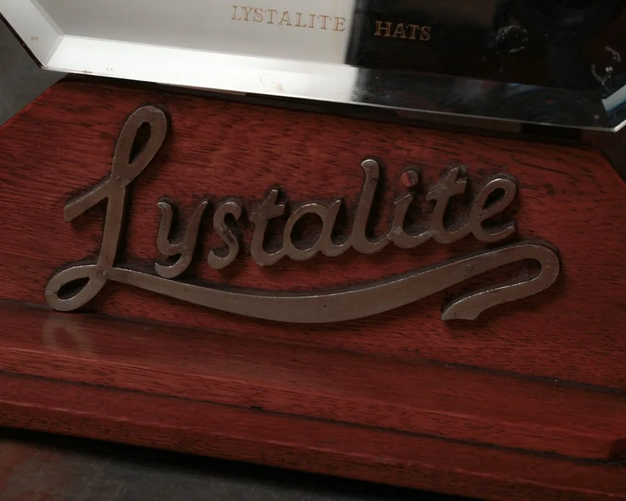
A killer piece of early 20th-century retail display, this Lystalite Hats advertising mirror is equal parts elegance and swagger. Mounted to a warm, reddish oak base with stepped beveled edges, the mirror is framed by clean lines and anchored by a cast metal script that reads "Lystalite" in bold, looping confidence. Below the mirror's surface, the words “Lystalite Hats” are subtly etched. The mirror tilts on a double-armed support and still holds solid.
There’s a quiet confidence to it—designed to catch the eye without shouting, inviting a closer look from across the counter. The materials do the talking: wood, glass, and metal working together in a way that feels both grounded and refined.
Category History
Lystalite hats are a clever answer to a very practical problem: how do you make something that looks like straw but holds up better to travel, weather, and wear? Introduced in the mid-20th century, Lystalite was a proprietary synthetic material developed to mimic the airy, woven look of traditional summer hats while offering more consistency and durability.
At a glance, they read like classic straw—light in color, open in structure, easy on the eyes. But up close, the difference shows. The fibers are more uniform, less prone to splitting, and better able to hold their shape over time. That made them especially appealing for hats that needed to be packed, handled, and worn regularly without losing form.
Design-wise, Lystalite hats didn’t reinvent the wheel. They followed familiar silhouettes—fedoras, western styles, casual summer hats—but with a slightly cleaner, more controlled finish thanks to the material. It’s subtle, but noticeable.
What makes them interesting now is that balance between imitation and innovation. They aren’t trying to replace straw so much as improve on its limitations. You get the look, with a bit more reliability.
They sit comfortably in that mid-century mindset—practical, forward-looking, and just a little optimistic about what new materials could do for everyday objects.
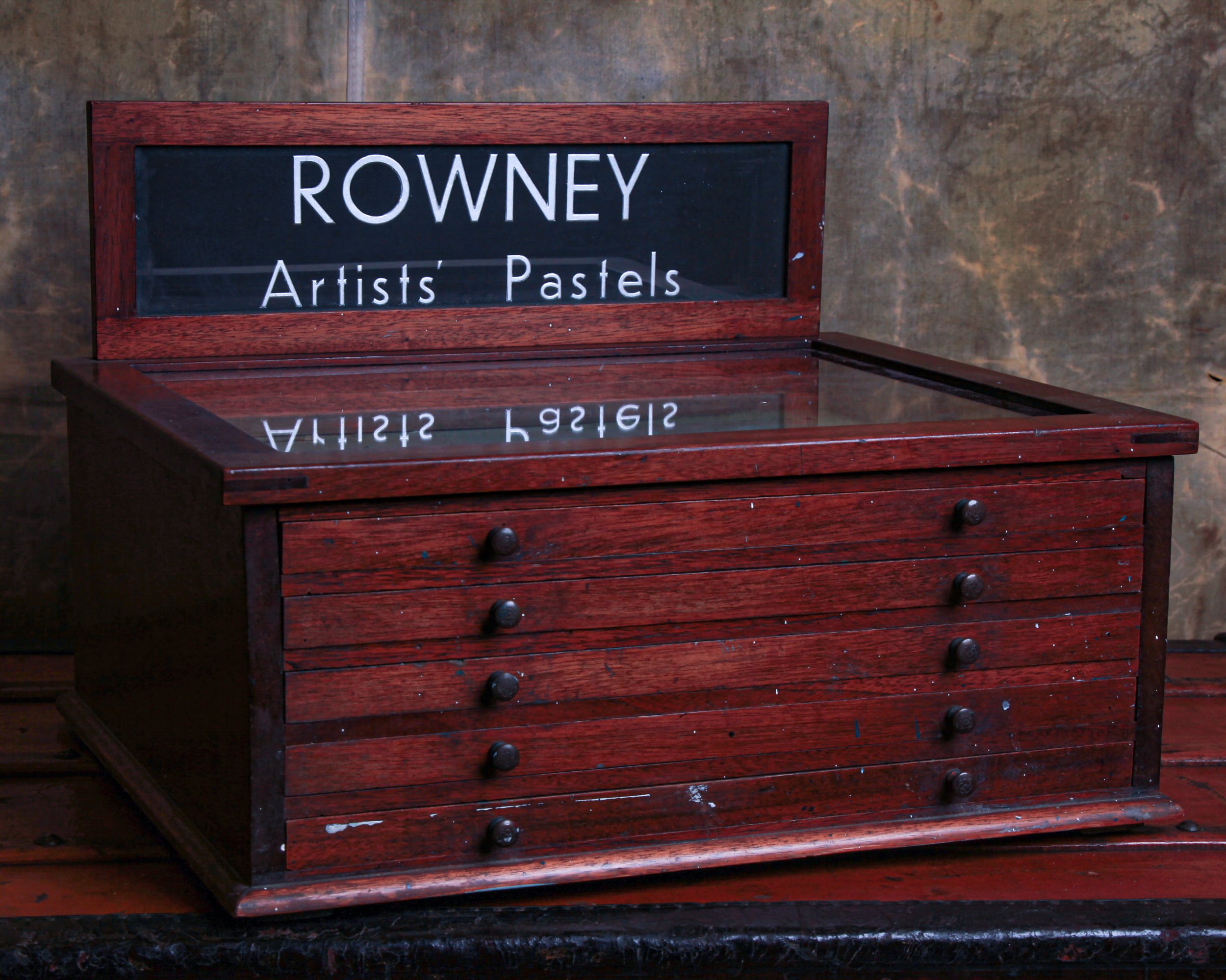
This original 1930s Rowney Artists' Pastels display cabinet is as charming as it is useful. Made of solid oak with a glass-front lift-up top and five shallow drawers, it once lived a colorful life-literally-housing rows of pastels in a well-used art shop or studio. The drawers still hold the soft hues of long-gone pigments, and we've left that glorious chalky residue untouched because, well, it's part of the story.
The wood has aged beautifully, with a warm patina and plenty of paint flecks that prove it saw action. All original drawer knobs are intact, the drawers open smoothly, and the hinged top works just as it should. It's got all the right imperfections in all the right places.
Sourced in England.
W: 18.5" H: 13.4" D: 14.8"
Category History
Old display cases are where objects learned how to present themselves. From the late 19th into the early 20th century, they showed up in shops, museums, and exhibitions as quiet frames for attention—glass, wood, and joinery working together to hold and highlight what mattered.
Most were built with purpose in mind. Retail cases prioritized visibility and access—hinged lids, sliding doors, mirrored backs—while museum versions leaned toward protection and order. Materials were chosen for both durability and clarity: hardwood frames, thick glass panels, sometimes lined interiors to soften the presentation.
What makes them interesting now is how much thought went into what you don’t immediately notice. The proportions, the way light moves through the glass, the height relative to the viewer—all designed to guide the eye without calling attention to themselves.
Over time, they pick up a quiet patina. Scratches in the glass, worn edges on the wood, small repairs that hint at long use. They weren’t static; they were opened, rearranged, cleaned, used daily.
Today, they read as both furniture and stage. Not just containers, but collaborators—objects that understand how to show something at its best without getting in the way.
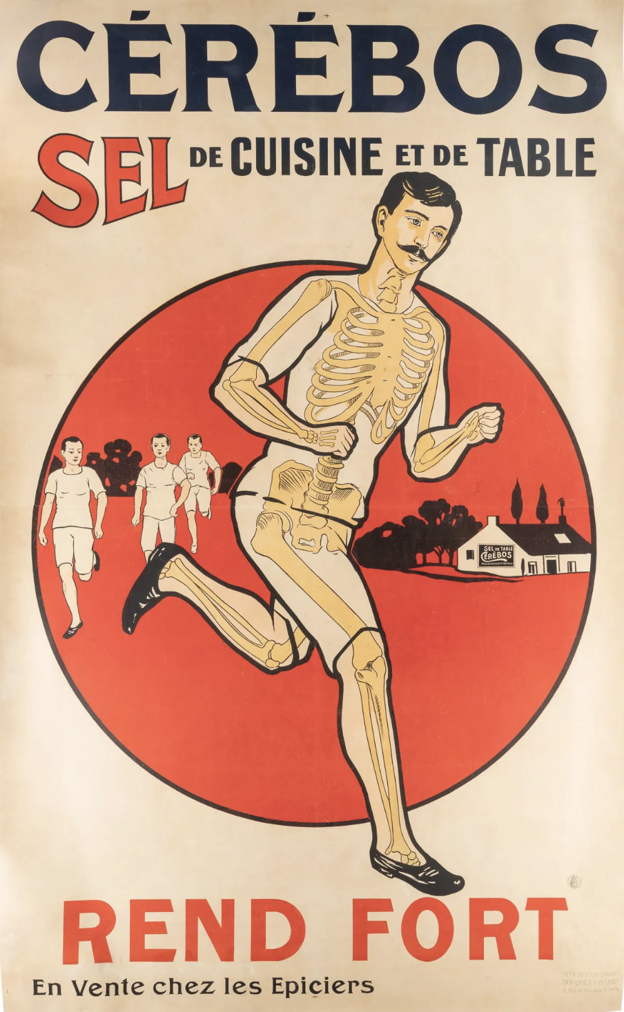
Massive and visually electric, this original French Cérébos salt lithograph is a true showstopper at 84 inches tall by 52 inches wide. Backed on linen for stability and preservation, it features a bold graphic design and punchy colors, centered around a partially skeletal runner powering ahead-because, as the slogan says, "Rend Fort" ("Makes You Strong"). French text promotes this kitchen and table salt as essential for strength and vitality, with playful anatomy visuals driving the point home. It’s bizarre way to sell salt for sure.
Category History
Lithographed advertising in the 19th and early 20th centuries is where marketing learned to flirt with art. Using stone or metal plates, printers could layer colors one at a time, building rich, eye-catching images that went far beyond simple text. The process wasn’t quick—each color required its own pass—but the results were worth it: bold posters, trade cards, and labels that could stop you mid-step.
Companies leaned into it. Soap, tobacco, travel, machinery—you name it, it got a visual identity. Figures were often idealized, scenes exaggerated, and color palettes pushed just enough to feel vivid without losing clarity. The goal was simple: make the product memorable, even if the image had more imagination than accuracy.
What makes these pieces compelling now is the balance between precision and personality. You can often see the registration lines, slight overlaps, or subtle shifts in color where the process reveals itself. And then there’s the wear—creases, fading, pinholes—that reminds you these weren’t precious objects, but working advertisements out in the world.
They sit comfortably between graphic design and fine art, capturing a moment when selling something also meant crafting an image worth keeping. Printers, illustrators, and clients all collaborated, creating a layered process where artistry and commerce worked side by side rather than in opposition.
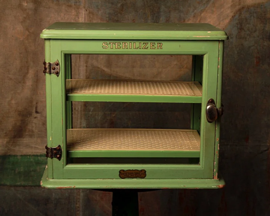
This 1930s sterilizer cabinet by Erie City Mfg. Co. is as charming as it is functional—a perfect blend of early American industry and soft-serve soda fountain color palette. Originally built to keep medical tools germ-free, it now makes a surprisingly handsome display case. It's painted in a lovely seafoam green and the front reads "STERILIZER" in bold, no-nonsense lettering, with original nickel hardware that's aged beautifully. It opens with a chunky turn-latch that feels satisfyingly sturdy and features two perforated metal shelves inside, both intact and ready to serve. Manufactured in Erie, Pennsylvania, this little cabinet still proudly wears its maker's label like a badge of honor.
Category History
Old display cases are where objects learned how to present themselves. From the late 19th into the early 20th century, they showed up in shops, museums, and exhibitions as quiet frames for attention—glass, wood, and joinery working together to hold and highlight what mattered.
Most were built with purpose in mind. Retail cases prioritized visibility and access—hinged lids, sliding doors, mirrored backs—while museum versions leaned toward protection and order. Materials were chosen for both durability and clarity: hardwood frames, thick glass panels, sometimes lined interiors to soften the presentation.
What makes them interesting now is how much thought went into what you don’t immediately notice. The proportions, the way light moves through the glass, the height relative to the viewer—all designed to guide the eye without calling attention to themselves.
Over time, they pick up a quiet patina. Scratches in the glass, worn edges on the wood, small repairs that hint at long use. They weren’t static; they were opened, rearranged, cleaned, used daily.
Today, they read as both furniture and stage. Not just containers, but collaborators—objects that understand how to show something at its best without getting in the way.
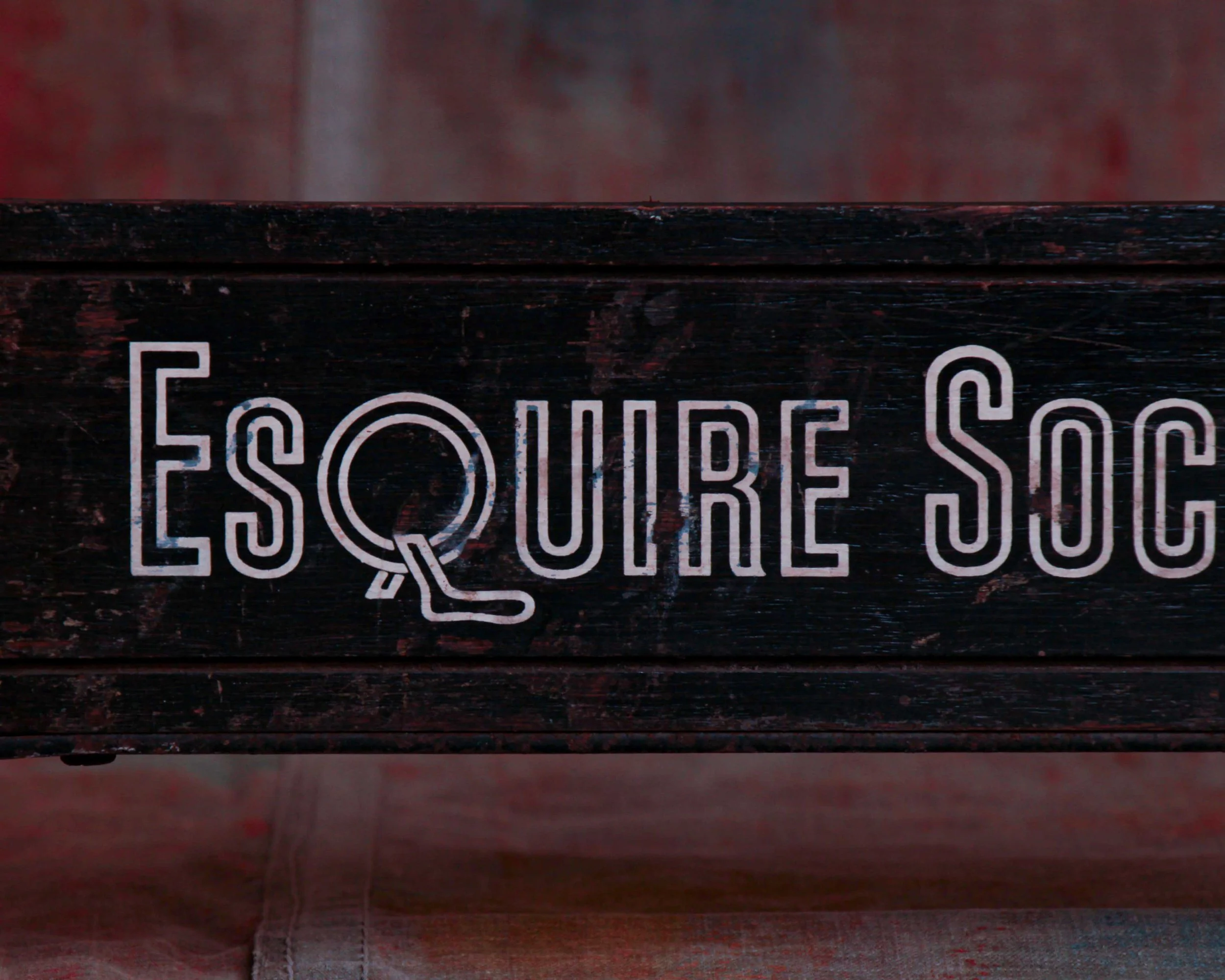
Long, low, and unapologetically elegant, this Esquire socks advertising display was made to sit at counter height and do its job without shouting. The black-painted wooden center panel carries the crisp Esquire Socks lettering in a clean, Deco-leaning typeface, while the iron scrollwork stretching out on either side adds just enough flourish to remind you this came from an era when even utilitarian objects were designed with a little swagger.
It’s easy to picture this sitting in a men’s department store sometime in the early to mid 20th century. Maybe under warm lights, surrounded by ties, handkerchiefs, and cologne, doing its part to sell the idea that socks mattered.
Category History
Esquire built its name in the 1930s as a magazine that treated style as culture, not just clothing. It mixed sharp writing, illustration, and a certain confident tone that spoke directly to men figuring out how they wanted to present themselves. Fashion, humor, politics—it all sat side by side, with a visual language that felt modern and deliberate.
Out of that identity came Esquire-branded goods, including socks, which translated the magazine’s sensibility into something wearable. These weren’t just basics—they carried the same attention to color, pattern, and presentation that showed up in the pages. Packaging, graphics, even the way they were marketed leaned into the idea that style extended to every detail.
What’s interesting is how the two reinforced each other. The magazine set the tone, the products made it tangible. You could read about style, then literally put it on.
Visually, Esquire is hard to separate from its illustrations—the “Esky” mascot, clean layouts, and bold yet controlled graphics. That same clarity carried into its merchandise.
Today, both the magazine and its branded items read as part of a larger ecosystem—media and product working together to shape taste. Not loud, not experimental for the sake of it, but confident in its point of view.
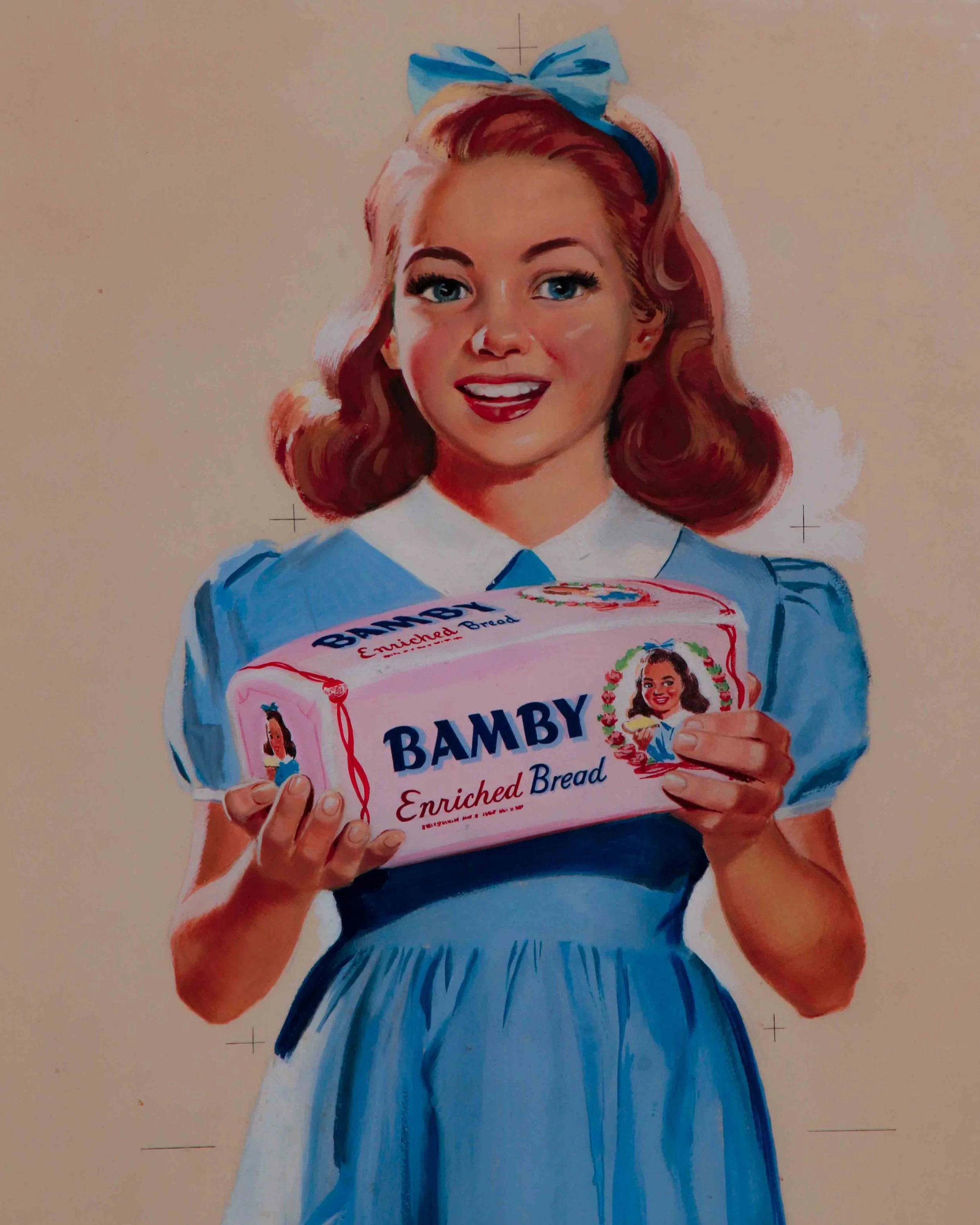
This is the kind of advertising art that quietly does everything right. An original Bamby bread illustration from the 1930s, rendered in gouache and pencil on board, and still carrying all the warmth, optimism, and polish of early American commercial illustration.
The composition centers on a smiling young girl in a crisp blue dress, proudly presenting a loaf of Bamby Bread like it’s the best news she’s heard all day. Her posture is confident, her expression open and inviting, and the styling hits that sweet spot between wholesome and aspirational that defined the era. The artist’s hand is evident everywhere, from the soft modeling of her face to the carefully painted folds of the dress and the subtle pencil underdrawing that peeks through in places.
The surface has naturally toned over time, with visible foxing along the lower left edge and some spotting toward the right corner. It’s been handsomely framed and presents beautifully.
Measures 28 x 16 inches.
Category history
Original artwork made for advertising sits in an interesting space—created to sell something, but often with the care and intention of fine art. Before photography and digital design took over, illustrators and painters were hired to produce everything from product labels to large-scale posters. These works were then translated into prints, but the originals remained as the source—the first, most direct version of the idea.
What’s compelling is how much thinking you can see in them. Pencil lines beneath paint, color notes in the margins, adjustments made mid-process. They weren’t meant to be displayed; they were working pieces, part of a larger production chain.
Stylistically, they vary widely—some highly polished, others loose and expressive—but all are guided by clarity. The goal was to catch attention and communicate quickly.
Today, these originals feel more personal than the printed versions they produced. You’re seeing the hand behind the message, not just the message itself. Part artwork, part artifact of commerce, they carry both intention and process in equal measure.
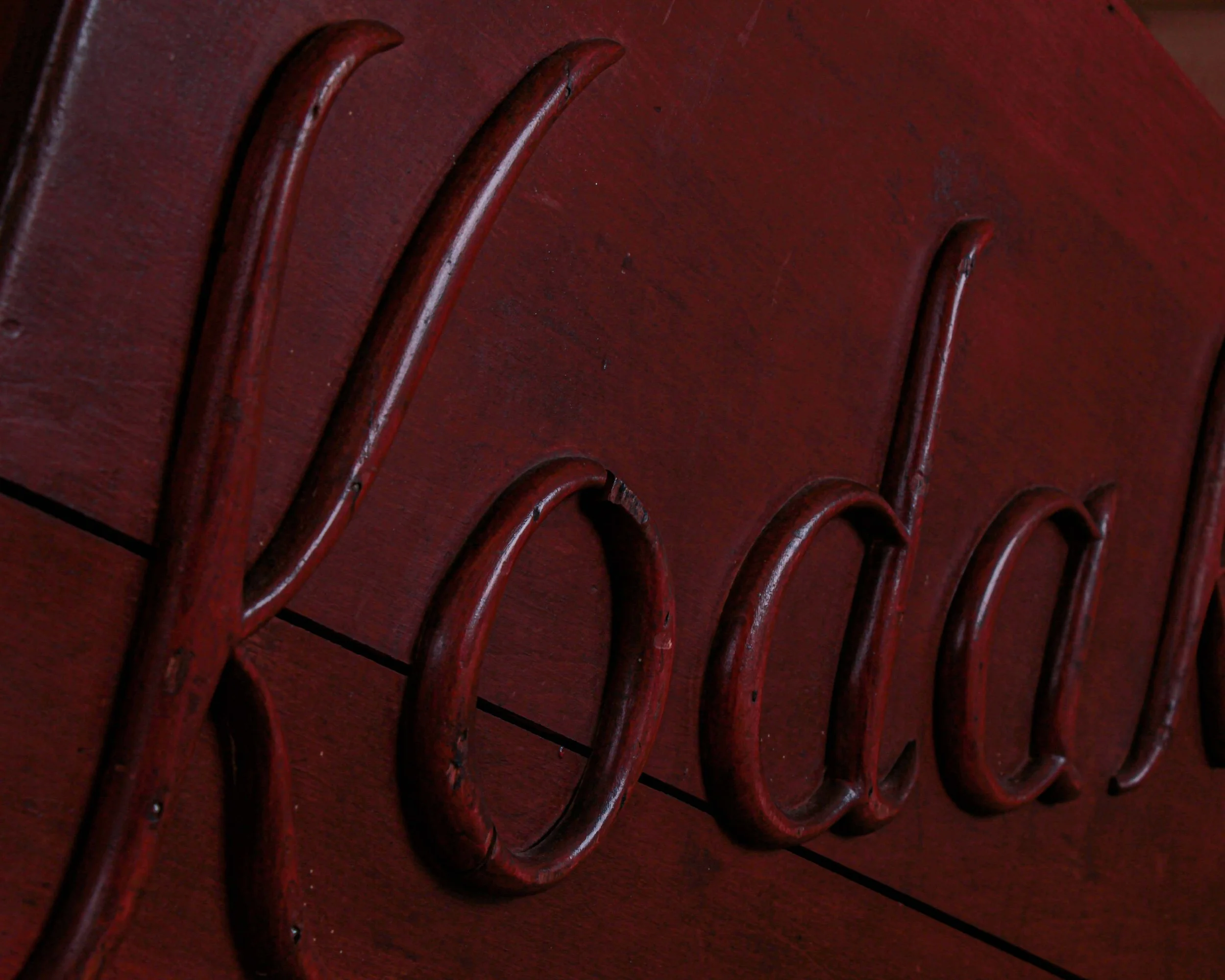
A large 1890s Kodak wooden travel case built for the age of plate photography, when taking a photograph meant packing carefully, thinking ahead, and committing to the moment. The lid is crowned with hand-carved wooden letters spelling “Kodak,” each one individually cut and nailed in place.
It was a working companion, meant to travel, to be opened and closed in the field, to protect fragile glass plates and photographic equipment when photography still felt like a minor miracle.
Open the lid and the interior tells its own story. Compartmentalized sections once held plates, chemicals, and tools of the trade, all laid out with purpose. The original interior surface shows heavy, honest wear, along with chain supports that keep the lid from falling back. There’s even a small surviving key tucked inside, a quiet reminder that what lived here was once valuable enough to lock away.
The sides feature sturdy cast metal handles, reinforcing the idea that this chest was meant to be moved, hauled, and trusted. Whether heading into the countryside, onto a city street, or across town to a studio, this case was part of the process. It embodies the era when photography was physical, methodical, and deeply intentional.
Measures 18” x 27” x 8”
Category History
Kodak built its name on a simple promise: photography made easy. Founded in 1888 by George Eastman, the company replaced complex glass plates with roll film and sold cameras preloaded for everyday use. “You press the button, we do the rest” wasn’t just a slogan—it reshaped who could take pictures.
By the early 20th century, Kodak was everywhere, turning snapshots into a habit rather than an event. Their films, papers, and processing systems standardized how images were made and shared.
What makes Kodak interesting is the shift. It helped define modern photography, then struggled to adapt when digital arrived—an innovator caught off guard by its own future.
There is more to explore. Browse the full collection.
Frequently Asked Questions
-
Antique advertising refers to original commercial promotional material produced over one hundred years ago. This includes lithograph signs, printed posters, enamel signs, painted boards and early promotional printed materials produced during the nineteenth and early twentieth centuries for commercial businesses and public institutions.
-
Most antique advertising and vintage commercial art was produced by specialist commercial printing and sign making businesses rather than individual artists. Many of the commercial artists who designed these pieces worked anonymously. Despite this, the quality of illustration, typography and colour in early 20th century advertising reflects a high level of craft that is increasingly recognised by collectors and designers.
-
The value of antique advertising is determined by a combination of factors including rarity, condition, subject matter, graphic quality and the brand or industry represented. Pieces advertising well known historical brands or featuring exceptional commercial illustration tend to command the most interest. Original pieces in good condition with minimal restoration are always preferred by serious collectors.
-
Antique lithograph signs were produced using a printing process in which designs were drawn onto stone or metal plates and transferred onto paper, card or tin using oil based inks. The process allowed for detailed illustration and rich colour and was widely used for commercial advertising during the nineteenth and early twentieth centuries. Lithograph signs produced on tin are particularly durable and have survived in greater numbers than paper based advertising materials.
-
Original antique advertising will show consistent ageing across the entire surface including the reverse side and edges. Later reprints and licensed reproductions typically use modern printing techniques that produce a uniformity of colour and texture not found in genuine antiques. Examining the printing method, fixings and any marks or labels on the reverse can help establish whether a piece is an original or a later reproduction.
This mid-19th century Limoges porcelain apothecary jar is a terrific little piece of pharmacy history, standing just six inches high but carrying plenty of visual punch. The cylindrical body is topped with a tall, domed cover and rounded finial, giving it the elegant silhouette associated with Continental drug jars of the period. Against the white porcelain, a dense black lattice pattern is punctuated with small cobalt-blue dots, while leafy black borders frame the top and bottom. At the center, a scrolling cartouche is boldly labeled “OPIUM.”
There are a few small chips and areas of wear, all consistent with age and use, but the decoration remains crisp and graphic. The piece is possibly attributable to the Laviolette factory in Limoges, though without a visible maker’s mark that attribution should remain cautious.
Apothecary jars like this were made for pharmacies at a time when medicines were still commonly stored, compounded, and dispensed by hand. Shelves lined with labeled ceramic jars were both practical and theatrical, giving 19th-century pharmacies an orderly, almost laboratory-like appearance.
Opium was an important medicinal ingredient during the period and was widely used in preparations intended to relieve pain, suppress coughing, treat diarrhea, and induce sleep. Laudanum, a tincture of opium dissolved in alcohol, became especially common in Europe and America during the 18th and 19th centuries. Regulations were far looser than they are today, and opium-based medicines could often be purchased directly from pharmacists.
Limoges became one of France’s major porcelain-producing centers after deposits of kaolin were discovered nearby in the 18th century. By the 19th century, numerous factories were producing everything from tableware to specialized pharmacy vessels. Pieces like this sit at an interesting intersection of decorative arts, medical history, and everyday commerce, which is exactly what makes old apothecary jars so appealing to collectors today.