
Antique Art + Folk Art + Photography
One-of-a-kind artworks including paintings, sculptures and photographs.
Our collection of antique art brings together a carefully curated selection of visual works spanning the late nineteenth and early twentieth centuries. From early photography and portrait cabinet cards to antique prints, engravings, and hand-drawn studies, these pieces reflect the craftsmanship and artistic traditions of their time.
Many of these works were originally created as portraits, academic studies, or decorative prints, offering a glimpse into historic artistic practices and everyday life. Early photographs such as tintypes and cabinet cards capture individual stories, while antique prints and lithographs reveal the visual culture of past eras.
Today these works are sought after by collectors and interior designers for their authenticity, character, and quiet historical presence. Each piece in the Heimwee collection is selected for its originality, aesthetic quality, and enduring visual appeal.
Art
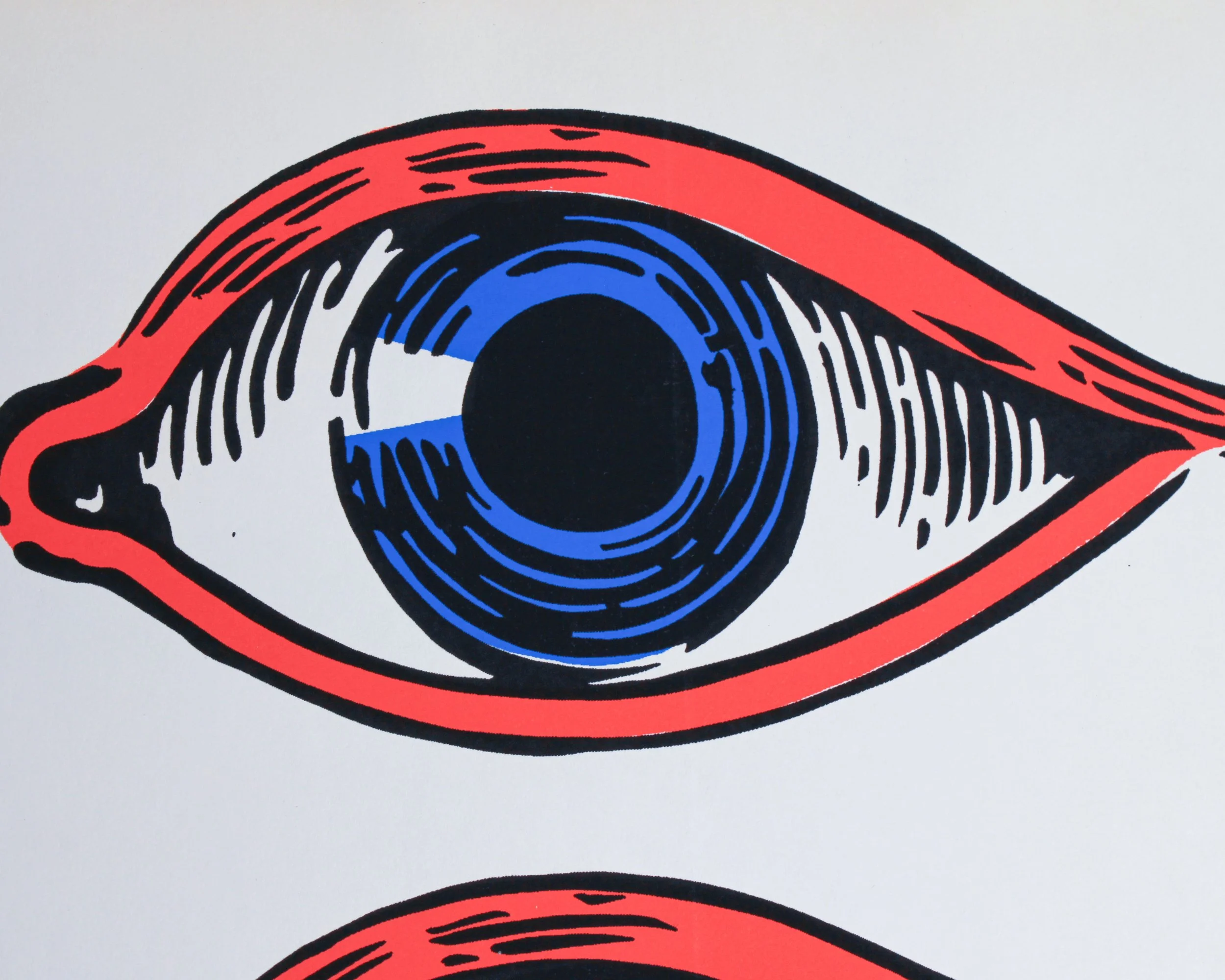
This vintage eye decal sheet has the wonderfully bold, slightly uncanny look of mid-century commercial graphics. Printed on white paper, it features four oversized eyes arranged in two rows, each rendered in a limited palette of bright red, vivid blue, black, and white. Heavy outlines, exaggerated lashes and circular irises give the design a punchy, almost comic-book quality. The repetition makes the sheet especially fun visually, somewhere between an optician’s display, carnival decoration, sign-painter’s stock and Pop Art.
The sheet is new old stock, with the original backing paper still intact. A small circular printer’s or manufacturer’s mark appears near the lower left corner, although there isn’t enough visible information here to confidently identify the maker. Judging by the graphic style, printing technique and color palette, a date somewhere between the 1950s and 1970s feels reasonable, with the 1960s perhaps the strongest visual fit.
Large-format decals like this were widely used throughout the mid-20th century for storefront windows, advertising displays, vending machines, amusement attractions and promotional signage. Before inexpensive digital printing, decals offered businesses an easy way to add bright, professionally printed graphics to glass, metal and other smooth surfaces. Sign shops and commercial printers produced everything from lettering and logos to stars, pointing hands, cartoon figures and, naturally, attention-grabbing eyes.
The eye itself was an especially effective advertising device. It could suggest vision, observation, photography or optical services, but it was also simply hard to ignore. By the 1960s, enlarged eyes had become part of the broader visual vocabulary of psychedelic posters, Pop Art, underground graphics and novelty advertising.
Whatever its original purpose, this surviving uncut sheet works beautifully today as graphic art in its own right. The scale, saturated colors and four staring eyes give it plenty of presence, along with just the right amount of weirdness.
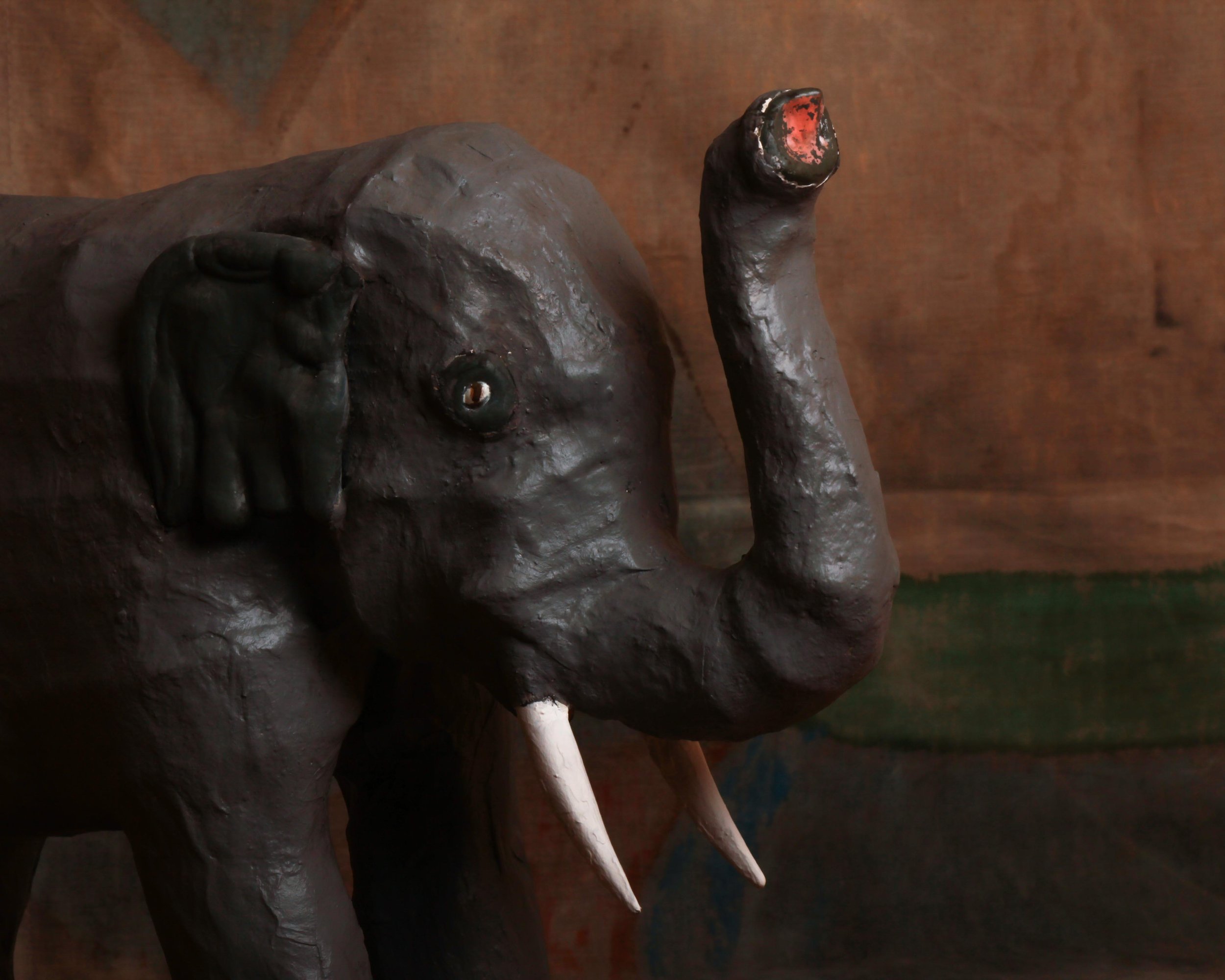
This mid-century papier-mâché elephant has a wonderfully handmade presence, with just enough realism to read immediately and just enough awkwardness to make it interesting. The body is built in a sturdy, simplified form, with thick legs, a rounded back, oversized ears, white tusks, and a raised trunk. The dark gray painted surface has plenty of texture from the papier-mâché underneath, and the slightly uneven modeling gives the elephant a lot more character than a perfectly molded factory piece would have. Small details, like the inset eyes and traces of red paint at the end of the trunk, add to its oddball charm.
What works here is the combination of scale and directness. The elephant is not trying to be zoologically perfect. Instead, it has the blunt, almost theatrical look of something made to be seen from across a room. The raised trunk gives it a celebratory stance, while the rough surface and hand-shaped details keep it grounded in the maker’s process. It is a good example of how humble materials can produce an object with real visual weight and personality.
Papier-mâché has been used for centuries because it is lightweight, inexpensive, and surprisingly strong once built up in layers. By the 19th century it was used for everything from decorative boxes and furniture to masks, toys, theatrical props, and shop displays. The material remained popular well into the 20th century, especially for larger sculptural objects that would have been costly or impractical to make from carved wood or plaster.
Mid-century papier-mâché animals often lived somewhere between toy, display piece, and folk sculpture. Elephants were especially appealing subjects because their heavy forms translated well into simplified construction, and their exotic associations made them natural candidates for circus displays, department-store decoration, children’s rooms, and promotional installations.
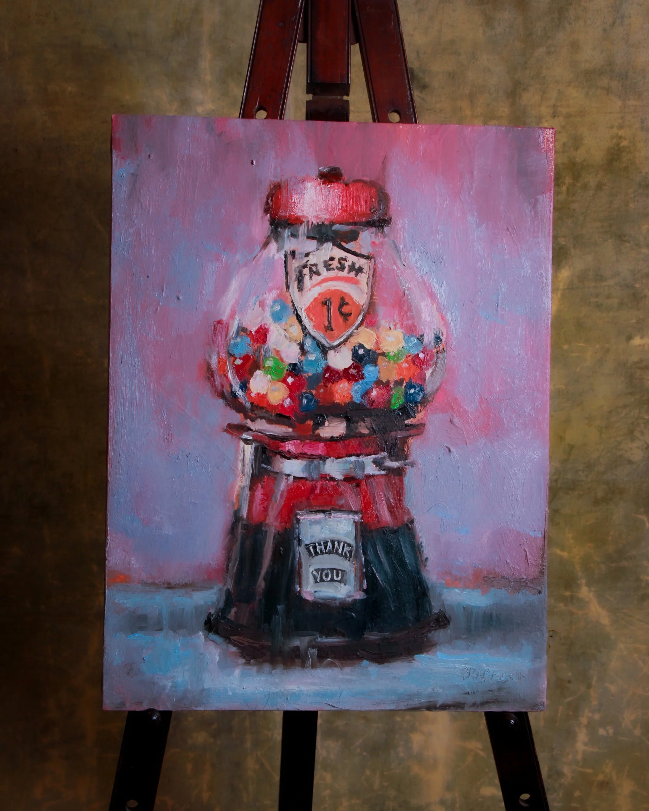
This 2020 oil on canvas by Bradford J. Salamon turns an ordinary one-cent gumball machine into something much more characterful. The machine fills nearly the entire composition, centered against a loose field of pinks, mauves, and cool blue-gray. Inside the glass globe, dozens of brightly colored gumballs are built up with quick, chunky strokes of red, turquoise, green, cream, orange, and navy. The painted “FRESH 1¢” shield and the small “THANK YOU” panel are especially good details, giving the machine the slightly awkward, hand-lettered personality of the original object.
Salamon’s handling is intentionally loose rather than photographic. Edges blur, paint remains visible, and the surface has a tactile quality that suits an object already loaded with nostalgia. The work is signed at lower right, and the reverse is inscribed “Bradford J. Salamon / Oil / 2020.”
Born in Los Angeles in 1963, Salamon is a multidisciplinary artist whose work has included portraiture, sculpture, film, and paintings of everyday objects. His object paintings grew from the idea that a familiar possession can be approached almost as a portrait, with its own age, personality, and history.
That approach makes particular sense with an old penny gumball machine. Coin-operated candy dispensers became common fixtures in American stores, barbershops, arcades, and waiting rooms during the early 20th century. For a cent, a child could turn a handle and receive a small reward, making these machines tiny monuments to impulse buying long before anyone used that phrase.
Salamon’s broader practice has repeatedly focused on the expressive possibilities of both people and humble objects, treating the act of painting as a way of recording time and memory. Here, the humble gumball machine gets the full portrait treatment, and somehow earns it.
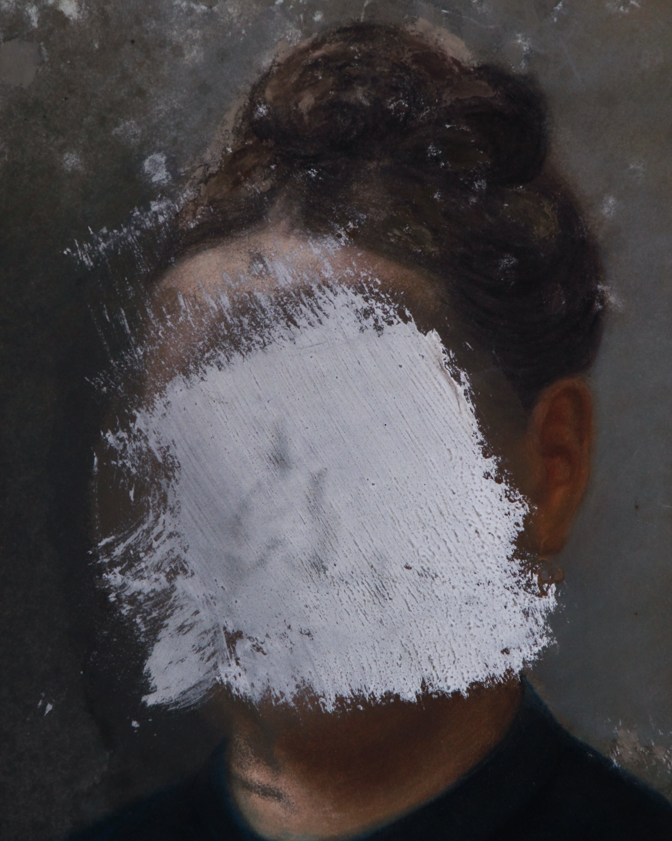
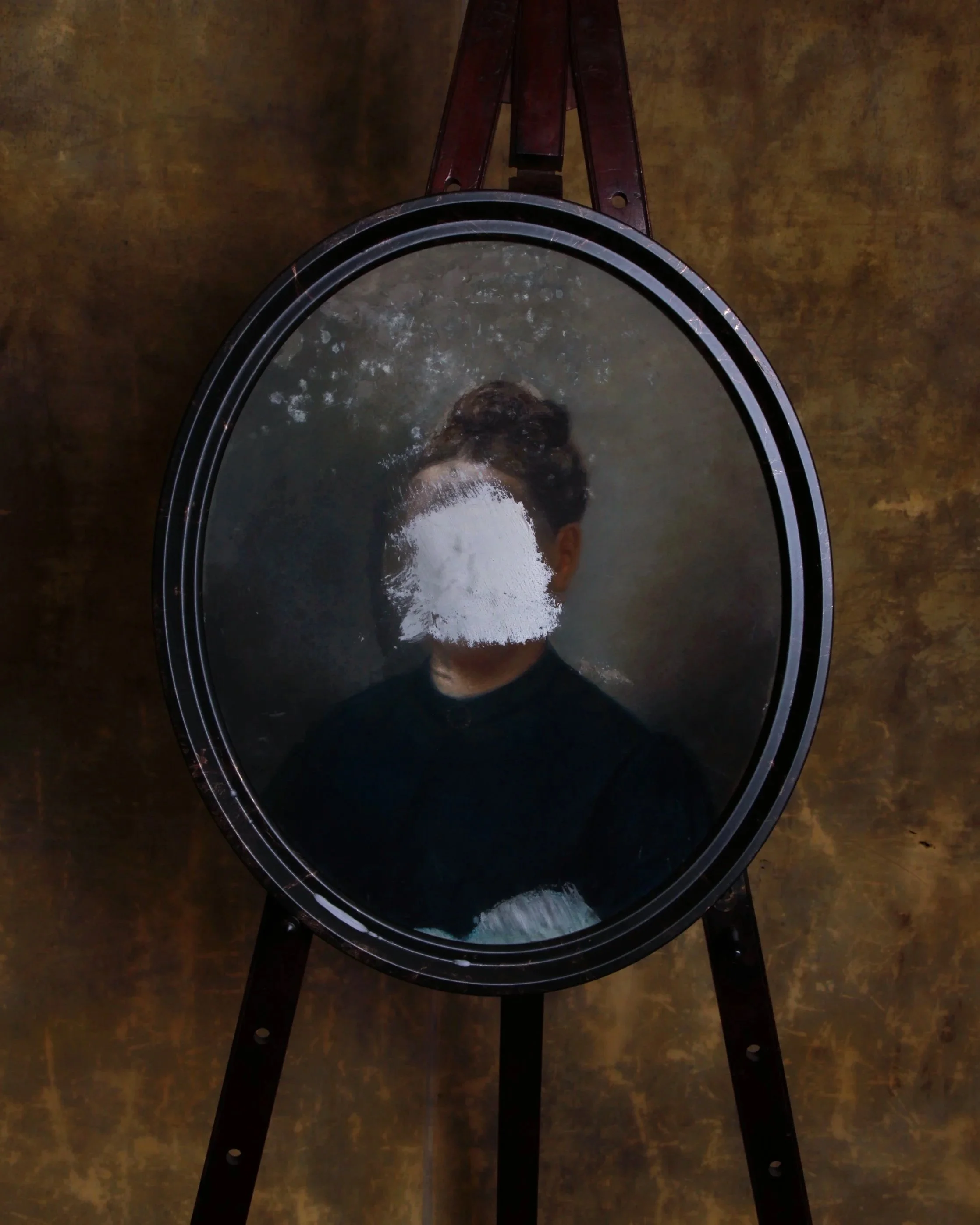
This French school portrait, circa 1870, is executed in pastels on paper, laid to card, and set in a handsome oval frame, but what makes it memorable is not the sitter’s identity. It is the fact that someone later tried to erase her.
The woman is shown in the sober, formal manner typical of the period, dressed in black with her hair arranged high at the back of her head. The palette is restrained and the composition conventional, which makes the intervention across her face feel even more jarring. A broad patch of white paint has been brushed directly over her features, with another smaller area at the bottom of the composition. The surface elsewhere shows age, abrasion, and scattered losses, all of which add to the painting’s strange, layered presence.
Portraiture in 19th-century France was deeply tied to family, status, memory, and respectability. Even modest households commissioned likenesses to mark marriages, inheritances, anniversaries, or simply to preserve a face for future generations. Once painted, these portraits often remained in families for decades, passing through houses, marriages, arguments, deaths, and changing fortunes.
That is what makes deliberate damage so intriguing. Defacing a portrait was rarely neutral. It could be an act of anger, rejection, censorship, embarrassment, grief, or even dark humor. Was the face covered by the painter after a disagreement? By the sitter herself? By a spouse, child, jealous lover, or later owner who wanted the person gone but could not quite bring themselves to throw the portrait away?
There is no way to know, and that uncertainty is really the appeal. The painting began as a straightforward record of one person’s appearance. The later act of obliteration turned it into something else entirely: a portrait not only of a woman, but of a relationship that clearly went wrong somewhere along the way.
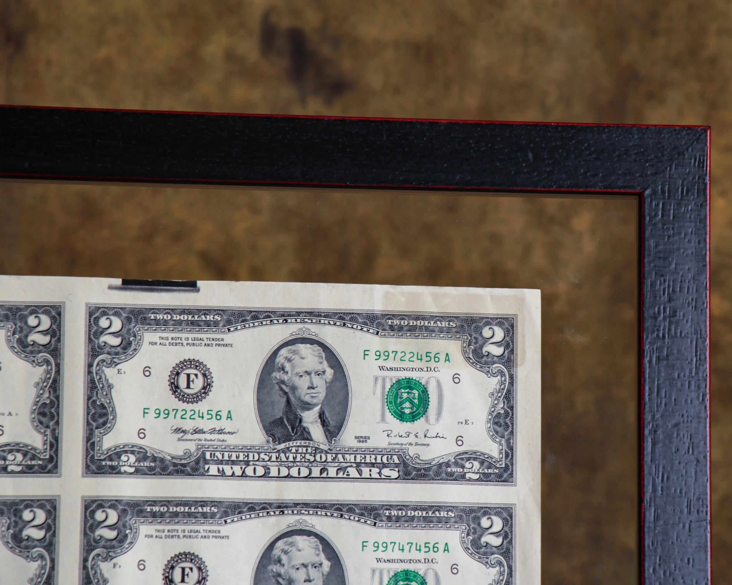
This uncut sheet of thirty-two United States $2 bills is from Series 1995 and presents the denomination in the way it originally existed before individual notes were cut apart for circulation. The full sheet has a wonderfully graphic quality, with Thomas Jefferson’s portrait repeated in a precise grid across the front and John Trumbull’s famous Declaration of Independence scene repeated on the reverse. The serial numbers progress across the sheet, giving it that satisfying mix of bureaucracy, design, and pattern.
The sheet is displayed in a double-sided frame, allowing both sides of the currency to be viewed. It is protected with Tru Vue Optium Museum Acrylic, a high-grade glazing material favored for important works on paper because of its clarity, UV protection, and anti-reflective qualities. The floating presentation also gives the sheet some breathing room and keeps the untrimmed edges visible, which is an important part of its appeal.
The $2 bill has had one of the more curious histories in American currency. The denomination dates back to the 19th century, but it has never circulated as heavily as the $1 or $5 bill. Its relative scarcity in everyday use eventually gave it an almost novelty status, even though it remains legal tender.
The modern $2 Federal Reserve Note was introduced in 1976 as part of the United States Bicentennial. That redesign brought the familiar reverse image of the signing of the Declaration of Independence, adapted from Trumbull’s painting, while Jefferson remained on the face.
Uncut currency sheets occupy a slightly different corner of collecting than ordinary notes. They were sold specifically as collectibles and souvenirs, preserving the bills in their original sheet format before cutting. Seeing thirty-two notes together makes the engraving, repetition, spacing, and printing process much easier to appreciate. Framed this way, the sheet lands somewhere between numismatics, graphic design, and American historical ephemera.
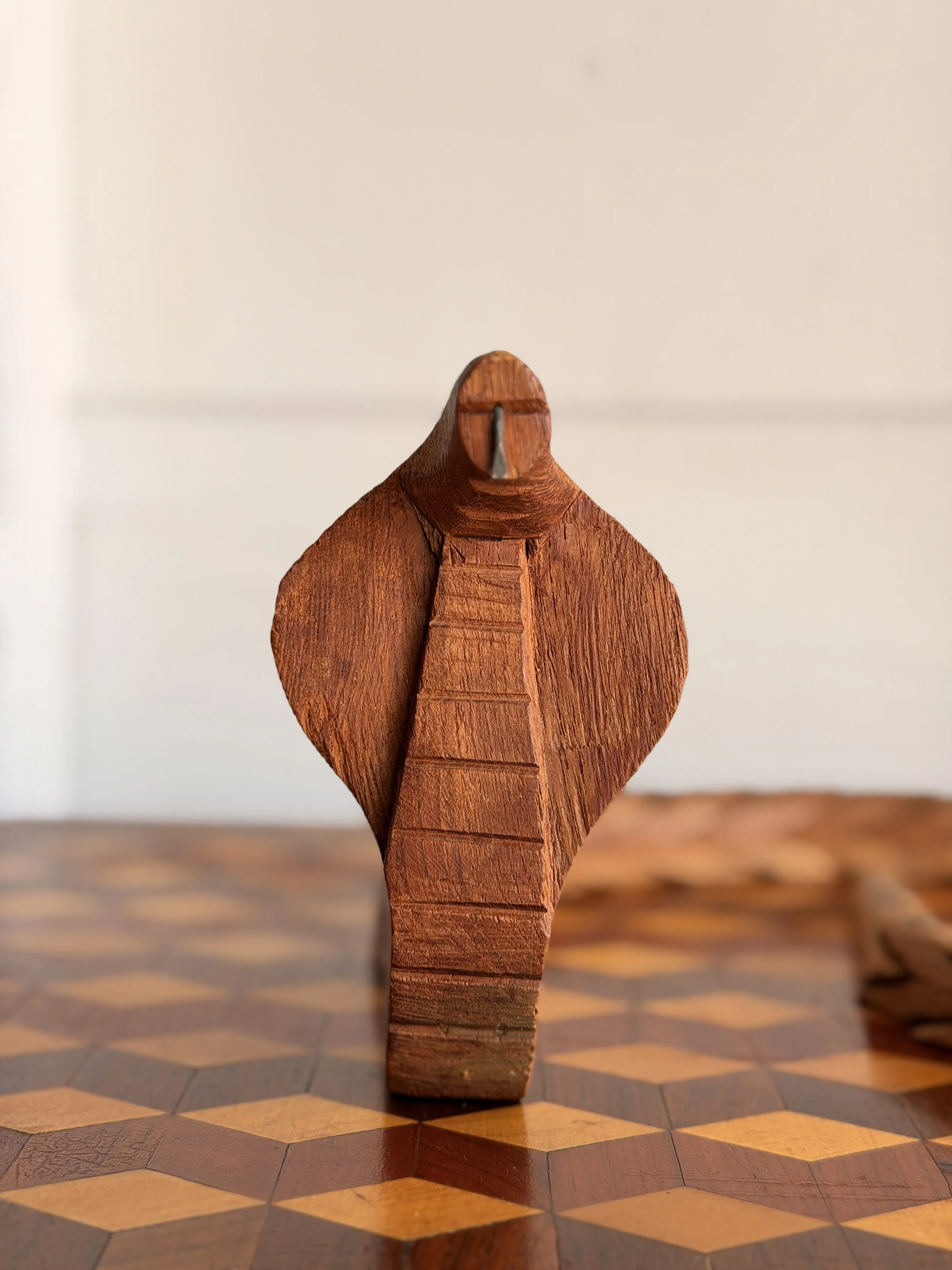
This hand-carved wooden cobra has the kind of clever construction that makes folk art so much fun to study up close. The snake rises upright with its hood spread wide, its simplified head reduced to a few strong cuts and a small metal tongue. Horizontal incisions run down the front of the neck, suggesting the segmented belly scales of a cobra. The carving is direct and wonderfully unfussy, with visible tool marks, an uneven surface, and a warm, dry patina that has developed with age.
The real surprise, though, is the body. Viewed from above it reads as a long, coiling snake, but from the side the construction becomes much stranger and more inventive. The body is made from a repeating series of overlapping carved sections, each shaped almost like a little snake head with an open mouth biting into the one ahead of it. Small metal pins connect the individual pieces, allowing the body to bend and curve while also creating a terrific sawtooth silhouette. It is part sculpture, part mechanical puzzle.
Snakes have appeared in folk and decorative art across cultures for centuries, often carrying several meanings at once. Because snakes shed their skins, they became natural symbols of renewal and transformation. Cobras in particular have long been associated with protection, power, danger, and supernatural authority, especially throughout South Asia and parts of Africa.
Wooden snake carvings also appealed to makers because the animal’s long, flexible form invited experimentation. Carvers could create rigid sculptures, walking sticks, toys, articulated snakes, or ingenious chain-like constructions such as this one. Articulated wooden animals became especially popular as handmade souvenirs and folk objects during the 19th and early 20th centuries, when makers often combined local carving traditions with a bit of mechanical ingenuity.
This cobra fits comfortably into that world: slightly eccentric, handmade, and full of personality, with a construction that becomes more interesting the longer you look at it.
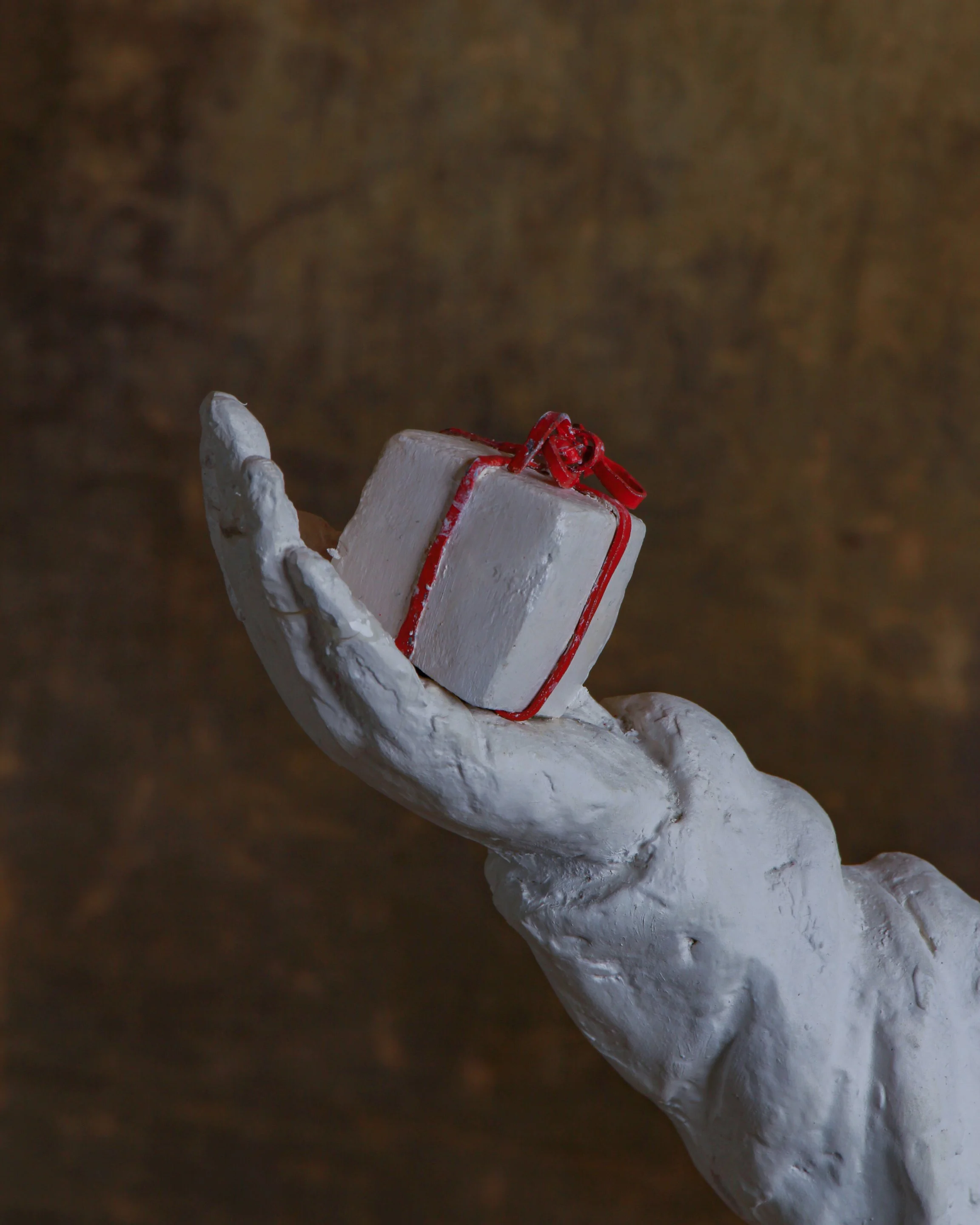
This wonderfully strange Standing Clown sculpture is by British artist Beth Carter, whose work often sits somewhere between mythology, carnival, fairy tale, and the slightly unsettling corners of the imagination. Made from white pigmented resin, the figure stands approximately 41" high x 24.5" wide x 6" deep and is from an edition of 15.
The clown is rendered almost entirely in white, with arms stretched wide, an exaggerated pointed hat, oversized shoes, a heavily textured ruff, and a small gift balanced in one hand. Gold-colored laces provide a subtle flash of decoration at the feet, while the tiny present is tied with a bright red ribbon. The roughly modeled surface is intentionally tactile, retaining marks and irregularities that give the sculpture the feeling of something shaped directly by hand rather than mechanically perfected.
Carter is a UK-based sculptor and Royal West of England Academician whose work frequently combines human figures with animals, masks, performers, and mythological characters. Clowns, jesters, minotaurs, hybrid creatures, and carnival figures appear repeatedly throughout her sculpture and drawings. Her work has been exhibited internationally and is held in museum and private collections. (Beth Carter)
The clown has a particularly long history in visual art. Beyond comedy, clowns and jesters have often represented outsiders, performers, fools, and figures who can move between humor and melancholy. Artists have returned to them precisely because that identity is so unstable: funny one moment, lonely or slightly unnerving the next.
Carter plays with that ambiguity here. The open arms feel welcoming, but the blank white surface, closed eyes, pointed head, and elongated proportions give the figure a quieter, stranger presence. The artist’s own records list Standing Clowns in black, white, and red pigmented resin, each produced in an edition of 15. (Beth Carter)
This example includes its original signed certificate of authenticity, identifying it as edition 3/15.
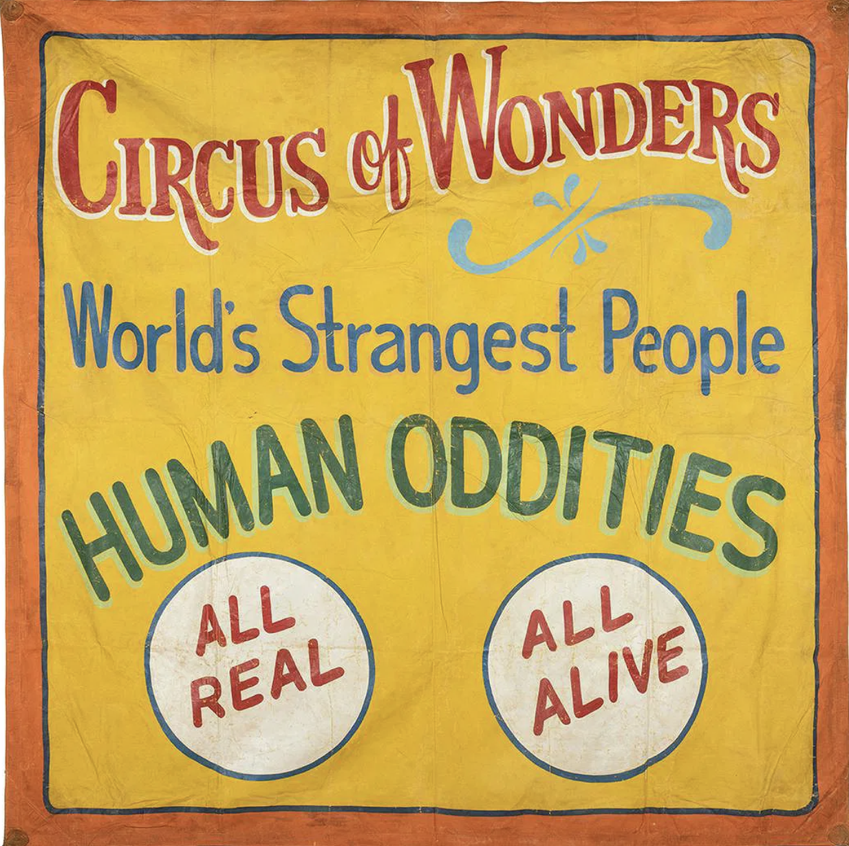
This large hand-painted canvas sideshow banner has everything you want from old carnival advertising: huge lettering, loud color, slightly wonky handwork, and absolutely no subtlety about getting your attention. Against a warm yellow field bordered in orange and blue, it announces “Circus of Wonders,” followed by “World’s Strangest People” and the wonderfully direct “HUMAN ODDITIES.” Two large white medallions at the bottom promise “ALL REAL” and “ALL ALIVE.”
The lettering is especially good. Red, blue, green, white, and pale turquoise are layered to create shadows and depth, while a loose decorative flourish breaks up the typography. Up close, you can see the painter’s hand everywhere: uneven outlines, brush marks, shifts in spacing, and small inconsistencies that give the banner considerably more personality than mechanically printed advertising ever could. The canvas shows expected wear from use and storage, including creases, scattered losses, rubbing, staining, and general surface aging.
Sideshow banners like this were essentially giant roadside sales pitches. Hung across entrances and midway façades, they had only a few seconds to stop someone walking past, so painters relied on enormous lettering, saturated colors, sensational language, and bold imagery. Tampa, Florida became an important center for this work during the mid-20th century, home to banner painters and commercial shops supplying traveling carnivals throughout the country.
This example is unsigned, so a firm attribution would be difficult. Stylistically, however, it fits comfortably within the Tampa banner-painting tradition associated with Snap Wyatt, Jack Cripe, and Sigler & Sons Art Service. Both Wyatt and Cripe worked in the Tampa sideshow world, while Sigler’s shop produced banners for traveling shows on a commercial scale.
Whether painted by one of those recognizable hands or another artist working within the same circle, it survives as a terrific piece of American carnival history, made to shout across a crowded midway and still doing a pretty good job of it.
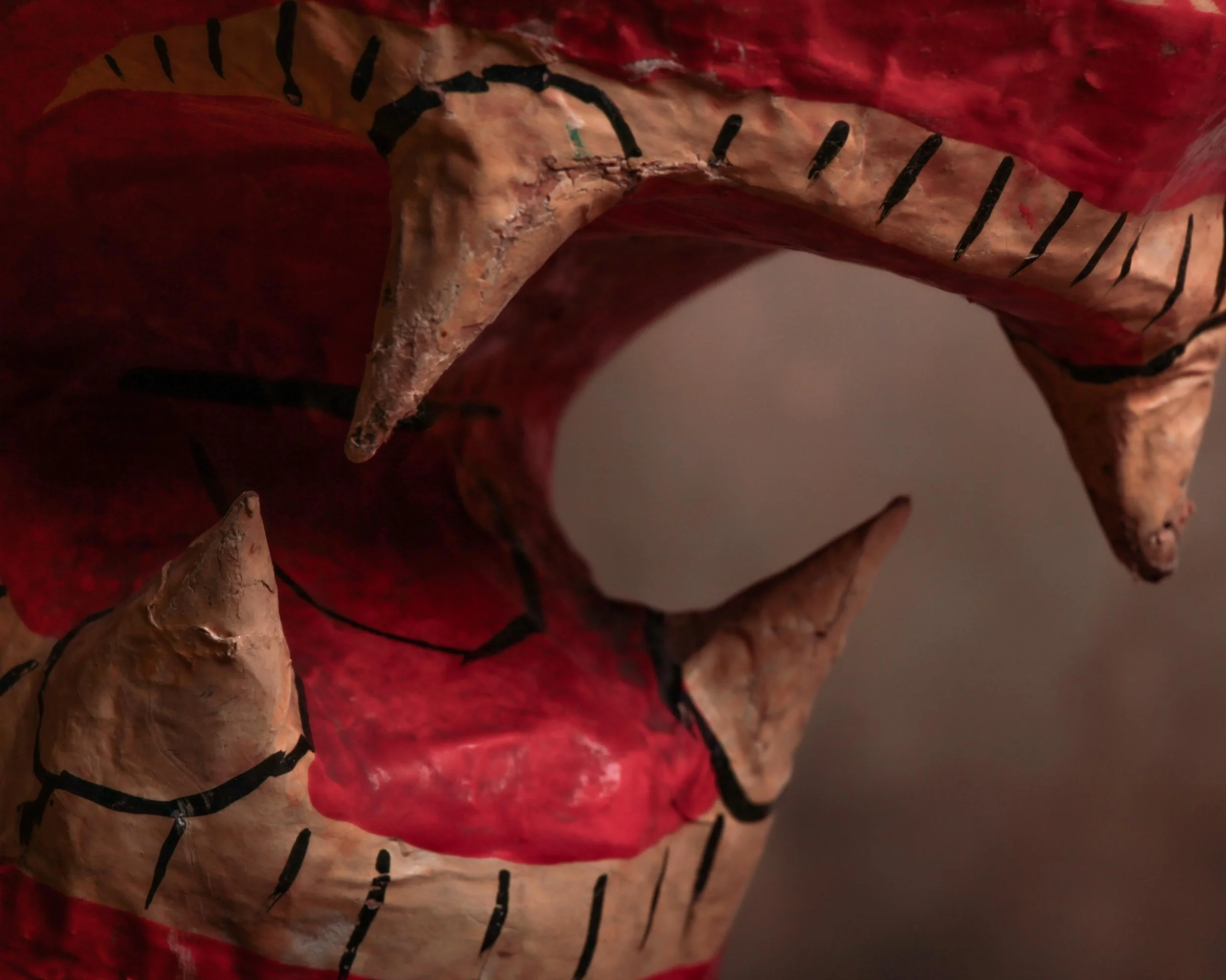
This wonderfully expressive papier-mâché lion dates to around the 1930s and has exactly the kind of personality that makes handmade objects hard to resist. He’s big, slightly awkward, a little intimidating, and somehow still very charming.
The lion is constructed in papier-mâché and finished in a warm reddish-brown paint, with simple black hand-painted lines defining the mane, paws, whiskers, facial features, and body. His oversized head is the main event. The mouth is wide open in a permanent roar, complete with individually formed teeth and fangs, a bright red interior, painted gums, and a wonderfully exaggerated muzzle. The large painted eyes give him an almost animated expression, somewhere between fierce and mildly surprised.
His body is substantial and simply modeled, standing firmly on four broad paws. Rather than trying for anatomical perfection, the maker clearly leaned into presence and character. A braided cord tail hangs from the back, an especially nice handmade detail that adds to the slightly theatrical feel of the piece.
The surface shows plenty of age and use, including scuffs, scratches, areas of paint loss, small cracks, worn edges, and old repairs or touch-ups. There is visible wear around the nose, mouth, teeth, body, and paws. None of this feels out of place. In fact, the imperfections make the construction easier to appreciate and give the lion a much more interesting surface than a pristine example ever could.
Its original purpose is uncertain, but the large scale, lightweight construction, bold paintwork, and dramatic expression suggest it may have been made as a decorative display, theatrical prop, parade figure, or fairground-related object.
A great piece of early 20th-century folk art with a lot of visual presence, handmade charm, and just the right amount of bite.
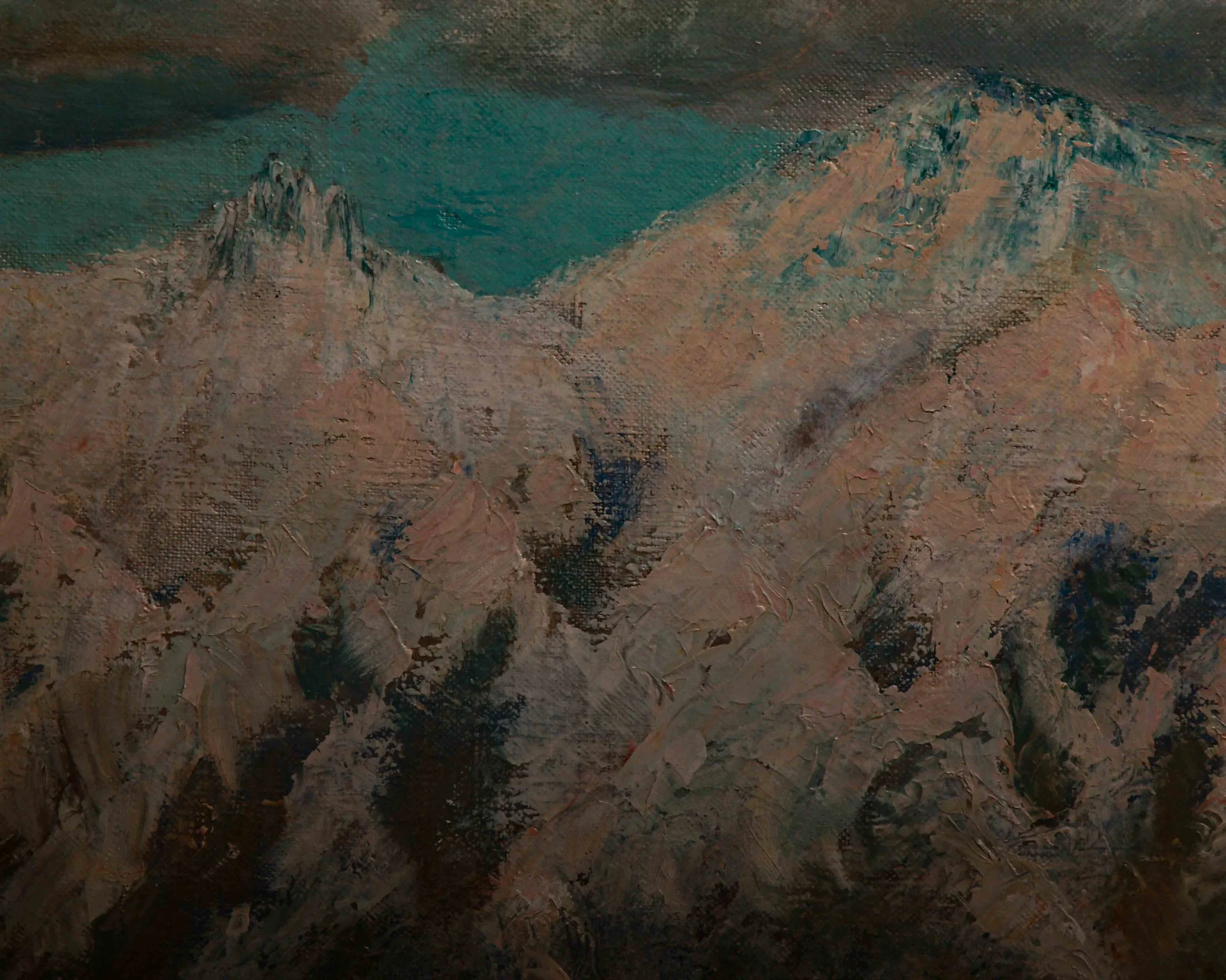
This charming antique oil painting captures a striking mountain landscape where rugged, snow-covered peaks rise dramatically above an open desert plain. The contrast between the crisp white mountains and the warm, earthy foreground gives the piece a wonderful sense of balance, creating a scene that feels both peaceful and expansive. Overhead, large, billowing clouds drift across a bright blue sky, adding movement and depth while casting soft shadows across the mountains below.
The artist has used loose, expressive brushstrokes throughout the composition, giving the painting a painterly quality that feels natural rather than overly refined. Thick applications of paint in the snowy peaks create texture, while softer blending in the clouds lends a sense of atmosphere. The foreground is painted with muted browns, dusty tans, and olive greens, suggesting dry desert vegetation scattered across the landscape. Small shrubs, a cluster of dark green trees, and a tiny red-roofed building tucked near the base of the mountains provide scale and a subtle focal point, inviting the viewer to imagine life within this remote setting.
The color palette is understated yet effective, pairing cool blues and whites with warm earth tones to emphasize the changing terrain. The mountains dominate the composition without overwhelming it, while the open sky contributes an airy, spacious feeling. Visible canvas texture and confident brushwork add character, highlighting the handcrafted nature of the piece.
Mounted on stretched canvas, the painting displays the gentle signs of age and handling that are often appreciated in vintage artwork. Minor wear around the edges and light surface variations are consistent with its age and contribute to its authentic appeal without distracting from the overall presentation.
Circa 1940s
Measures 14” by 20”
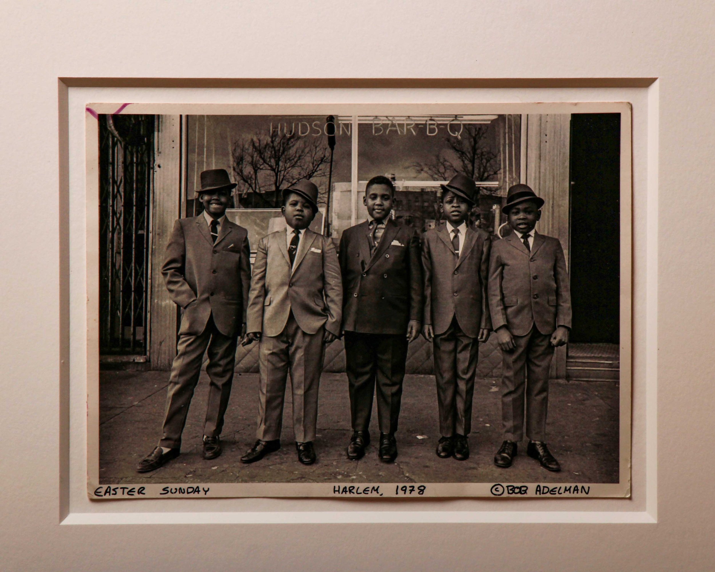
There’s a reason Bob Adelman’s photographs still land with so much force decades later. He had a way of catching people exactly as they were, proud, stylish, tired, joyful, guarded, confident, all at once. Nothing overworked. Nothing staged into lifelessness. Just real life, sharpened by timing.
This 1978 silver gelatin print, titled Easter Sunday, Harlem, captures five young boys lined up outside Hudson Bar-B-Q in Harlem, each dressed like they knew the sidewalk was their runway. Sharp suits, polished shoes, ties pulled tight, hats tilted with varying degrees of confidence. Together, they look less like kids waiting for church and more like a tiny board of directors about to negotiate a record deal.
And that’s the magic of the photograph. It’s deeply human without trying too hard to announce itself as Important Photography. Adelman lets the details do the work. The slight lean of the boy on the left. Hands in pockets. One expression cool and skeptical, another halfway between serious and amused. The storefront reflection behind them quietly rooting the whole scene in a specific New York moment.
Printed as an original silver gelatin photograph, the image carries all the tonal richness you want from darkroom work of the period. The blacks are deep without swallowing detail, while the softer grays keep the photograph grounded and alive rather than overly crisp or clinical. You can feel the texture of the city in it.
Hand signed, titled, and dated along the lower margin by Adelman, the photograph has been professionally framed under museum quality plexiglass, giving it a clean, restrained presentation that lets the image stay front and center.
What makes it especially good now is that it never slips into nostalgia bait. It doesn’t romanticize the moment or flatten it into cliché. It simply observes five impeccably dressed kids standing on a Harlem sidewalk in 1978, fully aware of how good they look.
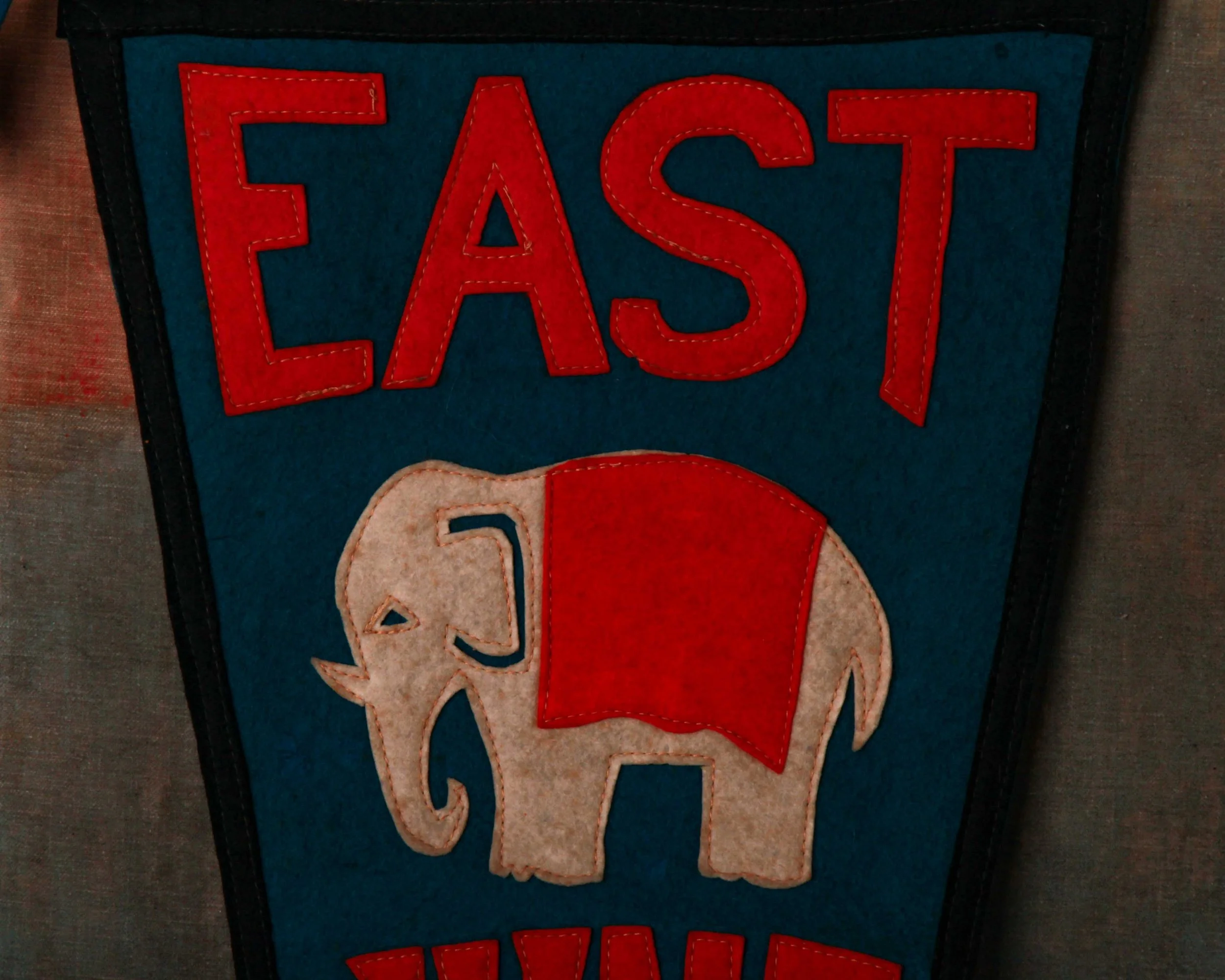
There’s something deeply charming about old school pennants, especially when they weren’t made for tourists, collectors, or nostalgia dealers. This one was made for somebody who actually went there. A student, a proud parent, maybe someone headed home after a game on a cold Ohio night with this rolled under their arm.
Made for East High School in Akron, Ohio, this felt pennant carries all the graphic confidence that 1920s school spirit seemed to produce so effortlessly. The colors do most of the heavy lifting: bold orange lettering stitched against a deep blue ground, framed by black trim that sharpens the whole silhouette. And right in the center, an elephant mascot that somehow manages to look both tough and slightly polite at the same time. It’s great.
The lettering has that unmistakable handmade athletic feel too. Slightly irregular, stitched rather than printed, full of character in a way modern reproductions rarely get right. “EAST” across the top lands with real presence, while the oversized “29” running down the tail gives the pennant a strong vertical rhythm that reads beautifully on the wall.
What really makes this one work, though, is the material itself. Felt pennants age in a very particular way. They soften. The colors mellow slightly. The edges relax. Instead of feeling worn out, they start to feel lived with. This example still retains remarkably strong color throughout, with only light age and handling wear that adds exactly the right amount of honesty.
Flip it over and you get the ghost image of the stitched lettering and elephant showing faintly through the back, which honestly might be one of the best details on the whole piece. It reminds you this thing was sewn together by actual hands, not mass-produced by machines trying to imitate character decades later.
Long and narrow at nearly classic collegiate proportions, it hangs beautifully. Equal parts Americana, folk graphic, and small-town memory stitched into felt.
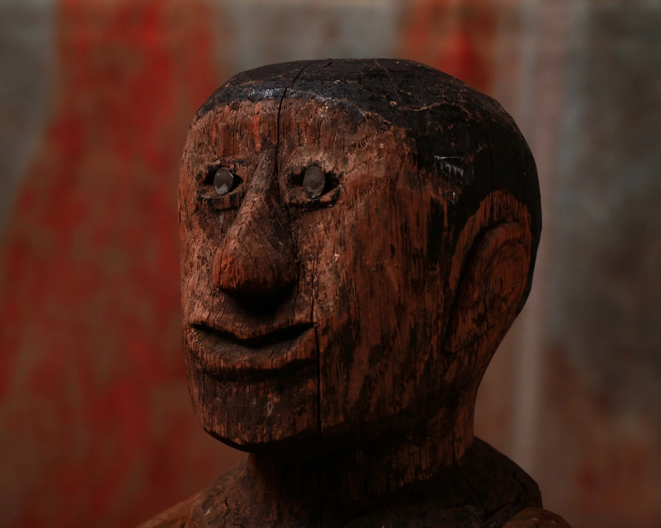
There’s something wonderfully unruly about this 1880 American primitive doll. The second you see it, it feels less like a toy and more like a character that wandered out of a storybook and decided to stay awhile. Honestly, it has the same strange, lovable energy as one of the monsters from Where the Wild Things Are. Slightly wild-eyed, slightly mysterious, but impossible not to like.
Hand carved from wood with its original painted surface still intact, the figure has an incredible rawness to it. The carving is direct and unfiltered in the best possible way. No delicate refinement, no attempt at perfection. Just bold features cut confidently into wood: oversized ears, a sharply pointed nose, a broad mouth curled into an unreadable little grin, and those fantastic metal eyes that catch the light in a way that makes the whole thing suddenly feel alive.
The surface tells the rest of the story. Layers of age, handling, shrinkage cracks, and worn paint have built up into a deep, dry patina that only a true survivor gets to wear. The dark paint across the hair remains remarkably strong, contrasting beautifully against the warmer exposed wood tones throughout the face and body.
One arm shows significant wear and loss, with softened, splintered wood fibers exposed from decades of use and time. But honestly, that damage only pushes it further into folk art territory. It doesn’t feel fragile or diminished. It feels seasoned. Earned.
What makes pieces like this so compelling is that they were never made as art objects in the formal sense. They were made by hand, likely for a child, with whatever tools and materials were available. And yet somehow, over a century later, this little carved figure lands closer to modern sculpture than many things intentionally made for galleries.
Measures 6” wide, 4” deep, and 15” high. Quietly eerie. Deeply charming. The kind of object that watches the room as much as the room watches it.
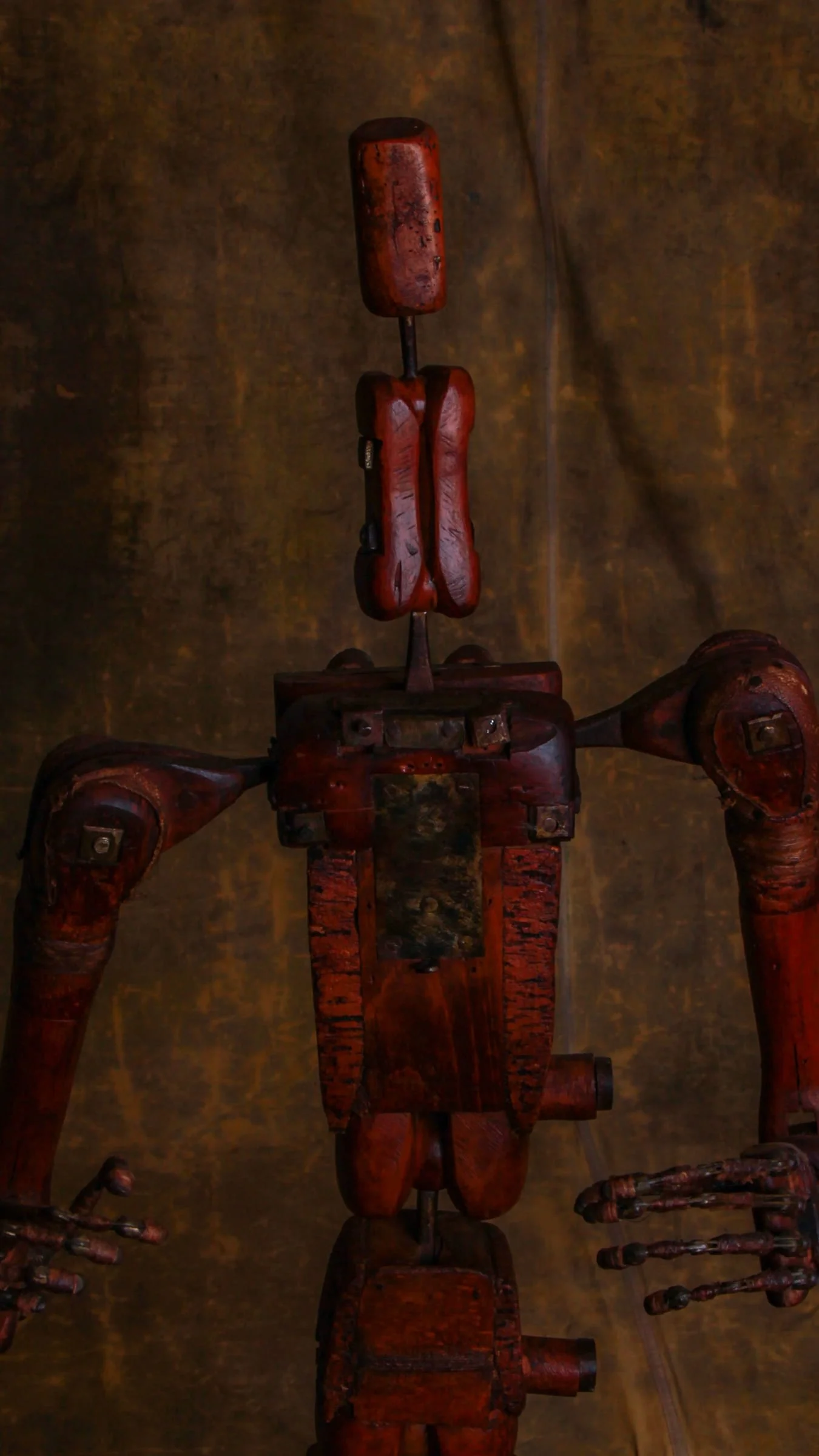
There’s something wonderfully unnerving about this late 18th century articulated mannequin by François-Pierre Guillois. At first glance, it reads almost like a figure pulled from an unfinished experiment. Half anatomy study, half mechanical apparition. The proportions are intentionally abstracted, the body reduced to a sequence of carved wooden forms connected by iron rods, leather hinges, wrapped joints, and tiny handmade fasteners that feel more surgical than decorative.
Guillois mannequins were working tools, built for artists who needed to understand movement, posture, and the mechanics of the human figure before photography could freeze a gesture in place. But this one pushes far beyond simple studio equipment. The long limbs, articulated fingers, and narrow stacked head give it a presence that feels startlingly modern, almost proto-robotic, despite being over two centuries old.
The surface is exceptional. Deep oxblood red lacquer worn smooth in places from handling, with scratches, chips, darkened brass plates, and layers of age that settle naturally into every edge and joint. You can see the construction thinking as much as the craftsmanship. Nothing hidden, nothing overly refined. Every screw, wrap, and pivot point remains visible, giving the figure an honesty that makes contemporary artist mannequins feel sterile by comparison.
Mounted on its original stand, it holds itself somewhere between sculpture and instrument. From certain angles it feels theatrical, from others oddly fragile, like it could collapse or come alive depending on the light in the room.
The articulated wire fingers are especially good. Slightly tense, slightly clawed, they give the mannequin an unexpected emotional charge, as though it’s caught mid-thought rather than mid-pose.
A rare survival from the late Enlightenment period, when art, anatomy, engineering, and curiosity still comfortably occupied the same table.
ITEM NOT AVAILABLE IMMEDIATELY—INQUIRE IF INTERESTED hello@heimweeantiques.com
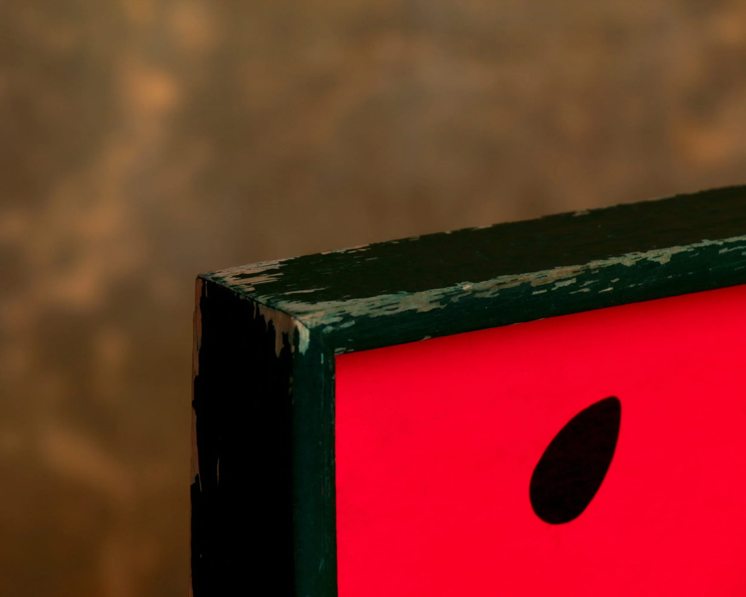
A mid-century serving tray built around a bold, graphic watermelon slice, all clean arcs and saturated color. The composition is simple but confident: deep red field dotted with black seeds, a crisp white band, and that unmistakable green rind fading outward into a darker edge. It’s the kind of design that feels pulled straight from a 1950s picnic ad, where everything was bright, optimistic, and just a little stylized.
The construction leans practical. A solid wooden frame surrounds the panel, painted in a deep green that ties the whole thing together. Cutout handles on either side are shaped with a slight curve, comfortable in the hand and clearly meant to be used, not just looked at. The tray has a good weight to it without feeling heavy, the kind of piece you could actually carry out loaded with drinks and not think twice.
What’s especially nice here is the wear. The edges show honest scuffing, a bit of paint loss along the corners, just enough to soften the graphic sharpness. The surface still holds its color beautifully, with only light marks that come from use rather than neglect. The back is simple, unfinished wood, stained and aged in a way that tells you it’s been around long enough to see a few seasons come and go.
Mid-century trays
Mid-century trays sit at that intersection where utility met a newly confident sense of design. In the 1940s through the 1960s, the idea of entertaining at home shifted. Casual hosting, backyard gatherings, and TV dinners all nudged everyday objects to become more visually engaging. The tray, once purely functional, turned into a kind of portable canvas.
Manufacturers leaned into new materials and techniques. Laminates, molded plywood, fiberglass, and early plastics allowed for bold color, smooth surfaces, and easy cleaning. At the same time, advances in screen printing and lithography made it possible to apply graphic designs at scale. That’s why you see everything from atomic patterns and abstract forms to playful fruit, cocktails, and kitschy scenes.

At its core, it’s a studio portrait, two young men posed shoulder to shoulder in their naval uniforms, striped undershirts peeking through, posture straight, expressions somewhere between composed and curious. But look a little closer and the photograph starts to shift. This isn’t just a photograph, it’s been hand-touched, carefully brought to life with subtle color.
The sailor collars carry a soft wash of turquoise, just enough to catch the eye without overpowering the image. Their lips are tinted a gentle red, giving warmth to otherwise monochrome faces. It’s restrained, deliberate work, the kind of coloring that sits right on the edge between realism and interpretation.
That practice, hand-coloring black and white photographs, was common in the first half of the 20th century, especially for portraits like this. It was a way of bridging the gap before color photography became widely accessible. But more than that, it added a layer of intimacy.
Before color film became practical and affordable, there was a long stretch of time when people still wanted their photographs to feel lifelike, not just accurate, but warm. That’s where hand-coloring stepped in.
Hand-painted Photography
In the early decades of the 20th century, studios routinely offered hand-painted photographs as an upgrade. A finished black and white print would be passed to a colorist, often someone trained in miniature painting or retouching, who would work directly on the surface using transparent dyes, watercolors, or oil tints. The goal wasn’t to completely repaint the image, but to breathe just enough color into it to suggest reality. Cheeks might get a soft blush, lips a touch of red, uniforms or dresses a gentle wash of color. Done well, it feels almost invisible.
The materials mattered. Photographic papers were slightly absorbent, which allowed pigments to settle in without fully covering the image beneath. Colorists worked in thin layers, building tone gradually, always careful not to obscure the fine detail captured by the camera. It was a balancing act between enhancement and restraint.
This process also introduced a human hand into what was otherwise a mechanical medium. Every piece is a little different. Two prints from the same negative could be colored in entirely different ways depending on the artist’s choices. That’s part of the appeal now. You’re not just looking at a photograph, you’re seeing a collaboration between lens and brush.
By the 1940s and 50s, as true color photography became more accessible, the practice began to fade. But for a few decades, this was how photographs crossed over from documentation into something closer to portraiture.
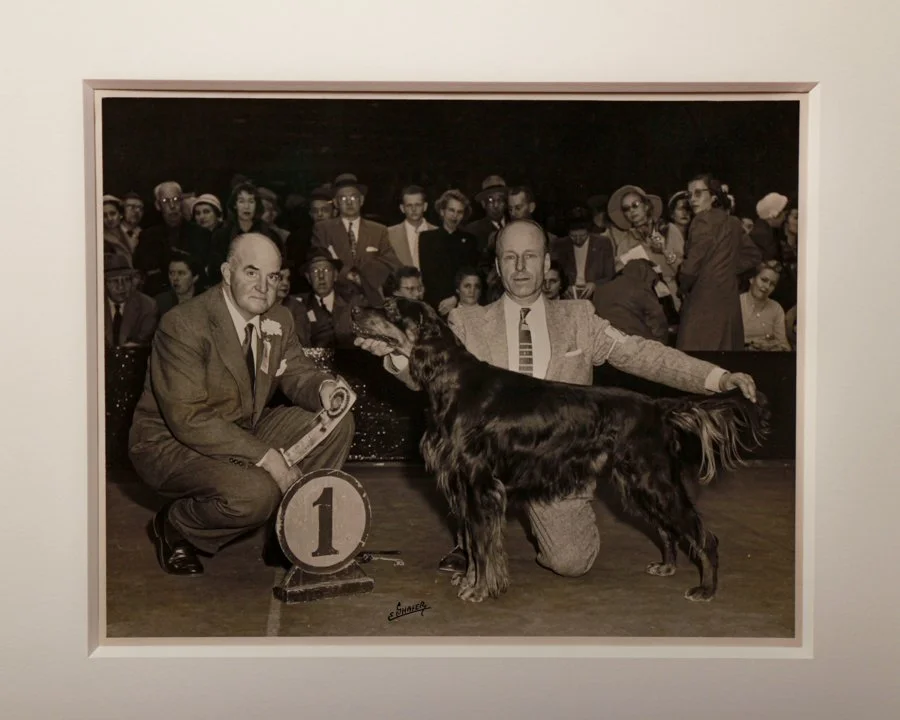
Framed glory from the floor of Madison Square Garden, this 1958 Westminster Kennel Club ribbon is the real deal-and not just because it still has its matching photo. The ribbon is marked "Best of Winners," complete with its original satin luster, a bronze center medallion, and a bit of age-earned charm along the edges. But the real kicker is the black-and-white photo it's framed with: a poised Gordon Setter mid-victory pose, flanked by a proud handler and a judge who's still holding the very same ribbon now mounted beside him. All sealed up in a clean shadow box frame with museum quality plexiglass.
Category History
By the 1950s, the Westminster Kennel Club Dog Show had settled into something close to its modern identity, but it still carried a distinctly mid-century flavor. Held at Madison Square Garden in New York City, the show wasn’t just a competition, it was a social event, a spectacle, and a reflection of postwar American culture all rolled into one.
The Westminster Kennel Club itself dates back to the 1870s, making it one of the oldest continuous sporting events in the country, but the 1950s marked a period of polish and national attention. Television was beginning to creep into American living rooms, and while full broadcasts came later, the idea of pedigree dogs, careful grooming, and competitive judging started to reach beyond the Garden’s walls. Attendance was strong, and the audience was a mix of serious breeders, society figures, and curious New Yorkers looking for a bit of pageantry in the middle of winter.
Madison Square Garden gave the whole thing a theatrical edge. The green carpeted rings, bright lights, and tightly scheduled judging created an atmosphere that felt part sporting event, part stage production. Handlers moved with precision, presenting each dog almost like a performance. Every detail mattered, from the way a dog stood to how it moved in a circle, all judged against strict breed standards that had been refined over decades.
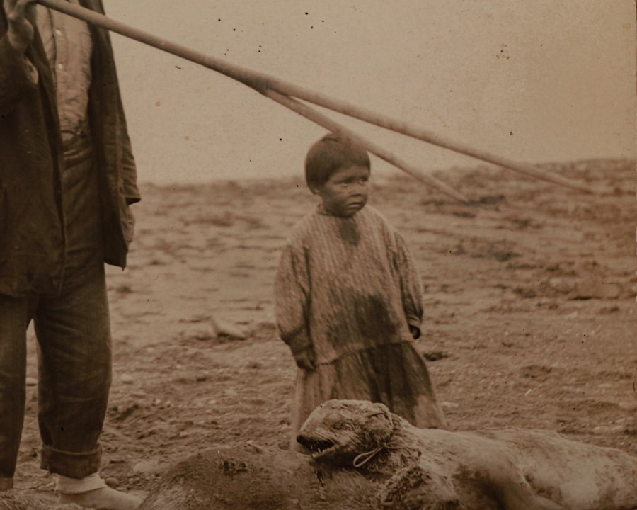
This original real photo postcard captures a moment of life and survival among Alaskan Inuit hunters. Likely taken in the early 20th century, the scene shows two men and a young child standing on rocky tundra beside several freshly hunted seals. One man holds a long harpoon over his shoulder, while the other grips a woven pouch-possibly used for rope or tools. The child, wearing a simple oversized dress, stands barefoot just inches from the seals, their body language quiet and observant.
The photo is uncaptioned, but the clarity of the image and the composition speak volumes. The tone is documentary and direct, offering a rare, unvarnished look at subsistence life in the Arctic, where hunting was not sport or spectacle-it was survival.
Alaskan Inuit Hunters
Alaskan Inuit hunters developed their skills in one of the most demanding environments on earth, where success wasn’t just about technique—it was about survival, timing, and deep familiarity with the land and sea. Hunting was central to daily life, providing food, clothing, tools, and fuel. Nothing was wasted. Seal, whale, caribou, fish—each animal carried multiple uses, and knowing how to process and preserve those resources was just as important as the hunt itself.
What stands out is the level of observation involved. Hunters read ice conditions, animal behavior, weather patterns, and seasonal shifts with precision. Small details mattered—a change in wind, the texture of snow, the movement of water under ice. This knowledge was passed down over generations, shaped by experience rather than written instruction.
Tools reflected that same balance of function and environment. Harpoons, kayaks, clothing made from animal skins—all designed specifically for Arctic conditions. Lightweight where needed, durable where it counted.
Hunting was rarely a solitary act. It was tied to community—shared effort, shared risk, shared reward. Cooperation increased success and ensured that resources were distributed where needed.
Today, Inuit hunting traditions continue, adapted but still grounded in that same relationship with the environment. It’s a practice built on respect—for the animals, the land, and the knowledge required to move within both.
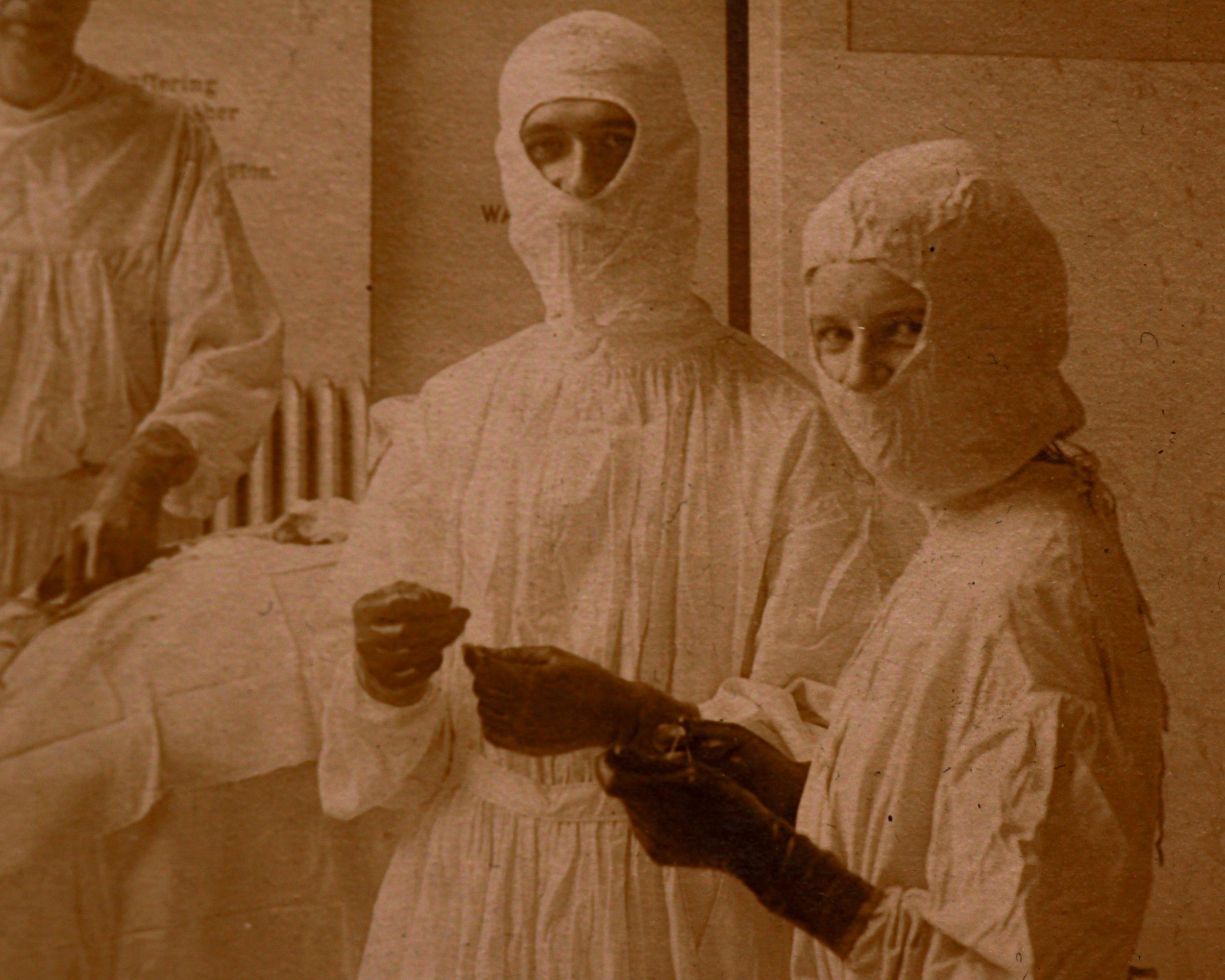
Here's a charmingly eerie glimpse into early 20th-century medicine: a mounted photograph taken in the operating room of Cooley Dickinson Hospital in Northampton, Massachusetts, circa 1910s. Six medical staff are seen mid-surgery-three of them suited up like turn-of-the-century ninjas, their faces completely veiled in gauze and cotton. There's a nurse in glasses calmly observing, an anesthetist holding a cone to the patient's face, and a surgeon with a blindfold bandana situation that raises a few questions.
Printed by Devine & Rosenberg of Boston, this sepia-toned photo is affixed to its original studio mount, complete with bevel-edged framing.
Category History
Early 1900s surgery sits right at a turning point—half rooted in rough, practical tradition, half stepping into modern medicine. By this point, anesthesia was already in use, which meant operations could be more controlled and less frantic than in the 19th century. At the same time, antiseptic and aseptic practices were becoming standard, thanks to earlier breakthroughs in understanding infection. Surgeons were finally operating with cleaner hands, sterilized tools, and a clearer sense of what could go wrong.
Hospital operating rooms began to reflect that shift. Spaces were often tiled—walls, floors, even ceilings—so they could be washed down thoroughly. Light mattered, too. Large windows or overhead lamps were used to flood the room, making every detail visible. The layout was deliberate: instrument tables arranged within easy reach, assistants positioned with purpose, everything designed to reduce unnecessary movement.
There’s a noticeable change in how surgery was approached. It became less about speed alone and more about precision. Specialized instruments appeared, tailored to specific procedures, and surgical teams started to function as coordinated units rather than individuals improvising in the moment.
Still, it wasn’t what we’d call modern. Techniques varied, risks were high, and recovery could be unpredictable. But this era laid the groundwork. It’s where surgery began to look familiar—structured, methodical, and increasingly guided by knowledge rather than guesswork.
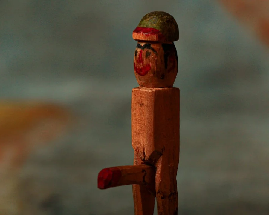
What you're looking at is a delightfully crude hand-carved wooden figure that walks the fine line between innocent mischief and bawdy humor. Standing proudly (pun fully intended) on a round base, this little character features a manually articulated phallus that swings upward like a flag at full mast.
This folk art marvel features a smiling hand-painted face, a green and red cap, and rudimentary limbs. He's chipped, worn, and a little paint-drunk.
There’s a kind of unapologetic humor baked into it—playful, slightly irreverent, and clearly made to get a reaction, whether a laugh, a raised eyebrow, or both.
Category History
Folk art lives in that space where making isn’t about fitting into an art world—it’s about expressing something directly, often with whatever is at hand. It’s shaped by necessity, tradition, and instinct rather than formal training. You see it in carved figures, painted signs, stitched textiles, weathervanes, toys—objects that were sometimes made to be useful, sometimes just because someone felt like making them.
What sets folk art apart is its independence. Proportion might bend, perspective might flatten, colors might lean bold or unexpected—but it all works because it’s guided by the maker’s eye, not a rulebook. There’s often a strong sense of place, too. Materials and motifs reflect where it was made, whether that’s rural, coastal, urban, or somewhere in between.
Many pieces carry a kind of quiet storytelling. A carved animal that feels more like a memory than a specimen, a painted scene that captures an event or daily life without worrying about precision. Imperfections aren’t flaws—they’re part of the language.
Over time, these objects shift from everyday use into something more reflective. What was once a tool or decoration becomes a record of how someone saw the world and chose to shape it. Folk art doesn’t try to impress—it connects, directly and without much explanation.
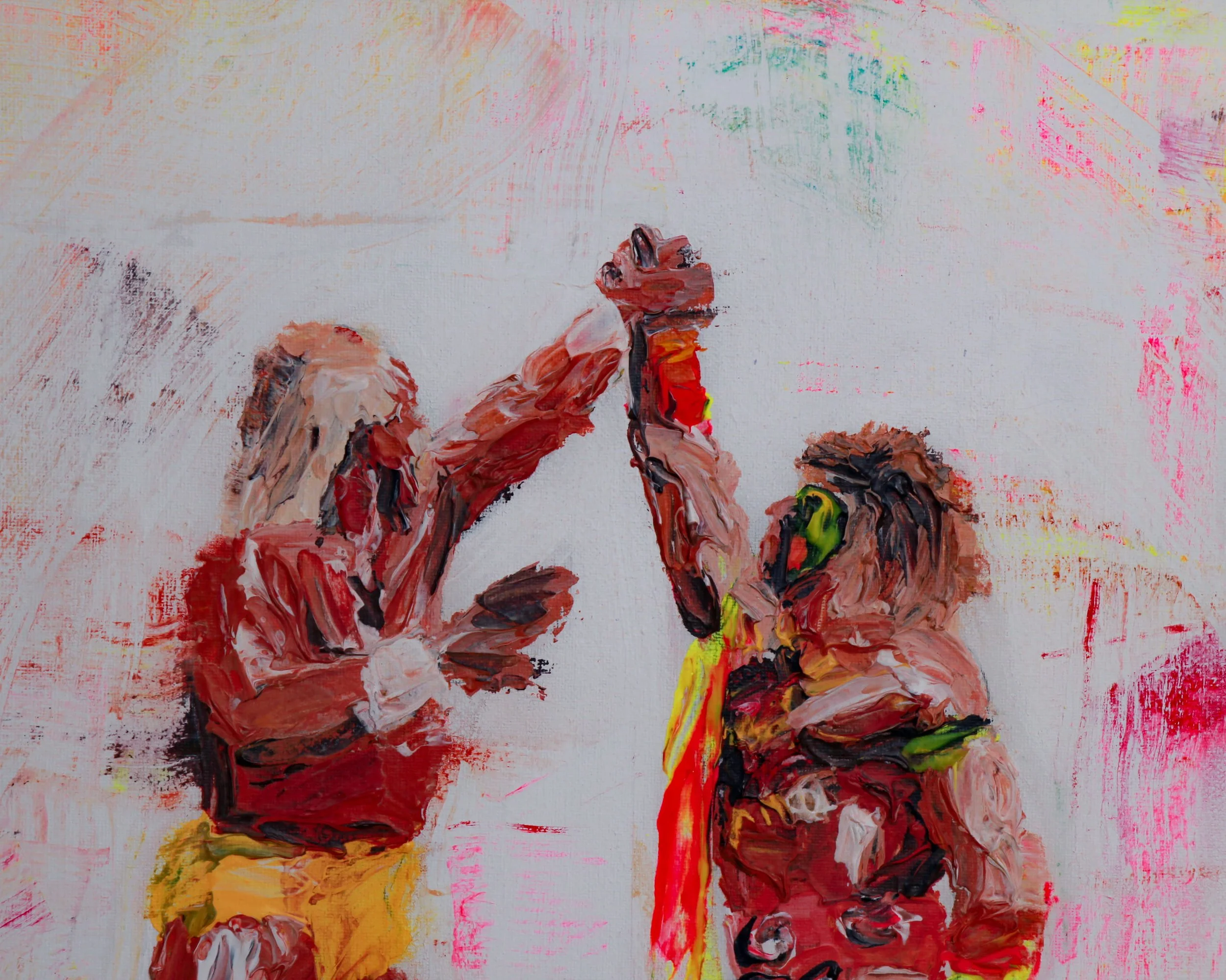
This original painting by Sam Evans is a raw, expressive tribute to one of the most legendary moments in wrestling history—Hulk Hogan and The Ultimate Warrior facing off in a moment of mutual respect. The piece is an explosion of energy, capturing the essence of these two larger-than-life 80s icons in thick, textured strokes of acrylic paint.
The white canvas serves as a wild, chaotic backdrop, with splashes of pink, yellow, and red, echoing the electric atmosphere of a WWF showdown. Hogan, decked out in his classic yellow, stands on one side, his muscular frame rendered in bold, impasto strokes. Opposite him, The Ultimate Warrior is a vision of intensity, his face paint streaked across his features in vivid green and orange, his wild energy practically vibrating off the canvas.
The two wrestlers meet in the center, their hands raised in a high-five that speaks to the drama, camaraderie, and larger-than-life spectacle of professional wrestling at its peak. The thick application of paint gives the piece a tactile, almost sculptural feel, with the artist's brushstrokes adding movement and depth.
Sam Evans
Sam Evans works in that space where image and memory overlap. Based in Australia, his paintings often pull from familiar figures—film characters, cultural icons, everyday faces—but strip them back to something more immediate. The likeness is there, but it’s not the point. Gesture, texture, and mood do most of the work.
His approach leans loose and intuitive. Oil on board or canvas, paint dragged, wiped, layered, sometimes left unresolved. You can see decisions as they happen—areas built up, others abandoned. It gives the work a sense of movement, like it’s still thinking.
What’s interesting is how he balances recognition with abstraction. A character might be instantly identifiable, yet the surface resists polish. Edges blur, colors shift, and the image sits somewhere between clarity and suggestion.
There’s a cinematic quality to it, but not in a literal way. More like fragments of scenes—cropped, paused, slightly altered.
His work doesn’t aim for perfection. It leans into imperfection, letting the process stay visible. That’s where the energy lives.
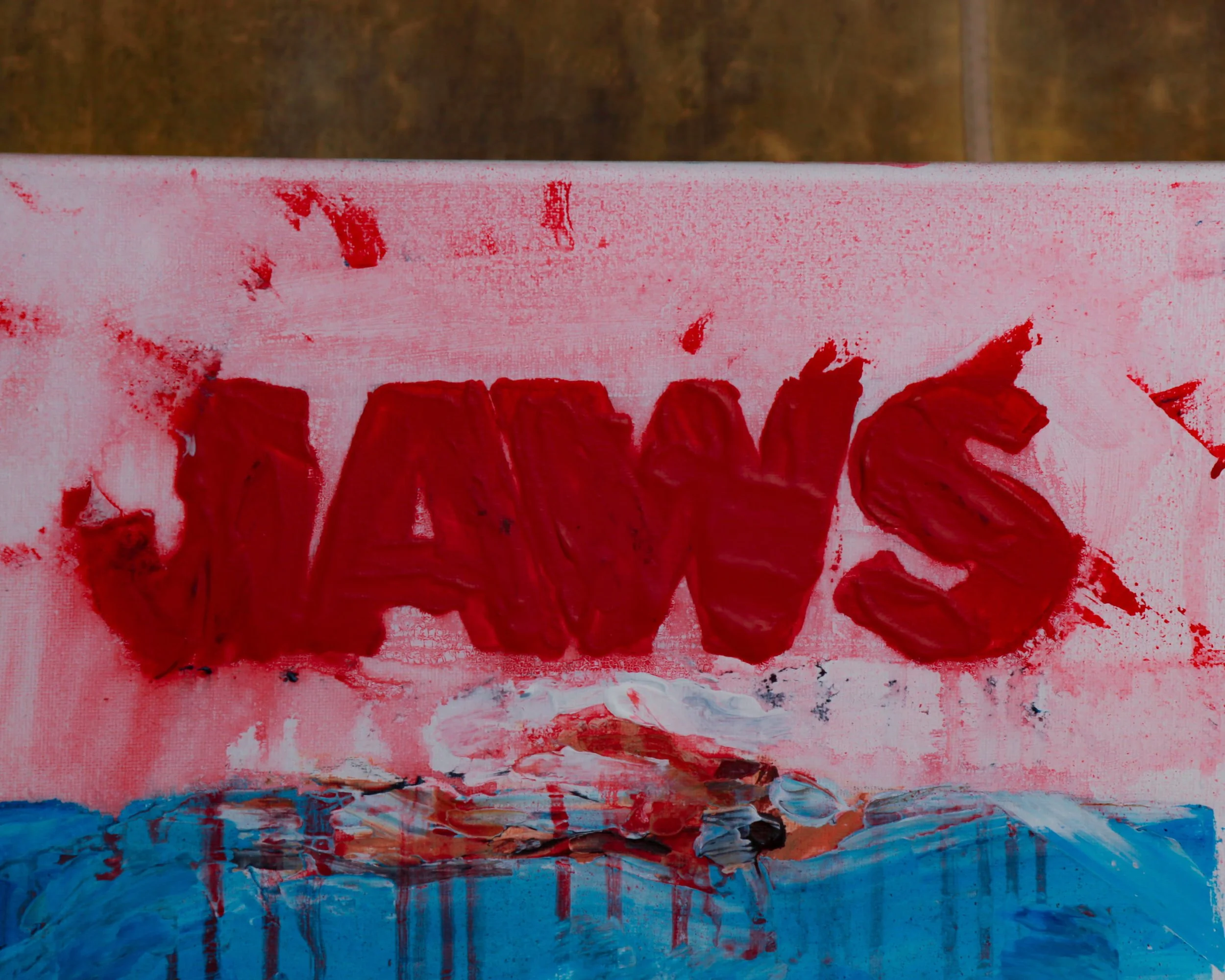
This original painting dated 2023 by Sam Evans is a bold, expressive take on the legendary Jaws movie poster. The raw, textured brushstrokes give it an almost frantic energy-like you've caught this scene in the middle of a nightmare. The massive great white shark emerges from the deep, its gaping mouth filled with jagged, menacing teeth, while streaks of red paint drip like blood in the water. Above, the iconic JAWS title looms in thick, impasto red, almost smeared like it was painted with pure adrenaline. The swimmer at the surface is just a tiny, vulnerable figure, oblivious to the terror below.
The whole thing feels urgent, messy in the best way—like the tension of the film has been trapped in paint. It's not a clean-cut reproduction of the poster; it's a visceral, almost chaotic reimagining that captures the fear, the movement, and the sheer cinematic impact of Spielberg's classic thriller.
Sam Evans
Sam Evans works in that space where image and memory overlap. Based in Australia, his paintings often pull from familiar figures—film characters, cultural icons, everyday faces—but strip them back to something more immediate. The likeness is there, but it’s not the point. Gesture, texture, and mood do most of the work.
His approach leans loose and intuitive. Oil on board or canvas, paint dragged, wiped, layered, sometimes left unresolved. You can see decisions as they happen—areas built up, others abandoned. It gives the work a sense of movement, like it’s still thinking.
What’s interesting is how he balances recognition with abstraction. A character might be instantly identifiable, yet the surface resists polish. Edges blur, colors shift, and the image sits somewhere between clarity and suggestion.
There’s a cinematic quality to it, but not in a literal way. More like fragments of scenes—cropped, paused, slightly altered.
His work doesn’t aim for perfection. It leans into imperfection, letting the process stay visible. That’s where the energy lives.
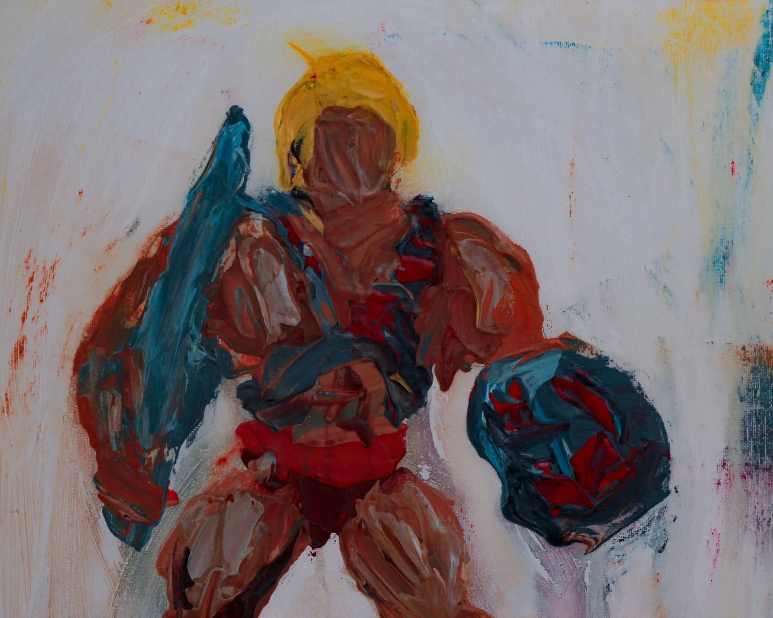
This original painting by Sam Evans is a wild, raw take on the one and only He-Man-the ultimate 80s muscle-bound hero.
Thick, textured brushstrokes bring the legendary warrior to life, his signature blonde hair glowing against the chaos of the background.
He-Man is in full battle mode, gripping his Power Sword in one hand and his shield in the other, ready to take on Skeletor or whoever dares challenge the might of Grayskull. His red loincloth, chest armor, and bold stance scream strength, while the abstract strokes of blue and red give the painting an almost electric energy. The background is loose and expressive, with splashes of white and hints of yellow, like an otherworldly battlefield straight out of Eternia.
The back of the canvas is titled "He-Man," signed by the artist, and dated 2023-making it an instant collectible for any nostalgic fan of Masters of the Universe. More than a painting; it's a bold, action-packed tribute to one of the greatest cartoon heroes of all time.
Sam Evans
Sam Evans works in that space where image and memory overlap. Based in Australia, his paintings often pull from familiar figures—film characters, cultural icons, everyday faces—but strip them back to something more immediate. The likeness is there, but it’s not the point. Gesture, texture, and mood do most of the work.
His approach leans loose and intuitive. Oil on board or canvas, paint dragged, wiped, layered, sometimes left unresolved. You can see decisions as they happen—areas built up, others abandoned. It gives the work a sense of movement, like it’s still thinking.
What’s interesting is how he balances recognition with abstraction. A character might be instantly identifiable, yet the surface resists polish. Edges blur, colors shift, and the image sits somewhere between clarity and suggestion.
There’s a cinematic quality to it, but not in a literal way. More like fragments of scenes—cropped, paused, slightly altered.
His work doesn’t aim for perfection. It leans into imperfection, letting the process stay visible. That’s where the energy lives.
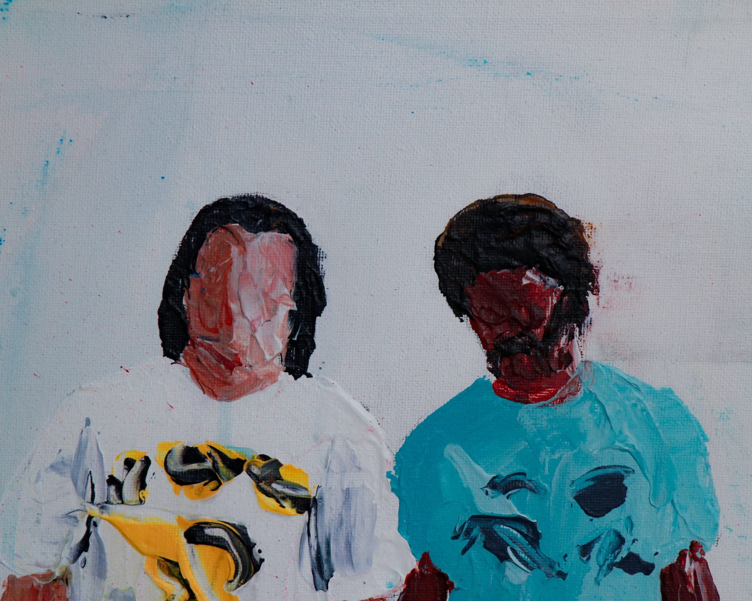
A tight, punchy trio of oil-on-board paintings by Sam Evans that taps straight into the cool, offbeat rhythm of Pulp Fiction. Vincent and Jules take center stage in their signature suits, rendered in loose, confident strokes that blur the faces but sharpen the attitude. There’s just enough red splatter and negative space to suggest the chaos without spelling it out.
Another panel shifts gears entirely, trading black suits for T-shirts and shorts—an unexpected, almost absurdly casual take that somehow feels right at home in Tarantino’s universe. It’s playful, a little irreverent, and a reminder that these characters live as much in style as they do in story.
The third piece captures that iconic dance scene—mid-step, slightly off-balance, full of rhythm. Evans leans into movement here, letting drips and gestures carry the energy instead of fine detail.
Across all three, the paint is handled with a kind of deliberate looseness—scraped, dragged, and left to speak for itself. It’s not about perfect likeness; it’s about capturing the feeling.
Sam Evans
Sam Evans works in that space where image and memory overlap. Based in Australia, his paintings often pull from familiar figures—film characters, cultural icons, everyday faces—but strip them back to something more immediate. The likeness is there, but it’s not the point. Gesture, texture, and mood do most of the work.
His approach leans loose and intuitive. Oil on board or canvas, paint dragged, wiped, layered, sometimes left unresolved. You can see decisions as they happen—areas built up, others abandoned. It gives the work a sense of movement, like it’s still thinking.
What’s interesting is how he balances recognition with abstraction. A character might be instantly identifiable, yet the surface resists polish. Edges blur, colors shift, and the image sits somewhere between clarity and suggestion.
There’s a cinematic quality to it, but not in a literal way. More like fragments of scenes—cropped, paused, slightly altered.
His work doesn’t aim for perfection. It leans into imperfection, letting the process stay visible. That’s where the energy lives.
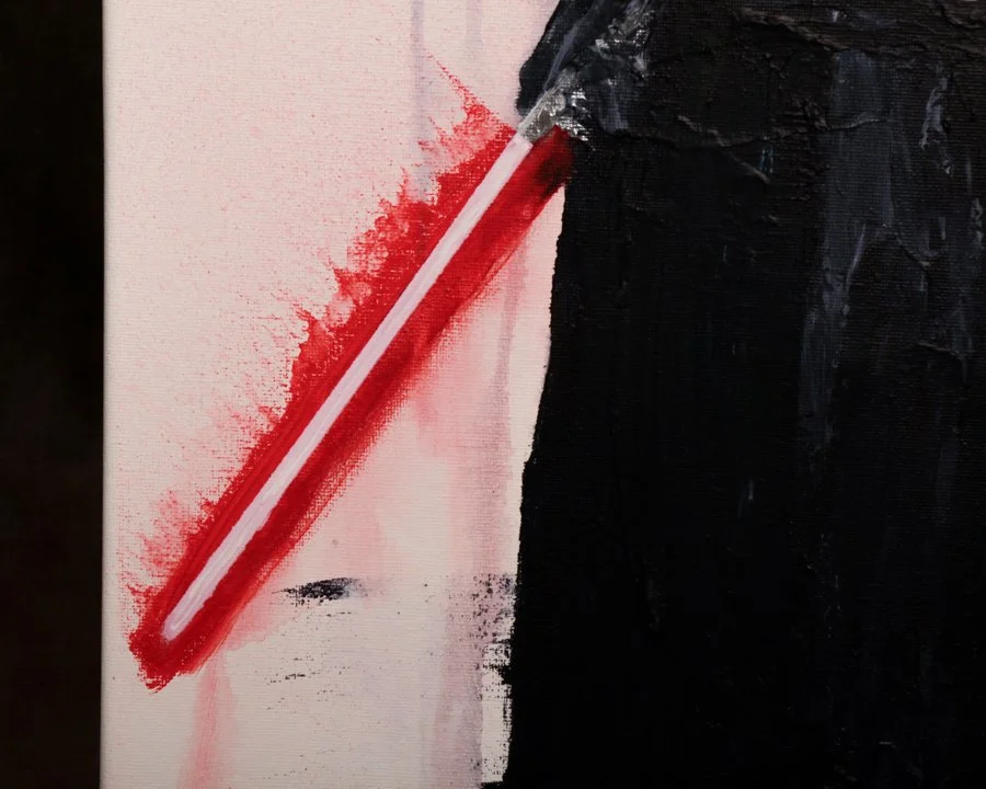
A tight, punchy set of seven oil-on-board paintings by Sam Evans, all dated 2023, that reimagines the Star Wars cast with a loose, expressive hand and just the right amount of restraint. Vader stands heavy and still, his red saber cutting through a field of scraped whites and charcoal streaks, while Han, Leia, and Luke feel almost caught mid-thought—figures built from gesture more than detail.
Evans leans into imperfection in the best possible way. Faces are suggested, not spelled out, and the paint does a lot of the talking—dragged, wiped, and layered like a memory that won’t sit still. C-3PO and R2-D2 come through with warmth and humor, while the stormtrooper lands somewhere between iconic and ghostly.
Each panel stands on its own, but together they read like a fragmented reel—familiar, but slightly out of focus. A smart, painterly take on iconic characters everyone knows, without feeling overly polished or precious.
Sam Evans
Sam Evans works in that space where image and memory overlap. Based in Australia, his paintings often pull from familiar figures—film characters, cultural icons, everyday faces—but strip them back to something more immediate. The likeness is there, but it’s not the point. Gesture, texture, and mood do most of the work.
His approach leans loose and intuitive. Oil on board or canvas, paint dragged, wiped, layered, sometimes left unresolved. You can see decisions as they happen—areas built up, others abandoned. It gives the work a sense of movement, like it’s still thinking.
What’s interesting is how he balances recognition with abstraction. A character might be instantly identifiable, yet the surface resists polish. Edges blur, colors shift, and the image sits somewhere between clarity and suggestion.
There’s a cinematic quality to it, but not in a literal way. More like fragments of scenes—cropped, paused, slightly altered.
His work doesn’t aim for perfection. It leans into imperfection, letting the process stay visible. That’s where the energy lives.
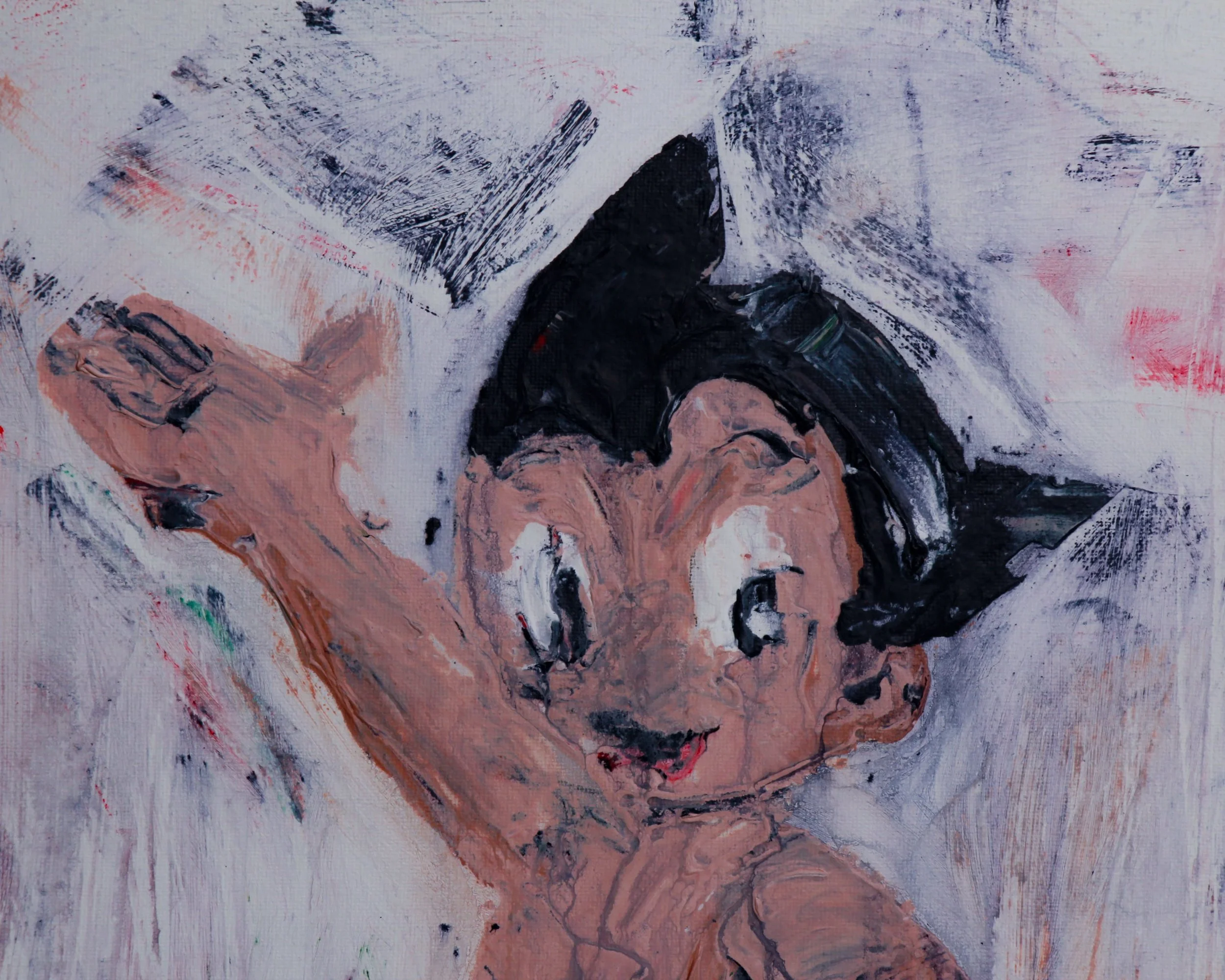
Sam Evans has a knack for making pop icons feel human again—and this oil-on-canvas take on Astro Boy is no exception. Rendered in his signature thick impasto style, Evans turns the polished, heroic robot of Tezuka’s imagination into something far more raw and immediate. The piece is full of movement, capturing the essence of Astro Boy’s childlike optimism and futuristic energy with thick, textured brushstrokes.
Astro Boy’s signature features are instantly recognizable—his spiky black hair, wide, expressive eyes, and that confident, heroic pose. His little robotic body, painted in muted flesh tones, is accentuated by his classic green belt and oversized red boots, which pop vibrantly against the chaotic, abstract background.
On the back, the painting is titled "Astro Boy," with Evans' signature and the date, marking it as a one-of-a-kind contemporary take on one of anime’s most legendary figures.
Sam Evans
Sam Evans works in that space where image and memory overlap. Based in Australia, his paintings often pull from familiar figures—film characters, cultural icons, everyday faces—but strip them back to something more immediate. The likeness is there, but it’s not the point. Gesture, texture, and mood do most of the work.
His approach leans loose and intuitive. Oil on board or canvas, paint dragged, wiped, layered, sometimes left unresolved. You can see decisions as they happen—areas built up, others abandoned. It gives the work a sense of movement, like it’s still thinking.
What’s interesting is how he balances recognition with abstraction. A character might be instantly identifiable, yet the surface resists polish. Edges blur, colors shift, and the image sits somewhere between clarity and suggestion.
There’s a cinematic quality to it, but not in a literal way. More like fragments of scenes—cropped, paused, slightly altered.
His work doesn’t aim for perfection. It leans into imperfection, letting the process stay visible. That’s where the energy lives.
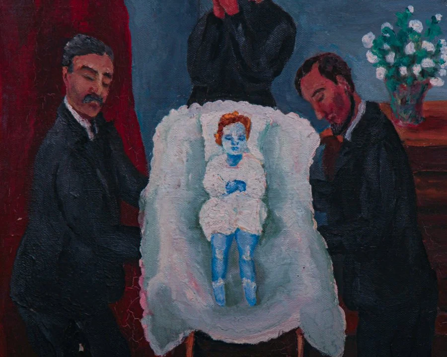
This painting, titled "L'enfant mort" (The Dead Child) and dated December 1936, is a striking and evocative work that portrays a somber and surreal scene. The composition features two men dressed in black suits and a woman dressed in dark formal attire, solemnly gathered around the dead body of a child. Laid out on a white cloth, the two men hold the child over a minute casket-reminiscent of a funeral or a ceremonial setting. The figures' postures and expressions suggest grief or reverence.
The room is a modest interior with deep red curtains, a chest of drawers adorned with a vase of flowers and a pink teddy bear. A small painting hangs over the dresser and a green upholstered chair is propped in the opposite corner. Toys scattered on the floor, including a doll and a ball, further enhance the unsettling juxtaposition of childhood innocence and mourning.
The style suggests a folk-art influence, with a focus on storytelling and emotion rather than strict realism. The ornate golden frame enhances its presence, lending it an air of gravitas and importance. The back of the canvas reveals markings indicative of its French origin, including a stamp from a fine art supplier in Paris and the handwritten title.
Category History
Late 19th to early 20th century oil paintings sit right at a turning point, where tradition meets a growing appetite for looseness and speed. Artists were still working within long-established studio practices—stretching canvas, sizing it with glue, then building up layers of ground—but the way paint was handled began to shift. Academic painters layered thin glazes, slowly building depth and polish. Others, especially influenced by Impressionism, worked more directly, laying down color in thicker, visible strokes.
Oil paint itself made all of this possible. It dries slowly, giving artists time to blend, adjust, scrape back, or completely rethink a passage. Many would begin with a loose underdrawing or tonal block-in, establishing composition and light before committing to color. From there, the painting could evolve in stages or be pushed forward all at once, depending on the artist’s approach.
What’s compelling about works from this period is the tension between control and freedom. You often see areas that are tightly rendered sitting right next to passages that feel almost unfinished. Brushwork becomes part of the story, not something to hide. These paintings don’t just show what the artist saw—they show how they worked, decision by decision, layer by layer.
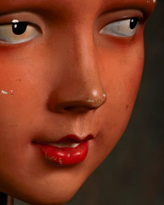
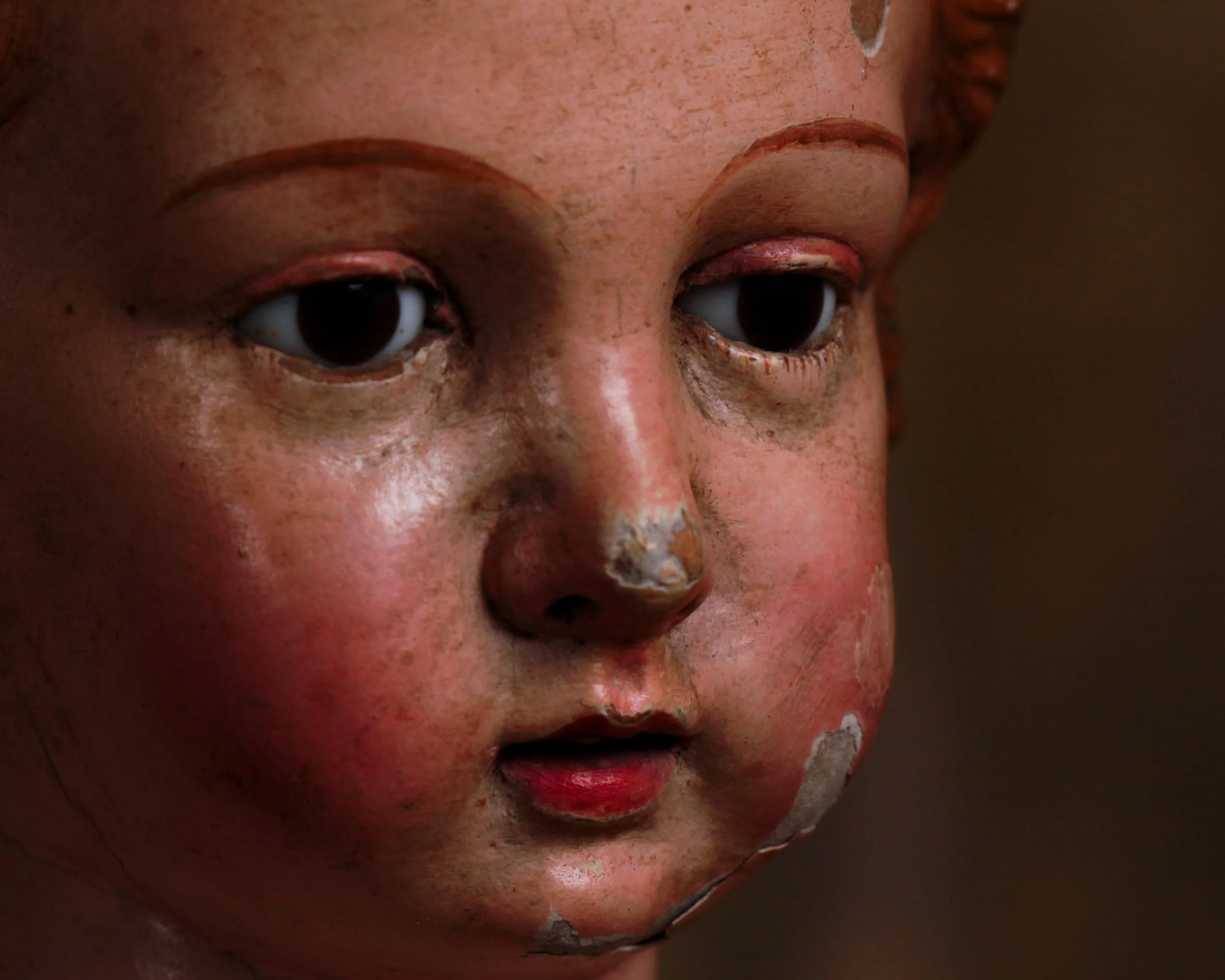
This mannequin head has a slight sidelong gaze that gives her personality, almost attitude. She does not demand attention, but she certainly holds it. Set her on a console, in a vitrine, or among other oddities and she’ll quickly become the quiet protagonist of the room.
Likely second quarter 20th century, this display head carries all the hallmarks of classic store mannequins. Sculpted composition material with hand painted features, softly modeled cheeks flushed in warm rose, delicately arched brows, and those perfectly lacquered red lips that have just enough wear to remind you they have seen a few seasons come and go. Small chips along the brow and cheek, tiny nicks on the nose, and subtle surface scratches give her that honest, unbothered patina that only time can script.
Her molded hair is pure period charm. A neat, sculpted wave swept across the forehead, frozen in that confident, practical style that once framed hats, scarves, and the occasional daring tilt of a department store spotlight. From the back, the hollowed interior reveals her original purpose. She was built to work. Built to sell dreams in a shop window.
Now mounted on a simple metal stand, she feels less like retail equipment and more like sculpture.
Category History
Old mannequin heads are where retail display meets quiet portrait. Made from papier-mâché, composition, plaster, or early plastics, they were designed to present hats, wigs, or cosmetics with just enough personality to draw attention. The features are often slightly idealized—arched brows, defined lips, smooth skin—meant to suggest rather than replicate a face.
What makes them interesting now is how they’ve aged. Paint softens, surfaces crack, expressions shift from polished to a bit uncanny. They carry the memory of storefronts and showrooms, but also read as standalone objects—somewhere between sculpture and artifact, holding a gaze that feels oddly present.
A 19th century Spanish capipote figure of the Salvator Mundi, carved in wood, built up with stucco, and finished in polychrome that has mellowed beautifully with time. Notice the proportions. The torso is elongated, the stance slightly improbable, the whole body just a touch off.
These santos figures were meant to be dressed in elaborate garments, with only the face, hands, and feet revealed to the faithful. The sculptor knew this. The anatomy was engineered for fabric, not for anatomy textbooks. Strip away the vestments and you are left with this wonderfully idiosyncratic silhouette.
The sulphide glass eyes give the face an intensity that contrasts beautifully with the exaggerated body beneath. There is tenderness in the modeling of the cheeks, a seriousness in the gaze, and the faintest suggestion of humanity in the slightly imperfect finish.
Standing just under twenty inches tall at 19.5 inches high, and measuring approximately 6.3 inches wide by 4.75 inches deep, he has presence without overwhelming a room.
Category History
A 19th century Spanish capipote figure of the Salvator Mundi sits at the intersection of devotion and local tradition. “Salvator Mundi”—Christ as the Savior of the World—was a widely used iconography across Europe, typically shown blessing with one hand and holding a globe in the other. In Spain, these figures often took on regional character, shaped by workshop practices and religious customs.
The capipote detail—evoking the tall, conical hood associated with penitential processions—adds a distinctly Spanish layer. It ties the figure to Holy Week traditions, where symbolism, costume, and ritual all work together to create a powerful visual language.
Carved in wood and often polychromed, these figures were meant to be seen up close—faces expressive, surfaces worn from handling or time. They weren’t just decorative; they were part of lived belief.
What makes them compelling now is that blend of universal imagery and local identity. Familiar subject, interpreted through a very specific cultural lens.
There is more to explore. Browse the full collection.
Frequently Asked Questions
-
Antique art generally refers to artworks that are over one hundred years old. This includes early photography, antique prints, drawings, engravings, and other works on paper produced during the nineteenth and early twentieth centuries using traditional artistic techniques.
-
This collection includes early photography such as cabinet cards and tintypes, antique prints including lithographs and engravings, as well as drawings and works on paper such as charcoal studies and ink illustrations. These works represent a range of historical artistic styles and subjects.
-
Early photography formats such as tintypes and cabinet cards were widely used during the nineteenth century for portrait photography. Today they are valued for their historical significance and craftsmanship, offering a rare visual record of people, fashion, and everyday life from earlier periods.
-
Antique prints and engravings are artworks produced using traditional printing techniques such as etching, engraving, or lithography. These prints were often created as illustrations, decorative artworks, or reproductions of paintings and were widely collected during the nineteenth century.
-
Antique art and vintage works on paper are often displayed in frames or as part of gallery walls to introduce historical depth and character into interior spaces. Collectors and designers frequently combine early photography, antique prints, and drawings to create visually layered displays.
This unusual folk art piece began life as a heavy wooden rigging or pulley block and was later transformed with a painted face on both sides. The thick, hand-worked wooden body has a wonderfully worn surface, with deep tool marks, cracks, old staining and traces of earlier color. On each broad face, someone added a wonderfully simple human expression using touches of green, blue, white, orange and bright pink. The features are now heavily faded, which only adds to its wonderfully odd personality.
Even better are the two large forged iron hooks mounted to the sides. Originally functional hardware, they now read almost like exaggerated arms or ears, giving the whole object an accidental sculptural quality. The iron has developed a dark, crusty oxidation that sits nicely against the warm, weathered wood.
Wooden pulley blocks were essential pieces of equipment in the 18th, 19th and early 20th centuries. Most commonly associated with ships and sailing vessels, blocks allowed ropes to change direction and gave sailors mechanical advantage when raising sails, moving cargo and handling heavy loads. Similar heavy-duty blocks were also used around docks, farms, workshops and industrial settings, so without documented provenance it is safest to describe this example simply as a rigging or pulley block rather than definitively maritime.
Repurposing worn-out tools and utilitarian objects has a long history in American folk art. Once an object had outlived its practical usefulness, its familiar shape could become raw material for something decorative, humorous or personal. Paint, scraps of metal and a little imagination were often all that was needed.
Here, whoever painted the faces clearly saw something human hiding in the old block. The result sits somewhere between found-object sculpture, folk portrait and industrial artifact, with enough wear and mystery left intact to make you wonder who made it, and why.