

Antique and Vintage Signs
Original signs sourced from old storefronts, workshops and commercial spaces. Every piece a genuine antique with a purpose and something to communicate.
Our collection of vintage antique signs brings together original commercial and decorative signage spanning the late nineteenth and early twentieth centuries. From antique enamel signs and antique metal signs to painted wooden boards and printed card stock, these pieces represent the visual communication of an era before digital design existed.
Many of the antique store signs in this collection were produced for businesses, public institutions and commercial enterprises that no longer exist. Real vintage signs carry the marks of their working lives, the fading, chipping and patina that comes from decades of exposure to weather and handling. That history is part of what makes them collectible.
Antique enamel signs in particular are among the most sought after pieces in this category. Produced using a vitreous enamel process that fused colour directly onto metal, these signs were built to last and many have survived in remarkable condition. Their graphic quality and bold colour make them visually distinctive objects that hold their own in any context.
Today vintage antique signs are collected for their graphic appeal, historical significance and the connection they offer to a vanished commercial world. Each piece in the Heimwee collection is selected for its originality, condition and visual character.
Signs
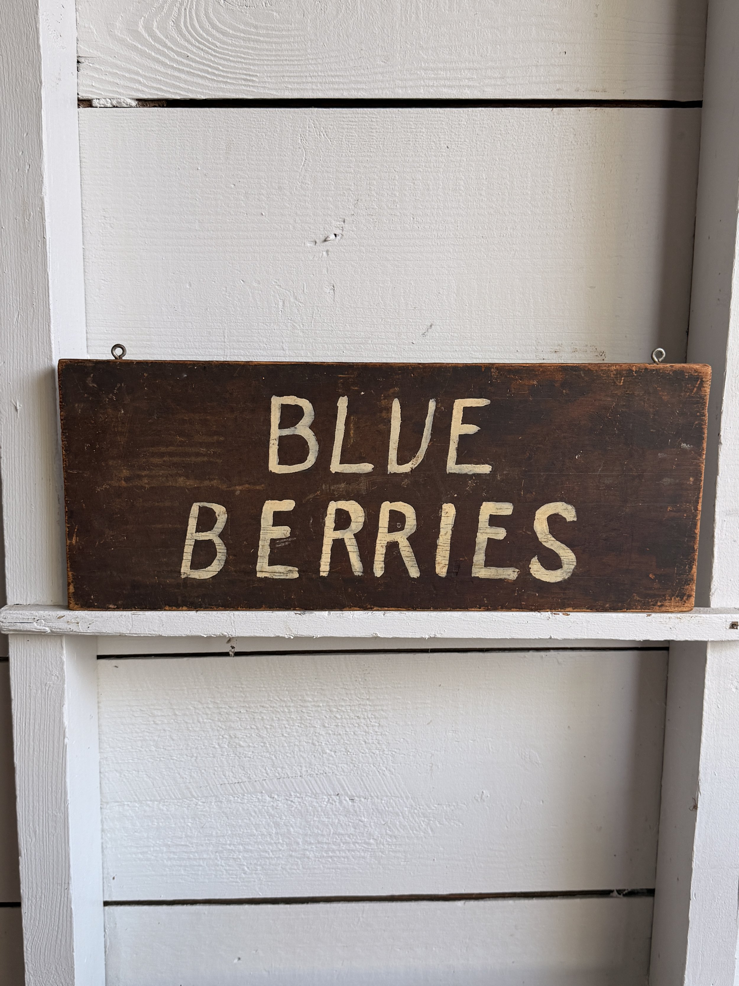
This simple hand-painted “BLUE BERRIES” sign has exactly the kind of straightforward charm you want from an old roadside or farm-market sign. Made from a single rectangular wooden board, it has a dark brown painted ground with large cream-colored lettering applied by hand. The uneven spacing, slightly irregular letterforms, and visible brushwork give it a warm, homemade quality that printed signage simply doesn’t have. The surface shows plenty of age, including scuffs, scratches, edge wear, and areas where the darker paint has thinned to reveal the wood beneath. Two small hanging eyes along the top edge suggest it was originally suspended rather than permanently mounted.
The wording itself is wonderfully direct. No logo, no price, no sales pitch, just “BLUE BERRIES.” That simplicity points to the kind of sign that may have hung at a farm stand, produce market, roadside fruit stand, or seasonal berry patch.
Hand-painted produce signs like this were especially common through the first half and middle of the 20th century, when roadside agriculture and small independent markets depended on bold, readable signage to catch the attention of passing motorists. Farmers often made their own signs using whatever lumber and leftover paint were available, which is why surviving examples can feel so individual.
Blueberries became increasingly important as a cultivated American crop during the early 20th century. Commercial cultivation expanded rapidly after successful breeding work in New Jersey beginning in the 1910s, helping turn what had largely been a wild-harvested fruit into a widely farmed seasonal crop.
Today, signs like this sit comfortably between advertising, folk art, and rural Americana. The spelling as two words, “BLUE BERRIES,” adds another small dose of personality. It is plain, useful, slightly quirky, and beautifully worn.
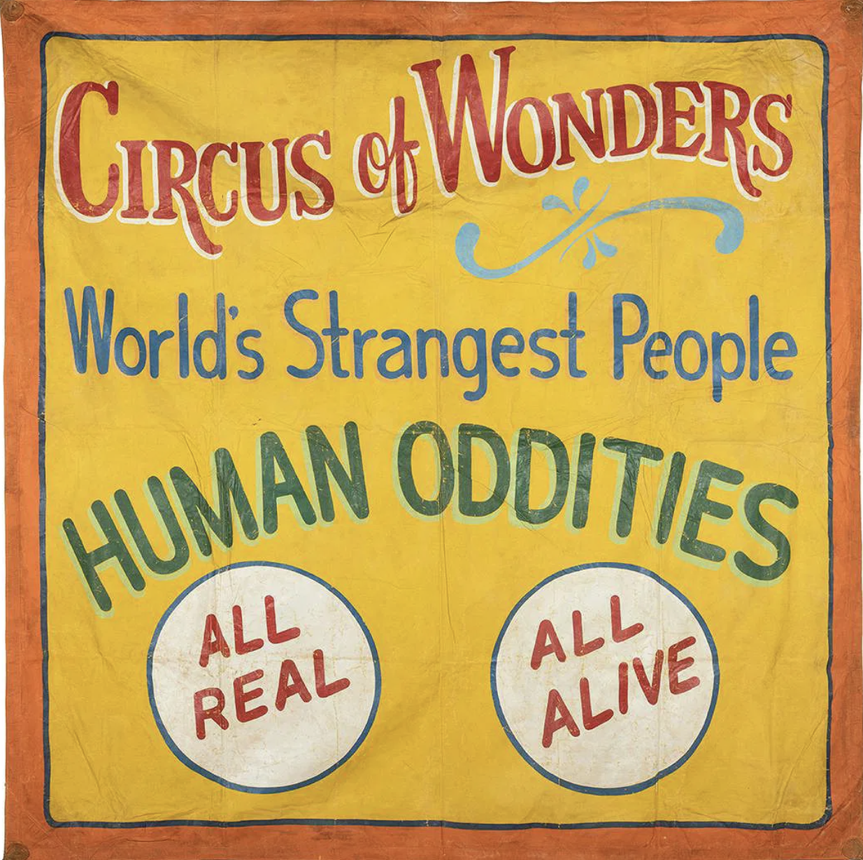
This large hand-painted canvas sideshow banner has everything you want from old carnival advertising: huge lettering, loud color, slightly wonky handwork, and absolutely no subtlety about getting your attention. Against a warm yellow field bordered in orange and blue, it announces “Circus of Wonders,” followed by “World’s Strangest People” and the wonderfully direct “HUMAN ODDITIES.” Two large white medallions at the bottom promise “ALL REAL” and “ALL ALIVE.”
The lettering is especially good. Red, blue, green, white, and pale turquoise are layered to create shadows and depth, while a loose decorative flourish breaks up the typography. Up close, you can see the painter’s hand everywhere: uneven outlines, brush marks, shifts in spacing, and small inconsistencies that give the banner considerably more personality than mechanically printed advertising ever could. The canvas shows expected wear from use and storage, including creases, scattered losses, rubbing, staining, and general surface aging.
Sideshow banners like this were essentially giant roadside sales pitches. Hung across entrances and midway façades, they had only a few seconds to stop someone walking past, so painters relied on enormous lettering, saturated colors, sensational language, and bold imagery. Tampa, Florida became an important center for this work during the mid-20th century, home to banner painters and commercial shops supplying traveling carnivals throughout the country.
This example is unsigned, so a firm attribution would be difficult. Stylistically, however, it fits comfortably within the Tampa banner-painting tradition associated with Snap Wyatt, Jack Cripe, and Sigler & Sons Art Service. Both Wyatt and Cripe worked in the Tampa sideshow world, while Sigler’s shop produced banners for traveling shows on a commercial scale.
Whether painted by one of those recognizable hands or another artist working within the same circle, it survives as a terrific piece of American carnival history, made to shout across a crowded midway and still doing a pretty good job of it.
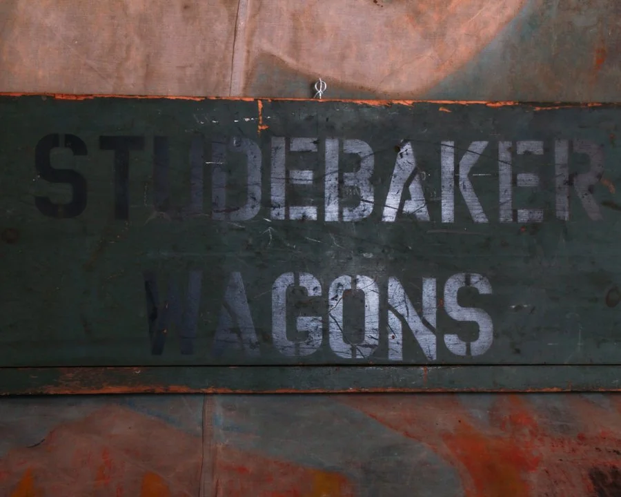
An original Studebaker wagon sign, hand-painted on wood and built for a working shop sometime in the 1930s, it carries the kind of straightforward confidence that defined early American advertising. No slogans to decode, no clever phrasing. Just the essentials, laid out in bold stencil: “Studebaker Wagons” across the center, with “New” on one end and “Used” on the other. It did its job in a glance.
The paint has settled into the wood over time, softening at the edges, thinning in places, and giving way to a mix of exposed grain, scratches, and oxidation. That deep, weathered green has taken on a life of its own, somewhere between industrial and agricultural, with flashes of rust and wear that feel earned rather than decorative. The lettering still holds strong, slightly uneven in that hand-done way, with just enough variation to remind you there was a brush involved, not a machine.
Studebaker, of course, built its reputation on wagons long before automobiles took over the road. By the 1930s, they were straddling both worlds, and pieces like this sit right at that intersection. A quiet nod to a time when horse-drawn transport was still very much part of daily life, even as the future was already rolling in on four rubber tires.
What’s left now is the surface, and it’s a good one. Honest wear, layered history, and a graphic presence that doesn’t need polishing up. It reads clearly from across the room, but rewards a closer look with all the small imperfections that make it feel real.
A working sign that’s outlived the work, and landed somewhere better.
Wagons
By the 1930s, wagons hadn’t disappeared, they’d just shifted roles. While automobiles took over roads, wagons remained essential on farms and in small towns, handling hauling, deliveries, and daily work, bridging the gap between horse power and the fast-approaching motor age.
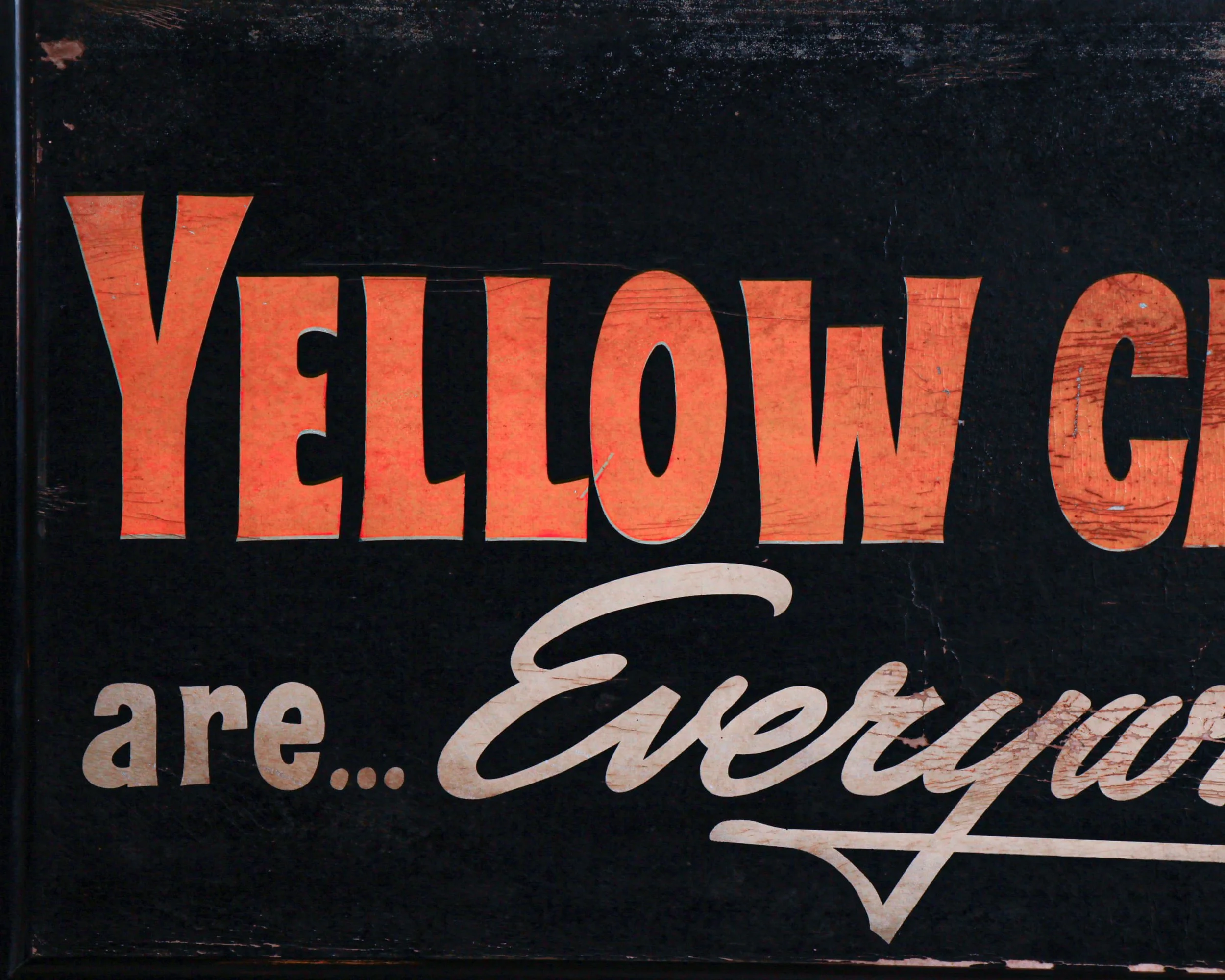
A wide, graphic slice of 1940s advertising, this framed single-sided cardboard sign stretches nearly four feet across, built to catch your eye from across a room—or a street. “Yellow Cabs are… Everywhere” runs boldly across the surface in that confident, straight-to-the-point typography that defined the era. The warm, time-softened orange lettering sits against a deep black ground.
Off to the right, a stylized signpost points in multiple directions—City, County, Forest, Wydown—each paired with mile markers that suggest reach, reliability, and a company that wanted you to believe they had the map covered.
The surface shows honest age. Scuffs, scratches, and small areas of loss reveal the cardboard beneath, giving it that worked-in look that only comes from years of being out in the world rather than tucked away. Nothing distracting, just the kind of wear that adds depth without taking anything away.
Framed in a simple black wooden frame, it measures 20.25 inches high, 47.5 inches wide, and 1.5 inches deep.
Cabs
By the 1940s, yellow cabs weren’t just a color choice, they were part of the visual language of the American city. The idea goes back a bit earlier, when John Hertz of the Yellow Cab Company standardized the color after a study suggested yellow was the most visible from a distance. By the time the 1940s rolled around, that decision had fully taken hold. In cities like New York, Chicago, and St. Louis, a flash of yellow moving through traffic meant one thing: transportation on demand.
The decade itself was a complicated one. World War II reshaped daily life, and taxis became more than a convenience. Gasoline rationing limited private driving, and many Americans relied on cabs to get to work, train stations, and factories tied to the war effort. At the same time, the industry was tightening up. Many cities began regulating fares, licensing drivers, and introducing medallion systems to control the number of cabs on the street. That structure helped create a sense of reliability and order, even as demand surged.
Design-wise, cabs of the 1940s were solid, purposeful machines. Built by major automakers like Checker, DeSoto, and Ford, they were designed to take abuse. Spacious back seats, durable interiors, and simple, functional dashboards made them workhorses rather than showpieces.
But beyond the mechanics, yellow cabs took on a cultural role. They became shorthand for movement, independence, and the rhythm of city life. Movies, photographs, and advertising from the era leaned into that image, using the taxi as a symbol of connection. If you needed to get somewhere, the answer was already on the street, painted bright enough that you couldn’t miss it.

Dating to the 1940s, this reverse-painted glass sign reads “Dr. P. Campi – Dentist” in bold black lettering, the kind meant to be easily spotted from a hallway outside an office door. The typography is clean, direct, and honest—with that confident mid-century look that never feels over-designed.
The lettering is applied to the reverse of the glass and sits within a simple wooden frame that has aged nicely over the years, developing a dark patina and small signs of honest wear. A metal hanging chain still remains attached, a reminder that this piece likely spent decades quietly swaying in a doorway or window, guiding nervous patients inside.
There’s a certain calm authority to it—no frills, no unnecessary detail, just clarity and purpose. The kind of object that did its job without fanfare, and still holds that same quiet presence today.
Category History
In the first half of the 20th century, before vinyl and neon took over, a good sign was as much about the hand as the message. Most small businesses relied on local painters or sign makers who worked with wood panels, house paint, and a steady eye. The result: one-of-a-kind pieces where every letter carries a bit of personality—slightly off, sometimes bold, sometimes improvised, but never generic.
These weren’t precious objects at the time. They hung outside in the weather, took on sun fade, rain streaks, and the occasional repaint. That’s part of the appeal now. The layered paint, ghost lettering, and uneven brushwork tell you exactly how they lived.
What stands out is the balance between function and instinct. The maker wasn’t chasing perfection—they were chasing readability, speed, and impact. And in doing so, they created something far more human. Each sign feels like a handshake from a past business owner, direct and unfiltered.
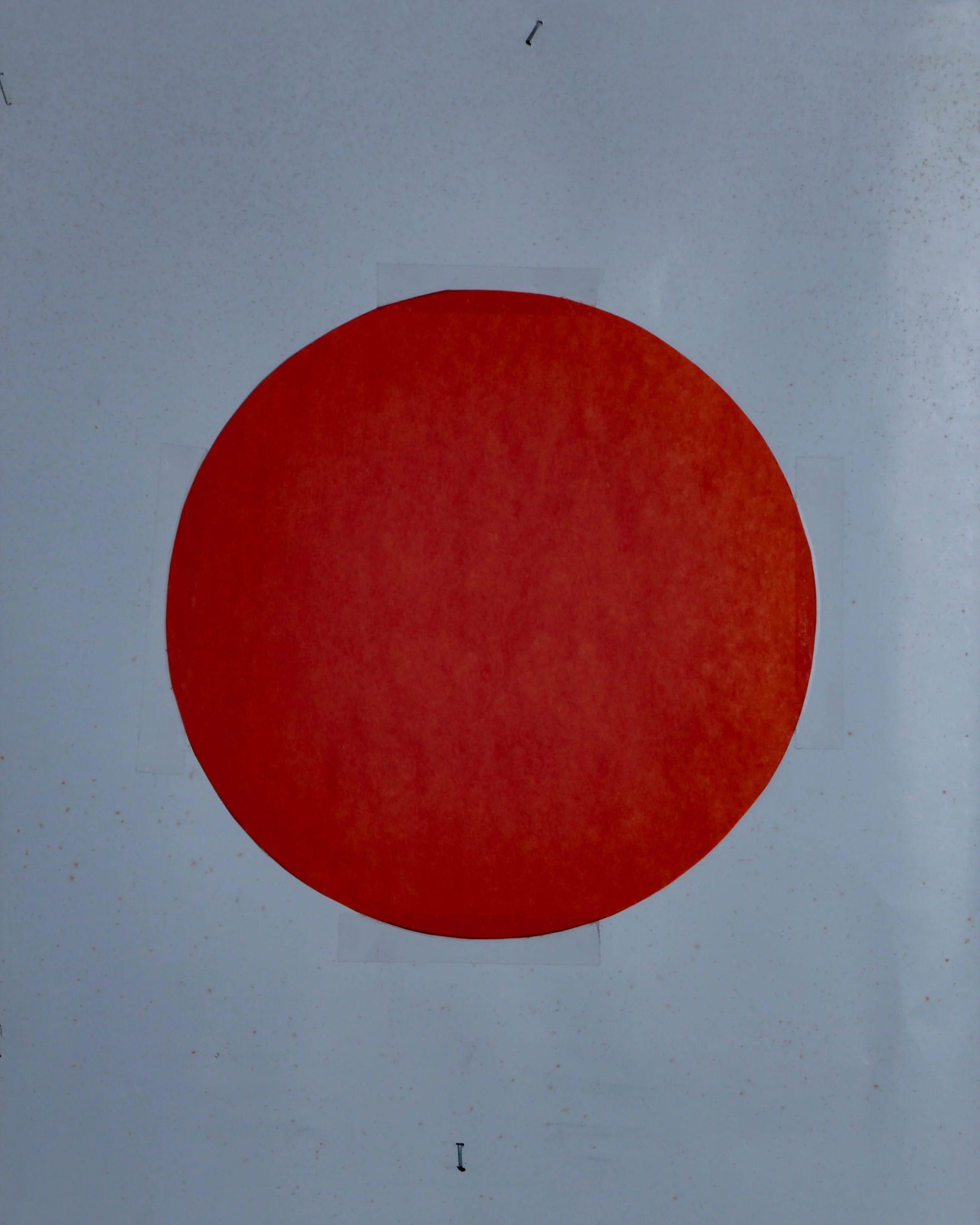
This homemade shooting target stencil, likely dating to the 1950s, is a perfect example of that kind of honest utility. What makes this piece especially appealing today is its graphic simplicity. The red circle against the white field has a striking, almost modernist quality. No extra graphics, no decoration, just the unmistakable symbol of a target that can be seen from a distance.
The stencil itself appears to be cut from thin metal and mounted to a simple wooden frame. The construction is straightforward and practical, the kind of thing someone put together in a garage or workshop with the tools they had on hand. Small nails hold the sheet in place, and the wood backing gives the whole piece rigidity so it could be reused again and again.
The surface shows scattered age spots, slightly uneven edges, light wear, and small imperfections that only add to its character.
Probably used at a small shooting range, hunting club, or even by an individual who wanted to make their own targets rather than buying them.
Category History
Shooting target signs have always walked a line between utility and graphic design. Originally made for ranges, fairs, and training grounds, they were designed to do one thing well—give you something clear to aim at. Bold concentric circles, stark silhouettes, or human-shaped outlines all served the same purpose: instant readability from a distance.
Materials varied—paper for temporary use, tin or steel for repeated shooting—but the visual language stayed consistent. High contrast, simple forms, no ambiguity. Some even doubled as advertising pieces, incorporating brand names or slogans into the design without distracting from function.
What makes them interesting now is how they change with use. Bullet holes, dents, and wear become part of the composition, turning a clean graphic into something layered and unpredictable.
They start as precise tools, but over time, they pick up a kind of accidental abstraction—marks of aim, misses, and repetition, all recorded right on the surface.

DANGER
SHARKS
DEEP WATER
UNACCOMPANIED CHILDREN
KEEP OUT
That is the entire message, delivered with the blunt efficiency of a lifeguard whistle and a raised eyebrow. No illustrations, no polite suggestions, just a series of escalating facts that end with a firm “don’t even think about it.”
This beach warning sign is made of single-sided tin and was likely once posted somewhere along the Southern California coast, probably around Los Angeles. You can easily imagine it bolted to a weathered pier piling or standing near a rocky stretch of shoreline where the water gets deep quickly.
Graphically, it is a beauty. The bold red “DANGER” headline grabs you immediately, while the stark black lettering underneath marches down the sign like a checklist of reasons to turn around. It is classic mid-century municipal design. Clear, direct, and built to be read from a distance through salt air and sun glare.
What really makes this piece special is the wear. The surface carries a constellation of rust blooms, small impact marks, scratches, and honest scars from decades outdoors. The edges show oxidation, the mounting holes have darkened, and the face has that wonderful sun-washed patina that only time near the ocean can produce.
Category History
Old metal and tin advertising signs are the original attention-grabbers—built to catch your eye, hold it, and do the selling in a split second. From the late 19th into the mid-20th century, these signs showed up everywhere: general stores, gas stations, roadside stands, and city walls. Lightweight and relatively inexpensive to produce, tin became a go-to material for brands looking to spread their message far and wide.
The graphics did the heavy lifting. Bold lettering, high-contrast colors, and simple imagery made them readable at a glance. Lithography allowed for detailed illustrations—everything from smiling characters to idealized products—printed directly onto the metal surface. Some were single-sided for interior use, others designed to hang outdoors and withstand weather, picking up rust, chips, and fade along the way.
What makes them interesting now is that wear. The scratches, oxidation, and softened edges aren’t flaws—they’re proof of exposure and use. Unlike porcelain enamel signs, which were built to last, tin signs often lived harder, shorter lives, making surviving examples feel a bit more accidental.
They sit comfortably between graphic design and object. Direct, a little rough around the edges, and still doing their job decades later—pulling your attention without asking politely.
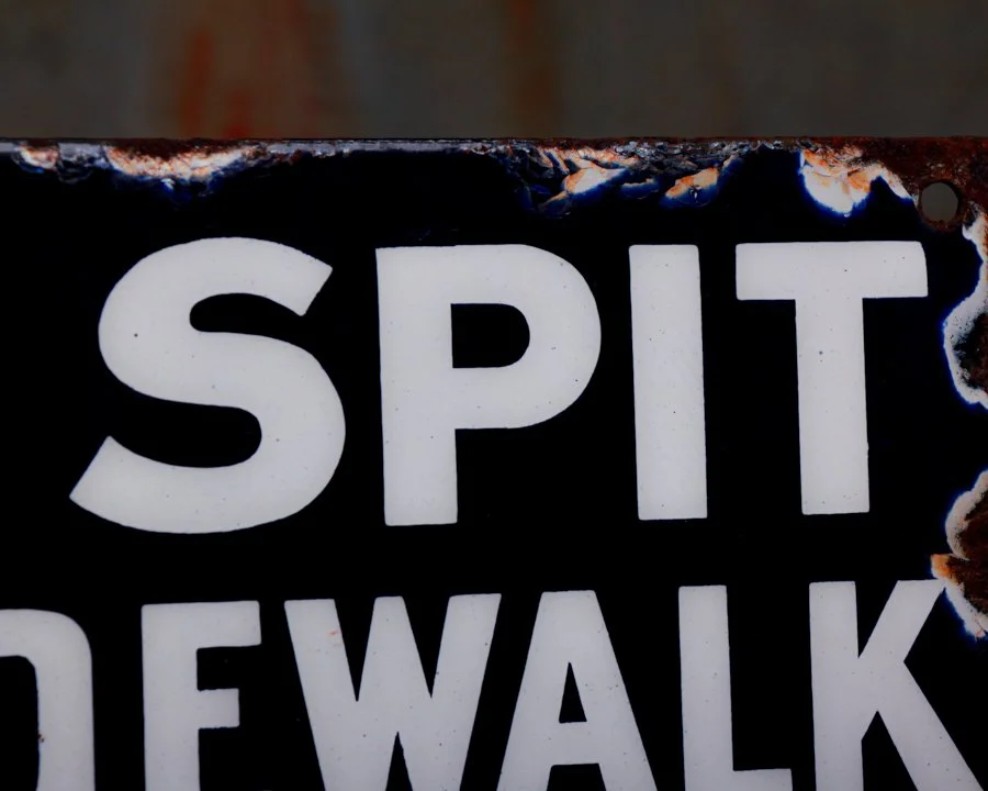
This old porcelain sign once laid down the law in no uncertain terms: DO NOT SPIT ON SIDEWALK - FINE $20.
Straightforward, bold, and impossible to ignore, it was part of a public health campaign from the early 1900s aimed at curbing the spread of disease, especially tuberculosis. You'd find signs like this posted around cities as a reminder to keep things clean-and to avoid a hefty fine.
This one has definitely seen some things. The enamel has chipped away in spots, and there's rust where the metal's been exposed, but the type still pops, and the message is mostly intact. It's marked at the bottom by H.M. Rich of Beaver Falls, PA, a company known for producing industrial porcelain signage during that time.
Category History
Early enamel porcelain signs are where durability meets bold messaging. Emerging in the late 19th and early 20th centuries, they were built for the outdoors—gas stations, storefronts, railways—anywhere a message needed to survive weather, time, and a bit of neglect. The process was industrial but surprisingly refined: steel sheets were coated with powdered glass and fired in a kiln, fusing the enamel into a hard, glossy surface that resisted rust and fading.
That technique gave these signs their signature look—deep, saturated color, crisp lettering, and a sheen that still catches light a century later. Layers were often applied in stages, with separate firings for each color, which is why even simple designs can feel so graphic and intentional.
The content ranged from straightforward advertising—oil, tobacco, soda—to practical messaging like safety warnings or directional signs. Either way, the goal was clarity and impact. Big type, strong contrast, no wasted space.
What makes them compelling now is how well they’ve held up. Chips, edge wear, and the occasional rust spot don’t detract—they add texture and proof of life. These signs were made to be seen, not preserved, and that longevity has turned them into objects that feel both industrial and oddly timeless.
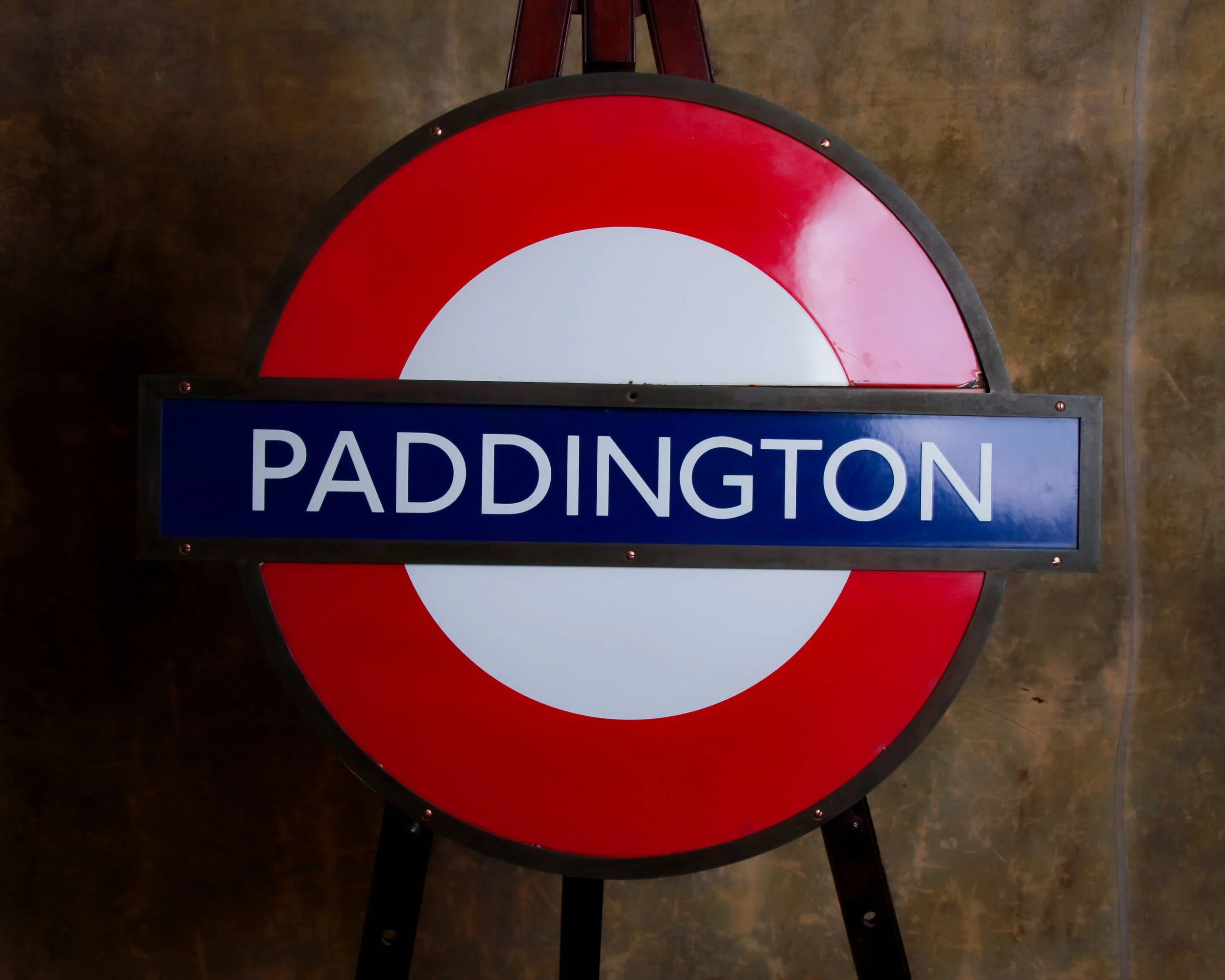
There’s something about a proper London Underground roundel that doesn’t just mark a place, it anchors it. Paddington is one of those names that carries weight, and here it is in full voice, stretched across a 33 inch circle of enamel and steel that was built to cut through steam, soot, and the shuffle of thousands of feet a day.
This is the real thing, not a polite reproduction. You feel it immediately. Twenty two pounds of purpose. The kind of object that wasn’t made to decorate, but to function. To be seen from a distance, at a glance, in less than ideal conditions. And it still does that beautifully.
The construction is classic Underground. That red bullseye has a depth to it, still glossy, still catching light the way enamel does when it’s been fired right. The blue bar is rich and saturated, framing that Johnston typeface with its clean, no nonsense confidence. PADDINGTON reads exactly as it should, crisp and legible, like it hasn’t forgotten its job.
Up close, the surface tells its story. Light scratches, small marks, a bit of edge wear where time and use have had their say. There’s a small chip at the edge of the red field, nothing dramatic, just enough to remind you this wasn’t living a quiet life on a wall somewhere. It earned its keep. The color is still strong, the graphics still sharp. It hasn’t softened.
What’s nice here is that it hasn’t been overworked or fussed with. No attempt to erase the past. Just a solid, honest piece that’s been given a second life. It’s mounted to an MDF backer for stability, with a straightforward two part bracket system, one on the sign, one on the wall. Hang it once and forget about it.
It’s the kind of piece that changes a room without trying too hard. Industrial, graphic, unmistakably London.
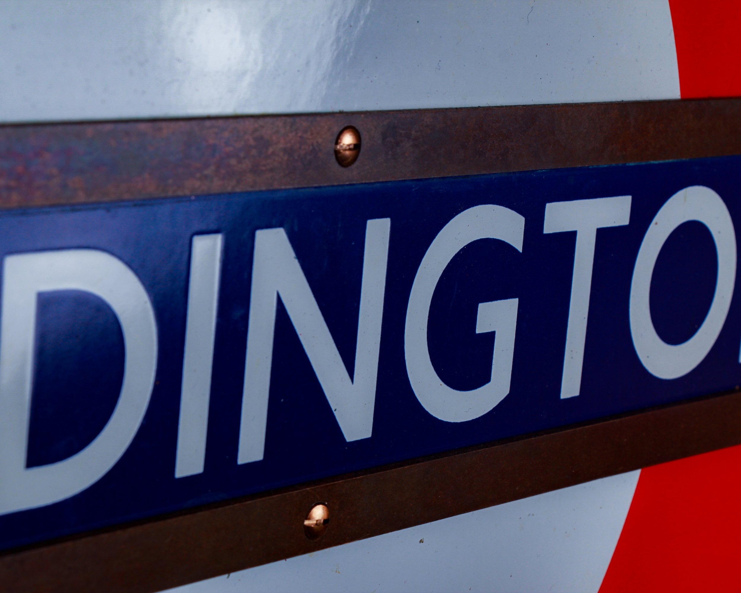
This is an original early London Underground PADDINGTON station roundel, the full 24 inch version. It was built to be seen through steam, soot, and the daily tide of commuters moving in and out of one of London’s great railway gateways.
The classic three part construction is all here. The red bullseye, still bold and glossy. The deep blue name bar with that unmistakable Johnston lettering spelling PADDINGTON in clean, confident white.
The enamel shows expected wear. Light surface scratches, minor marks, a bit of history in the red field. Nothing distracting. Just evidence that this sign once lived a real life underground rather than in a collector’s loft. The color remains strong, the graphics sharp. It still does exactly what it was designed to do. It commands attention.
Mounted to an MDF board for stability, it is ready to hang and enjoy. It comes with a two part bracket system, one fixed to the sign and one to the wall, making installation straightforward and secure.
Category History
Early enamel porcelain signs are where durability meets bold messaging. Emerging in the late 19th and early 20th centuries, they were built for the outdoors—gas stations, storefronts, railways—anywhere a message needed to survive weather, time, and a bit of neglect. The process was industrial but surprisingly refined: steel sheets were coated with powdered glass and fired in a kiln, fusing the enamel into a hard, glossy surface that resisted rust and fading.
That technique gave these signs their signature look—deep, saturated color, crisp lettering, and a sheen that still catches light a century later. Layers were often applied in stages, with separate firings for each color, which is why even simple designs can feel so graphic and intentional.
The content ranged from straightforward advertising—oil, tobacco, soda—to practical messaging like safety warnings or directional signs. Either way, the goal was clarity and impact. Big type, strong contrast, no wasted space.
What makes them compelling now is how well they’ve held up. Chips, edge wear, and the occasional rust spot don’t detract—they add texture and proof of life. These signs were made to be seen, not preserved, and that longevity has turned them into objects that feel both industrial and oddly timeless.
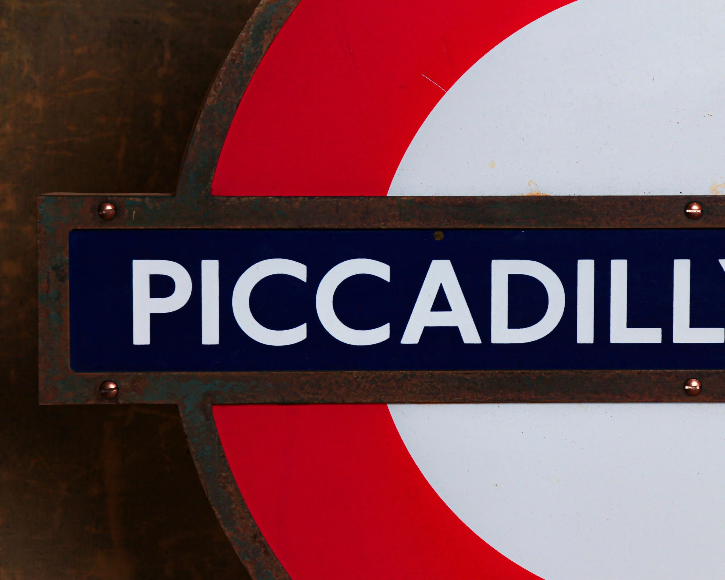
This 24 inch London Underground roundel, once marking Piccadilly Circus station, features the iconic red bullseye and blue bar. It is pure London in one confident circle.
The red field is still vivid and glossy, with scattered scuffs and surface marks that read like the memory of a thousand passing commuters. The blue name bar is deep and inky, allowing the crisp white lettering to stand out with authority. There are scratches and minor wear to the enamel, visible upon close inspection, but nothing that interrupts its graphic punch. If anything, they confirm it once lived in the wild rather than in a storage crate.
The London Underground roundel is one of the most successful pieces of public design ever created. It is simple, bold, democratic. This example, tied to Piccadilly Circus, carries the added romance of one of the city’s most storied stations.
Category History
Early enamel porcelain signs are where durability meets bold messaging. Emerging in the late 19th and early 20th centuries, they were built for the outdoors—gas stations, storefronts, railways—anywhere a message needed to survive weather, time, and a bit of neglect. The process was industrial but surprisingly refined: steel sheets were coated with powdered glass and fired in a kiln, fusing the enamel into a hard, glossy surface that resisted rust and fading.
That technique gave these signs their signature look—deep, saturated color, crisp lettering, and a sheen that still catches light a century later. Layers were often applied in stages, with separate firings for each color, which is why even simple designs can feel so graphic and intentional.
The content ranged from straightforward advertising—oil, tobacco, soda—to practical messaging like safety warnings or directional signs. Either way, the goal was clarity and impact. Big type, strong contrast, no wasted space.
What makes them compelling now is how well they’ve held up. Chips, edge wear, and the occasional rust spot don’t detract—they add texture and proof of life. These signs were made to be seen, not preserved, and that longevity has turned them into objects that feel both industrial and oddly timeless.
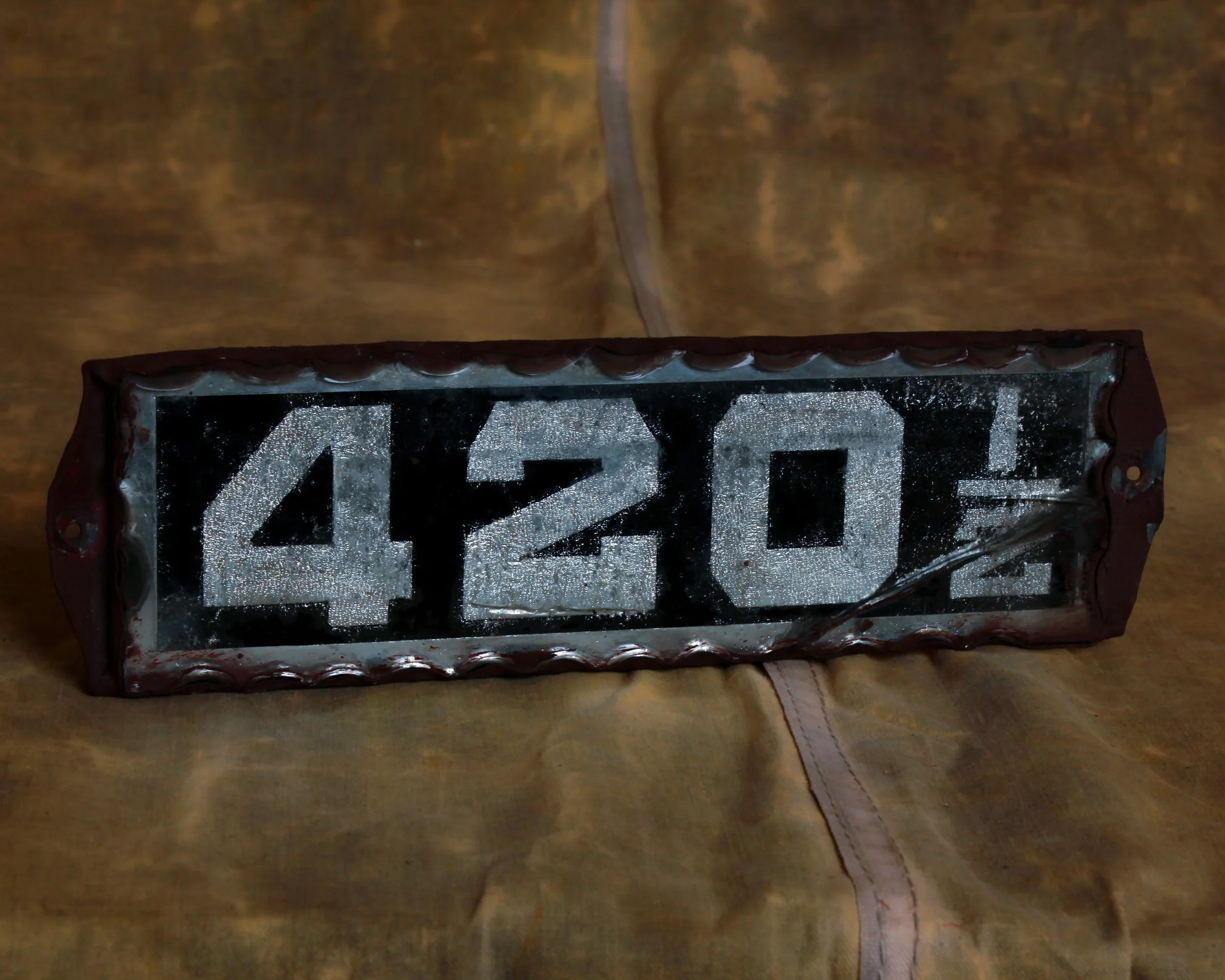
A reverse painted glass address sign reading 420 ½, set against a deep black background with shimmering silver foil backing that has that wonderful, almost frosted sparkle. The numerals are bold, blocky, and unapologetic. Crisp white against that glittering, textured foil. The scalloped glass border frames it with just enough flourish to keep it from feeling too utilitarian. It has presence, even at rest.
And then, of course, there is the number itself. The subtle wink to 4/20. The quiet nod. Add the ½ and it becomes even better, slightly offbeat, like the address that only locals know about.
Please note that there is a small crack in the bottom right corner, visible but honest. It does not detract.
Category History
Reverse glass painted signs are a bit of a trick—and that’s exactly the point. The image is painted on the back of the glass in reverse order, so what you see from the front is crisp, glossy, and sealed beneath the surface. Lettering comes first, then layers of color and background, all built backward with no room for correction once it’s covered.
Popular from the late 19th into the early 20th century, these signs were often used by businesses that wanted a more refined look—dentists, barbers, jewelers, cafés. Gold leaf, bold typography, and clean lines gave them a sense of permanence and polish that stood out from painted wood or tin.
What makes them compelling now is that balance of fragility and precision. The glass can crack, the paint can flake, but when they survive intact, the finish still feels sharp and luminous. Light hits the surface and stays there, making even simple designs feel elevated.
They’re part craft, part illusion. Everything you see is protected behind the glass, yet entirely dependent on it—one break, and the whole image changes.
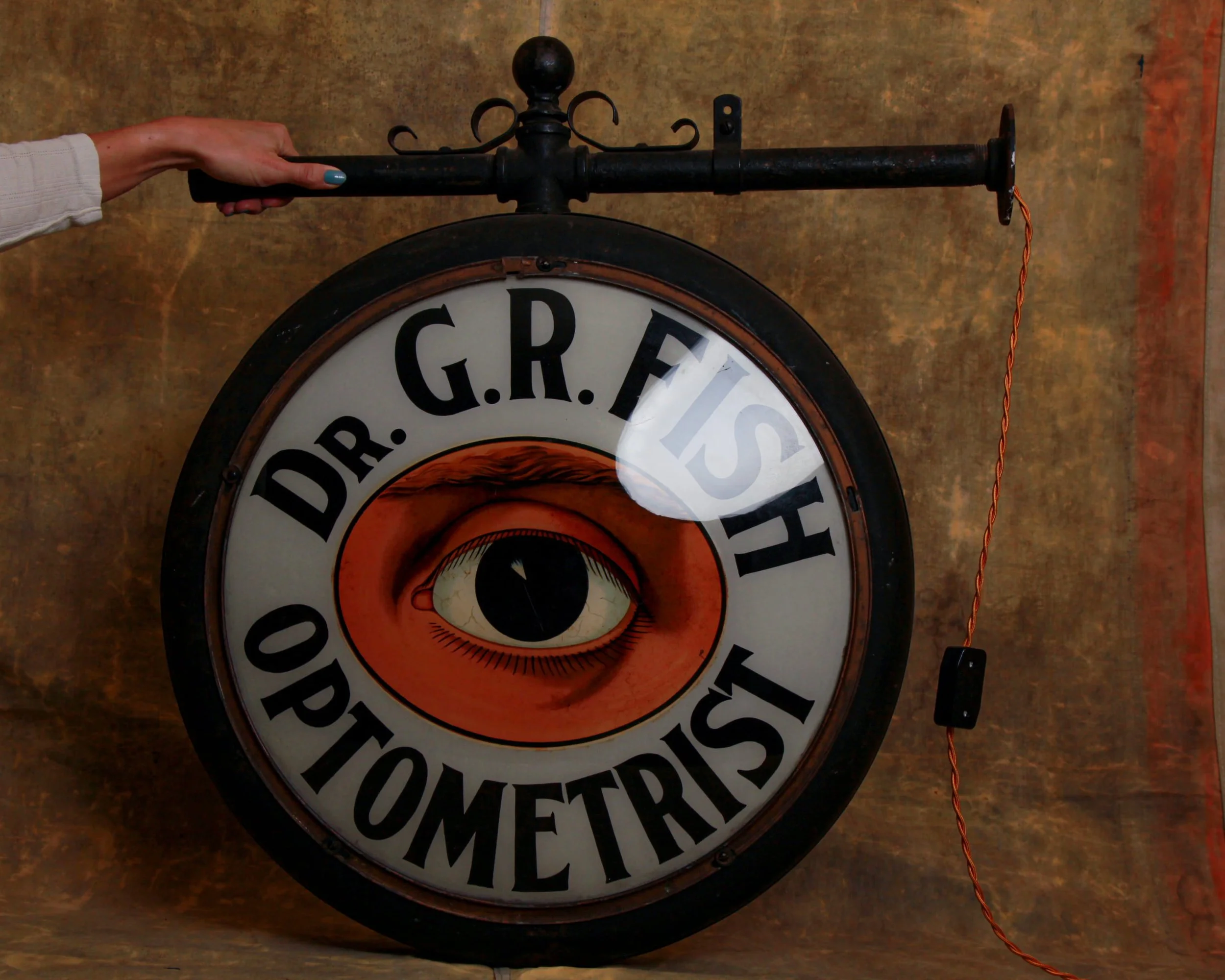
Early 20th century optometrist’s trade sign, double-sided and built around luminous milk glass panels—it features a single, unblinking eye at its center, encircled by bold lettering that reads “Dr. G.R. Fish Optometrist.”
The milk glass has that beautiful, softly diffused glow that only this material can deliver. When lit, the eye comes alive, the iris deepening, the sclera showing its delicate crackle, the lashes rendered in fine, deliberate strokes. Even unlit, the surface holds a gentle warmth, with subtle age lines and minor imperfections that speak to decades of service rather than storage.
The sign is housed in its original metal can with a rich, darkened patina, and retains its bracket, complete with decorative iron scrollwork and mounting arm. That bracket is not just functional, it is part of the silhouette. It gives the piece presence. From the side, it reads like a proper piece of street architecture. From the front, it is pure graphic punch.
Category History
Old trade signs were the original storefront handshake—clear, direct, and built to be understood at a glance. Before standardized branding, dentists, cobblers, optometrists, and every trade in between relied on signs made from wood, metal, or glass to signal what they did and who they were.
Wooden examples were often hand-painted, with bold lettering and simple imagery shaped by the maker’s hand. Metal signs—tin or iron—brought durability and sharper graphics, while reverse-painted glass added a touch of refinement, catching light in a way that made even a straightforward message feel considered.
What makes these signs compelling now is their individuality. No templates, no uniformity—just decisions made in real time about color, scale, and layout. Weather, use, and time softened edges, chipped paint, and added layers of history.
They’re equal parts advertisement and object, carrying not just a profession, but a presence—one that still reads clearly, even decades later.
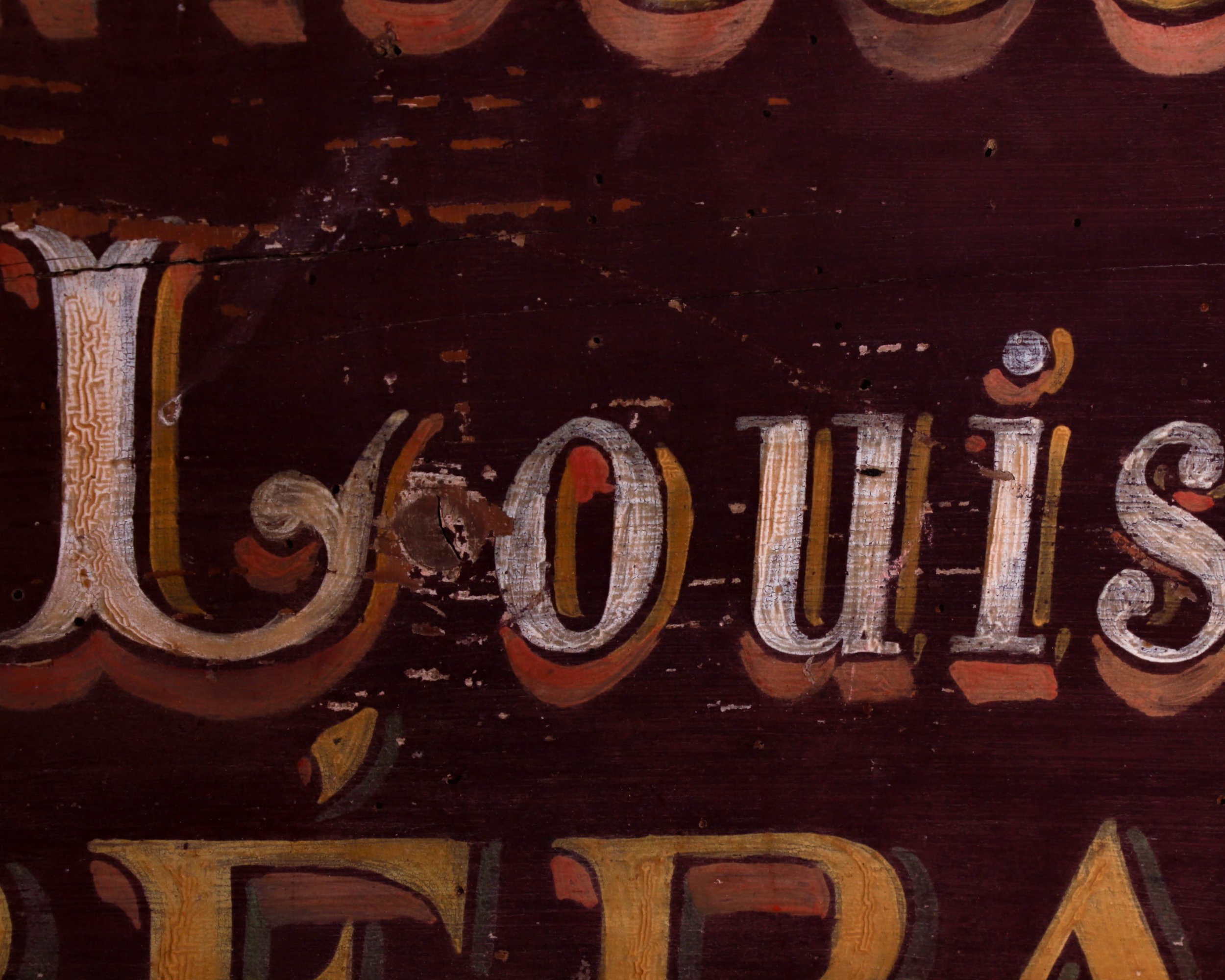
This late-19th-century French cobbler’s sign is painted on a single plank of wood and meant to be read from one side only, it advertises the services of Louis Duvary with no fuss and no nonsense. Just shoes, repairs, and the promise that someone inside knows exactly what they’re doing.
The hand-lettering is the star here. Tall, slightly imperfect letters sit against a deep, wine-colored background, layered with warm golds, creams, and soft shadows that give the whole thing some depth. You can still see the brushstrokes, the touch of the sign painter’s hand, and the subtle spacing choices that make each word breathe. It’s graphic, but human. Decorative, but hardworking.
Time has done its part, too. The surface shows honest wear, scuffs, and small losses that only add to its character. The wood has darkened and softened, the paint has mellowed, and the overall effect feels beautifully settled, like it’s been exactly where it belongs for more than a century. Measuring roughly 32 by 16 inches.
Category History
In the first half of the 20th century, before vinyl and neon took over, a good sign was as much about the hand as the message. Most small businesses relied on local painters or sign makers who worked with wood panels, house paint, and a steady eye. The result: one-of-a-kind pieces where every letter carries a bit of personality—slightly off, sometimes bold, sometimes improvised, but never generic.
These weren’t precious objects at the time. They hung outside in the weather, took on sun fade, rain streaks, and the occasional repaint. That’s part of the appeal now. The layered paint, ghost lettering, and uneven brushwork tell you exactly how they lived.
What stands out is the balance between function and instinct. The maker wasn’t chasing perfection—they were chasing readability, speed, and impact. And in doing so, they created something far more human. Each sign feels like a handshake from a past business owner, direct and unfiltered.
ITEM NOT AVAILABLE IMMEDIATELY—INQUIRE IF INTERESTED hello@heimweeantiques.com
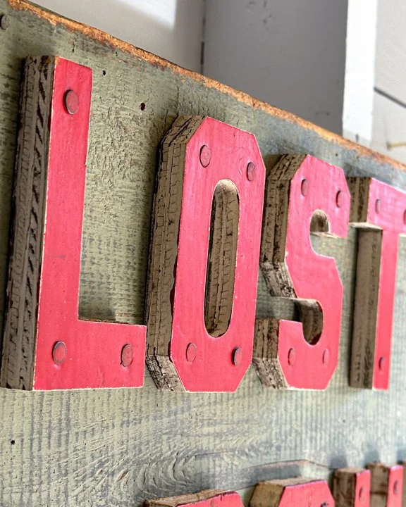
This single-sided wooden sign points the way to “Lost Pond.” Hand-painted in a weathered sage green, the board sets the stage for bold, blocky red letters that look like they were punched straight out of an old summer camp dream. Each letter is nailed down with a kind of rugged charm—slightly uneven, a little scuffed, carrying the patina of countless seasons outdoors. And then there’s the arrow. Bright red, simple, and to the point—probably leading you down a dirt trail, through the trees, toward mystery and maybe even mischief.
Category History
In the first half of the 20th century, before vinyl and neon took over, a good sign was as much about the hand as the message. Most small businesses relied on local painters or sign makers who worked with wood panels, house paint, and a steady eye. The result: one-of-a-kind pieces where every letter carries a bit of personality—slightly off, sometimes bold, sometimes improvised, but never generic.
These weren’t precious objects at the time. They hung outside in the weather, took on sun fade, rain streaks, and the occasional repaint. That’s part of the appeal now. The layered paint, ghost lettering, and uneven brushwork tell you exactly how they lived.
What stands out is the balance between function and instinct. The maker wasn’t chasing perfection—they were chasing readability, speed, and impact. And in doing so, they created something far more human. Each sign feels like a handshake from a past business owner, direct and unfiltered.

ITEM NOT AVAILABLE IMMEDIATELY—INQUIRE IF INTERESTED hello@heimweeantiques.com
Original single-sided porcelain sign boldly declaring "UNEXPLODED BOMB" in unapologetically red block letters. Manufactured by R&A Main Ltd., it likely dates back to mid-20th century Britain, possibly WWII era, when such signs were unfortunately more routine than rare. The white enamel background has taken a few hits of its own—there’s some chipping along the edges and a healthy scattering of rust, mostly near the bottom, which adds a nice bit of gritty drama.
Category History
Early enamel porcelain signs are where durability meets bold messaging. Emerging in the late 19th and early 20th centuries, they were built for the outdoors—gas stations, storefronts, railways—anywhere a message needed to survive weather, time, and a bit of neglect. The process was industrial but surprisingly refined: steel sheets were coated with powdered glass and fired in a kiln, fusing the enamel into a hard, glossy surface that resisted rust and fading.
That technique gave these signs their signature look—deep, saturated color, crisp lettering, and a sheen that still catches light a century later. Layers were often applied in stages, with separate firings for each color, which is why even simple designs can feel so graphic and intentional.
The content ranged from straightforward advertising—oil, tobacco, soda—to practical messaging like safety warnings or directional signs. Either way, the goal was clarity and impact. Big type, strong contrast, no wasted space.
What makes them compelling now is how well they’ve held up. Chips, edge wear, and the occasional rust spot don’t detract—they add texture and proof of life. These signs were made to be seen, not preserved, and that longevity has turned them into objects that feel both industrial and oddly timeless.
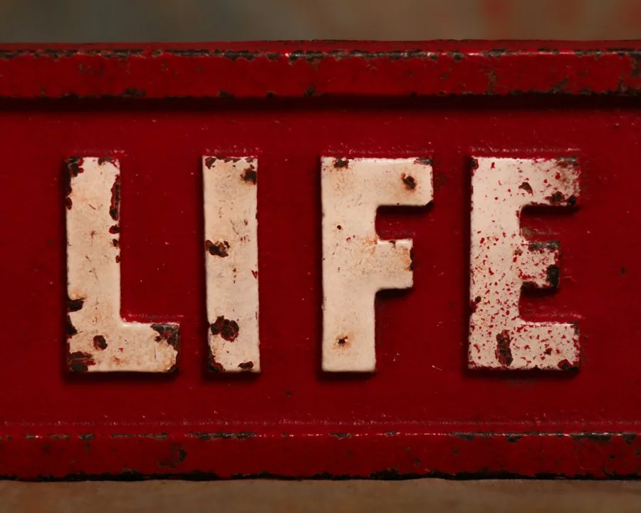
This vintage LIFE Magazine cast iron paperweight is the kind of thing you don’t come across every day. Originally used on newsstands to keep the stacks in place, it’s double-sided and features raised lettering that spells out “LIFE” in bold white on red, with a simple embossed border framing it all in. The paint shows plenty of age and wear, and the chippy surface gives it a great, no-nonsense look. It measures about 2 3/4" tall by 6 3/4" wide, just under 1/2" thick, and clocks in at nearly 1 lb 5 oz of solid cast iron. An authentic bit of old-school print culture, from a time when magazines were king and the newsstand was a daily ritual.
Category History
Early cast iron paperweights made for magazine and newspaper stands were less about decoration and more about keeping order in a windy, high-traffic world. Found in train stations, hotel lobbies, newsstands, and corner shops, they were built to pin down stacks of daily papers that were constantly being flipped through, rearranged, and restocked.
Most were cast in simple, functional forms—arched bars, handled weights, or flat, elongated shapes that could span across a stack. Many carried embossed names of publications, distributors, or local businesses, doubling as subtle advertising while doing their job. Produced by the same foundries turning out industrial hardware, they have that same no-nonsense construction—solid, heavy, and made to last.
Years of use left their mark. Worn edges, softened lettering, and a darkened surface from constant handling give them a kind of quiet authority. They weren’t meant to stand out, but to work.
Today, they read as small pieces of everyday infrastructure—objects that kept information in place before everything went digital. Practical, durable, and surprisingly graphic in their simplicity.

This double-sided wooden sign doesn’t just suggest no smoking, it demands it, “by orders of the L.A. Fire Dept.” Hand-painted in thick white block letters on a fire-engine red background, it’s got the kind of visual authority that makes you sit up straight. Dating to the mid-20th century and measuring 18" x 36", this piece was likely hung in or around city buildings where even a spark could be a serious problem. Both sides still pack a visual punch, with weathered edges and paint crackling that add just the right dose of grit. Bonus points for the original hanging hooks still intact.
Category History
In the first half of the 20th century, before vinyl and neon took over, a good sign was as much about the hand as the message. Most small businesses relied on local painters or sign makers who worked with wood panels, house paint, and a steady eye. The result: one-of-a-kind pieces where every letter carries a bit of personality—slightly off, sometimes bold, sometimes improvised, but never generic.
These weren’t precious objects at the time. They hung outside in the weather, took on sun fade, rain streaks, and the occasional repaint. That’s part of the appeal now. The layered paint, ghost lettering, and uneven brushwork tell you exactly how they lived.
What stands out is the balance between function and instinct. The maker wasn’t chasing perfection—they were chasing readability, speed, and impact. And in doing so, they created something far more human. Each sign feels like a handshake from a past business owner, direct and unfiltered.

There is more to explore. Browse the full collection.
Frequently Asked Questions
-
Original vintage signs will show genuine signs of age including fading, chipping, rust and uneven patina that develops over decades. Reproduction signs are typically uniform in their ageing and lack the small imperfections that come from a working life. Checking the fixings, the back of the sign and the printing or enamel technique can also help establish authenticity.
-
Antique enamel signs were produced by fusing powdered glass onto a metal base at high temperature, creating a hard, glossy surface with vivid colour. Antique metal signs were produced using lithographic printing directly onto tin or steel. Both methods were widely used for commercial signage during the nineteenth and early twentieth centuries, though enamel signs are generally considered more durable and are among the most collectible.
-
Antique store signs and commercial signage from the nineteenth and early twentieth centuries were produced for a wide range of industries including tobacco, food and drink, pharmaceuticals, hardware, transport and public services. Signs advertising now defunct brands and businesses are particularly sought after by collectors.
-
Real vintage signs are best cleaned with minimal intervention. A soft dry cloth is usually sufficient to remove surface dust. Antique enamel signs can tolerate gentle cleaning with a slightly damp cloth but harsh chemicals should be avoided as they can damage the enamel surface. For signs with significant rust or damage, professional conservation advice is recommended before attempting any restoration.
-
Original vintage signs in good condition have historically held and increased in value, particularly antique enamel signs and signs from well known historical brands. Rarity, condition, subject matter and graphic quality all affect collectible value. As with all antiques, provenance and originality are the most important factors in determining long term value.

This old single-sided wooden “FROST” sign has a great homemade commercial look, with raised red letters mounted individually over a blue-painted board. The lettering is bold, blocky, and slightly irregular, giving it the feel of a sign made for visibility rather than polish. The blue background has developed a dense network of age cracks, scratches, edge wear, and losses, while the red letters have their own worn surface and chipped paint. Together, the colors have mellowed into exactly the kind of surface that makes old signage so visually appealing.
The letters appear to be separate cut wooden elements nailed or fastened to the board rather than simply painted on. That extra dimension gives the sign a nice shadow line and helps the word read clearly from a distance. The back is unfinished wood and now has a newer metal hanging cleat attached, making display easy while leaving the original face untouched.
Signs like this were common fixtures of small businesses, workshops, roadside establishments, warehouses, farm stands, garages, and local stores throughout the late 19th and early 20th centuries. Before vinyl lettering and inexpensive illuminated signage, painted wooden boards were among the simplest and most practical ways to advertise a name, product, or service. Raised letters offered an inexpensive way to make a sign feel more substantial and easier to read.
Without additional provenance, it is difficult to say exactly what “FROST” referred to. It could have been a surname, business name, product name, or part of a larger sign that no longer survives.
That ambiguity is part of its appeal. Reduced to one strong word, two colors, and a beautifully weathered surface, the sign now reads almost like found graphic art. It has the directness of old advertising, but enough mystery left in it to keep you wondering where it originally hung.