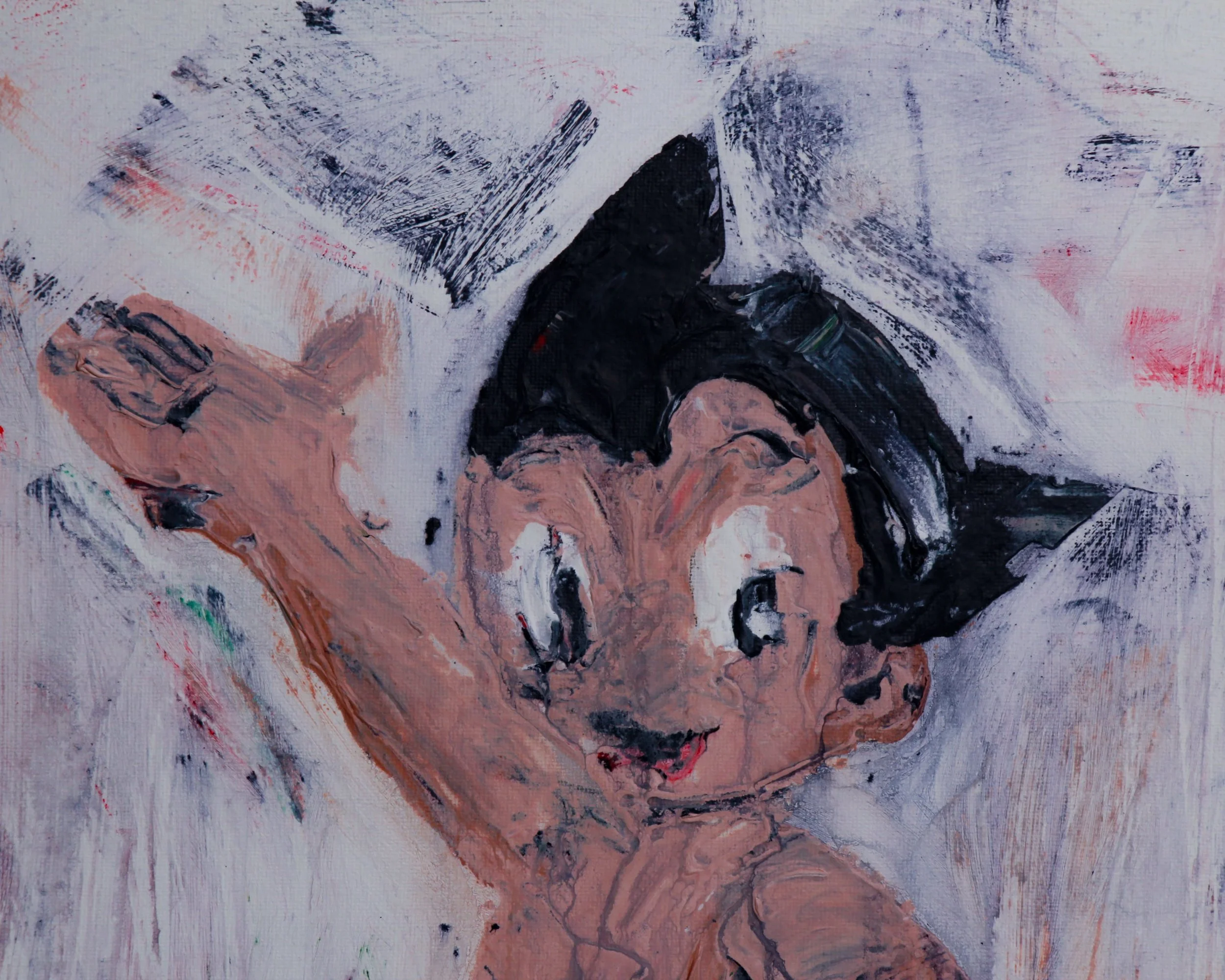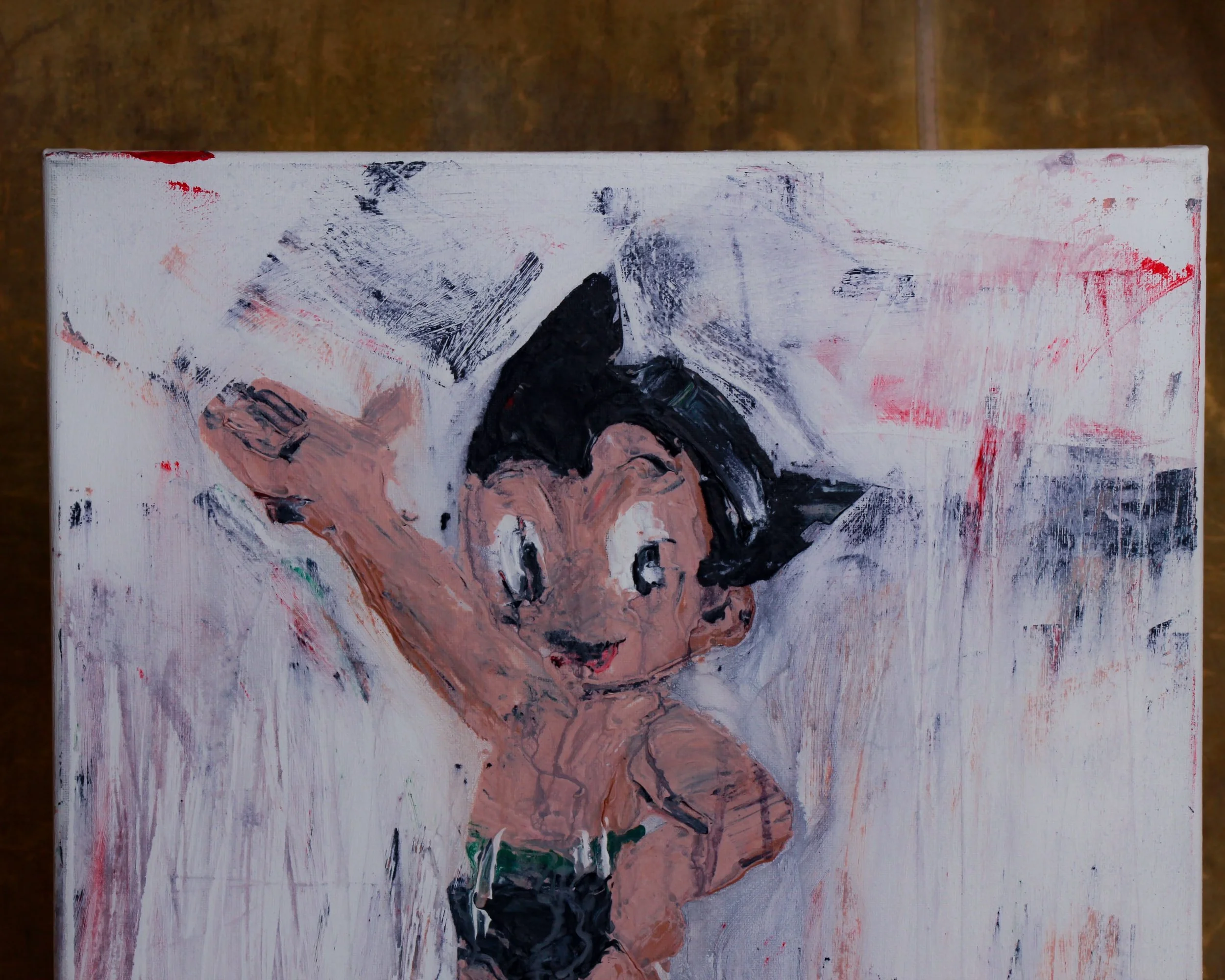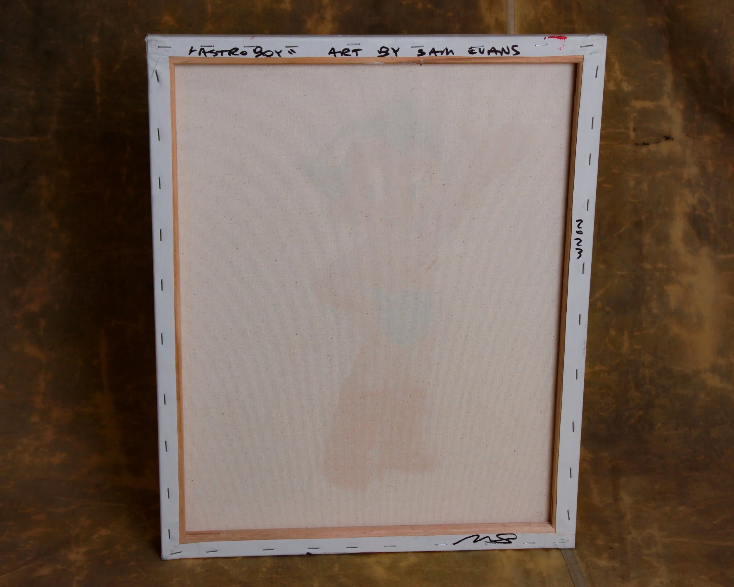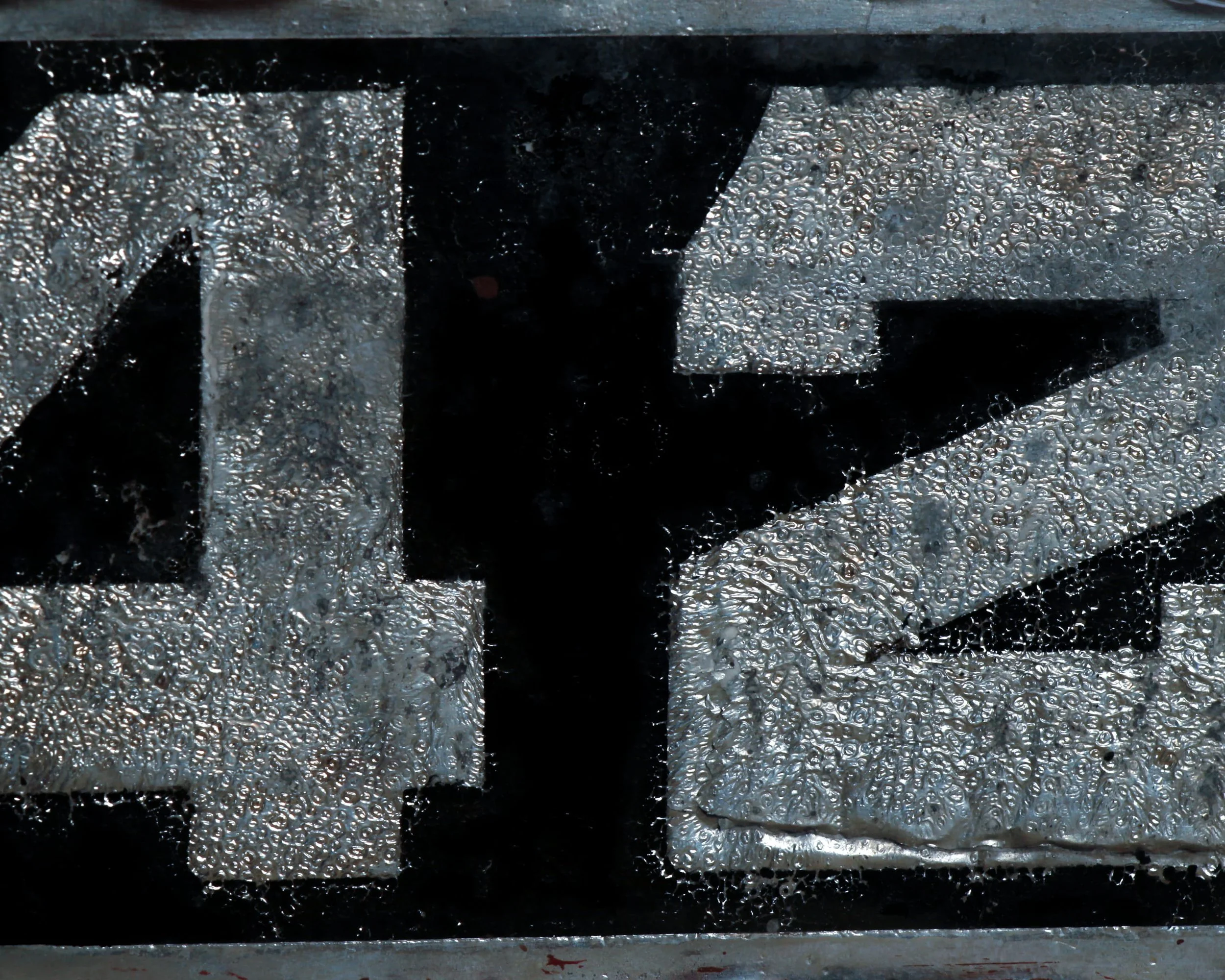
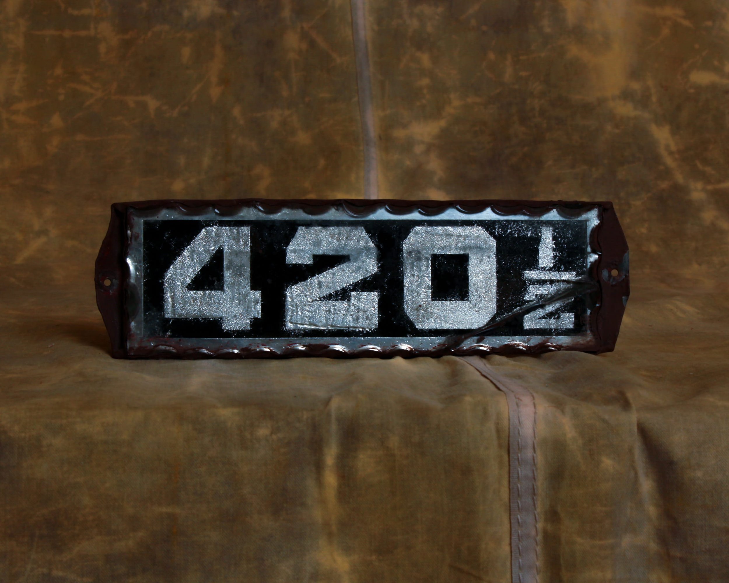
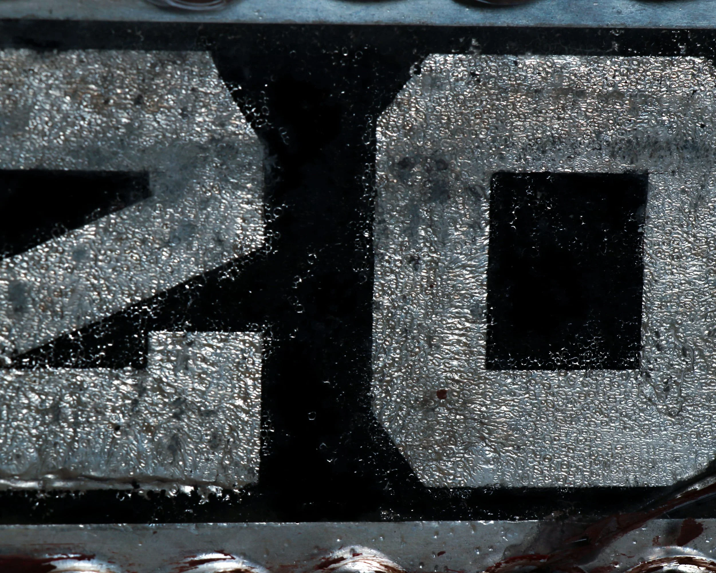
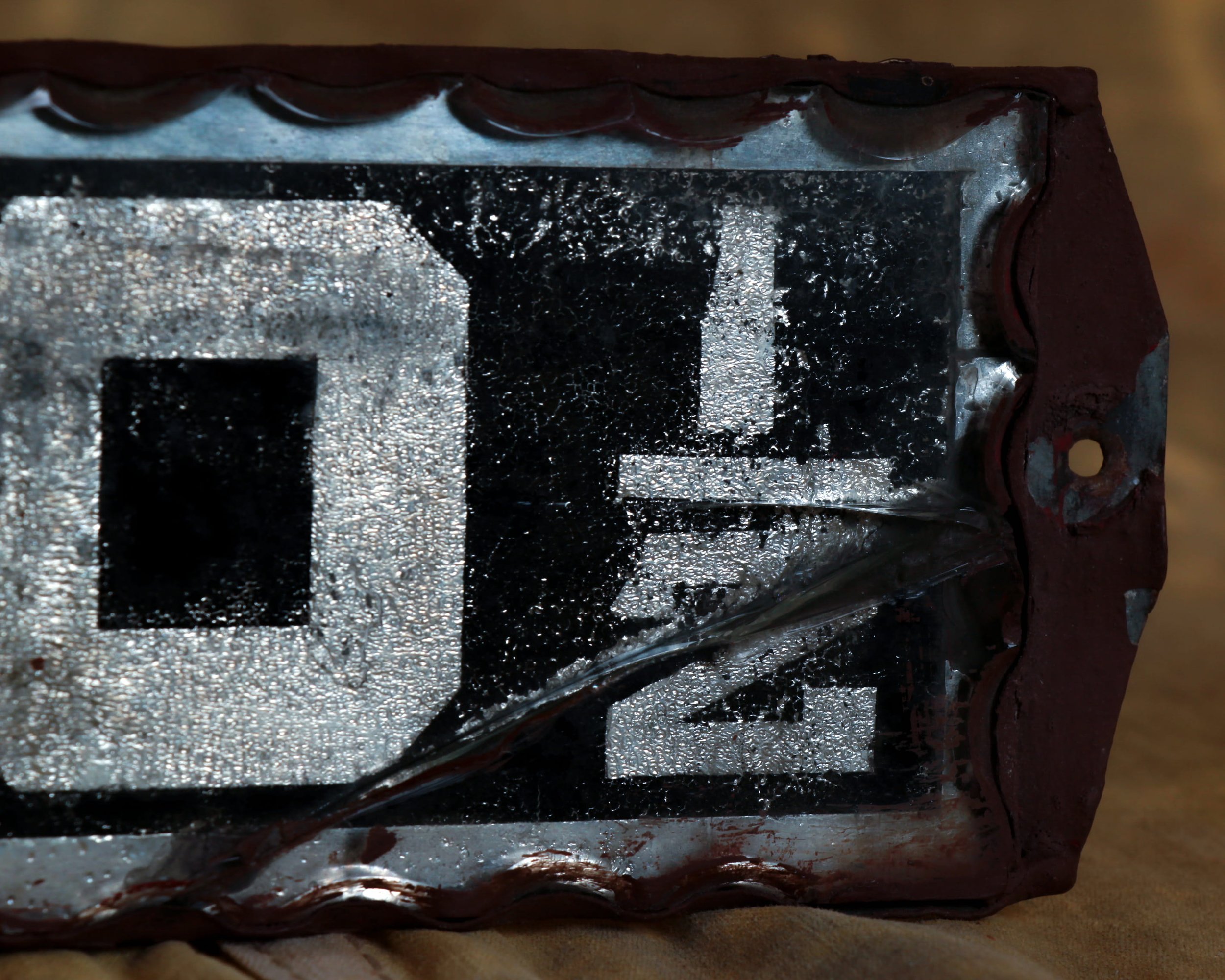
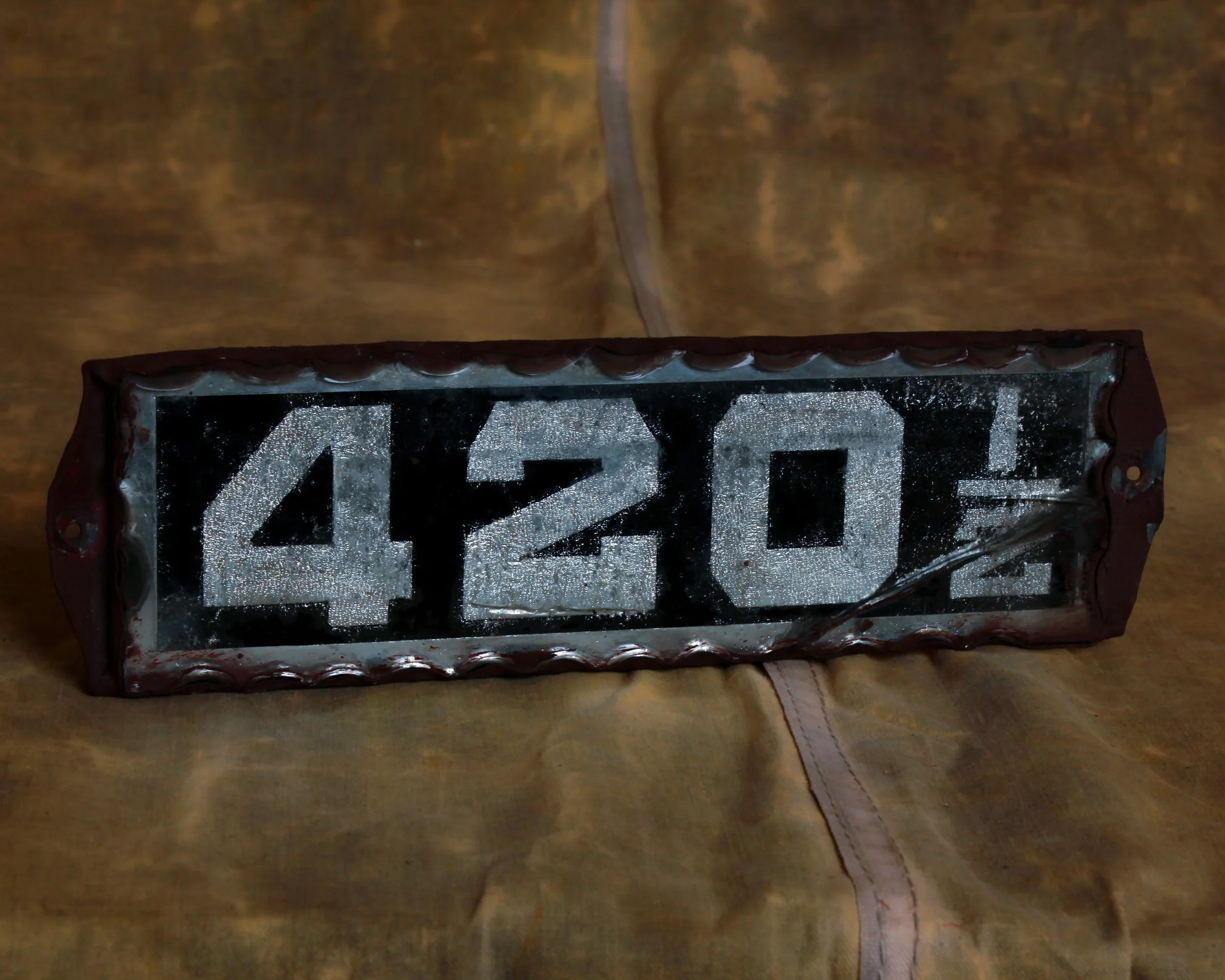
A reverse painted glass address sign reading 420 ½, set against a deep black background with shimmering silver foil backing that has that wonderful, almost frosted sparkle. The numerals are bold, blocky, and unapologetic. Crisp white against that glittering, textured foil. The scalloped glass border frames it with just enough flourish to keep it from feeling too utilitarian. It has presence, even at rest.
And then, of course, there is the number itself. The subtle wink to 4/20. The quiet nod. Add the ½ and it becomes even better, slightly offbeat, like the address that only locals know about.
Please note that there is a small crack in the bottom right corner, visible but honest. It does not detract.
Category History
Reverse glass painted signs are a bit of a trick—and that’s exactly the point. The image is painted on the back of the glass in reverse order, so what you see from the front is crisp, glossy, and sealed beneath the surface. Lettering comes first, then layers of color and background, all built backward with no room for correction once it’s covered.
Popular from the late 19th into the early 20th century, these signs were often used by businesses that wanted a more refined look—dentists, barbers, jewelers, cafés. Gold leaf, bold typography, and clean lines gave them a sense of permanence and polish that stood out from painted wood or tin.
What makes them compelling now is that balance of fragility and precision. The glass can crack, the paint can flake, but when they survive intact, the finish still feels sharp and luminous. Light hits the surface and stays there, making even simple designs feel elevated.
They’re part craft, part illusion. Everything you see is protected behind the glass, yet entirely dependent on it—one break, and the whole image changes.