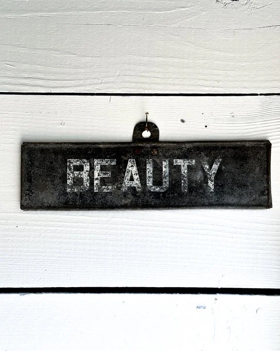


There’s something irresistible about a word when it stands on its own. This early metal trade sign simply reads “BEAUTY” in bold white block letters, now softened and weathered by age. No extra context, no slogan, just that single, loaded word staring you down like a challenge. Perhaps, it was once nailed above a shopfront selling hair tonic, corsets, or skin lotion.
The paint has thinned in places, letting the metal peek through, and the edges carry that slight bend and wear from years outdoors. It doesn’t explain itself—it just holds the word up and lets you decide what it means.
Measures approximately 12" by 3"
Category History
Old metal and tin advertising signs are the original attention-grabbers—built to catch your eye, hold it, and do the selling in a split second. From the late 19th into the mid-20th century, these signs showed up everywhere: general stores, gas stations, roadside stands, and city walls. Lightweight and relatively inexpensive to produce, tin became a go-to material for brands looking to spread their message far and wide.
The graphics did the heavy lifting. Bold lettering, high-contrast colors, and simple imagery made them readable at a glance. Lithography allowed for detailed illustrations—everything from smiling characters to idealized products—printed directly onto the metal surface. Some were single-sided for interior use, others designed to hang outdoors and withstand weather, picking up rust, chips, and fade along the way.
What makes them interesting now is that wear. The scratches, oxidation, and softened edges aren’t flaws—they’re proof of exposure and use. Unlike porcelain enamel signs, which were built to last, tin signs often lived harder, shorter lives, making surviving examples feel a bit more accidental.
They sit comfortably between graphic design and object. Direct, a little rough around the edges, and still doing their job decades later—pulling your attention without asking politely.