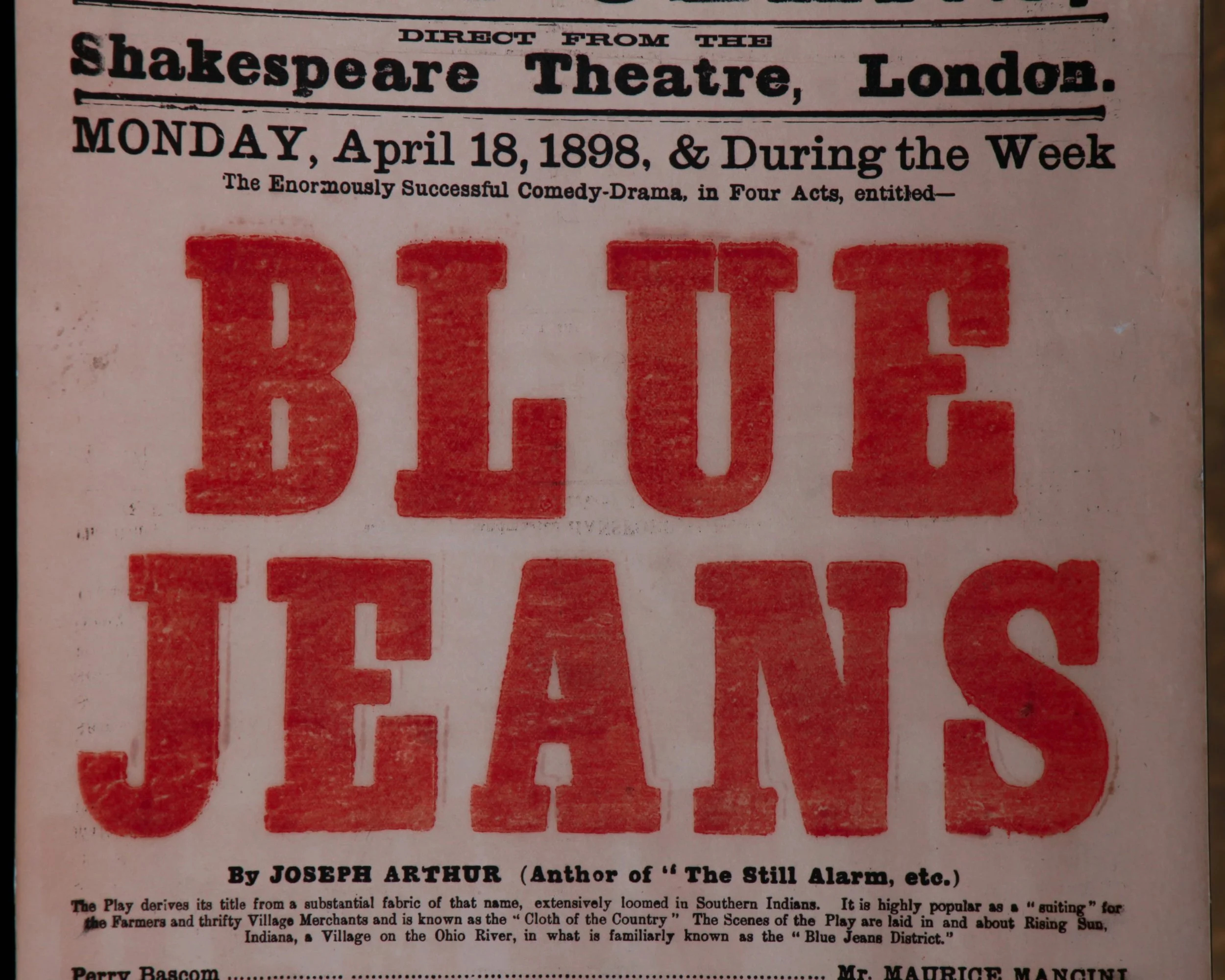
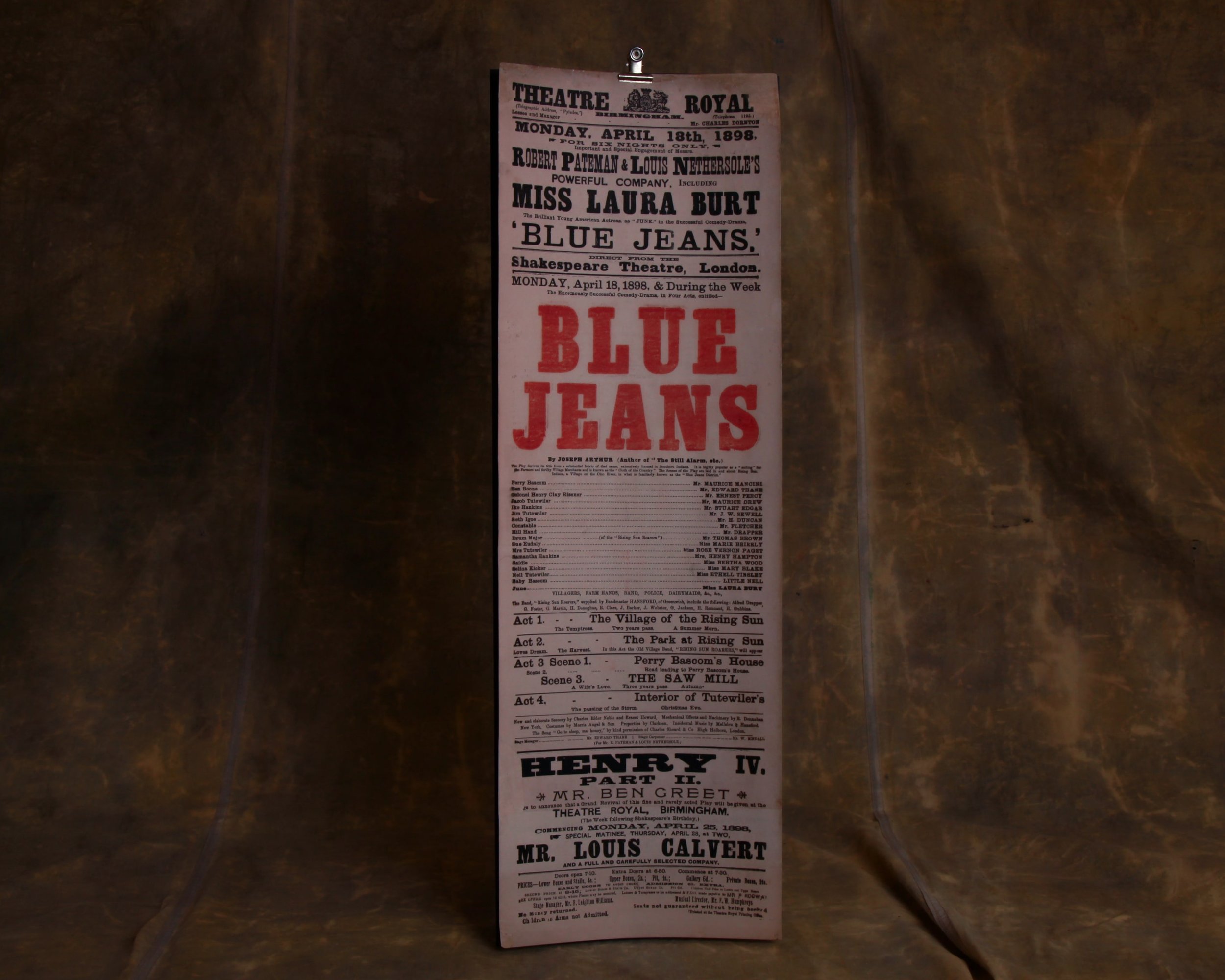
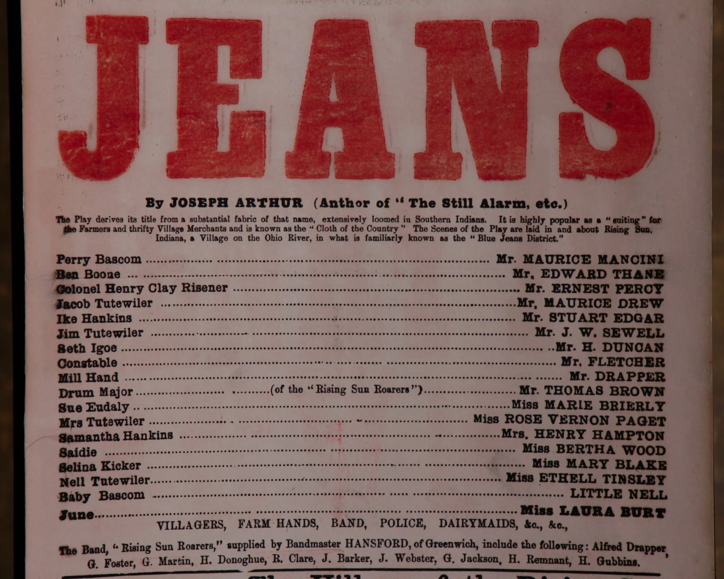
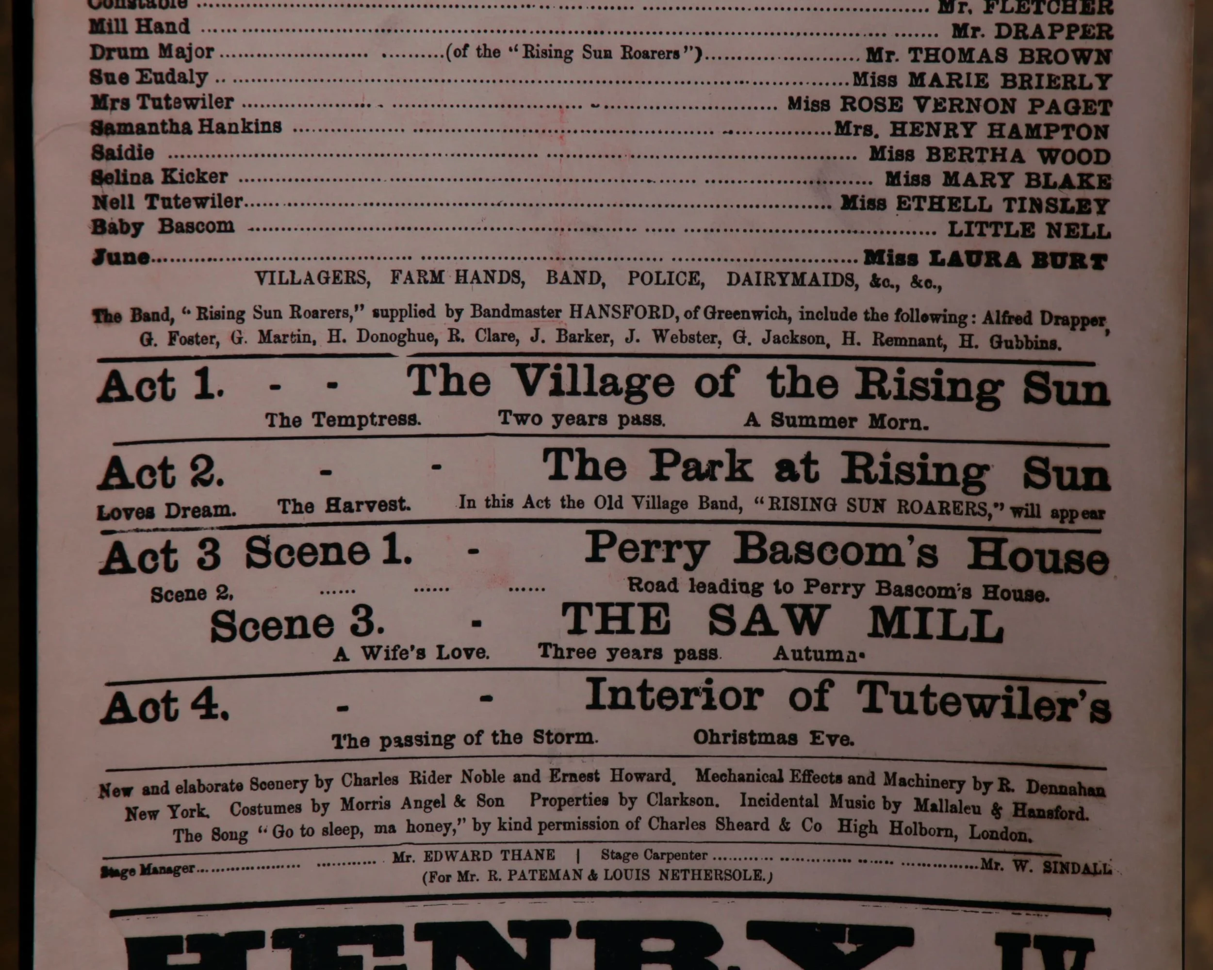
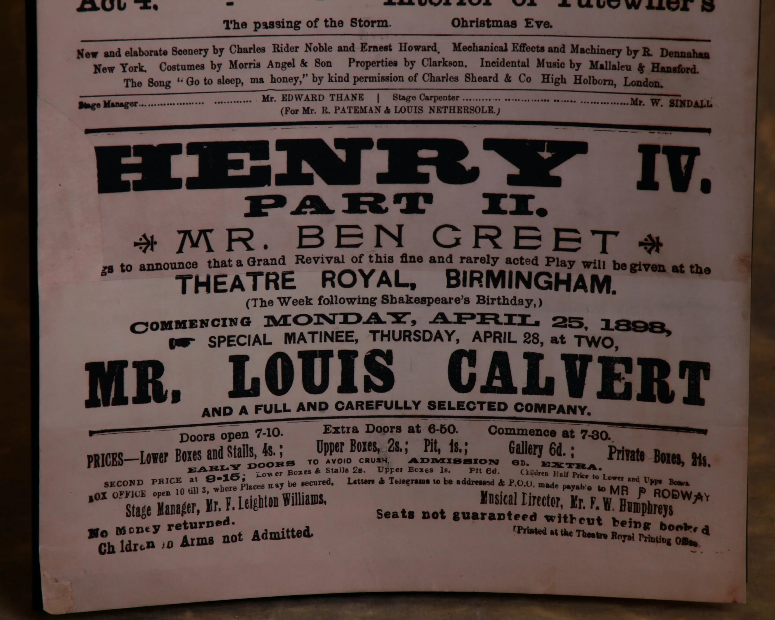
This late 19th-century Theatre Royal broadside announces the Birmingham engagement of Blue Jeans, a comedy-drama fresh from London’s Shakespeare Theatre, opening April 18, 1898. The typography does most of the talking: bold, layered, and unapologetically loud, with that oversized “BLUE JEANS” anchoring the whole thing.
What makes this piece sing is the density of it all—cast lists, acts, scenes, ticket prices, even house rules—an entire evening at the theater compressed into ink and paper.
Printed for a moment that passed quickly, yet built to announce itself with authority, this is the kind of ephemera that wasn’t meant to last—and did anyway.
Category History
Lithographed advertising in the 19th and early 20th centuries is where marketing learned to flirt with art. Using stone or metal plates, printers could layer colors one at a time, building rich, eye-catching images that went far beyond simple text. The process wasn’t quick—each color required its own pass—but the results were worth it: bold posters, trade cards, and labels that could stop you mid-step.
Companies leaned into it. Soap, tobacco, travel, machinery—you name it, it got a visual identity. Figures were often idealized, scenes exaggerated, and color palettes pushed just enough to feel vivid without losing clarity. The goal was simple: make the product memorable, even if the image had more imagination than accuracy.
What makes these pieces compelling now is the balance between precision and personality. You can often see the registration lines, slight overlaps, or subtle shifts in color where the process reveals itself. And then there’s the wear—creases, fading, pinholes—that reminds you these weren’t precious objects, but working advertisements out in the world.
They sit comfortably between graphic design and fine art, capturing a moment when selling something also meant crafting an image worth keeping.
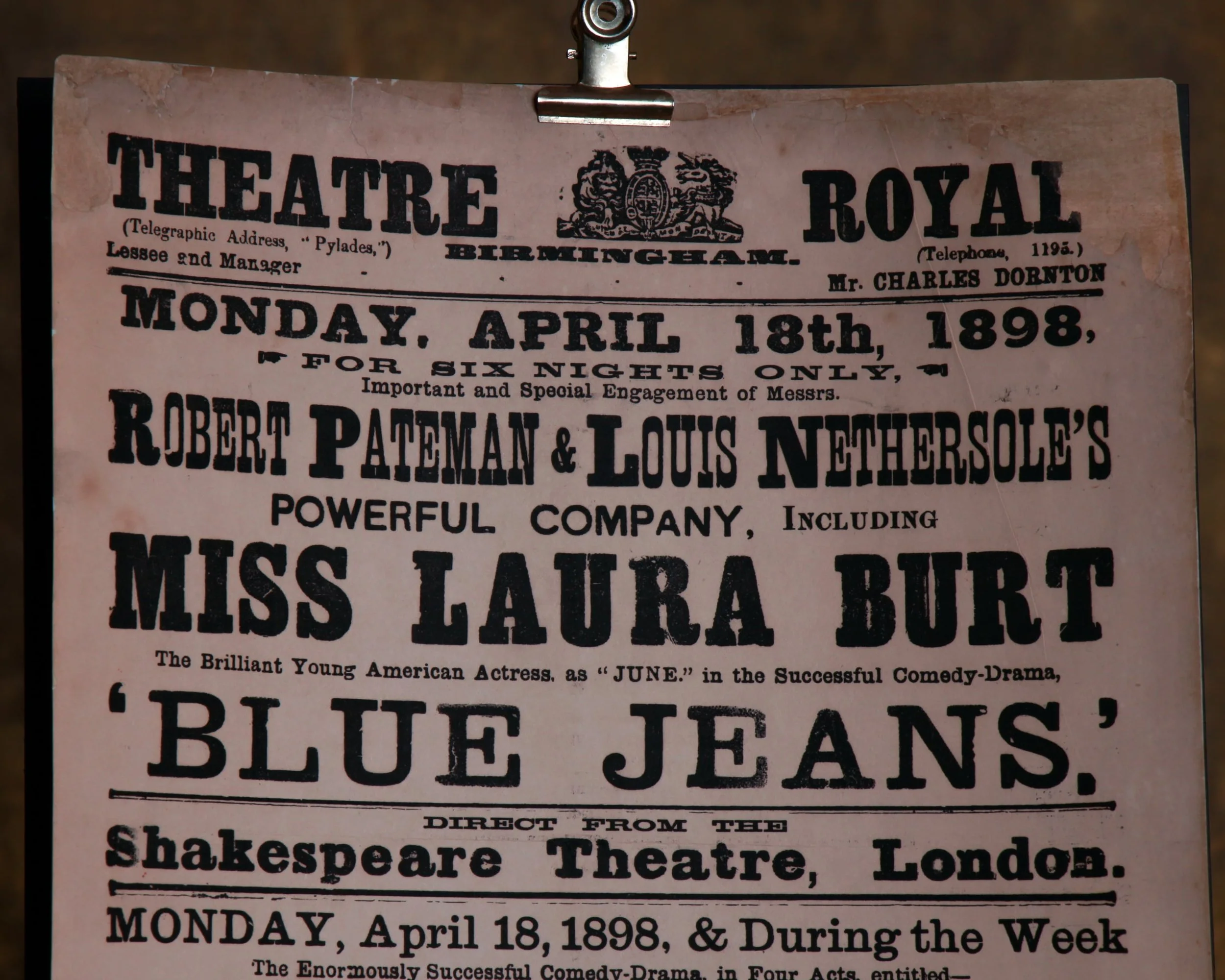
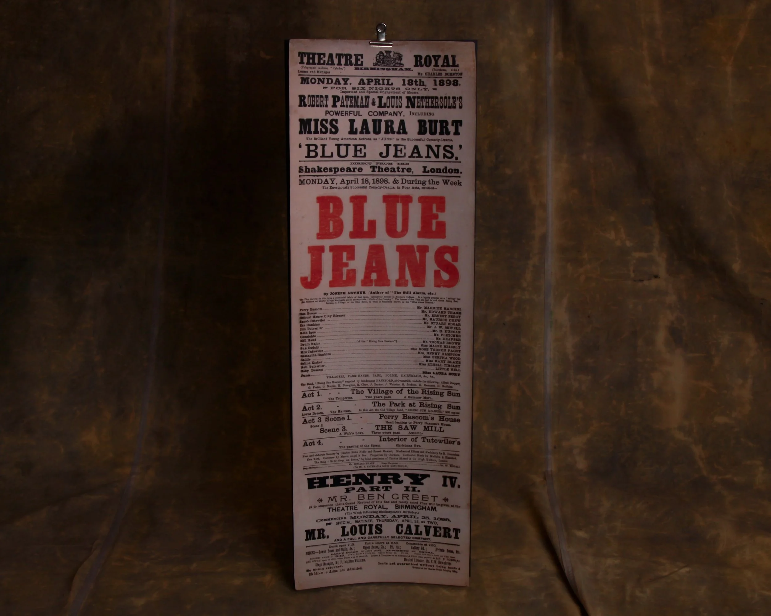