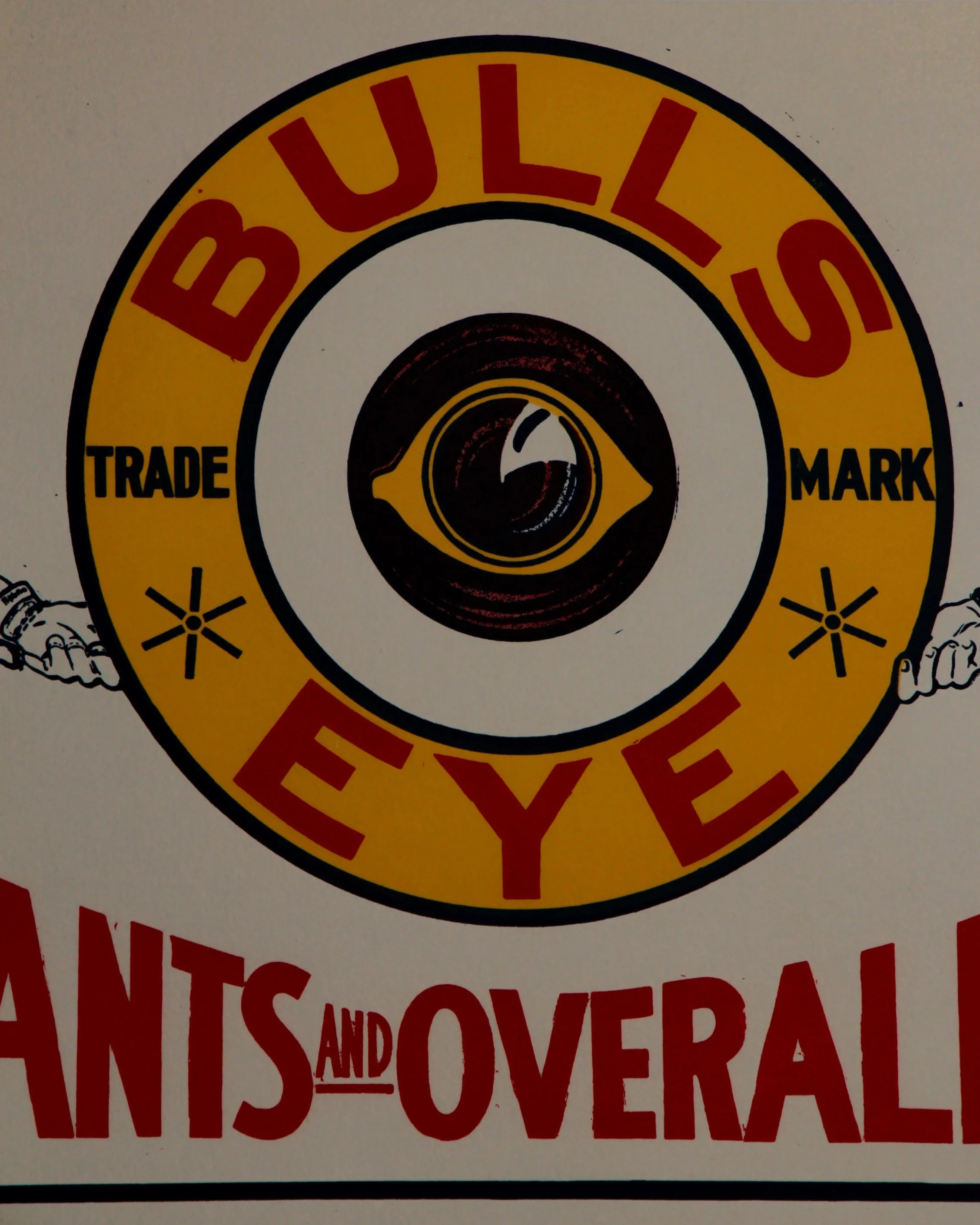
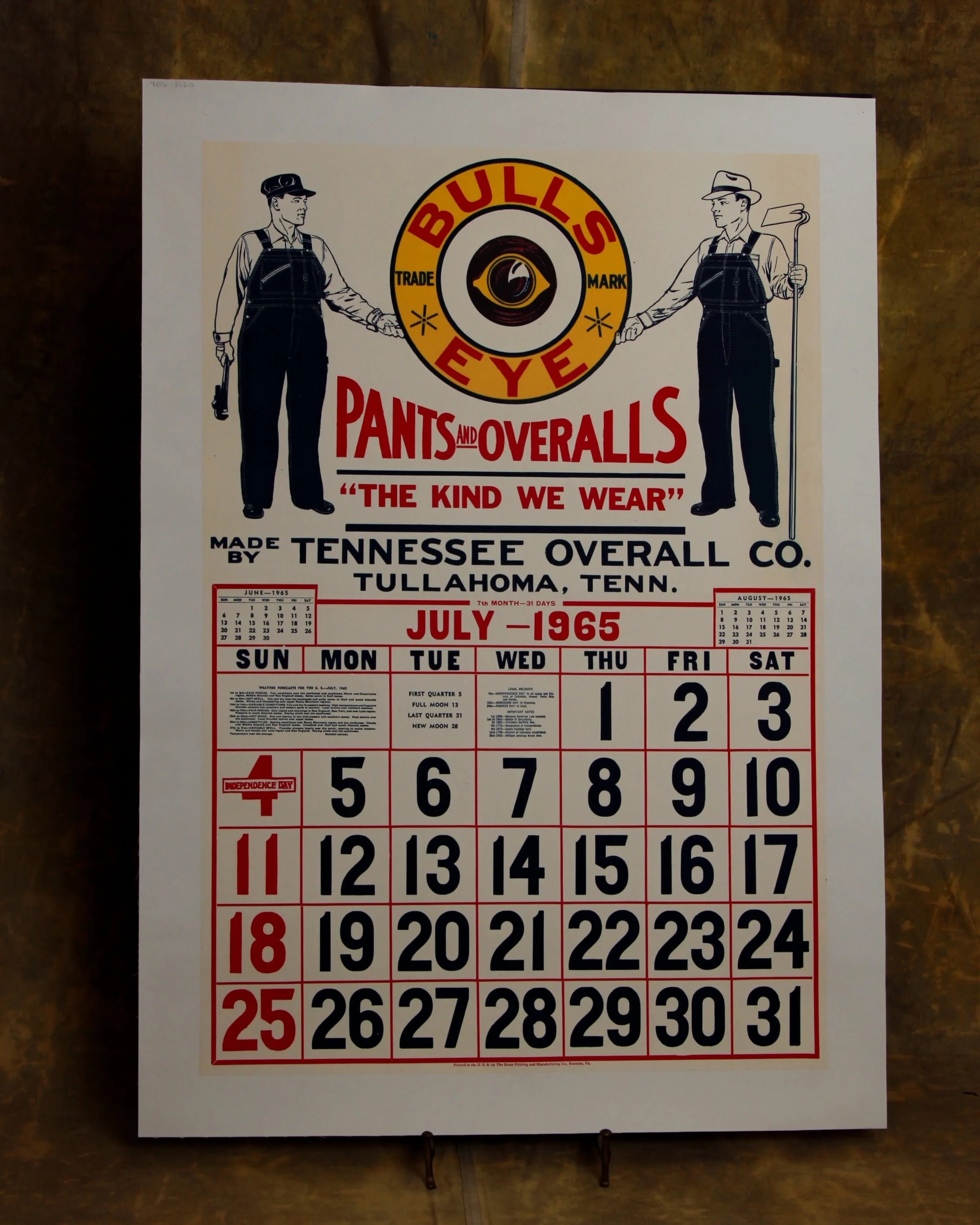
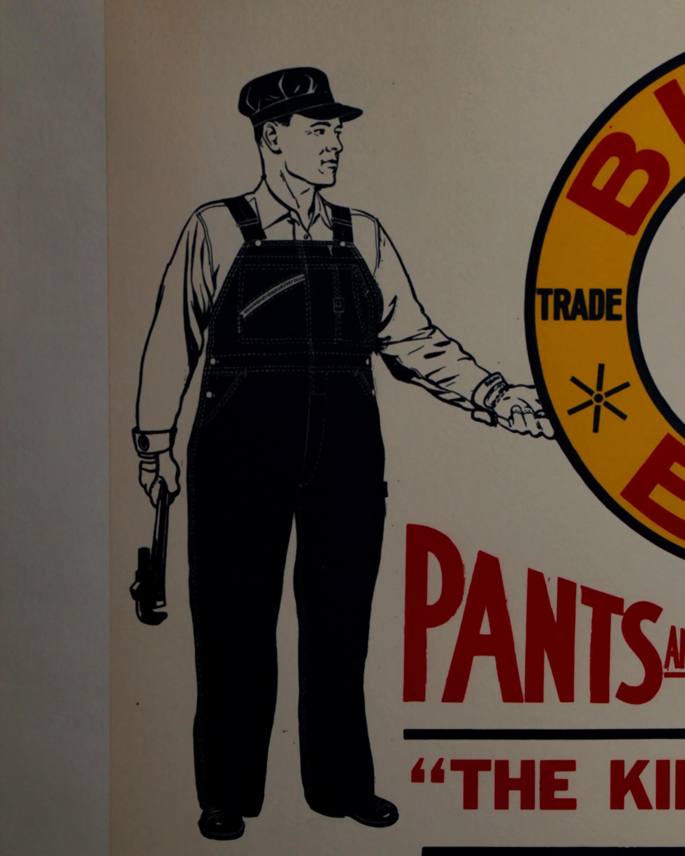
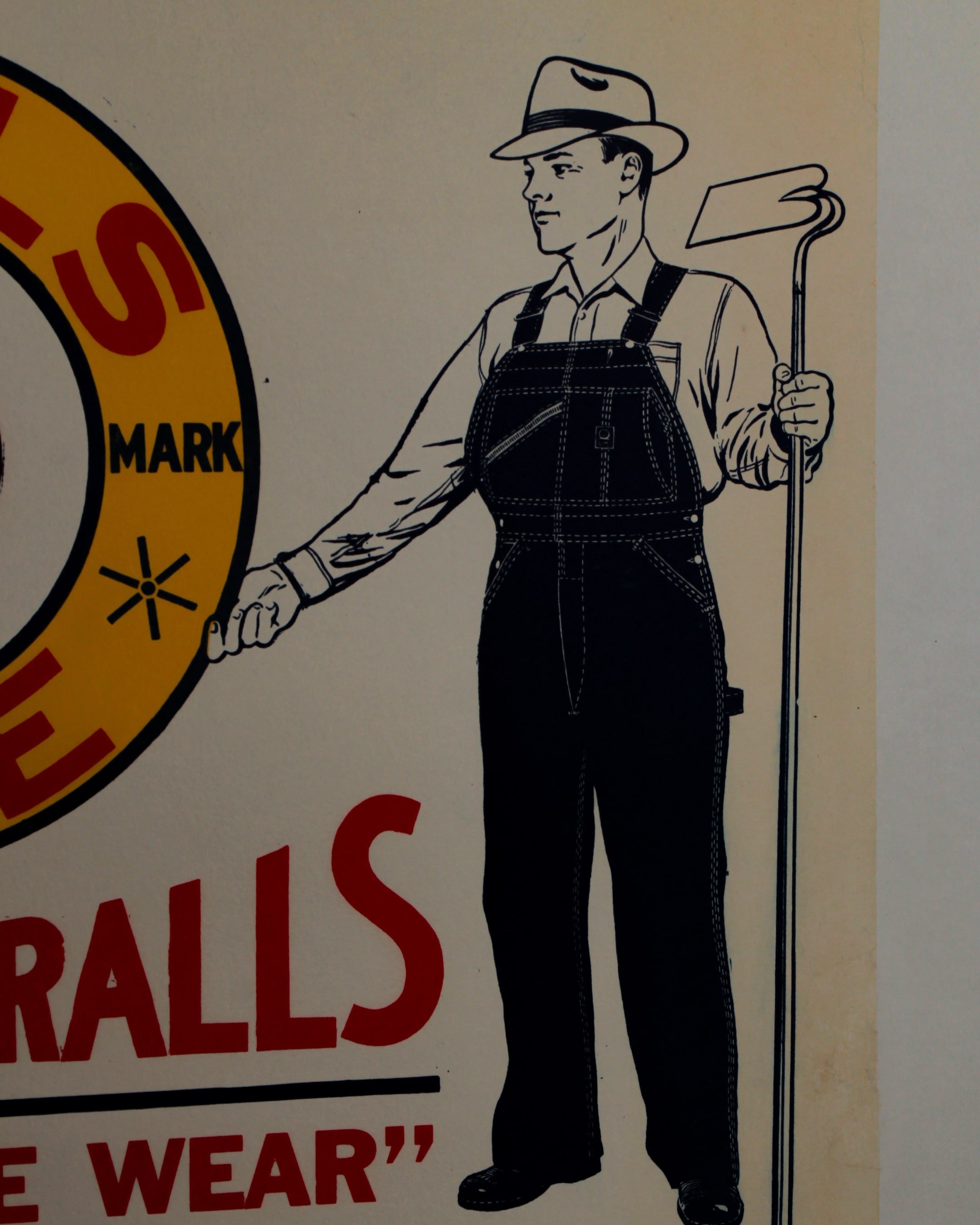
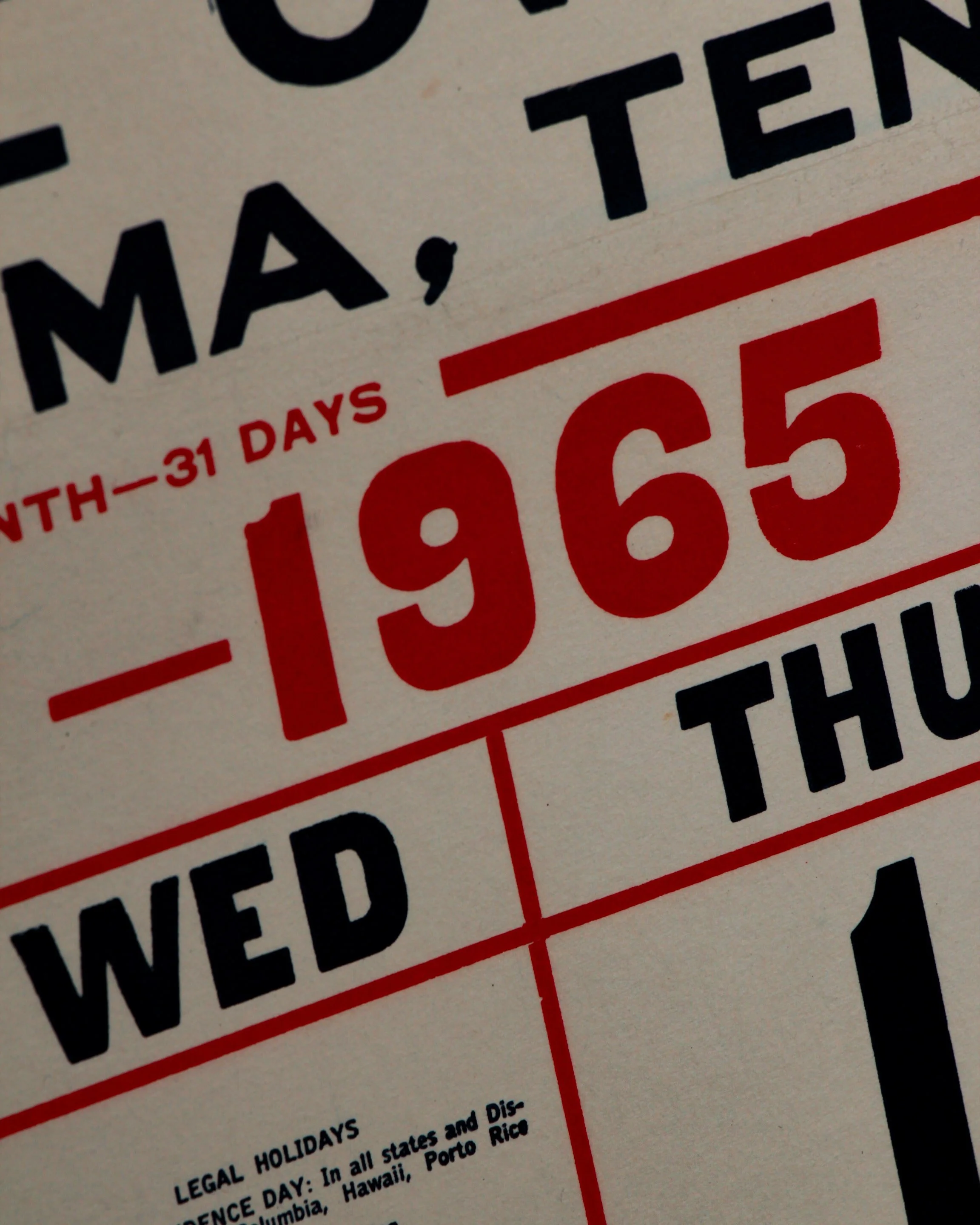
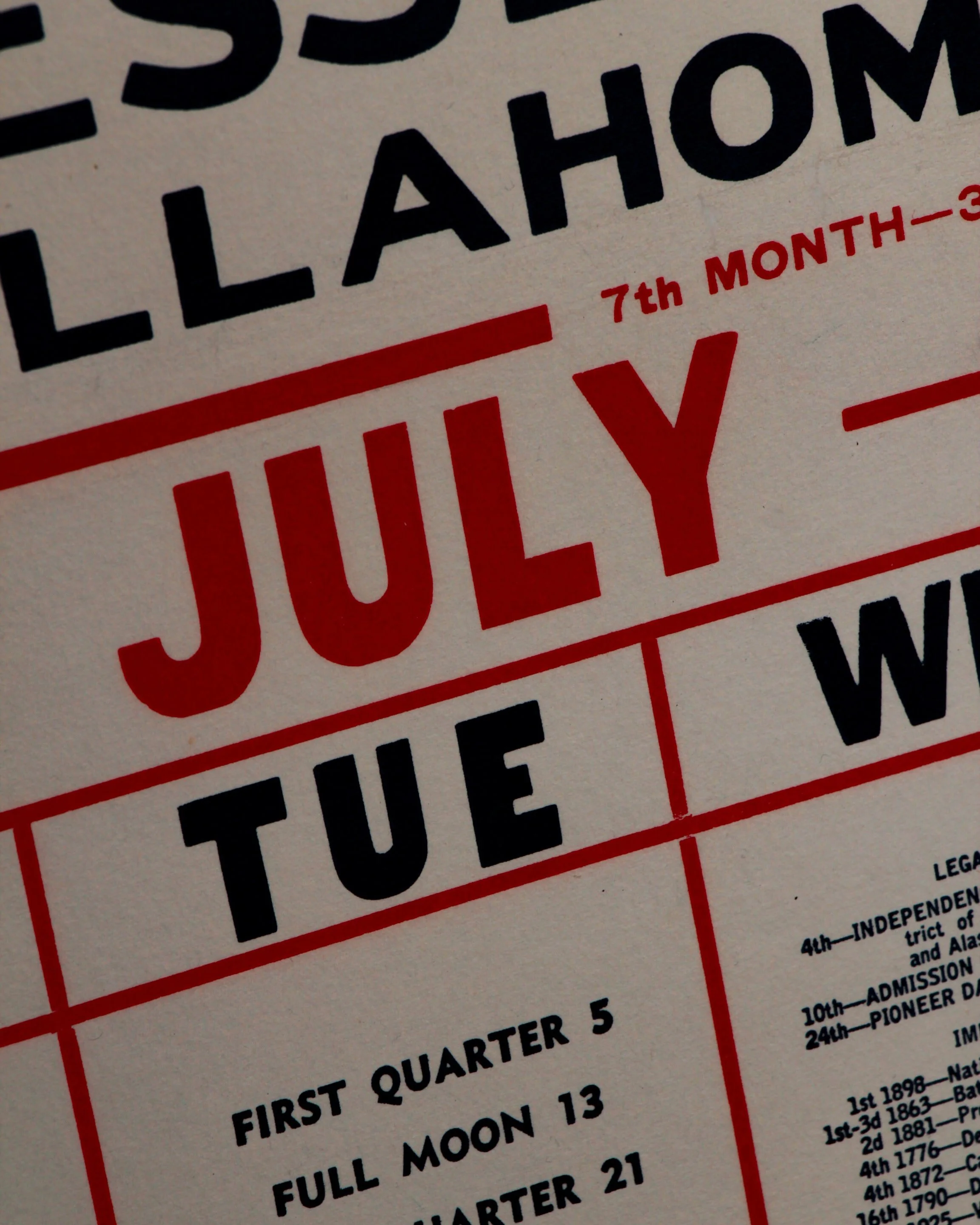
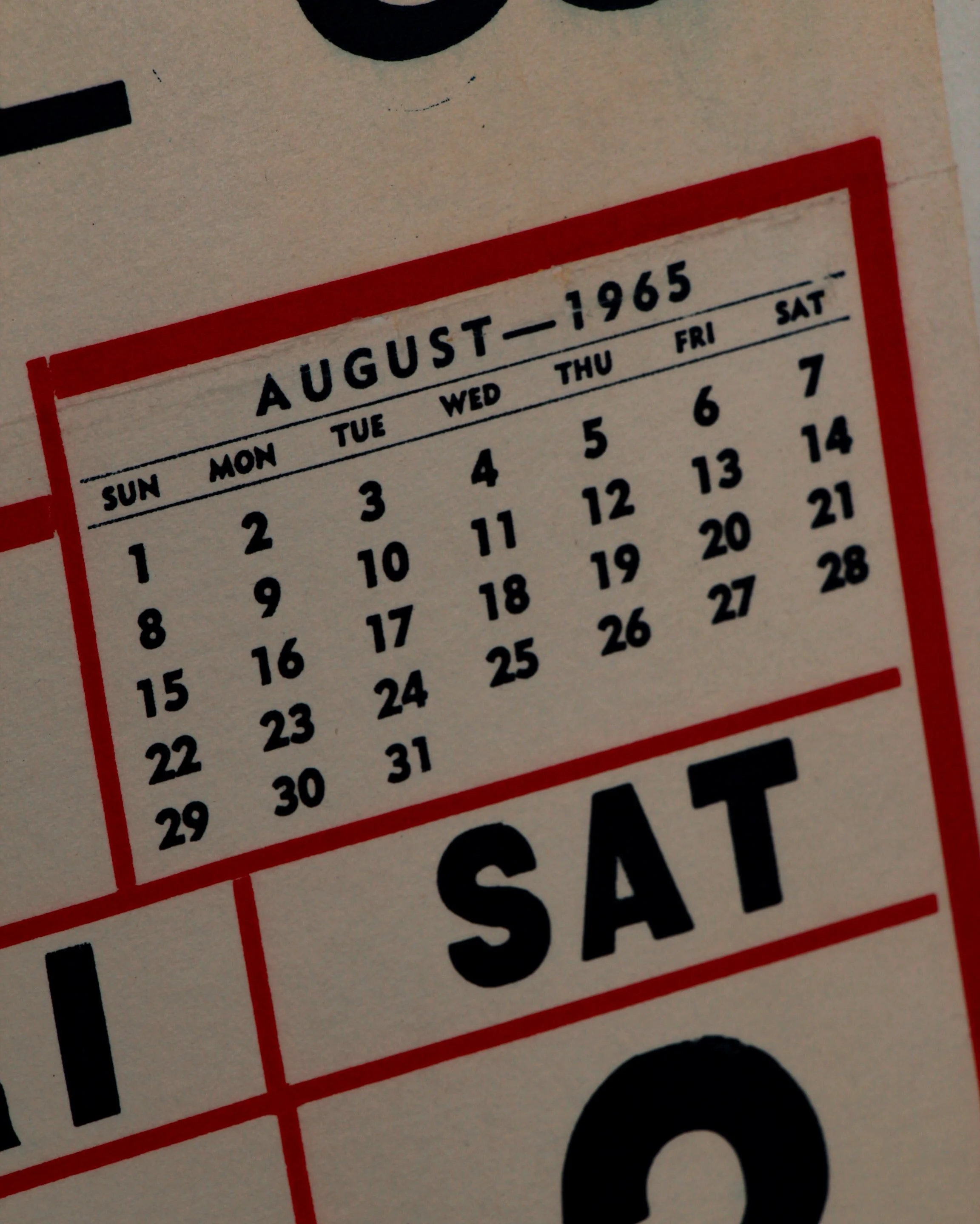
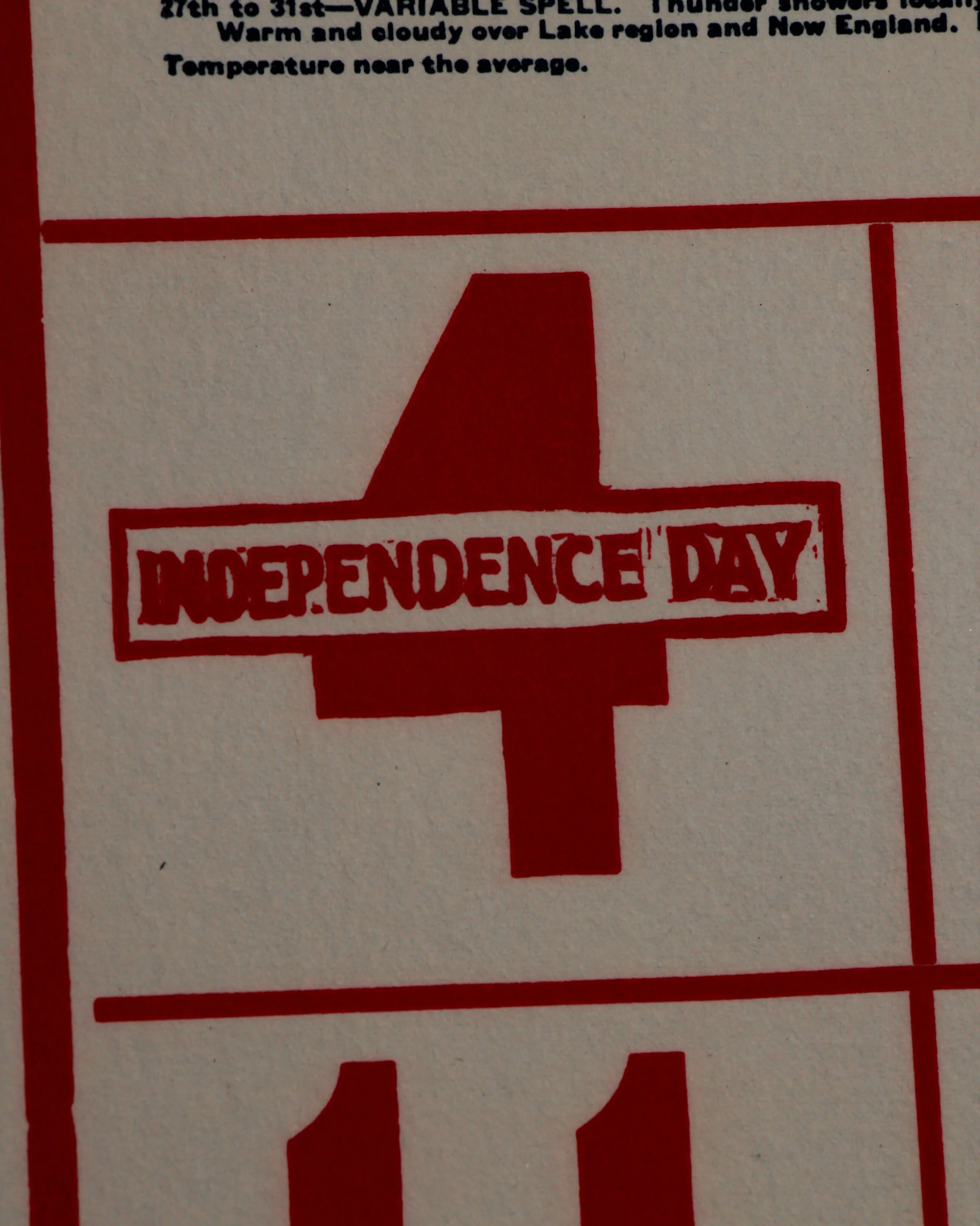
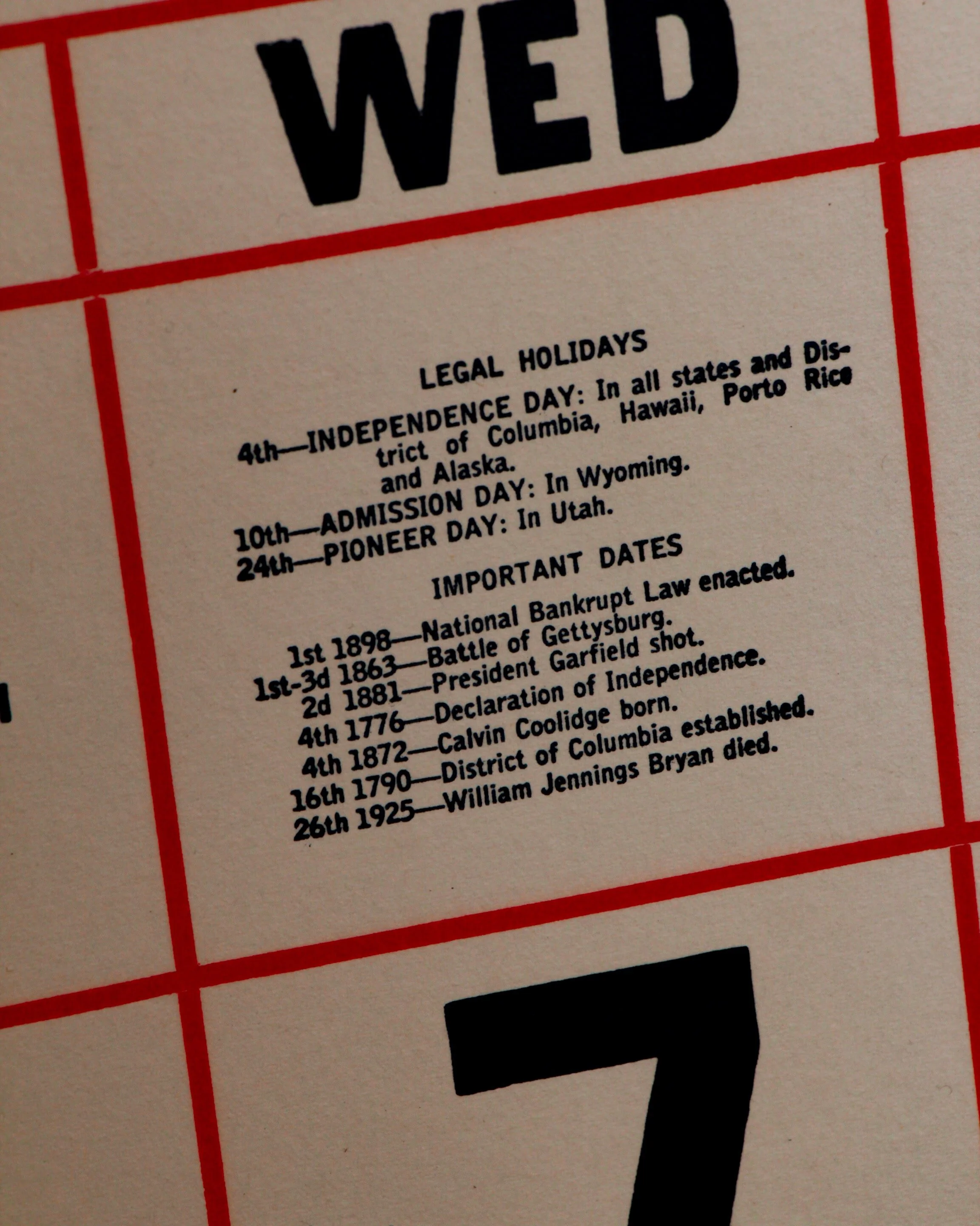
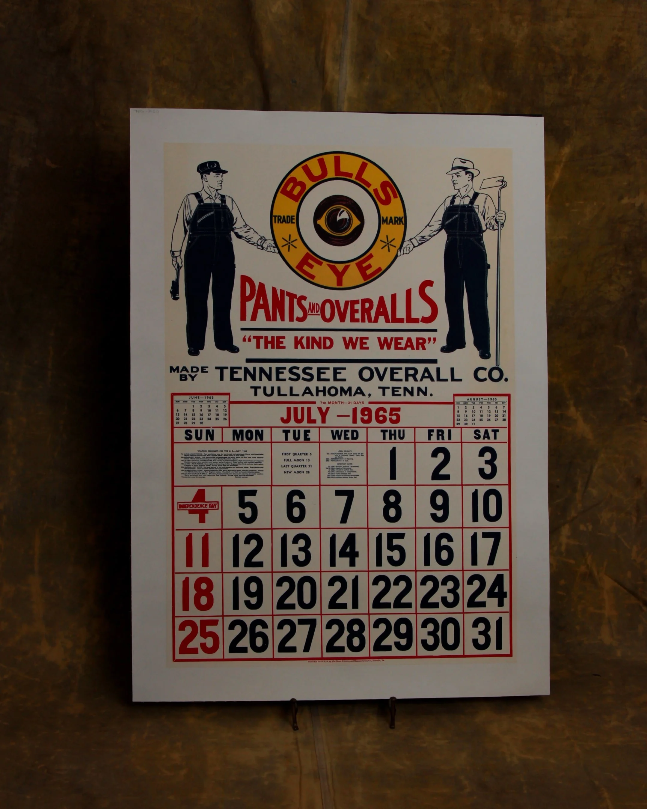
Workwear advertising with a graphic punch you can spot from across the room. This July 1965 Bulls Eye calendar page does exactly what it was meant to do—stop you in your tracks. The bold red and black palette, oversized numerals, and that target logo front and center give it a clean, confident presence, while the illustrated figures in overalls quietly sell the promise of durability without saying a word twice.
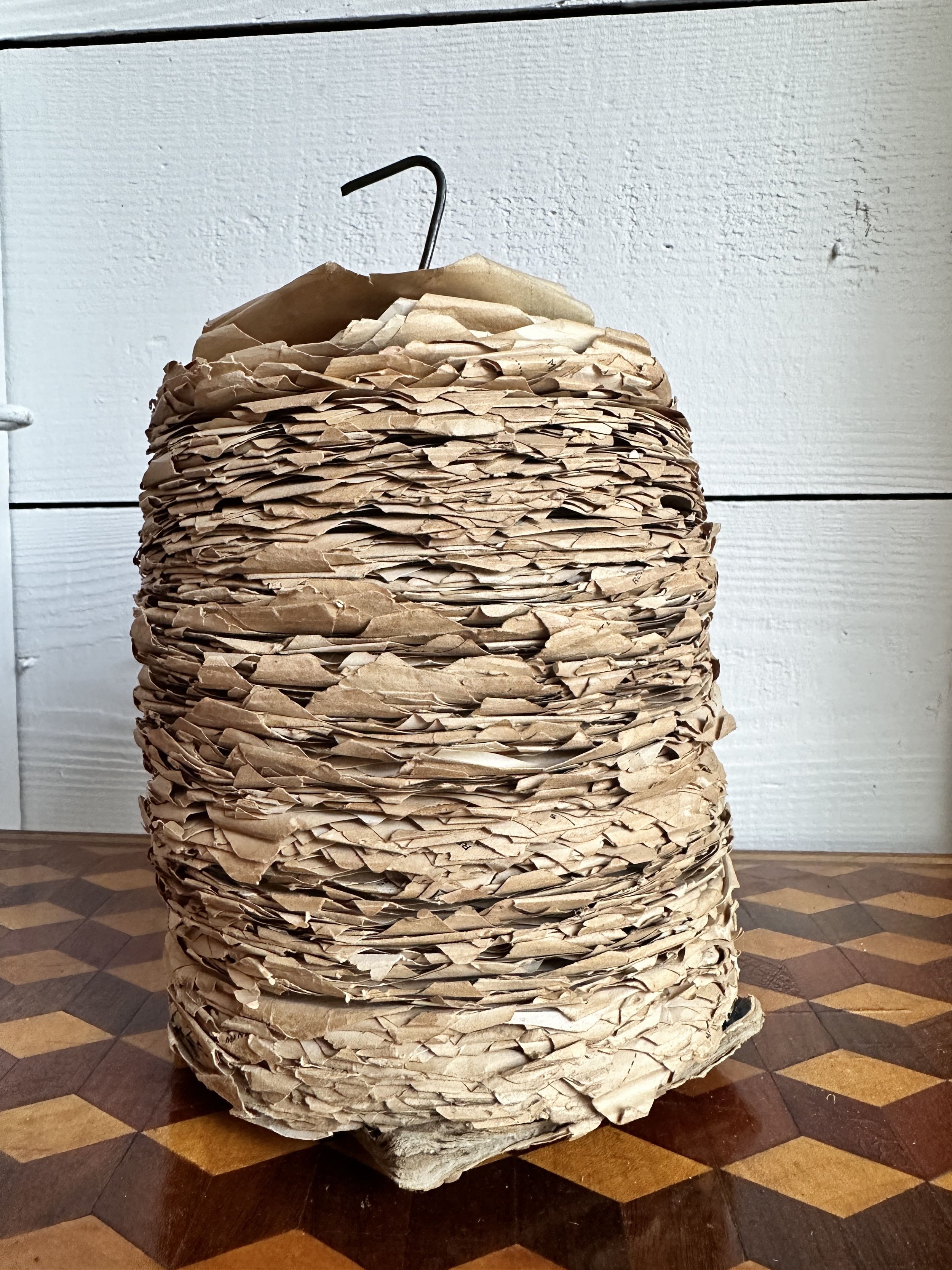
Printed for the Tennessee Overall Co. of Tullahoma, it’s equal parts utility and design—laid out with crisp grids, practical details, and just enough flair to elevate it beyond everyday ephemera. The linen backing keeps it sturdy and display-ready, turning what was once disposable into something worth framing.
A sharp, mid-century piece that bridges advertising and typography, with a kind of honest, no-nonsense charm that still lands today.
Category History
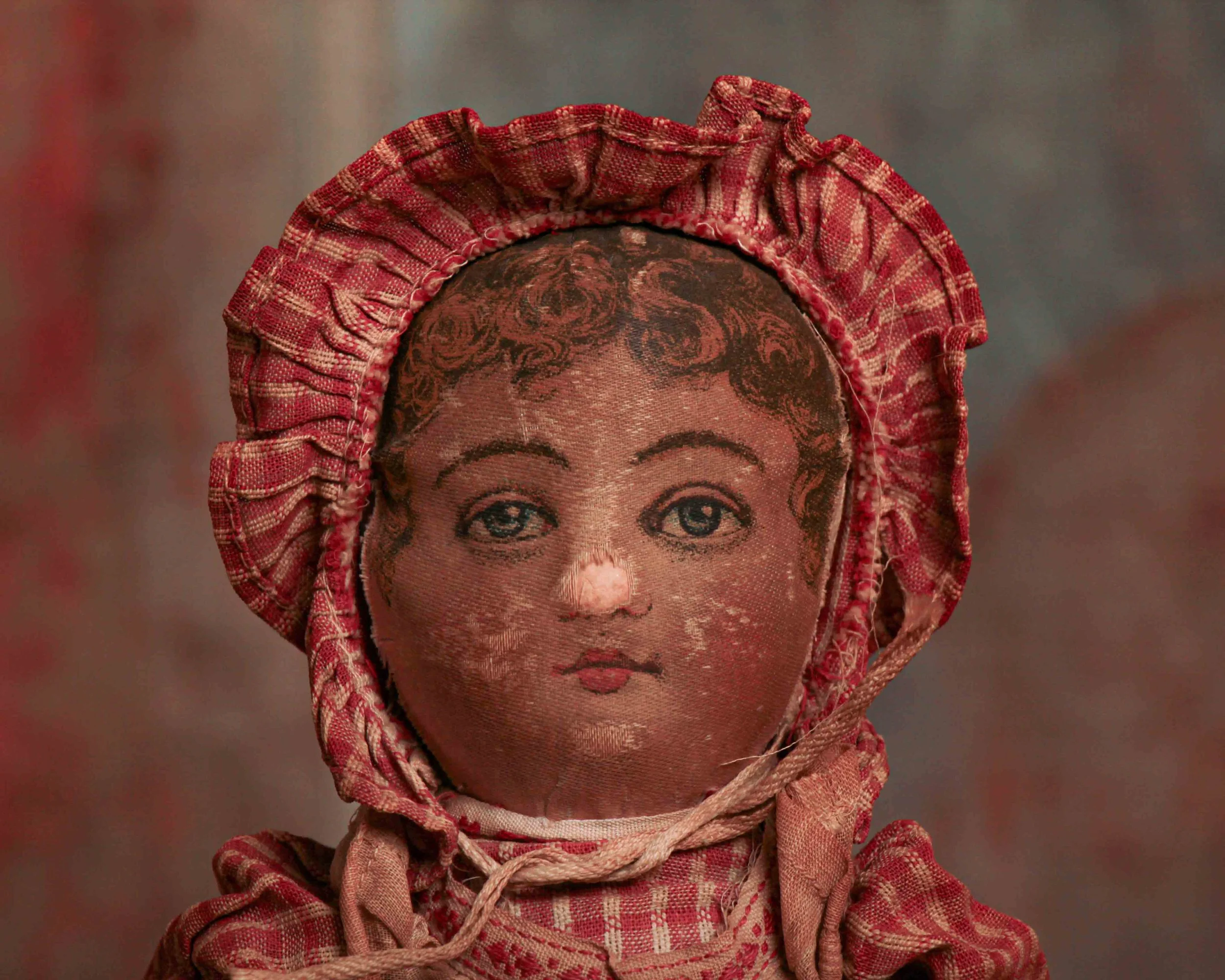
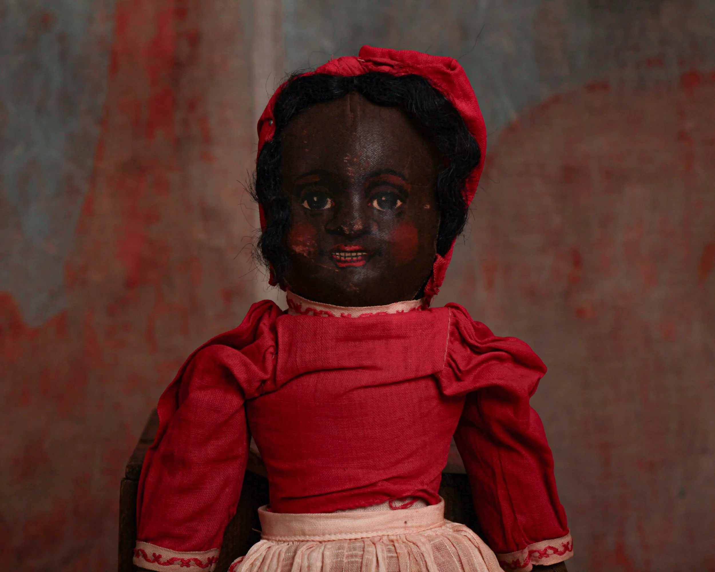
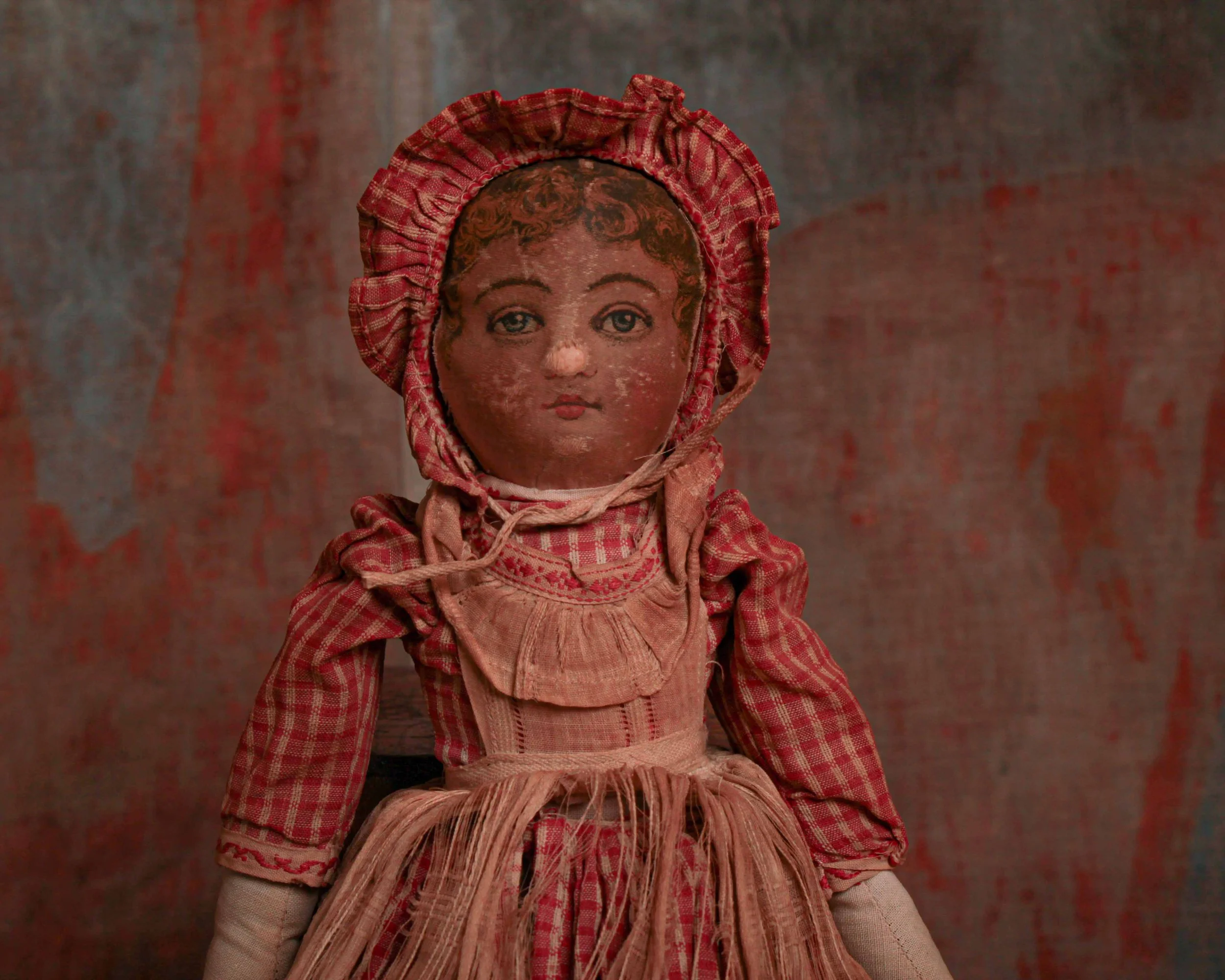
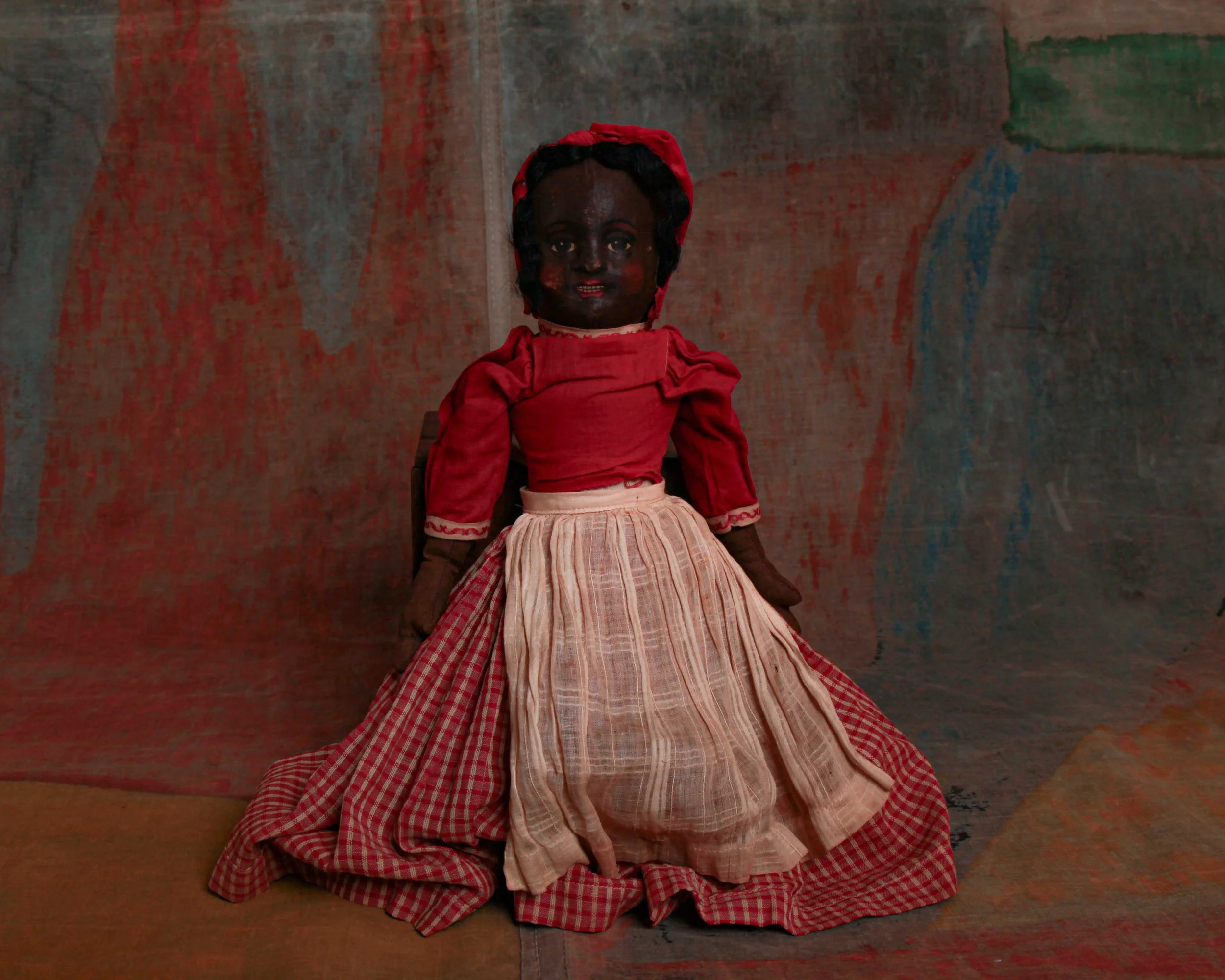
Lithographed advertising in the 19th and early 20th centuries is where marketing learned to flirt with art. Using stone or metal plates, printers could layer colors one at a time, building rich, eye-catching images that went far beyond simple text. The process wasn’t quick—each color required its own pass—but the results were worth it: bold posters, trade cards, and labels that could stop you mid-step.
Companies leaned into it. Soap, tobacco, travel, machinery—you name it, it got a visual identity. Figures were often idealized, scenes exaggerated, and color palettes pushed just enough to feel vivid without losing clarity. The goal was simple: make the product memorable, even if the image had more imagination than accuracy.
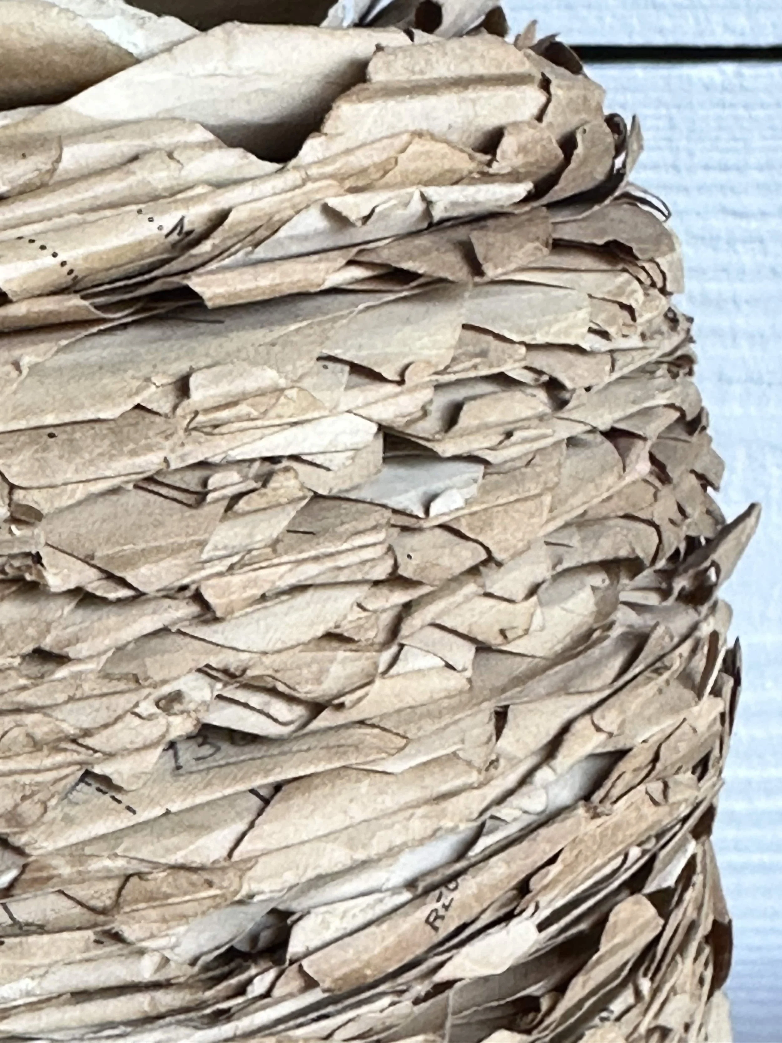
What makes these pieces compelling now is the balance between precision and personality. You can often see the registration lines, slight overlaps, or subtle shifts in color where the process reveals itself. And then there’s the wear—creases, fading, pinholes—that reminds you these weren’t precious objects, but working advertisements out in the world.
They sit comfortably between graphic design and fine art, capturing a moment when selling something also meant crafting an image worth keeping.
Workwear advertising with a graphic punch you can spot from across the room. This July 1965 Bulls Eye calendar page does exactly what it was meant to do—stop you in your tracks. The bold red and black palette, oversized numerals, and that target logo front and center give it a clean, confident presence, while the illustrated figures in overalls quietly sell the promise of durability without saying a word twice.
Printed for the Tennessee Overall Co. of Tullahoma, it’s equal parts utility and design—laid out with crisp grids, practical details, and just enough flair to elevate it beyond everyday ephemera. The linen backing keeps it sturdy and display-ready, turning what was once disposable into something worth framing.
A sharp, mid-century piece that bridges advertising and typography, with a kind of honest, no-nonsense charm that still lands today.
Category History
Lithographed advertising in the 19th and early 20th centuries is where marketing learned to flirt with art. Using stone or metal plates, printers could layer colors one at a time, building rich, eye-catching images that went far beyond simple text. The process wasn’t quick—each color required its own pass—but the results were worth it: bold posters, trade cards, and labels that could stop you mid-step.
Companies leaned into it. Soap, tobacco, travel, machinery—you name it, it got a visual identity. Figures were often idealized, scenes exaggerated, and color palettes pushed just enough to feel vivid without losing clarity. The goal was simple: make the product memorable, even if the image had more imagination than accuracy.
What makes these pieces compelling now is the balance between precision and personality. You can often see the registration lines, slight overlaps, or subtle shifts in color where the process reveals itself. And then there’s the wear—creases, fading, pinholes—that reminds you these weren’t precious objects, but working advertisements out in the world.
They sit comfortably between graphic design and fine art, capturing a moment when selling something also meant crafting an image worth keeping.