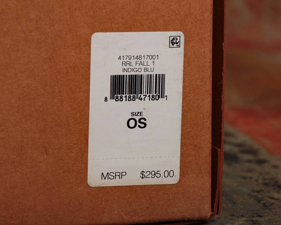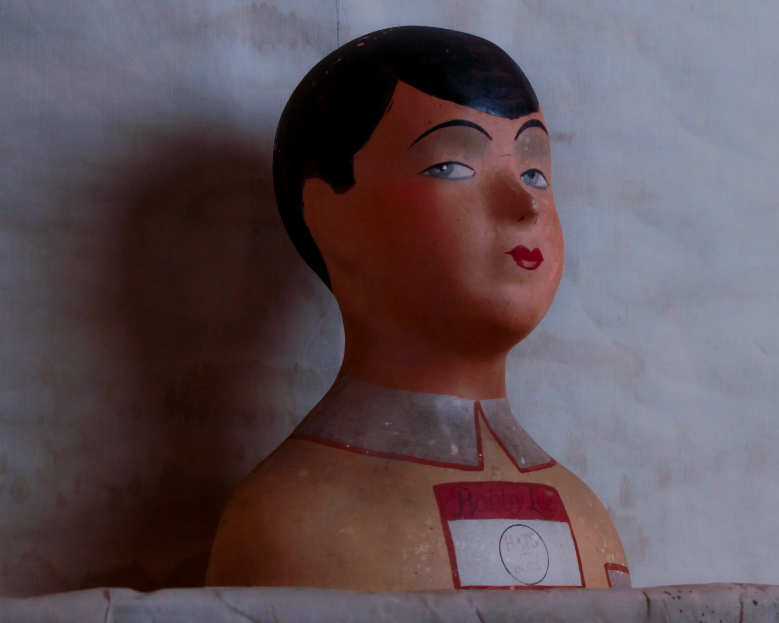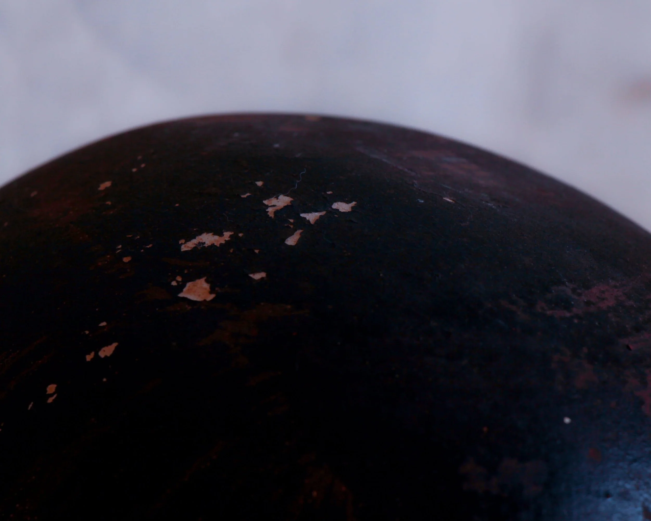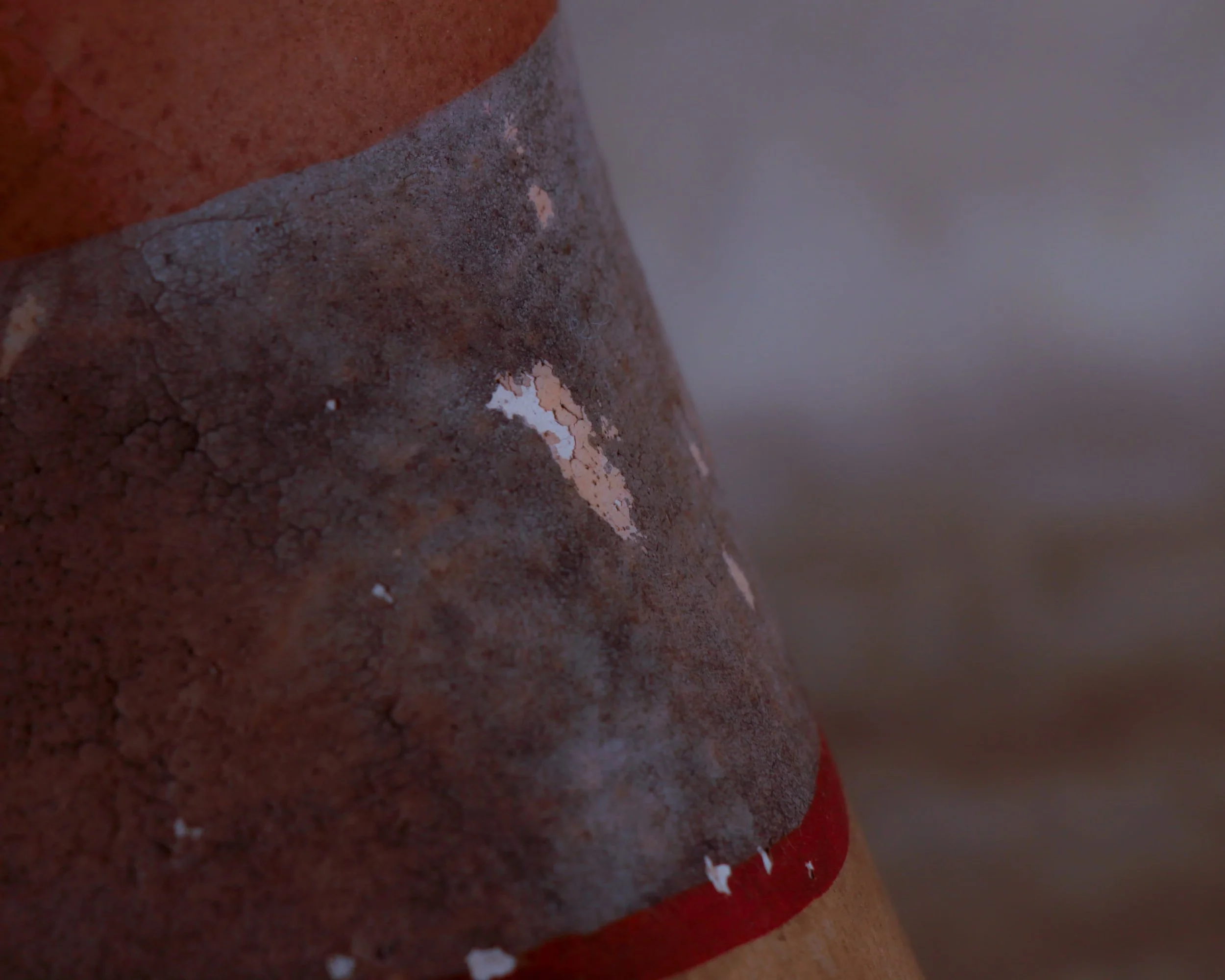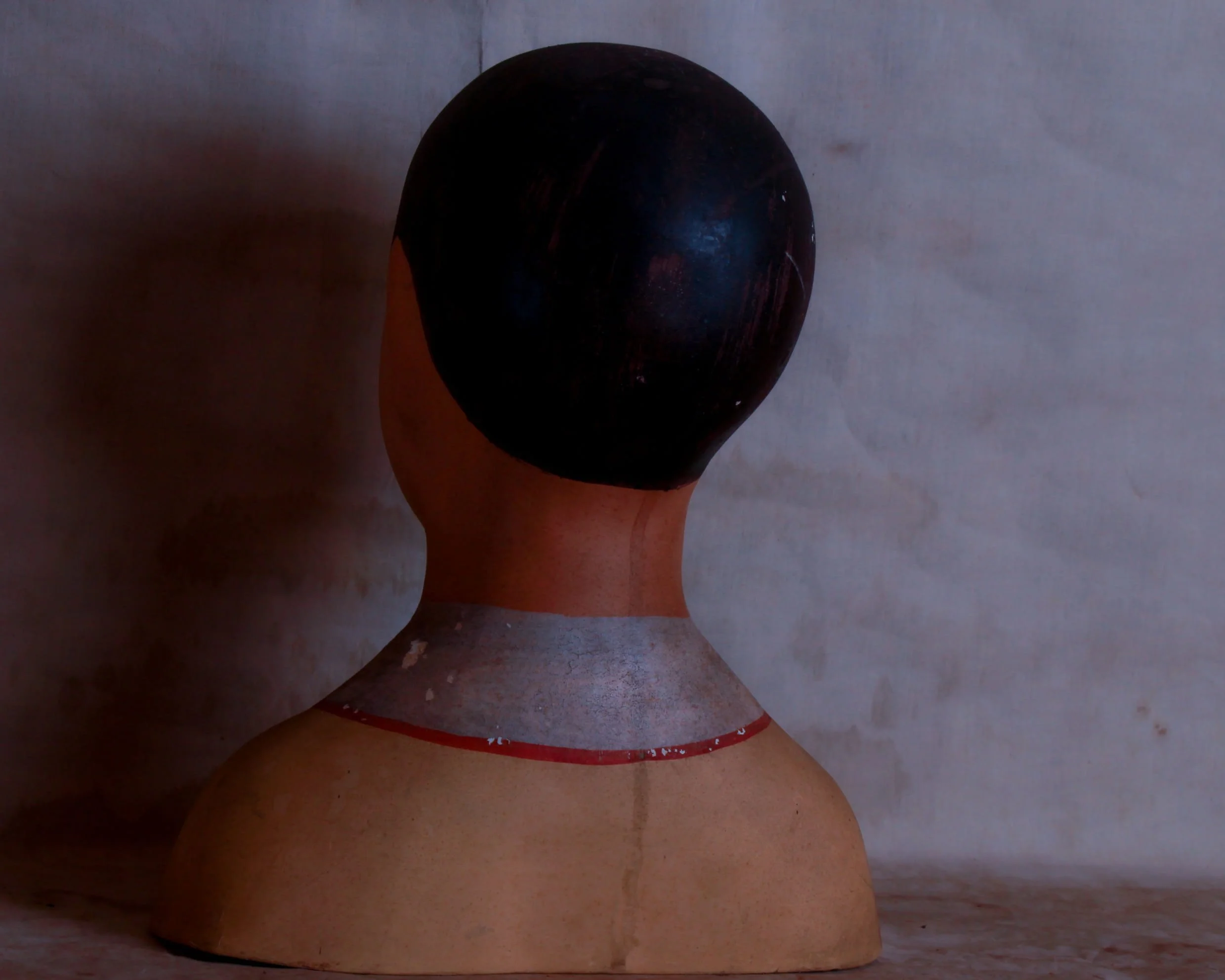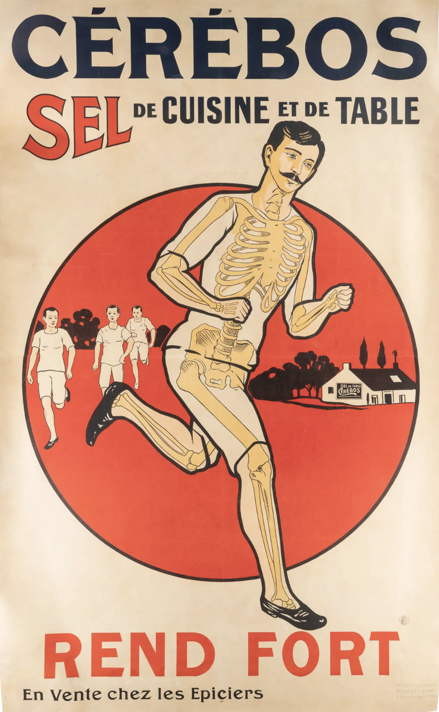
Massive and visually electric, this original French Cérébos salt lithograph is a true showstopper at 84 inches tall by 52 inches wide. Backed on linen for stability and preservation, it features a bold graphic design and punchy colors, centered around a partially skeletal runner powering ahead-because, as the slogan says, "Rend Fort" ("Makes You Strong"). French text promotes this kitchen and table salt as essential for strength and vitality, with playful anatomy visuals driving the point home. It’s bizarre way to sell salt for sure.
Category History
Lithographed advertising in the 19th and early 20th centuries is where marketing learned to flirt with art. Using stone or metal plates, printers could layer colors one at a time, building rich, eye-catching images that went far beyond simple text. The process wasn’t quick—each color required its own pass—but the results were worth it: bold posters, trade cards, and labels that could stop you mid-step.
Companies leaned into it. Soap, tobacco, travel, machinery—you name it, it got a visual identity. Figures were often idealized, scenes exaggerated, and color palettes pushed just enough to feel vivid without losing clarity. The goal was simple: make the product memorable, even if the image had more imagination than accuracy.
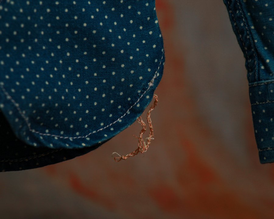
What makes these pieces compelling now is the balance between precision and personality. You can often see the registration lines, slight overlaps, or subtle shifts in color where the process reveals itself. And then there’s the wear—creases, fading, pinholes—that reminds you these weren’t precious objects, but working advertisements out in the world.
They sit comfortably between graphic design and fine art, capturing a moment when selling something also meant crafting an image worth keeping. Printers, illustrators, and clients all collaborated, creating a layered process where artistry and commerce worked side by side rather than in opposition.
Massive and visually electric, this original French Cérébos salt lithograph is a true showstopper at 84 inches tall by 52 inches wide. Backed on linen for stability and preservation, it features a bold graphic design and punchy colors, centered around a partially skeletal runner powering ahead-because, as the slogan says, "Rend Fort" ("Makes You Strong"). French text promotes this kitchen and table salt as essential for strength and vitality, with playful anatomy visuals driving the point home. It’s bizarre way to sell salt for sure.
Category History
Lithographed advertising in the 19th and early 20th centuries is where marketing learned to flirt with art. Using stone or metal plates, printers could layer colors one at a time, building rich, eye-catching images that went far beyond simple text. The process wasn’t quick—each color required its own pass—but the results were worth it: bold posters, trade cards, and labels that could stop you mid-step.
Companies leaned into it. Soap, tobacco, travel, machinery—you name it, it got a visual identity. Figures were often idealized, scenes exaggerated, and color palettes pushed just enough to feel vivid without losing clarity. The goal was simple: make the product memorable, even if the image had more imagination than accuracy.
What makes these pieces compelling now is the balance between precision and personality. You can often see the registration lines, slight overlaps, or subtle shifts in color where the process reveals itself. And then there’s the wear—creases, fading, pinholes—that reminds you these weren’t precious objects, but working advertisements out in the world.
They sit comfortably between graphic design and fine art, capturing a moment when selling something also meant crafting an image worth keeping. Printers, illustrators, and clients all collaborated, creating a layered process where artistry and commerce worked side by side rather than in opposition.