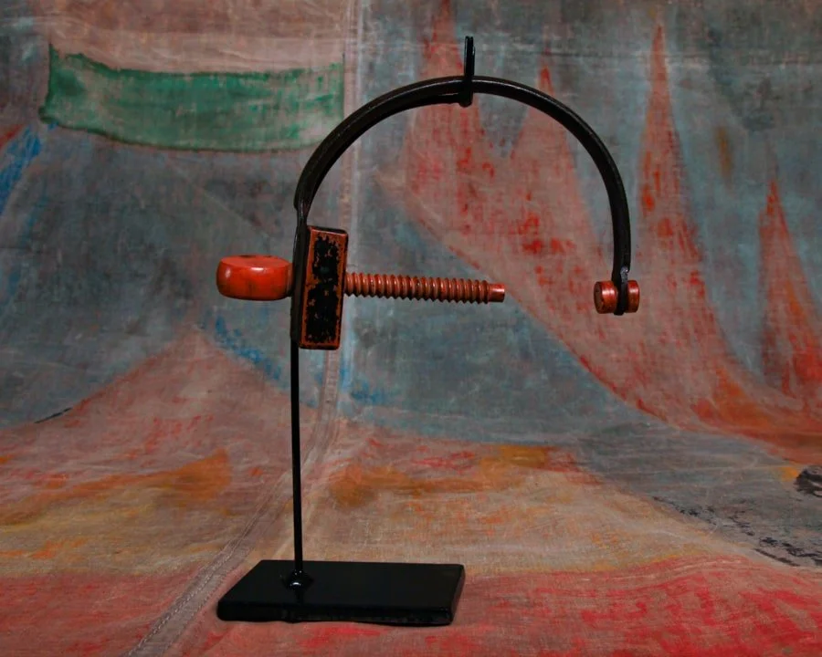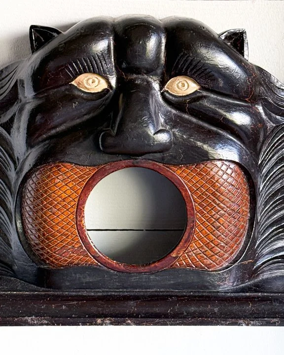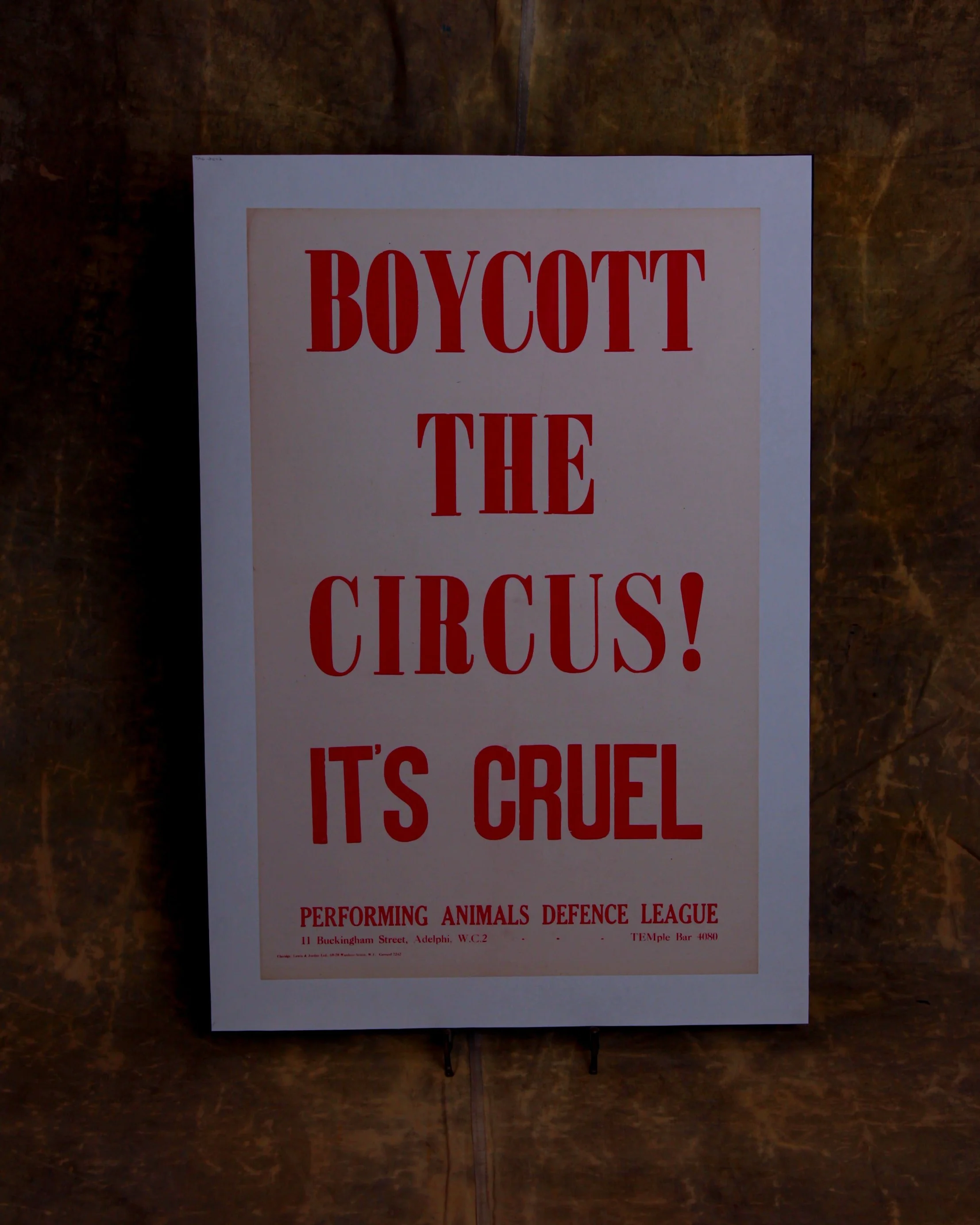
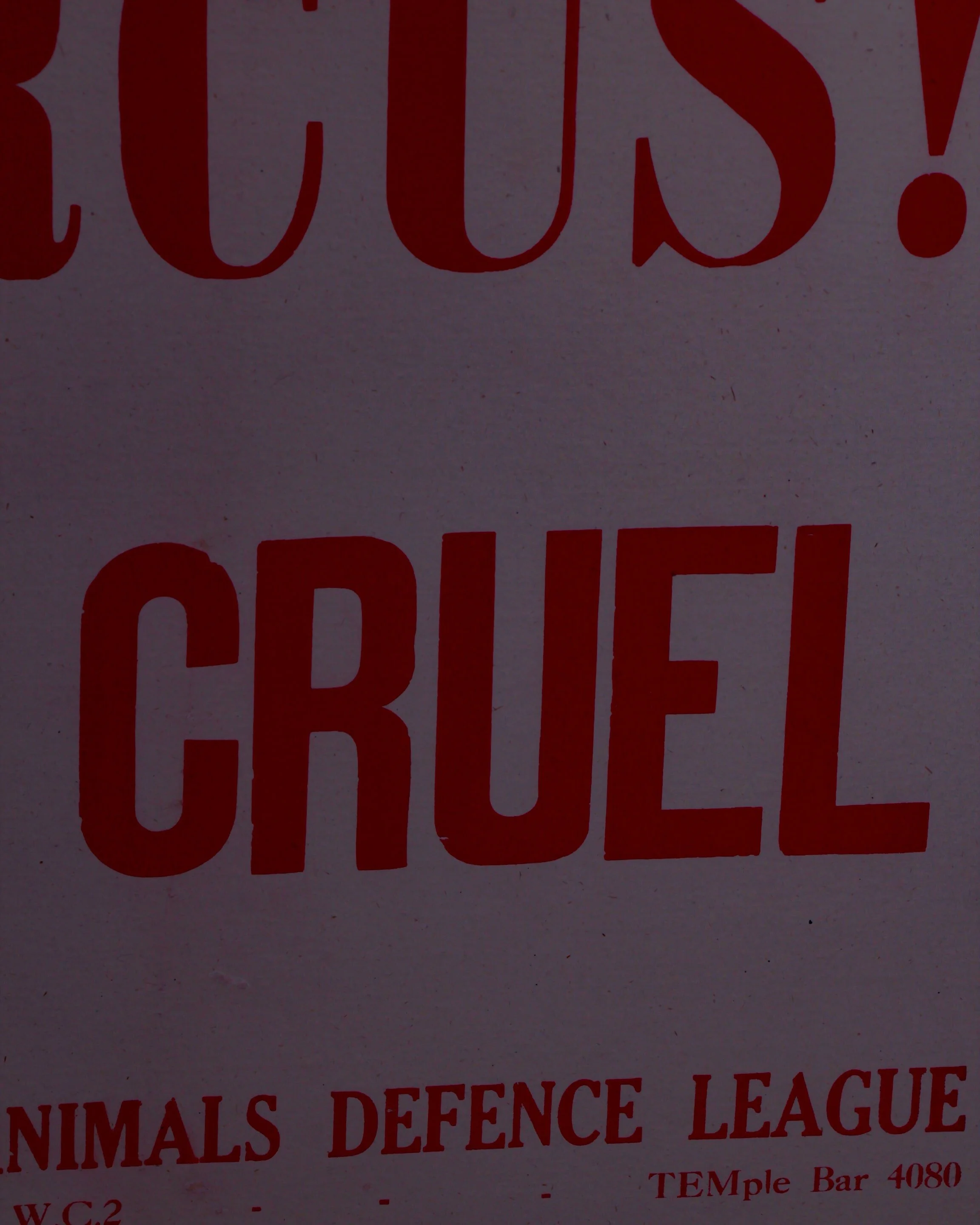
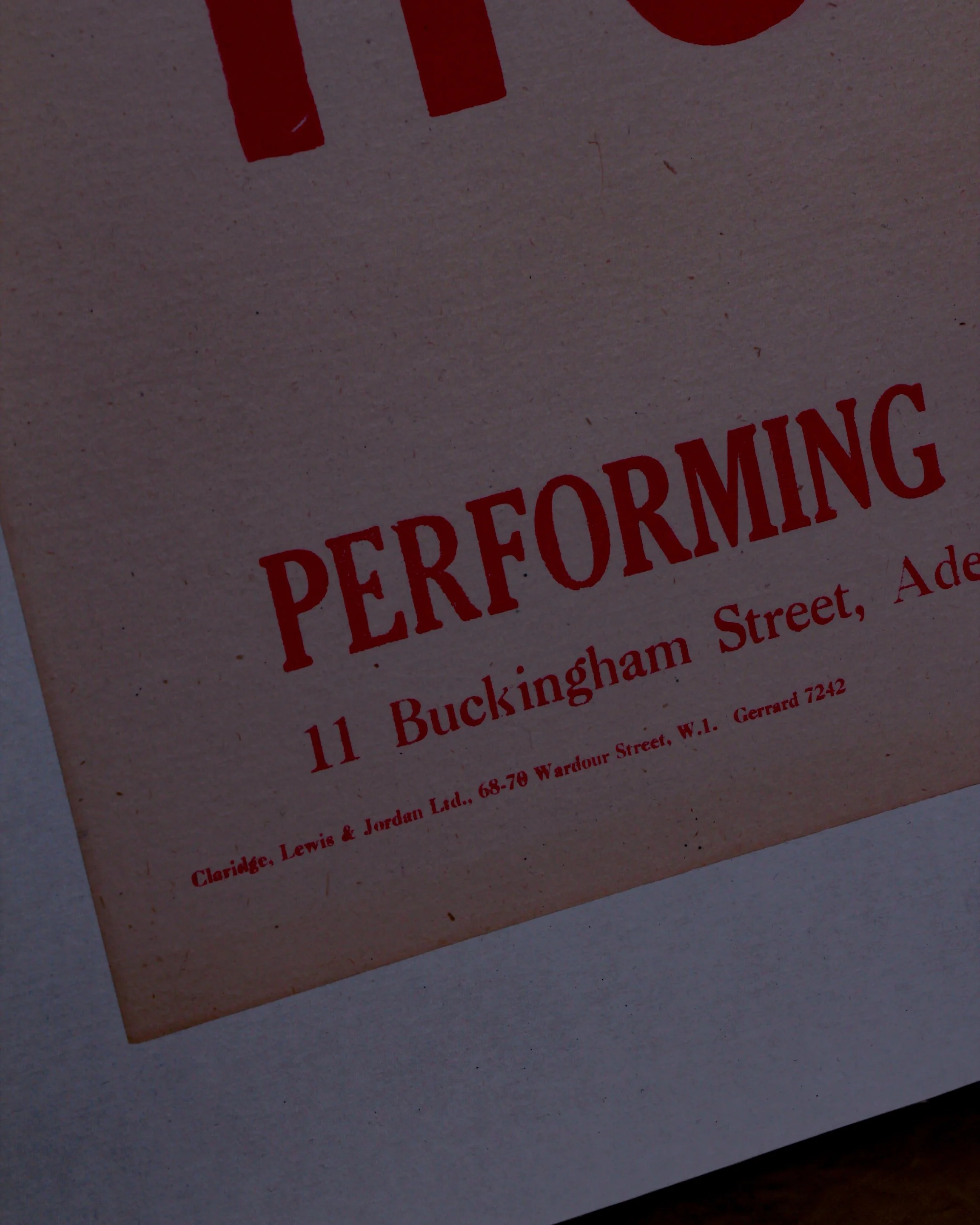

Here's a hard to find mid-century lithograph advertising the Performing Animals' Defence League's opposition to circuses.
The Performing Animals Defence League was founded in 1914 and this lithograph was printed by St Christopher Press Ltd, Letchworth, Herts circa 1950s when animal acts became increasingly popular (and concerning).
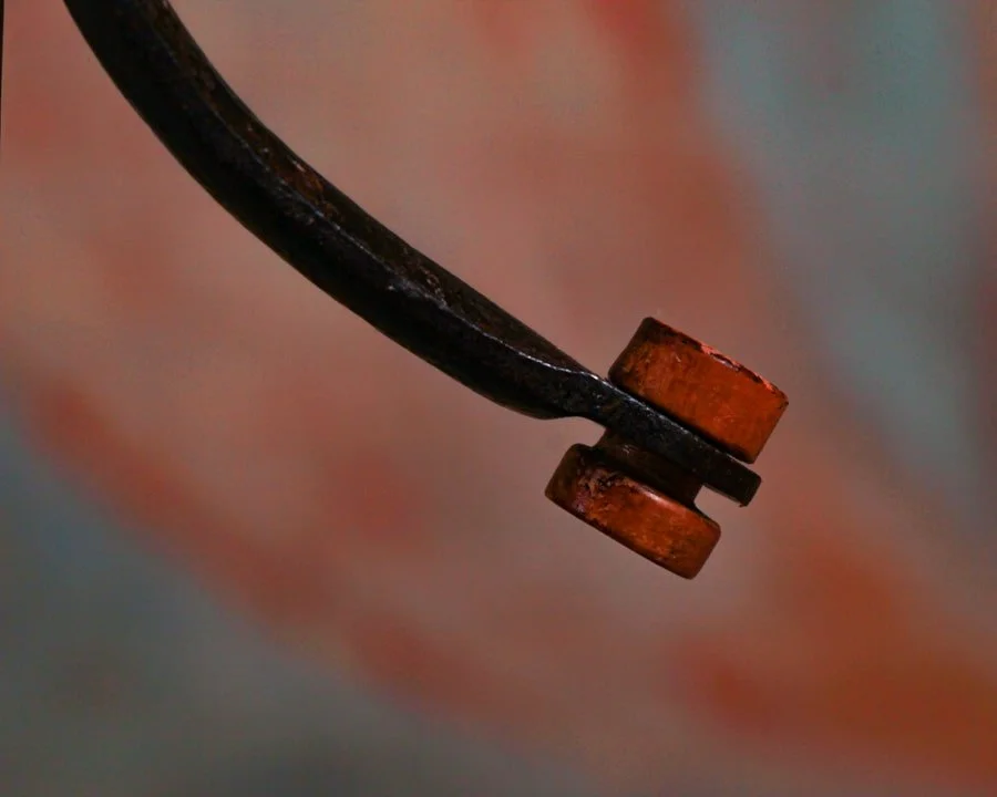
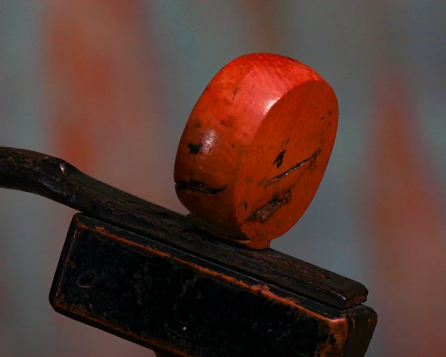
Timeworn and professionally linen-backed.
Measures roughly W 24" by H 35" (including the linen backing)
Category History
Lithographed advertising in the 19th and early 20th centuries is where marketing learned to flirt with art. Using stone or metal plates, printers could layer colors one at a time, building rich, eye-catching images that went far beyond simple text. The process wasn’t quick—each color required its own pass—but the results were worth it: bold posters, trade cards, and labels that could stop you mid-step.
Companies leaned into it. Soap, tobacco, travel, machinery—you name it, it got a visual identity. Figures were often idealized, scenes exaggerated, and color palettes pushed just enough to feel vivid without losing clarity. The goal was simple: make the product memorable, even if the image had more imagination than accuracy.
What makes these pieces compelling now is the balance between precision and personality. You can often see the registration lines, slight overlaps, or subtle shifts in color where the process reveals itself. And then there’s the wear—creases, fading, pinholes—that reminds you these weren’t precious objects, but working advertisements out in the world.
They sit comfortably between graphic design and fine art, capturing a moment when selling something also meant crafting an image worth keeping. Printers, illustrators, and clients all collaborated, creating a layered process where artistry and commerce worked side by side rather than in opposition.
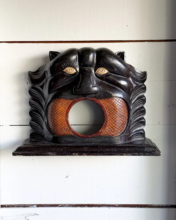
Here's a hard to find mid-century lithograph advertising the Performing Animals' Defence League's opposition to circuses.
The Performing Animals Defence League was founded in 1914 and this lithograph was printed by St Christopher Press Ltd, Letchworth, Herts circa 1950s when animal acts became increasingly popular (and concerning).
Timeworn and professionally linen-backed.
Measures roughly W 24" by H 35" (including the linen backing)
Category History
Lithographed advertising in the 19th and early 20th centuries is where marketing learned to flirt with art. Using stone or metal plates, printers could layer colors one at a time, building rich, eye-catching images that went far beyond simple text. The process wasn’t quick—each color required its own pass—but the results were worth it: bold posters, trade cards, and labels that could stop you mid-step.
Companies leaned into it. Soap, tobacco, travel, machinery—you name it, it got a visual identity. Figures were often idealized, scenes exaggerated, and color palettes pushed just enough to feel vivid without losing clarity. The goal was simple: make the product memorable, even if the image had more imagination than accuracy.
What makes these pieces compelling now is the balance between precision and personality. You can often see the registration lines, slight overlaps, or subtle shifts in color where the process reveals itself. And then there’s the wear—creases, fading, pinholes—that reminds you these weren’t precious objects, but working advertisements out in the world.
They sit comfortably between graphic design and fine art, capturing a moment when selling something also meant crafting an image worth keeping. Printers, illustrators, and clients all collaborated, creating a layered process where artistry and commerce worked side by side rather than in opposition.