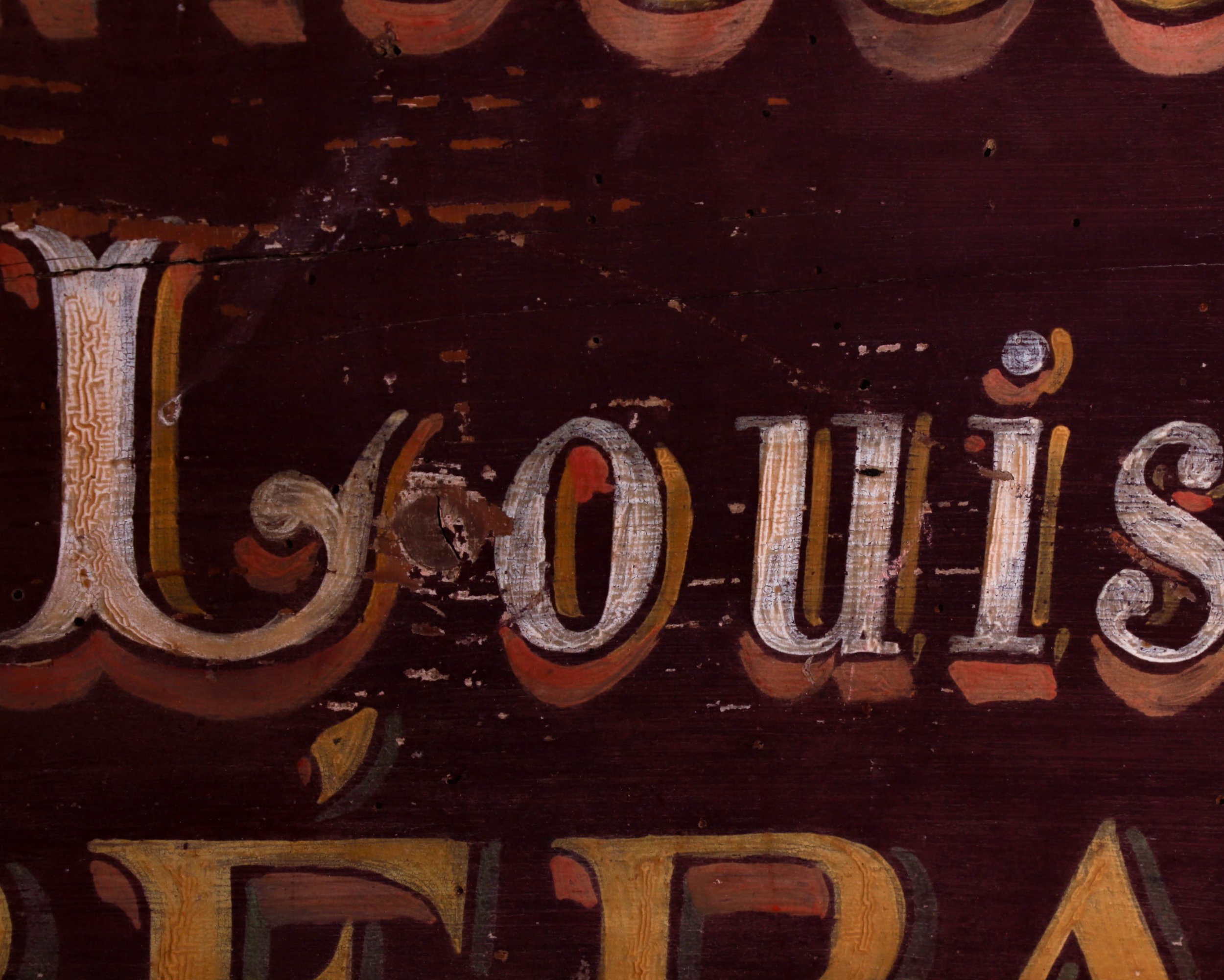
This late-19th-century French cobbler’s sign is painted on a single plank of wood and meant to be read from one side only, it advertises the services of Louis Duvary with no fuss and no nonsense. Just shoes, repairs, and the promise that someone inside knows exactly what they’re doing.
The hand-lettering is the star here. Tall, slightly imperfect letters sit against a deep, wine-colored background, layered with warm golds, creams, and soft shadows that give the whole thing some depth. You can still see the brushstrokes, the touch of the sign painter’s hand, and the subtle spacing choices that make each word breathe. It’s graphic, but human. Decorative, but hardworking.
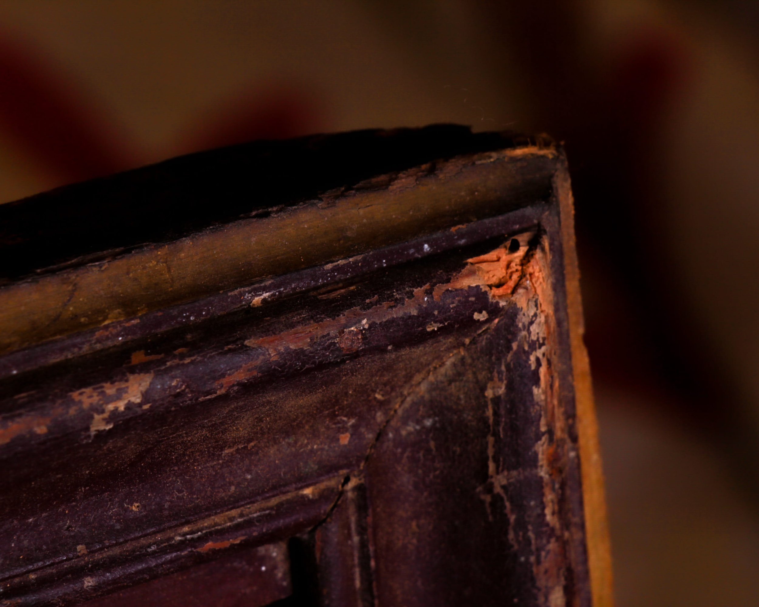
Time has done its part, too. The surface shows honest wear, scuffs, and small losses that only add to its character. The wood has darkened and softened, the paint has mellowed, and the overall effect feels beautifully settled, like it’s been exactly where it belongs for more than a century. Measuring roughly 32 by 16 inches.
Category History
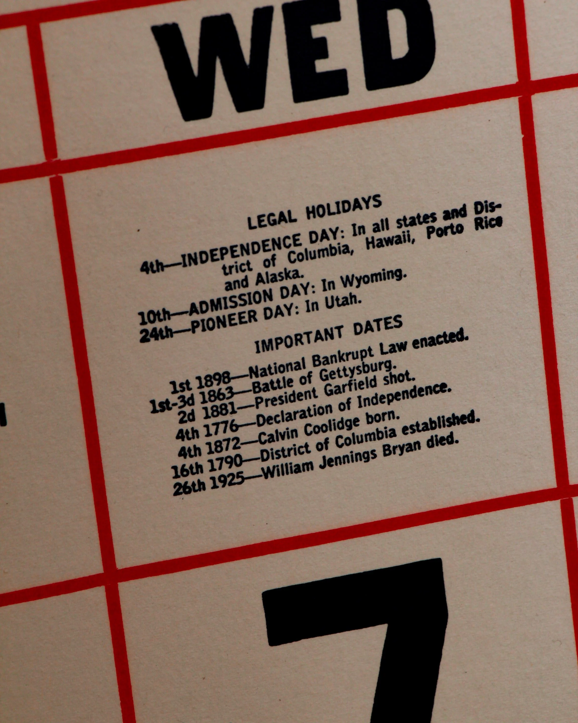
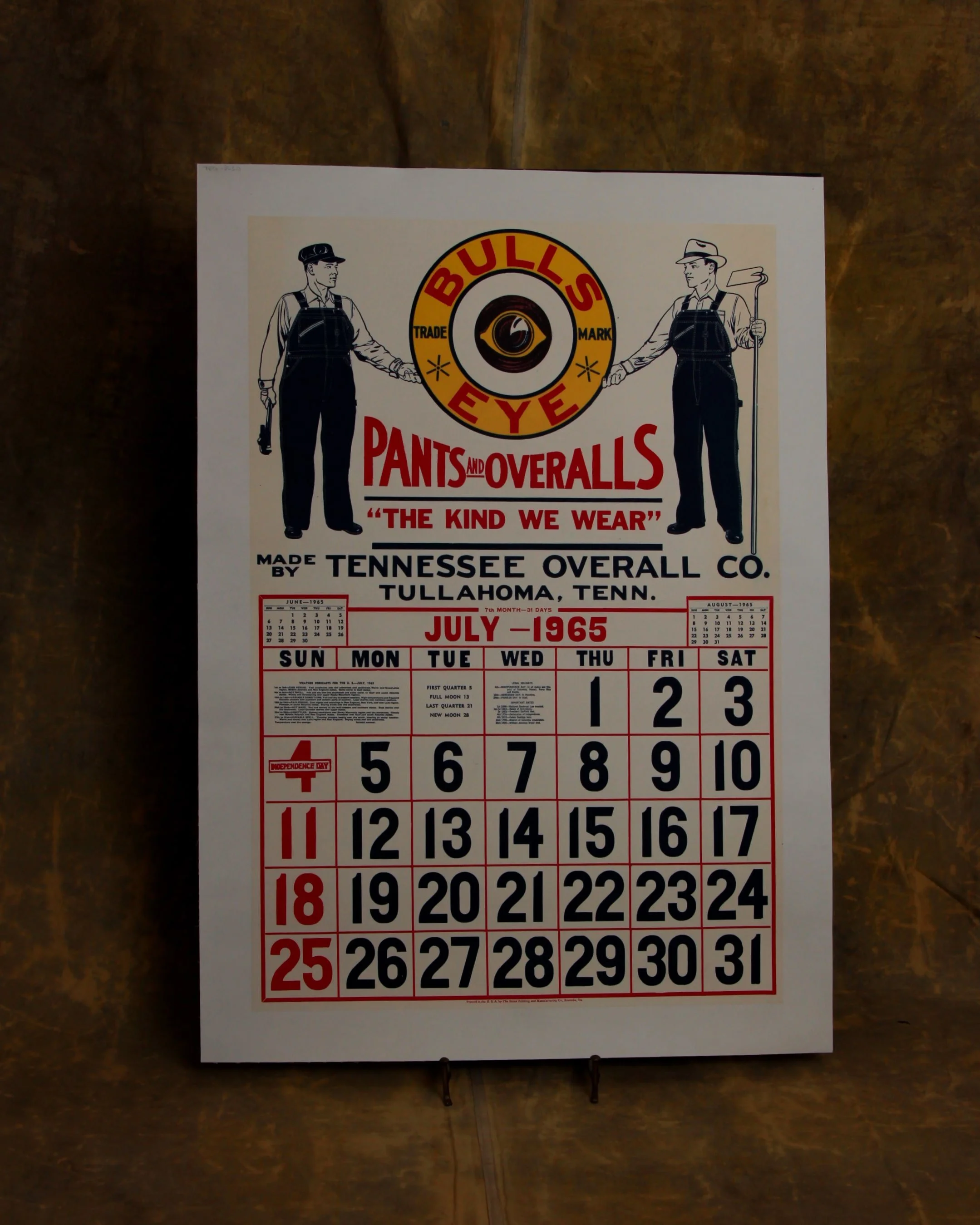
In the first half of the 20th century, before vinyl and neon took over, a good sign was as much about the hand as the message. Most small businesses relied on local painters or sign makers who worked with wood panels, house paint, and a steady eye. The result: one-of-a-kind pieces where every letter carries a bit of personality—slightly off, sometimes bold, sometimes improvised, but never generic.
These weren’t precious objects at the time. They hung outside in the weather, took on sun fade, rain streaks, and the occasional repaint. That’s part of the appeal now. The layered paint, ghost lettering, and uneven brushwork tell you exactly how they lived.
What stands out is the balance between function and instinct. The maker wasn’t chasing perfection—they were chasing readability, speed, and impact. And in doing so, they created something far more human. Each sign feels like a handshake from a past business owner, direct and unfiltered.
This late-19th-century French cobbler’s sign is painted on a single plank of wood and meant to be read from one side only, it advertises the services of Louis Duvary with no fuss and no nonsense. Just shoes, repairs, and the promise that someone inside knows exactly what they’re doing.
The hand-lettering is the star here. Tall, slightly imperfect letters sit against a deep, wine-colored background, layered with warm golds, creams, and soft shadows that give the whole thing some depth. You can still see the brushstrokes, the touch of the sign painter’s hand, and the subtle spacing choices that make each word breathe. It’s graphic, but human. Decorative, but hardworking.
Time has done its part, too. The surface shows honest wear, scuffs, and small losses that only add to its character. The wood has darkened and softened, the paint has mellowed, and the overall effect feels beautifully settled, like it’s been exactly where it belongs for more than a century. Measuring roughly 32 by 16 inches.
Category History
In the first half of the 20th century, before vinyl and neon took over, a good sign was as much about the hand as the message. Most small businesses relied on local painters or sign makers who worked with wood panels, house paint, and a steady eye. The result: one-of-a-kind pieces where every letter carries a bit of personality—slightly off, sometimes bold, sometimes improvised, but never generic.
These weren’t precious objects at the time. They hung outside in the weather, took on sun fade, rain streaks, and the occasional repaint. That’s part of the appeal now. The layered paint, ghost lettering, and uneven brushwork tell you exactly how they lived.
What stands out is the balance between function and instinct. The maker wasn’t chasing perfection—they were chasing readability, speed, and impact. And in doing so, they created something far more human. Each sign feels like a handshake from a past business owner, direct and unfiltered.