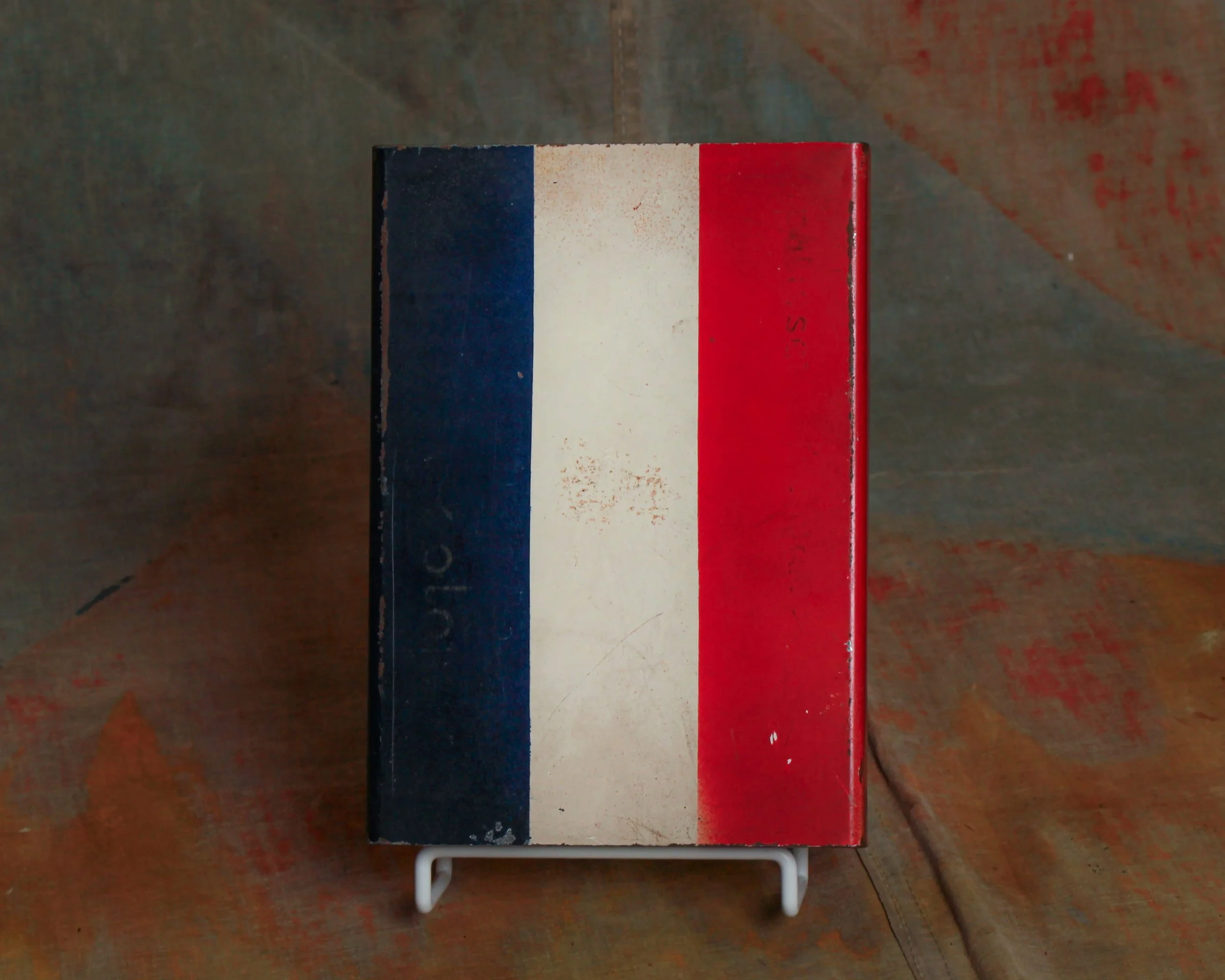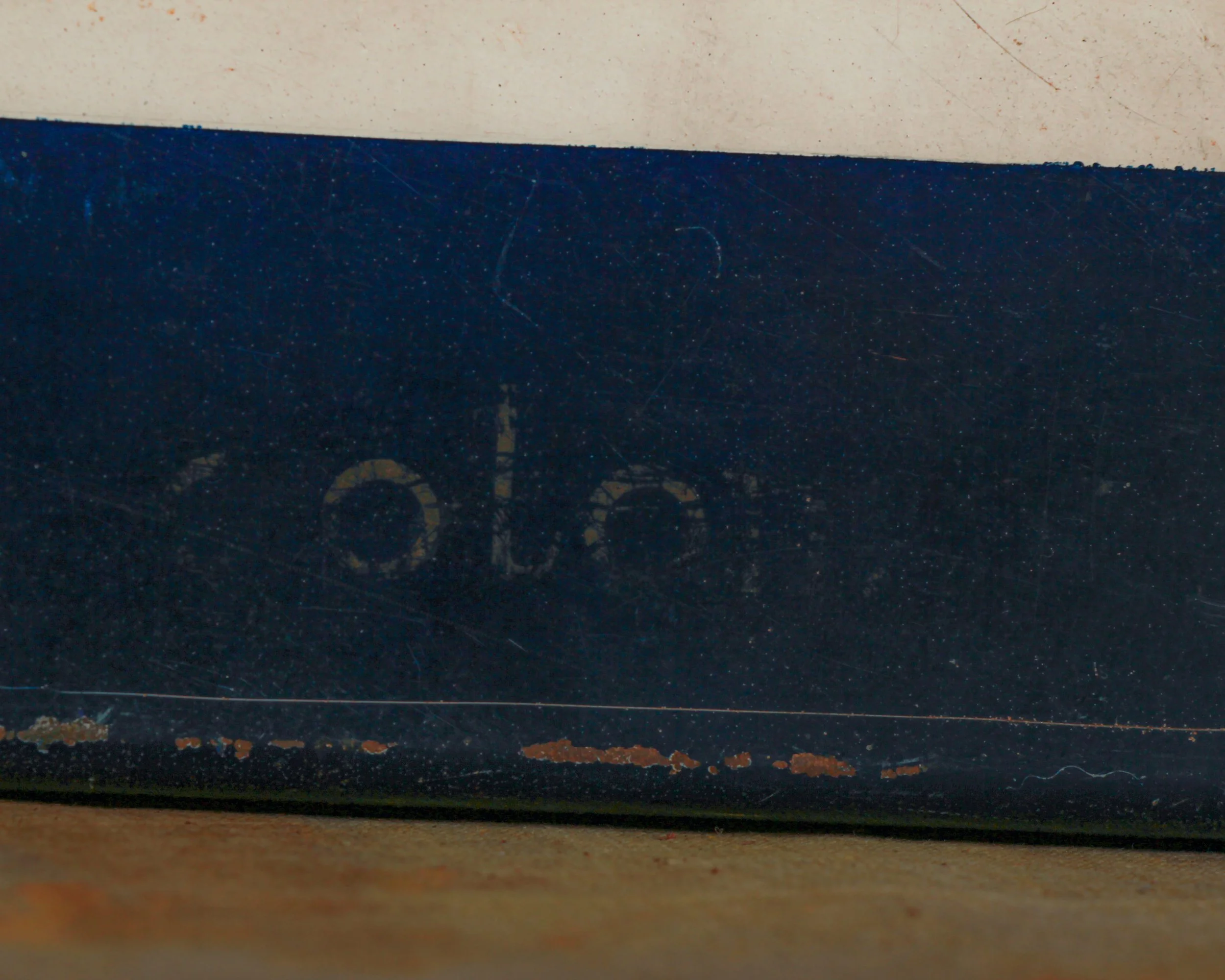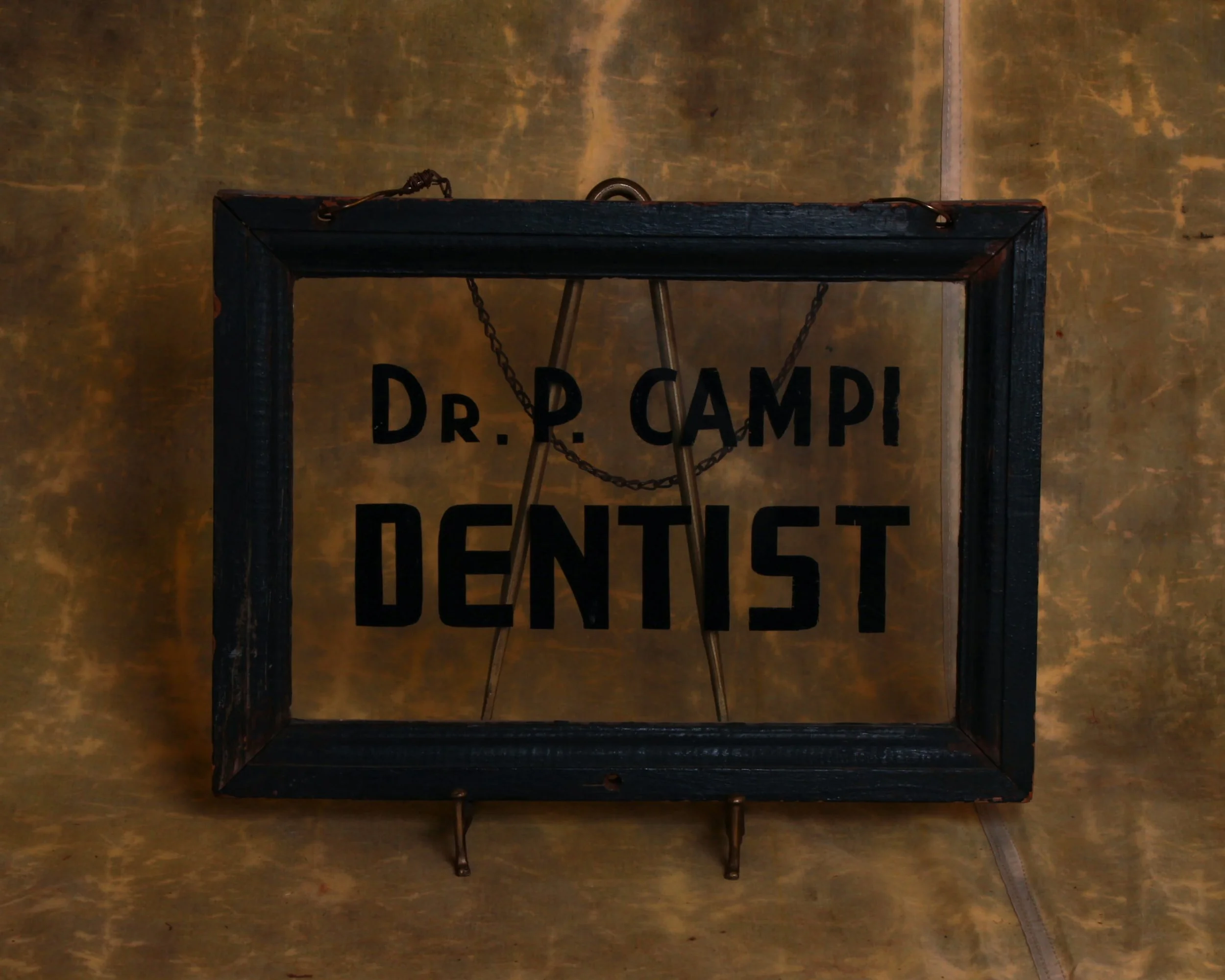
Dating to the 1940s, this reverse-painted glass sign reads “Dr. P. Campi – Dentist” in bold black lettering, the kind meant to be easily spotted from a hallway outside an office door. The typography is clean, direct, and honest—with that confident mid-century look that never feels over-designed.
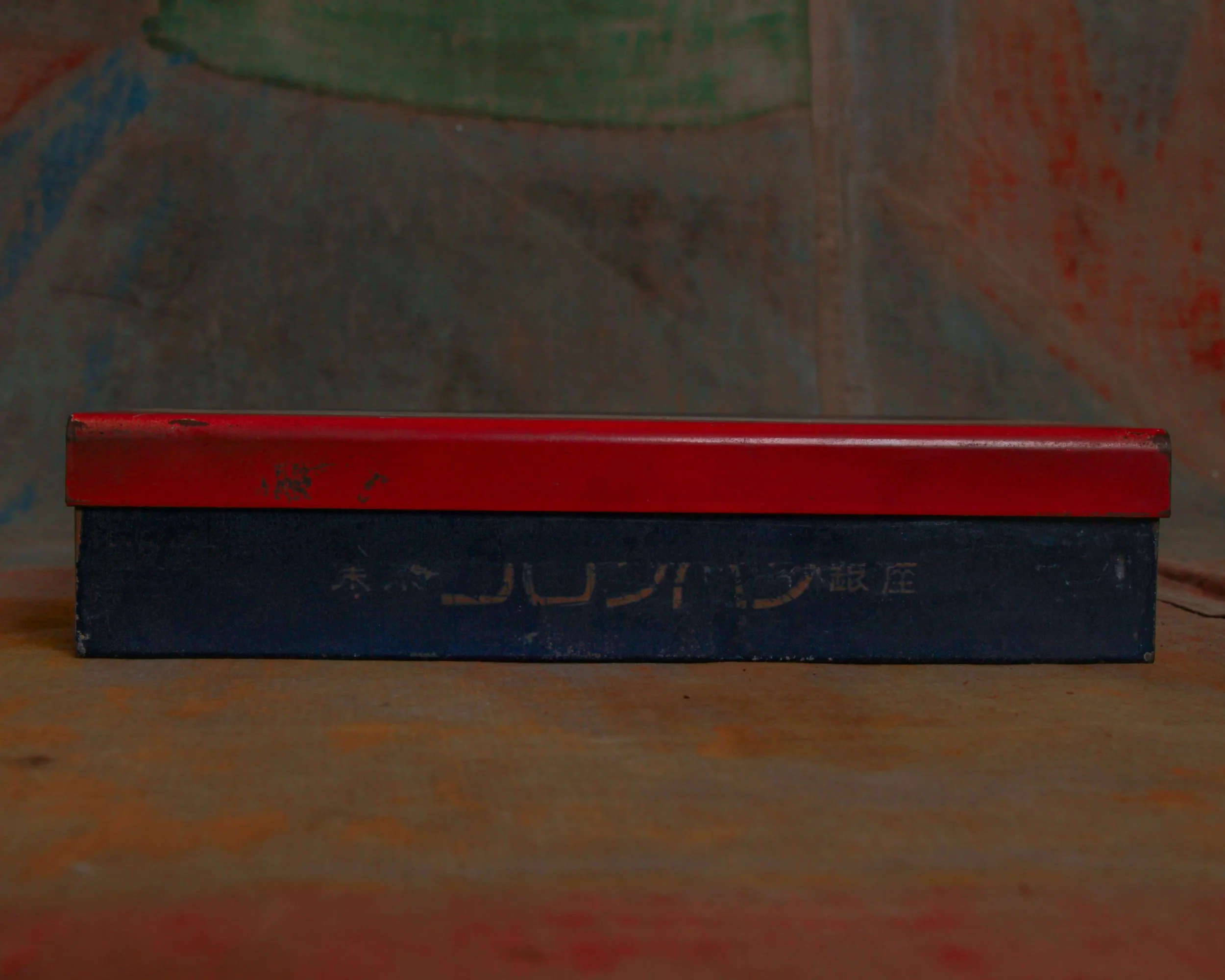
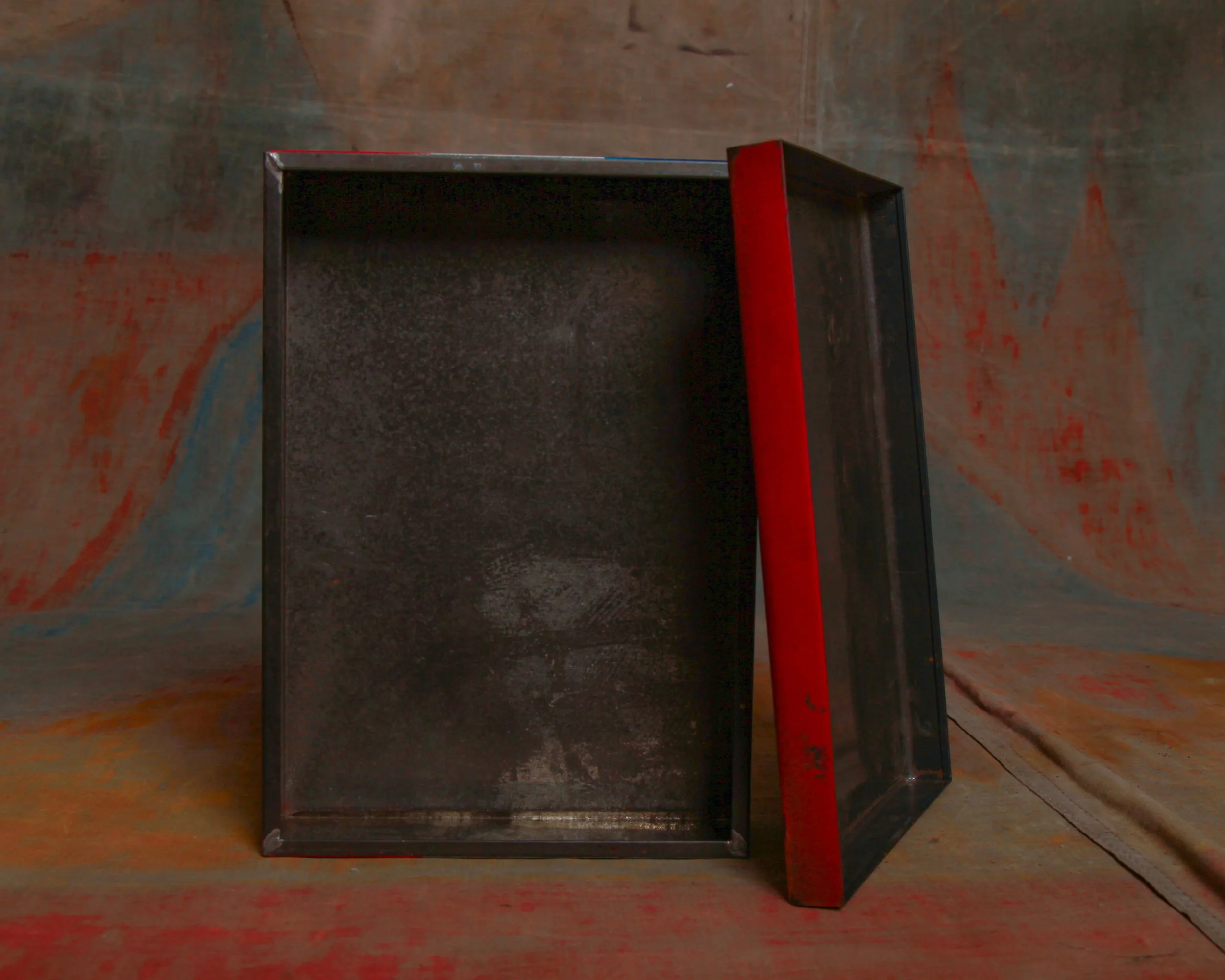
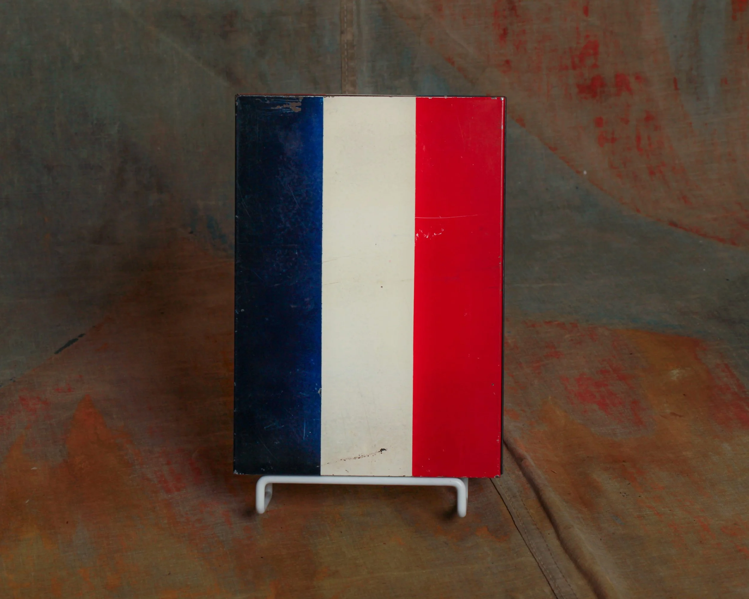
The lettering is applied to the reverse of the glass and sits within a simple wooden frame that has aged nicely over the years, developing a dark patina and small signs of honest wear. A metal hanging chain still remains attached, a reminder that this piece likely spent decades quietly swaying in a doorway or window, guiding nervous patients inside.
There’s a certain calm authority to it—no frills, no unnecessary detail, just clarity and purpose. The kind of object that did its job without fanfare, and still holds that same quiet presence today.
Category History
In the first half of the 20th century, before vinyl and neon took over, a good sign was as much about the hand as the message. Most small businesses relied on local painters or sign makers who worked with wood panels, house paint, and a steady eye. The result: one-of-a-kind pieces where every letter carries a bit of personality—slightly off, sometimes bold, sometimes improvised, but never generic.
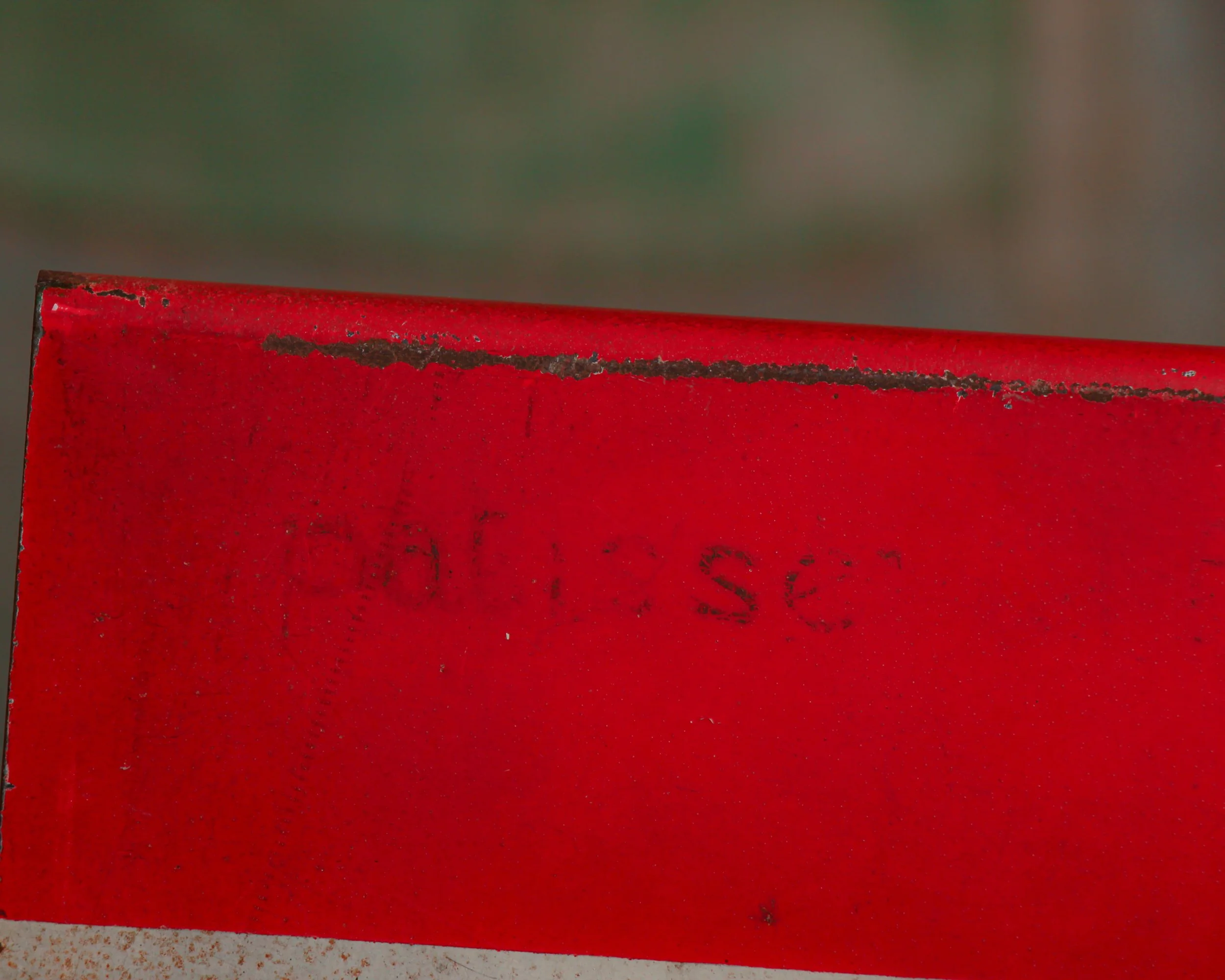
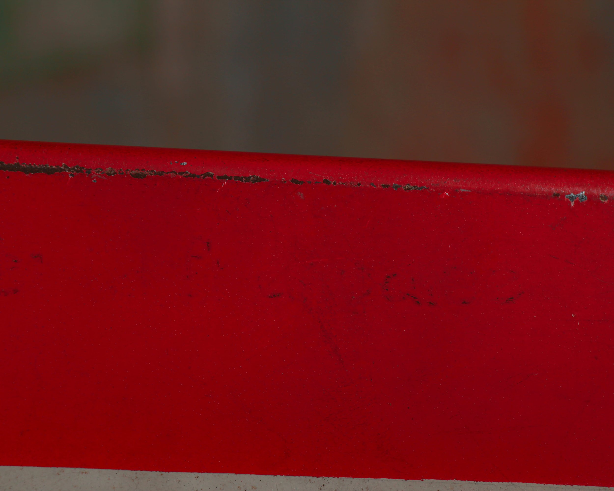
These weren’t precious objects at the time. They hung outside in the weather, took on sun fade, rain streaks, and the occasional repaint. That’s part of the appeal now. The layered paint, ghost lettering, and uneven brushwork tell you exactly how they lived.
What stands out is the balance between function and instinct. The maker wasn’t chasing perfection—they were chasing readability, speed, and impact. And in doing so, they created something far more human. Each sign feels like a handshake from a past business owner, direct and unfiltered.
Dating to the 1940s, this reverse-painted glass sign reads “Dr. P. Campi – Dentist” in bold black lettering, the kind meant to be easily spotted from a hallway outside an office door. The typography is clean, direct, and honest—with that confident mid-century look that never feels over-designed.
The lettering is applied to the reverse of the glass and sits within a simple wooden frame that has aged nicely over the years, developing a dark patina and small signs of honest wear. A metal hanging chain still remains attached, a reminder that this piece likely spent decades quietly swaying in a doorway or window, guiding nervous patients inside.
There’s a certain calm authority to it—no frills, no unnecessary detail, just clarity and purpose. The kind of object that did its job without fanfare, and still holds that same quiet presence today.
Category History
In the first half of the 20th century, before vinyl and neon took over, a good sign was as much about the hand as the message. Most small businesses relied on local painters or sign makers who worked with wood panels, house paint, and a steady eye. The result: one-of-a-kind pieces where every letter carries a bit of personality—slightly off, sometimes bold, sometimes improvised, but never generic.
These weren’t precious objects at the time. They hung outside in the weather, took on sun fade, rain streaks, and the occasional repaint. That’s part of the appeal now. The layered paint, ghost lettering, and uneven brushwork tell you exactly how they lived.
What stands out is the balance between function and instinct. The maker wasn’t chasing perfection—they were chasing readability, speed, and impact. And in doing so, they created something far more human. Each sign feels like a handshake from a past business owner, direct and unfiltered.