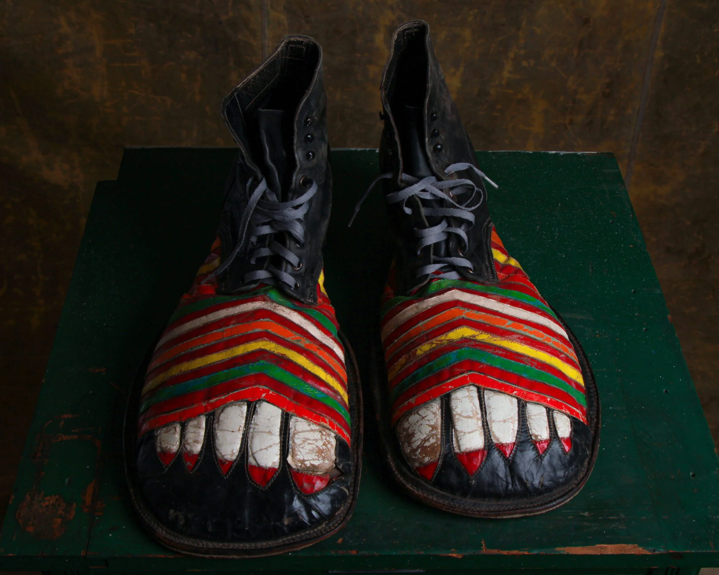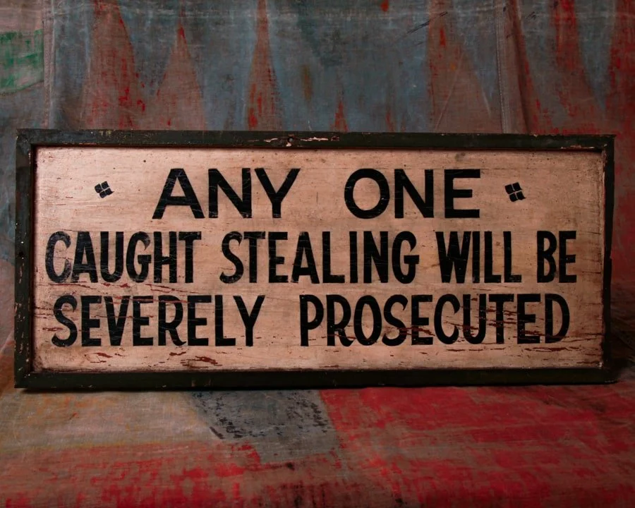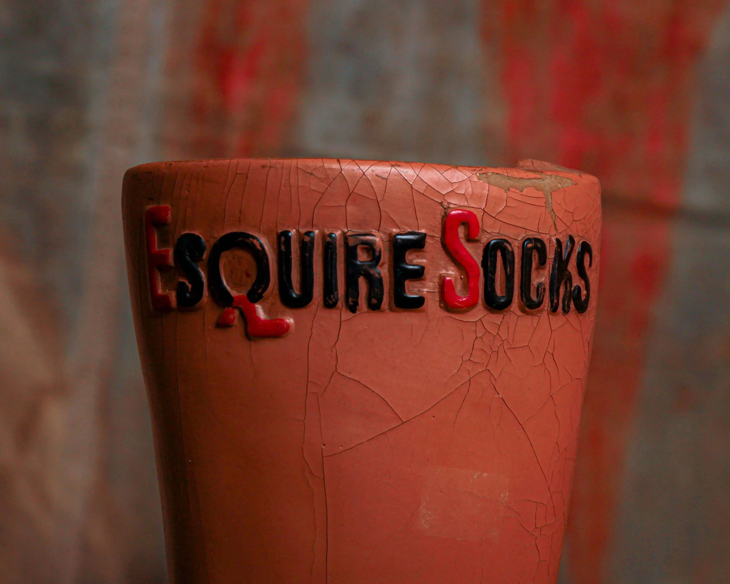
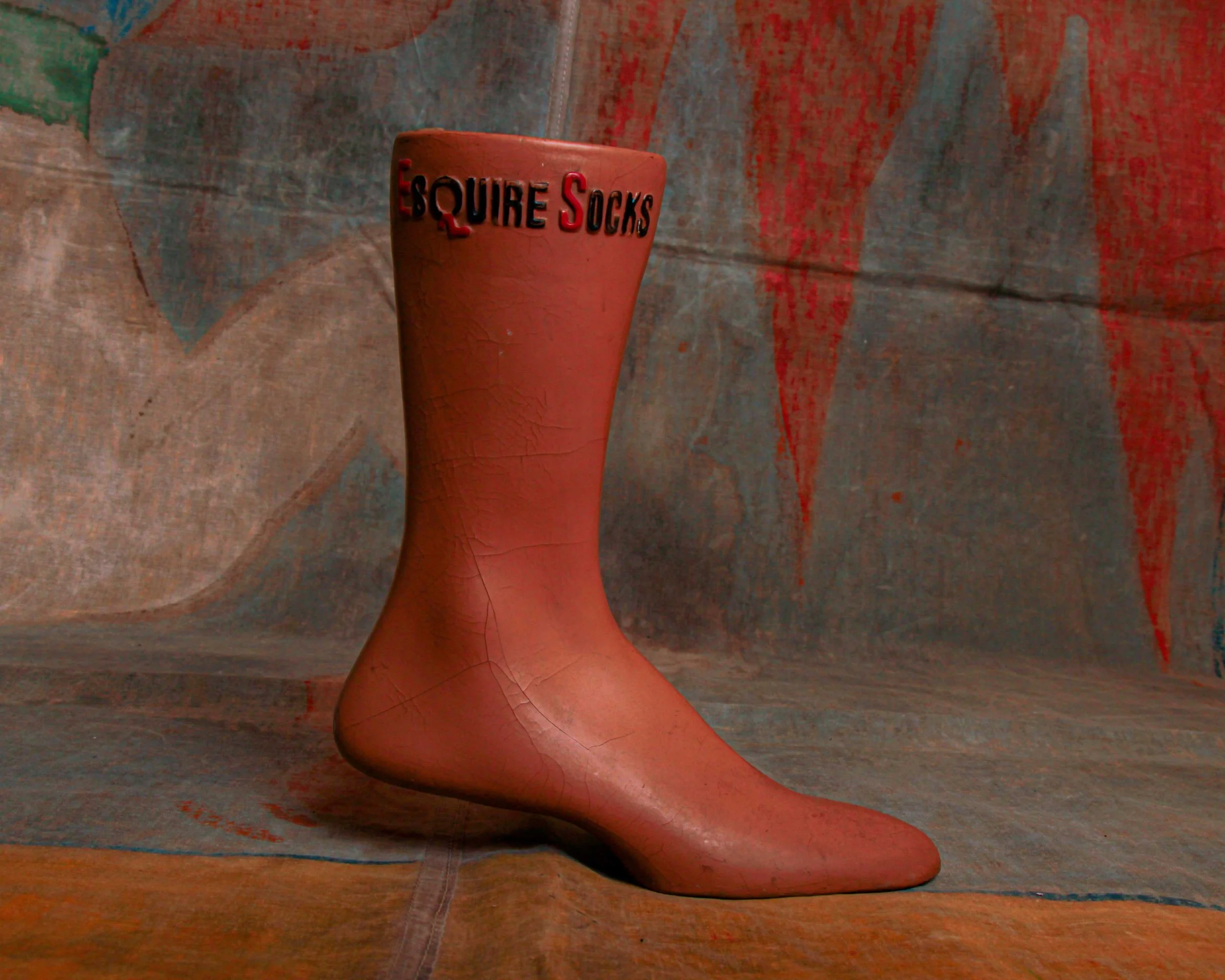
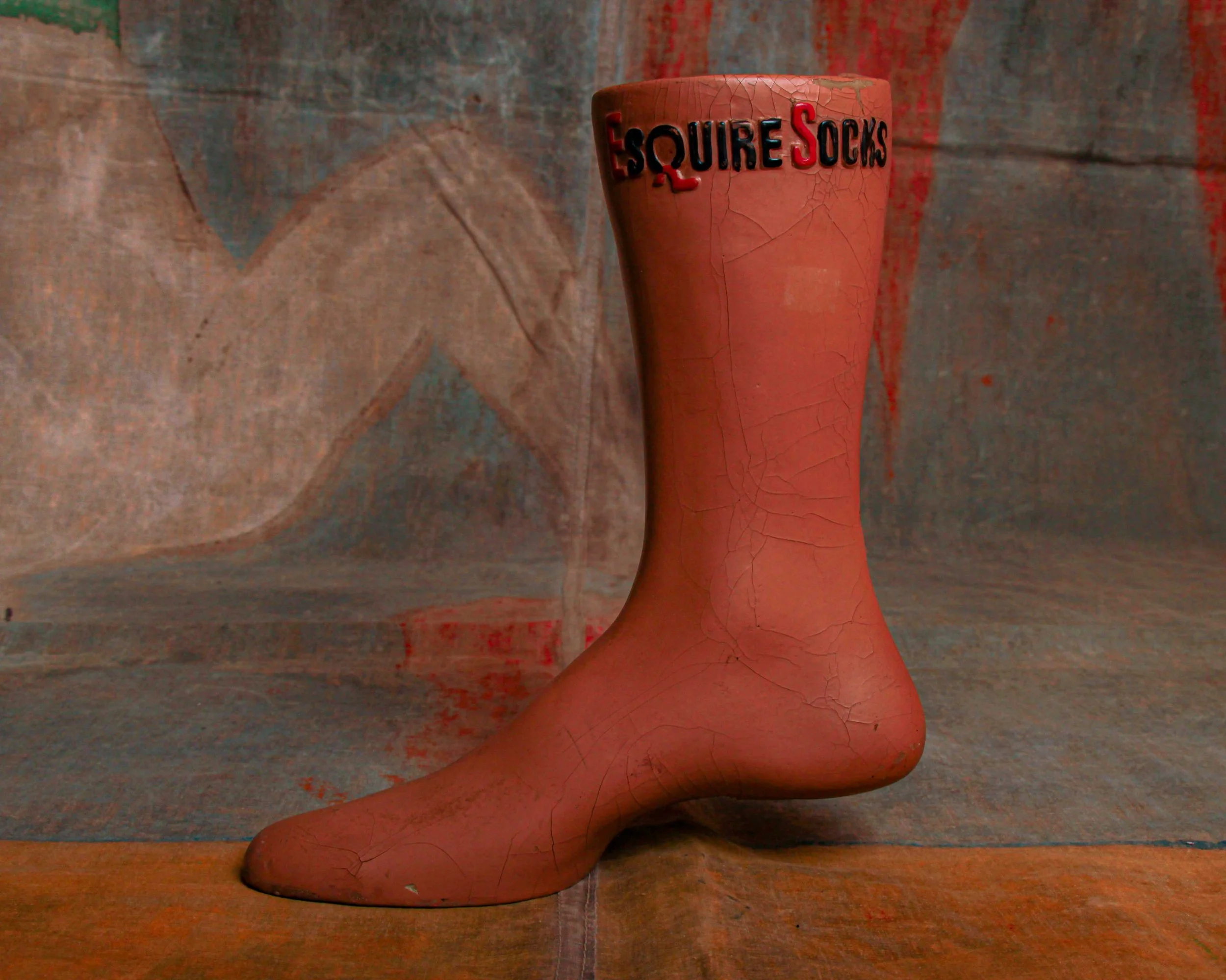
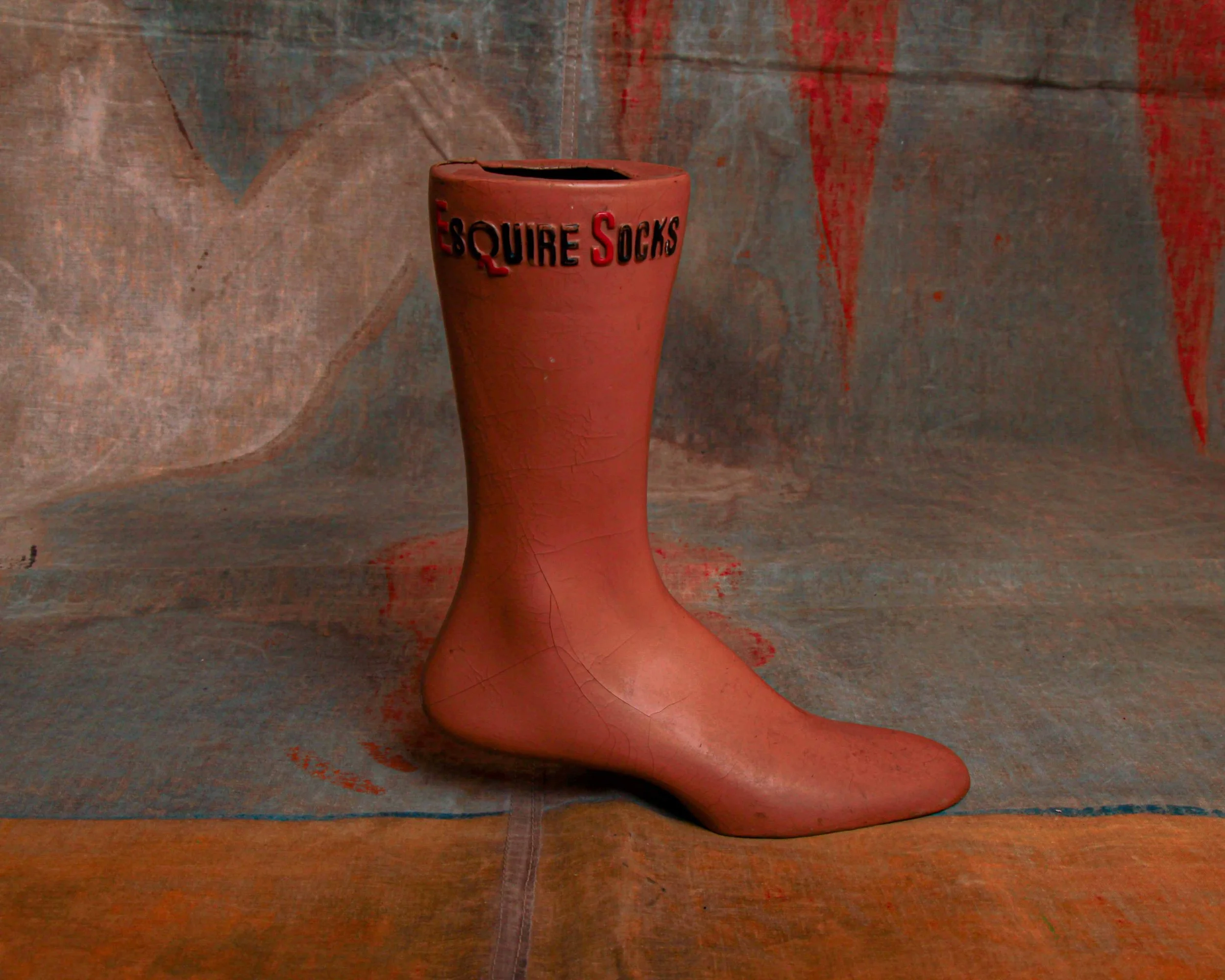
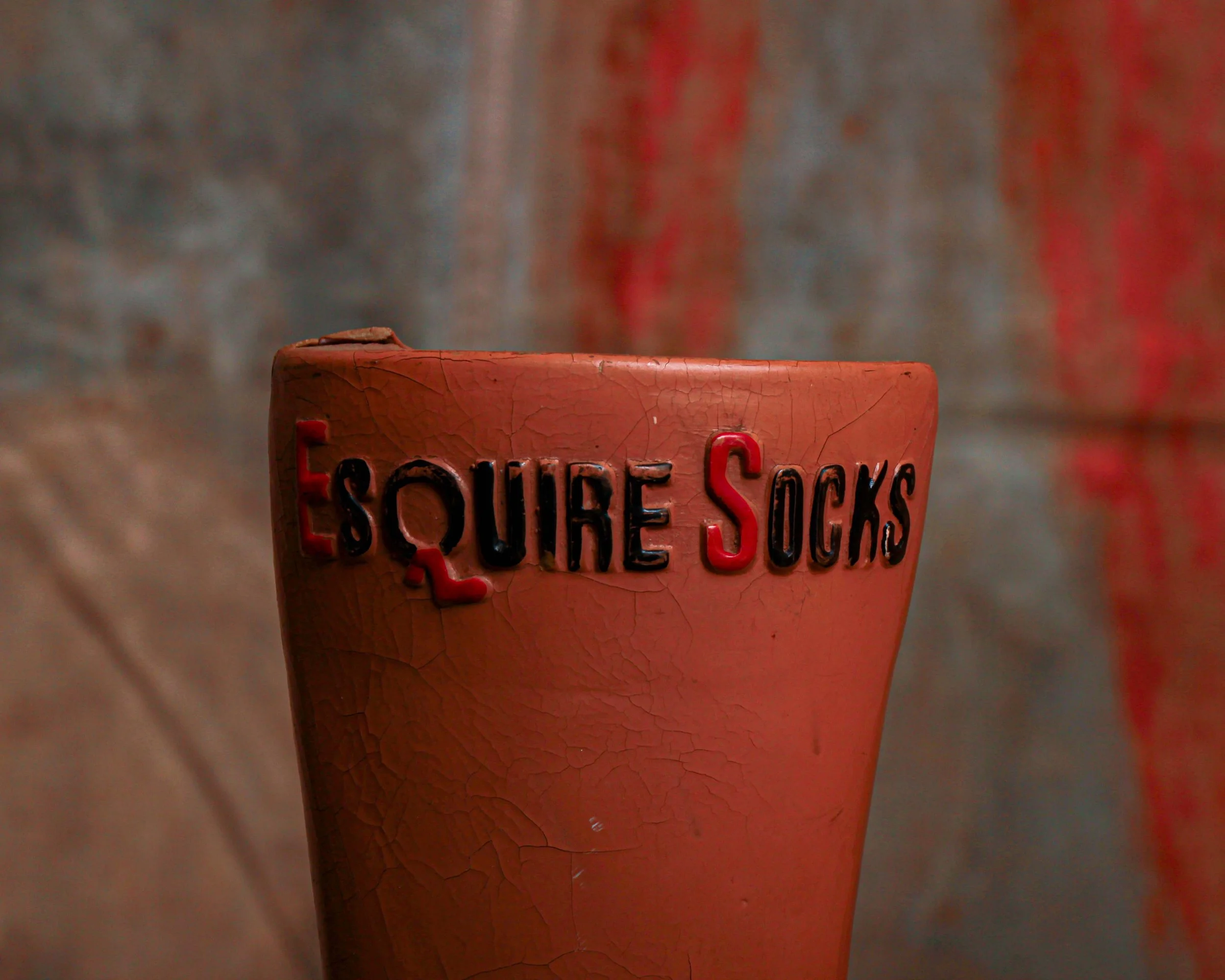
This Esquire Socks advertising display does exactly what it’s supposed to do, and does it well. Cast in a warm, terracotta-toned composition and shaped with a clean, slightly idealized profile, it was designed to show off the product in the most literal way possible. Slip a sock over it, and suddenly you’ve got a perfect, wrinkle-free pitch sitting right there in the window.
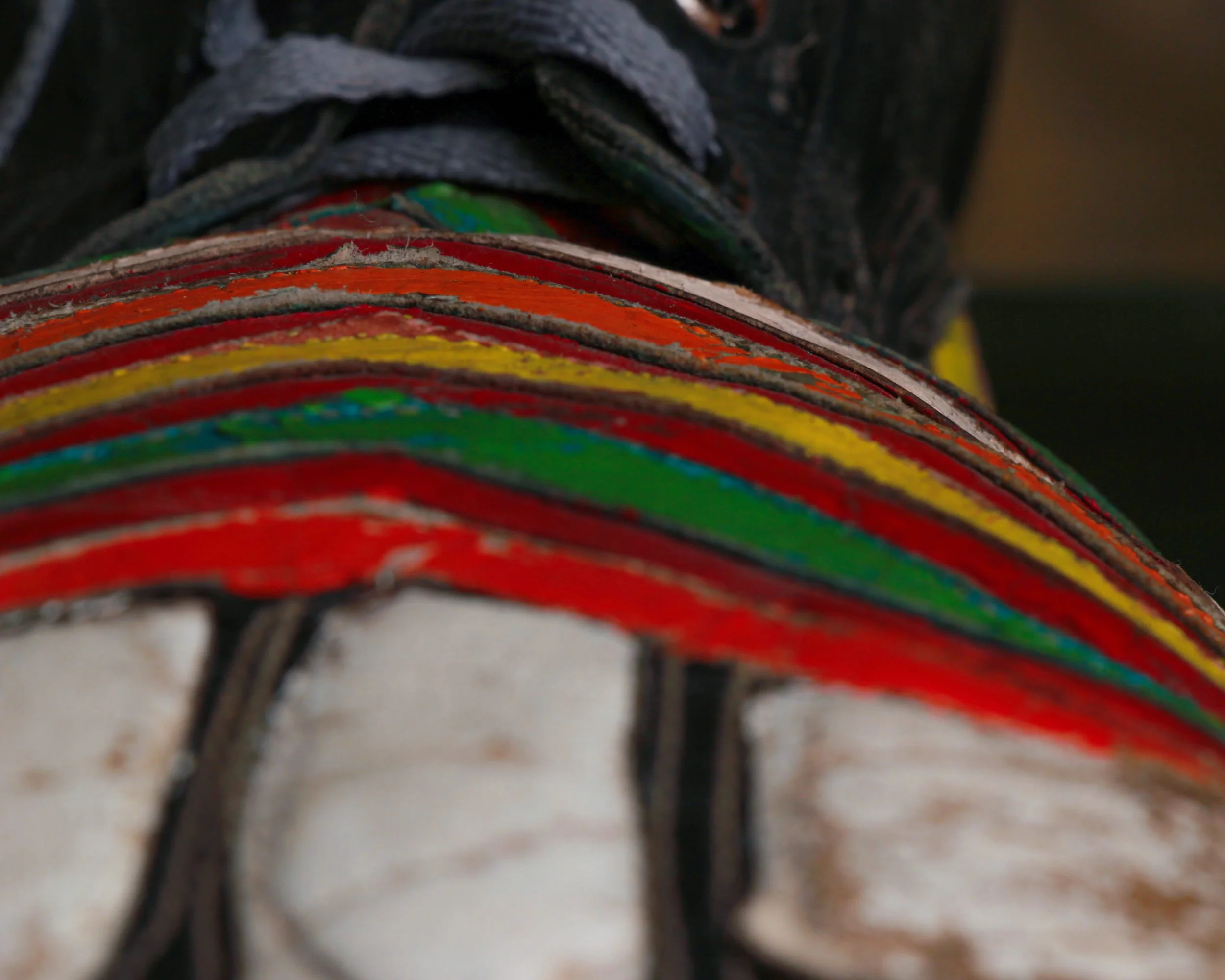
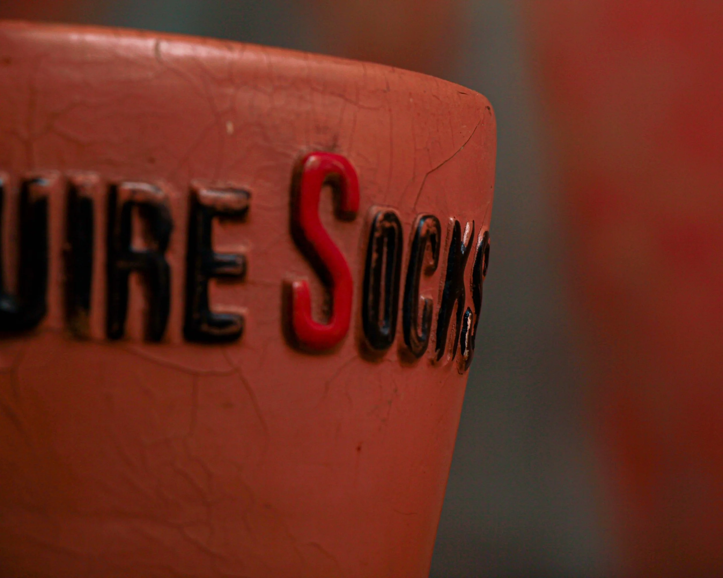
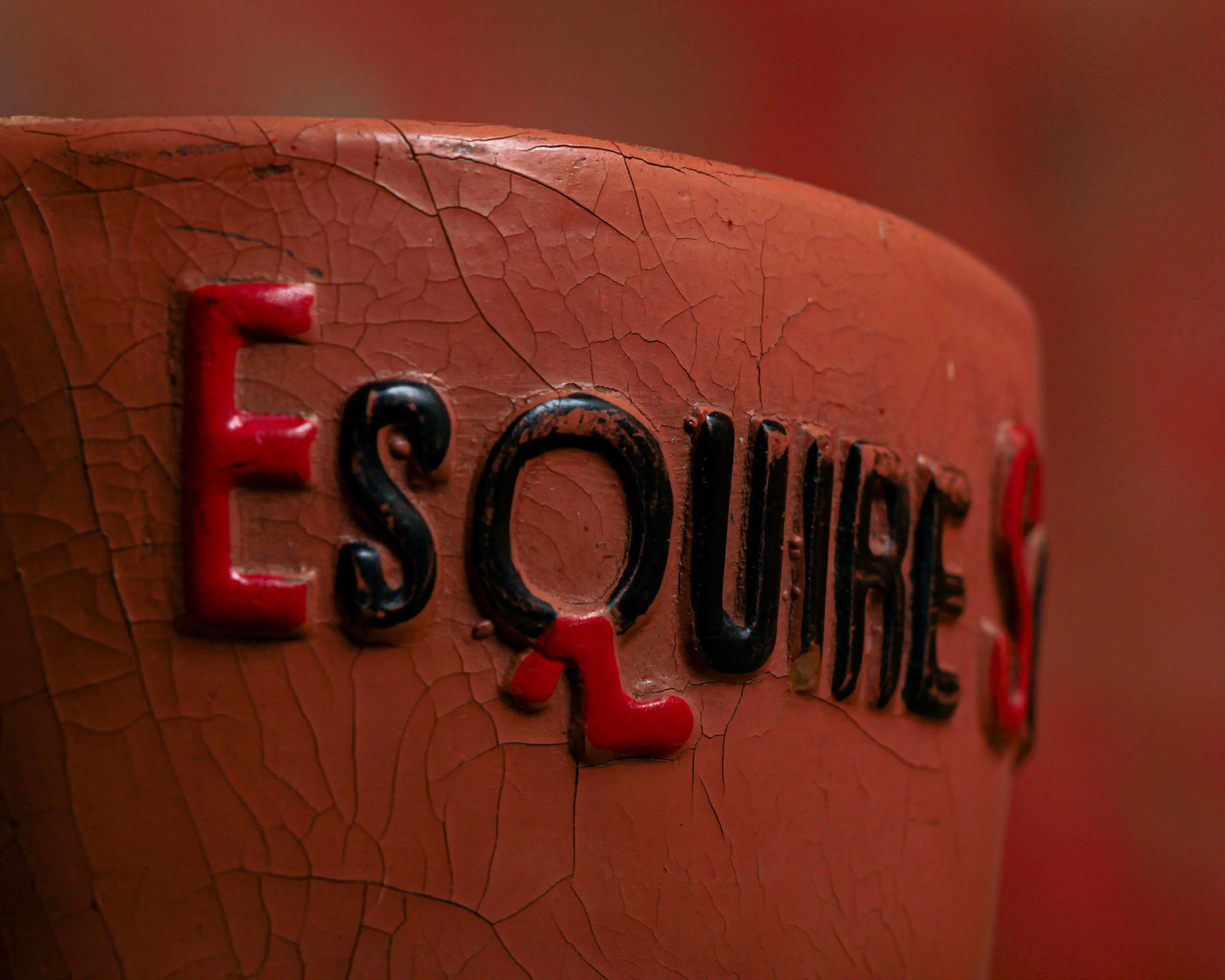
The “Esquire Socks” lettering wraps neatly around the cuff, raised and painted in black with hits of red that give it just enough pop without feeling loud. It’s a subtle bit of branding that feels considered, not forced. Likely mid-20th century, it lands in that era when menswear leaned heavily on polish and presentation, when even something as simple as socks had to look sharp.
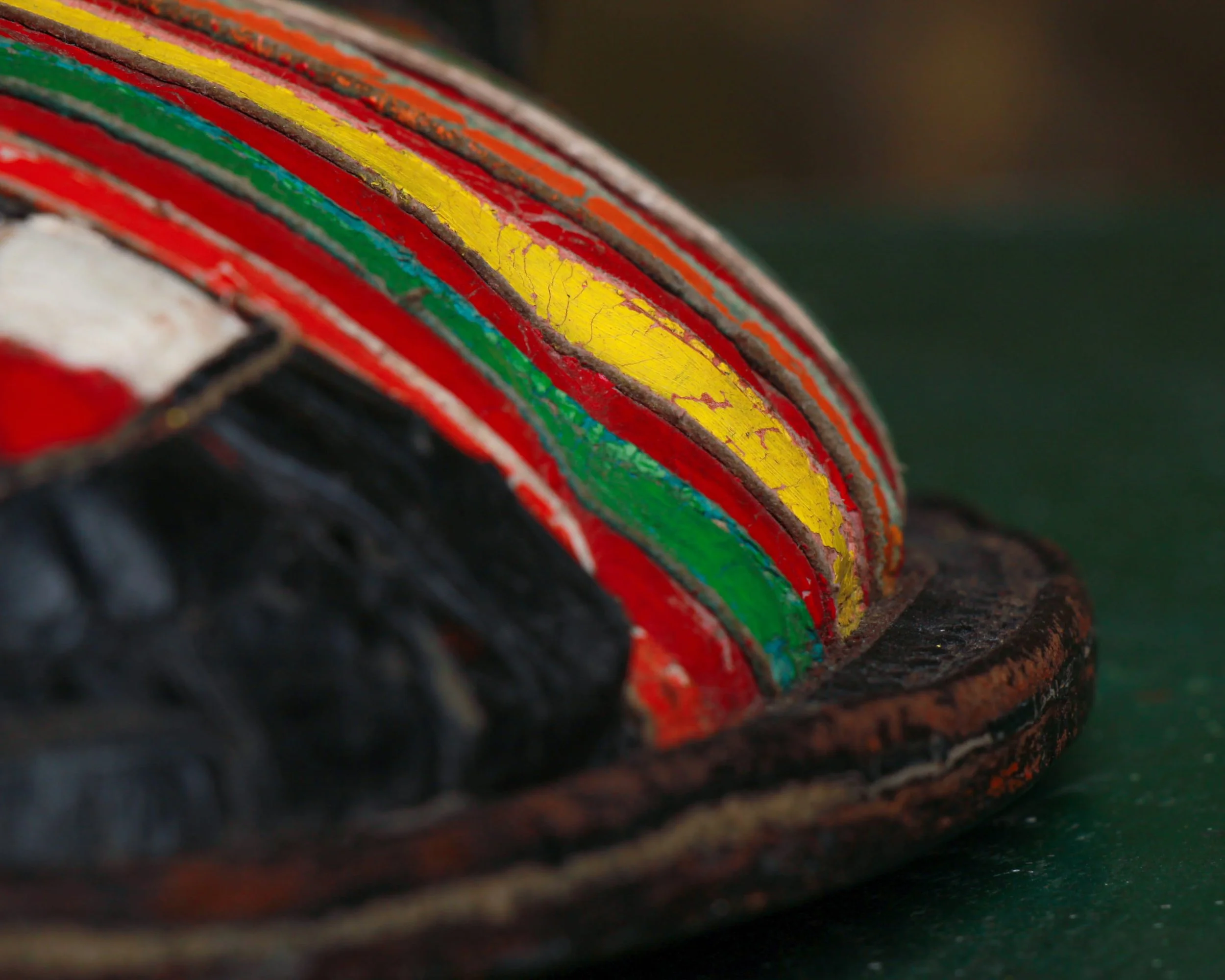
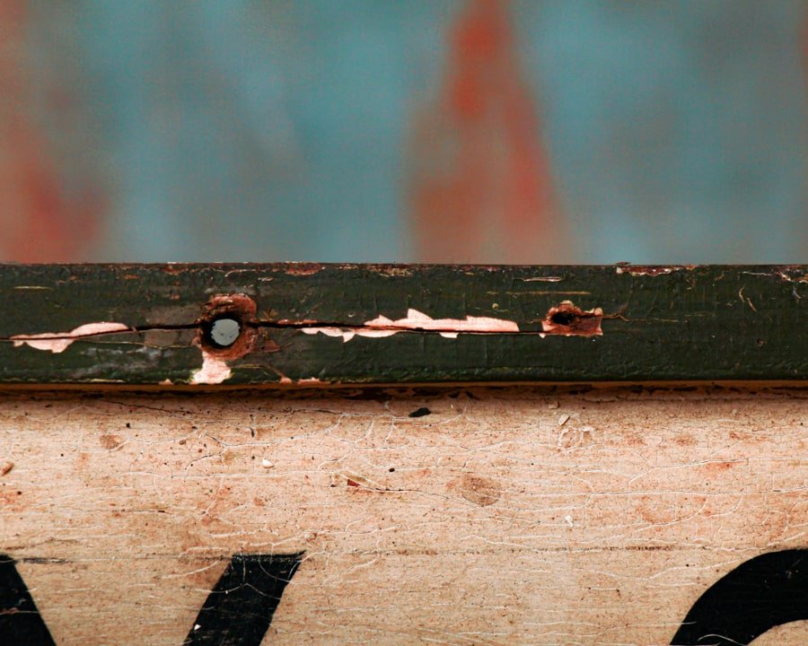
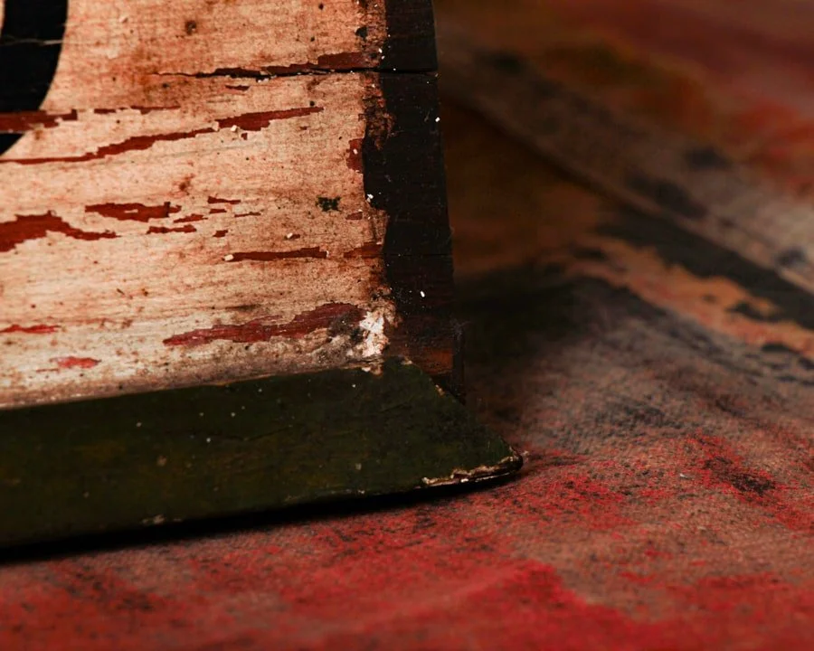
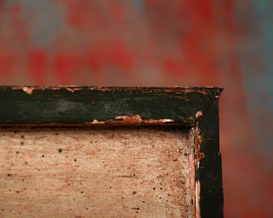
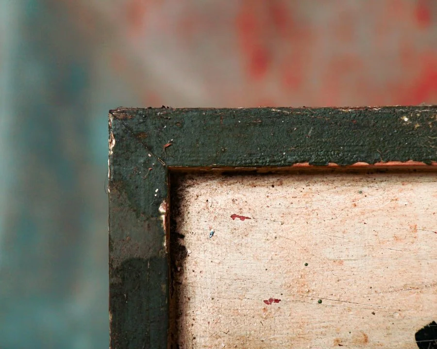
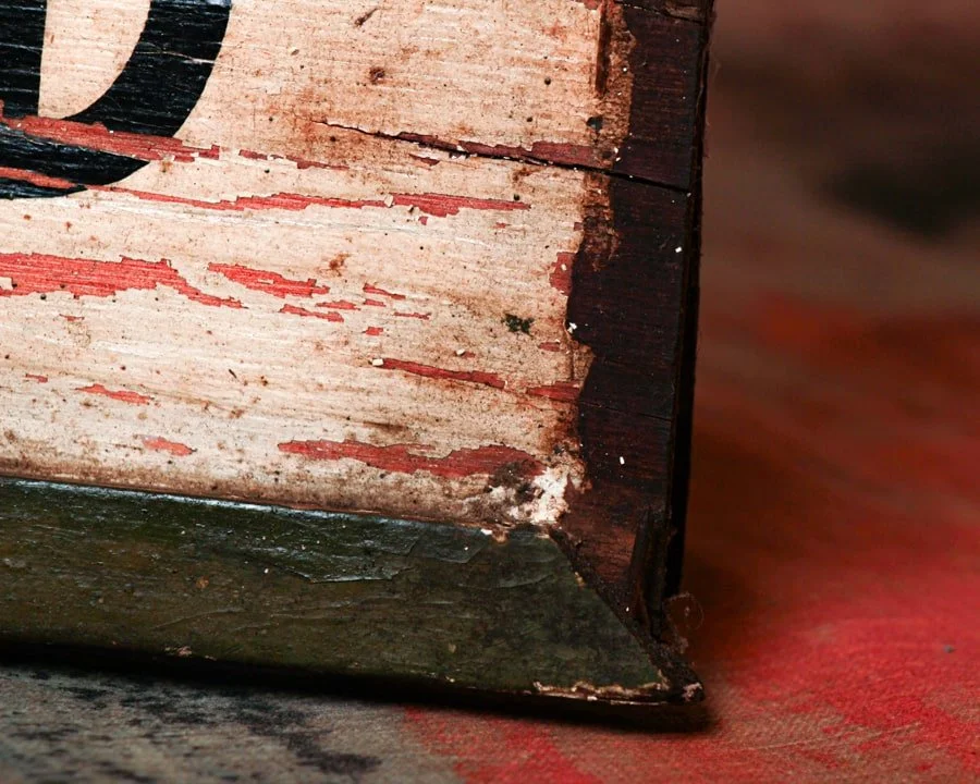
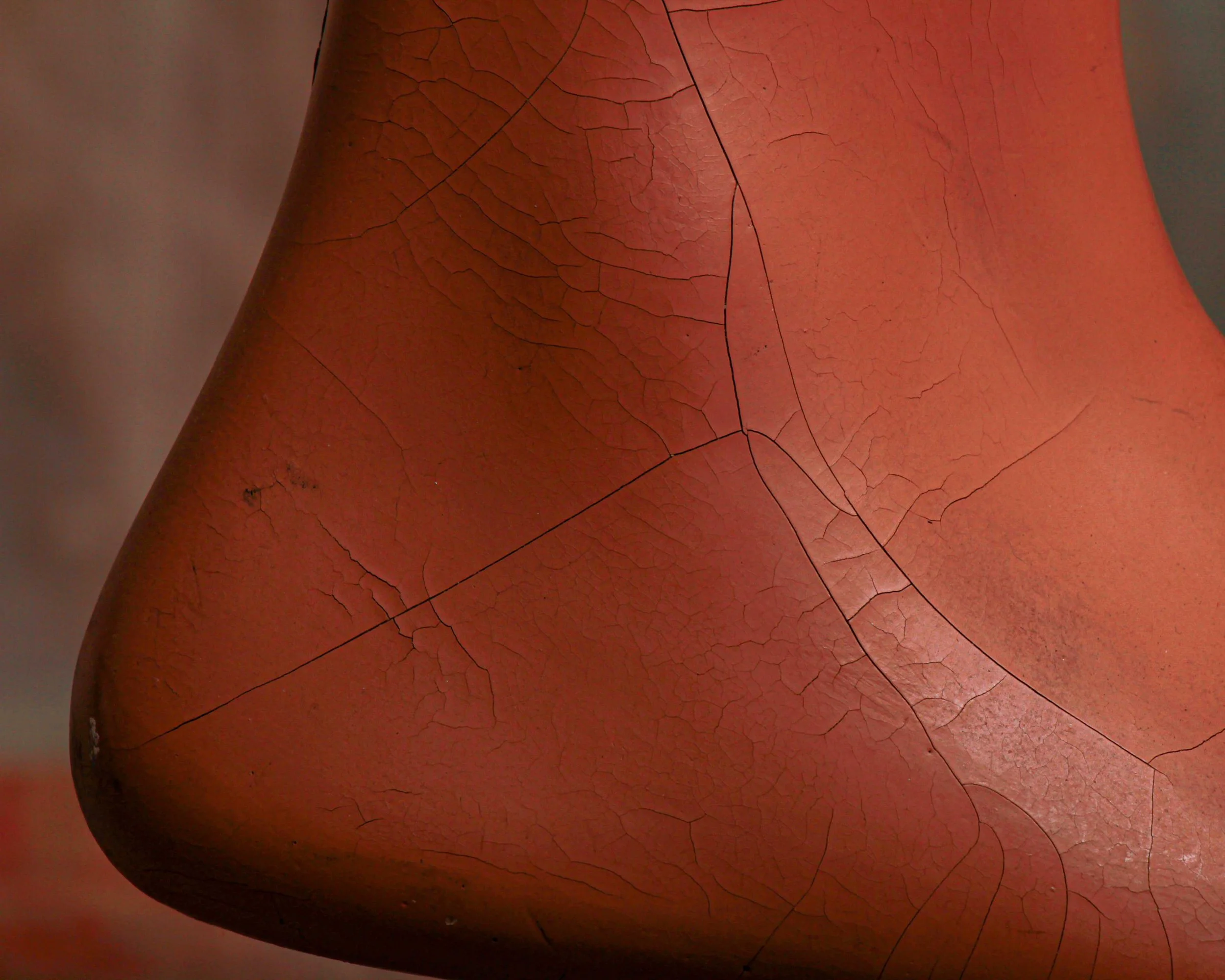
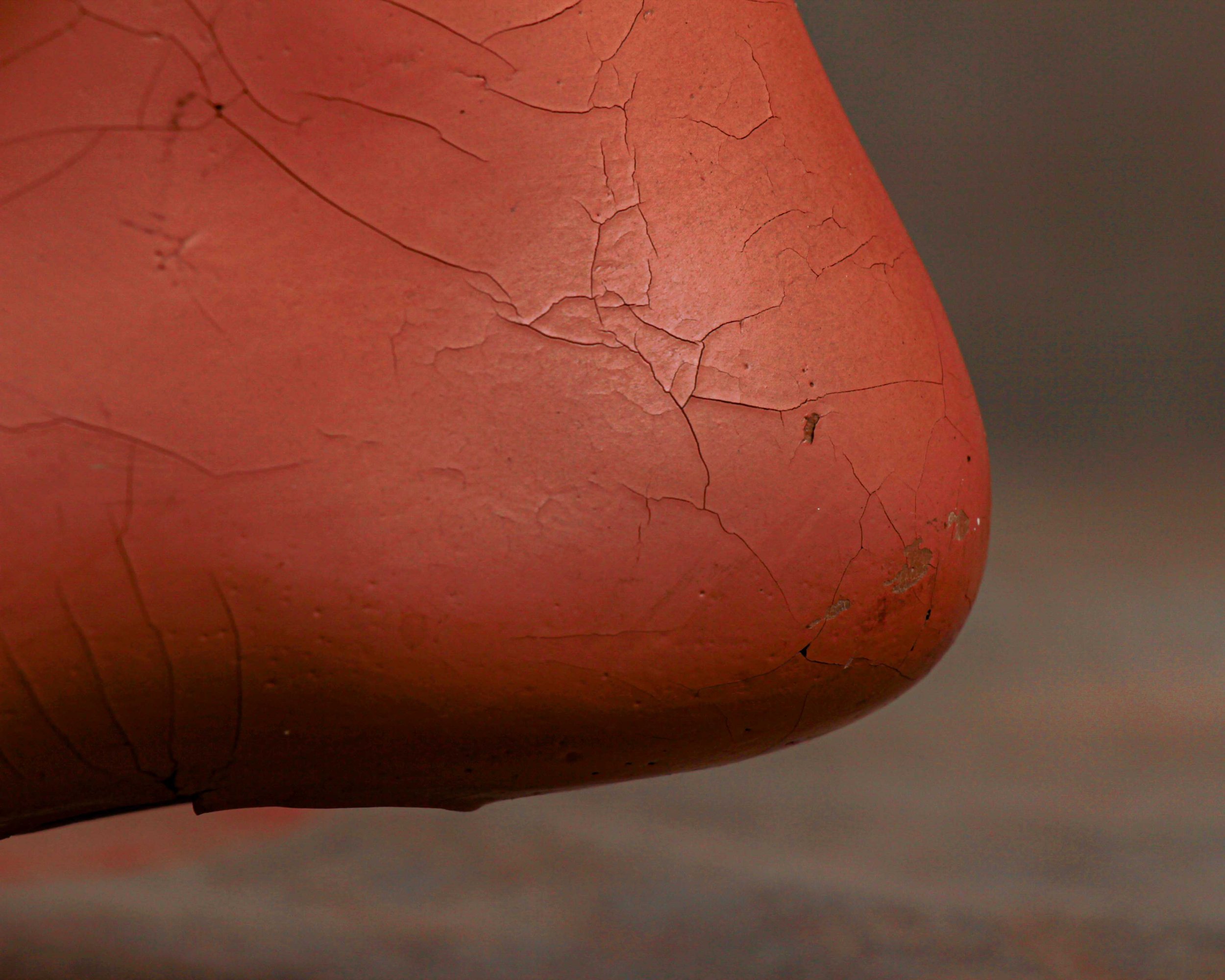
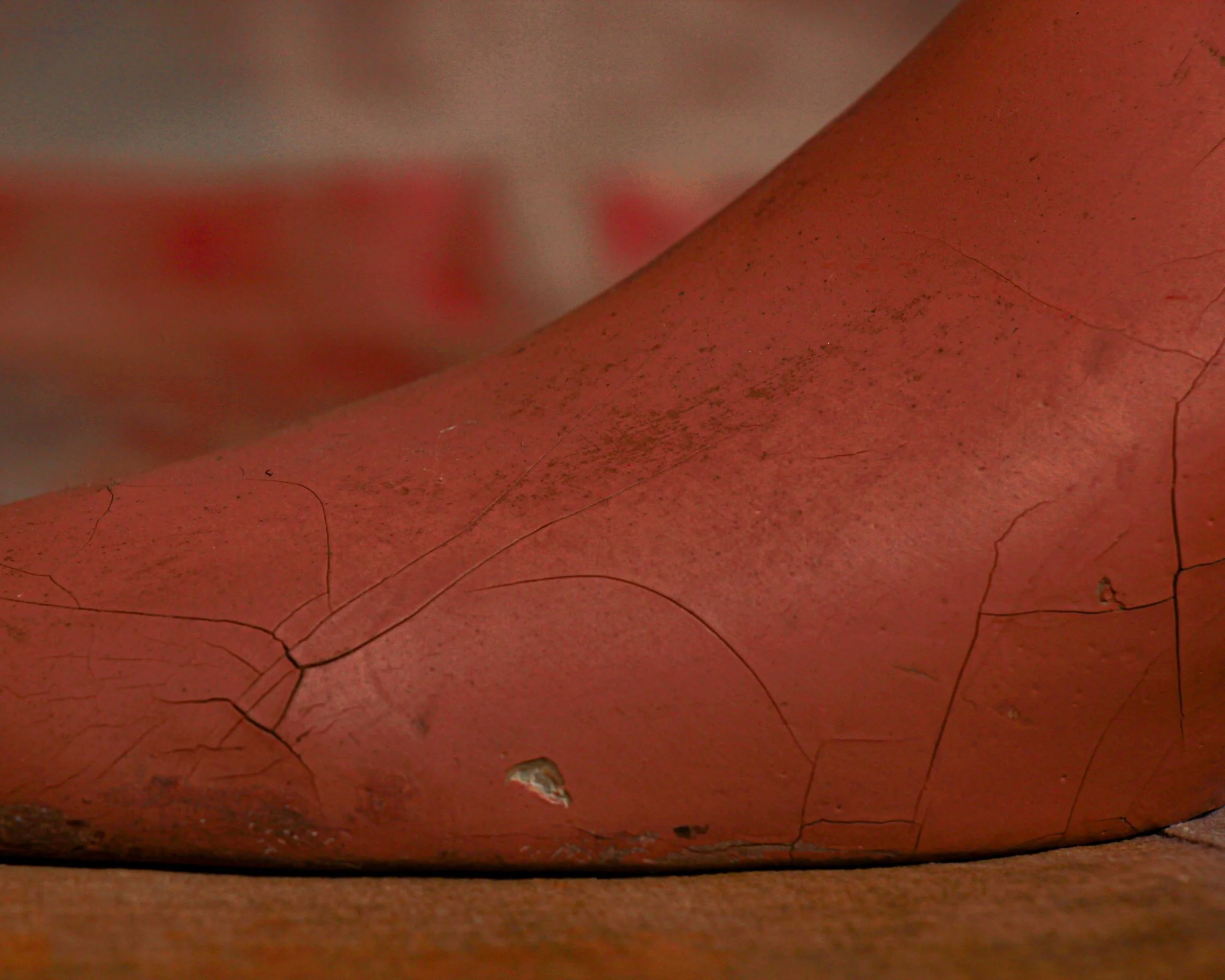
What really sells it now, though, is the surface. The finish has developed a network of fine craquelure, with scattered scuffs and small chips that give it texture and depth. It’s the kind of wear that only comes from years of handling, display, and being part of a working shop. Nothing overdone, nothing distracting, just honest age doing its thing.
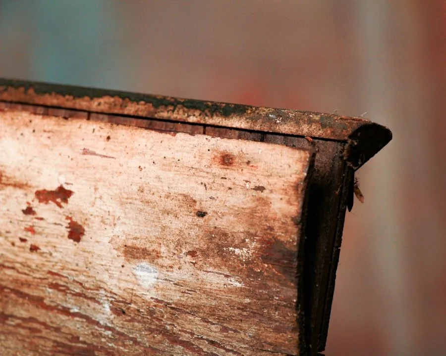
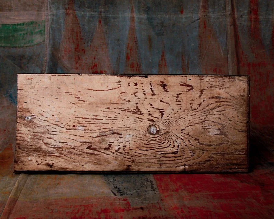
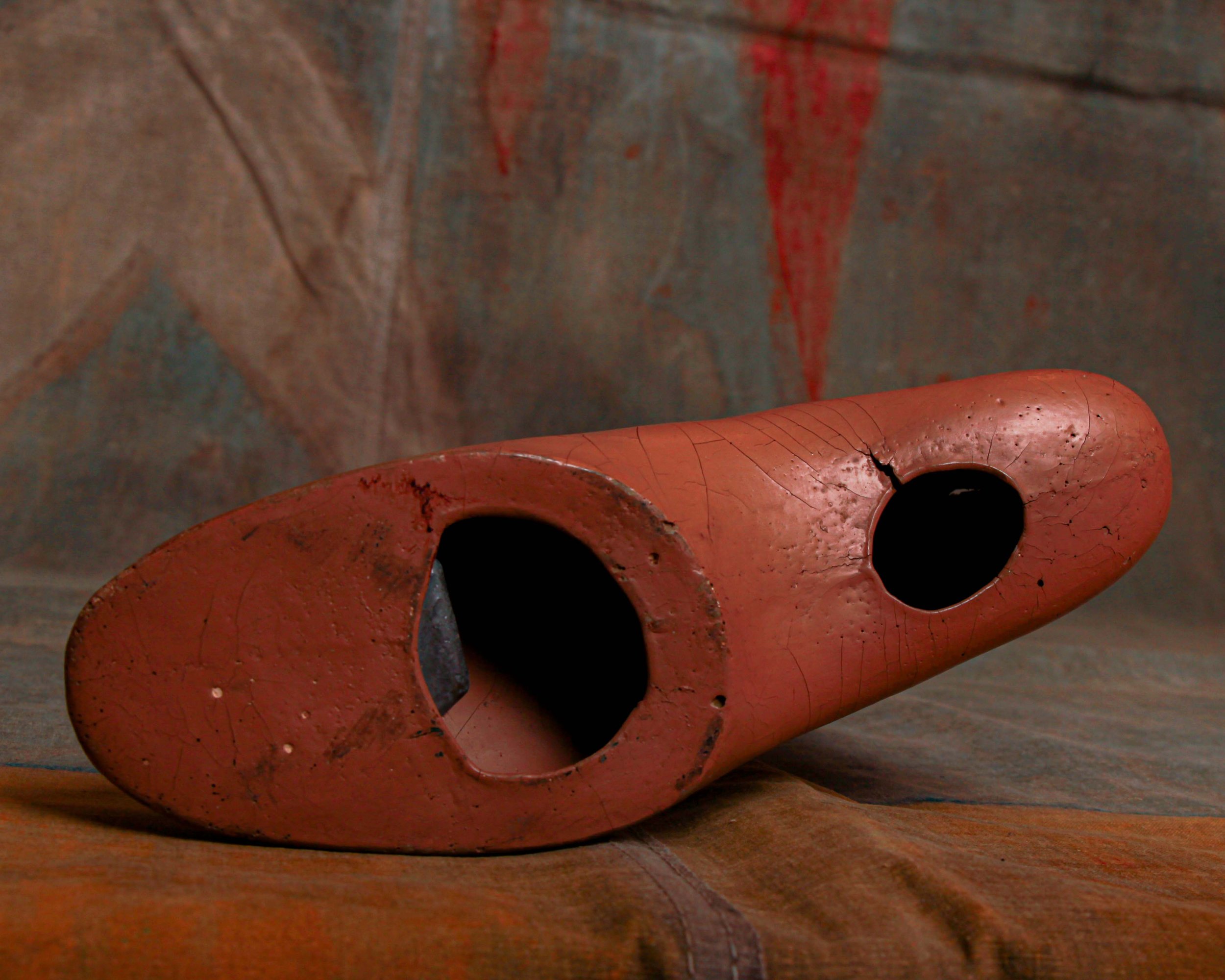
Turn it over and you’ll find the hollowed underside, a reminder of its utilitarian origins.
Now, of course, it’s graduated. No longer pitching socks, just quietly holding its own as a sculptural oddity. Equal parts retail relic and object study.
Esquire
“Esquire” started as a magazine before it became a mood. Launched in 1933, right in the teeth of the Great Depression, Esquire wasn’t just reporting on style, it was quietly rewriting the rules of American masculinity. It mixed sharp tailoring advice with literature, illustration, and a kind of aspirational ease that felt both polished and attainable. By the 1940s and 50s, it had become a cultural barometer. If Esquire said it looked right, it usually did.
Out of that orbit came licensed goods like Esquire Socks. These weren’t random brand extensions, they were part of a broader shift where men’s fashion was becoming more intentional. Department stores and haberdasheries leaned into recognizable names to signal quality and taste. Socks, once purely functional, became another detail to get right, color, pattern, fit.
This Esquire Socks advertising display does exactly what it’s supposed to do, and does it well. Cast in a warm, terracotta-toned composition and shaped with a clean, slightly idealized profile, it was designed to show off the product in the most literal way possible. Slip a sock over it, and suddenly you’ve got a perfect, wrinkle-free pitch sitting right there in the window.
The “Esquire Socks” lettering wraps neatly around the cuff, raised and painted in black with hits of red that give it just enough pop without feeling loud. It’s a subtle bit of branding that feels considered, not forced. Likely mid-20th century, it lands in that era when menswear leaned heavily on polish and presentation, when even something as simple as socks had to look sharp.
What really sells it now, though, is the surface. The finish has developed a network of fine craquelure, with scattered scuffs and small chips that give it texture and depth. It’s the kind of wear that only comes from years of handling, display, and being part of a working shop. Nothing overdone, nothing distracting, just honest age doing its thing.
Turn it over and you’ll find the hollowed underside, a reminder of its utilitarian origins.
Now, of course, it’s graduated. No longer pitching socks, just quietly holding its own as a sculptural oddity. Equal parts retail relic and object study.
Esquire
“Esquire” started as a magazine before it became a mood. Launched in 1933, right in the teeth of the Great Depression, Esquire wasn’t just reporting on style, it was quietly rewriting the rules of American masculinity. It mixed sharp tailoring advice with literature, illustration, and a kind of aspirational ease that felt both polished and attainable. By the 1940s and 50s, it had become a cultural barometer. If Esquire said it looked right, it usually did.
Out of that orbit came licensed goods like Esquire Socks. These weren’t random brand extensions, they were part of a broader shift where men’s fashion was becoming more intentional. Department stores and haberdasheries leaned into recognizable names to signal quality and taste. Socks, once purely functional, became another detail to get right, color, pattern, fit.