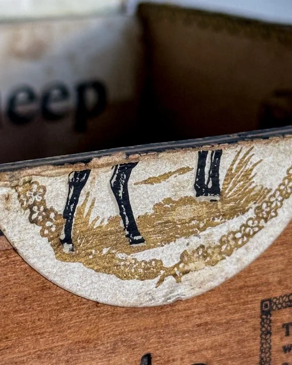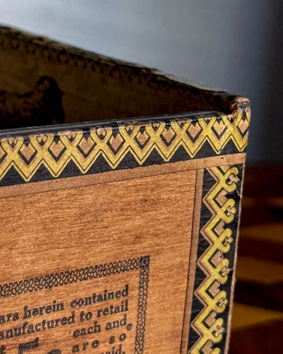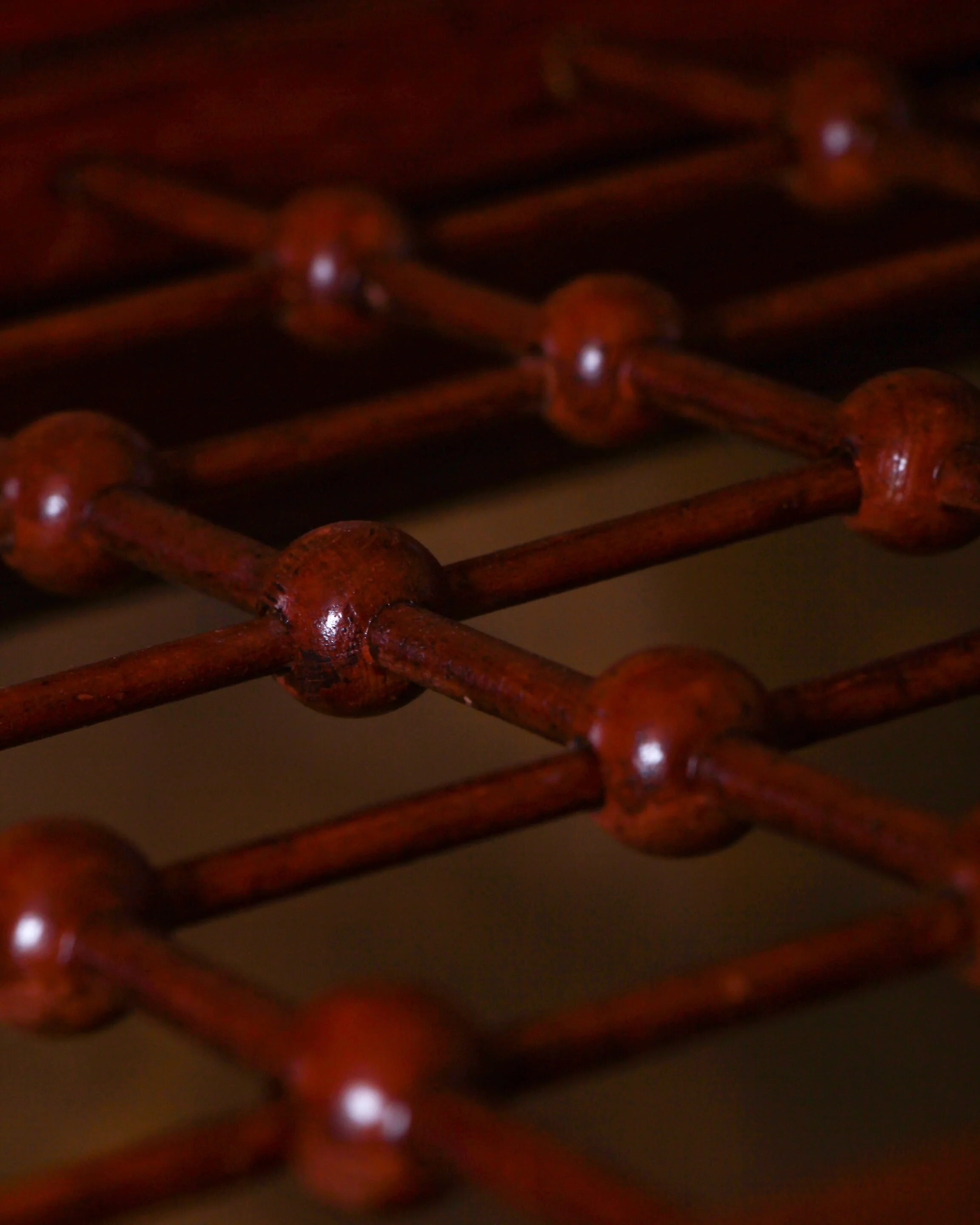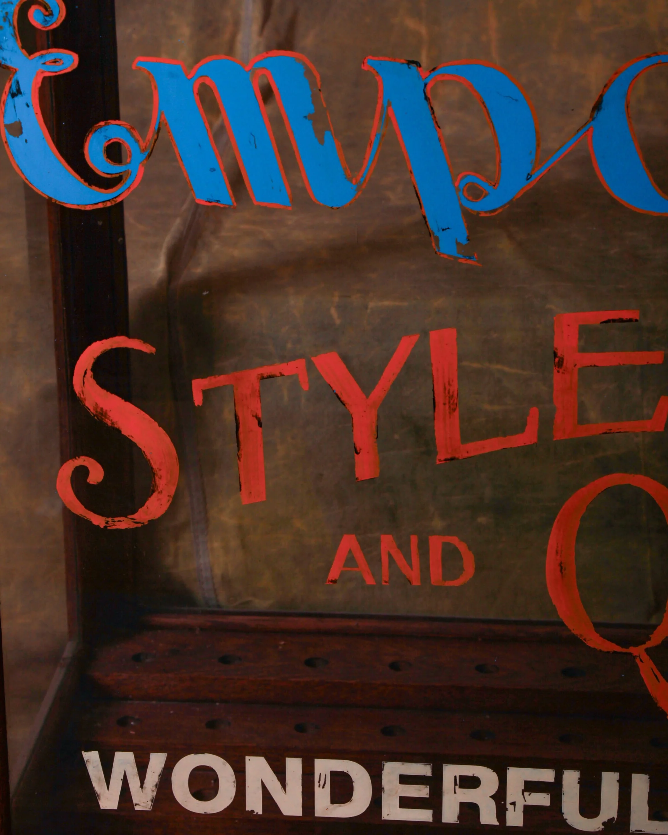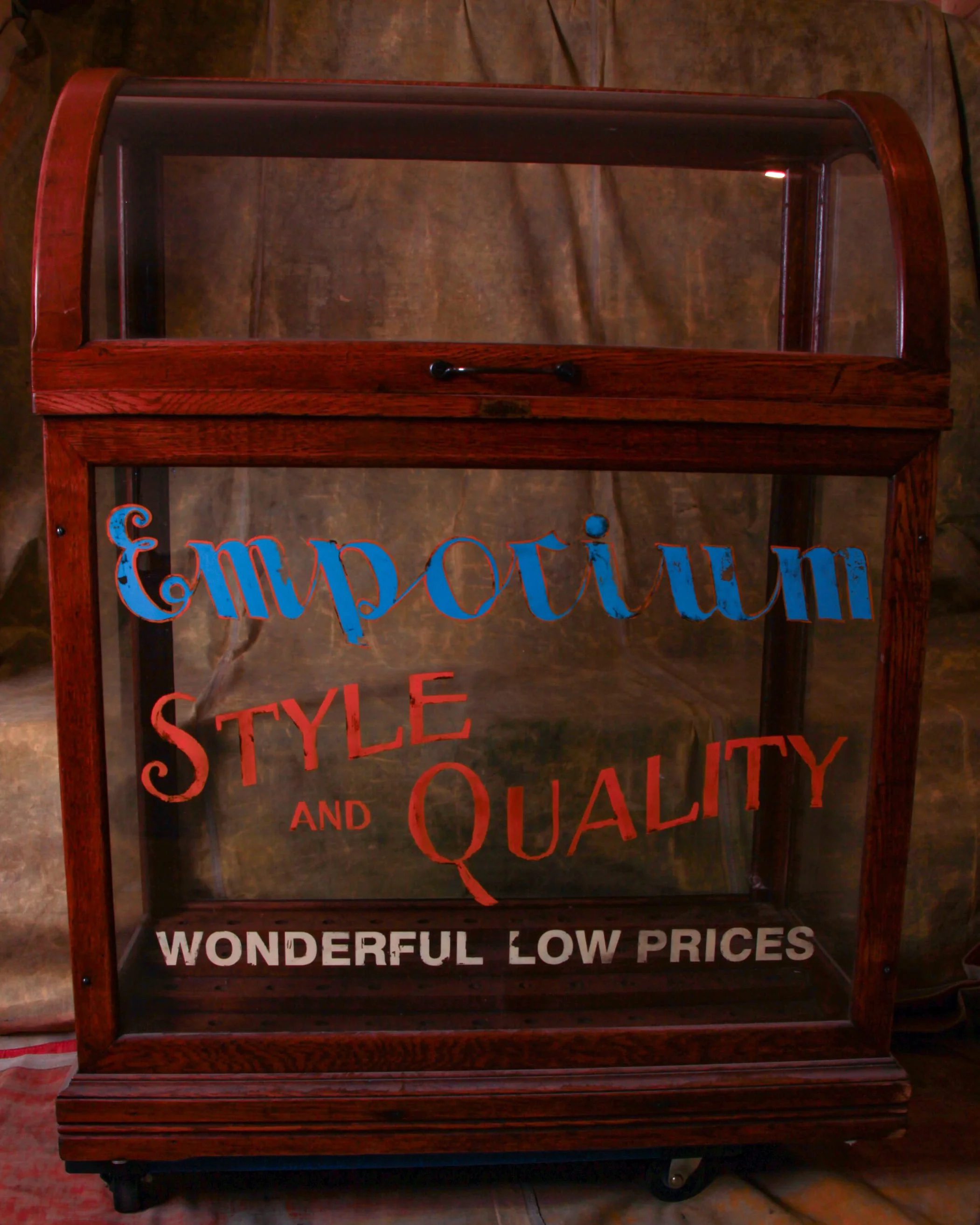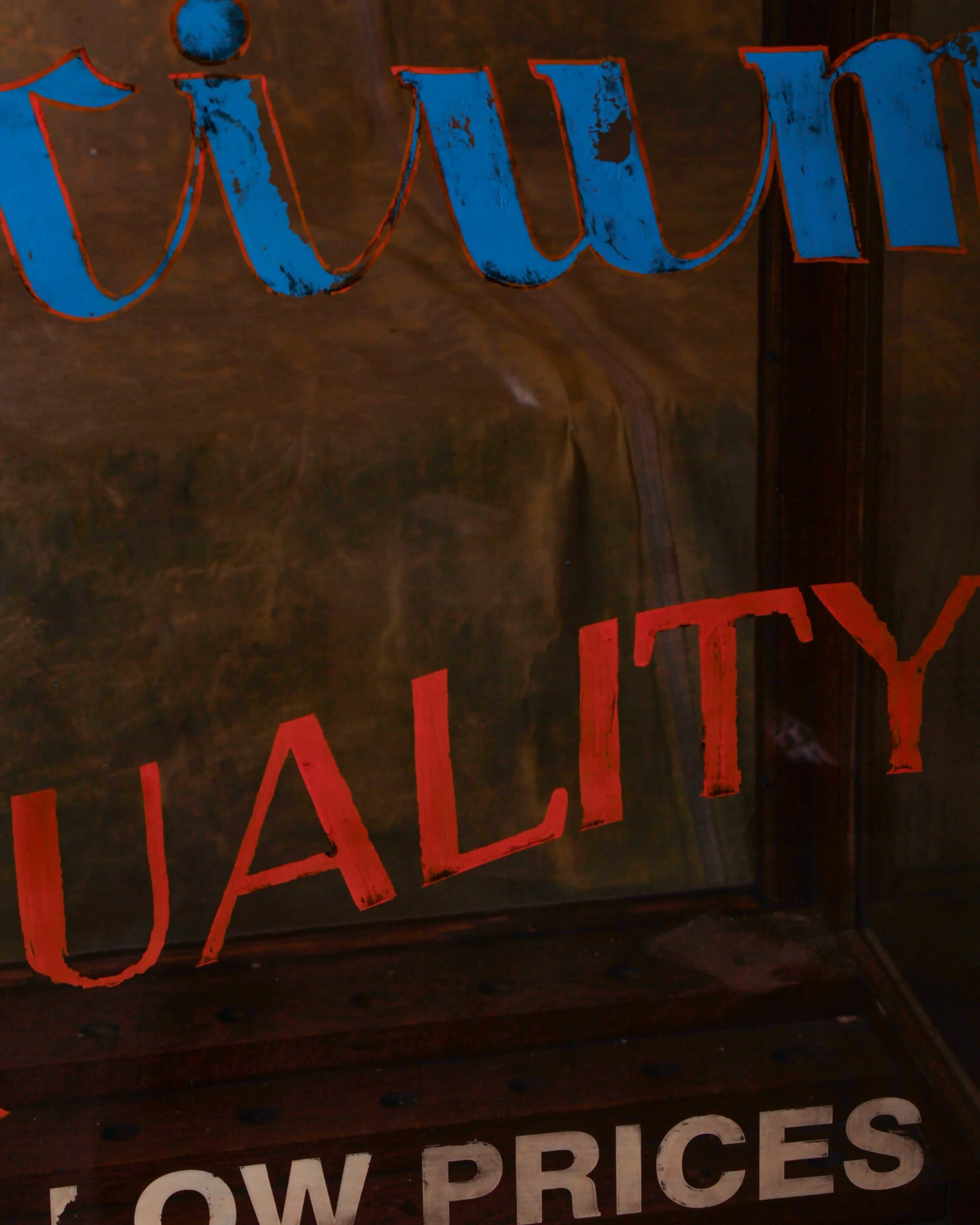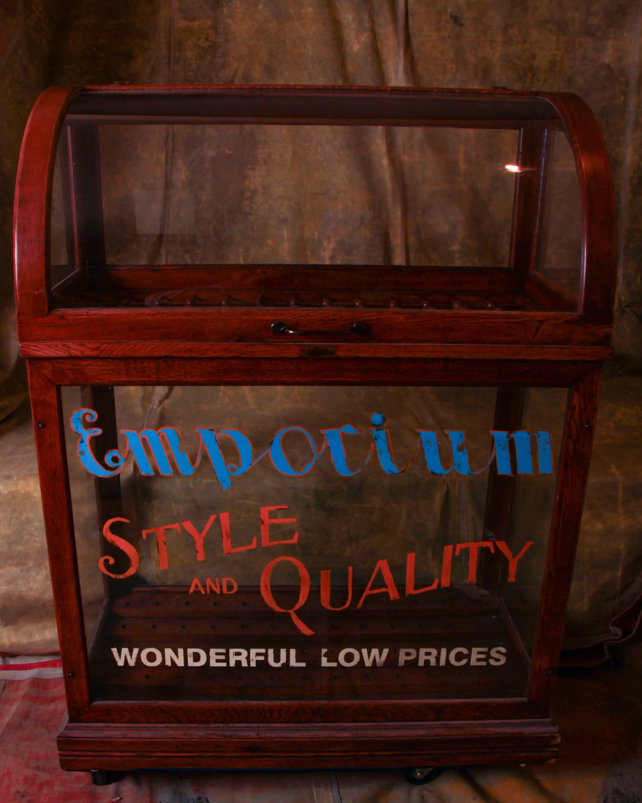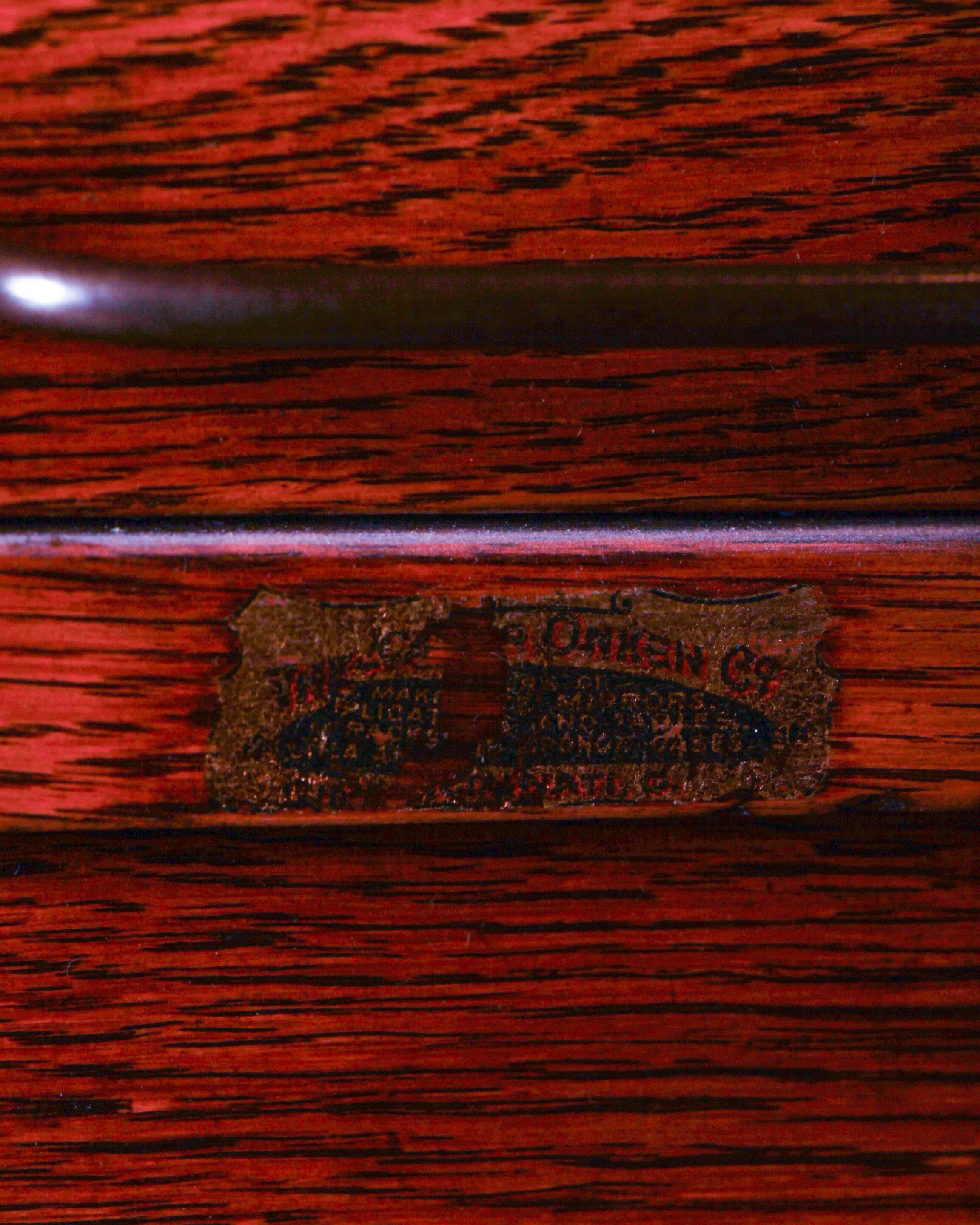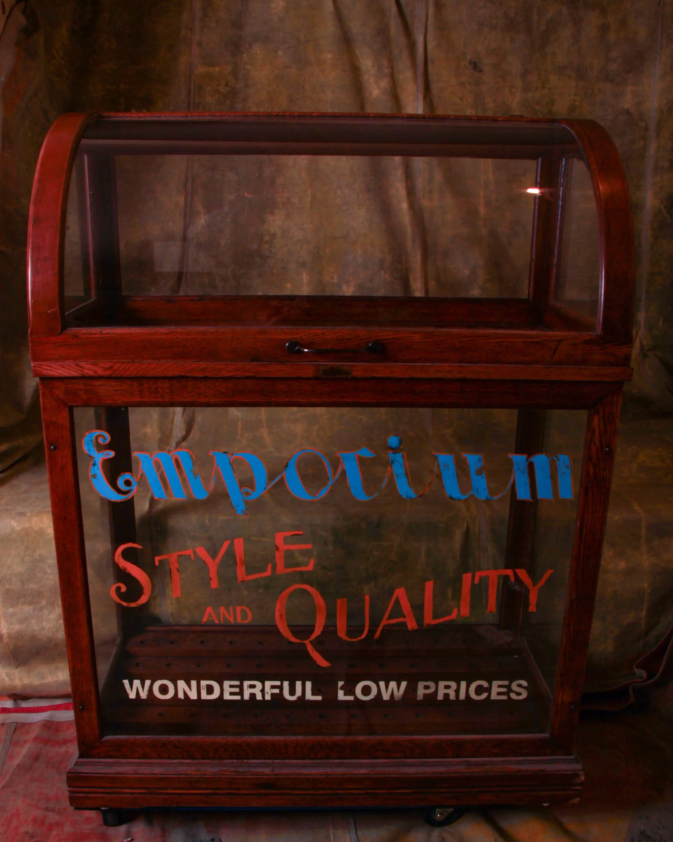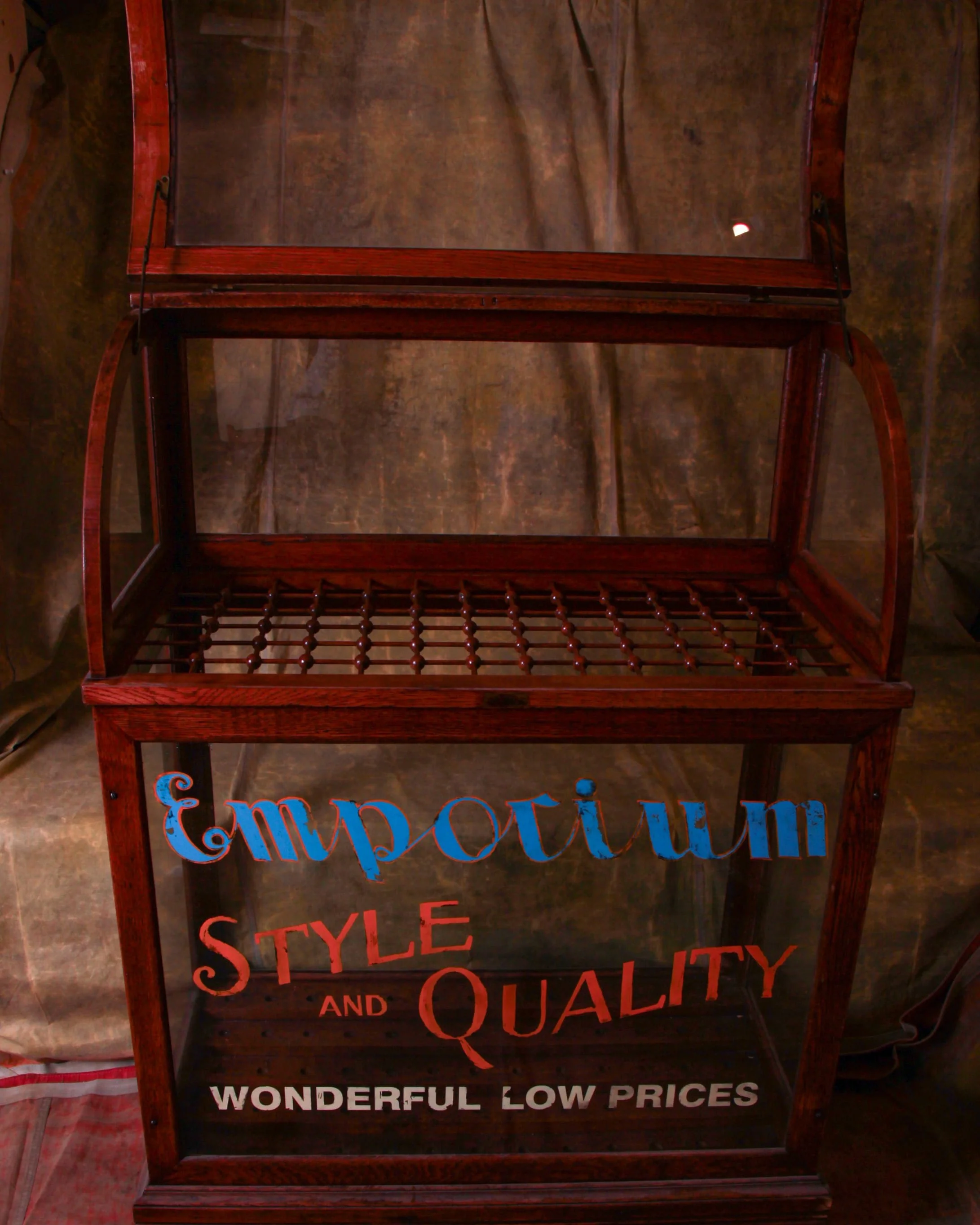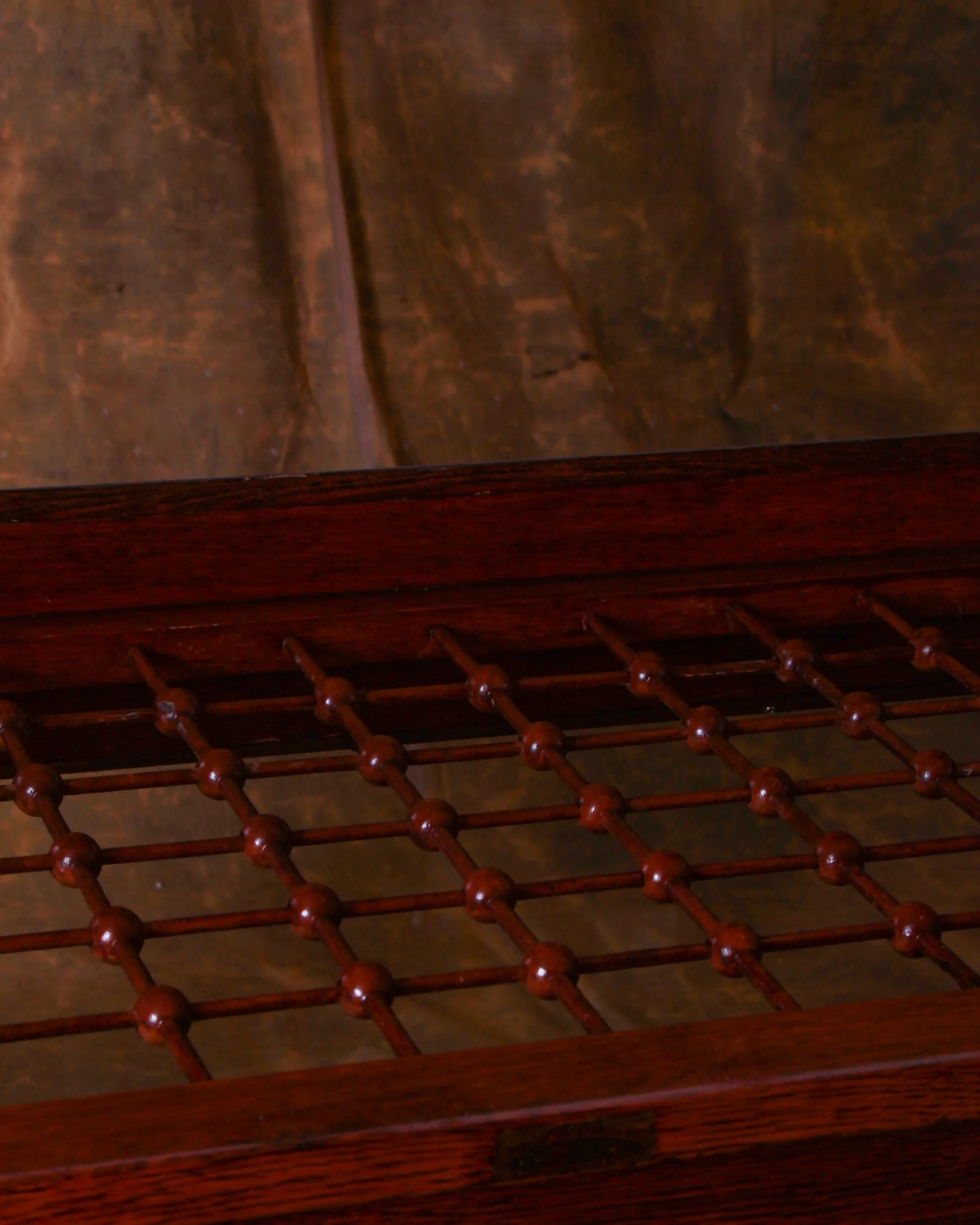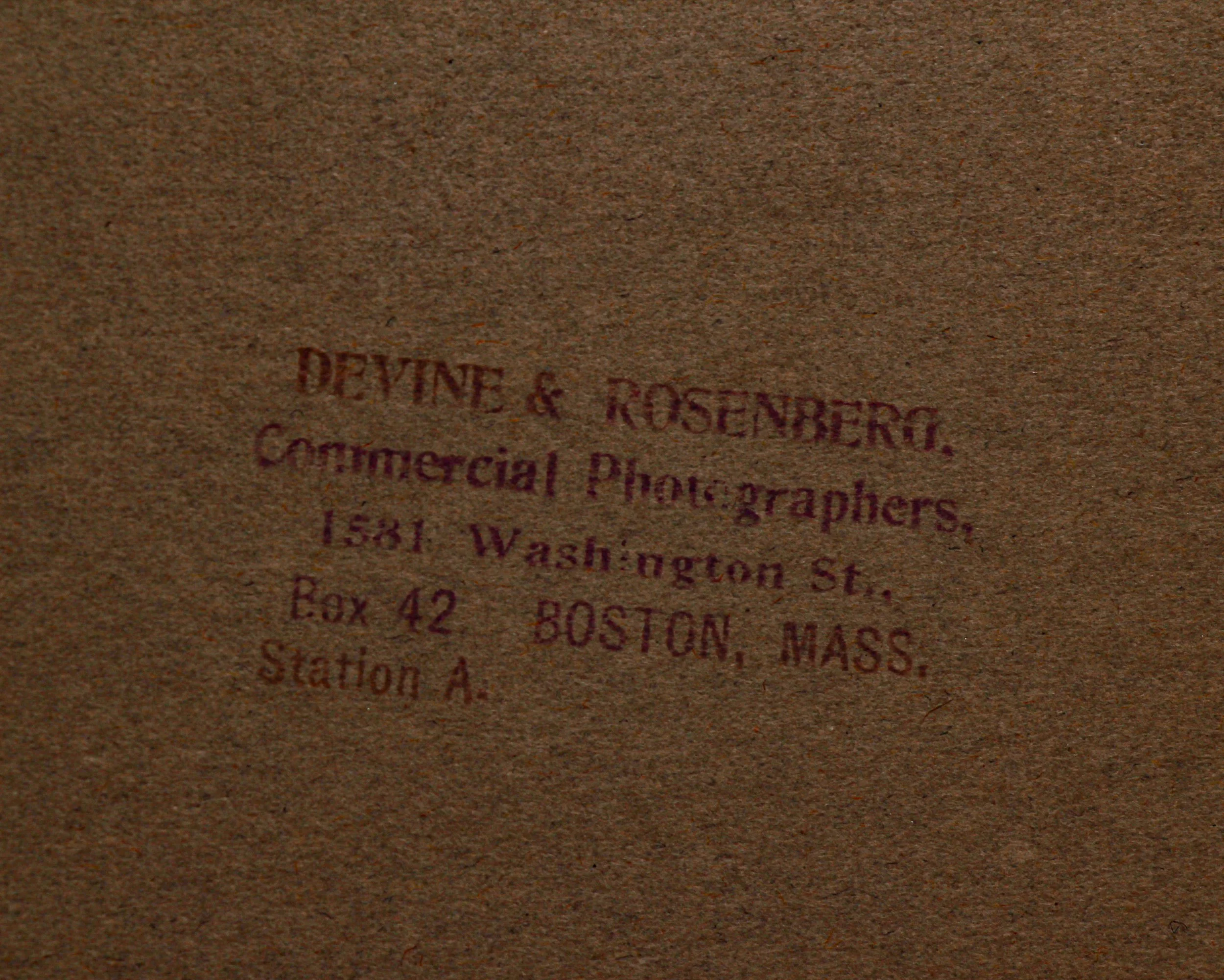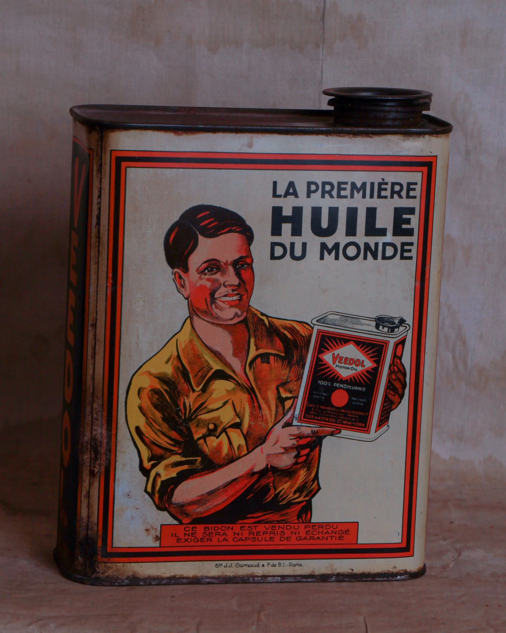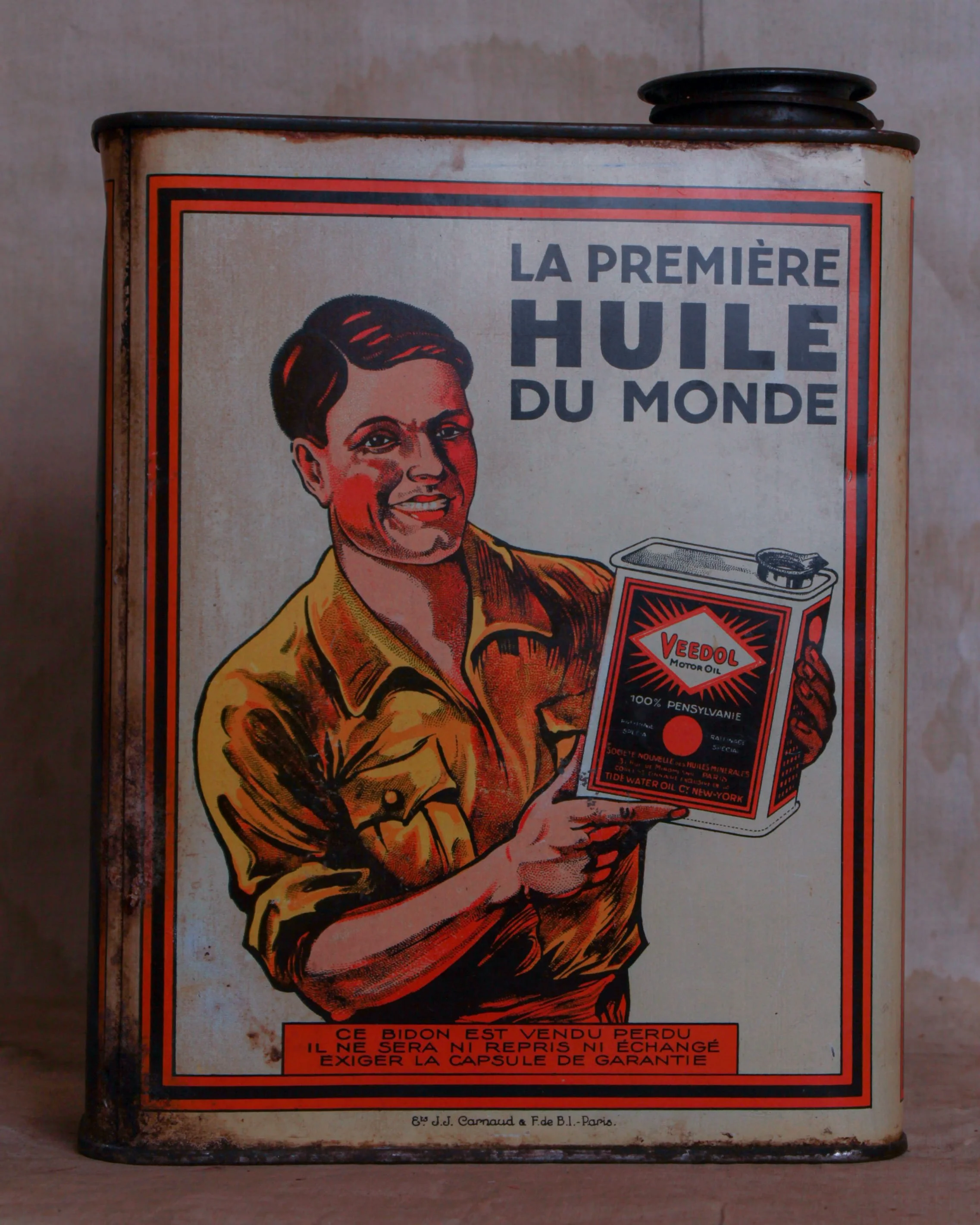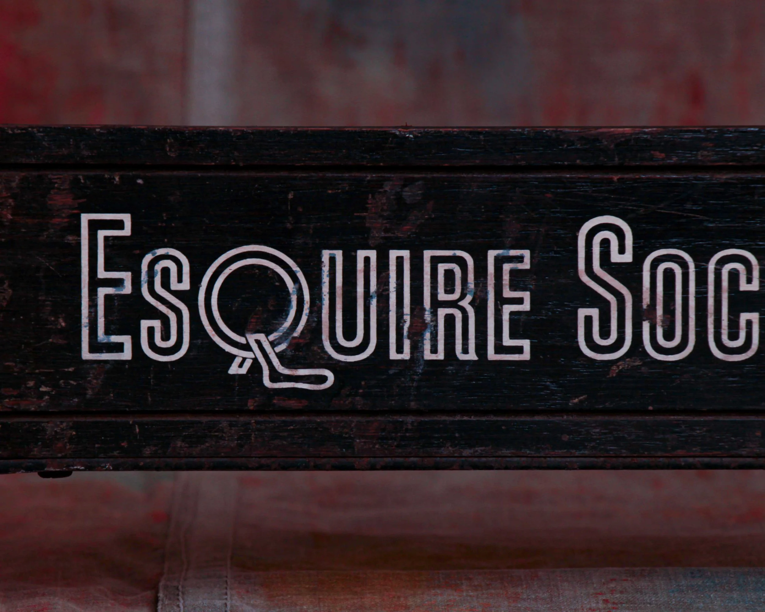
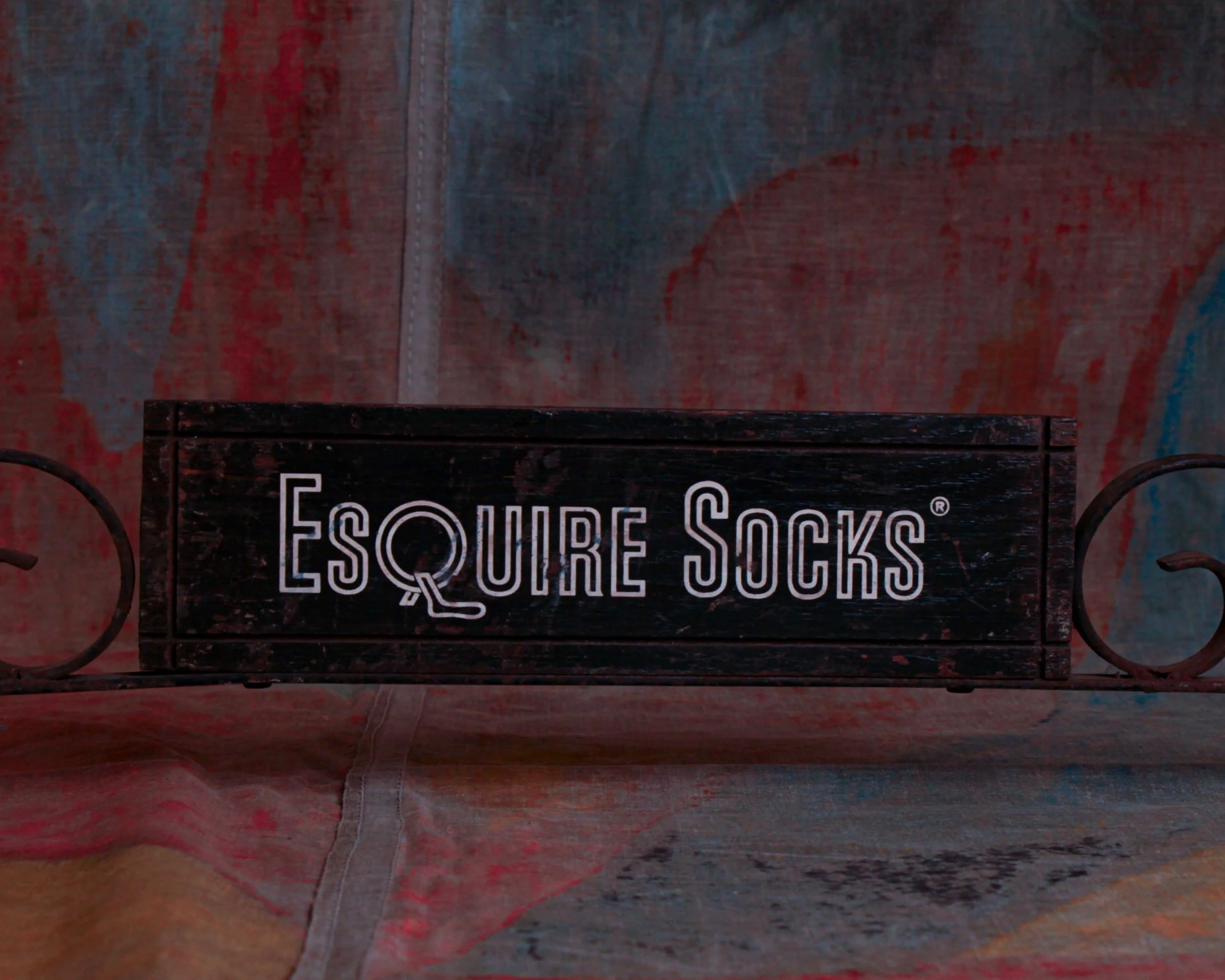
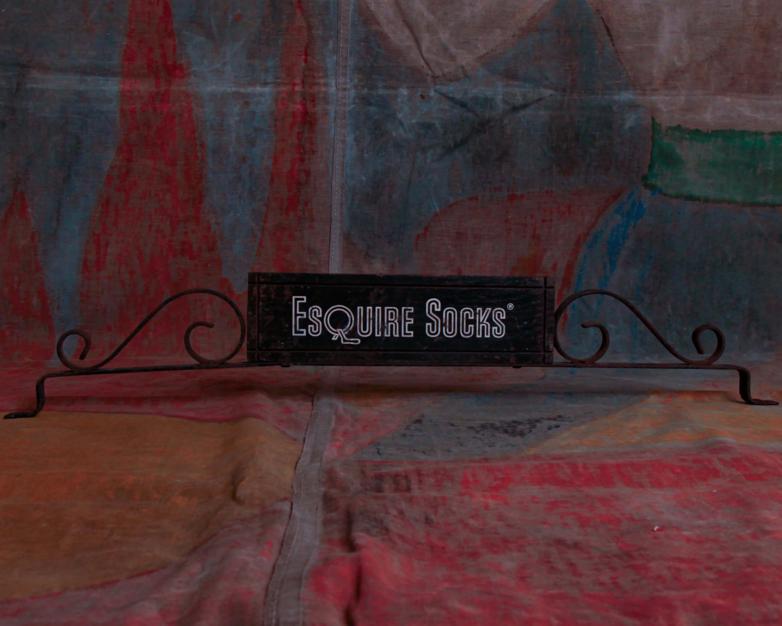
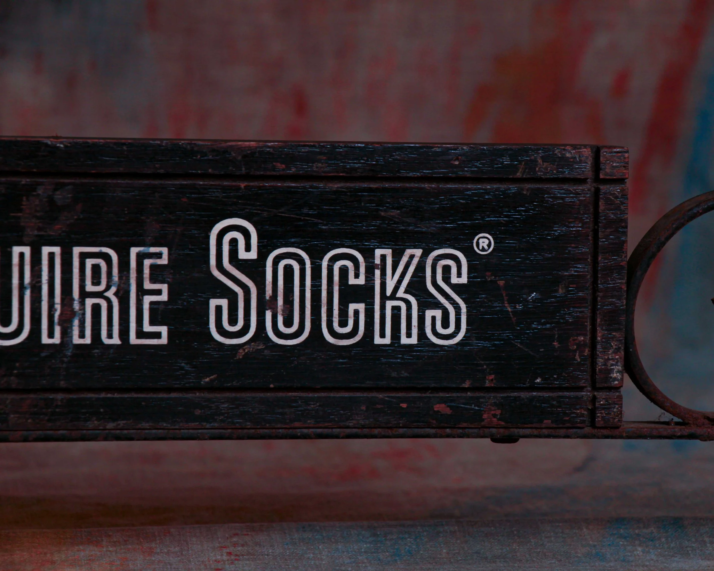
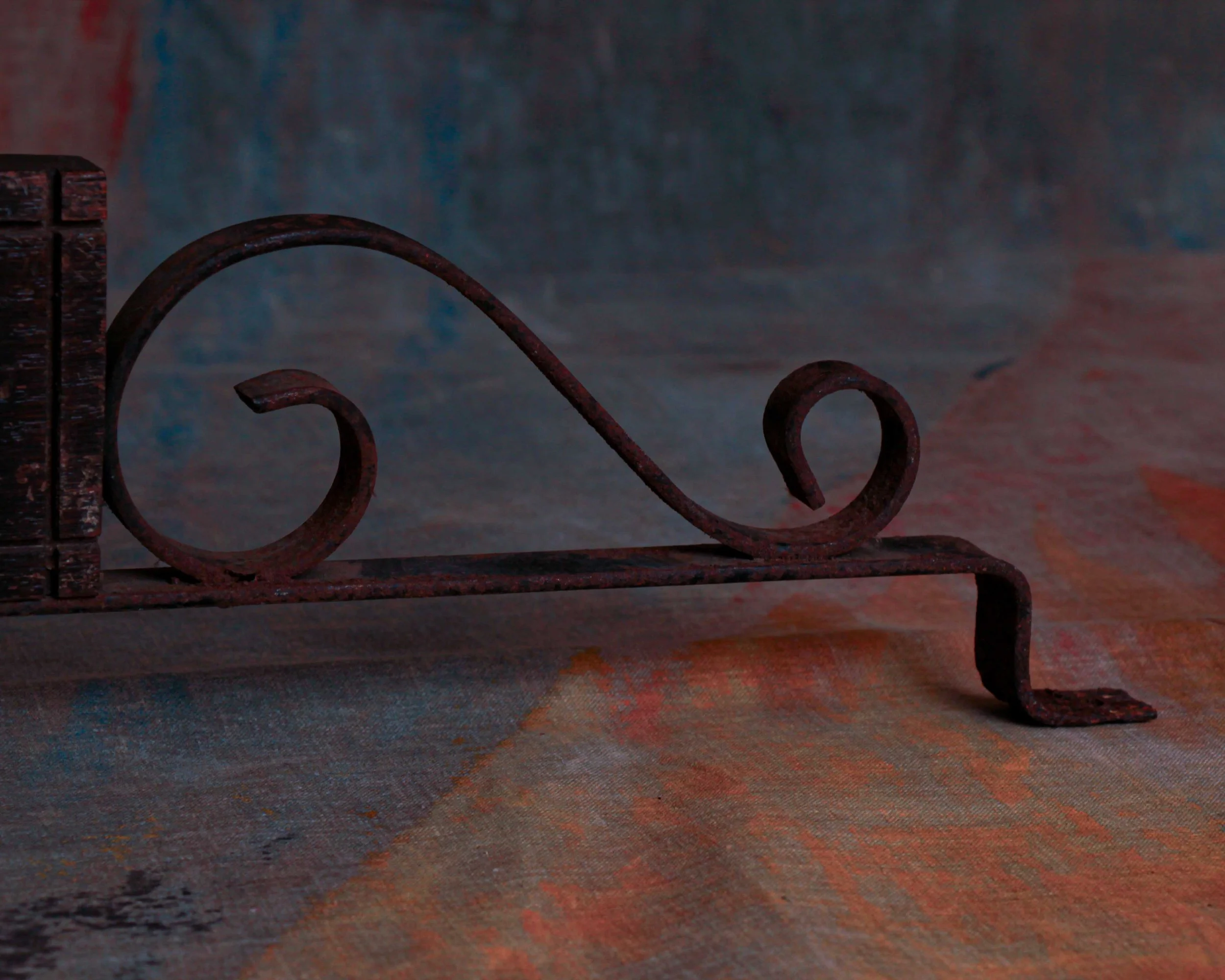
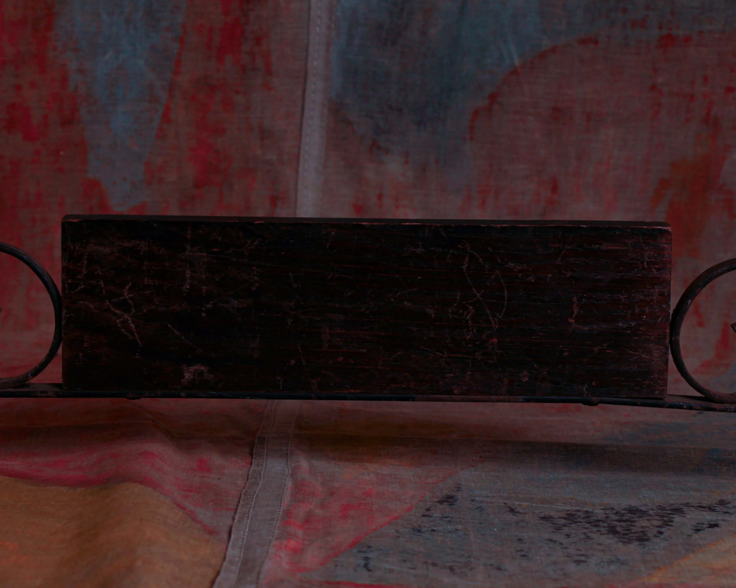
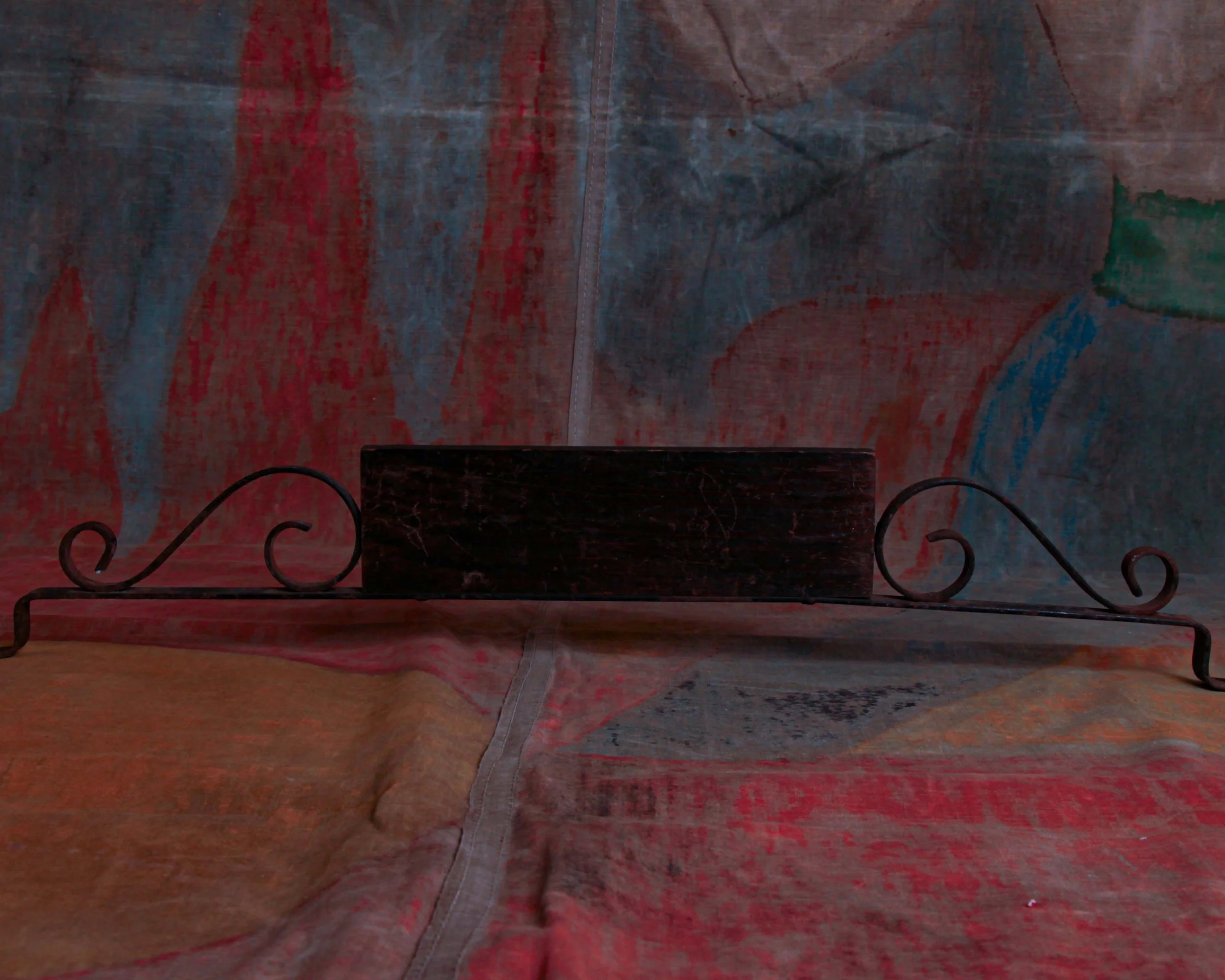
Long, low, and unapologetically elegant, this Esquire socks advertising display was made to sit at counter height and do its job without shouting. The black-painted wooden center panel carries the crisp Esquire Socks lettering in a clean, Deco-leaning typeface, while the iron scrollwork stretching out on either side adds just enough flourish to remind you this came from an era when even utilitarian objects were designed with a little swagger.
It’s easy to picture this sitting in a men’s department store sometime in the early to mid 20th century. Maybe under warm lights, surrounded by ties, handkerchiefs, and cologne, doing its part to sell the idea that socks mattered.
Category History
Esquire built its name in the 1930s as a magazine that treated style as culture, not just clothing. It mixed sharp writing, illustration, and a certain confident tone that spoke directly to men figuring out how they wanted to present themselves. Fashion, humor, politics—it all sat side by side, with a visual language that felt modern and deliberate.
Out of that identity came Esquire-branded goods, including socks, which translated the magazine’s sensibility into something wearable. These weren’t just basics—they carried the same attention to color, pattern, and presentation that showed up in the pages. Packaging, graphics, even the way they were marketed leaned into the idea that style extended to every detail.
What’s interesting is how the two reinforced each other. The magazine set the tone, the products made it tangible. You could read about style, then literally put it on.
Visually, Esquire is hard to separate from its illustrations—the “Esky” mascot, clean layouts, and bold yet controlled graphics. That same clarity carried into its merchandise.
Today, both the magazine and its branded items read as part of a larger ecosystem—media and product working together to shape taste. Not loud, not experimental for the sake of it, but confident in its point of view.