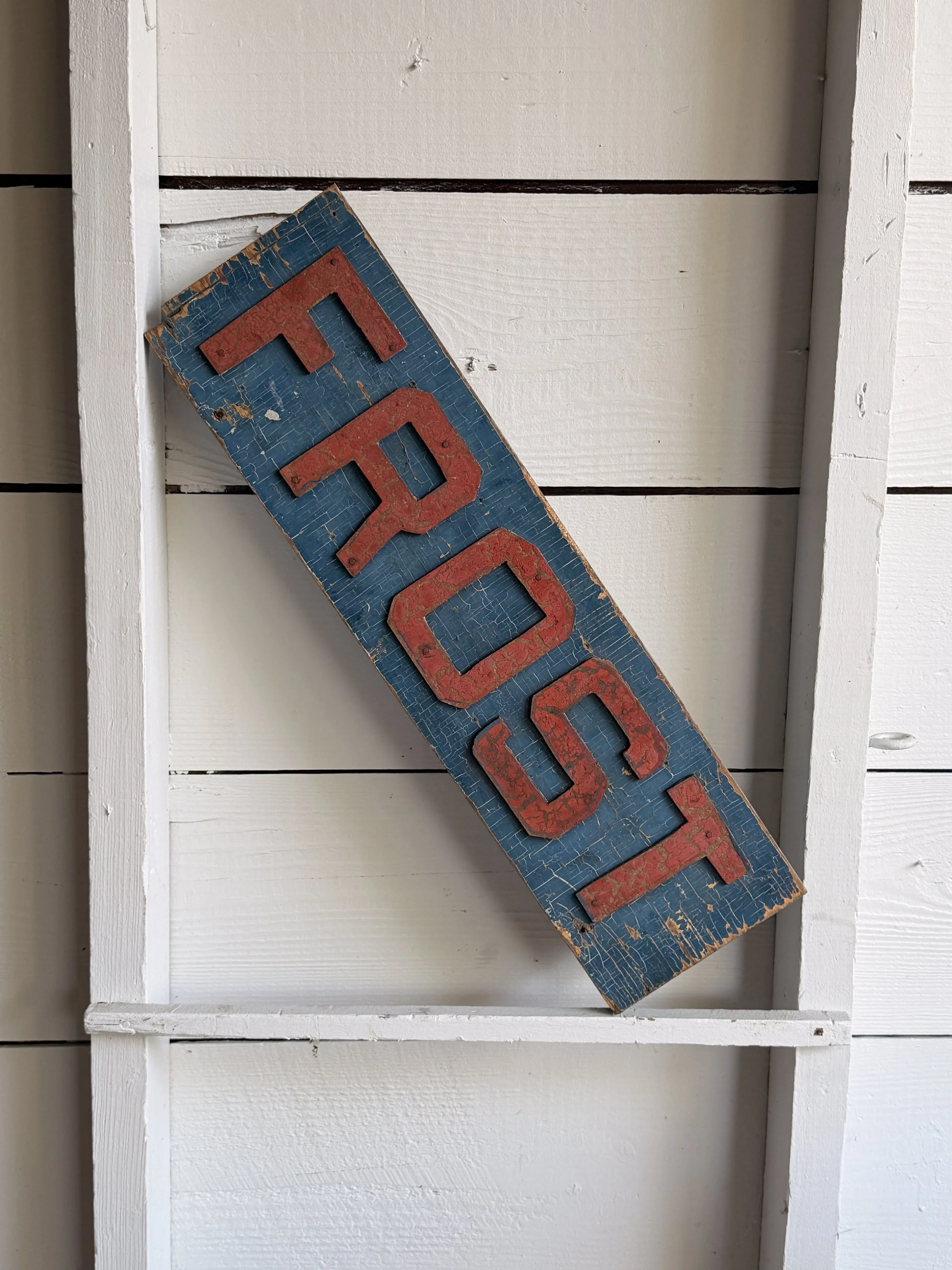
This old single-sided wooden “FROST” sign has a great homemade commercial look, with raised red letters mounted individually over a blue-painted board. The lettering is bold, blocky, and slightly irregular, giving it the feel of a sign made for visibility rather than polish. The blue background has developed a dense network of age cracks, scratches, edge wear, and losses, while the red letters have their own worn surface and chipped paint. Together, the colors have mellowed into exactly the kind of surface that makes old signage so visually appealing.
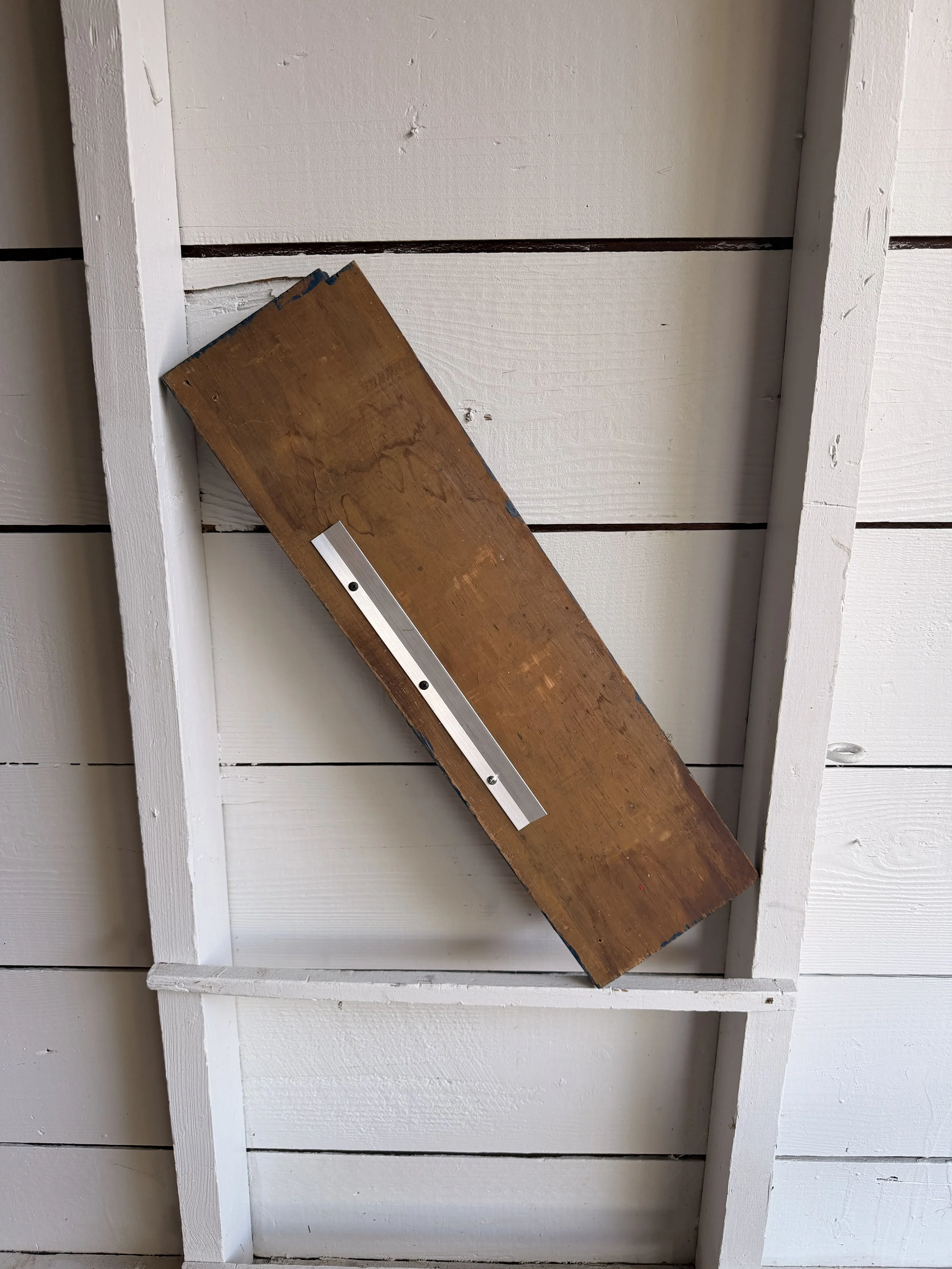
The letters appear to be separate cut wooden elements nailed or fastened to the board rather than simply painted on. That extra dimension gives the sign a nice shadow line and helps the word read clearly from a distance. The back is unfinished wood and now has a newer metal hanging cleat attached, making display easy while leaving the original face untouched.
Signs like this were common fixtures of small businesses, workshops, roadside establishments, warehouses, farm stands, garages, and local stores throughout the late 19th and early 20th centuries. Before vinyl lettering and inexpensive illuminated signage, painted wooden boards were among the simplest and most practical ways to advertise a name, product, or service. Raised letters offered an inexpensive way to make a sign feel more substantial and easier to read.
Without additional provenance, it is difficult to say exactly what “FROST” referred to. It could have been a surname, business name, product name, or part of a larger sign that no longer survives.
That ambiguity is part of its appeal. Reduced to one strong word, two colors, and a beautifully weathered surface, the sign now reads almost like found graphic art. It has the directness of old advertising, but enough mystery left in it to keep you wondering where it originally hung.
This old single-sided wooden “FROST” sign has a great homemade commercial look, with raised red letters mounted individually over a blue-painted board. The lettering is bold, blocky, and slightly irregular, giving it the feel of a sign made for visibility rather than polish. The blue background has developed a dense network of age cracks, scratches, edge wear, and losses, while the red letters have their own worn surface and chipped paint. Together, the colors have mellowed into exactly the kind of surface that makes old signage so visually appealing.
The letters appear to be separate cut wooden elements nailed or fastened to the board rather than simply painted on. That extra dimension gives the sign a nice shadow line and helps the word read clearly from a distance. The back is unfinished wood and now has a newer metal hanging cleat attached, making display easy while leaving the original face untouched.
Signs like this were common fixtures of small businesses, workshops, roadside establishments, warehouses, farm stands, garages, and local stores throughout the late 19th and early 20th centuries. Before vinyl lettering and inexpensive illuminated signage, painted wooden boards were among the simplest and most practical ways to advertise a name, product, or service. Raised letters offered an inexpensive way to make a sign feel more substantial and easier to read.
Without additional provenance, it is difficult to say exactly what “FROST” referred to. It could have been a surname, business name, product name, or part of a larger sign that no longer survives.
That ambiguity is part of its appeal. Reduced to one strong word, two colors, and a beautifully weathered surface, the sign now reads almost like found graphic art. It has the directness of old advertising, but enough mystery left in it to keep you wondering where it originally hung.