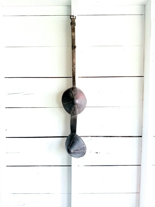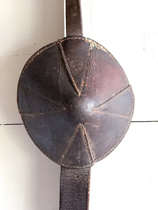
ITEM NOT AVAILABLE IMMEDIATELY—INQUIRE IF INTERESTED hello@heimweeantiques.com
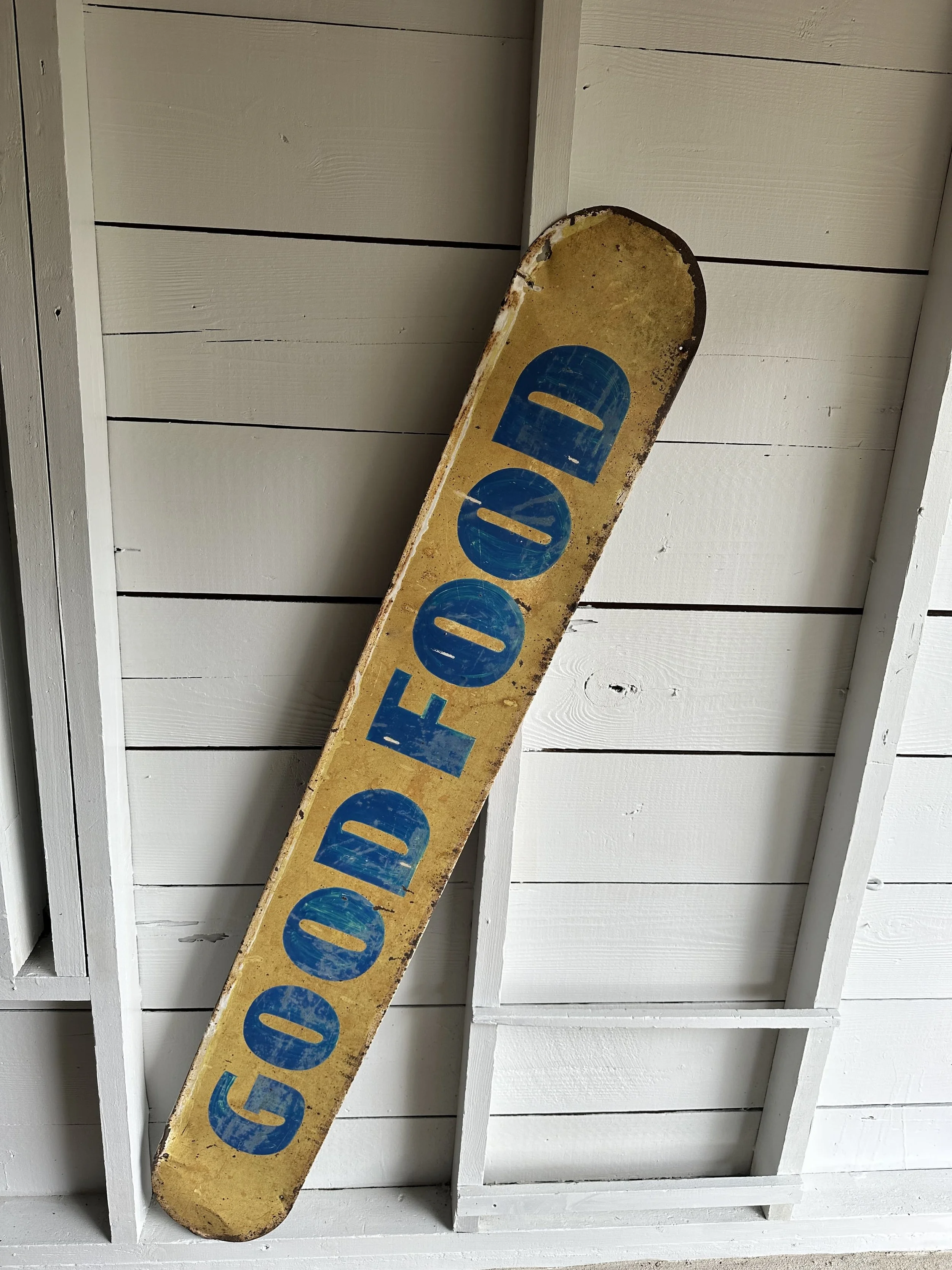
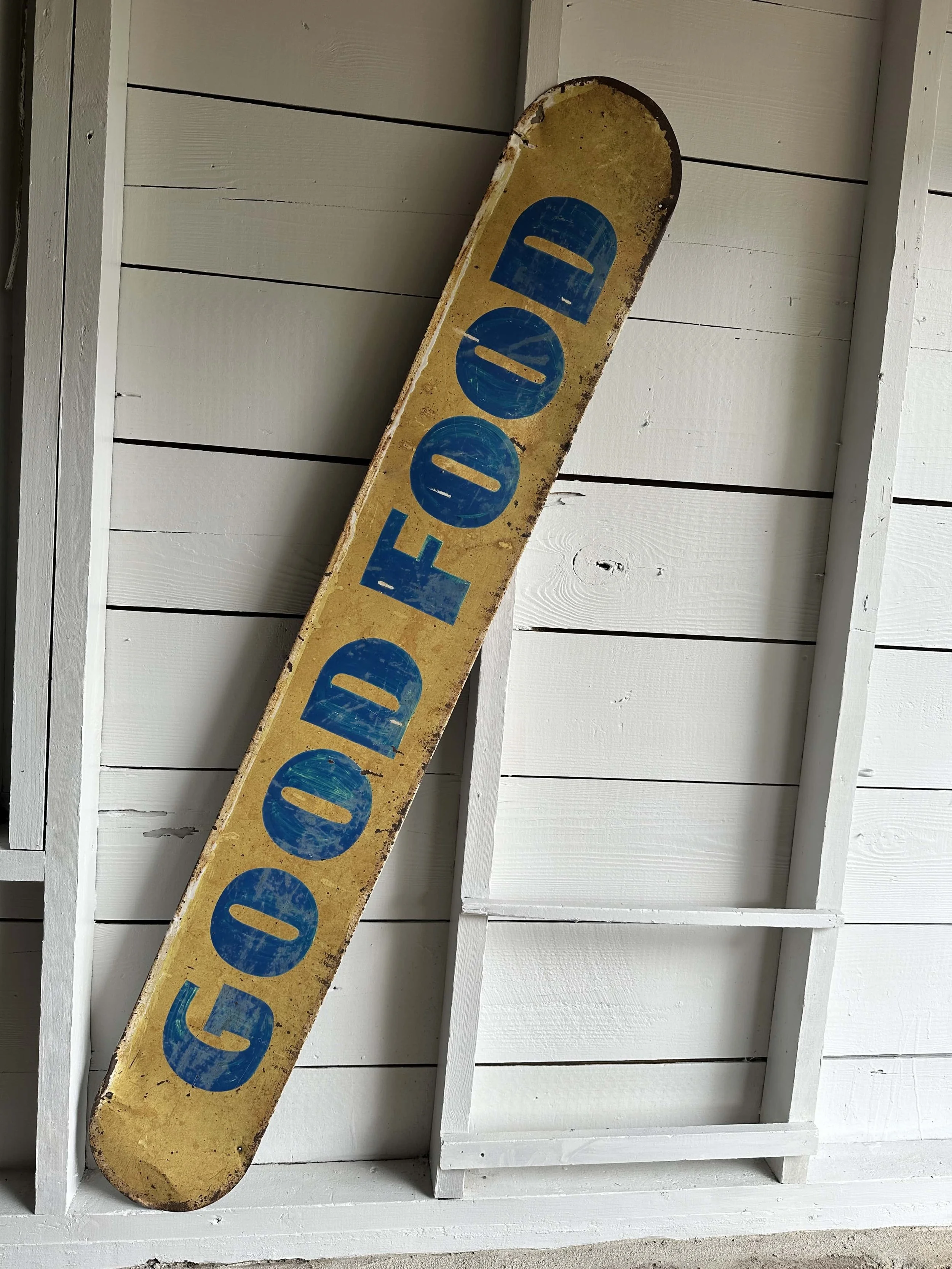
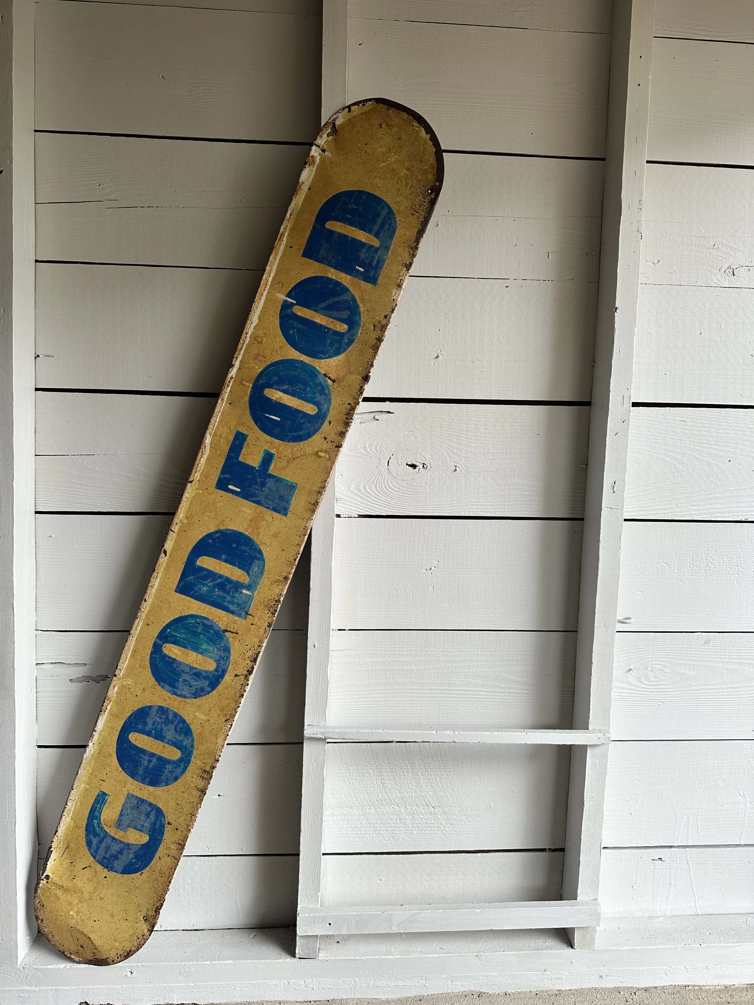
Single-sided metal sign painted in can’t-miss yellow with bright blue block letters spelling out “GOOD FOOD.” But the kicker is the faint Pepsi logo still just visible in the bottom right corner. That subtle detail ties this piece to one of America’s most iconic brands, elevating it from a generic diner sign into a slice of advertising history. It likely hung outside a café or roadside stop, you can practically hear the screen door of the diner creak open and smell the frying oil and coffee brewing.
Category History
Old metal and tin advertising signs are the original attention-grabbers—built to catch your eye, hold it, and do the selling in a split second. From the late 19th into the mid-20th century, these signs showed up everywhere: general stores, gas stations, roadside stands, and city walls. Lightweight and relatively inexpensive to produce, tin became a go-to material for brands looking to spread their message far and wide.
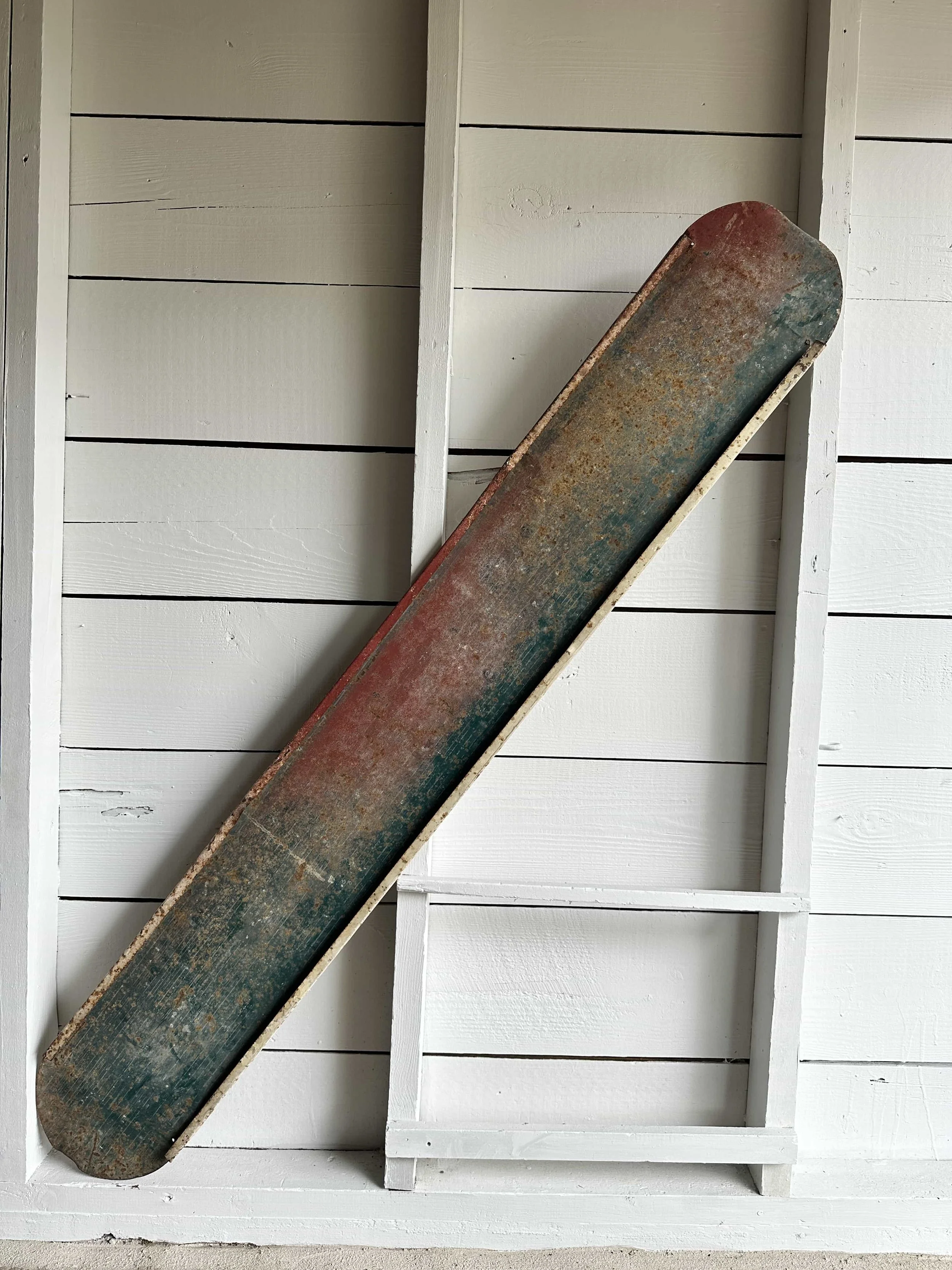
The graphics did the heavy lifting. Bold lettering, high-contrast colors, and simple imagery made them readable at a glance. Lithography allowed for detailed illustrations—everything from smiling characters to idealized products—printed directly onto the metal surface. Some were single-sided for interior use, others designed to hang outdoors and withstand weather, picking up rust, chips, and fade along the way.
What makes them interesting now is that wear. The scratches, oxidation, and softened edges aren’t flaws—they’re proof of exposure and use. Unlike porcelain enamel signs, which were built to last, tin signs often lived harder, shorter lives, making surviving examples feel a bit more accidental.
They sit comfortably between graphic design and object. Direct, a little rough around the edges, and still doing their job decades later—pulling your attention without asking politely.
ITEM NOT AVAILABLE IMMEDIATELY—INQUIRE IF INTERESTED hello@heimweeantiques.com
Single-sided metal sign painted in can’t-miss yellow with bright blue block letters spelling out “GOOD FOOD.” But the kicker is the faint Pepsi logo still just visible in the bottom right corner. That subtle detail ties this piece to one of America’s most iconic brands, elevating it from a generic diner sign into a slice of advertising history. It likely hung outside a café or roadside stop, you can practically hear the screen door of the diner creak open and smell the frying oil and coffee brewing.
Category History
Old metal and tin advertising signs are the original attention-grabbers—built to catch your eye, hold it, and do the selling in a split second. From the late 19th into the mid-20th century, these signs showed up everywhere: general stores, gas stations, roadside stands, and city walls. Lightweight and relatively inexpensive to produce, tin became a go-to material for brands looking to spread their message far and wide.
The graphics did the heavy lifting. Bold lettering, high-contrast colors, and simple imagery made them readable at a glance. Lithography allowed for detailed illustrations—everything from smiling characters to idealized products—printed directly onto the metal surface. Some were single-sided for interior use, others designed to hang outdoors and withstand weather, picking up rust, chips, and fade along the way.
What makes them interesting now is that wear. The scratches, oxidation, and softened edges aren’t flaws—they’re proof of exposure and use. Unlike porcelain enamel signs, which were built to last, tin signs often lived harder, shorter lives, making surviving examples feel a bit more accidental.
They sit comfortably between graphic design and object. Direct, a little rough around the edges, and still doing their job decades later—pulling your attention without asking politely.