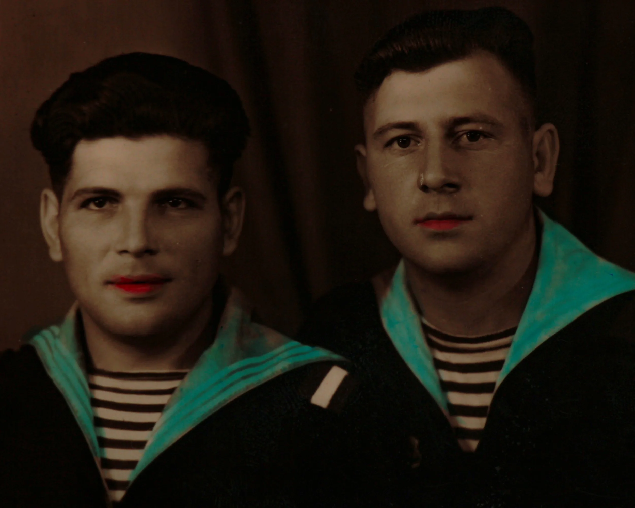
At its core, it’s a studio portrait, two young men posed shoulder to shoulder in their naval uniforms, striped undershirts peeking through, posture straight, expressions somewhere between composed and curious. But look a little closer and the photograph starts to shift. This isn’t just a photograph, it’s been hand-touched, carefully brought to life with subtle color.
The sailor collars carry a soft wash of turquoise, just enough to catch the eye without overpowering the image. Their lips are tinted a gentle red, giving warmth to otherwise monochrome faces. It’s restrained, deliberate work, the kind of coloring that sits right on the edge between realism and interpretation.
That practice, hand-coloring black and white photographs, was common in the first half of the 20th century, especially for portraits like this. It was a way of bridging the gap before color photography became widely accessible. But more than that, it added a layer of intimacy.
Before color film became practical and affordable, there was a long stretch of time when people still wanted their photographs to feel lifelike, not just accurate, but warm. That’s where hand-coloring stepped in.
Hand-painted Photography
In the early decades of the 20th century, studios routinely offered hand-painted photographs as an upgrade. A finished black and white print would be passed to a colorist, often someone trained in miniature painting or retouching, who would work directly on the surface using transparent dyes, watercolors, or oil tints. The goal wasn’t to completely repaint the image, but to breathe just enough color into it to suggest reality. Cheeks might get a soft blush, lips a touch of red, uniforms or dresses a gentle wash of color. Done well, it feels almost invisible.
The materials mattered. Photographic papers were slightly absorbent, which allowed pigments to settle in without fully covering the image beneath. Colorists worked in thin layers, building tone gradually, always careful not to obscure the fine detail captured by the camera. It was a balancing act between enhancement and restraint.
This process also introduced a human hand into what was otherwise a mechanical medium. Every piece is a little different. Two prints from the same negative could be colored in entirely different ways depending on the artist’s choices. That’s part of the appeal now. You’re not just looking at a photograph, you’re seeing a collaboration between lens and brush.
By the 1940s and 50s, as true color photography became more accessible, the practice began to fade. But for a few decades, this was how photographs crossed over from documentation into something closer to portraiture.
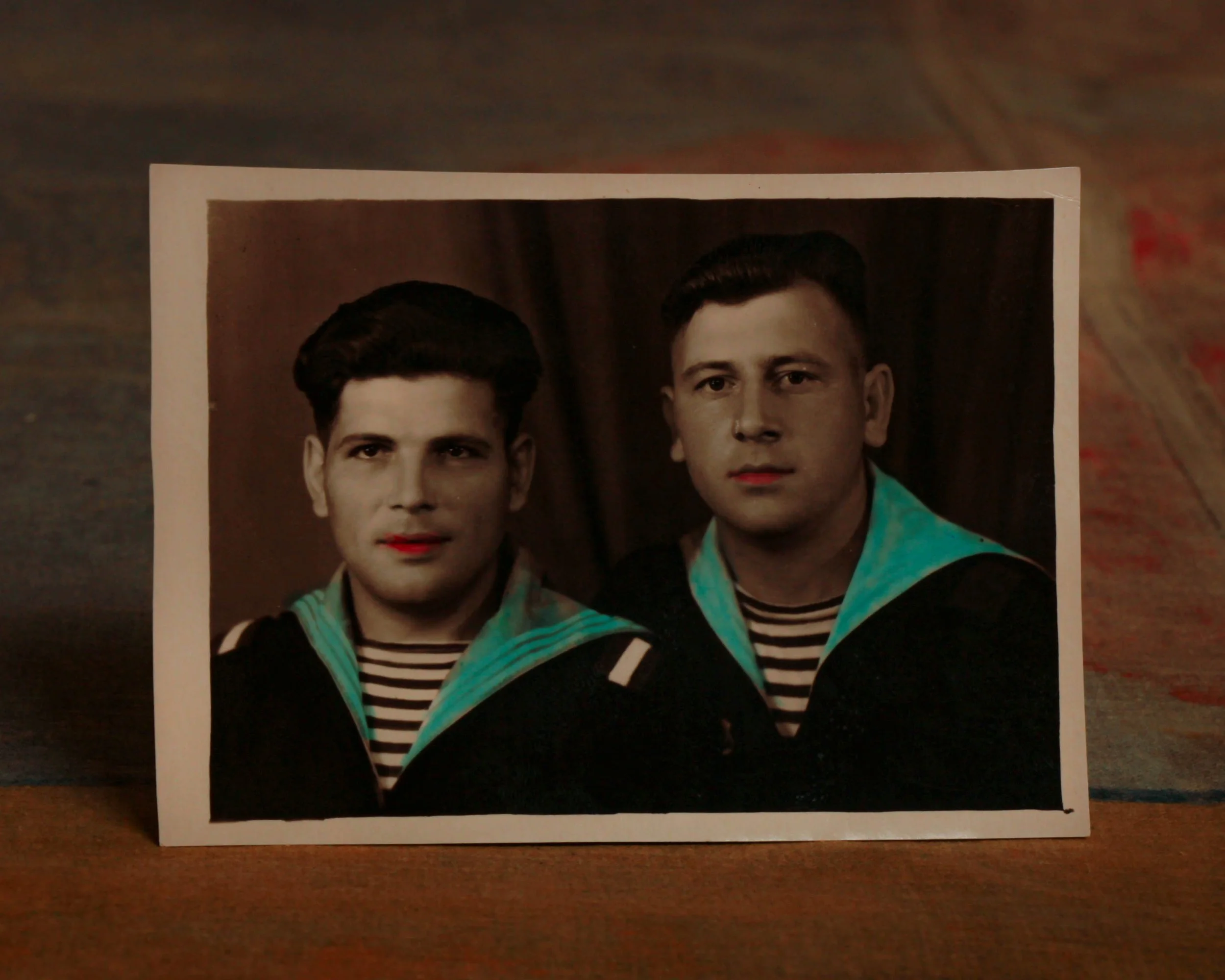