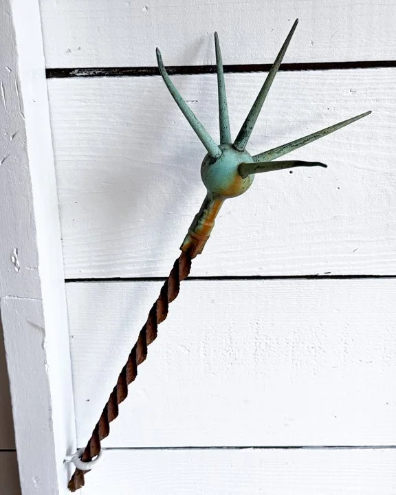


ITEM NOT AVAILABLE IMMEDIATELY—INQUIRE IF INTERESTED hello@heimweeantiques.com
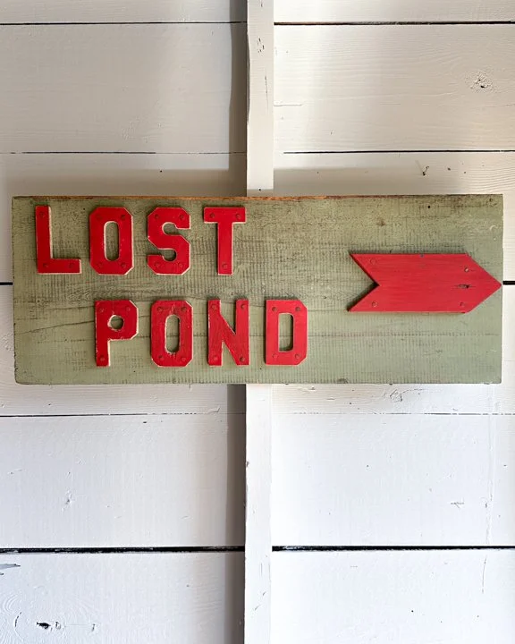
This single-sided wooden sign points the way to “Lost Pond.” Hand-painted in a weathered sage green, the board sets the stage for bold, blocky red letters that look like they were punched straight out of an old summer camp dream. Each letter is nailed down with a kind of rugged charm—slightly uneven, a little scuffed, carrying the patina of countless seasons outdoors. And then there’s the arrow. Bright red, simple, and to the point—probably leading you down a dirt trail, through the trees, toward mystery and maybe even mischief.
Category History
In the first half of the 20th century, before vinyl and neon took over, a good sign was as much about the hand as the message. Most small businesses relied on local painters or sign makers who worked with wood panels, house paint, and a steady eye. The result: one-of-a-kind pieces where every letter carries a bit of personality—slightly off, sometimes bold, sometimes improvised, but never generic.
These weren’t precious objects at the time. They hung outside in the weather, took on sun fade, rain streaks, and the occasional repaint. That’s part of the appeal now. The layered paint, ghost lettering, and uneven brushwork tell you exactly how they lived.
What stands out is the balance between function and instinct. The maker wasn’t chasing perfection—they were chasing readability, speed, and impact. And in doing so, they created something far more human. Each sign feels like a handshake from a past business owner, direct and unfiltered.
ITEM NOT AVAILABLE IMMEDIATELY—INQUIRE IF INTERESTED hello@heimweeantiques.com
This single-sided wooden sign points the way to “Lost Pond.” Hand-painted in a weathered sage green, the board sets the stage for bold, blocky red letters that look like they were punched straight out of an old summer camp dream. Each letter is nailed down with a kind of rugged charm—slightly uneven, a little scuffed, carrying the patina of countless seasons outdoors. And then there’s the arrow. Bright red, simple, and to the point—probably leading you down a dirt trail, through the trees, toward mystery and maybe even mischief.
Category History
In the first half of the 20th century, before vinyl and neon took over, a good sign was as much about the hand as the message. Most small businesses relied on local painters or sign makers who worked with wood panels, house paint, and a steady eye. The result: one-of-a-kind pieces where every letter carries a bit of personality—slightly off, sometimes bold, sometimes improvised, but never generic.
These weren’t precious objects at the time. They hung outside in the weather, took on sun fade, rain streaks, and the occasional repaint. That’s part of the appeal now. The layered paint, ghost lettering, and uneven brushwork tell you exactly how they lived.
What stands out is the balance between function and instinct. The maker wasn’t chasing perfection—they were chasing readability, speed, and impact. And in doing so, they created something far more human. Each sign feels like a handshake from a past business owner, direct and unfiltered.