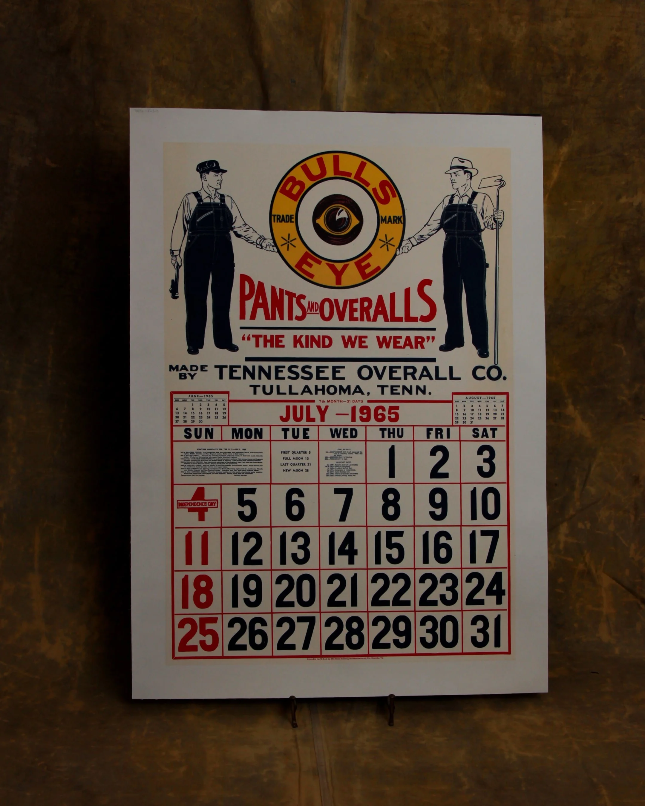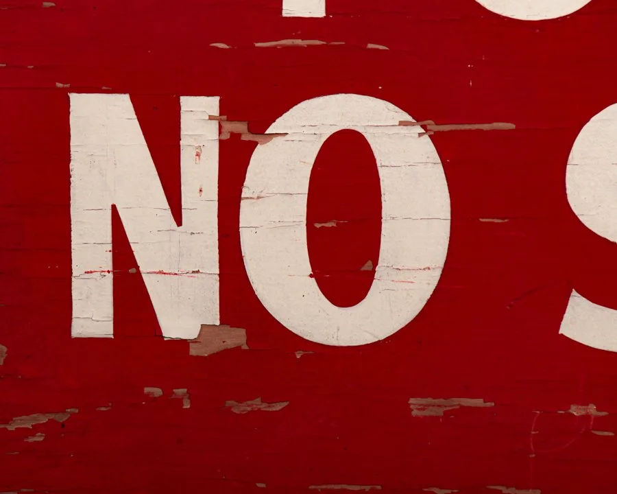


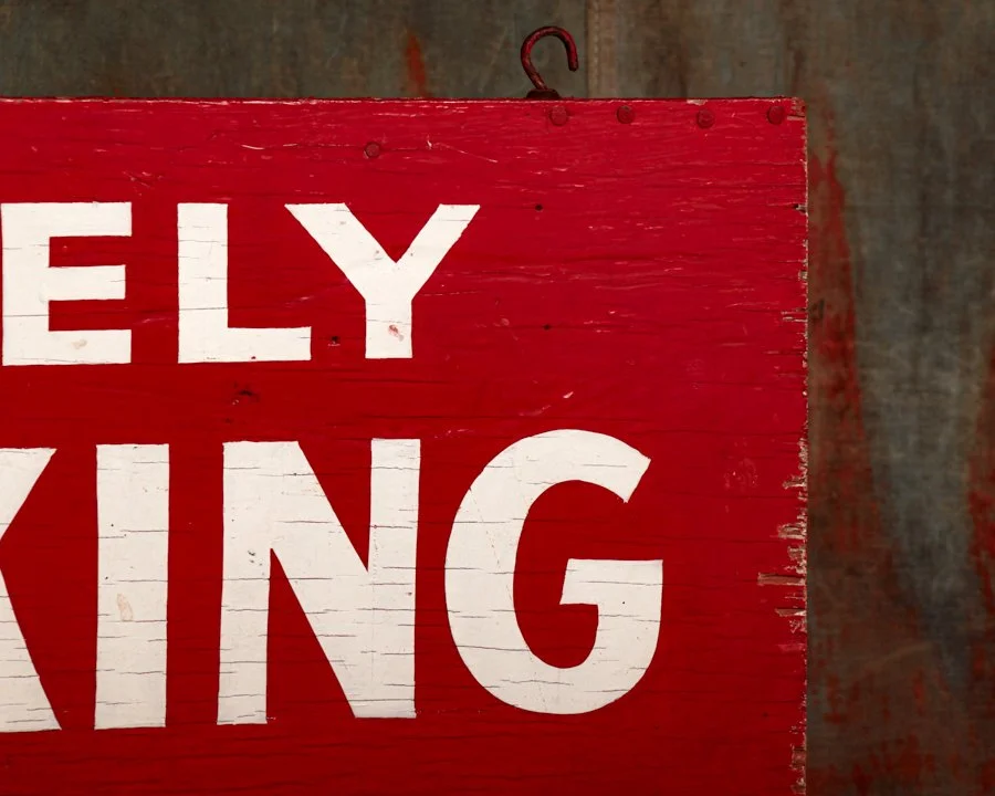


This double-sided wooden sign doesn’t just suggest no smoking, it demands it, “by orders of the L.A. Fire Dept.” Hand-painted in thick white block letters on a fire-engine red background, it’s got the kind of visual authority that makes you sit up straight. Dating to the mid-20th century and measuring 18" x 36", this piece was likely hung in or around city buildings where even a spark could be a serious problem. Both sides still pack a visual punch, with weathered edges and paint crackling that add just the right dose of grit. Bonus points for the original hanging hooks still intact.
Category History
In the first half of the 20th century, before vinyl and neon took over, a good sign was as much about the hand as the message. Most small businesses relied on local painters or sign makers who worked with wood panels, house paint, and a steady eye. The result: one-of-a-kind pieces where every letter carries a bit of personality—slightly off, sometimes bold, sometimes improvised, but never generic.
These weren’t precious objects at the time. They hung outside in the weather, took on sun fade, rain streaks, and the occasional repaint. That’s part of the appeal now. The layered paint, ghost lettering, and uneven brushwork tell you exactly how they lived.
What stands out is the balance between function and instinct. The maker wasn’t chasing perfection—they were chasing readability, speed, and impact. And in doing so, they created something far more human. Each sign feels like a handshake from a past business owner, direct and unfiltered.