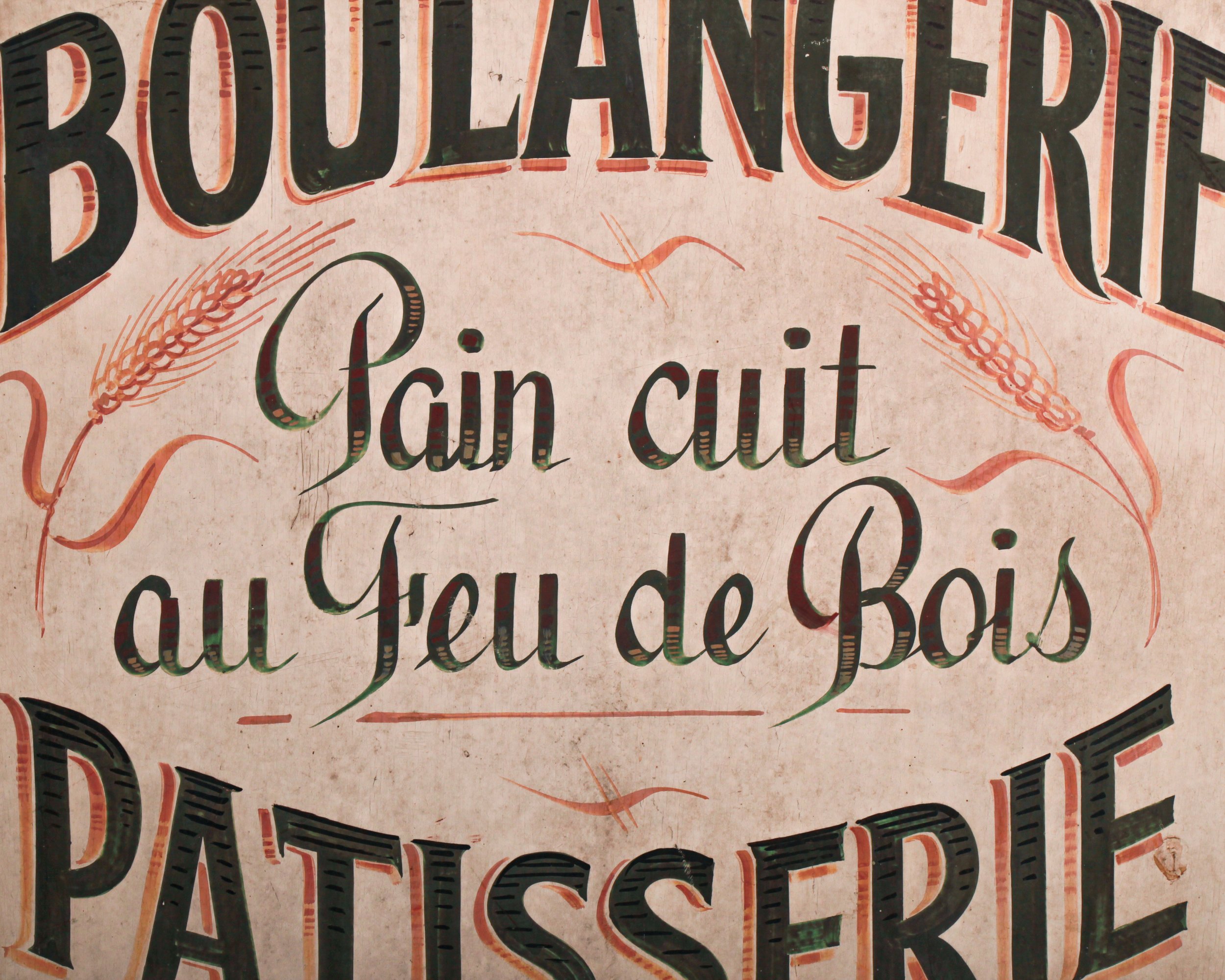
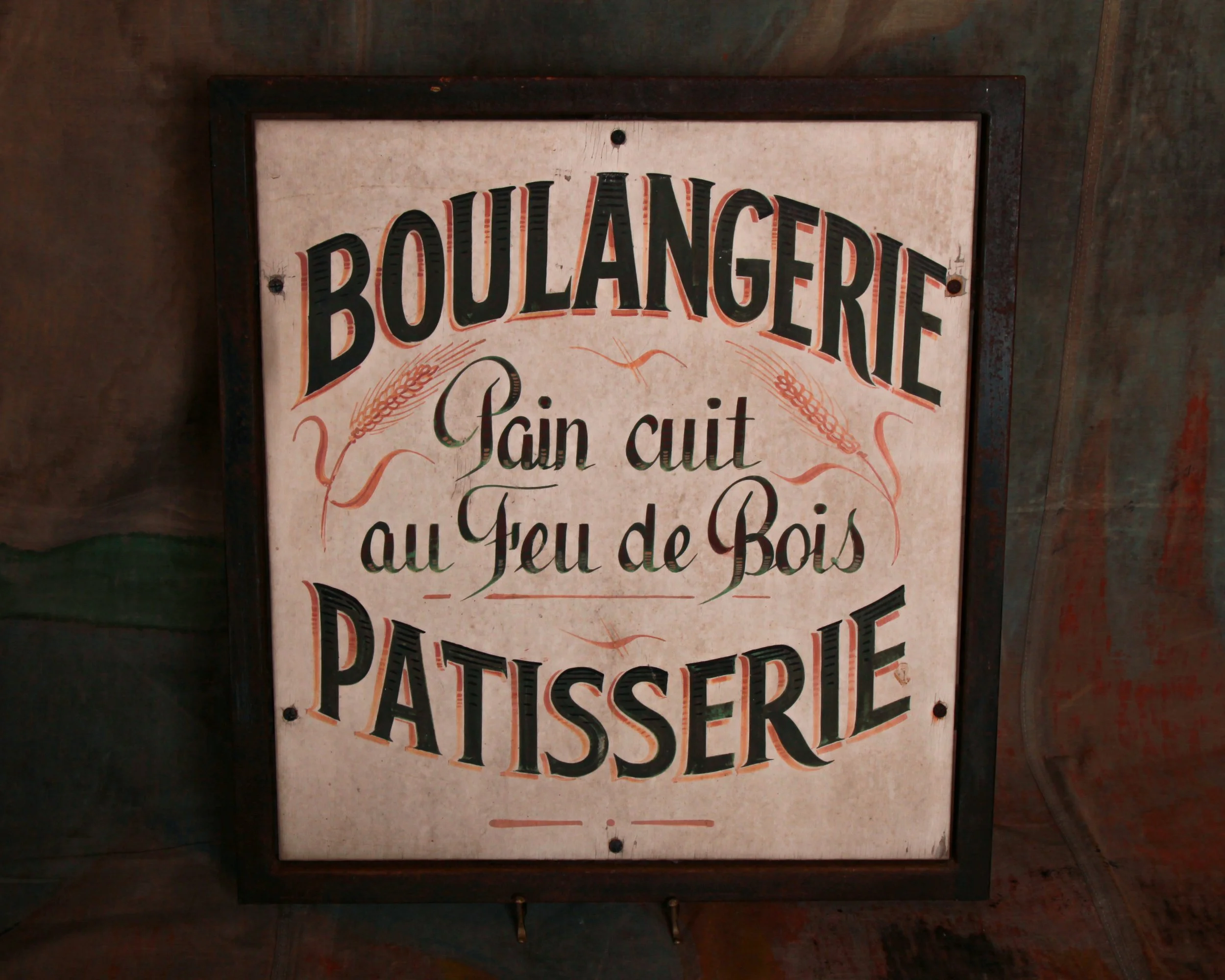
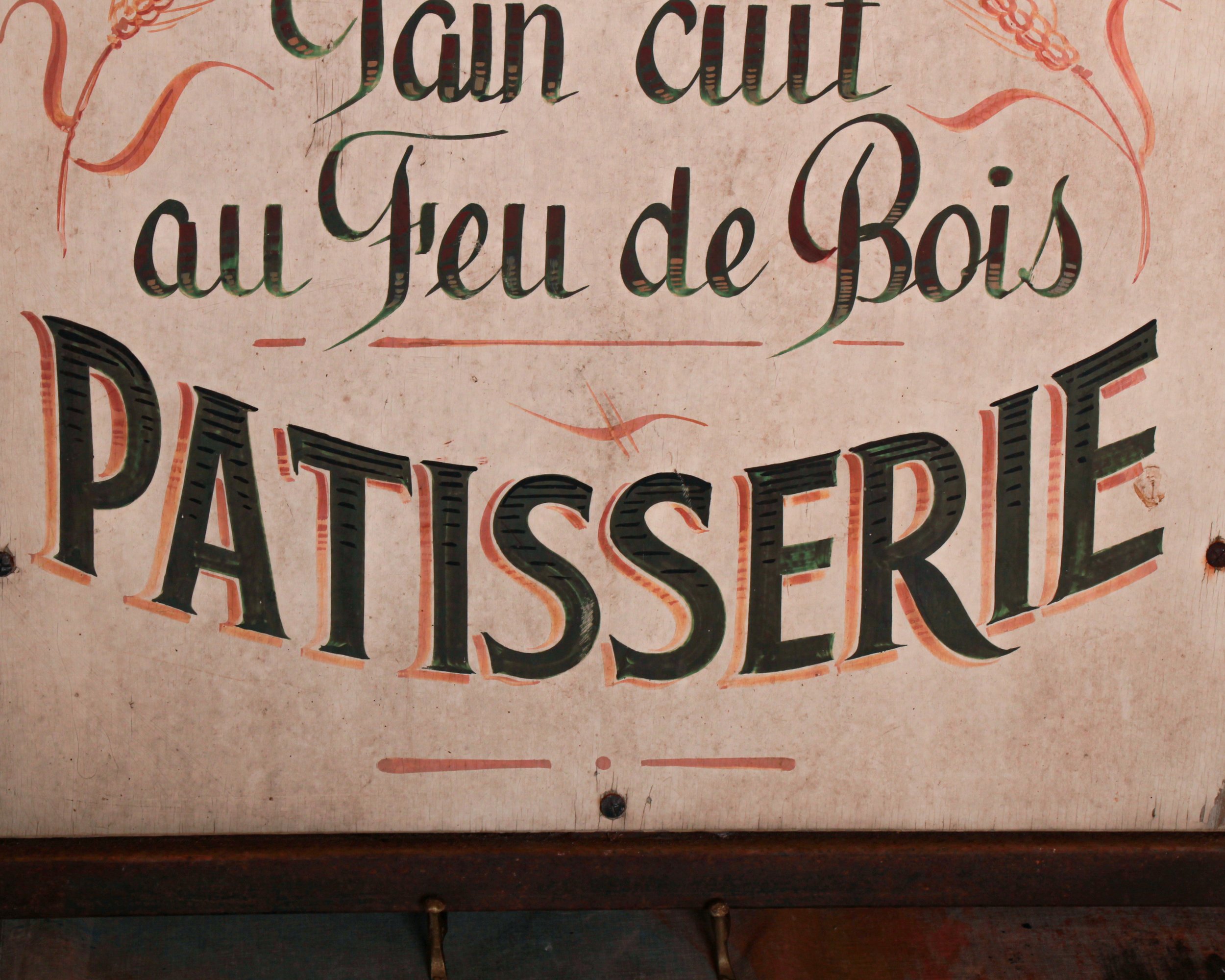
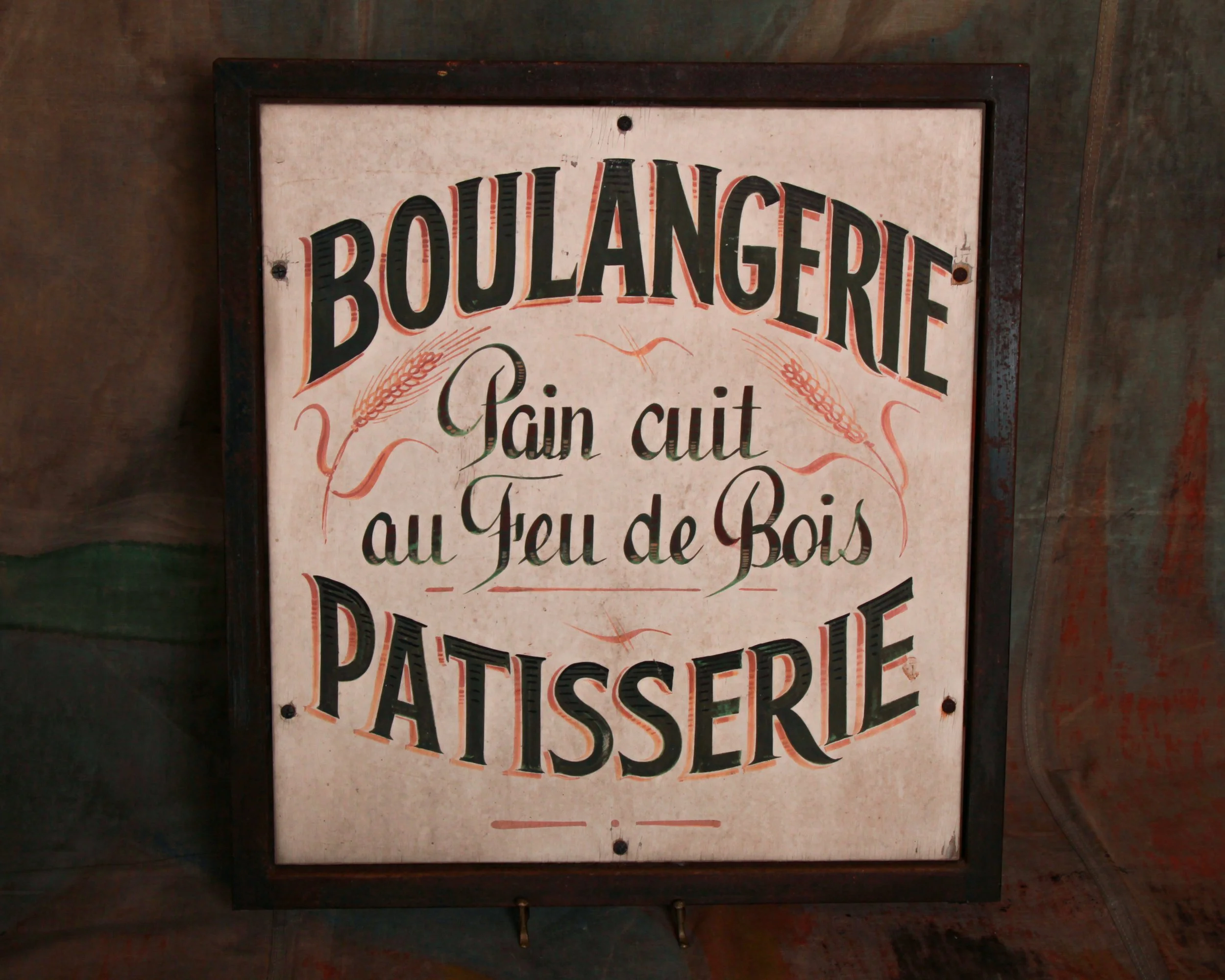
“BOULANGERIE PATISSERIE – Pain cuit au feu de bois.” In plain terms: bread baked in a wood-fired oven. In practice, it’s a quiet declaration of craft, patience, and a standard that predates shortcuts. France has long treated bread as something closer to heritage than food, with regulations, traditions, and daily rituals built around it. A sign like this wasn’t decoration. It was a statement of legitimacy.
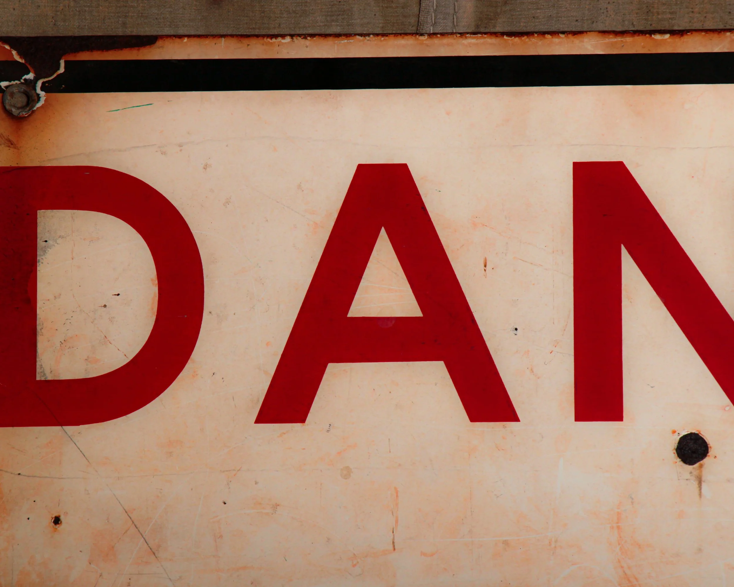
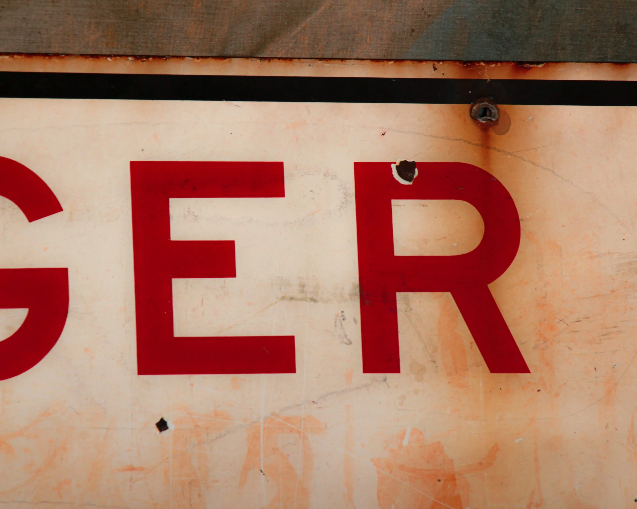
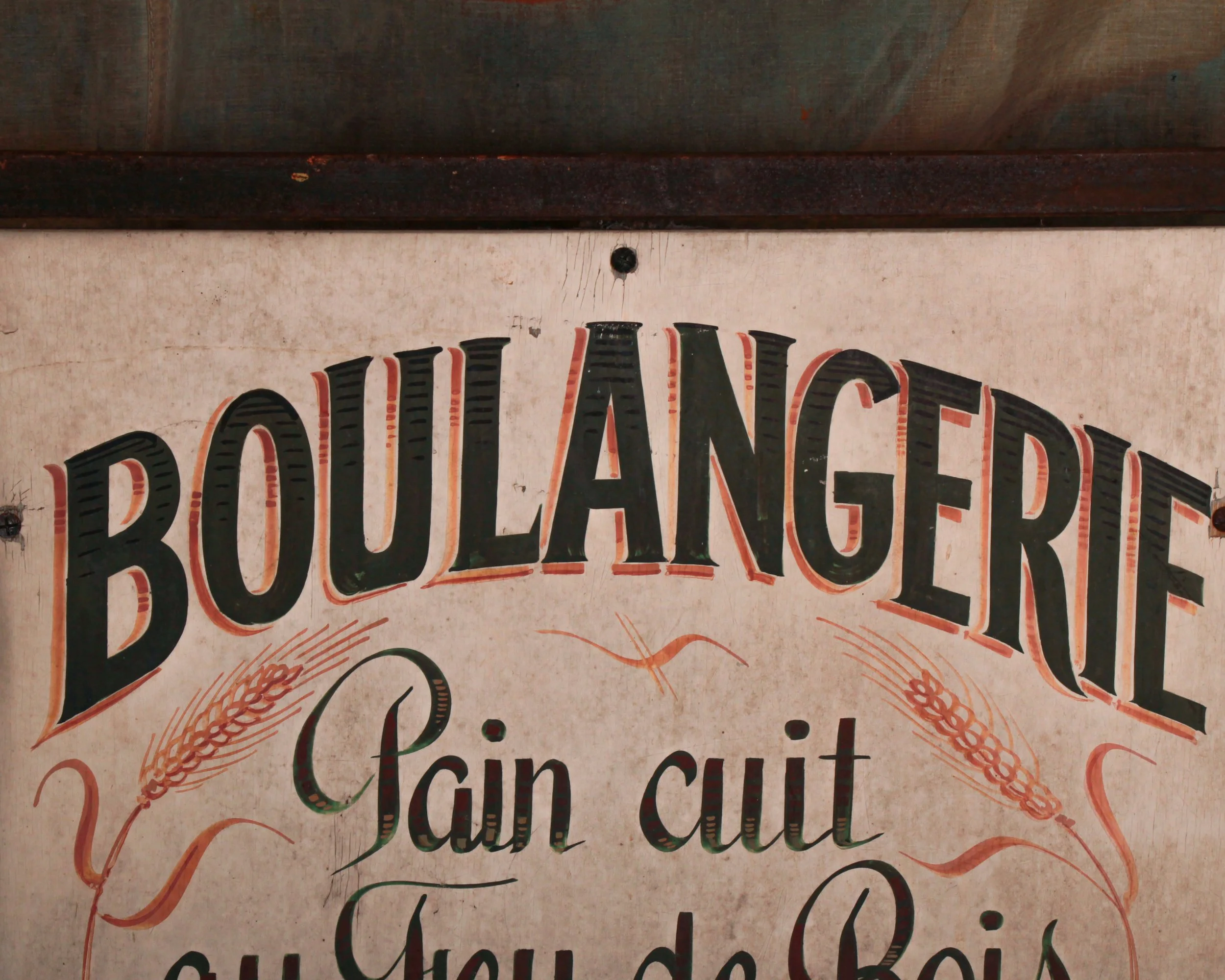
Dating to the 1930s, this piece lands right in that sweet spot where traditional hand-painted signage was still the norm, but design had begun to sharpen. The typography carries real presence. The bold, arched lettering feels confident without being loud, while the central script softens the message, almost conversational, like a baker explaining what makes his bread worth coming back for. Subtle red shadowing gives the letters a lift, and the flanking wheat sheaves tie the whole thing back to its source without overcomplicating the composition.
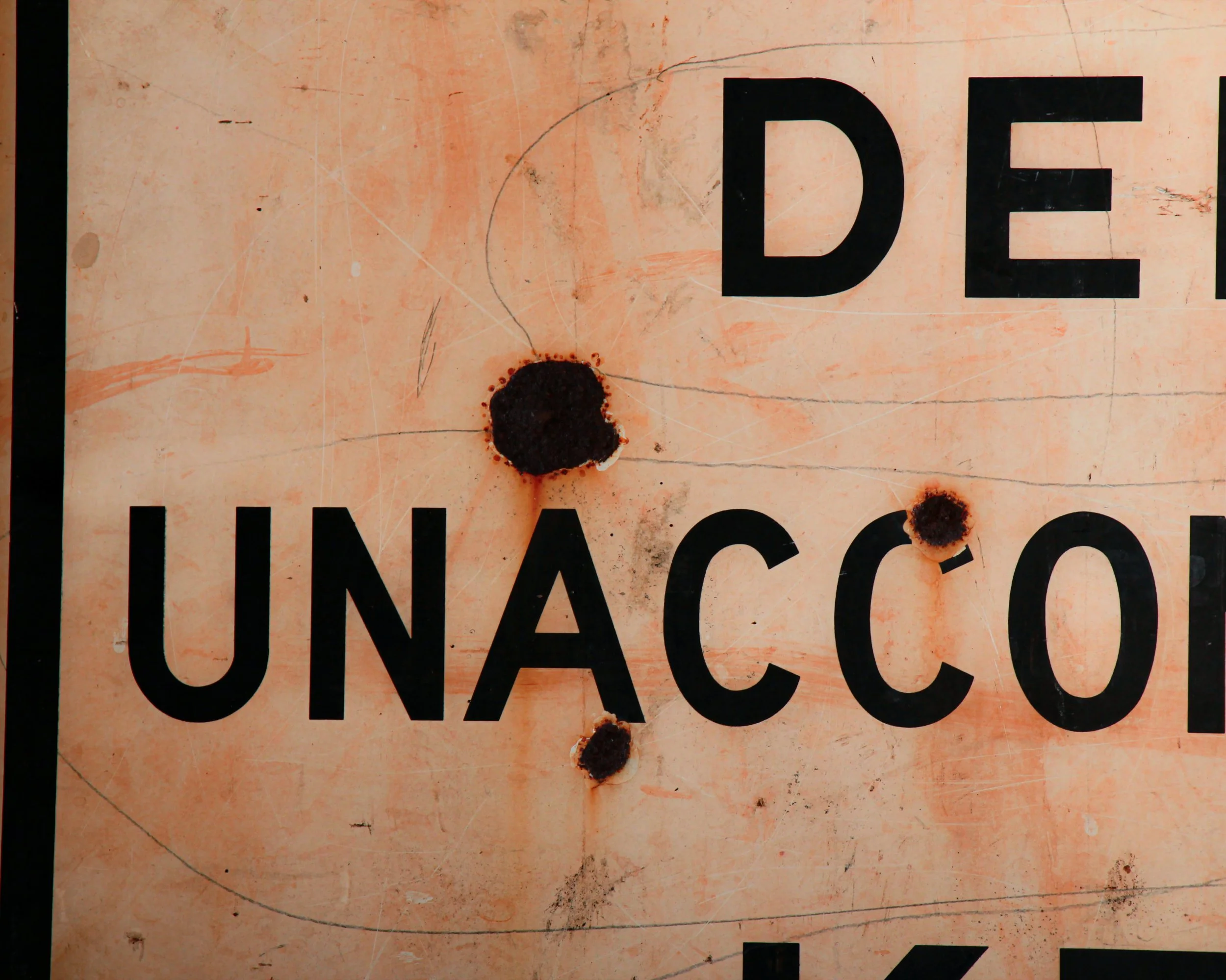
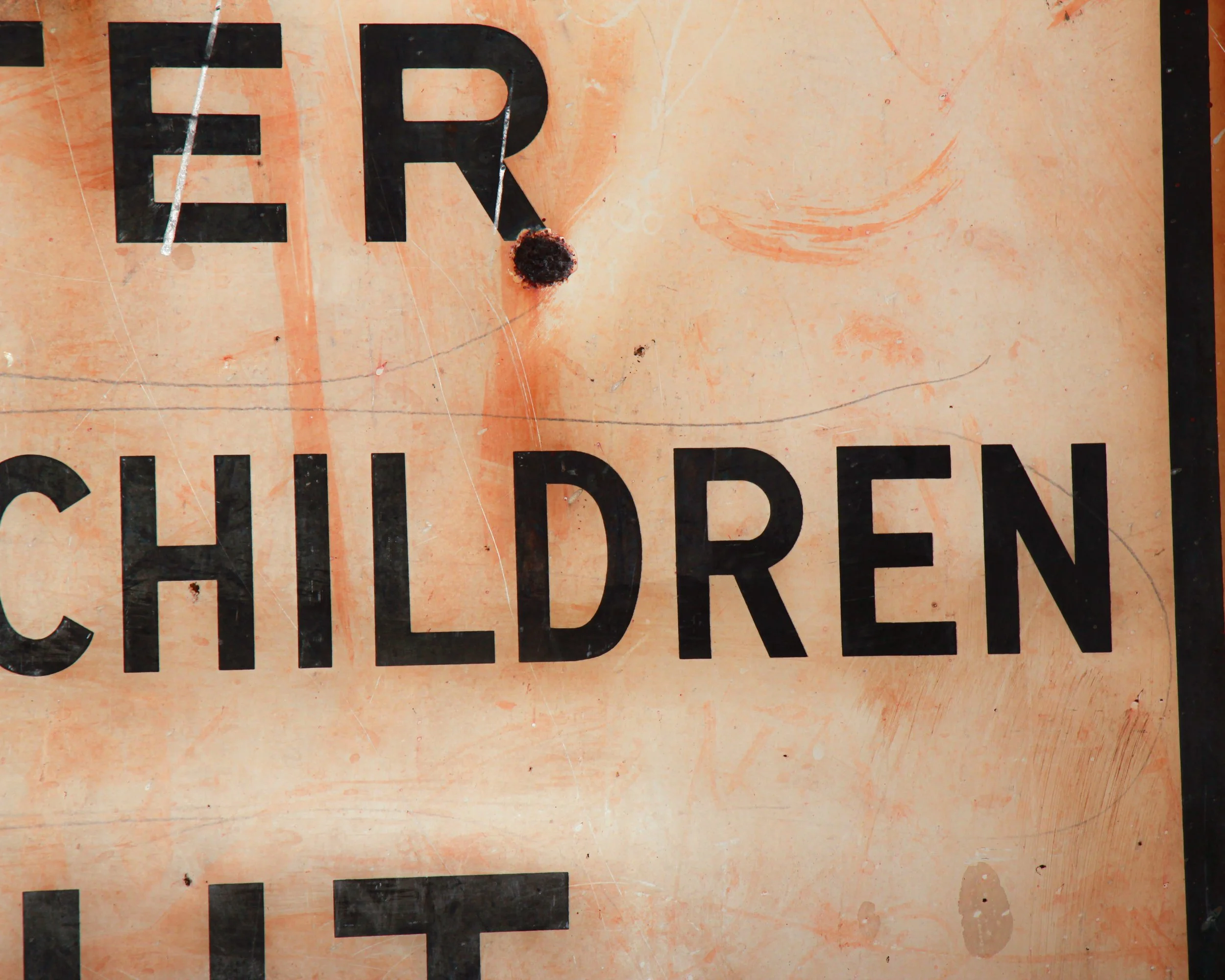
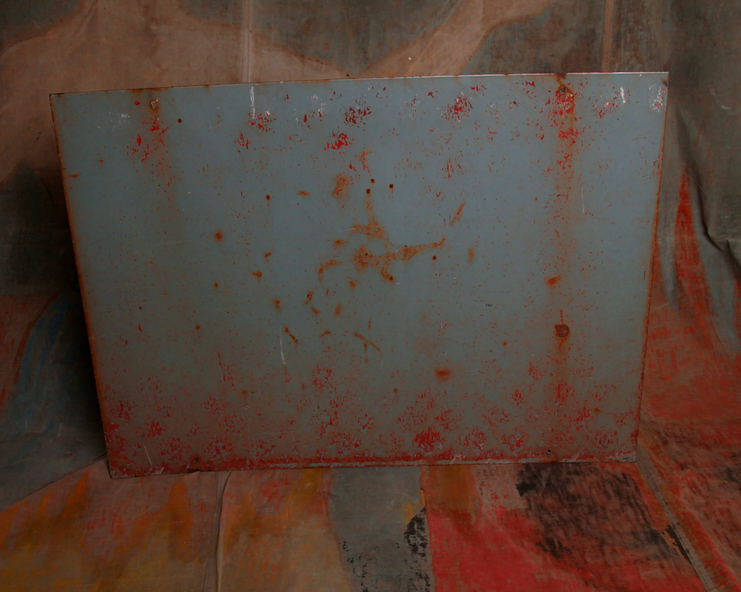
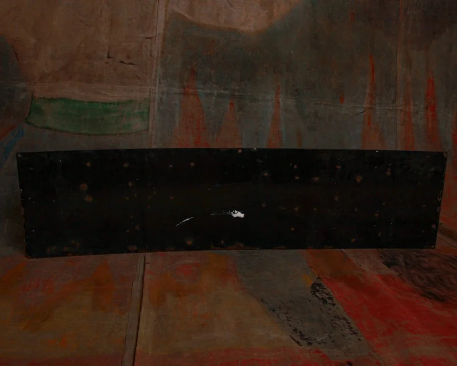
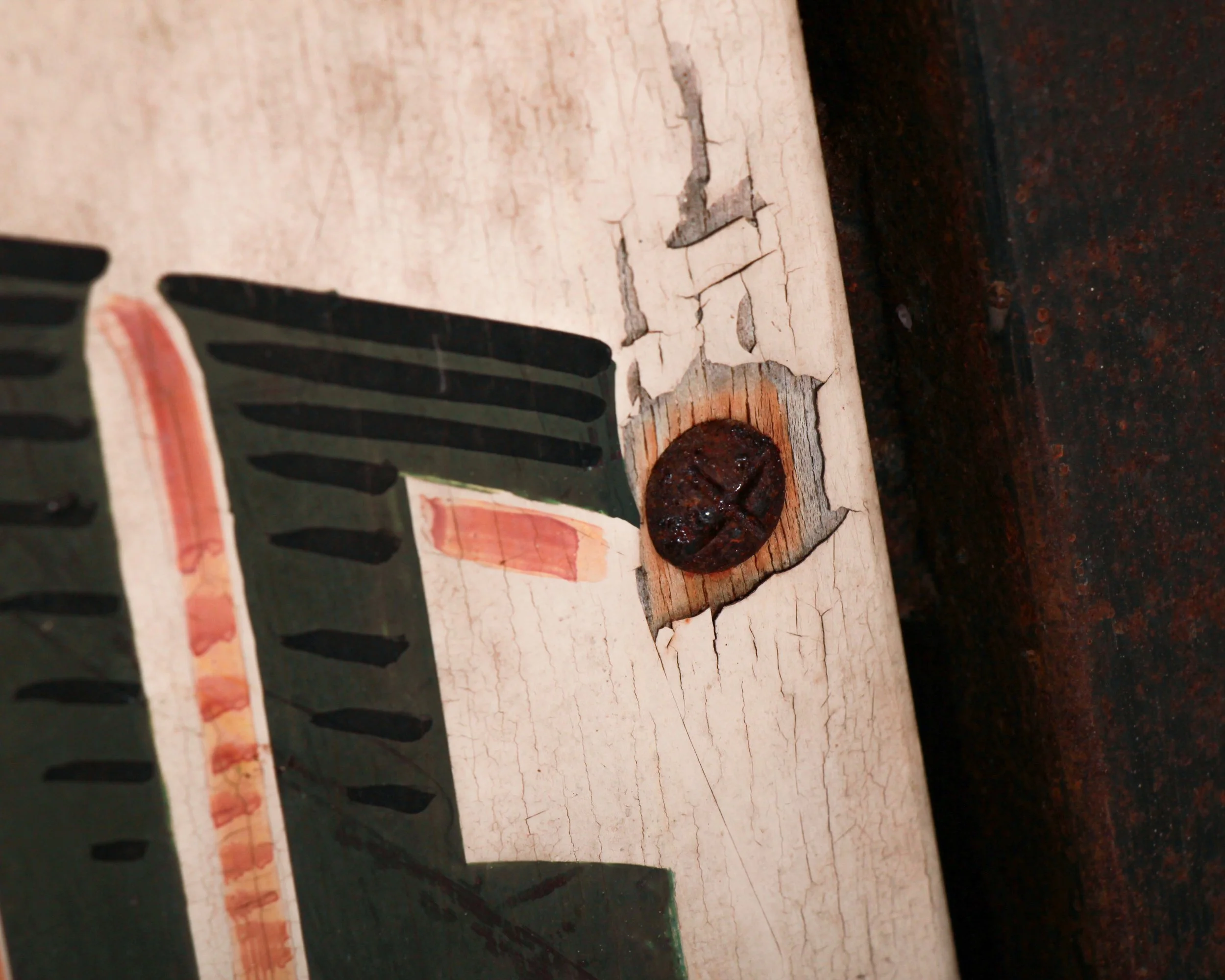
The surface tells its own story. Fine craquelure runs throughout, with areas of light wear and age that read as honest rather than distracting. Around the mounting points, you can see where it once lived and worked, likely greeting customers daily. The paint has mellowed, but the lettering remains crisp and legible, exactly as it should be.
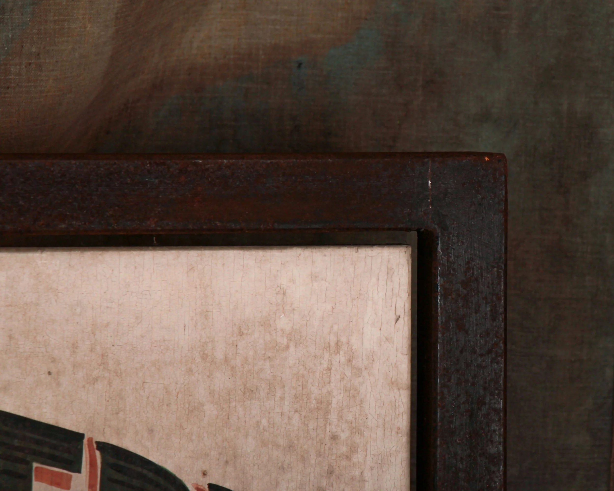
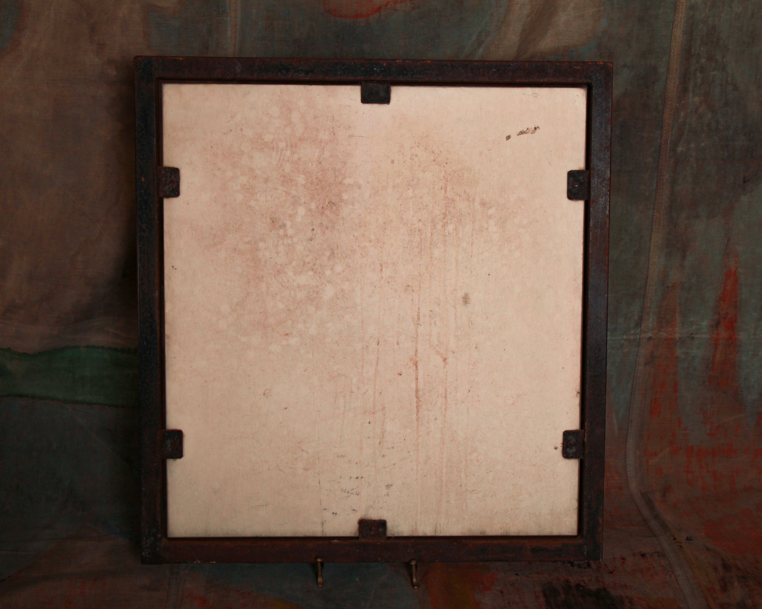
What sets this piece apart is the steel frame. It adds weight, both literally and visually, giving the sign a grounded, almost architectural presence. It feels built, not just made.
At 28 inches high by 26.25 inches wide and just over an inch deep, it’s substantial without being overwhelming. Large enough to anchor a wall, but still intimate in its detail.
Today, it does more than advertise bread. It brings with it the atmosphere of a small French street, early morning, doors just opened, ovens already working. It doesn’t try too hard. It doesn’t need to.
“BOULANGERIE PATISSERIE – Pain cuit au feu de bois.” In plain terms: bread baked in a wood-fired oven. In practice, it’s a quiet declaration of craft, patience, and a standard that predates shortcuts. France has long treated bread as something closer to heritage than food, with regulations, traditions, and daily rituals built around it. A sign like this wasn’t decoration. It was a statement of legitimacy.
Dating to the 1930s, this piece lands right in that sweet spot where traditional hand-painted signage was still the norm, but design had begun to sharpen. The typography carries real presence. The bold, arched lettering feels confident without being loud, while the central script softens the message, almost conversational, like a baker explaining what makes his bread worth coming back for. Subtle red shadowing gives the letters a lift, and the flanking wheat sheaves tie the whole thing back to its source without overcomplicating the composition.
The surface tells its own story. Fine craquelure runs throughout, with areas of light wear and age that read as honest rather than distracting. Around the mounting points, you can see where it once lived and worked, likely greeting customers daily. The paint has mellowed, but the lettering remains crisp and legible, exactly as it should be.
What sets this piece apart is the steel frame. It adds weight, both literally and visually, giving the sign a grounded, almost architectural presence. It feels built, not just made.
At 28 inches high by 26.25 inches wide and just over an inch deep, it’s substantial without being overwhelming. Large enough to anchor a wall, but still intimate in its detail.
Today, it does more than advertise bread. It brings with it the atmosphere of a small French street, early morning, doors just opened, ovens already working. It doesn’t try too hard. It doesn’t need to.