

Sold, but not forgotten.
Sold
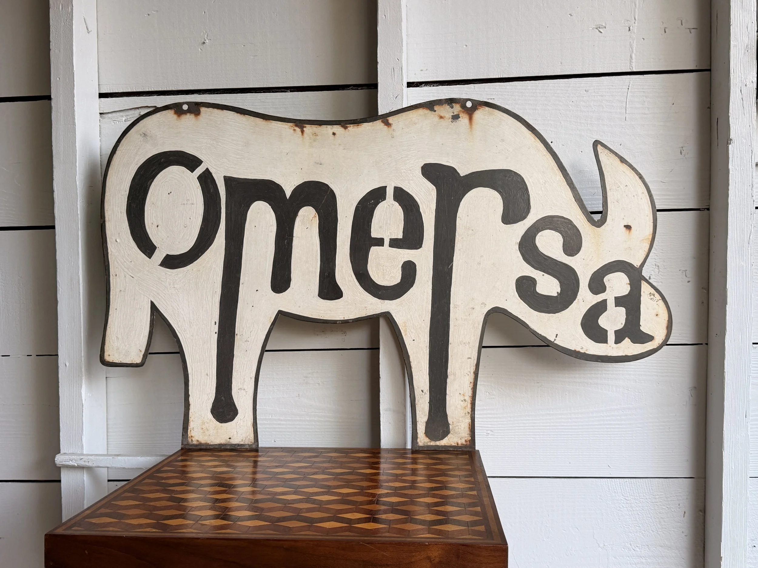
This single-sided metal sign was made for Omersa, the British company best known for its handmade leather animal footstools and sculptural home furnishings. Cut in the unmistakable shape of a rhinoceros, the sign has a cream-painted surface with bold black “Omersa” lettering worked directly into the silhouette. The reverse is unlettered, and the two holes along the upper edge suggest it was intended to hang. There is plenty of surface wear, paint loss, oxidation, and rust around the edges, all of which feel right for something that likely spent years in or around a working shop.
The handmade quality is what makes it especially interesting. This doesn’t look like a mass-produced retail sign. It feels much more like a one-off piece made for Omersa itself, probably to hang outside a workshop, showroom, or production space. The rhino shape is also especially fitting, since the leather rhinoceros became one of the company’s signature designs.
Omersa was founded in England in 1927 and became known for leather animals built over internal frames, pieces that were both sculptural and functional enough to use as footstools. Their popularity grew significantly through major retailers. In Britain, Omersa’s leather animals were sold through Liberty, where their playful, handmade character fit naturally alongside the department store’s distinctive design offerings. Later, in the United States, the pieces were carried by Abercrombie & Fitch, helping introduce them to a wider American audience and giving the brand an international following.
By the mid-20th century, Omersa animals had become recognizable decorative objects, especially the rhino, pig, elephant, and other wonderfully eccentric forms.
Signs like this are a different kind of survivor. Workshop signage was made to be useful, not collectible, which makes a piece tied directly to a maker all the more appealing today. This one sits somewhere between trade sign, folk art, and company ephemera, with enough wear to suggest it had a real working life.
ITEM NOT AVAILABLE IMMEDIATELY—INQUIRE IF INTERESTED hello@heimweeantiques.com
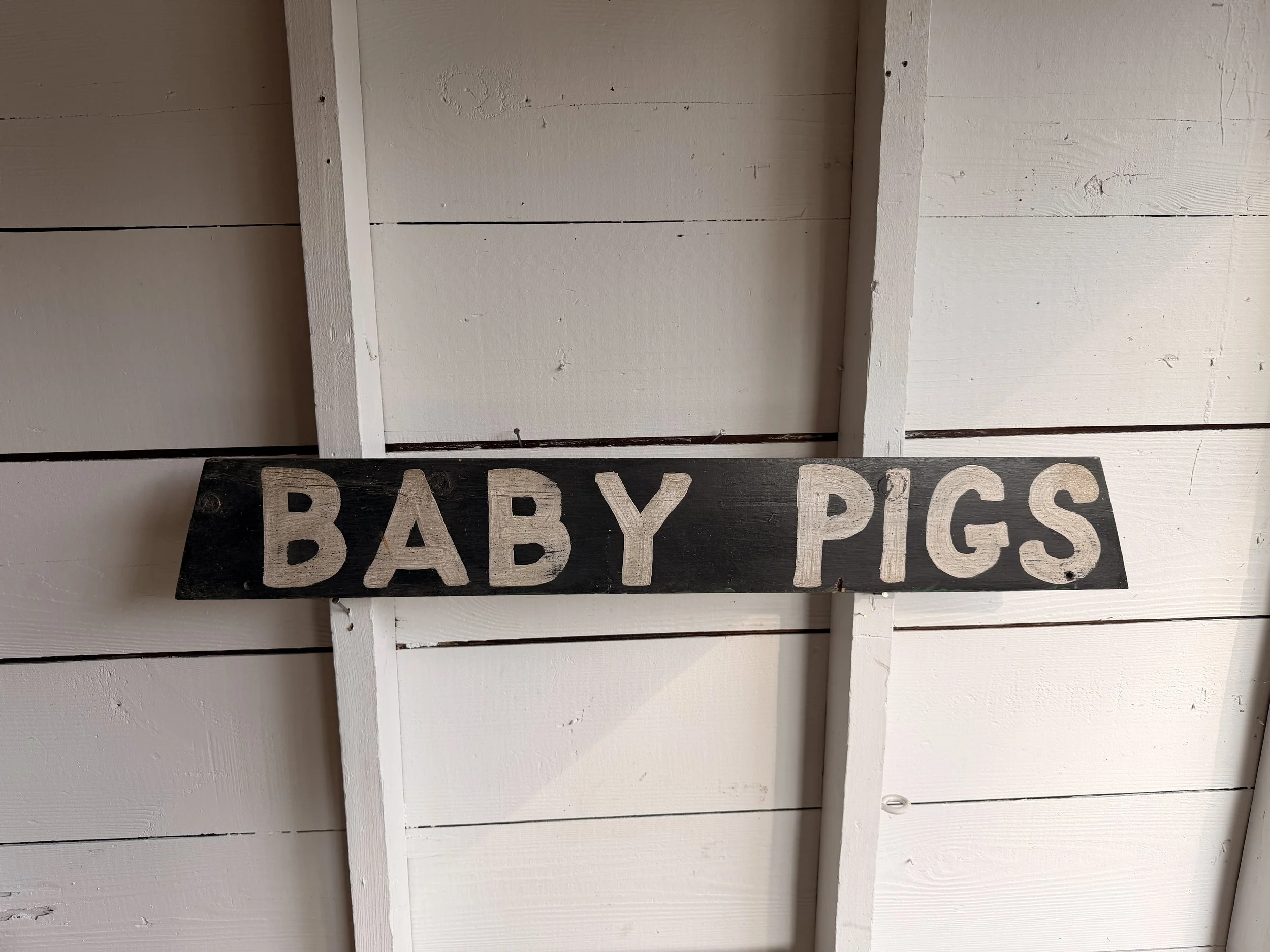
Antique hand-painted wooden “BABY PIGS” sign, likely made as a simple roadside or farm sign advertising piglets for sale. Painted by hand on a single pine board, it has a black ground with large cream-colored block lettering running vertically down the face. The typography is wonderfully straightforward, with slightly irregular letters that give away its handmade origins. The unfinished back shows the natural wood, knots, nail holes, and years of wear. The surface has plenty of age and character without losing any of its graphic punch.
Signs like this were once a familiar sight along rural American roads. Before professionally printed vinyl banners and inexpensive mass-produced signage became commonplace, farmers and small businesses often made their own signs using whatever lumber and paint were already around the property. They were functional objects rather than decorative ones, meant to catch the attention of someone passing in a car or truck and communicate the message in about two seconds.
Livestock signs were especially common in farming communities, advertising everything from eggs and chicks to calves, rabbits, puppies, and pigs. A sign reading “BABY PIGS” would most likely have been put near the roadside when a farmer had a litter of young pigs available for sale. The big, uncomplicated lettering reflects exactly what these signs needed to do: be readable at a distance and leave no mystery about what was on offer.
What makes these homemade signs so appealing now is that no two are quite alike. There was no branding department, font selection, or design system involved, just somebody with a board, a brush, and a message to get across. This one has a particularly great combination of folk-art simplicity, agricultural history, and accidental graphic design.

Dating to the 1940s, this reverse-painted glass sign reads “Dr. P. Campi – Dentist” in bold black lettering, the kind meant to be easily spotted from a hallway outside an office door. The typography is clean, direct, and honest—with that confident mid-century look that never feels over-designed.
The lettering is applied to the reverse of the glass and sits within a simple wooden frame that has aged nicely over the years, developing a dark patina and small signs of honest wear. A metal hanging chain still remains attached, a reminder that this piece likely spent decades quietly swaying in a doorway or window, guiding nervous patients inside.
There’s a certain calm authority to it—no frills, no unnecessary detail, just clarity and purpose. The kind of object that did its job without fanfare, and still holds that same quiet presence today.
Category History
In the first half of the 20th century, before vinyl and neon took over, a good sign was as much about the hand as the message. Most small businesses relied on local painters or sign makers who worked with wood panels, house paint, and a steady eye. The result: one-of-a-kind pieces where every letter carries a bit of personality—slightly off, sometimes bold, sometimes improvised, but never generic.
These weren’t precious objects at the time. They hung outside in the weather, took on sun fade, rain streaks, and the occasional repaint. That’s part of the appeal now. The layered paint, ghost lettering, and uneven brushwork tell you exactly how they lived.
What stands out is the balance between function and instinct. The maker wasn’t chasing perfection—they were chasing readability, speed, and impact. And in doing so, they created something far more human. Each sign feels like a handshake from a past business owner, direct and unfiltered.
ITEM NOT AVAILABLE IMMEDIATELY—INQUIRE IF INTERESTED hello@heimweeantiques.com
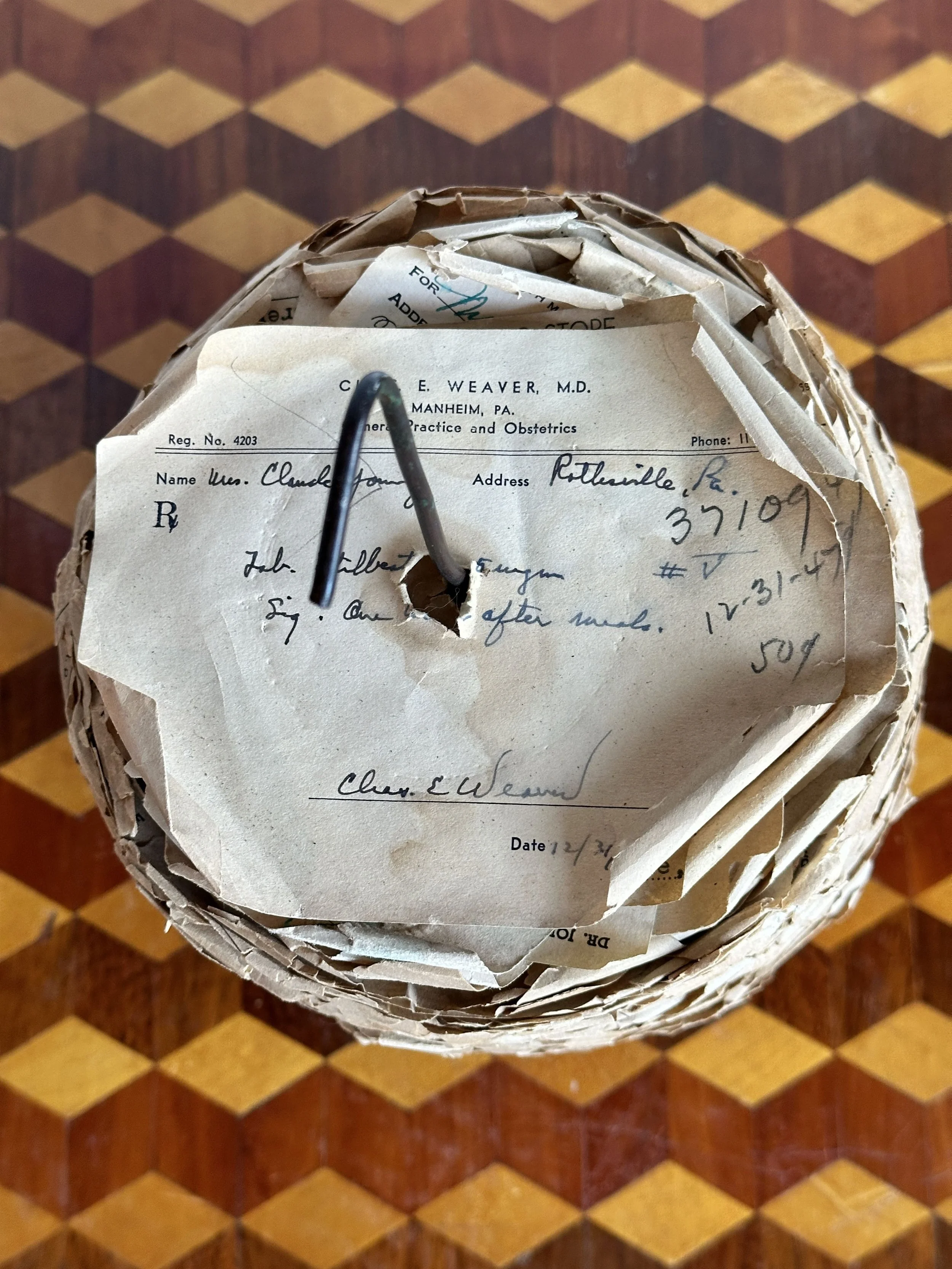
A true monument to everyday medicine, this towering stack of spiked prescriptions comes straight out of Ruhl’s Drugstore, circa 1930s. Each slip of paper—yellowed, curling, and perfectly impaled—is a tiny time capsule of ailments past, scrawled in doctorly cursive and dosed with authority. It’s less a receipt spike, more a paper wasp nest of human frailty, headaches, fevers, and tonics. Look closely and you’ll find names and dates—back when medicine came with a handwritten note and a pharmacist who probably knew your dog’s name.
Category History
Early 1900s pharmacies were part lab, part storefront, and part neighborhood advice desk. Before mass-produced medications took over, prescriptions were often compounded by hand. A doctor’s note—sometimes scribbled in hurried script—would be brought in, and the pharmacist would measure, grind, mix, and bottle the remedy on the spot. Powders, tinctures, tonics, and syrups were all part of the daily rhythm.
The paper trail that came with it is just as telling. Prescriptions, receipts, and labels were typically handwritten or printed in small batches, often stamped with the pharmacy’s name and address. They carry a kind of immediacy—names of patients, dates, dosages—tiny records of individual needs rather than standardized solutions.
What’s interesting is how personal it all feels. These weren’t anonymous transactions; there was a level of trust and familiarity between customer and pharmacist. The documents reflect that—less polished, more direct, sometimes corrected or amended on the fly.
Today, these pieces read like fragments of everyday medical history. Ink fading, paper yellowing, edges worn from handling—they hold onto a moment when medicine was as much craft as science, and every prescription had a human scale to it.

This homemade shooting target stencil, likely dating to the 1950s, is a perfect example of that kind of honest utility. What makes this piece especially appealing today is its graphic simplicity. The red circle against the white field has a striking, almost modernist quality. No extra graphics, no decoration, just the unmistakable symbol of a target that can be seen from a distance.
The stencil itself appears to be cut from thin metal and mounted to a simple wooden frame. The construction is straightforward and practical, the kind of thing someone put together in a garage or workshop with the tools they had on hand. Small nails hold the sheet in place, and the wood backing gives the whole piece rigidity so it could be reused again and again.
The surface shows scattered age spots, slightly uneven edges, light wear, and small imperfections that only add to its character.
Probably used at a small shooting range, hunting club, or even by an individual who wanted to make their own targets rather than buying them.
Category History
Shooting target signs have always walked a line between utility and graphic design. Originally made for ranges, fairs, and training grounds, they were designed to do one thing well—give you something clear to aim at. Bold concentric circles, stark silhouettes, or human-shaped outlines all served the same purpose: instant readability from a distance.
Materials varied—paper for temporary use, tin or steel for repeated shooting—but the visual language stayed consistent. High contrast, simple forms, no ambiguity. Some even doubled as advertising pieces, incorporating brand names or slogans into the design without distracting from function.
What makes them interesting now is how they change with use. Bullet holes, dents, and wear become part of the composition, turning a clean graphic into something layered and unpredictable.
They start as precise tools, but over time, they pick up a kind of accidental abstraction—marks of aim, misses, and repetition, all recorded right on the surface.
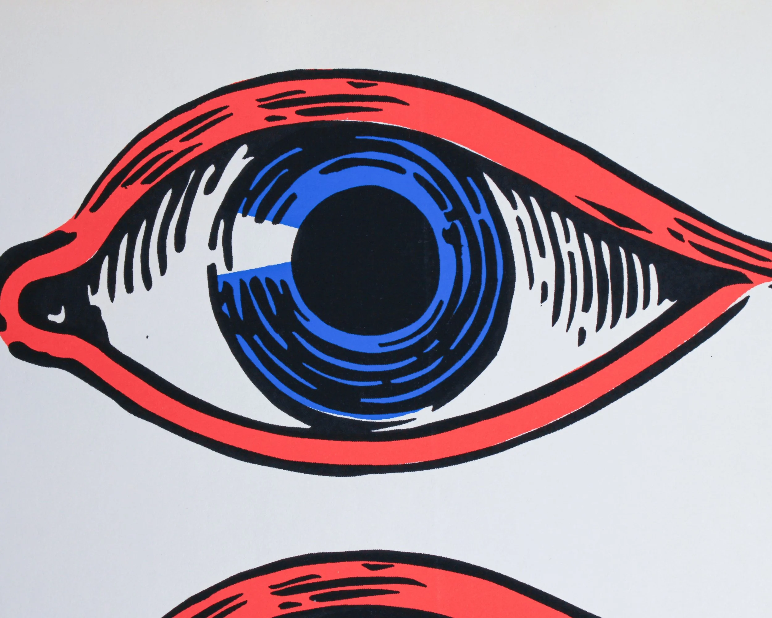
This vintage eye decal sheet has the wonderfully bold, slightly uncanny look of mid-century commercial graphics. Printed on white paper, it features four oversized eyes arranged in two rows, each rendered in a limited palette of bright red, vivid blue, black, and white. Heavy outlines, exaggerated lashes and circular irises give the design a punchy, almost comic-book quality. The repetition makes the sheet especially fun visually, somewhere between an optician’s display, carnival decoration, sign-painter’s stock and Pop Art.
The sheet is new old stock, with the original backing paper still intact. A small circular printer’s or manufacturer’s mark appears near the lower left corner, although there isn’t enough visible information here to confidently identify the maker. Judging by the graphic style, printing technique and color palette, a date somewhere between the 1950s and 1970s feels reasonable, with the 1960s perhaps the strongest visual fit.
Large-format decals like this were widely used throughout the mid-20th century for storefront windows, advertising displays, vending machines, amusement attractions and promotional signage. Before inexpensive digital printing, decals offered businesses an easy way to add bright, professionally printed graphics to glass, metal and other smooth surfaces. Sign shops and commercial printers produced everything from lettering and logos to stars, pointing hands, cartoon figures and, naturally, attention-grabbing eyes.
The eye itself was an especially effective advertising device. It could suggest vision, observation, photography or optical services, but it was also simply hard to ignore. By the 1960s, enlarged eyes had become part of the broader visual vocabulary of psychedelic posters, Pop Art, underground graphics and novelty advertising.
Whatever its original purpose, this surviving uncut sheet works beautifully today as graphic art in its own right. The scale, saturated colors and four staring eyes give it plenty of presence, along with just the right amount of weirdness.
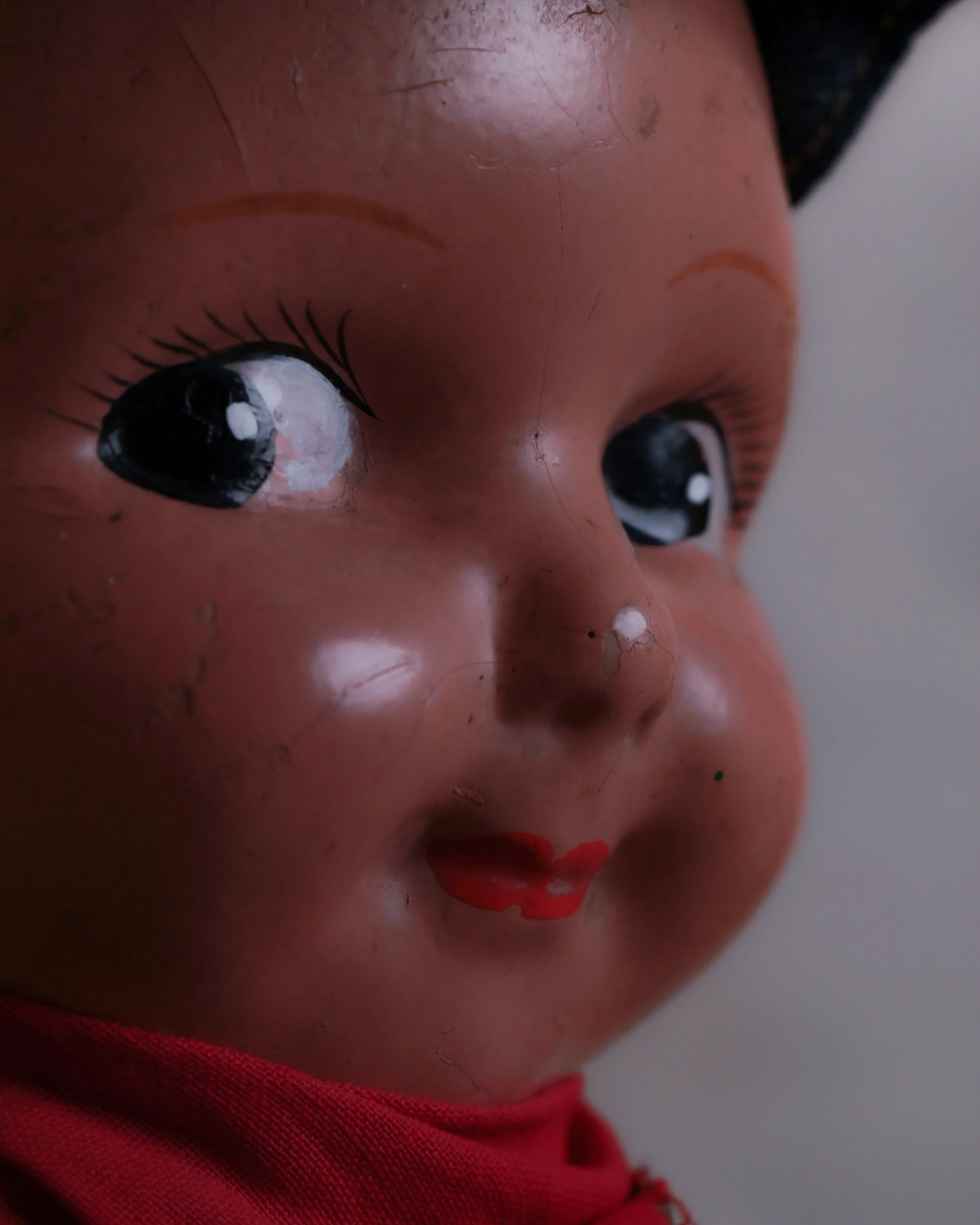
Meet the original denim influencer: a 1920s Buddy Lee composition advertising doll decked out in full Union Made Lee overalls, complete with embossed copper buttons, red neckerchief, and matching denim engineer cap. At just under 14 inches tall, he may be pint-sized, but he’s dressed to union-spec perfection. These dolls were originally made as store displays, helping Lee jeans market their workwear, and this little guy still delivers plenty of charm nearly a century later.
The painted composition face is all rosy cheeks, sly smile, and side-eye confidence—like he knows he's the best-dressed doll on the shelf. His hands show signs of wear, and the top of his head has a patch where the original paint has flaked off—visible when the hat is removed, but totally hidden when he’s dressed. The denim is original and in great condition, with that unmistakable old-school Lee label stitched right across the back.
Category History
Buddy Lee dolls first appeared in the early 1920s as pint-sized pitchmen for the H.D. Lee Company, a Kansas workwear brand built on durability and no-nonsense design. Instead of glossy ads, Lee put their product in people’s hands—literally—through these small, dressed-to-the-nines figures wearing miniature versions of their overalls, jackets, and uniforms.
The earliest examples were made of composition, a mix of sawdust and glue pressed into molds, giving them a solid, slightly textured feel. They were meant for store counters, not toy chests—handled often, picked up, examined, and remembered. That wear you see today—fine cracks, softened paint—isn’t a flaw, it’s proof they did their job.
What makes them interesting is how they blur the line between advertising and object. They’re equal parts salesman’s sample, display piece, and cultural snapshot of American labor at the time. Later versions moved into plastic, but the 1920s composition dolls carry a warmth—and a bit more soul—that’s hard to fake.
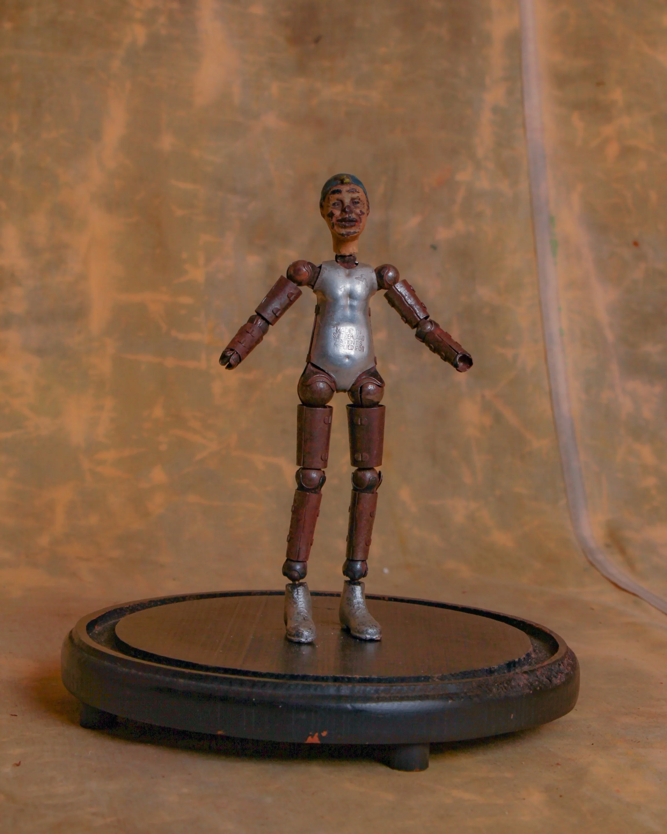
Here is a 1930s lay figure manufactured by renowned Swiss watch maker Bucherer. It has a composition head with painted facial features that resemble a clown. And a metal body made of aluminum, steel and brass. This ball-jointed "artist mannequin" can be positioned in multiple poses. Missing hands, which adds to its overall appeal. Measures roughly 7.5"
Category History
Bucherer begins in 1888, when Carl-Friedrich Bucherer opened a shop in Lucerne and set out to do two things well: sell fine watches and understand how they worked. That second part mattered. Switzerland’s watch industry was built on networks of specialists—case makers, dial painters, movement manufacturers—and Bucherer learned to navigate all of it, bridging retail and production with a clear eye for quality.
Through the early 20th century, the company grew alongside the rise of wristwatches, moving from pocket watches into more modern forms as tastes shifted. By mid-century, Bucherer wasn’t just a retailer—it was developing its own designs and building relationships with major Swiss houses, becoming a trusted name for both locals and travelers passing through Lucerne.
What sets Bucherer apart is that balance between heritage and adaptability. It stayed rooted in traditional craftsmanship while responding to changes that shook the industry, including the quartz crisis of the 1970s. Rather than disappearing, it leaned into its strengths—curation, design, and long-term partnerships.
Today, Bucherer sits in an interesting position: part historic retailer, part watchmaker, part gatekeeper of Swiss watch culture. Its pieces often reflect a clean, considered approach—less about flash, more about proportion, finish, and wearability.
It’s a name that doesn’t shout, but carries weight. Built over time, one watch—and one decision—at a time. And through it all, it has remained closely tied to place, with Lucerne still at the heart of its identity.
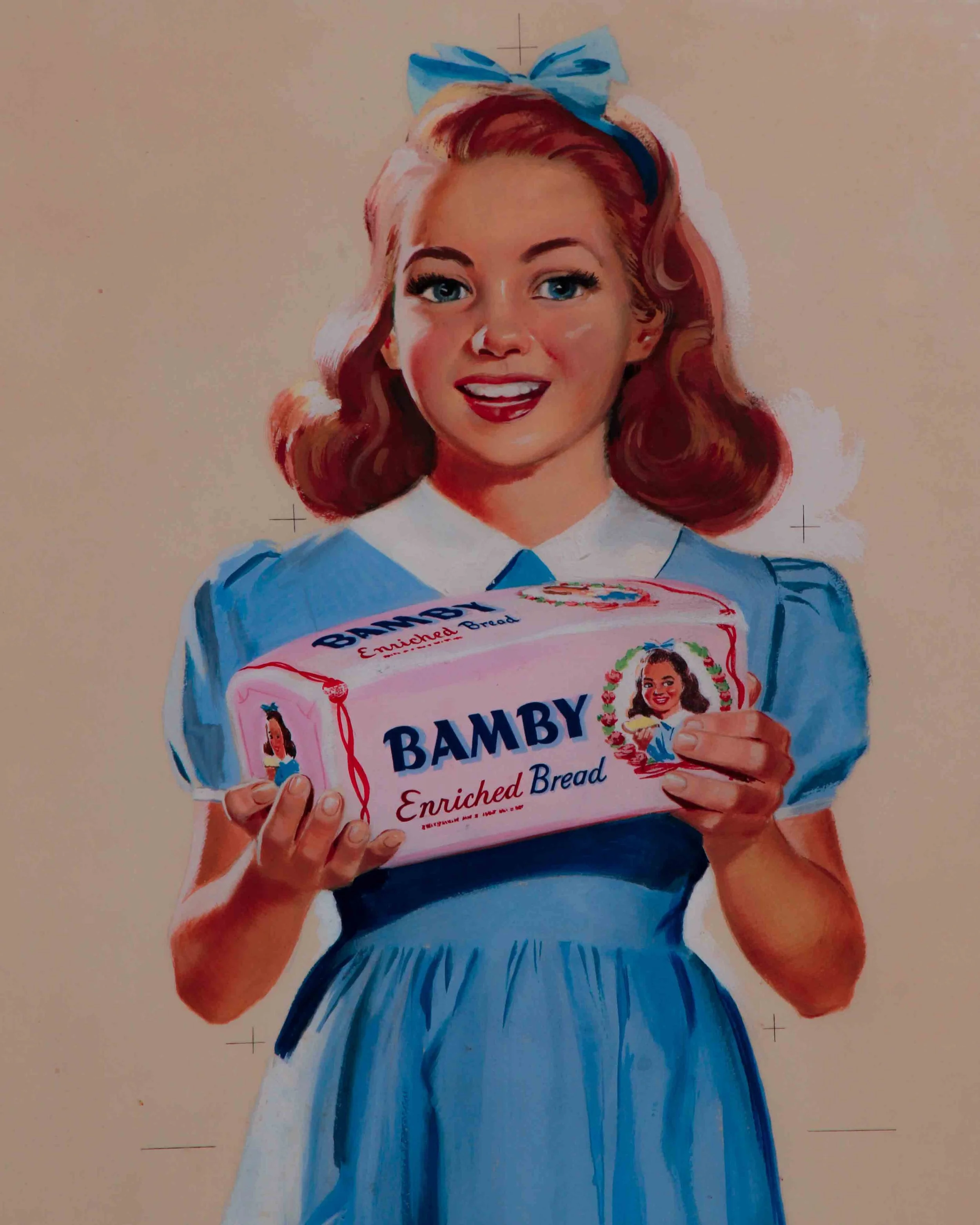
This is the kind of advertising art that quietly does everything right. An original Bamby bread illustration from the 1930s, rendered in gouache and pencil on board, and still carrying all the warmth, optimism, and polish of early American commercial illustration.
The composition centers on a smiling young girl in a crisp blue dress, proudly presenting a loaf of Bamby Bread like it’s the best news she’s heard all day. Her posture is confident, her expression open and inviting, and the styling hits that sweet spot between wholesome and aspirational that defined the era. The artist’s hand is evident everywhere, from the soft modeling of her face to the carefully painted folds of the dress and the subtle pencil underdrawing that peeks through in places.
The surface has naturally toned over time, with visible foxing along the lower left edge and some spotting toward the right corner. It’s been handsomely framed and presents beautifully.
Measures 28 x 16 inches.
Category history
Original artwork made for advertising sits in an interesting space—created to sell something, but often with the care and intention of fine art. Before photography and digital design took over, illustrators and painters were hired to produce everything from product labels to large-scale posters. These works were then translated into prints, but the originals remained as the source—the first, most direct version of the idea.
What’s compelling is how much thinking you can see in them. Pencil lines beneath paint, color notes in the margins, adjustments made mid-process. They weren’t meant to be displayed; they were working pieces, part of a larger production chain.
Stylistically, they vary widely—some highly polished, others loose and expressive—but all are guided by clarity. The goal was to catch attention and communicate quickly.
Today, these originals feel more personal than the printed versions they produced. You’re seeing the hand behind the message, not just the message itself. Part artwork, part artifact of commerce, they carry both intention and process in equal measure.
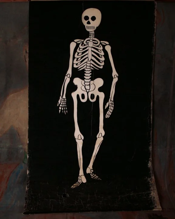
Independent Order of Odd Fellows black window rolling shade with painted skeleton. American, 19th century.
Category History
The Independent Order of Odd Fellows, often shortened to IOOF, is one of those fraternal organizations that feels part civic club, part theater troupe, part mutual aid network. Founded in the 18th century and firmly established in the United States by the 19th, the Odd Fellows were built around a simple idea: members look after one another. Before social safety nets, that meant real support—financial help, burial services, care for widows and orphans.
But the way they delivered that message was anything but plain. Meetings were structured around ritual, with degrees that members advanced through, each one accompanied by symbolic lessons about friendship, love, and truth. And with those rituals came props—lots of them.
Lodge rooms were often outfitted like stage sets. Painted backdrops, banners, staffs, costumes, ceremonial collars, even coffins and skeletons used as memento mori reminders. Objects weren’t just decorative; they were tools for storytelling, designed to make abstract ideas feel immediate. A blindfold might represent ignorance, a staff guidance, a skeletal figure the inevitability of death.
What’s striking is how seriously the symbolism was taken. These rituals created a shared language among members, reinforcing identity and community through repeated performance.
Today, the surviving props carry that layered history. Slightly worn, sometimes a bit theatrical in the best way, they read as both artifacts of belief and objects of craft. Not just remnants of secret meetings, but pieces of a system that blended support, symbolism, and a touch of stagecraft to make its point stick.
Many lodges also functioned as social hubs, hosting events, gatherings, and charitable activities that extended beyond members. The objects reflect that dual life—ceremonial yet communal, formal yet deeply rooted in everyday connection and shared responsibility.
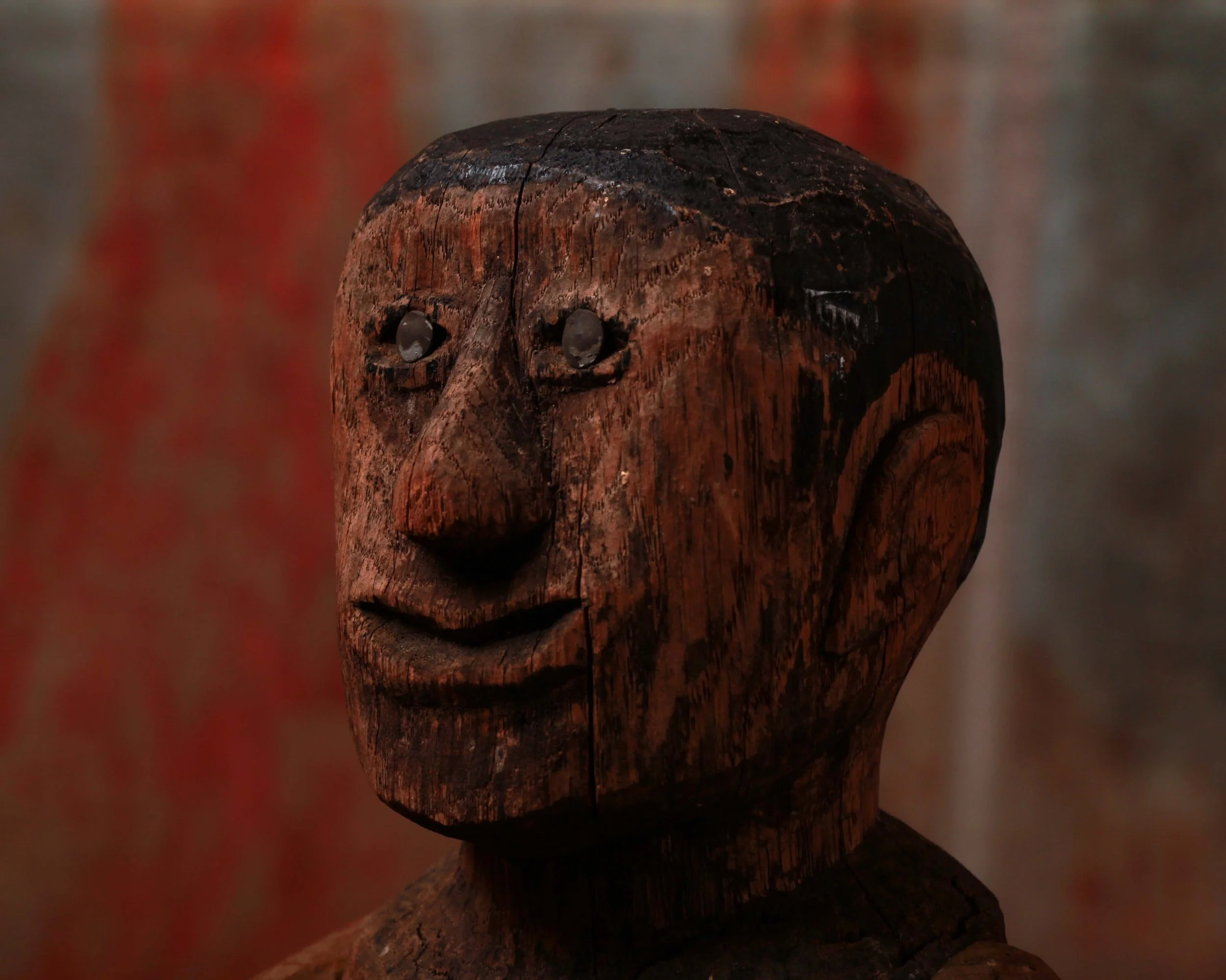
There’s something wonderfully unruly about this 1880 American primitive doll. The second you see it, it feels less like a toy and more like a character that wandered out of a storybook and decided to stay awhile. Honestly, it has the same strange, lovable energy as one of the monsters from Where the Wild Things Are. Slightly wild-eyed, slightly mysterious, but impossible not to like.
Hand carved from wood with its original painted surface still intact, the figure has an incredible rawness to it. The carving is direct and unfiltered in the best possible way. No delicate refinement, no attempt at perfection. Just bold features cut confidently into wood: oversized ears, a sharply pointed nose, a broad mouth curled into an unreadable little grin, and those fantastic metal eyes that catch the light in a way that makes the whole thing suddenly feel alive.
The surface tells the rest of the story. Layers of age, handling, shrinkage cracks, and worn paint have built up into a deep, dry patina that only a true survivor gets to wear. The dark paint across the hair remains remarkably strong, contrasting beautifully against the warmer exposed wood tones throughout the face and body.
One arm shows significant wear and loss, with softened, splintered wood fibers exposed from decades of use and time. But honestly, that damage only pushes it further into folk art territory. It doesn’t feel fragile or diminished. It feels seasoned. Earned.
What makes pieces like this so compelling is that they were never made as art objects in the formal sense. They were made by hand, likely for a child, with whatever tools and materials were available. And yet somehow, over a century later, this little carved figure lands closer to modern sculpture than many things intentionally made for galleries.
Measures 6” wide, 4” deep, and 15” high. Quietly eerie. Deeply charming. The kind of object that watches the room as much as the room watches it.
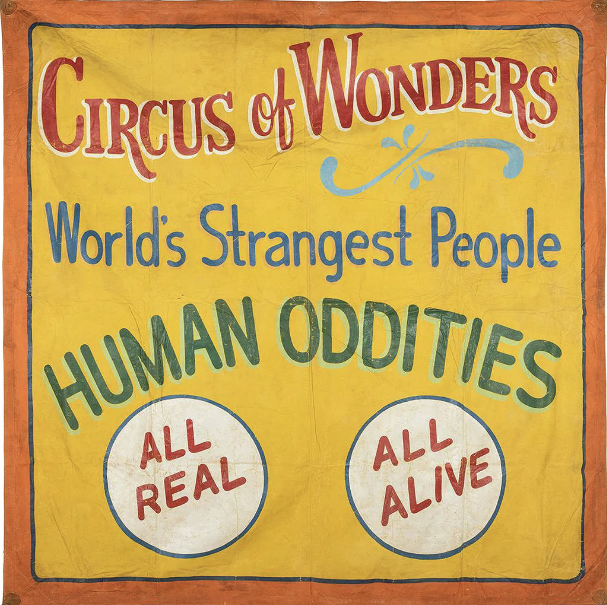
This large hand-painted canvas sideshow banner has everything you want from old carnival advertising: huge lettering, loud color, slightly wonky handwork, and absolutely no subtlety about getting your attention. Against a warm yellow field bordered in orange and blue, it announces “Circus of Wonders,” followed by “World’s Strangest People” and the wonderfully direct “HUMAN ODDITIES.” Two large white medallions at the bottom promise “ALL REAL” and “ALL ALIVE.”
The lettering is especially good. Red, blue, green, white, and pale turquoise are layered to create shadows and depth, while a loose decorative flourish breaks up the typography. Up close, you can see the painter’s hand everywhere: uneven outlines, brush marks, shifts in spacing, and small inconsistencies that give the banner considerably more personality than mechanically printed advertising ever could. The canvas shows expected wear from use and storage, including creases, scattered losses, rubbing, staining, and general surface aging.
Sideshow banners like this were essentially giant roadside sales pitches. Hung across entrances and midway façades, they had only a few seconds to stop someone walking past, so painters relied on enormous lettering, saturated colors, sensational language, and bold imagery. Tampa, Florida became an important center for this work during the mid-20th century, home to banner painters and commercial shops supplying traveling carnivals throughout the country.
This example is unsigned, so a firm attribution would be difficult. Stylistically, however, it fits comfortably within the Tampa banner-painting tradition associated with Snap Wyatt, Jack Cripe, and Sigler & Sons Art Service. Both Wyatt and Cripe worked in the Tampa sideshow world, while Sigler’s shop produced banners for traveling shows on a commercial scale.
Whether painted by one of those recognizable hands or another artist working within the same circle, it survives as a terrific piece of American carnival history, made to shout across a crowded midway and still doing a pretty good job of it.

This cast iron doorstop by Hubley is one of the best examples known to exist.
Depicting Popeye standing tall with fists clenched and pipe firmly planted, this example captures everything that made the character an instant icon. The proportions are pure Popeye: massive forearms, compact torso, planted stance, and that unmistakable squint. The original paint is still vibrant, with rich reds, deep black, bright blue trousers, and warm yellow accents that pop beautifully against the iron.
Turn him around and there it is, crisply cast into the back: “1929 King Features Syn.”, tying this piece directly to the golden age of American comics and licensing. The pipe is original and intact, a detail that’s often missing and one of the first things collectors look for. Its survival here makes a real difference.
Yes, there’s wear. Honest chipping, scattered scuffs, and rubbed edges from decades of use. At roughly 9 inches tall, whether it’s holding a door, anchoring a shelf, or just standing there looking tough, Popeye still gets the job done.
Category History
Old cast iron toys are built like they mean it. Produced mainly in the late 19th and early 20th centuries, they were cast in solid iron and painted by hand, often depicting banks, vehicles, animals, or everyday scenes. Weight was part of the appeal—these weren’t fragile playthings, but objects meant to be handled, dropped, and kept.
Many doubled as mechanical banks, with simple levers or triggers that brought the piece to life while collecting coins. The casting process left subtle seams and textures, while the paint—often bright and slightly uneven—added personality.
What stands out now is their durability and presence. Chips, wear, and softened edges aren’t damage so much as evidence of use. They feel closer to small sculptures than toys—solid, direct, and made to last well beyond the play they were built for.
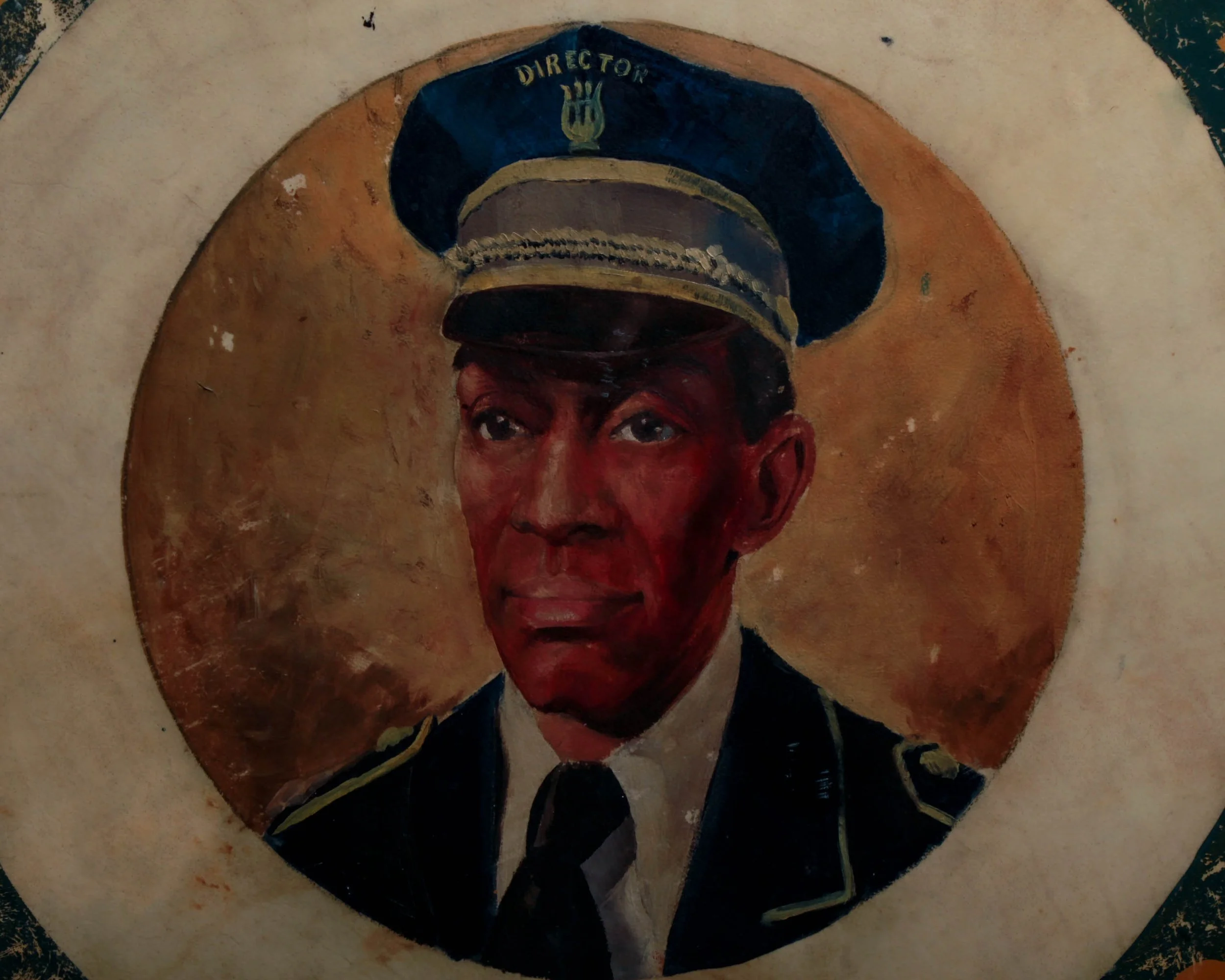
This large parade drum from the James T. Moore Memorial Band of Philadelphia carries all the swagger of a marching line at full tilt. The front head is hand-painted with bold lettering circling a portrait of the band’s director, framed by a deep green field that’s worn just right—honest scuffs and rubs that read like miles, not damage.
Circa 1940s, it’s built the way they should be: wood shell, brass hardware, and a beautifully aged vellum head that’s still intact with no cracks. The reverse shows the natural wear of use, with tonal variations and markings that only come from years in rotation. One small chip to the wooden rim, otherwise solid and structurally sound.
At 32 inches high and just over 19 inches in diameter, it’s a statement piece whether hung or leaned—it’s equal parts folk art and functional object.
Memorial parade marching bands
Memorial parade marching bands are built on rhythm, memory, and a shared sense of purpose. Emerging in the 19th century alongside military traditions, these bands became a central part of civic ceremonies—especially events tied to remembrance, where music helped set the tone as much as any speech.
Instrumentation is classic: brass, woodwinds, percussion—designed to carry outdoors and move in step. The sound is structured, deliberate, often familiar. Hymns, patriotic songs, and slow marches create a pace that matches the occasion, guiding both participants and spectators through the moment.
Uniforms matter too. Crisp lines, coordinated colors, polished details—all reinforcing unity and discipline. It’s not just about performance, it’s about presence.
What makes these bands compelling is how they balance formality with feeling. The music is rehearsed, the steps are counted, but the impact is immediate. You feel it in the repetition, the cadence, the way sound moves through space.
They’re less about spectacle and more about continuity—keeping traditions in motion, one measured step at a time, carrying memory forward through sound.
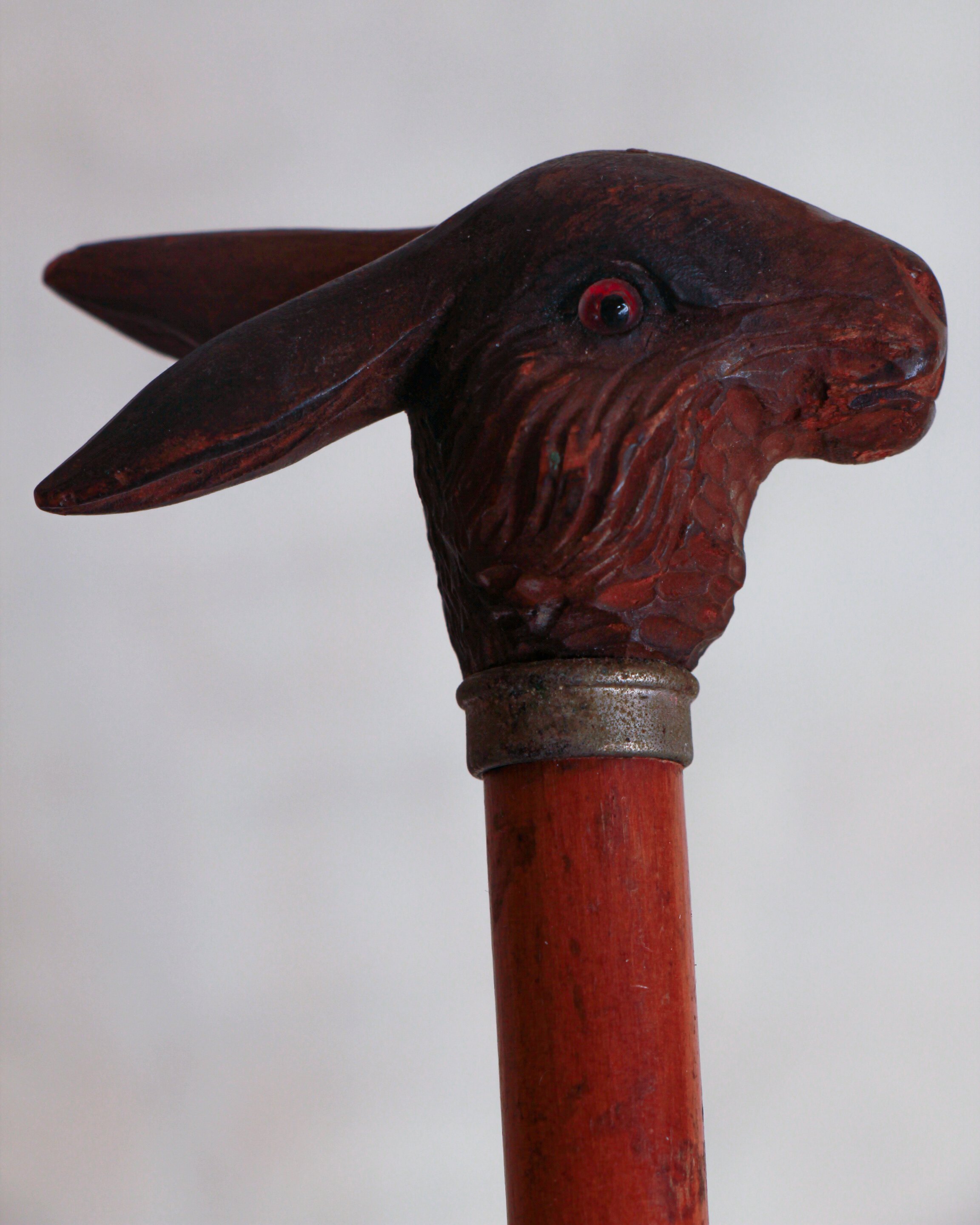
This charming early 20th-century child’s cane measures just 22 inches long and is topped with a wonderfully expressive carved wooden rabbit head. The rabbit has long swept-back ears, deeply carved fur and facial details, and small inset glass eyes that give it an unexpectedly lively personality. The carving is attached to a slender reddish-brown wooden shaft with a simple metal collar beneath the handle and a metal ferrule at the bottom. The surface shows the kind of gentle wear, darkening and small marks you’d hope to find on something that has survived a century or so.
Children’s walking sticks were made in surprisingly wide variety during the late 19th and early 20th centuries. While some were genuinely functional, many were essentially miniature versions of fashionable adult accessories. At a time when a cane could be part of a well-dressed gentleman’s everyday outfit, children were often given scaled-down examples that allowed them to imitate the adults around them.
Animal-head handles were especially popular. Dogs, horses, ducks, birds and rabbits all appeared, ranging from inexpensive molded handles to individually carved wooden examples. They belonged to a broader tradition of novelty walking sticks, where the handle became an opportunity for humor, craftsmanship and personal expression. Some were souvenirs, others were sold through sporting-goods shops, department stores or specialty cane makers.
The rabbit is an especially appealing subject for a child’s cane. Familiar from toys, children’s books and rural life, it gives what could otherwise be a fairly formal accessory a playful character.
At only 22 inches, this one was clearly intended for a young child rather than an adult. The combination of its small scale, hand-carved rabbit, glass eyes and well-aged metal fittings makes it a particularly fun surviving piece of early childhood fashion, somewhere between a walking stick, toy and piece of folk carving.
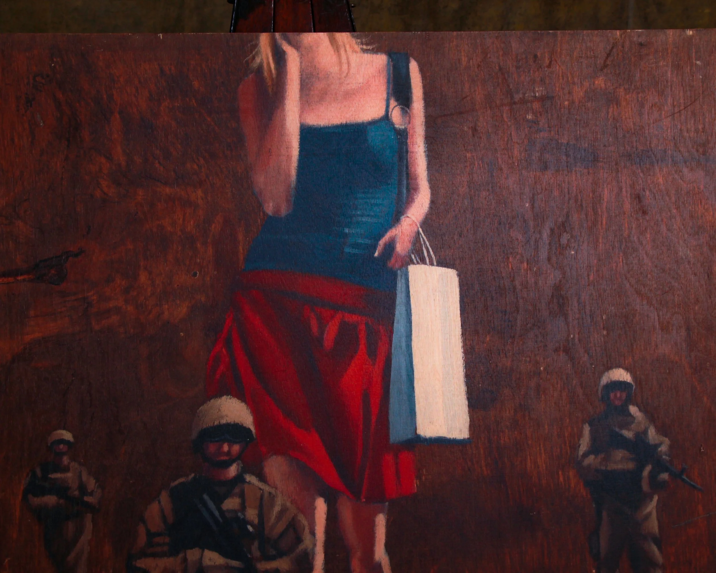
Commissioned by The Curtain in London—now the Mondrian Shoreditch—and produced through Steve Lazarides, Banksy’s longtime agent, this print on wood was never meant to be quiet décor.
The image itself plays like a visual contradiction. A casually dressed woman mid-stride, shopping bag in hand, moves forward while a small squad of mini armed soldiers protect her every move. It’s cinematic and slightly absurd in the best possible way.
Created on a thick wood panel with a clean, gallery-style presence, it has the weight and depth you want from something that was designed to anchor a room. The top edge shows four screw marks from its original install—small reminders of its previous life in hotel suites. Minor wear throughout, nothing distracting, just the kind of honest handling that comes from being lived with rather than stored away.
At 39.5 inches wide, 27.5 inches high, and 2 inches deep, it reads immediately from across the room but holds up just as well up close.
A hotel commission, yes—but more like a snapshot of a moment when street art, hospitality, and a certain London attitude briefly shared the same wall.
Steve Lazarides
Steve Lazarides came up through London’s gritty 1990s photo scene, shooting nightlife, street culture, and the kind of moments most people missed. He’s best known as Banksy’s early manager and photographer, helping take an anonymous street artist from walls and alleyways into galleries, books, and eventually the global stage.
Lazarides had a sharp instinct for presentation—he understood how to frame rebellion without sanding off its edge. After parting ways with Banksy around 2009, he continued curating, publishing, and championing urban and contemporary art through Lazarides Editions and his galleries. His legacy sits right at that pivot point where street art stopped being temporary and started being collectible.

This 1960s Scandinavian Air Service toy airplane is made of tin lithograph with hard plastic elements, it features a detailed cutaway fuselage revealing neat rows of passenger seats, turning a simple toy into a miniature window into mid-century air travel.
Made in Japan, it carries that perfect balance of playfulness and precision—spinning propellers, crisp graphics, and just enough wear to remind you it’s logged a few imaginary miles. The SAS markings and “Royal Viking” details root it firmly in the golden age of commercial aviation, when flying still felt like an occasion.
Measures 18" wide, 19" deep, and 5.5" high. A standout display piece for anyone drawn to aviation, design, or the quiet romance of a cabin full of tiny passengers heading somewhere far off.
Category History
Mid-century tin lithograph toys are where industry meets imagination at full speed. From the 1930s through the 1960s, makers in Japan, Germany, and the U.S. turned thin sheets of tin into bright, mechanical playthings—cars, robots, airplanes, space gadgets—each brought to life with wind-up keys or simple friction motors.
The magic is in the surface. Lithography allowed for crisp, colorful graphics printed directly onto the metal—logos, gauges, windows, tiny passengers—all rendered with a kind of optimistic precision. Even when the forms are simple, the detail sells the illusion.
Inside, the mechanics are straightforward but satisfying. Gears, springs, and cams translate a twist of the key into movement—rolling wheels, spinning propellers, wobbling figures. Nothing hidden, just a clear cause and effect.
They were built for play, not preservation, so surviving examples often show scratches, dings, and softened edges from years of use. That wear feels right.
What stands out now is their balance of charm and ingenuity. Lightweight, durable, and visually bold, they capture a moment when toys didn’t need batteries—just a little winding and a lot of imagination.
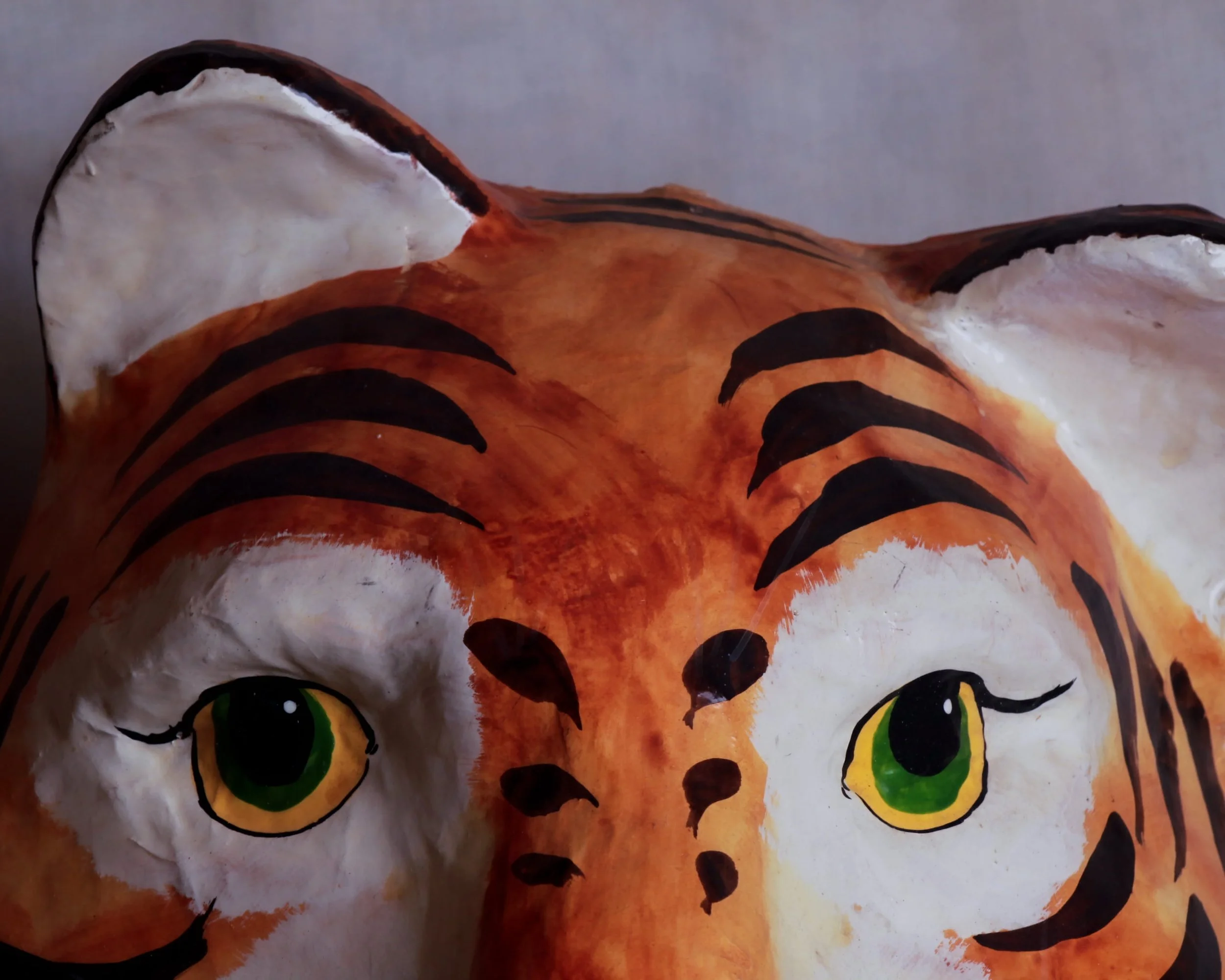
This papier-mâché tiger mask has that wonderful handmade quality that immediately tells you it wasn’t churned out by a factory line. It was shaped, painted, and brought to life by someone with a brush in one hand and a good imagination in the other.
The face has a wonderfully docile personality. There’s an innocent little snarl, but the wide, slightly playful eyes give the whole thing a friendly, almost mischievous expression. The painted stripes are applied with confident brushwork, adding texture and movement to the surface while letting the sculpted papier-mâché form do the heavy lifting.
Measuring 11 inches wide, 8 inches deep, and 12 inches high, it’s a great size for display.
Category History
Paper mâché masks from the 1930s through the 1960s sit right at the intersection of craft, costume, and early mass culture. Made by layering paper pulp or strips over molds, then painted by hand or stencil, they were lightweight, inexpensive, and expressive enough to transform a face in seconds. Perfect for Halloween, school plays, parades, and small-town theater.
The designs leaned bold. Features were exaggerated—wide eyes, sharp noses, heavy outlines—so the character read clearly even from a distance. As film and television grew, familiar faces began to appear: clowns, monsters, cowboys, and eventually licensed characters. Some were factory-produced in large numbers, others came from smaller workshops where variation was part of the charm.
What makes them compelling now is their fragility and personality. They weren’t built to last. Elastic straps snapped, edges softened, paint chipped with use. Surviving examples often carry those marks—creases, touch-ups, small repairs—that feel honest rather than worn out.
They sit somewhere between folk object and early pop artifact. Simple materials, direct execution, and just enough imagination to do the rest. Even now, they hold a certain presence—slightly theatrical, slightly uncanny, and unmistakably human-made.
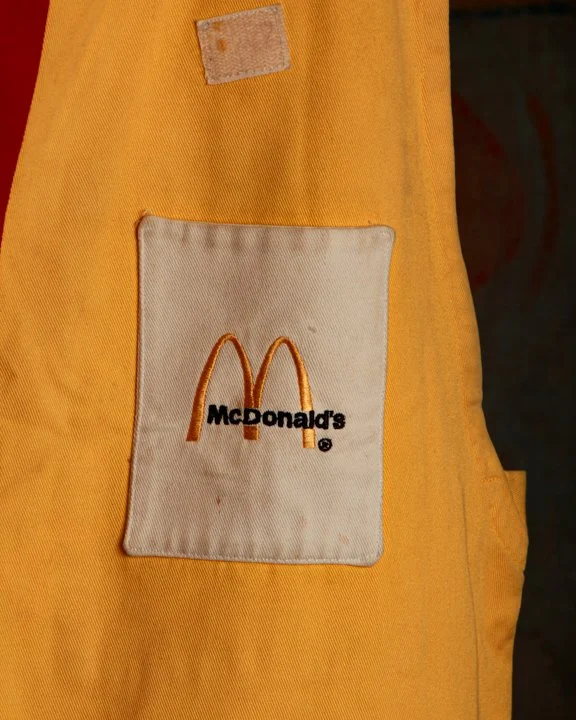
Please note that the "M" on the back is missing.
This 1970s Ronald McDonald clown costume, made by Eder Mfg. Co. in Milwaukee, is a rare relic from the golden era of McDonald's.
Drenched in that signature bright golden yellow, this oversized jumpsuit is complete with McDonald's embroidered logos on the pockets and bold red zipper down the front—the kind of branding that instantly sparks nostalgia for Happy Meals and birthday parties under the Golden Arches.
The fabric shows light wear consistent with use, but the color still pops, holding onto that unmistakable presence. It’s equal parts costume and cultural artifact—something that once performed, not just hung on a rack.
McDonald’s
McDonald’s built its empire on speed, consistency, and a kind of carefully engineered familiarity. Founded in the 1940s and rapidly expanding in the postwar years, McDonald's turned food into a system—streamlined menus, standardized kitchens, and an experience that felt the same whether you were in California or across the country.
Enter Ronald McDonald in the 1960s, a character designed to translate that system into something approachable, especially for families. Bright colors, exaggerated features, and a playful tone made him instantly recognizable. He wasn’t just a mascot—he was a bridge between brand and audience, turning a fast-food stop into something that felt a bit more like an event.
What makes this pairing interesting is how intentional it is. The food is predictable by design, and Ronald adds personality without disrupting that consistency. He appears in ads, packaging, and in-store promotions, reinforcing the brand’s identity in a way that’s hard to miss.
Over time, both the brand and the character have shifted—refined, updated, occasionally pulled back—but the core idea remains. Familiarity, delivered quickly, with just enough character to keep it from feeling purely mechanical.
It’s less about novelty and more about recognition—an experience built to be repeated, remembered, and easily found again.
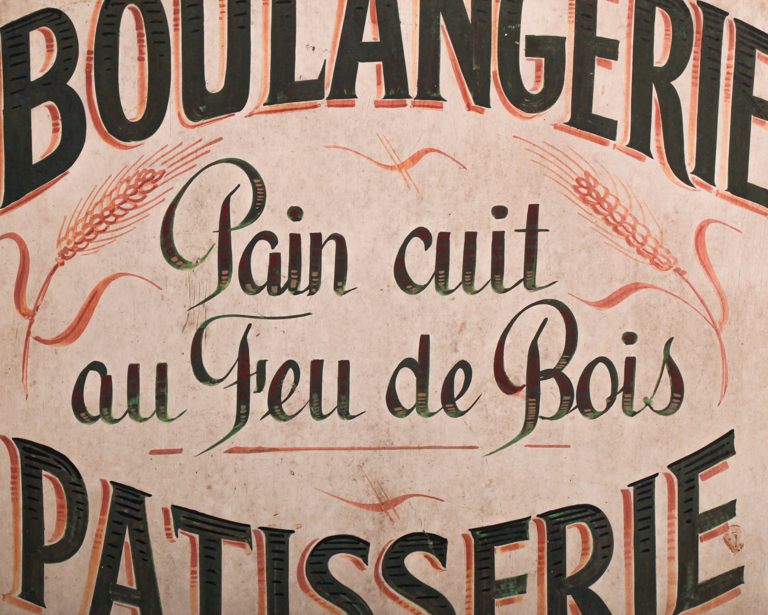
“BOULANGERIE PATISSERIE – Pain cuit au feu de bois.” In plain terms: bread baked in a wood-fired oven. In practice, it’s a quiet declaration of craft, patience, and a standard that predates shortcuts. France has long treated bread as something closer to heritage than food, with regulations, traditions, and daily rituals built around it. A sign like this wasn’t decoration. It was a statement of legitimacy.
Dating to the 1930s, this piece lands right in that sweet spot where traditional hand-painted signage was still the norm, but design had begun to sharpen. The typography carries real presence. The bold, arched lettering feels confident without being loud, while the central script softens the message, almost conversational, like a baker explaining what makes his bread worth coming back for. Subtle red shadowing gives the letters a lift, and the flanking wheat sheaves tie the whole thing back to its source without overcomplicating the composition.
The surface tells its own story. Fine craquelure runs throughout, with areas of light wear and age that read as honest rather than distracting. Around the mounting points, you can see where it once lived and worked, likely greeting customers daily. The paint has mellowed, but the lettering remains crisp and legible, exactly as it should be.
What sets this piece apart is the steel frame. It adds weight, both literally and visually, giving the sign a grounded, almost architectural presence. It feels built, not just made.
At 28 inches high by 26.25 inches wide and just over an inch deep, it’s substantial without being overwhelming. Large enough to anchor a wall, but still intimate in its detail.
Today, it does more than advertise bread. It brings with it the atmosphere of a small French street, early morning, doors just opened, ovens already working. It doesn’t try too hard. It doesn’t need to.
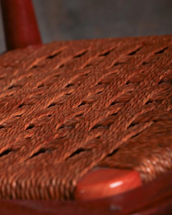
This is one of those pieces that quietly does everything.
An elegant mid-century valet stand, Italian-made and built from warm-toned mahogany, it walks the line between furniture and routine. You can see it in use without trying too hard. Jacket draped over the hanger, trousers folded neatly across the bar, watch and cufflinks set up top, ready for the next day.
The frame is clean and balanced, with just enough curve to keep it from feeling rigid. The woven rush seat adds texture and warmth, and it’s in fantastic condition—tight, even, and still doing its job. Beneath it, a small drawer slides out smoothly, a practical little hiding spot for the things that tend to disappear when you need them most.
Up top, the shallow tray is thoughtfully shaped, perfect for corralling the daily carry—coins, a watch, cufflinks—while the sculptural wooden hook and hanger keep everything else in place. Down at the base, brass-tipped shoe rails add another layer of function, catching a pair of shoes without turning the piece into something overly busy.
What makes it work is the restraint. Nothing feels added for the sake of it. Every element earns its keep, and the whole thing holds together with that easy confidence you only get from good mid-century design.
All original hardware, solid construction, and a presence that feels just as right in a bedroom as it does in a dressing room or entryway.
Measures 20 inches wide, 18 inches deep, and 42.5 inches high.
Please note: If the shipping quote at check out seems excessive, please reach out for a more accurate (and cheaper) quote at hello@heimweeantiques.com
Valets
Mid-century valet stands grew out of a very practical need: keeping a day’s outfit organized and ready without cluttering a room. Popular from the 1930s through the 1960s, they became especially common in postwar homes, when daily routines and personal presentation took on a renewed sense of order. Designers, particularly in Italy and across Europe, approached them with the same thinking applied to larger furniture—clean lines, efficient use of space, and materials that felt both warm and durable.
A typical valet combined several functions into one compact form: a hanger for jackets, a bar for trousers, a tray for small personal items, and sometimes a seat or drawer. It reflected a moment when furniture was expected to quietly support everyday life without excess. Today, they’re appreciated just as much for their thoughtful design as for their original purpose.
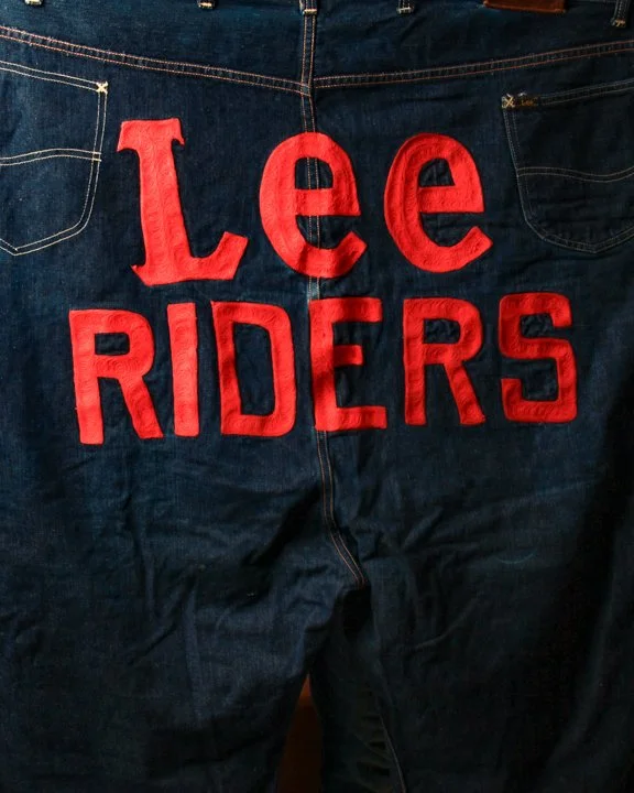
Oversized Lee Riders rodeo clown jeans. Originally made for the rodeo arena, these were worn by rodeo clowns (the brave souls who taunt bulls while saving cowboys), and the sizing is intentionally absurd. Think of them as performance gear with a wink. Made of deep indigo denim with a crisp, raw feel, these jeans are boldly emblazoned front and back with LEE RIDERS lettering in punchy orange. Double the branding on the front legs, plus a giant version across the back.
Category History
Rodeo clowns were never just comic relief—they were the safety net. In the early 20th century, as rodeo events grew larger and more organized, someone had to step in when things went sideways. That job fell to the clown, whose real role was to distract bulls, protect fallen riders, and buy precious seconds with quick thinking and quicker feet.
The oversized clothing became part of that strategy. Baggy shirts, wide suspenders, and loose pants weren’t just for laughs—they exaggerated movement, making the clown more visible and easier for the animal to focus on. Bright colors and bold patterns helped too, turning the clown into a moving target that could pull attention away from a vulnerable rider.
Materials were often tough and practical—denim, canvas, reinforced stitching—built to withstand dirt, horns, and hard landings. Over time, the look evolved into a recognizable uniform, but it always kept that balance of humor and function.
What’s compelling now is how much intent sits behind the spectacle. The costume reads playful, even ridiculous, but it’s engineered for survival. Vintage examples carry that history in their wear—faded fabric, patched knees, repairs that tell you exactly where the action happened.
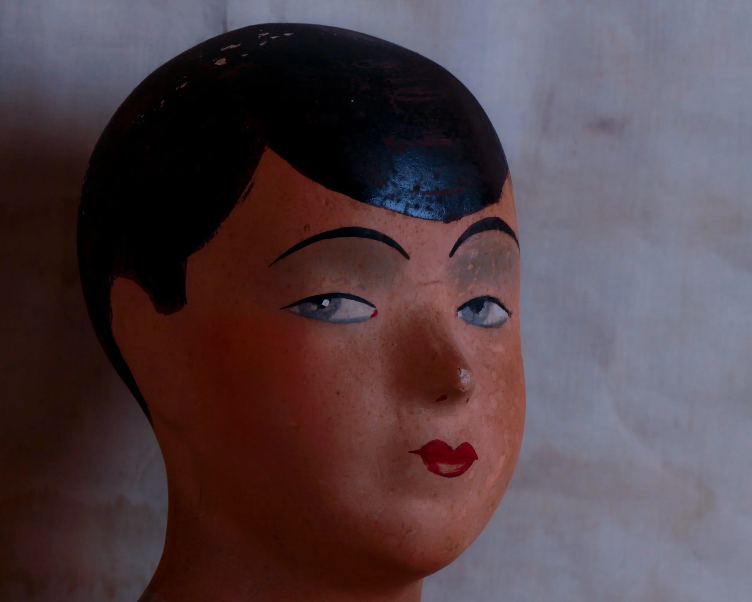
This 1930s Bobby Lee Hats display head was originally made for a hat shop counter, this composition mannequin head was designed to show off boys’ hats in a way that felt approachable, and just a little bit stylish. It features smooth cheeks, softly arched brows, and a calm, slightly knowing expression that seems to follow you around the room.
The surface is a papier mâché–type composition with its original hand-painted finish still intact. The hair is painted a deep glossy black, parted neatly in a way that feels very much of the period. The eyes are softly rendered with a relaxed sideways gaze, while the small red lips give the face a subtle touch of character.
At the base you’ll find the original Bobby Lee label, along with the circular “Hats for Boys” mark that would have helped identify the display in a shop setting. It’s a small but wonderful detail that anchors the piece firmly in its retail past. You can easily imagine it sitting in a department store window or on a wooden counter surrounded by felt caps and wool newsboys.
Measuring roughly 11.5” by 10”
Category History
Bobby Lee Hats carved out its place in the early to mid-20th century American hat trade by doing something simple, but well: making hats that felt accessible without losing style. Based in New York, the company produced a wide range of felt and straw hats that followed contemporary trends without drifting into excess.
What set them apart was presentation. Store displays, advertising pieces, and branded materials carried a distinct personality—clean, graphic, and confident enough to stand on their own. The hats themselves balanced durability with wearability, built for everyday use rather than special occasions.
Today, Bobby Lee survives as much through its ephemera as its products. Signs, displays, and packaging still carry that straightforward, well-made feel—less about spectacle, more about getting the details right.
ITEM NOT AVAILABLE IMMEDIATELY—INQUIRE IF INTERESTED hello@heimweeantiques.com
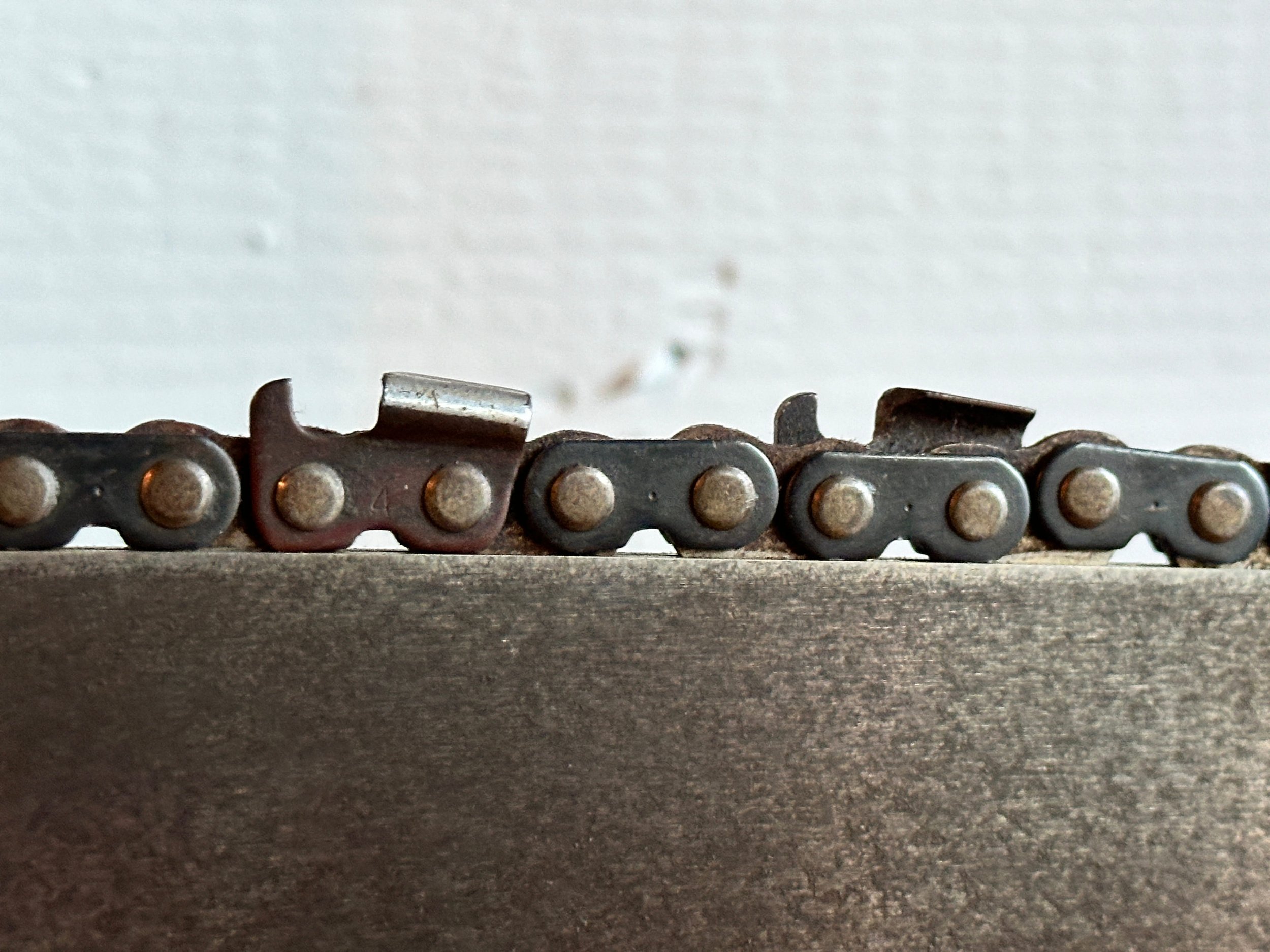
Here's a piece that's part sculpture, part machine-age marvel: a post-war Remington Model 1P aluminum chainsaw, mounted cleanly on a block of old hardwood like some kind of industrial trophy. Built in the 1940s by Remington Arms Co. in Park Forest, Illinois, this thing was engineered for utility, but it's aged into something closer to art. The all-aluminum housing has that smooth matte finish only decades of use can deliver, and the bar and chain are still fully intact-down to the tiny stamped patent numbers and "GREASE DAILY" warning etched on the sprocket. The pistol grip and oil reservoir still have that fighter-plane-meets-factory-tool vibe. It measures about 26 inches long—a true relic from the era when everything was overbuilt and unapologetically mechanical.
Remington Chainsaws
Remington chainsaws in the 1940s come out of a moment when tools were evolving quickly to meet real-world demands. Best known for typewriters and firearms, Remington expanded into power equipment as industries like logging, construction, and land clearing pushed for faster, more efficient methods. The chainsaw, still a relatively new technology, fit right into that shift.
These early machines were far from the compact tools we think of today. They were heavy, loud, and often required two operators—one on each end—just to control the cut. Powered by gasoline engines, they traded portability for raw cutting ability, making them especially useful for felling large trees or tackling dense timber.
What stands out is the engineering mindset behind them. Durability came first. Thick metal housings, exposed mechanical components, and straightforward construction made them easier to repair in the field. They weren’t designed to be delicate—they were built to work, and to keep working.
Using one required skill and awareness. There were fewer built-in safety features, so handling them was as much about experience as strength. But for those who knew how to use them, they represented a major leap forward.
Today, these early Remington chainsaws read as both industrial artifact and milestone—marking the point where manual labor began to give way to mechanized force in a very visible, very physical way.
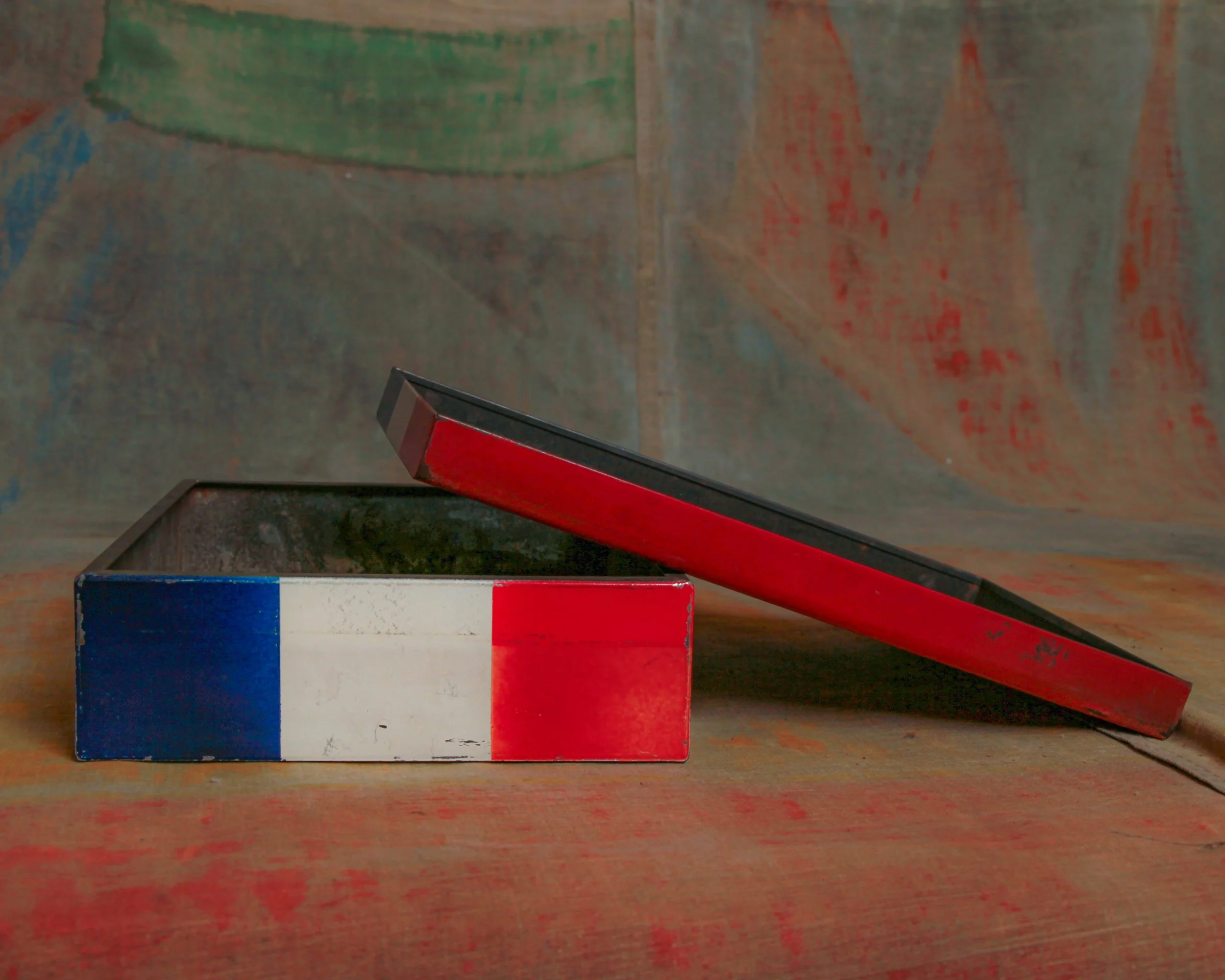
At first glance it looks unmistakably French. The bold vertical stripes in blue, white, and red immediately read like the French tricolor, the sort of graphic shorthand you might expect from a Parisian pâtisserie window. Clean, confident, and just a little bit stylish without trying too hard.
But look closer and the plot thickens. The sides carry Japanese lettering, hinting that this box likely came from a Japanese bakery inspired by French pastry culture, circa mid-20th century.
The tin itself has a wonderfully honest, mid-century feel. Simple folded steel construction, a snug-fitting lid, and crisp painted graphics that were meant to catch the eye across a bakery counter. Time has done its work in the best possible way. The surface shows scattered scuffs, small scratches, and gentle wear to the paint along the edges. The colors are still bold, but softened just enough to remind you this box lived a real life rather than sitting on a shelf.
What makes it especially appealing is that perfect mix of graphic design and cultural crossover. French pastry tradition filtered through Japanese design sensibility, all wrapped up in a practical bakery tin.
Category History
French patisserie in Japan is less import than interpretation. After World War II, French techniques—laminated doughs, custards, precise baking—made their way into Japanese culinary schools and shops. What followed wasn’t imitation so much as refinement. Bakers adopted the structure and discipline of French pastry, then adjusted it to local taste—lighter textures, less sugar, cleaner finishes.
Presentation became just as important as flavor. Display cases read like small galleries, each piece carefully proportioned and detailed. Seasonal ingredients and packaging add another layer of attention.
What makes it compelling is the balance. You can recognize the French foundation, but the execution feels distinctly Japanese—precise, restrained, and quietly inventive, with a focus on craft over excess.
ITEM NOT AVAILABLE IMMEDIATELY—INQUIRE IF INTERESTED hello@heimweeantiques.com
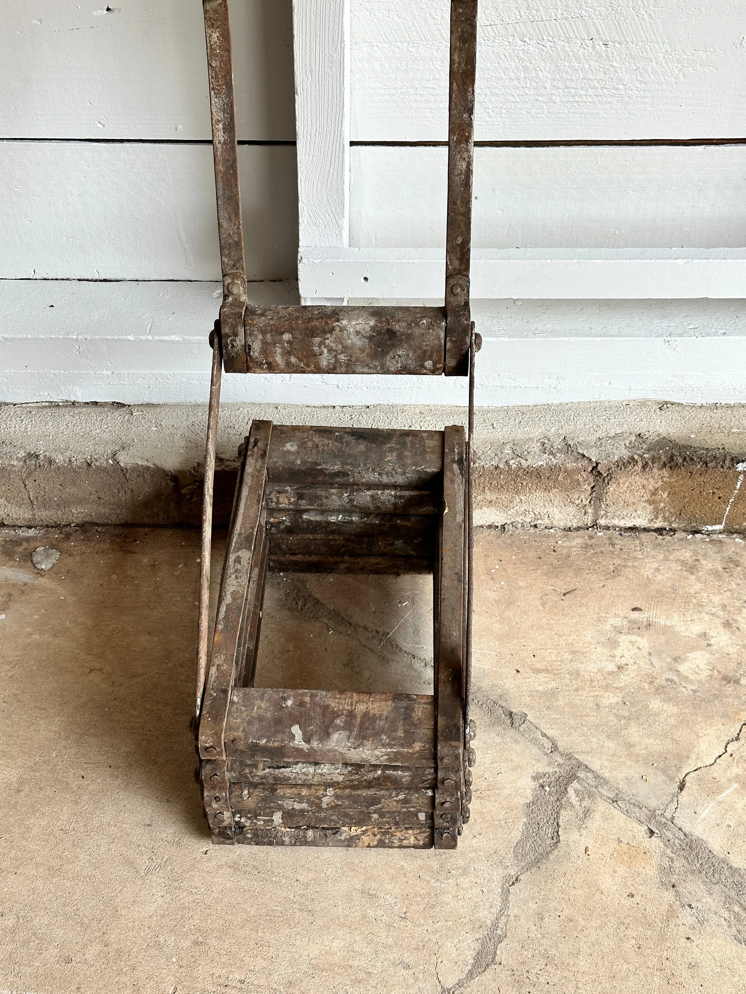
Straight out of an old hangar, this collapsible aircraft ladder is the real deal. Circa 1920s, it was designed for mechanics to access the fuselage during service and repairs. Constructed of hardwood steps and pressed steel side brackets, it folds up like a concertina and still has its original patina of age and elbow grease. The hooked top was made to latch securely to the plane's frame, while the flexible desian let it collapse flat against the wall when not in use. A rare survivor from the early days of aviation maintenance.
Category History
A 1920s folding service aircraft ladder belongs to that early chapter of aviation when everything was still being figured out—on the ground as much as in the air. Aircraft were smaller, lighter, and often parked out in open fields, so access wasn’t built in. Ladders like these were essential, used by mechanics, pilots, and crew to reach cockpits, engines, and fuel ports.
The design is all about portability and efficiency. Typically made from wood or lightweight metal, with simple hinges and locking braces, they could fold flat, be carried easily, and set up quickly wherever needed. No wasted parts, no excess weight—just enough structure to do the job safely.
What’s interesting is how closely they reflect the mindset of early aviation: practical, adaptable, and a little improvised. These weren’t mass-standardized pieces yet. Variations in construction and detail are common, shaped by workshop methods or specific needs.
Over time, they pick up the marks of use—worn steps, oil stains, repairs—evidence of long hours spent around machines that demanded constant attention.
Today, they read as more than tools. There’s a quiet elegance in their simplicity, a kind of honest engineering that mirrors the aircraft they once served—functional, direct, and built to keep things moving.
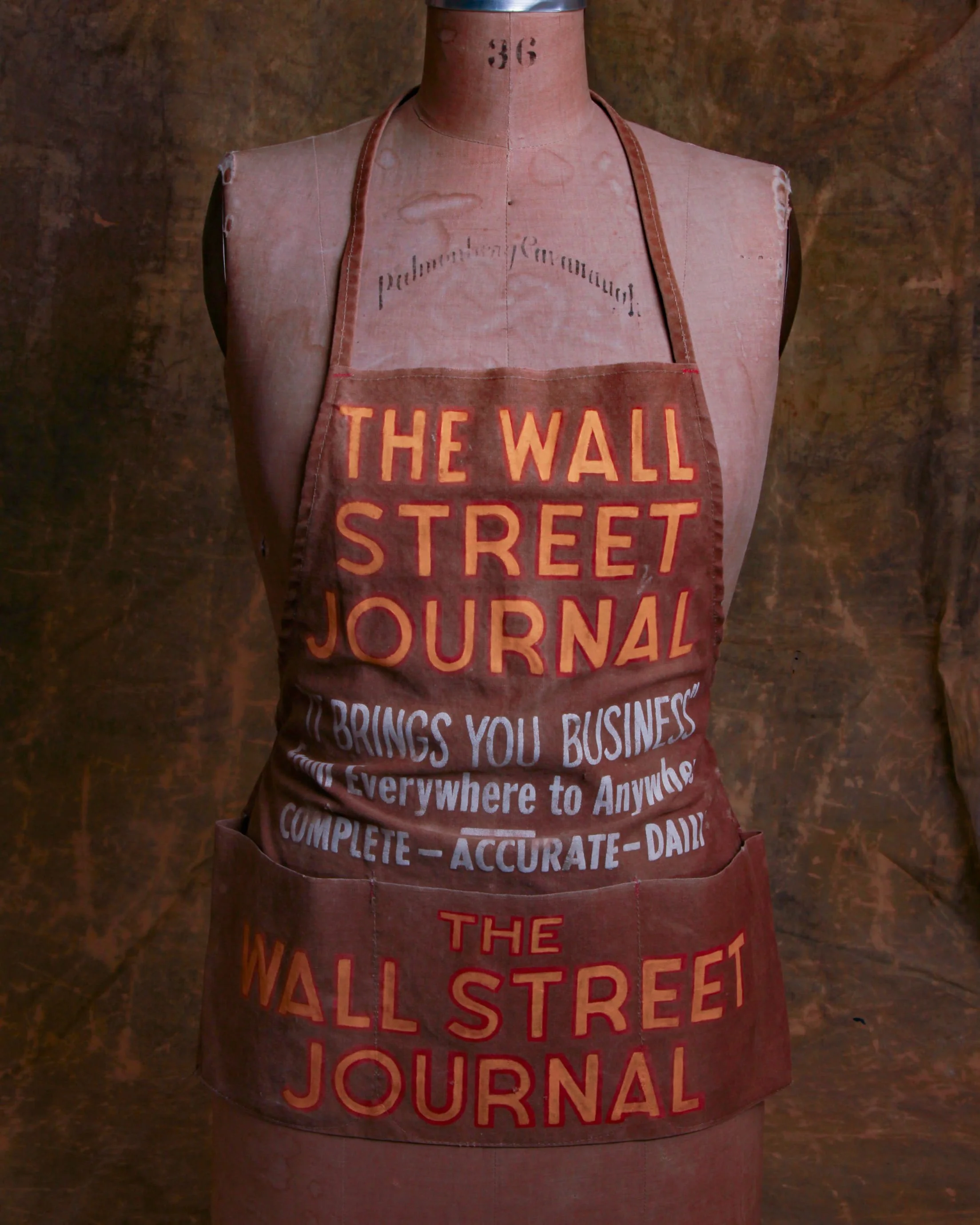
Immerse yourself in the scene of a bustling city street of yesteryear, where the newspaper hawkers would don this apron, their badge of honor. Picture the sun-drenched sidewalks, filled with the sights and sounds of a vibrant metropolis. The rhythmic calls of the hawkers, their voices carrying the urgency and importance of breaking news, echo through your imagination.
This late 1940s, heavy cloth canvas apron served as a beacon of information in the form of a wearable masterpiece, proudly promoting the esteemed Wall Street Journal newspaper.
As you hold this apron in your hands, you can feel the weight and durability of the canvas fabric, a testament to its early craftsmanship. Its sturdy construction speaks of a time when newspapers were cherished and revered as the primary source of news and knowledge. This apron stands as a symbol of the dedication and hard work of the street hawkers who tirelessly carried the news to the masses.
WSJ
The Wall Street Journal began in 1889 as a modest four-page publication created by Charles Dow, Edward Jones, and Charles Bergstresser—names now better known for the Dow Jones Industrial Average than for their newspaper. Early on, it was less about headlines and more about clarity. It aimed to translate the fast-moving, often opaque world of finance into something investors could actually use.
At a time when markets were fragmented and information traveled slowly, the paper became a kind of daily ledger of trust. It reported stock prices, railroad earnings, and business developments with a tone that was direct and unsentimental. That tone stuck. Even as the paper grew, it resisted flash in favor of precision, building a reputation on consistency rather than spectacle.
Through the 20th century, The Wall Street Journal expanded beyond pure finance, covering politics, global economics, and culture, but always with an eye toward how systems work—who moves markets, and why. Its distinctive front-page illustrations, those tightly crosshatched portraits, became a quiet signature.
What’s interesting is how the paper evolved without losing its core identity. It adapted to radio, television, and eventually the internet, but kept its emphasis on reported fact over noise. Today, it still operates as both a news source and a kind of institutional memory—tracking not just events, but the patterns behind them.
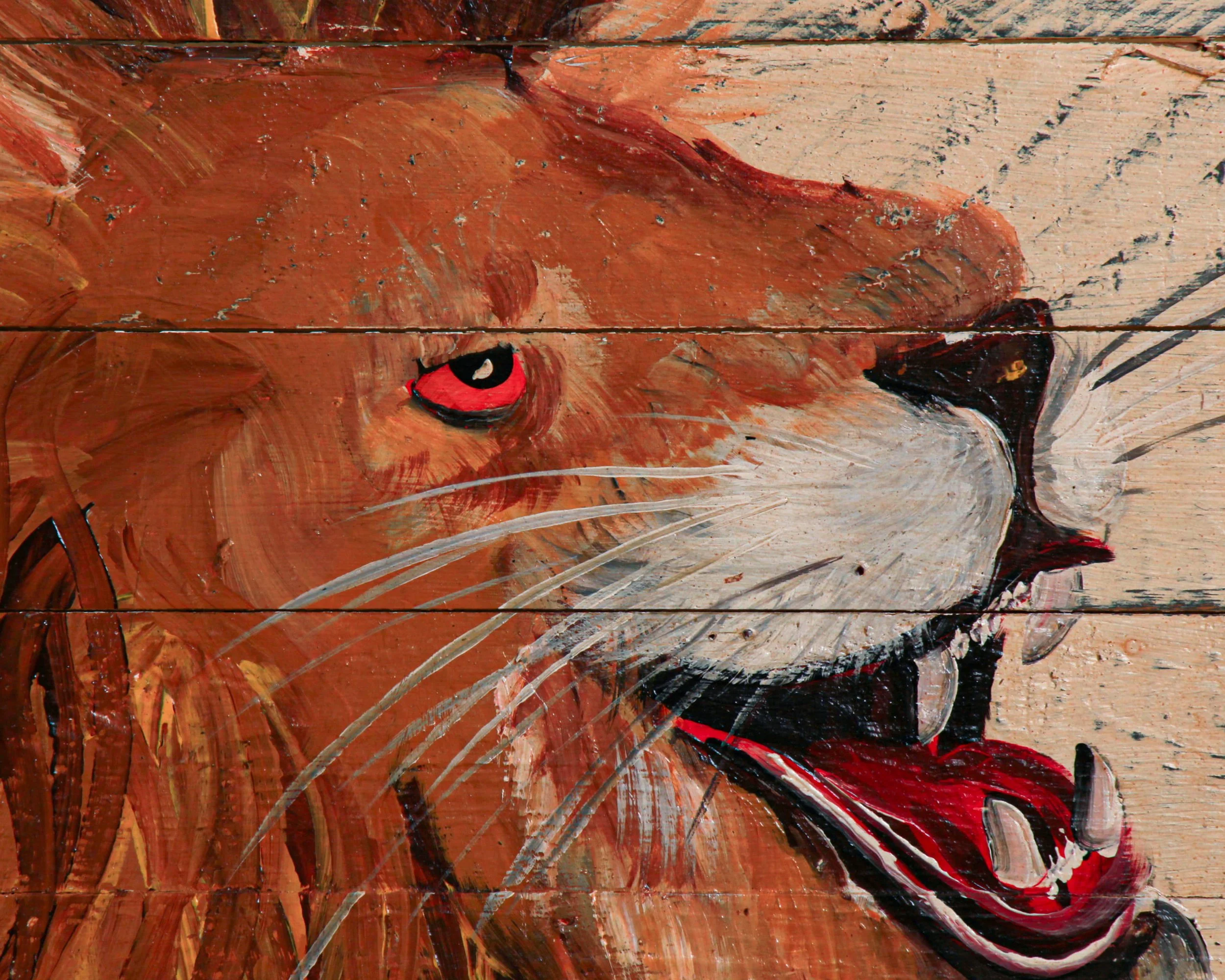
Hand-painted in the early 2000s but channeling the bold, unapologetic graphics of a 1930s circus midway, this “CIRCUS TICKET OFFICE” sign leans all the way in. The lettering has that classic carnival swagger—chunky, shadowed, and slightly irregular, painted on wide wooden planks.
And then there’s the lion. Mid-roar, teeth out, eyes locked forward with that slightly unhinged energy you’d expect just outside a big top. It’s not polished or overly refined, which is exactly the point. It feels like it was painted fast, loud, and with conviction—built to grab attention from across a dusty fairground.
At over four and a half feet wide, it has real presence.
Sourced in England.
Circus Life
Circus life has always been a world just slightly outside the everyday, equal parts grit and spectacle. In the late 19th and early 20th centuries, traveling circuses moved like small, self-contained cities—railcars packed with performers, animals, tents, props, and everything needed to set up overnight and disappear just as quickly. It was demanding work. Days were long, conditions were rough, and everyone had a role beyond the spotlight, from rigging tents to caring for equipment and animals.
Performers often came from generations of circus families, learning their craft young and refining it through repetition rather than formal training. Acts weren’t just entertainment, they were survival. A strongman, a trapeze artist, a clown—each depended on drawing a crowd, because the crowd meant the next town, the next paycheck.
What’s often overlooked is the sense of community. Circus life created tight bonds, built on trust and shared routines. You relied on the person catching you midair or setting the stage beneath your feet. It wasn’t glamorous in the way posters suggested, but it had its own rhythm and independence.
By the mid-20th century, changing tastes and regulations began to reshape the traditional circus, but the image endures—part nostalgia, part mythology, rooted in a very real, hardworking way of life.

ITEM NOT AVAILABLE IMMEDIATELY—INQUIRE IF INTERESTED hello@heimweeantiques.com
Early 20th-century Sukuma shield from Tanzania, crafted out of thick buffalo hide. The hide is worked into a broad, almost disc-like form with subtle side indentations and a proud raised boss at its center—both a functional deflector and a visual marker of strength. On the reverse sits a sturdy wooden handle, secured with leather bindings that have aged into a deep, earthy tone. Shields like this weren’t just practical armor; carried by Niatura warriors, they were symbols of identity and power, doubling as ritual objects in ceremonies long after the battle dust had settled. Mounted on a stand, it’s as much a sculpture as it is an artifact.
Category History
The Sukuma of northwestern Tanzania, centered around Lake Victoria, are often described through their balance of farming, cattle keeping, and performance traditions—but there’s also a more specialized layer within that world: the Niatura warrior societies. These groups functioned less like standing armies and more like organized bands of young men trained for protection, cattle defense, and, at times, raiding.
What makes the Niatura interesting is how structured they were. Membership, hierarchy, and ritual all played a role. Strength and agility mattered, but so did discipline and identity. Distinctive regalia—feathered headdresses, animal skins, and decorated shields—helped signal both status and presence, especially during gatherings or performances.
And that’s where the line blurs. Among the Sukuma, movement, rhythm, and display are central to cultural expression, so elements of warrior identity often carried into dance and competition. The same physicality used in defense translated into performance, where stamina and coordination became a form of prestige.
Cattle remained the underlying thread. Protecting herds meant protecting wealth, family, and standing within the community.
What emerges is a layered system—practical, symbolic, and social all at once. The Niatura weren’t separate from Sukuma life; they were one of its more focused expressions of strength, responsibility, and collective identity.

This mid-century Italian fireplace screen turns a purely practical object into something wonderfully theatrical. Made of brass and shaped as a large eagle with outstretched wings, it has a sculptural presence even when the fireplace isn’t in use. The eagle’s head, layered feather details, taloned feet, and broad wing outlines are all worked in relief, while the interior sections are filled with finely perforated metal mesh designed to catch sparks without blocking the glow of the fire. The warm, aged brass surface has developed a handsome patina that gives the piece plenty of depth without dulling the details.
Fireplace screens became increasingly decorative during the 19th and 20th centuries, especially as the hearth shifted from being a household necessity to more of an architectural focal point. By the mid-century period, Italian makers were particularly good at blending useful household objects with bold sculptural forms. Brass was a natural fit: durable, heat resistant, visually warm, and easy to cast or work into elaborate shapes.
Animal-form fireplace screens were part of that tradition, with peacocks, roosters, and eagles among the more dramatic designs. The eagle was especially effective because its spread wings naturally created the wide silhouette needed to cover a fireplace opening. It also gave makers a chance to add layers of feathering, relief work, and ornamental detail without losing the object’s function.
This example has a strong decorative quality, but it still reads clearly as a working fire screen rather than a purely sculptural piece. The perforated mesh, hinged wing sections, and freestanding feet all speak to its original purpose.
It’s the kind of mid-century Italian design that lands somewhere between furniture, decorative arts, and sculpture: practical enough to sit in front of a fire, but visually strong enough to hold its own anywhere in a room.