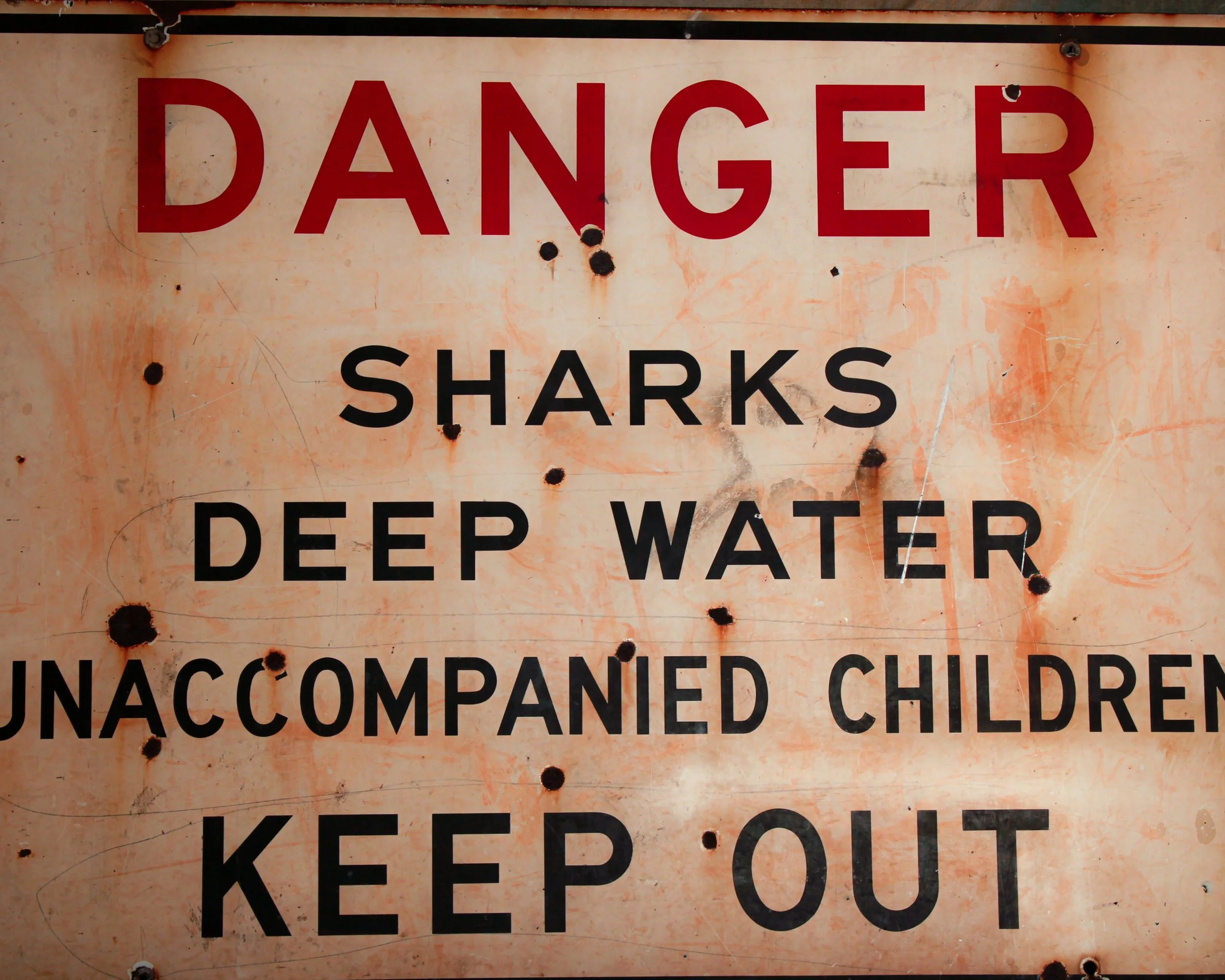
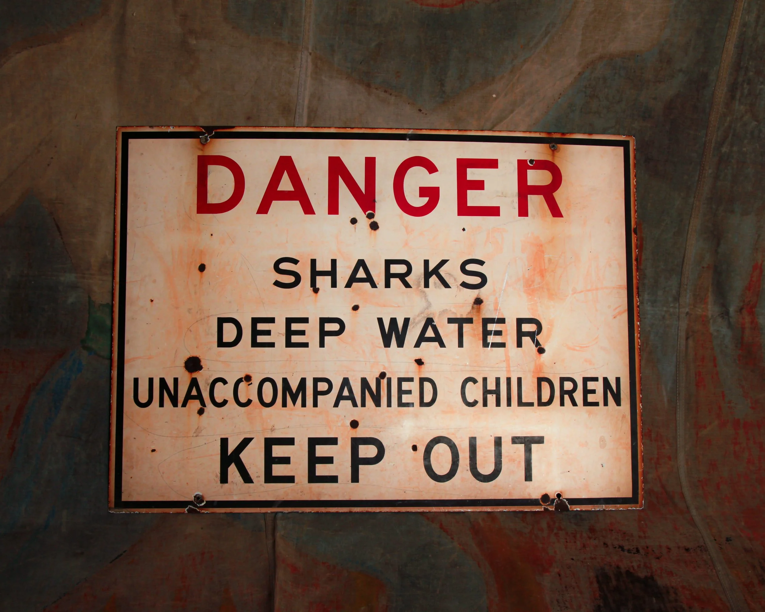
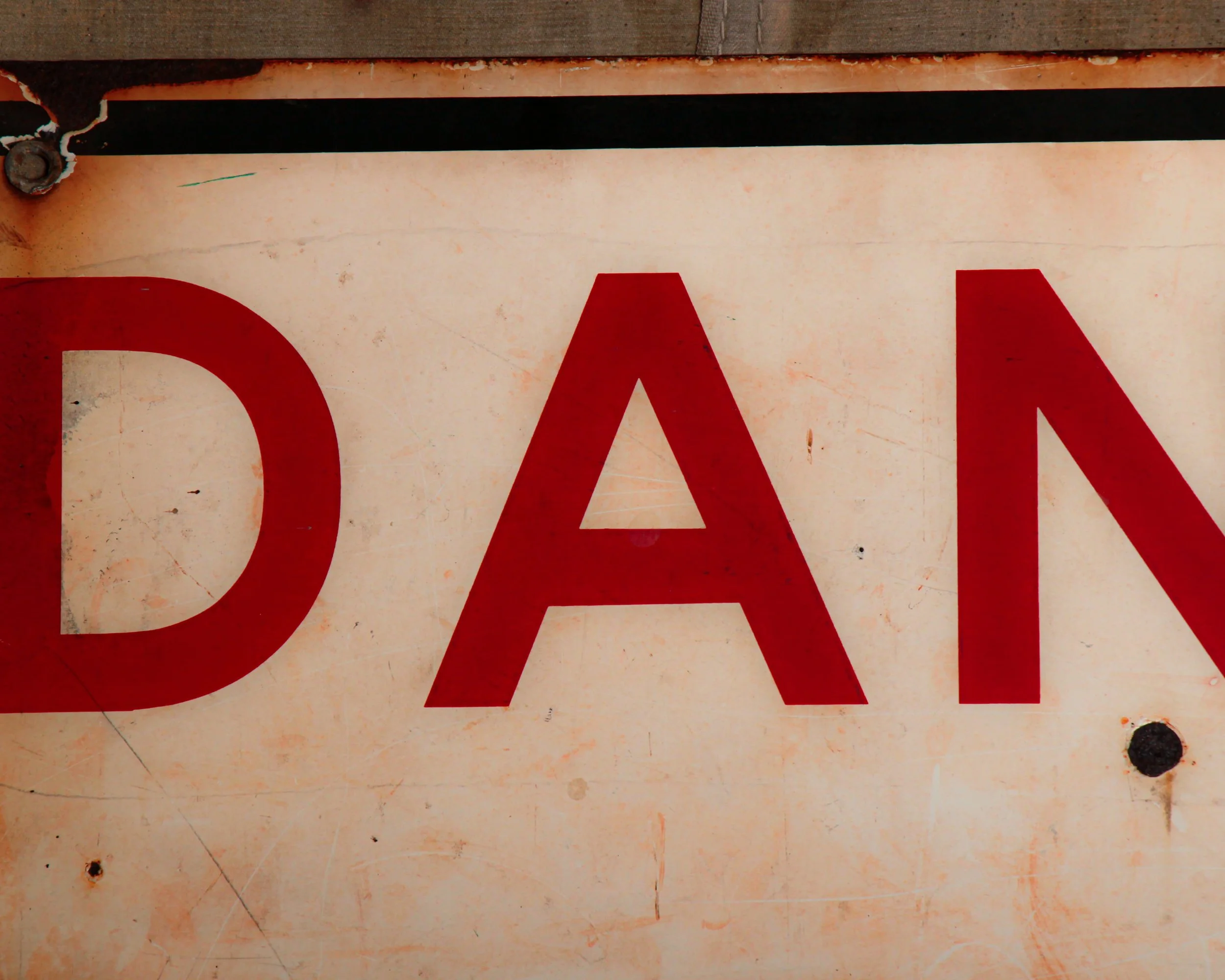
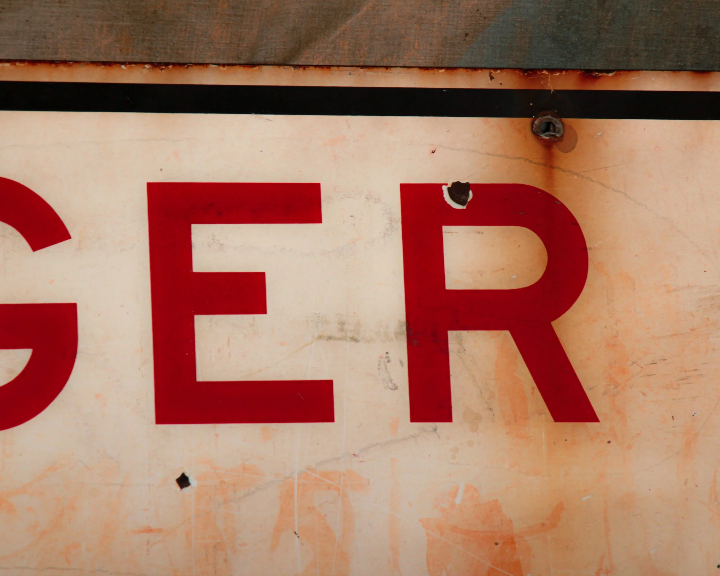
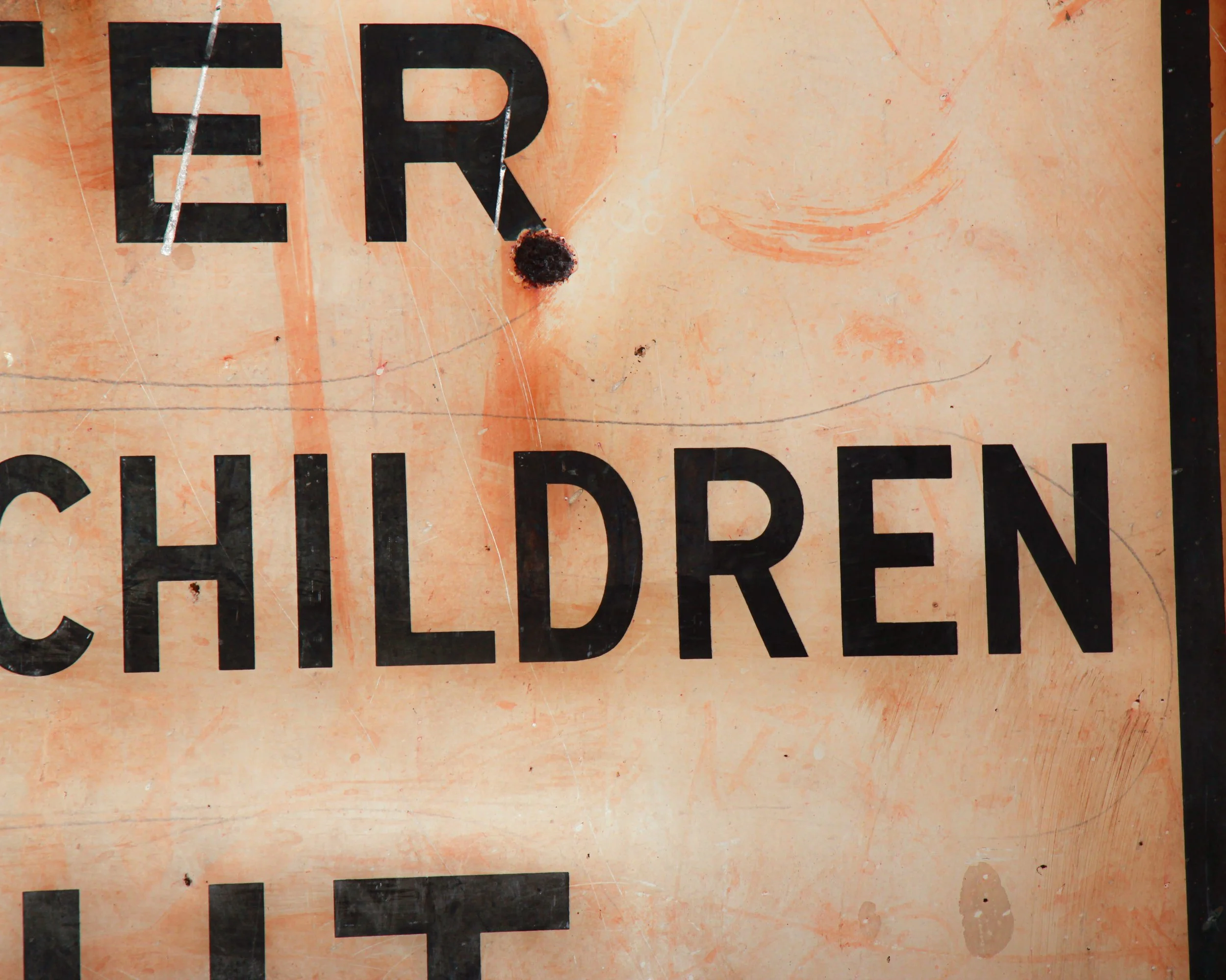
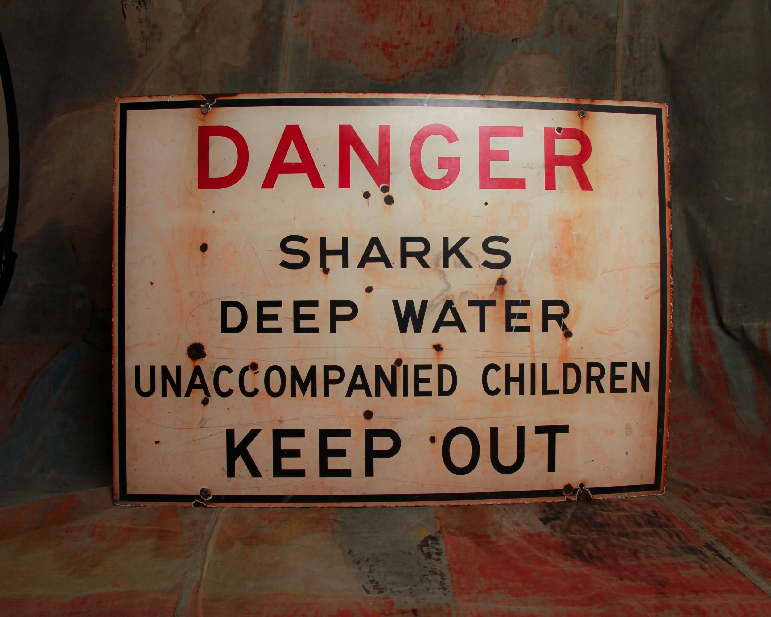
DANGER
SHARKS
DEEP WATER
UNACCOMPANIED CHILDREN
KEEP OUT
That is the entire message, delivered with the blunt efficiency of a lifeguard whistle and a raised eyebrow. No illustrations, no polite suggestions, just a series of escalating facts that end with a firm “don’t even think about it.”
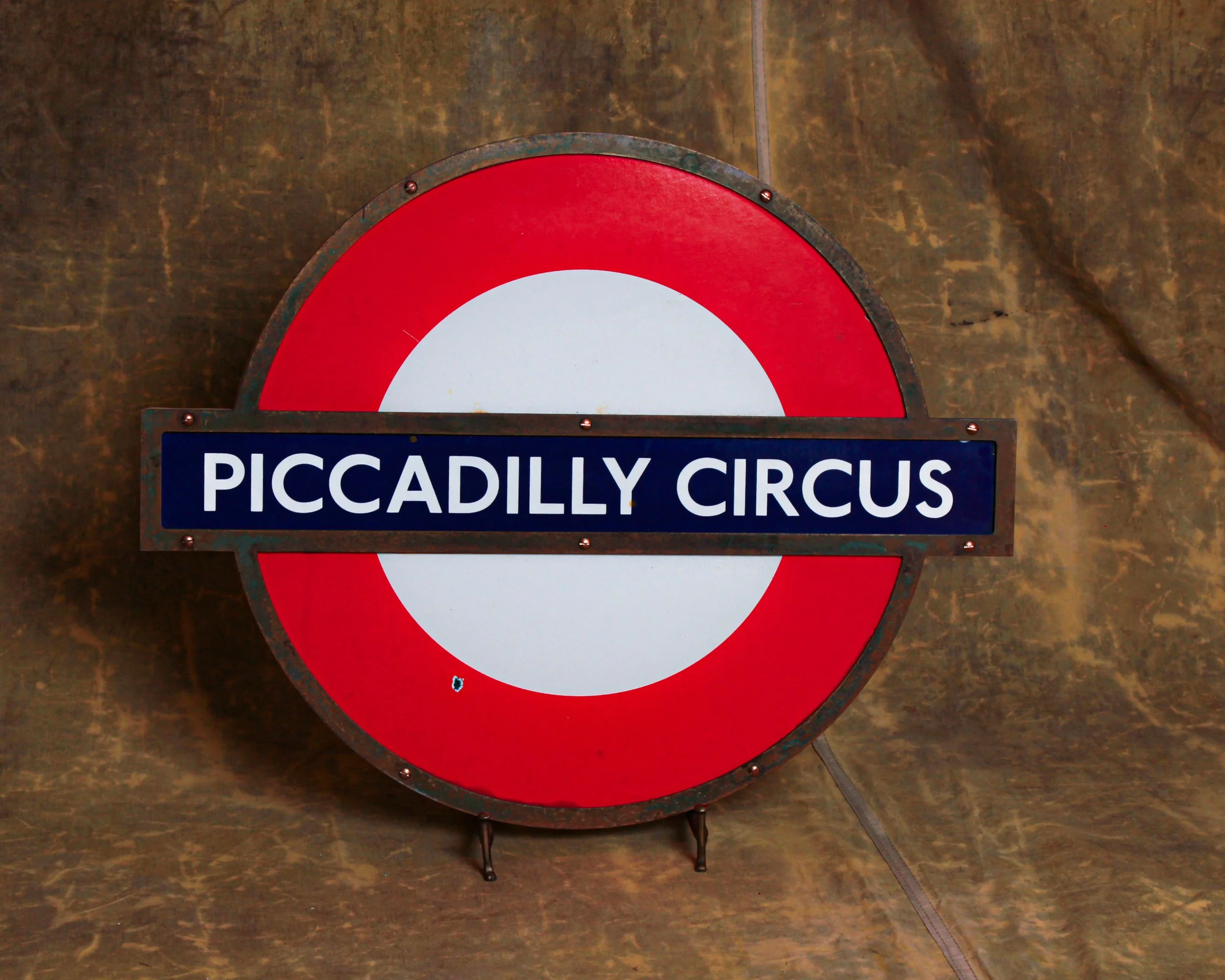
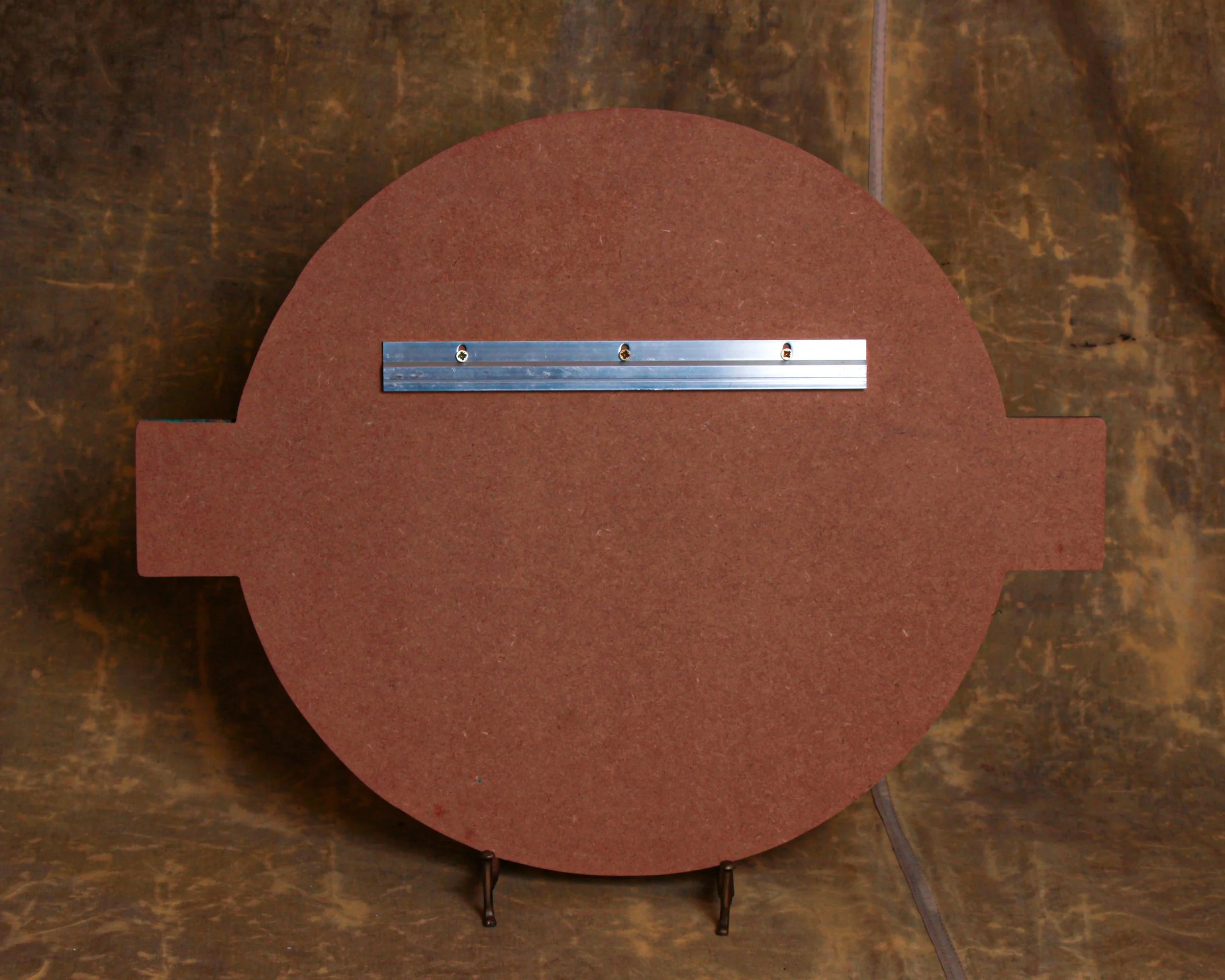
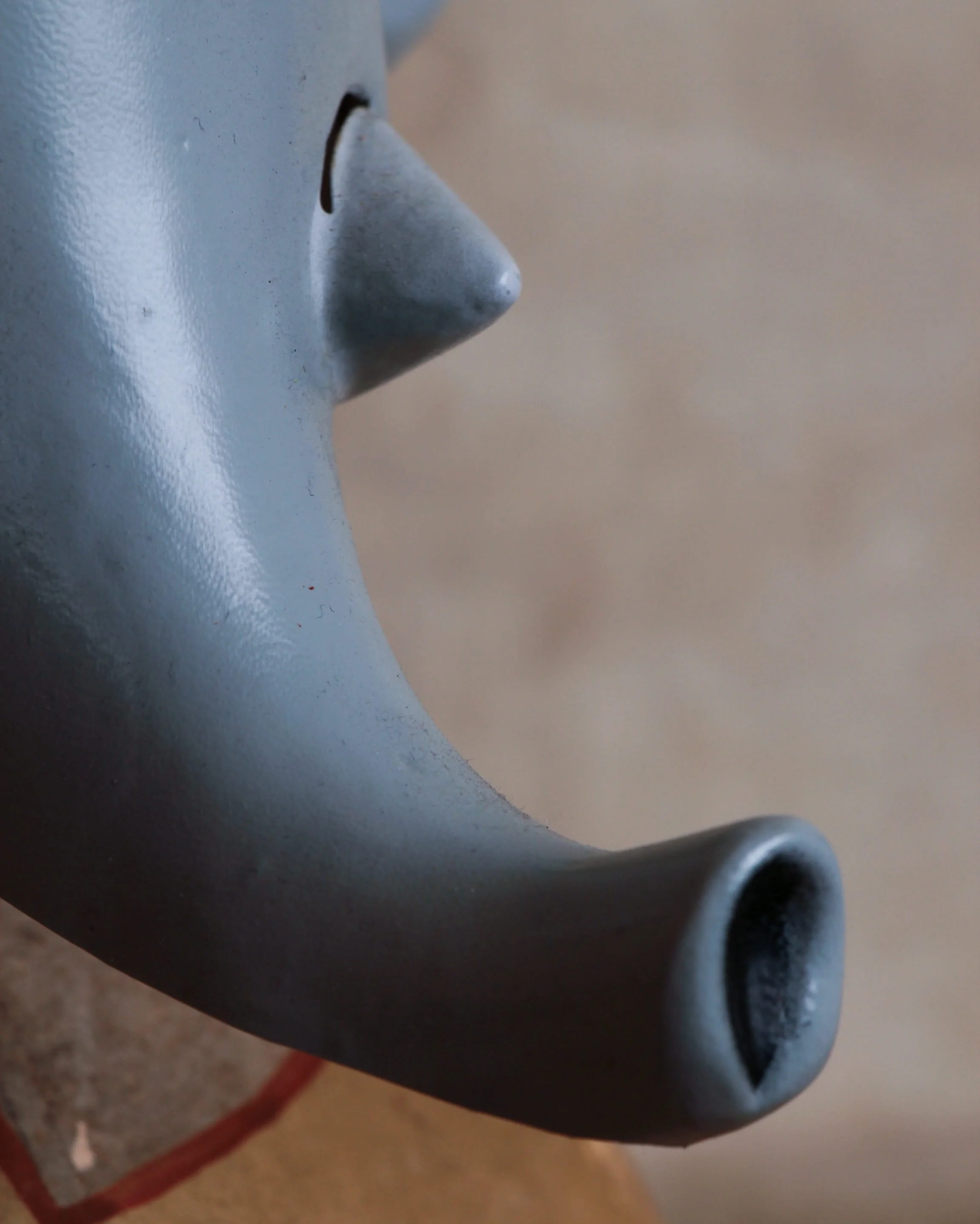
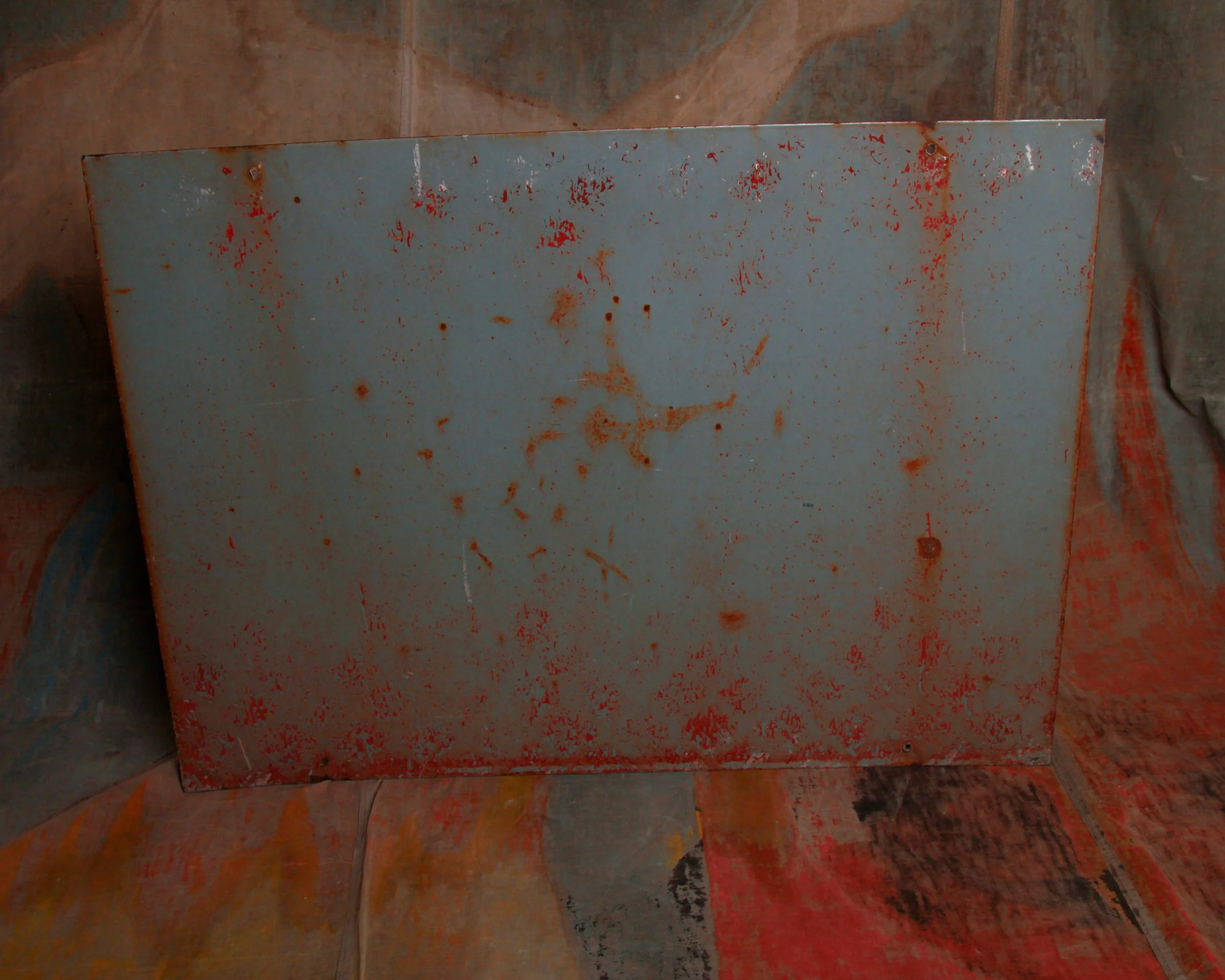
This beach warning sign is made of single-sided tin and was likely once posted somewhere along the Southern California coast, probably around Los Angeles. You can easily imagine it bolted to a weathered pier piling or standing near a rocky stretch of shoreline where the water gets deep quickly.
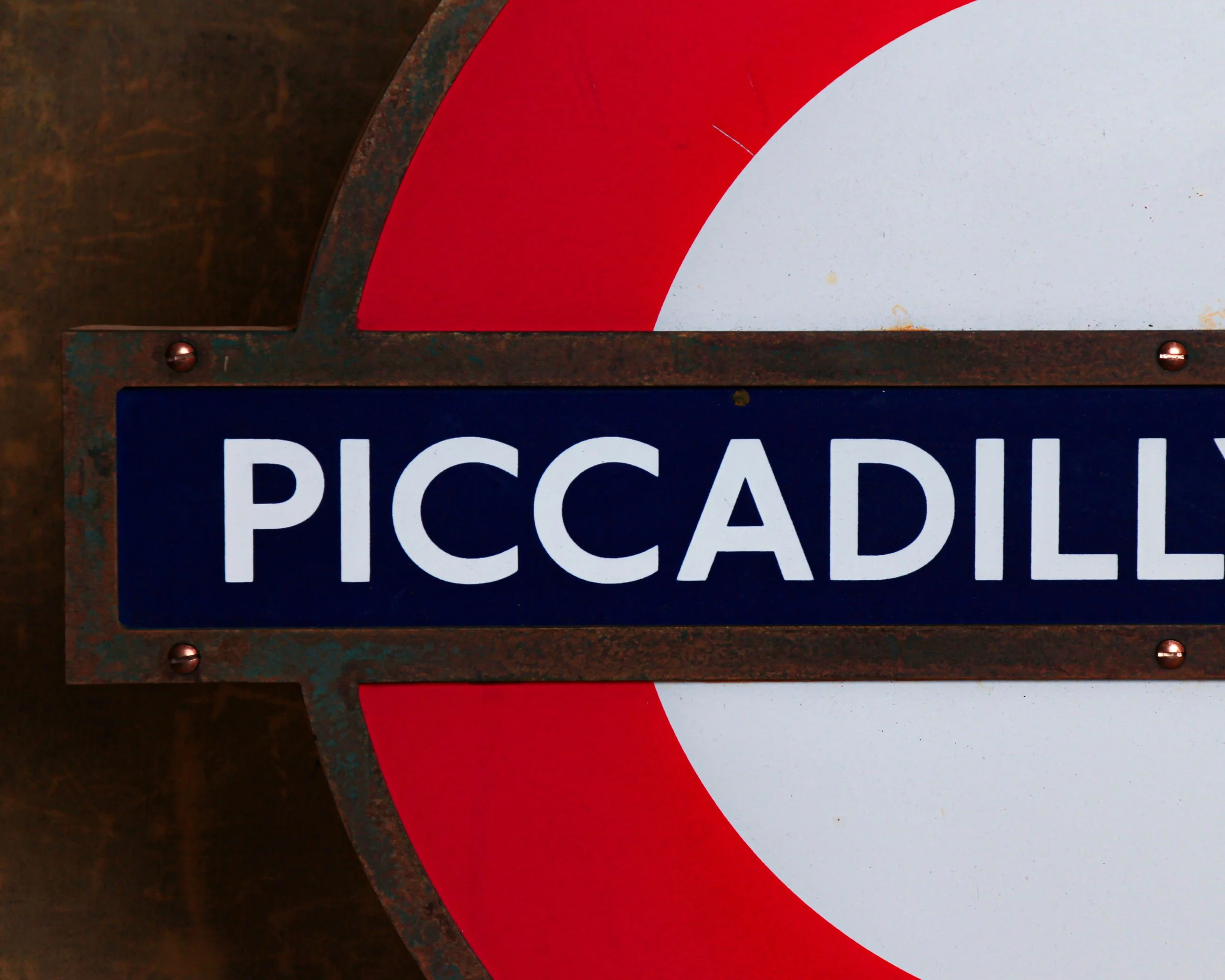
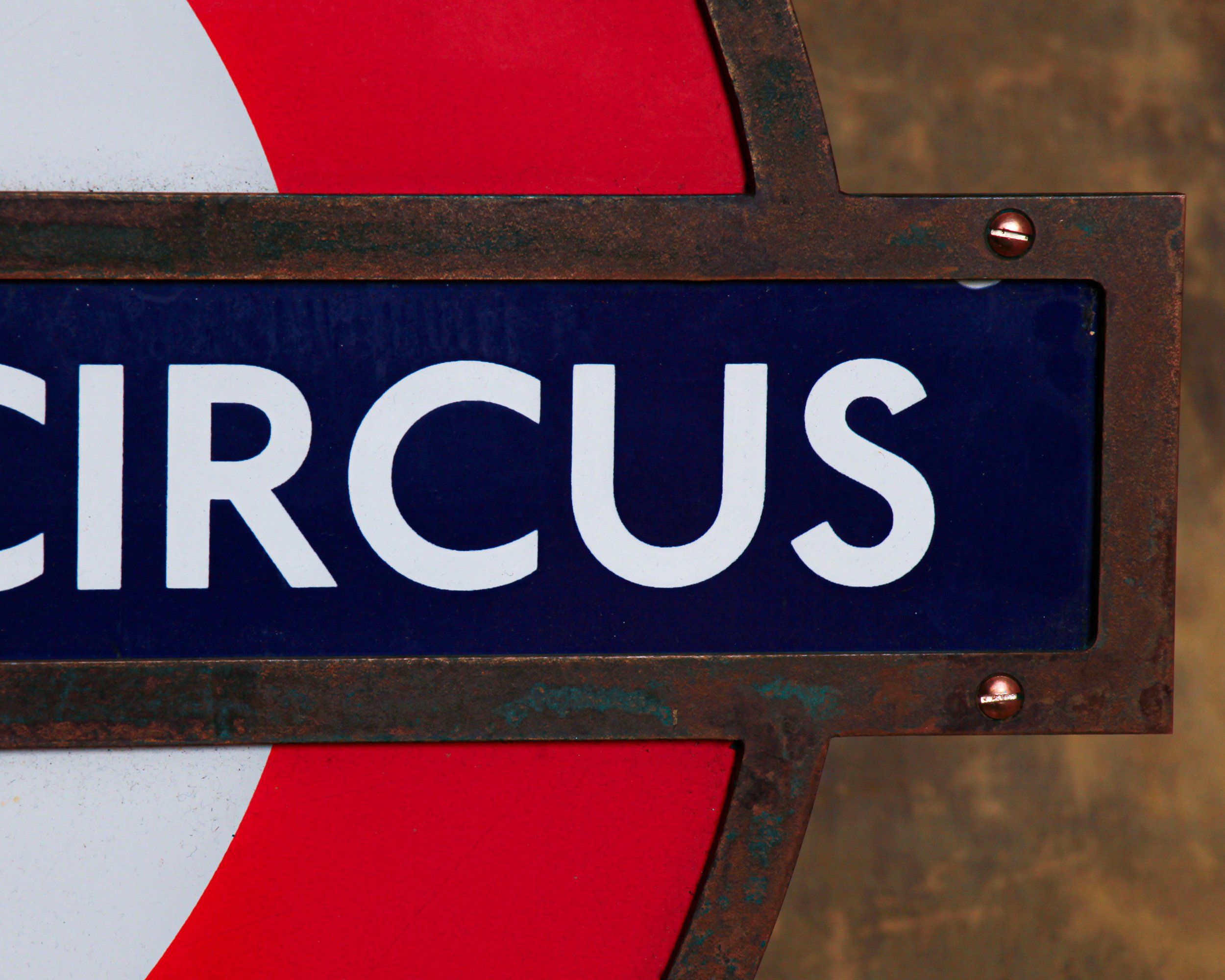
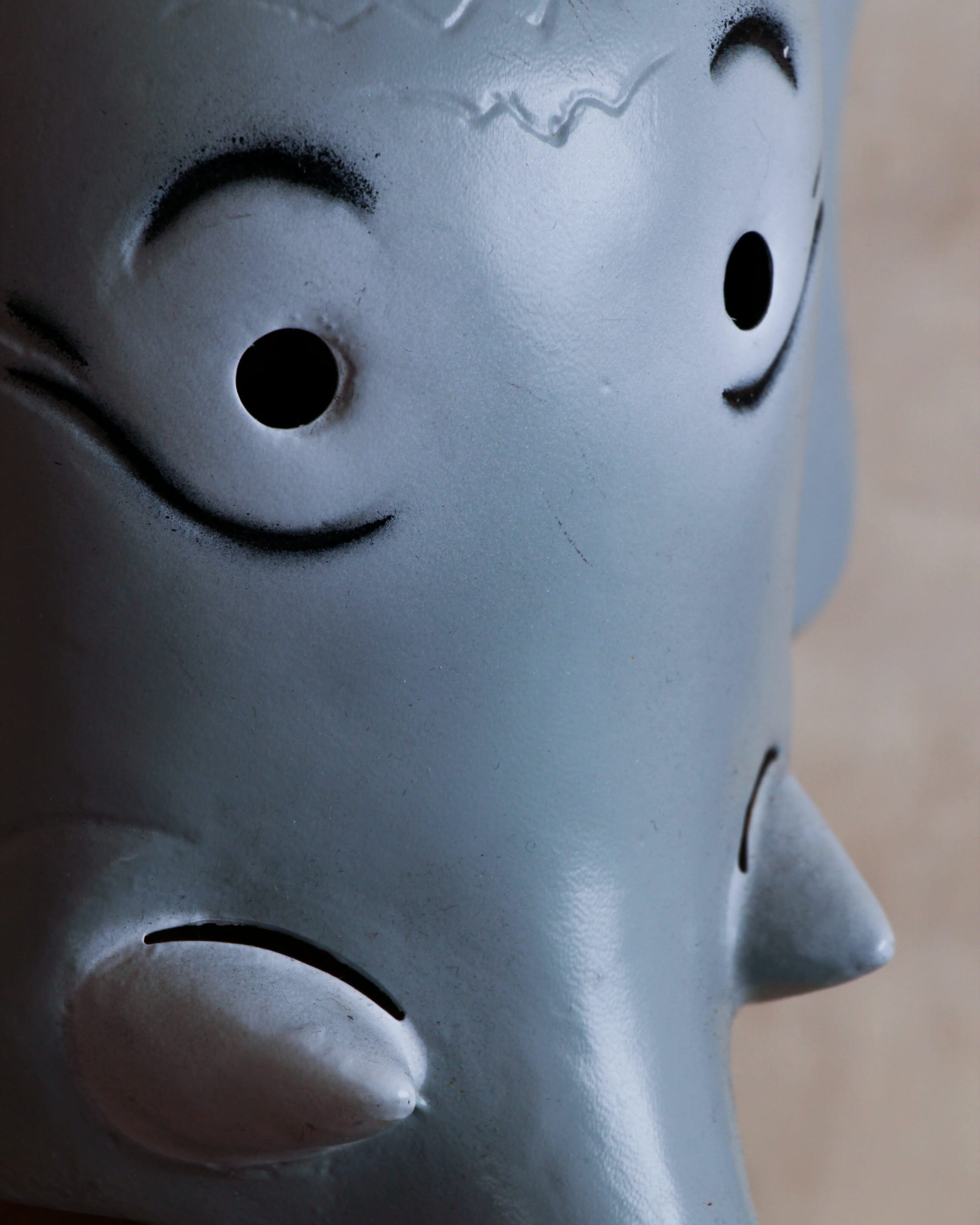
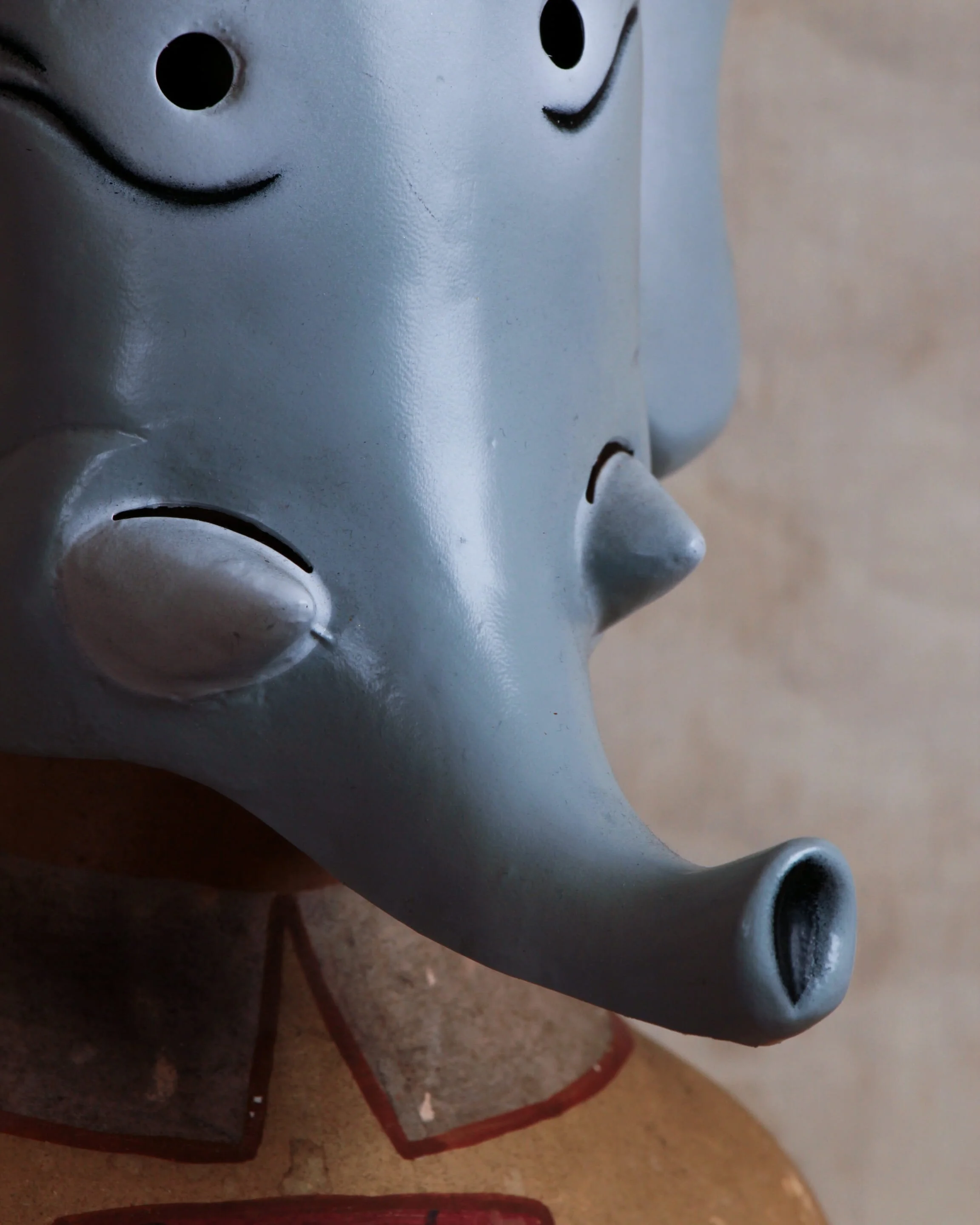
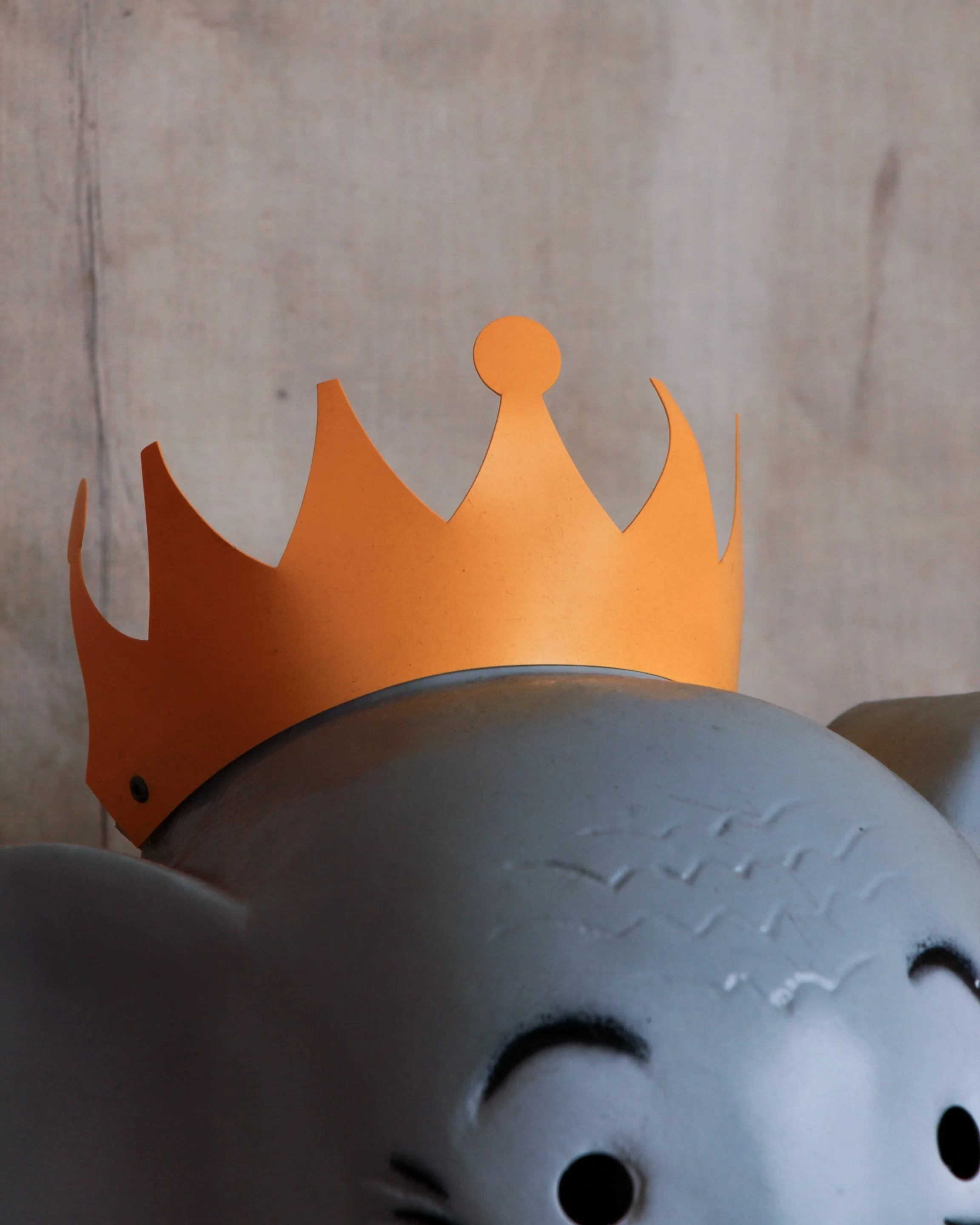
Graphically, it is a beauty. The bold red “DANGER” headline grabs you immediately, while the stark black lettering underneath marches down the sign like a checklist of reasons to turn around. It is classic mid-century municipal design. Clear, direct, and built to be read from a distance through salt air and sun glare.
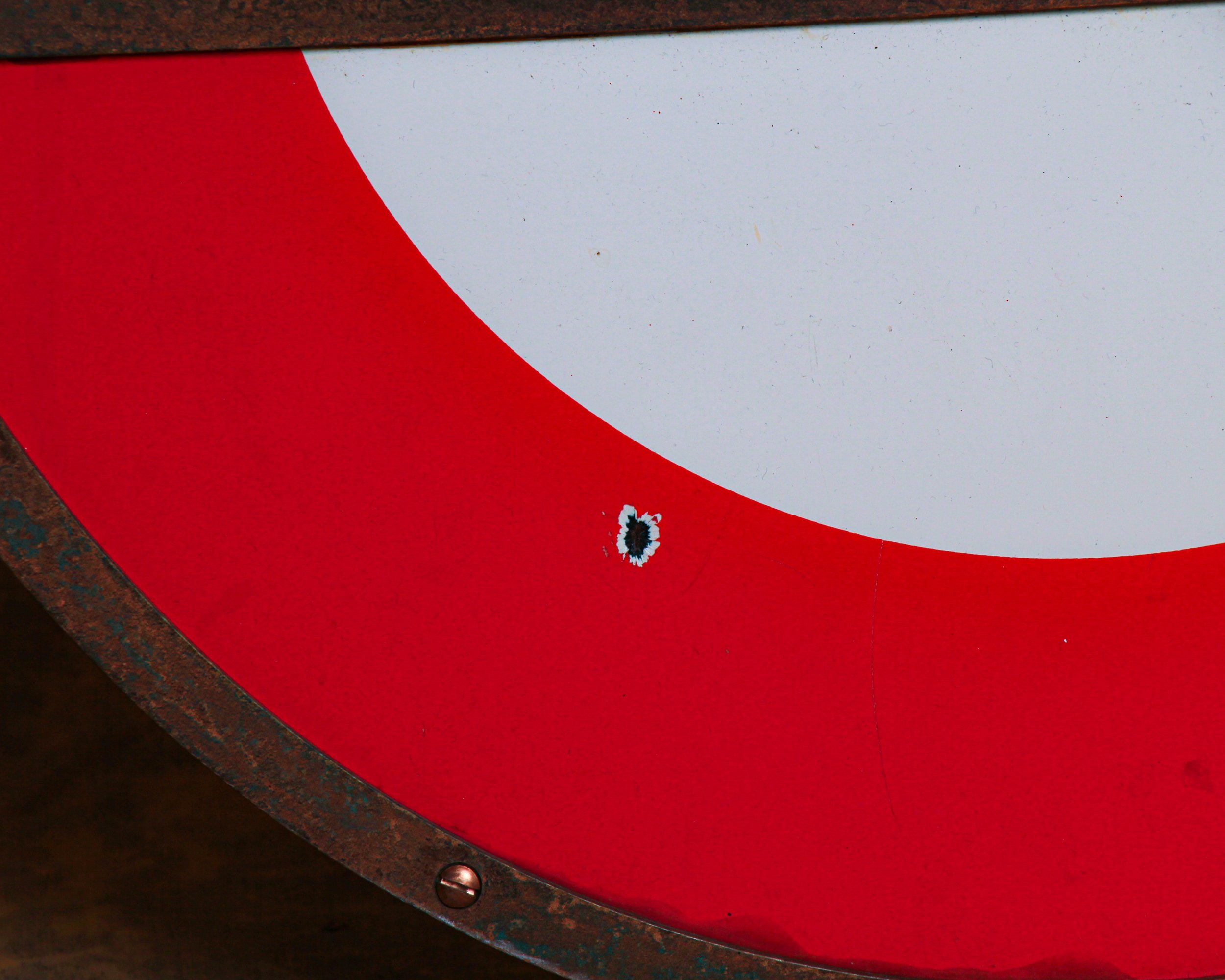
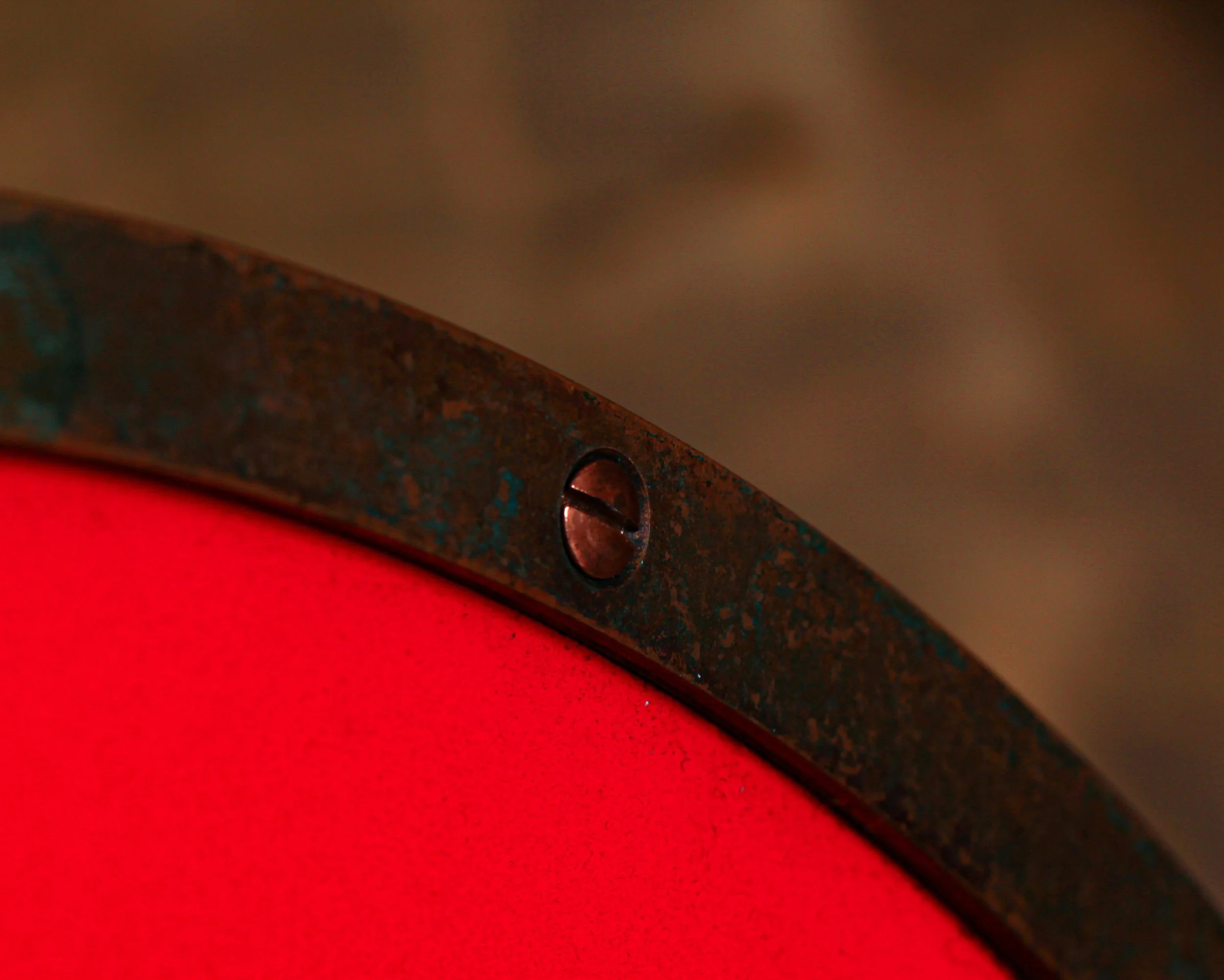
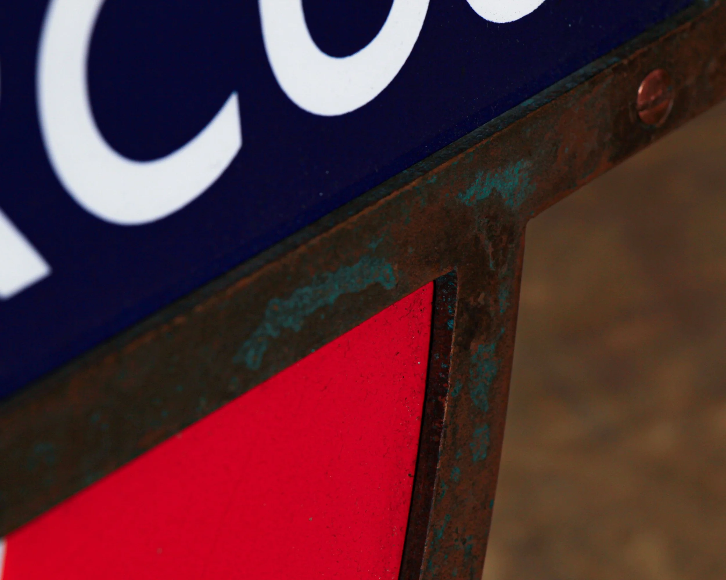
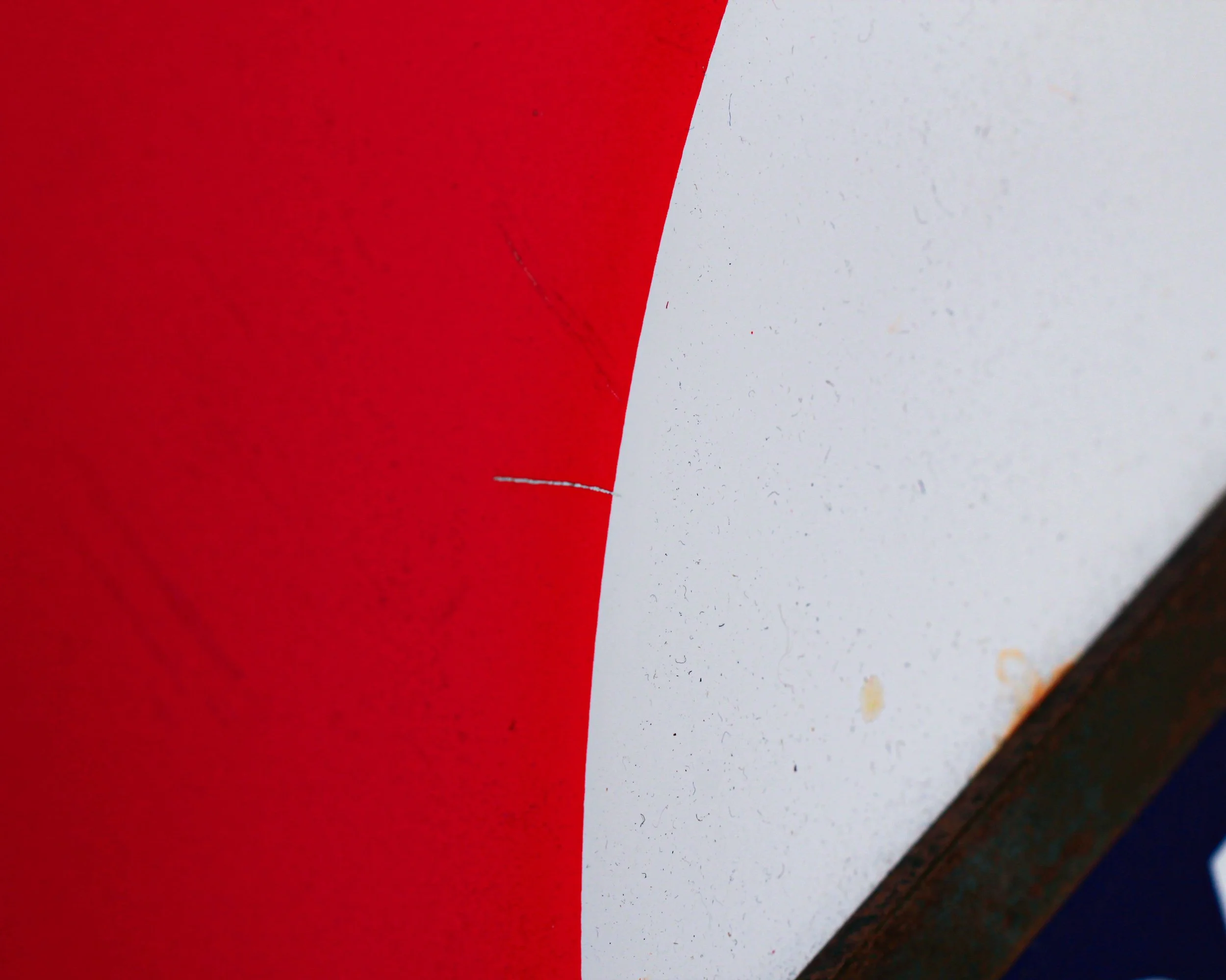
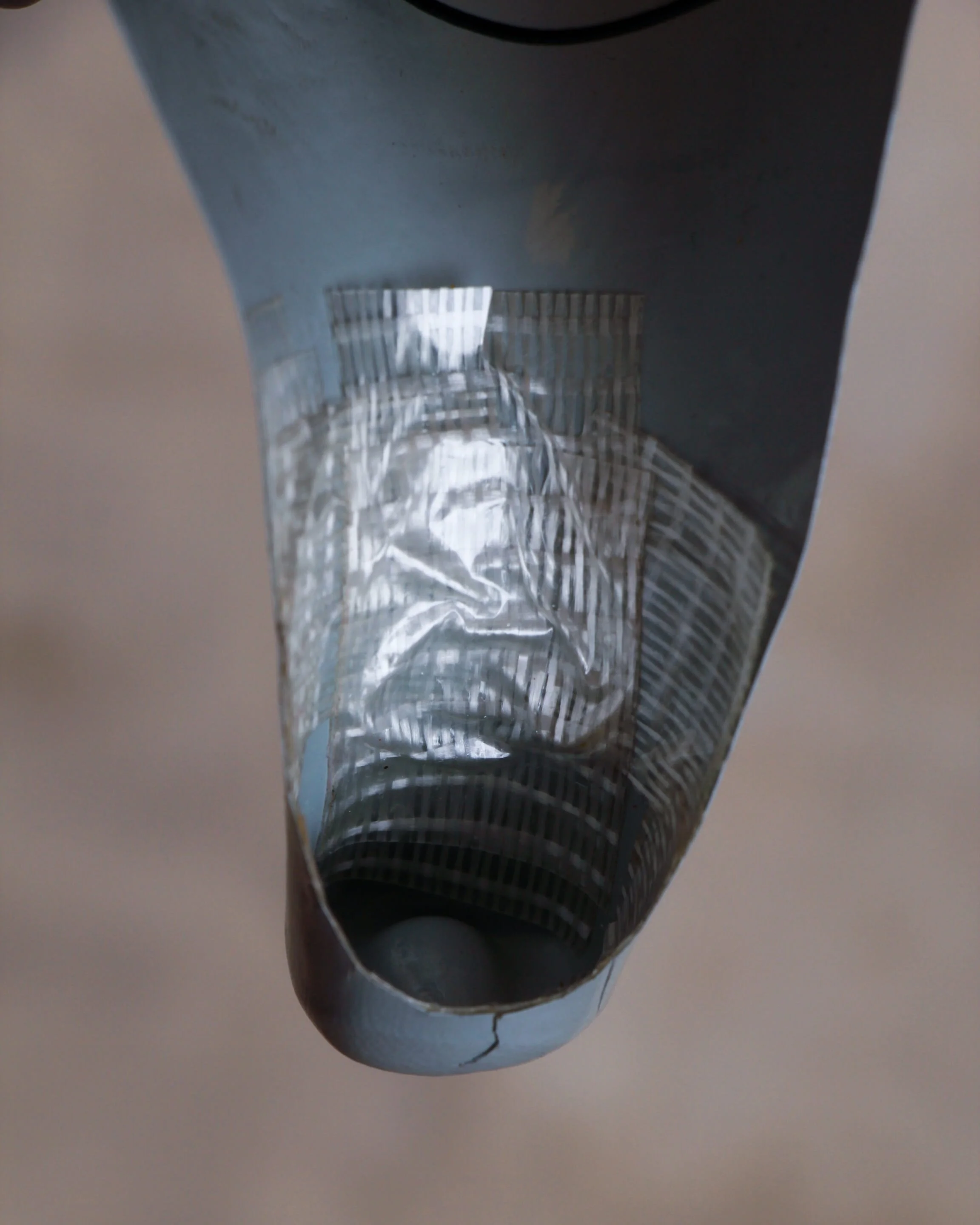
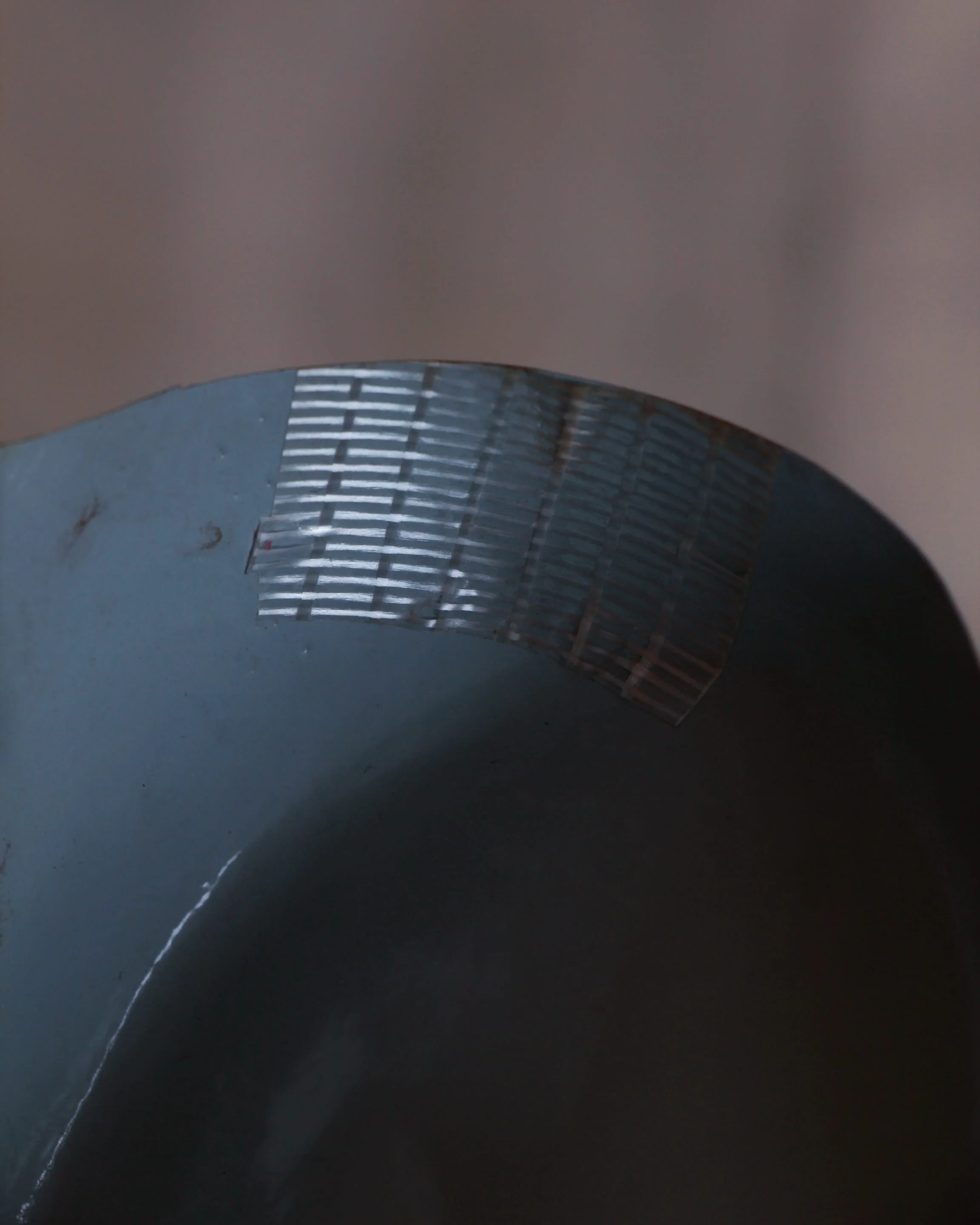
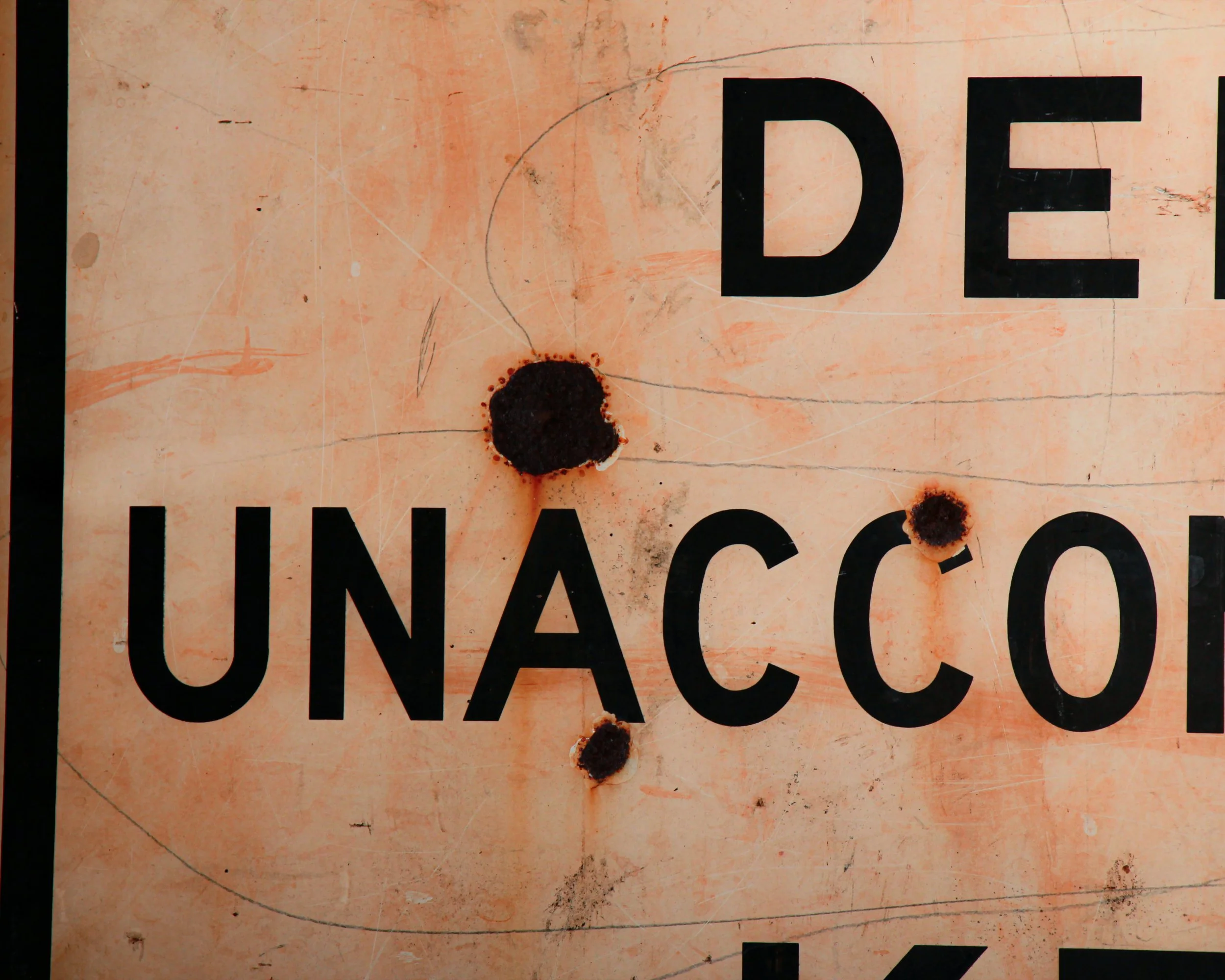
What really makes this piece special is the wear. The surface carries a constellation of rust blooms, small impact marks, scratches, and honest scars from decades outdoors. The edges show oxidation, the mounting holes have darkened, and the face has that wonderful sun-washed patina that only time near the ocean can produce.
Category History
Old metal and tin advertising signs are the original attention-grabbers—built to catch your eye, hold it, and do the selling in a split second. From the late 19th into the mid-20th century, these signs showed up everywhere: general stores, gas stations, roadside stands, and city walls. Lightweight and relatively inexpensive to produce, tin became a go-to material for brands looking to spread their message far and wide.
The graphics did the heavy lifting. Bold lettering, high-contrast colors, and simple imagery made them readable at a glance. Lithography allowed for detailed illustrations—everything from smiling characters to idealized products—printed directly onto the metal surface. Some were single-sided for interior use, others designed to hang outdoors and withstand weather, picking up rust, chips, and fade along the way.
What makes them interesting now is that wear. The scratches, oxidation, and softened edges aren’t flaws—they’re proof of exposure and use. Unlike porcelain enamel signs, which were built to last, tin signs often lived harder, shorter lives, making surviving examples feel a bit more accidental.
They sit comfortably between graphic design and object. Direct, a little rough around the edges, and still doing their job decades later—pulling your attention without asking politely.
DANGER
SHARKS
DEEP WATER
UNACCOMPANIED CHILDREN
KEEP OUT
That is the entire message, delivered with the blunt efficiency of a lifeguard whistle and a raised eyebrow. No illustrations, no polite suggestions, just a series of escalating facts that end with a firm “don’t even think about it.”
This beach warning sign is made of single-sided tin and was likely once posted somewhere along the Southern California coast, probably around Los Angeles. You can easily imagine it bolted to a weathered pier piling or standing near a rocky stretch of shoreline where the water gets deep quickly.
Graphically, it is a beauty. The bold red “DANGER” headline grabs you immediately, while the stark black lettering underneath marches down the sign like a checklist of reasons to turn around. It is classic mid-century municipal design. Clear, direct, and built to be read from a distance through salt air and sun glare.
What really makes this piece special is the wear. The surface carries a constellation of rust blooms, small impact marks, scratches, and honest scars from decades outdoors. The edges show oxidation, the mounting holes have darkened, and the face has that wonderful sun-washed patina that only time near the ocean can produce.
Category History
Old metal and tin advertising signs are the original attention-grabbers—built to catch your eye, hold it, and do the selling in a split second. From the late 19th into the mid-20th century, these signs showed up everywhere: general stores, gas stations, roadside stands, and city walls. Lightweight and relatively inexpensive to produce, tin became a go-to material for brands looking to spread their message far and wide.
The graphics did the heavy lifting. Bold lettering, high-contrast colors, and simple imagery made them readable at a glance. Lithography allowed for detailed illustrations—everything from smiling characters to idealized products—printed directly onto the metal surface. Some were single-sided for interior use, others designed to hang outdoors and withstand weather, picking up rust, chips, and fade along the way.
What makes them interesting now is that wear. The scratches, oxidation, and softened edges aren’t flaws—they’re proof of exposure and use. Unlike porcelain enamel signs, which were built to last, tin signs often lived harder, shorter lives, making surviving examples feel a bit more accidental.
They sit comfortably between graphic design and object. Direct, a little rough around the edges, and still doing their job decades later—pulling your attention without asking politely.