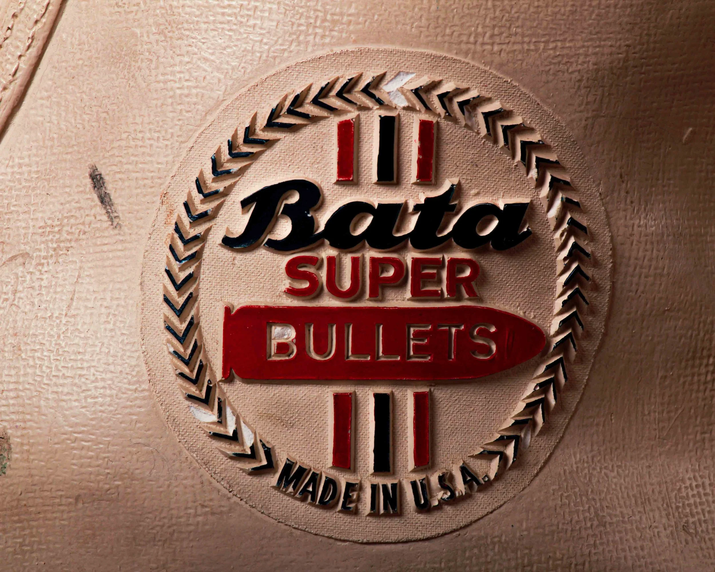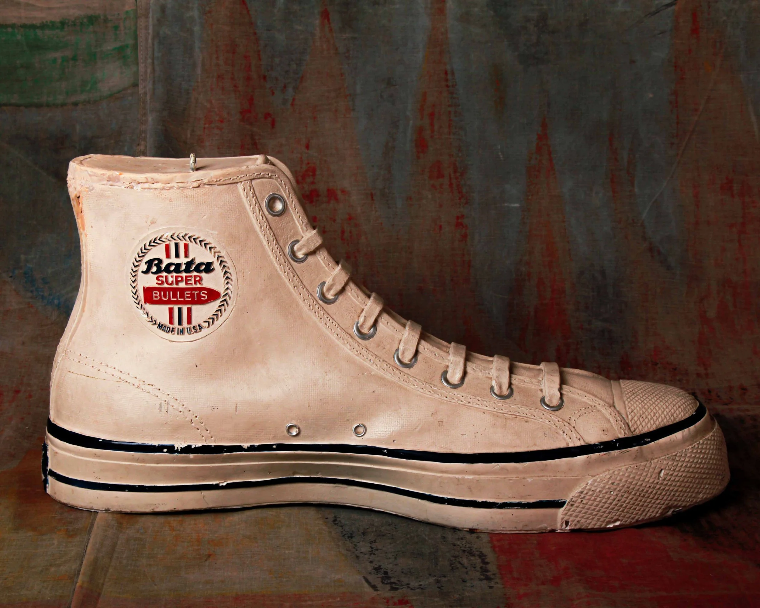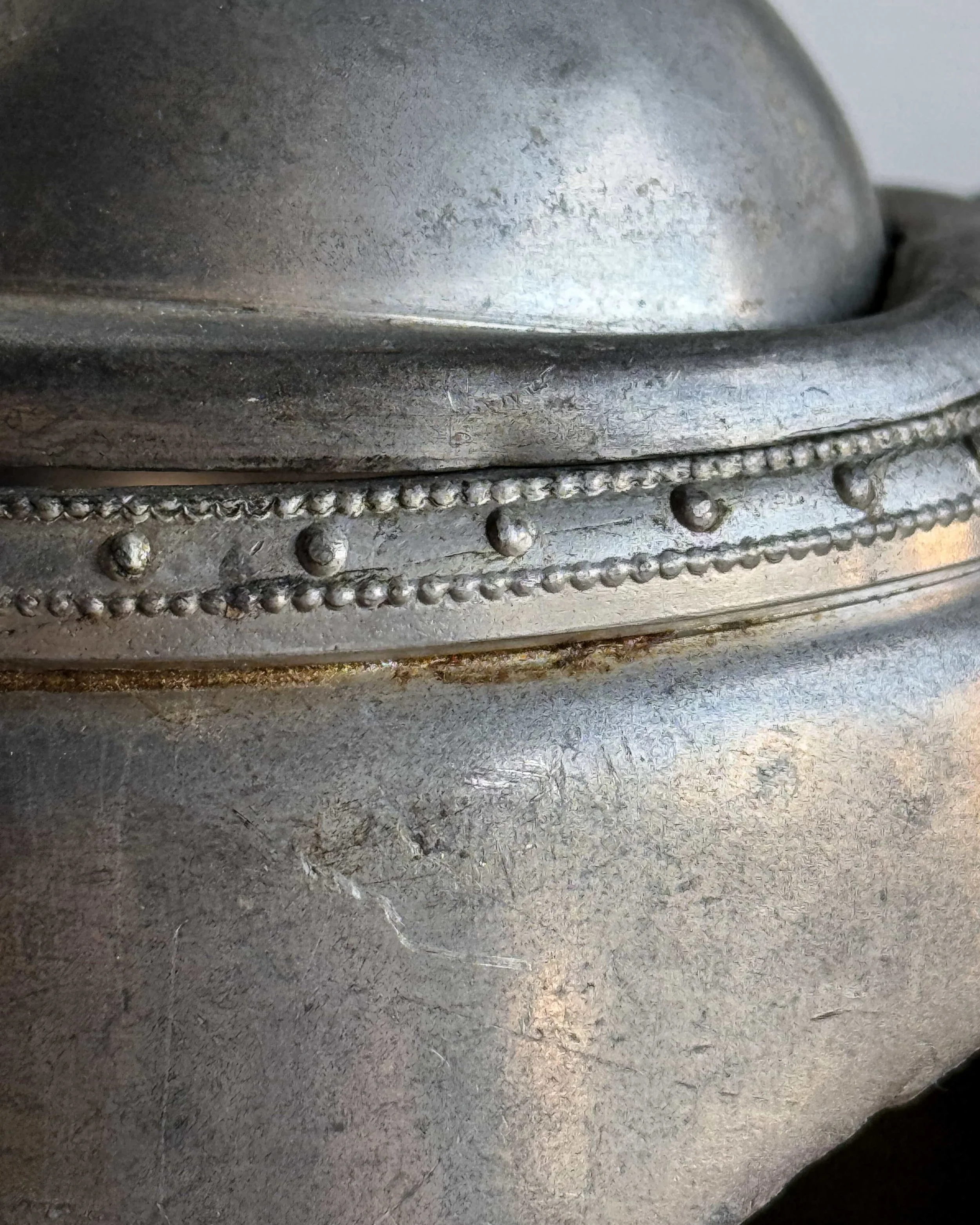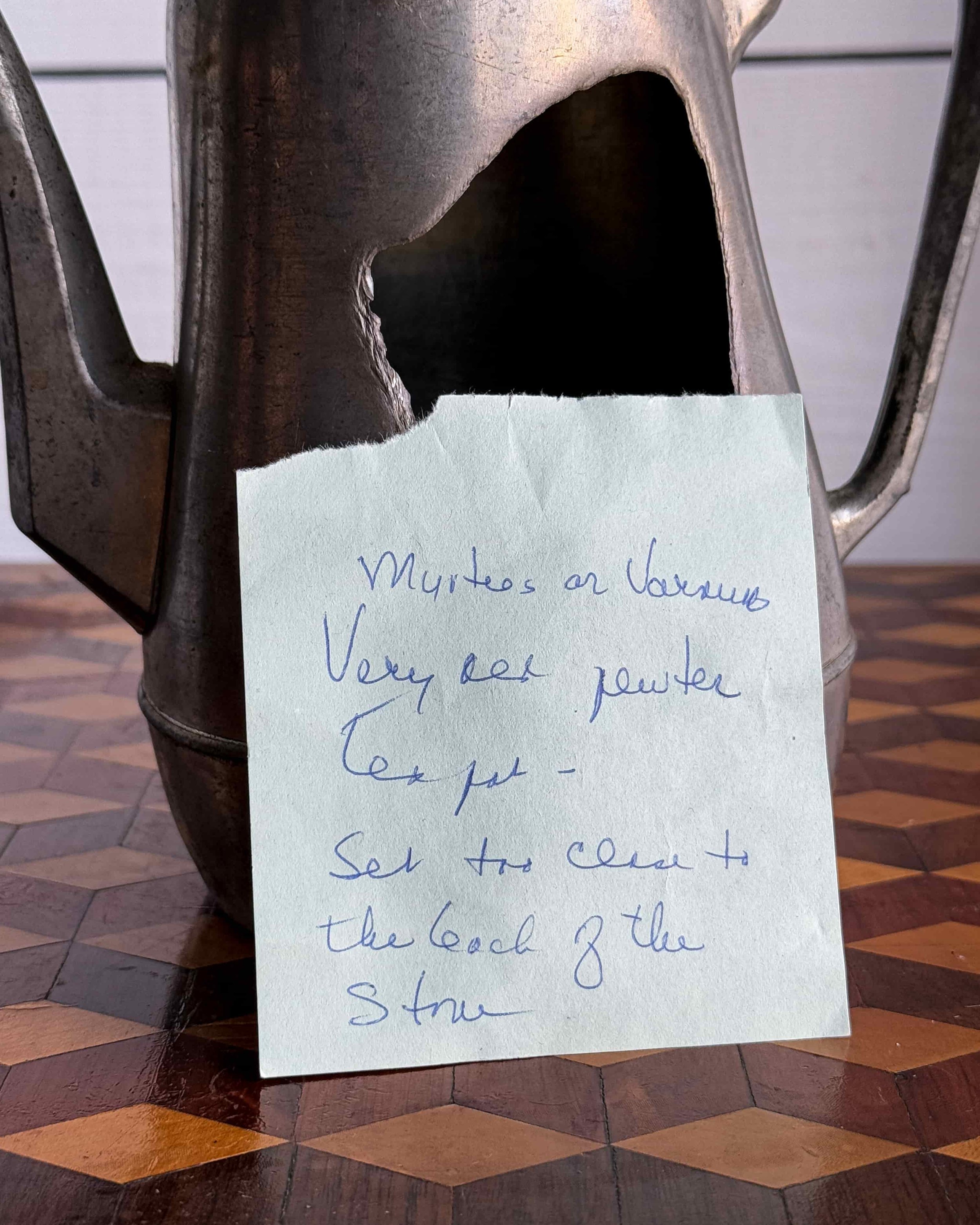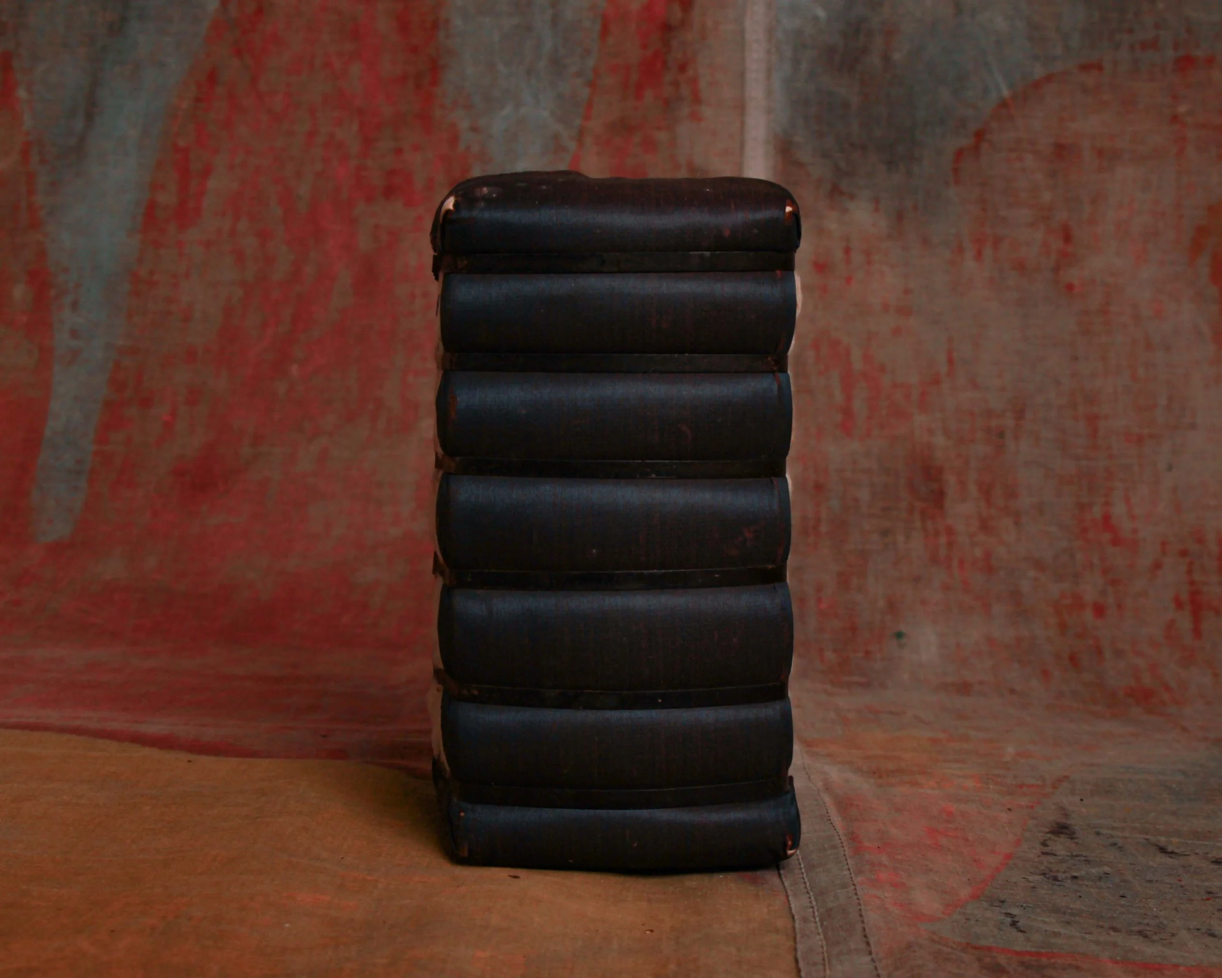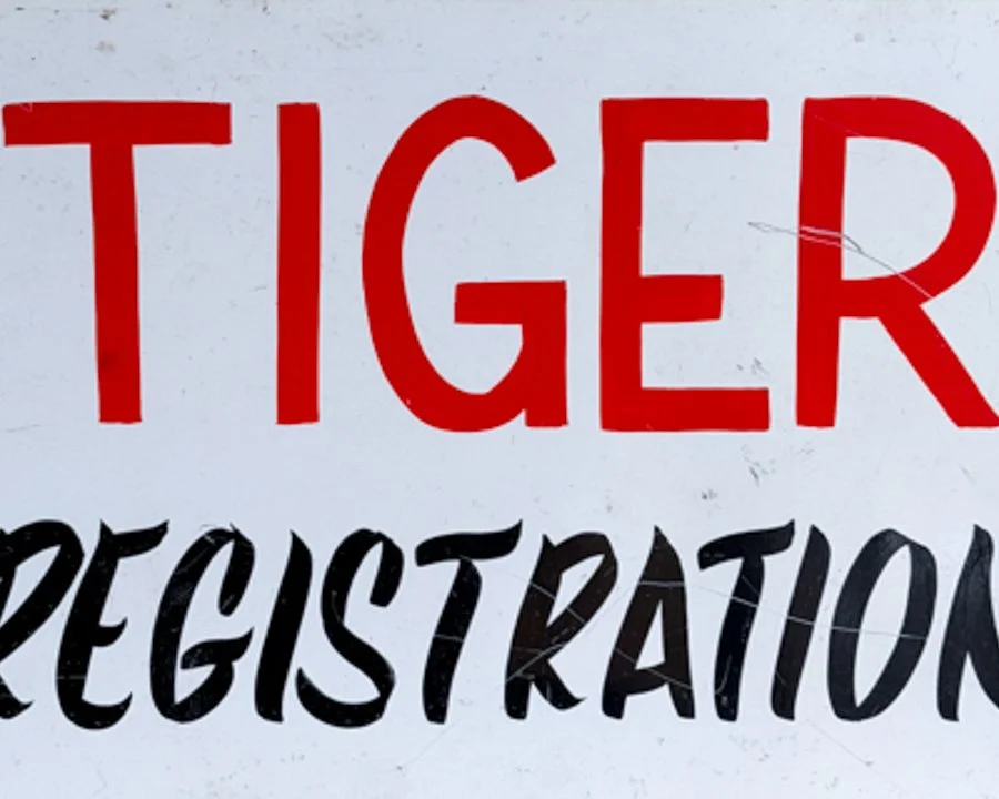

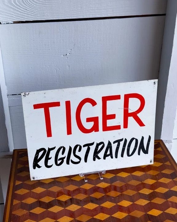
This hand-painted sign is one of those curious relics that makes you do a double-take: "Tiger Registration." No small print, no context—just bold red and black letters on a white sign, as if wrangling big cats were as simple as signing them in at the county fair. It probably once hung outdoors, proudly instructing folks where to register… for what exactly, we’ll never know. Was it a circus? A mascot rally? A tongue-in-cheek stunt at a small-town event? The mystery is half the fun.
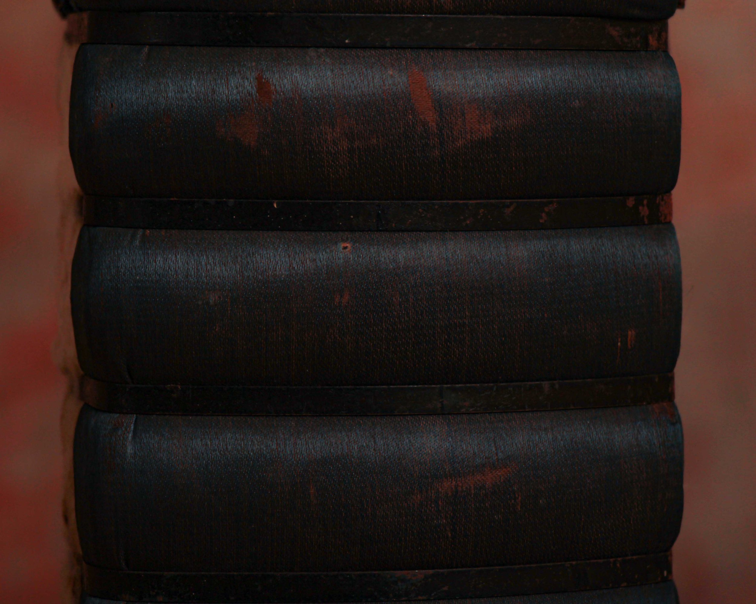
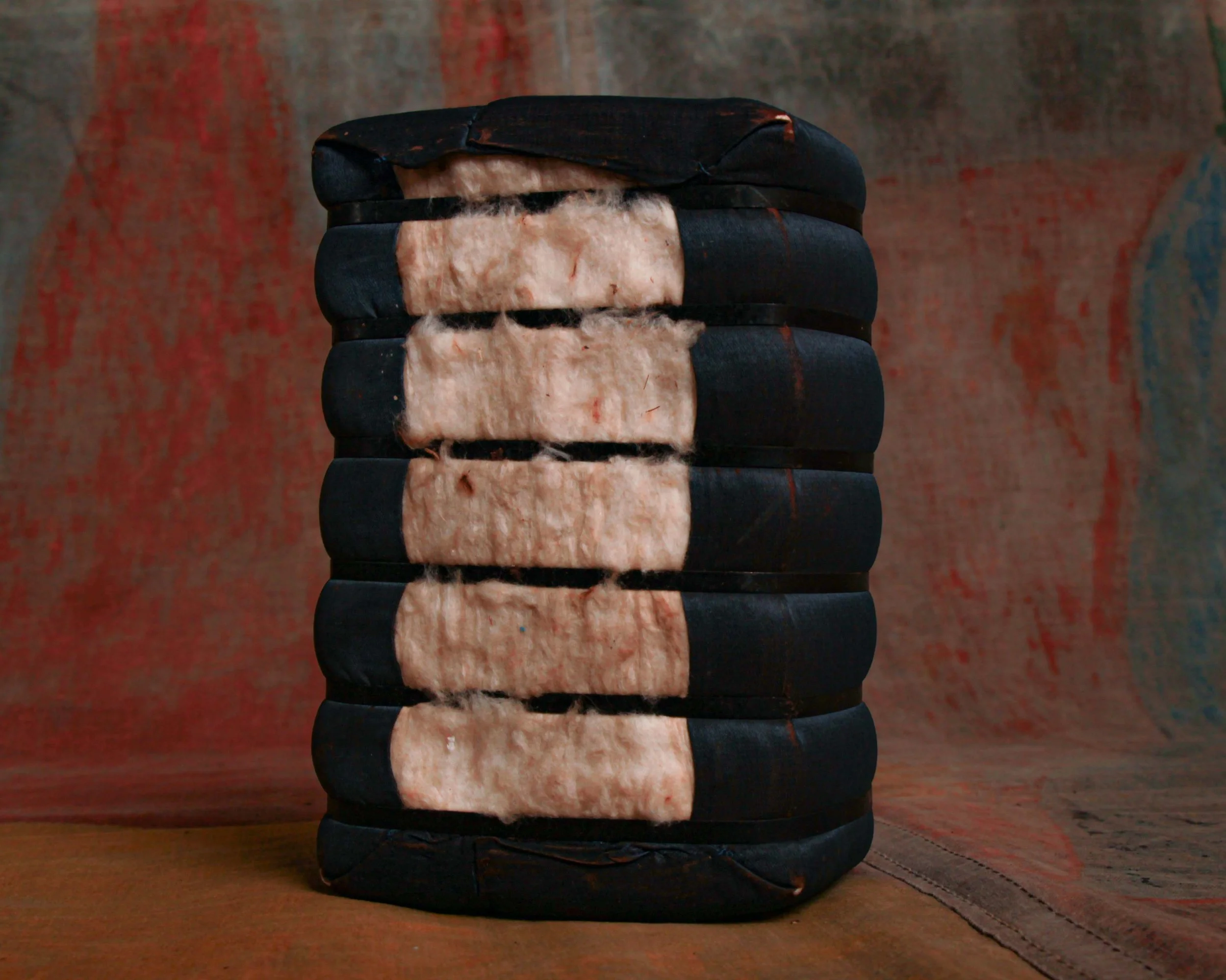
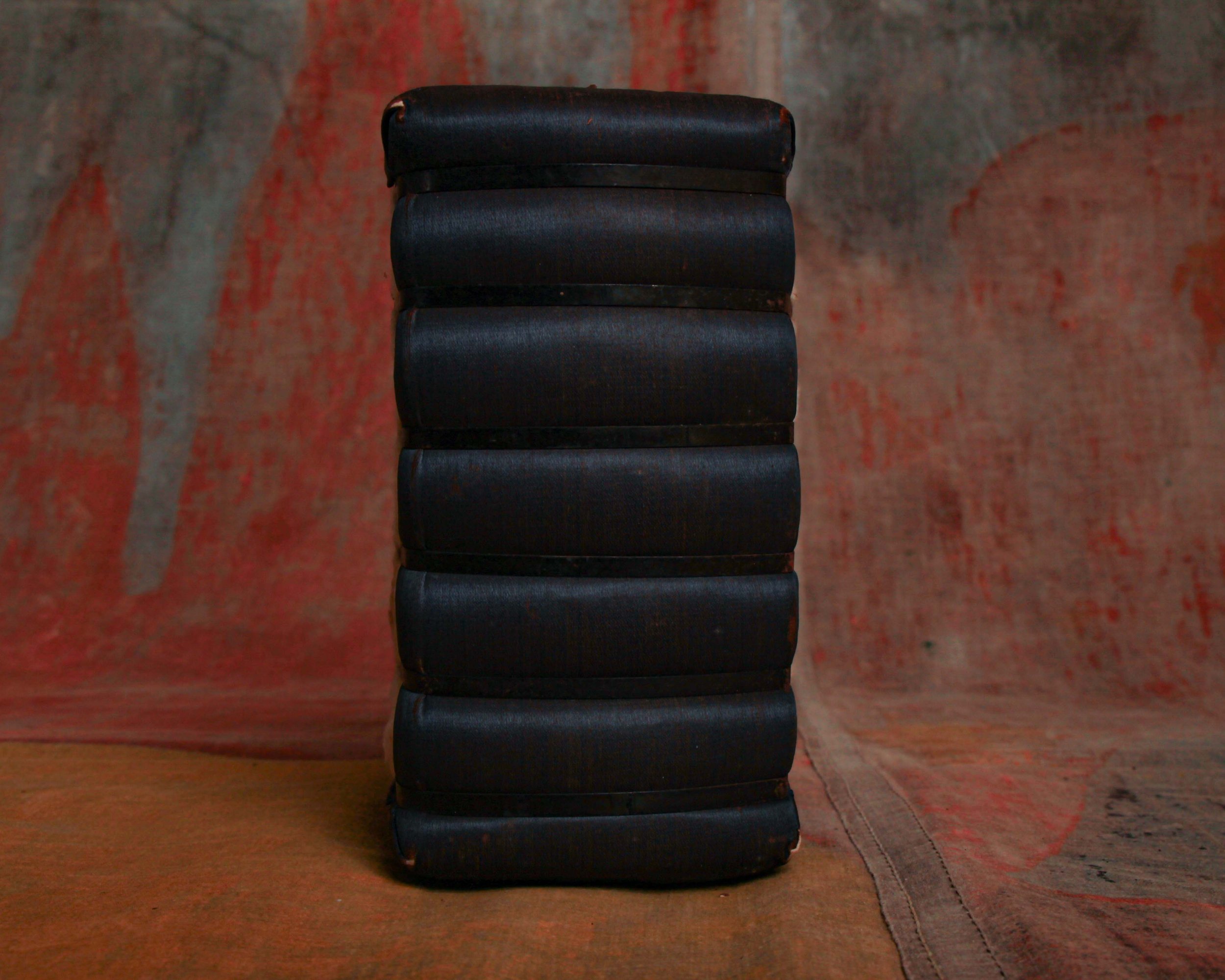
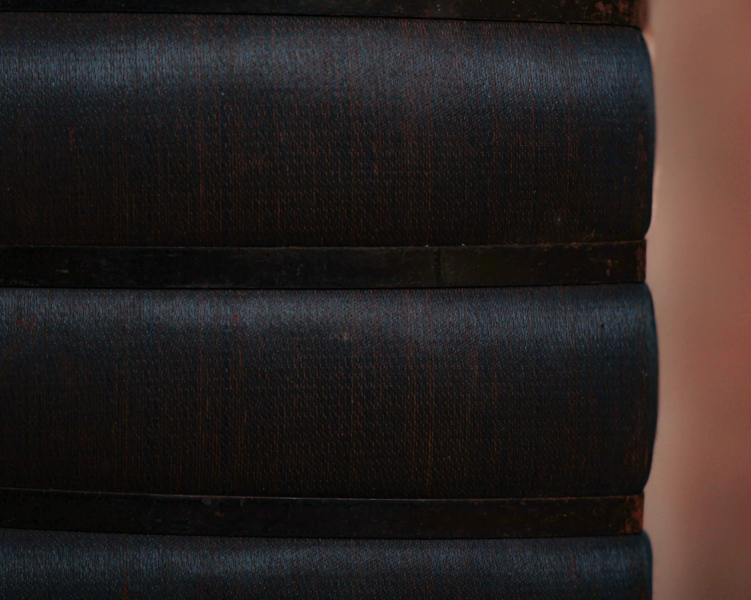
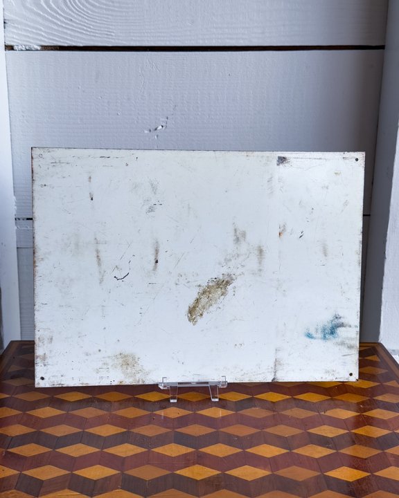
The paint shows signs of weather and age, giving the surface that slightly faded, sunbaked look that only adds to its charm.
Category History
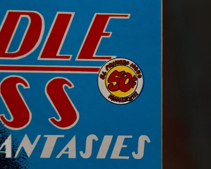
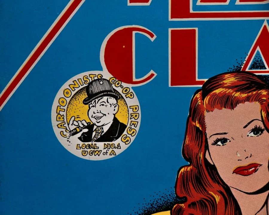
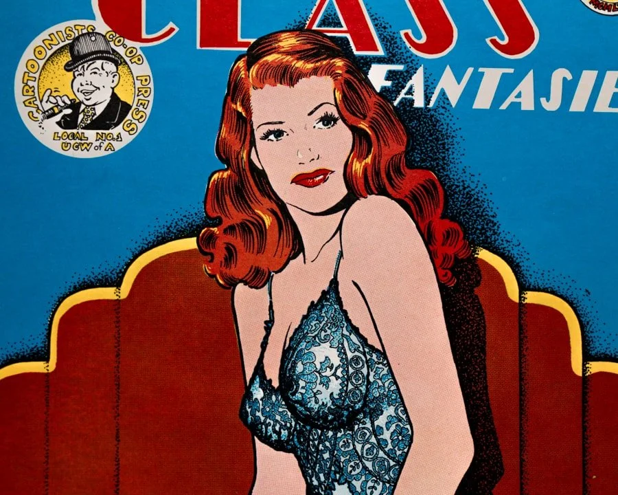
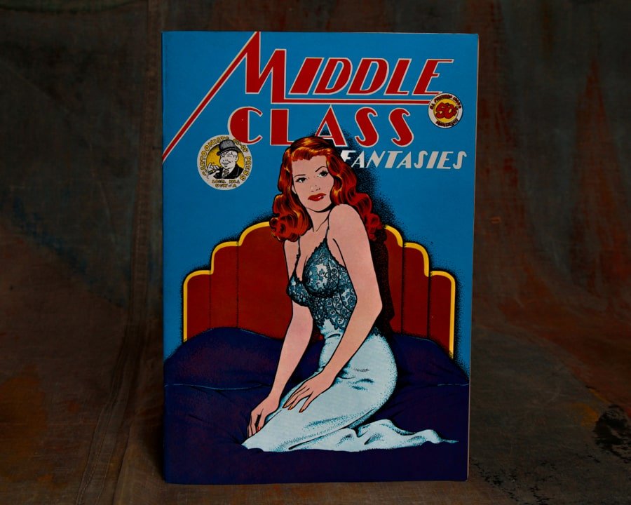
Old metal and tin advertising signs are the original attention-grabbers—built to catch your eye, hold it, and do the selling in a split second. From the late 19th into the mid-20th century, these signs showed up everywhere: general stores, gas stations, roadside stands, and city walls. Lightweight and relatively inexpensive to produce, tin became a go-to material for brands looking to spread their message far and wide.
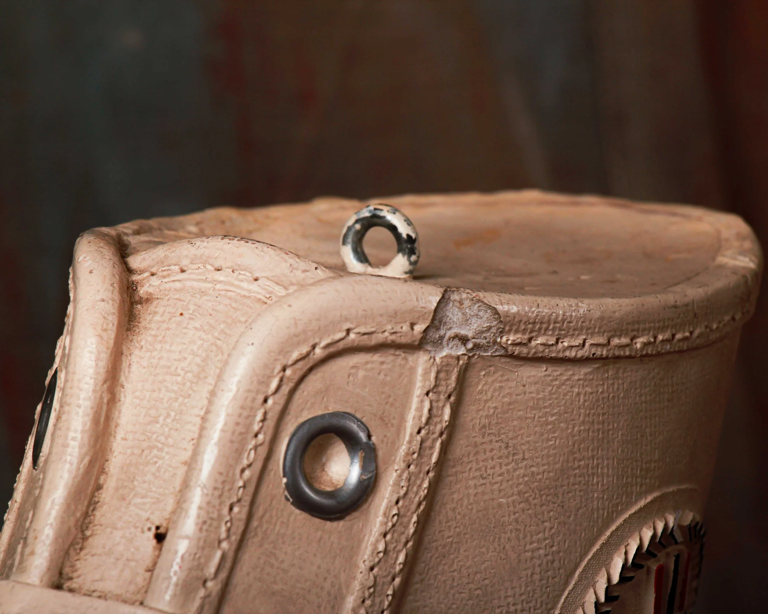
The graphics did the heavy lifting. Bold lettering, high-contrast colors, and simple imagery made them readable at a glance. Lithography allowed for detailed illustrations—everything from smiling characters to idealized products—printed directly onto the metal surface. Some were single-sided for interior use, others designed to hang outdoors and withstand weather, picking up rust, chips, and fade along the way.
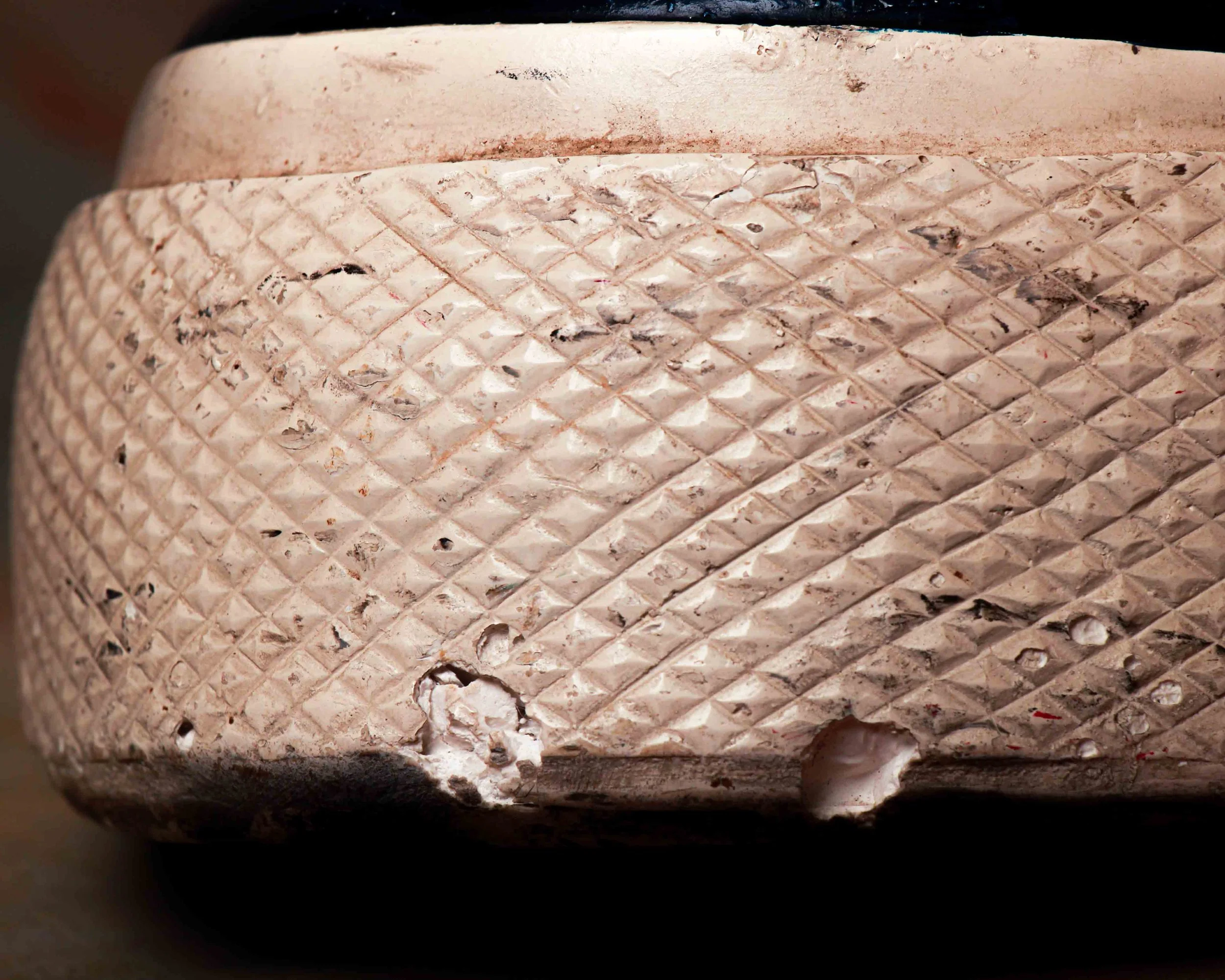
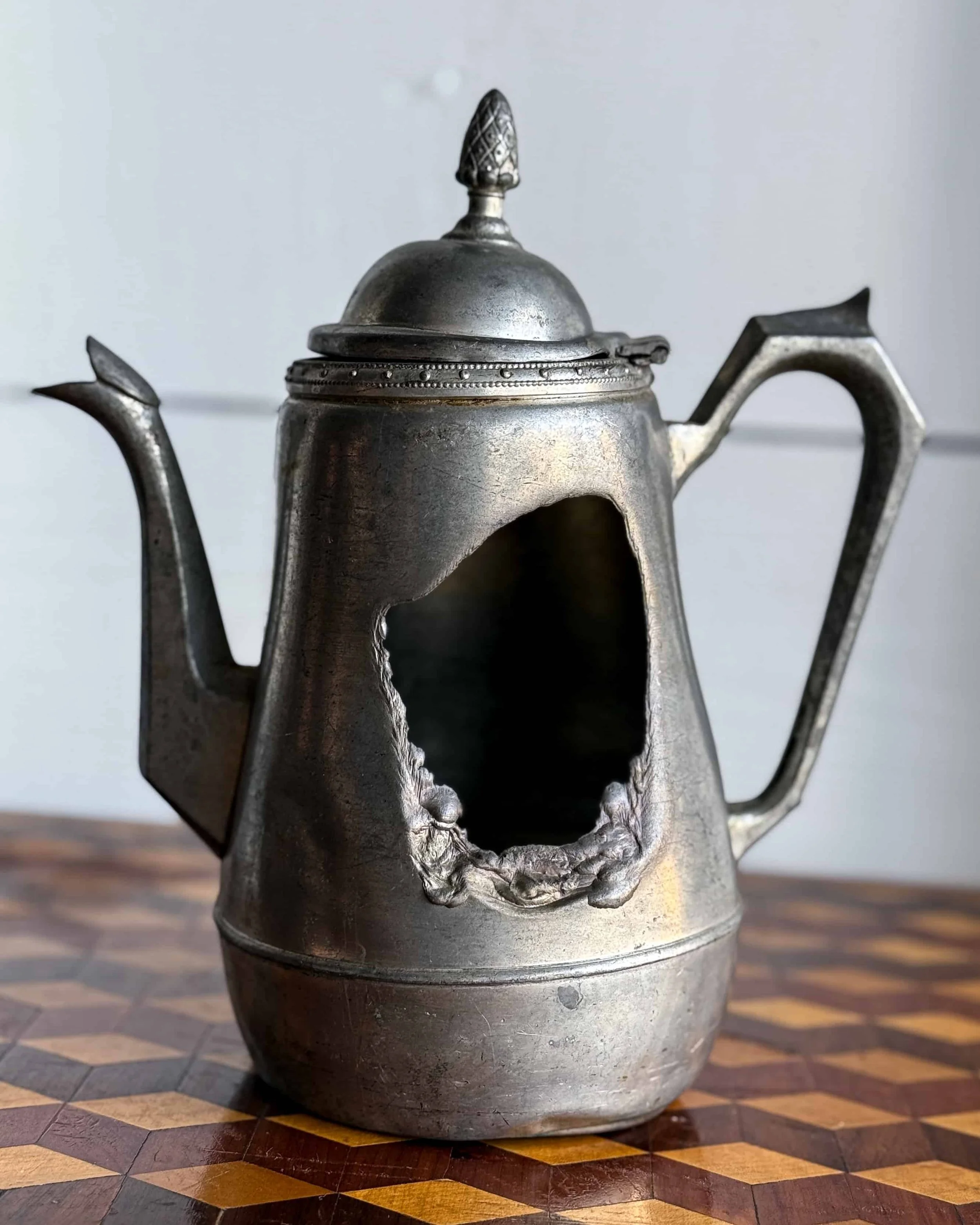
What makes them interesting now is that wear. The scratches, oxidation, and softened edges aren’t flaws—they’re proof of exposure and use. Unlike porcelain enamel signs, which were built to last, tin signs often lived harder, shorter lives, making surviving examples feel a bit more accidental.
They sit comfortably between graphic design and object. Direct, a little rough around the edges, and still doing their job decades later—pulling your attention without asking politely.
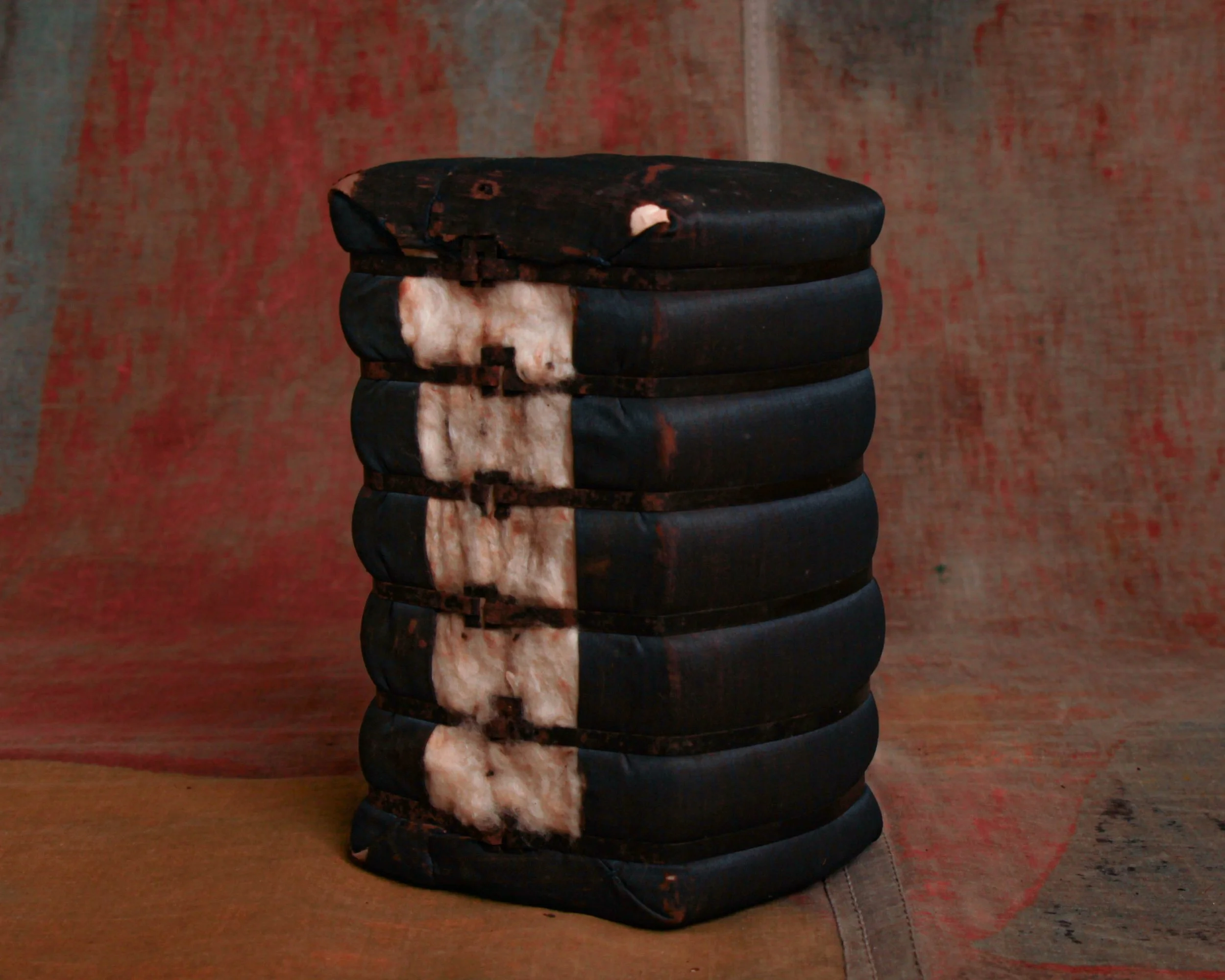
This hand-painted sign is one of those curious relics that makes you do a double-take: "Tiger Registration." No small print, no context—just bold red and black letters on a white sign, as if wrangling big cats were as simple as signing them in at the county fair. It probably once hung outdoors, proudly instructing folks where to register… for what exactly, we’ll never know. Was it a circus? A mascot rally? A tongue-in-cheek stunt at a small-town event? The mystery is half the fun.
The paint shows signs of weather and age, giving the surface that slightly faded, sunbaked look that only adds to its charm.
Category History
Old metal and tin advertising signs are the original attention-grabbers—built to catch your eye, hold it, and do the selling in a split second. From the late 19th into the mid-20th century, these signs showed up everywhere: general stores, gas stations, roadside stands, and city walls. Lightweight and relatively inexpensive to produce, tin became a go-to material for brands looking to spread their message far and wide.
The graphics did the heavy lifting. Bold lettering, high-contrast colors, and simple imagery made them readable at a glance. Lithography allowed for detailed illustrations—everything from smiling characters to idealized products—printed directly onto the metal surface. Some were single-sided for interior use, others designed to hang outdoors and withstand weather, picking up rust, chips, and fade along the way.
What makes them interesting now is that wear. The scratches, oxidation, and softened edges aren’t flaws—they’re proof of exposure and use. Unlike porcelain enamel signs, which were built to last, tin signs often lived harder, shorter lives, making surviving examples feel a bit more accidental.
They sit comfortably between graphic design and object. Direct, a little rough around the edges, and still doing their job decades later—pulling your attention without asking politely.