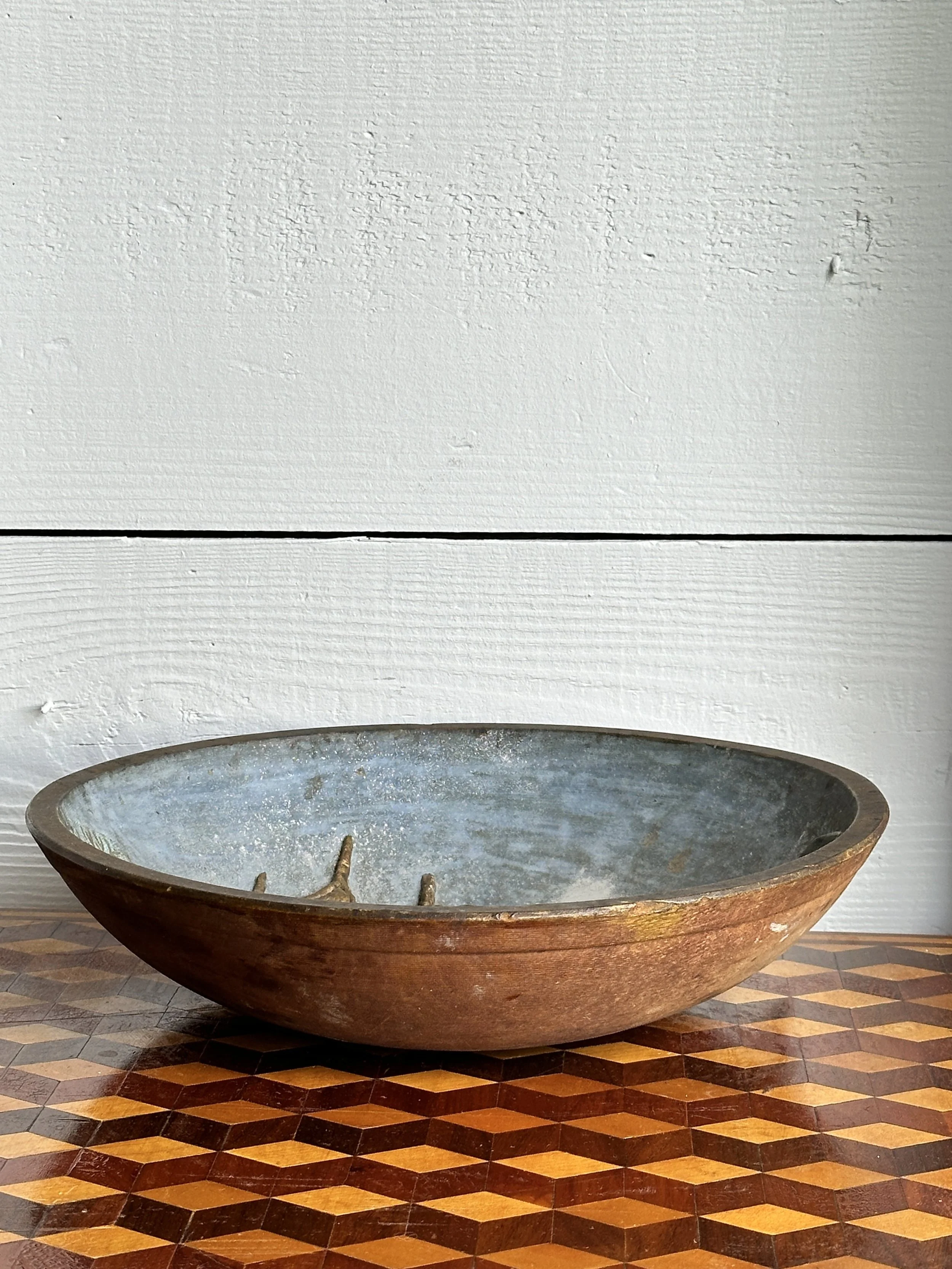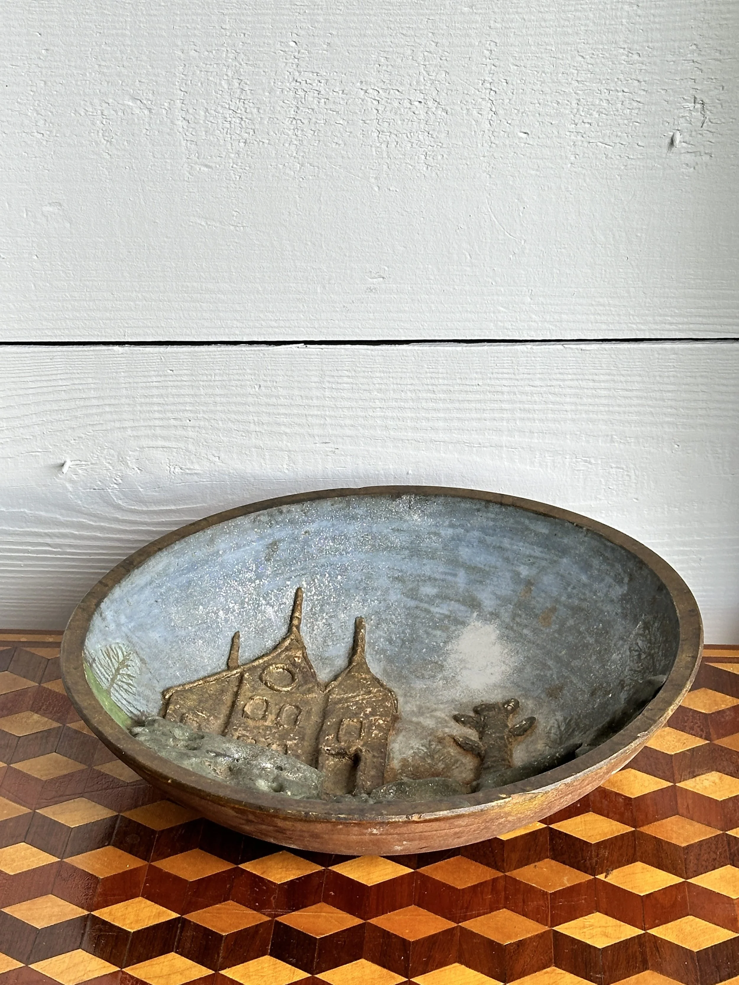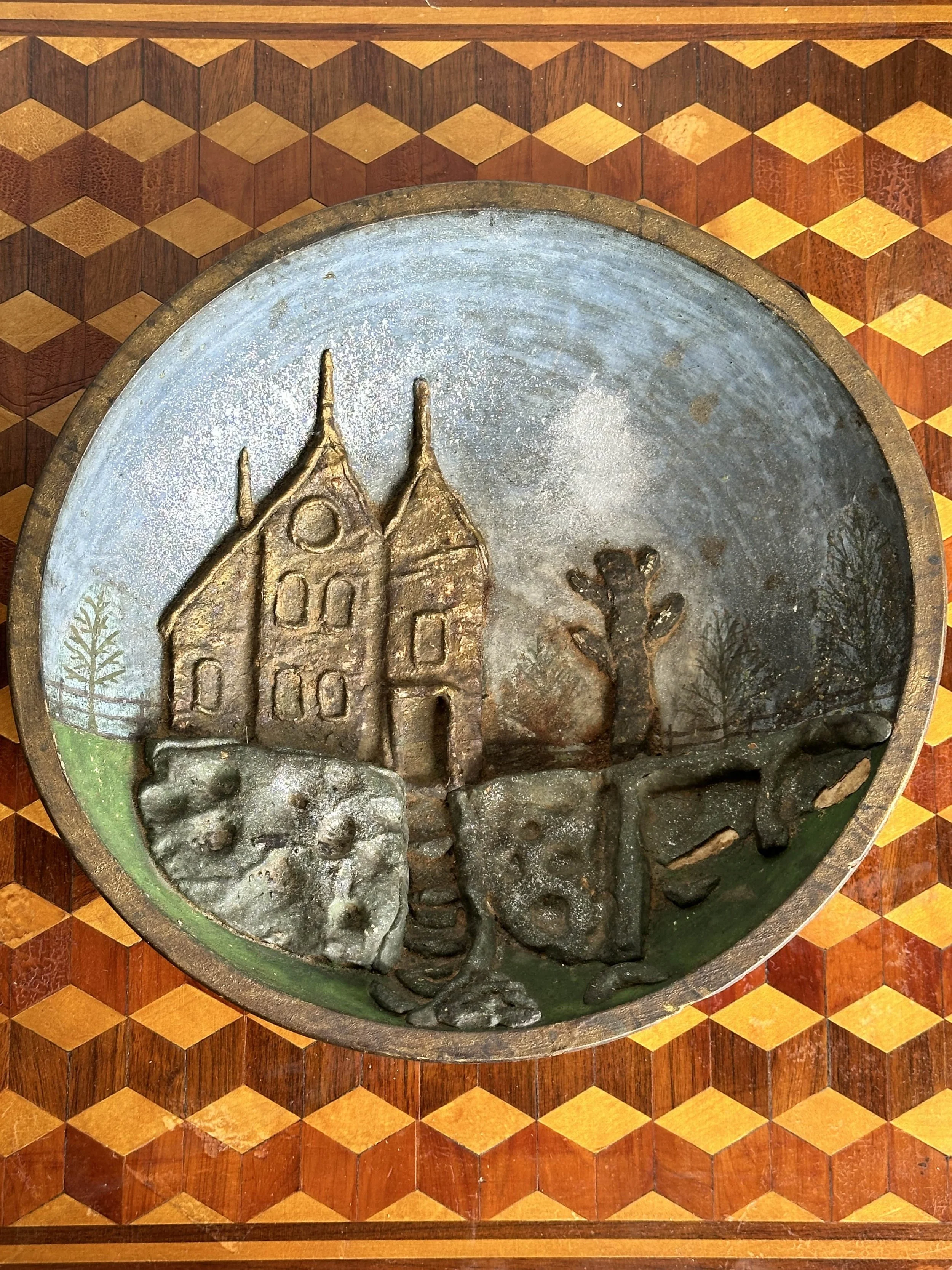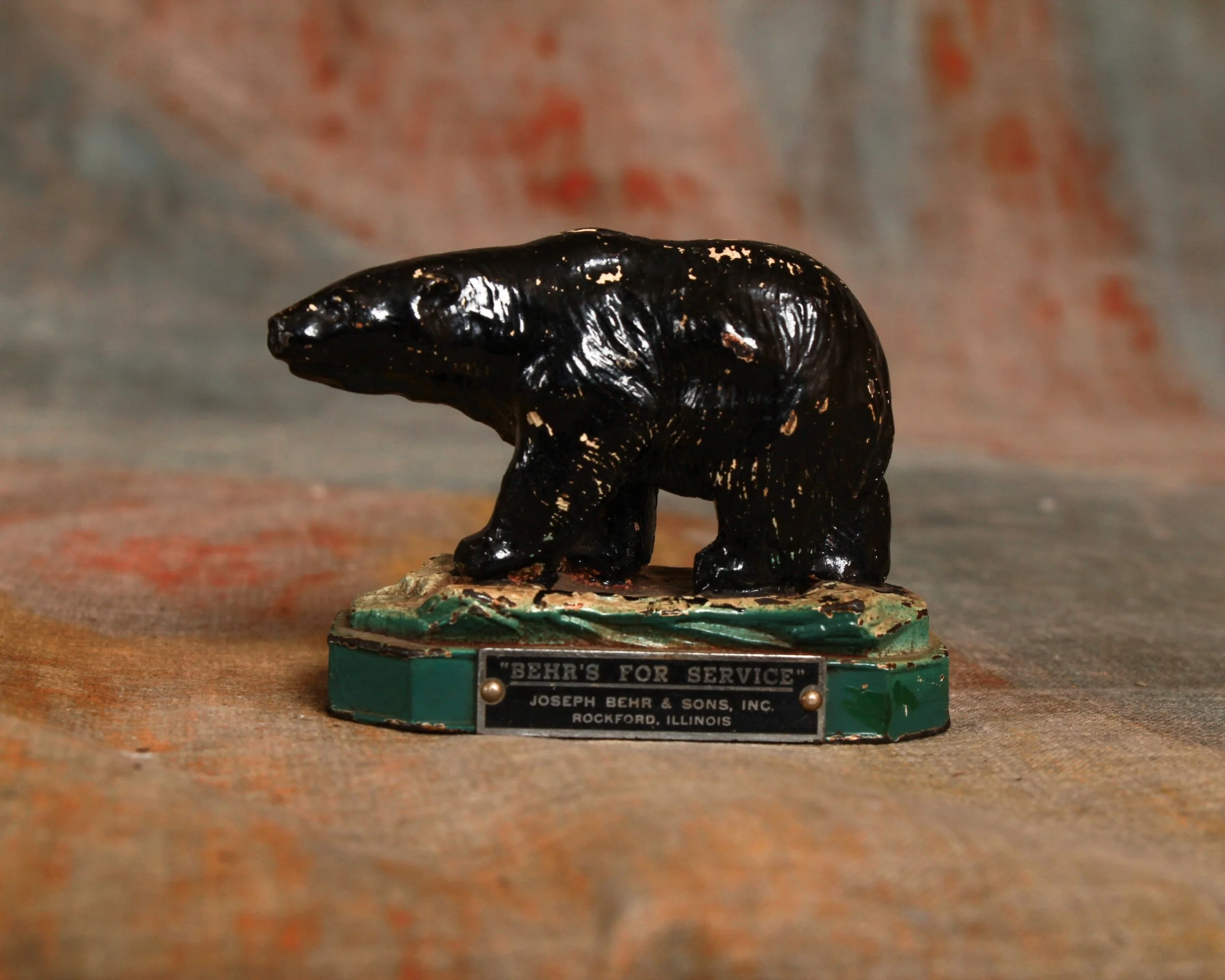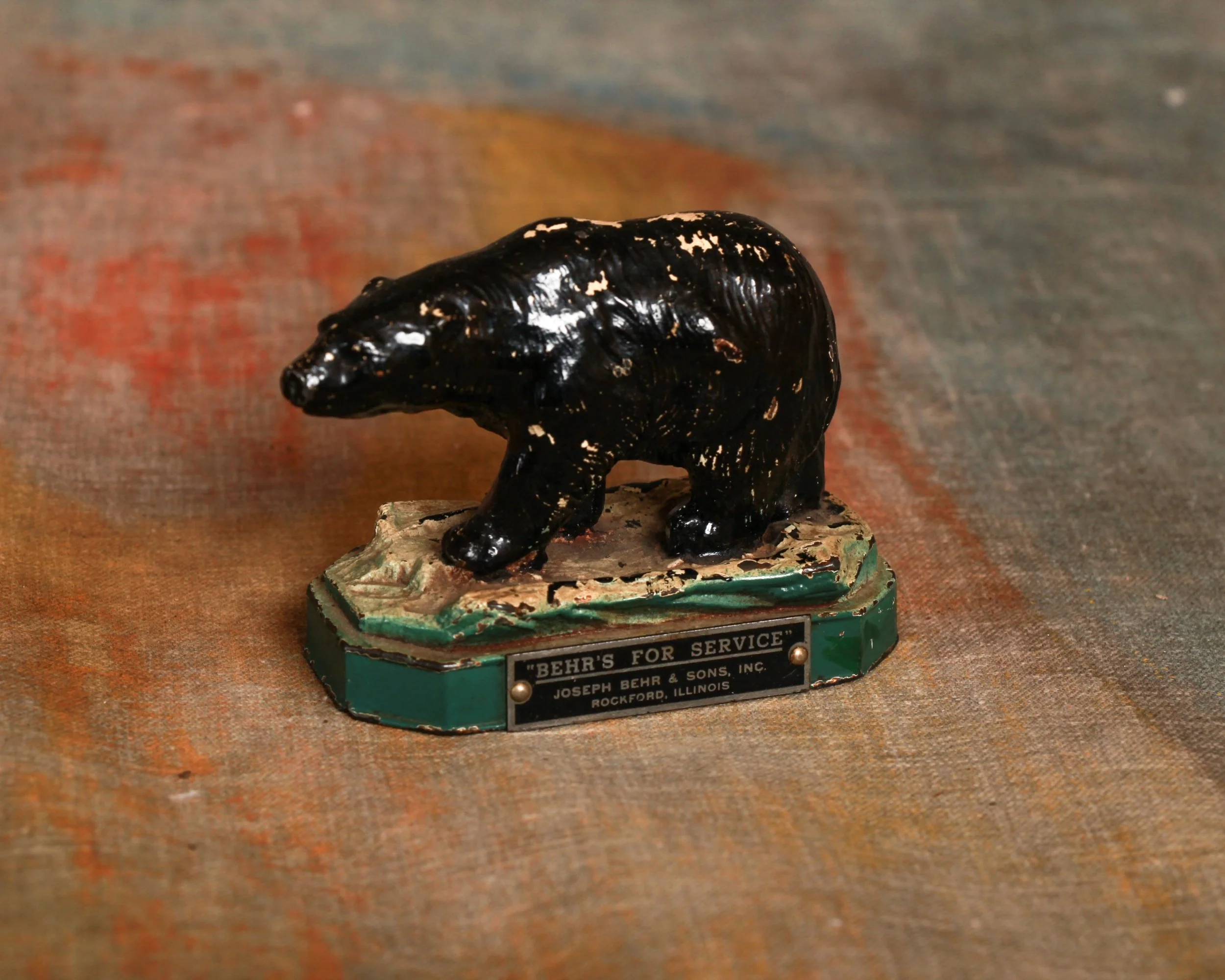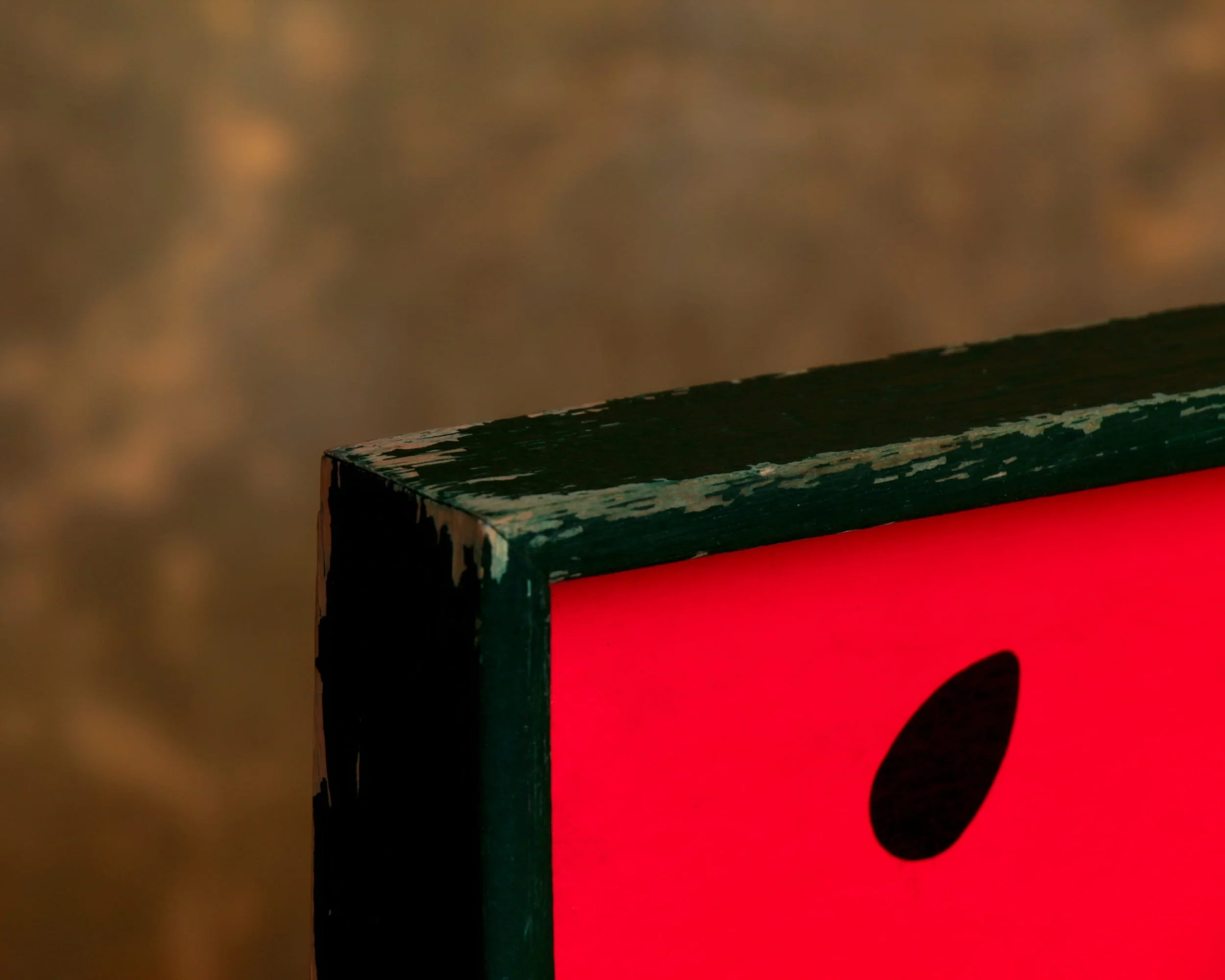
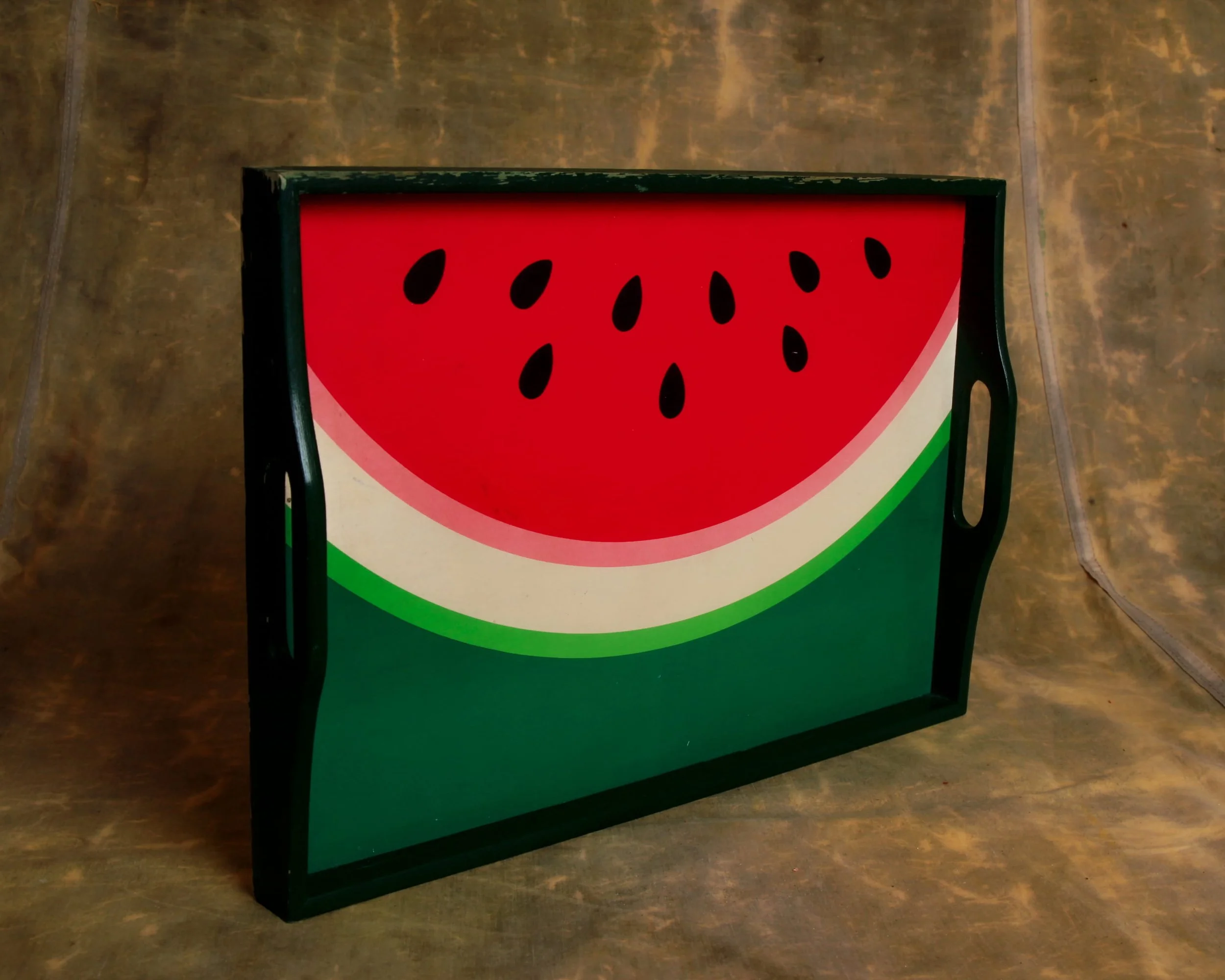
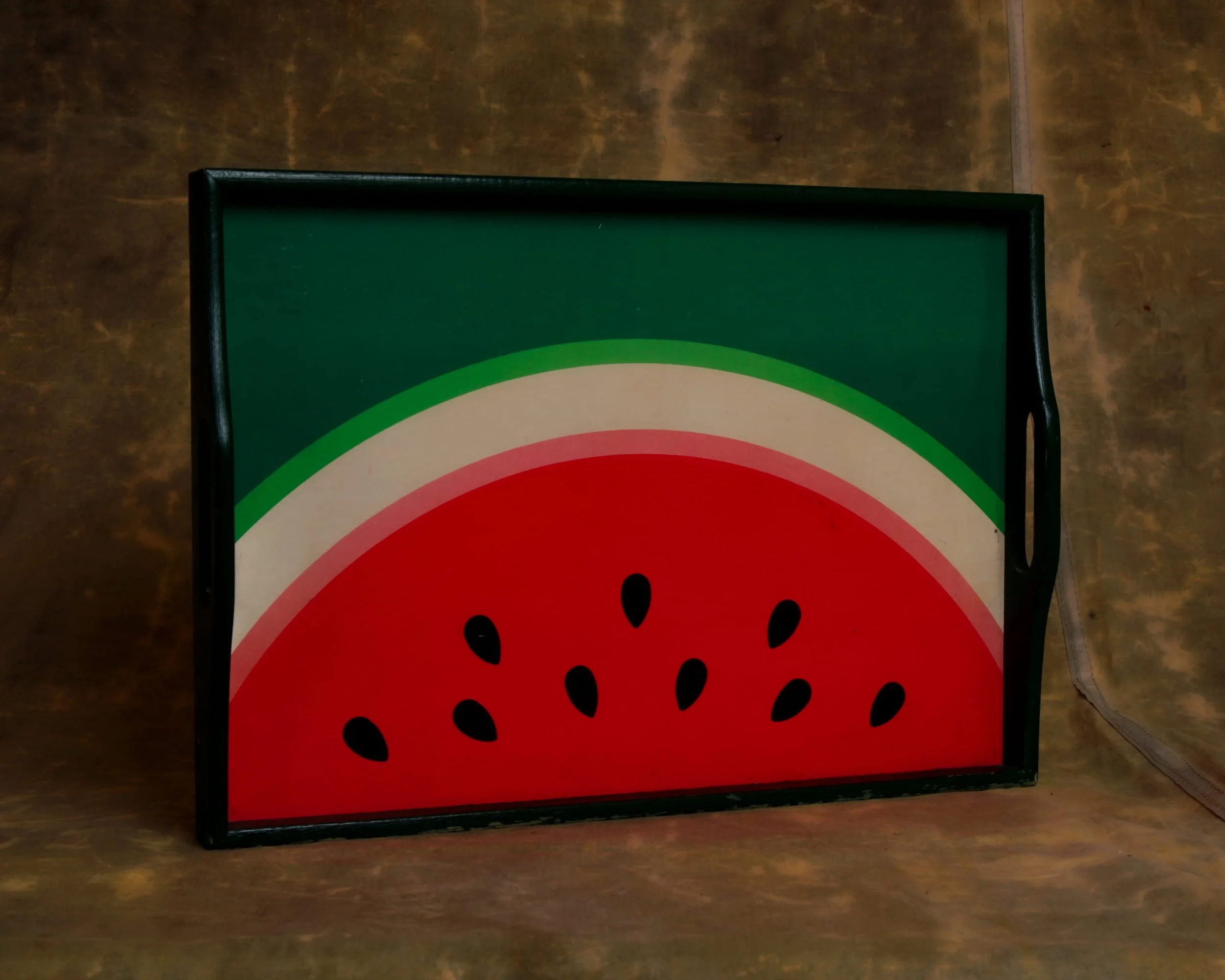
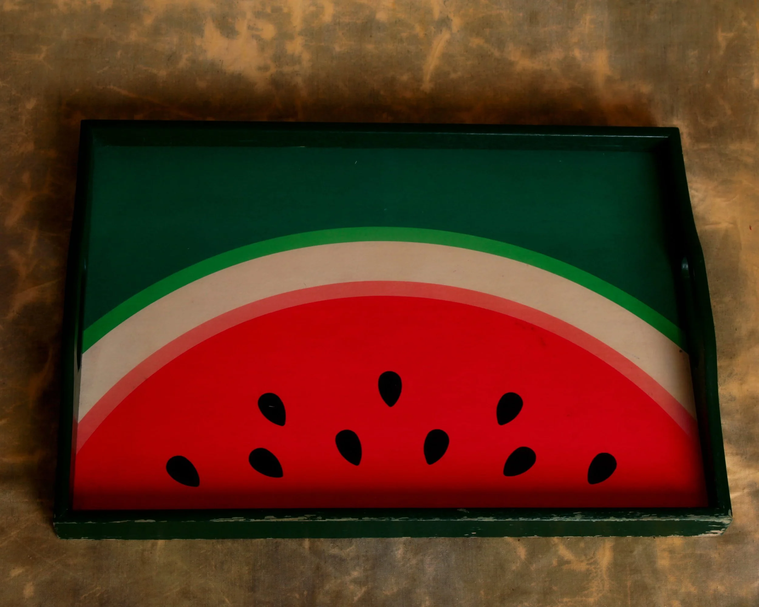
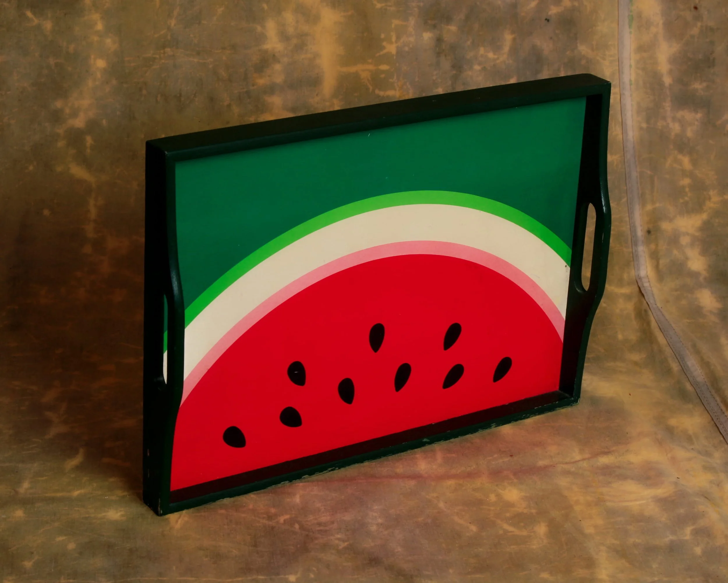
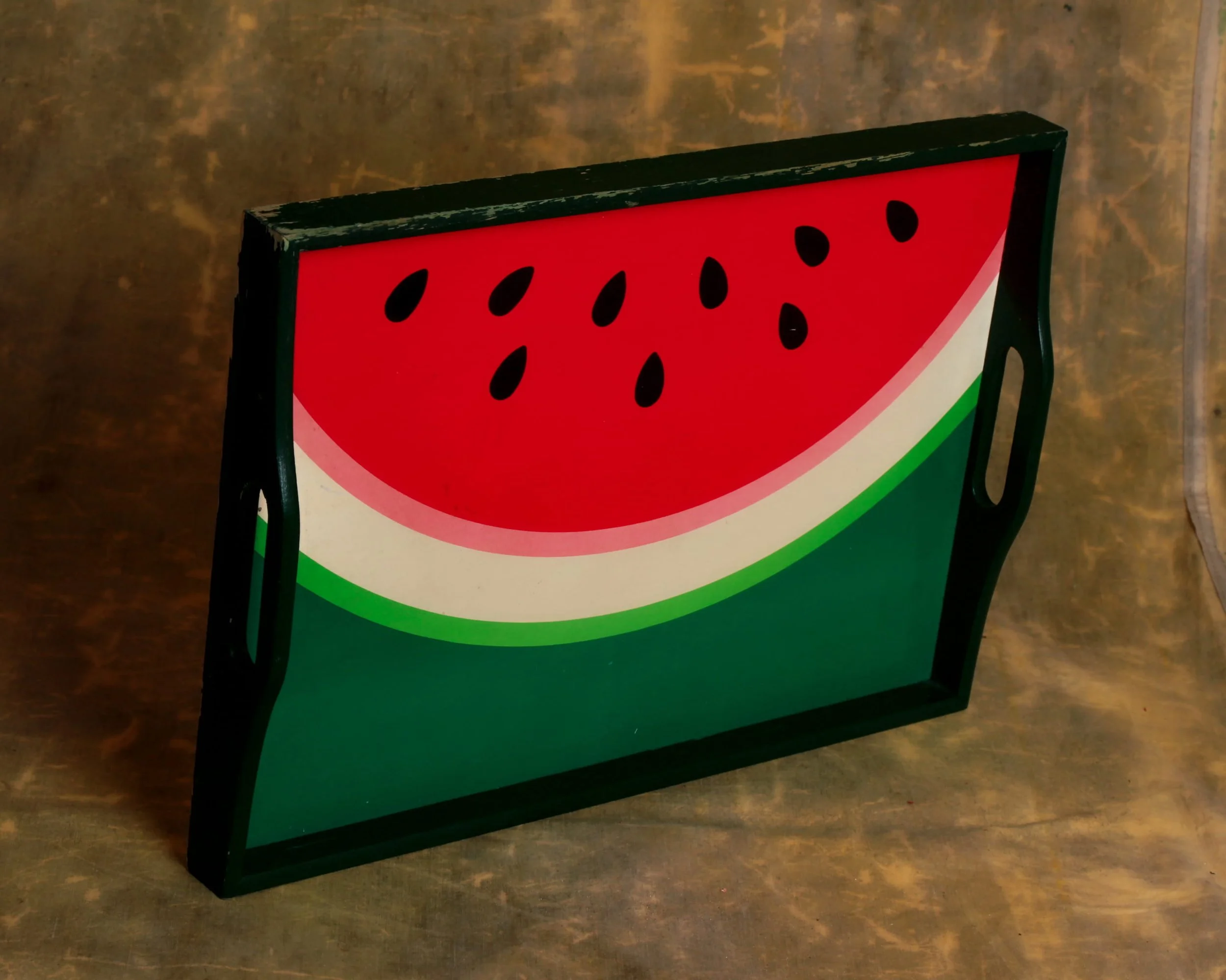
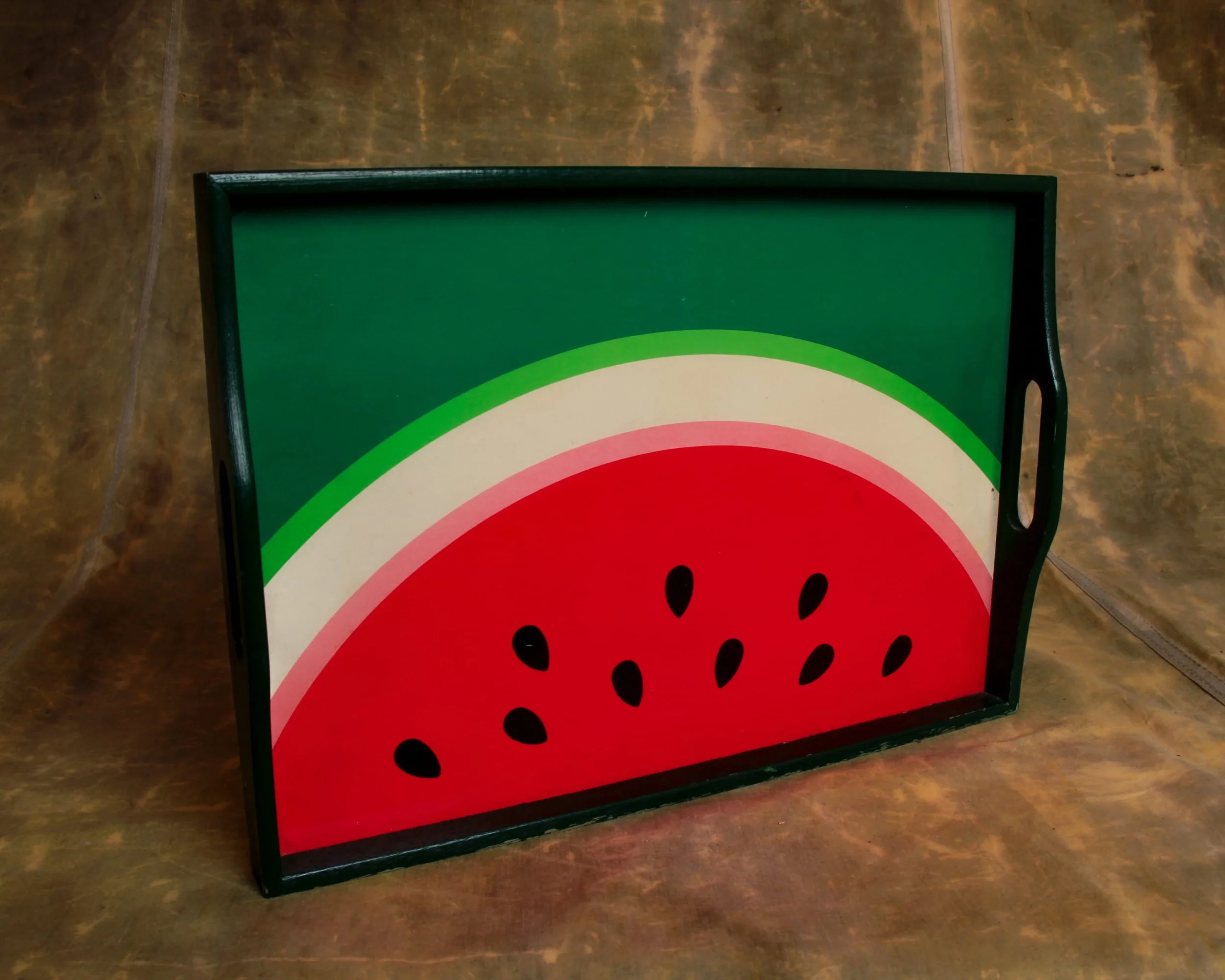
A mid-century serving tray built around a bold, graphic watermelon slice, all clean arcs and saturated color. The composition is simple but confident: deep red field dotted with black seeds, a crisp white band, and that unmistakable green rind fading outward into a darker edge. It’s the kind of design that feels pulled straight from a 1950s picnic ad, where everything was bright, optimistic, and just a little stylized.
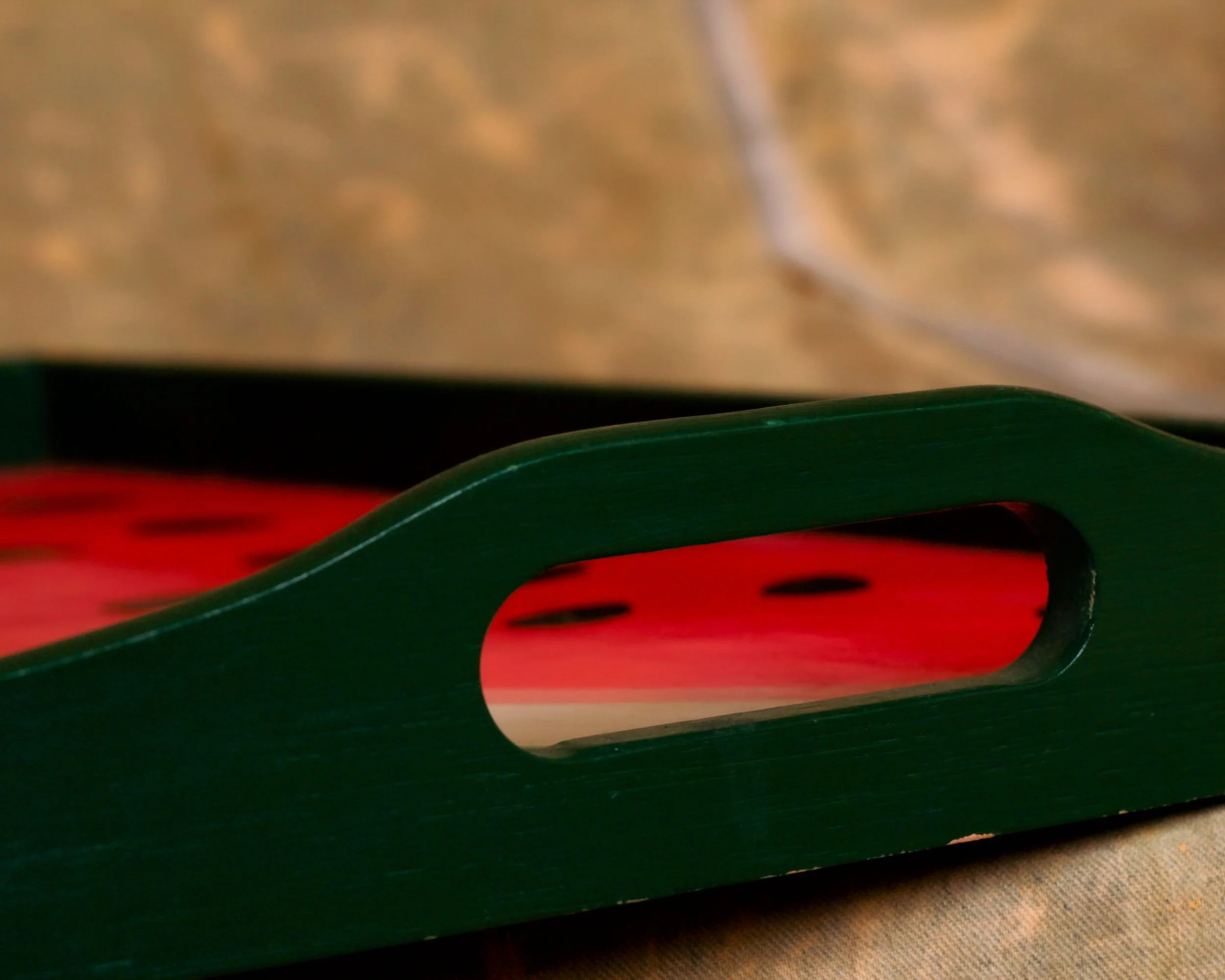
The construction leans practical. A solid wooden frame surrounds the panel, painted in a deep green that ties the whole thing together. Cutout handles on either side are shaped with a slight curve, comfortable in the hand and clearly meant to be used, not just looked at. The tray has a good weight to it without feeling heavy, the kind of piece you could actually carry out loaded with drinks and not think twice.
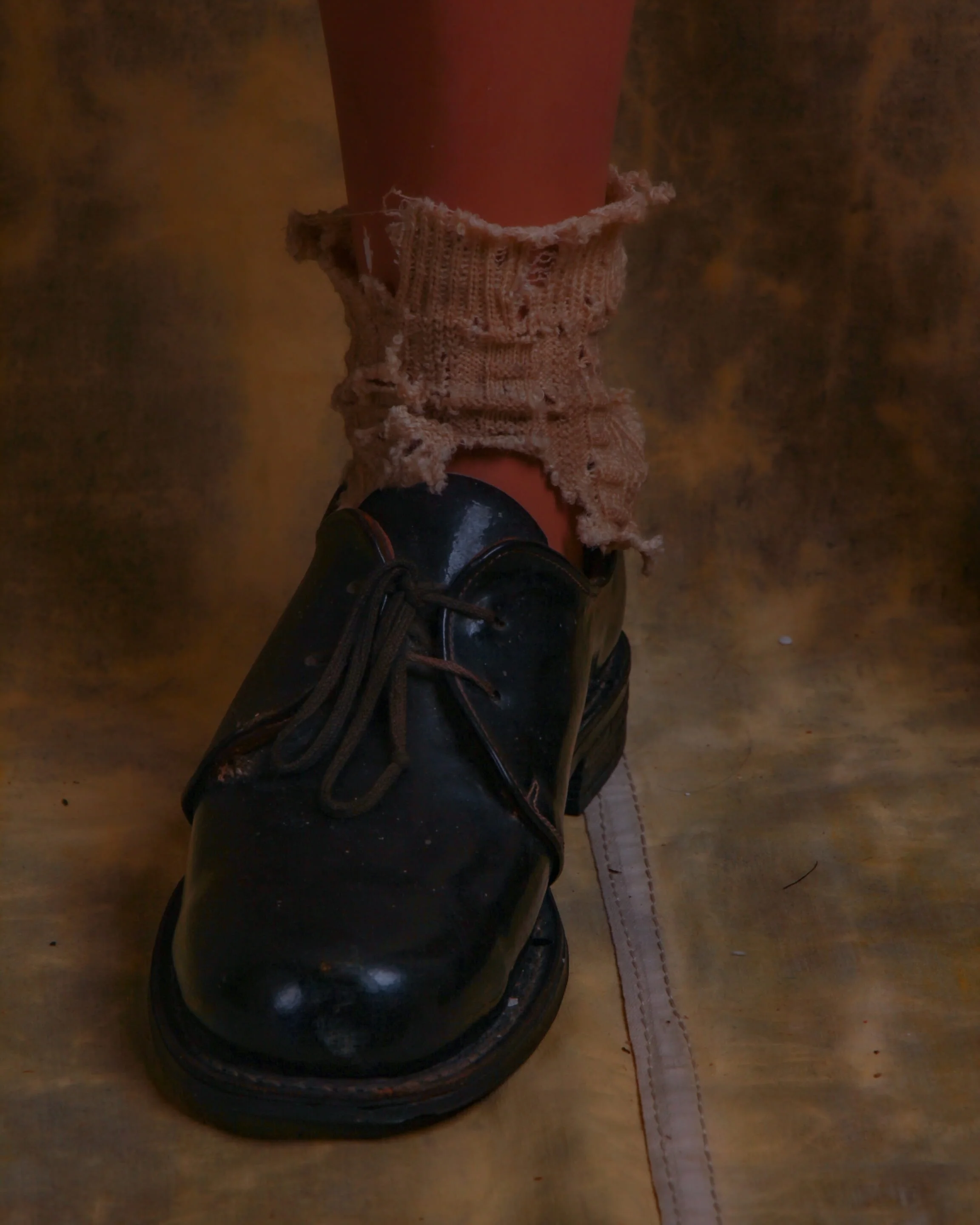
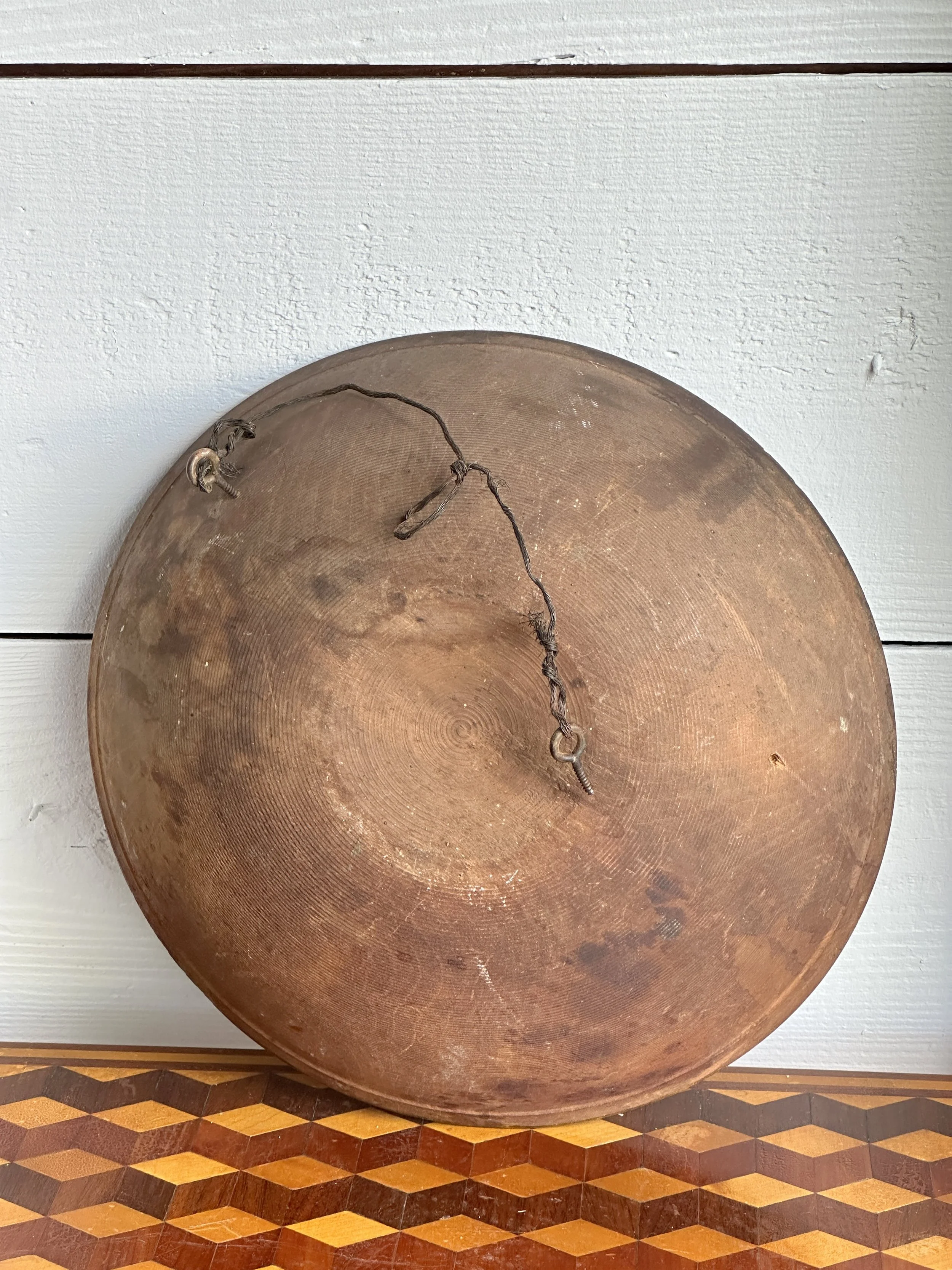
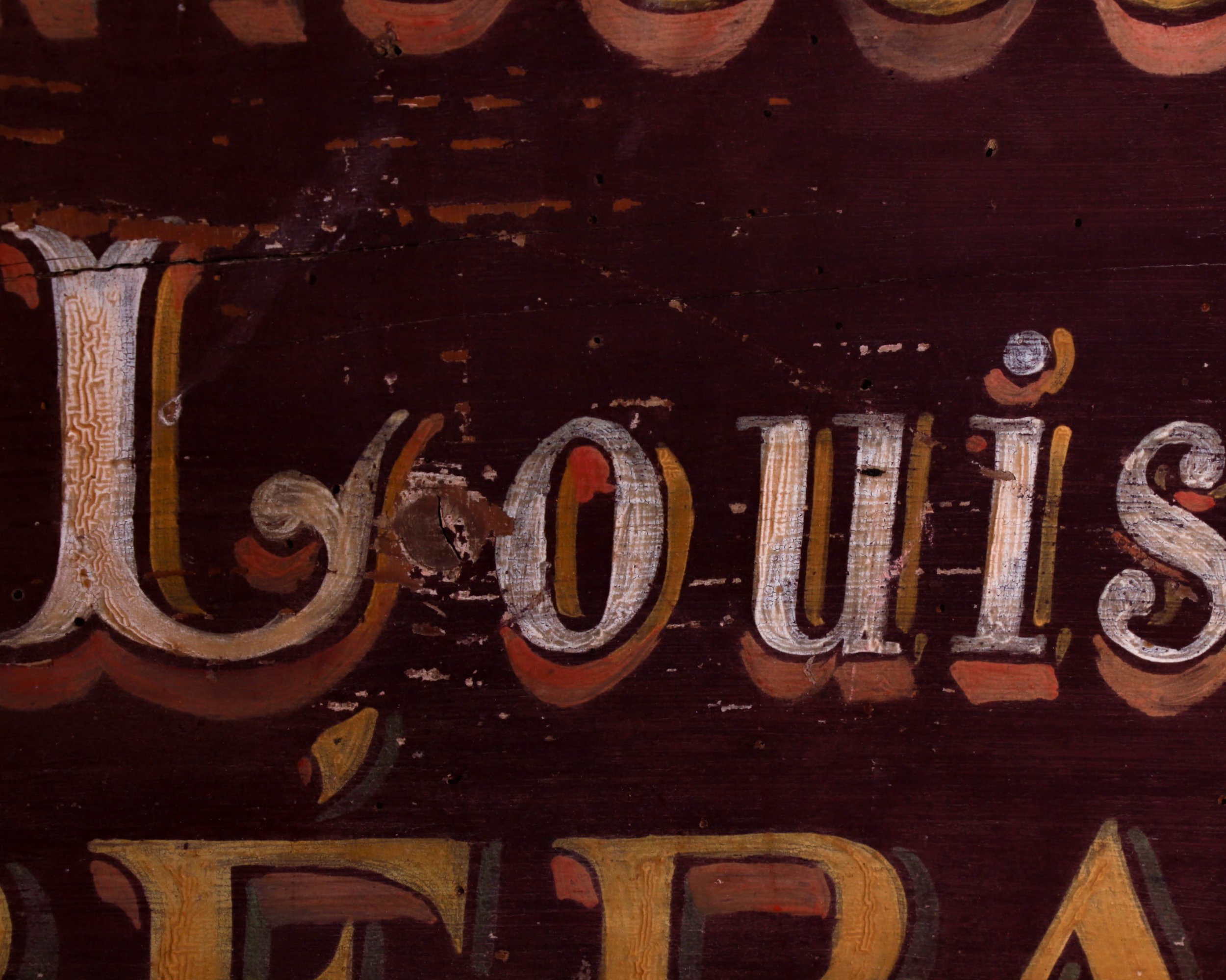
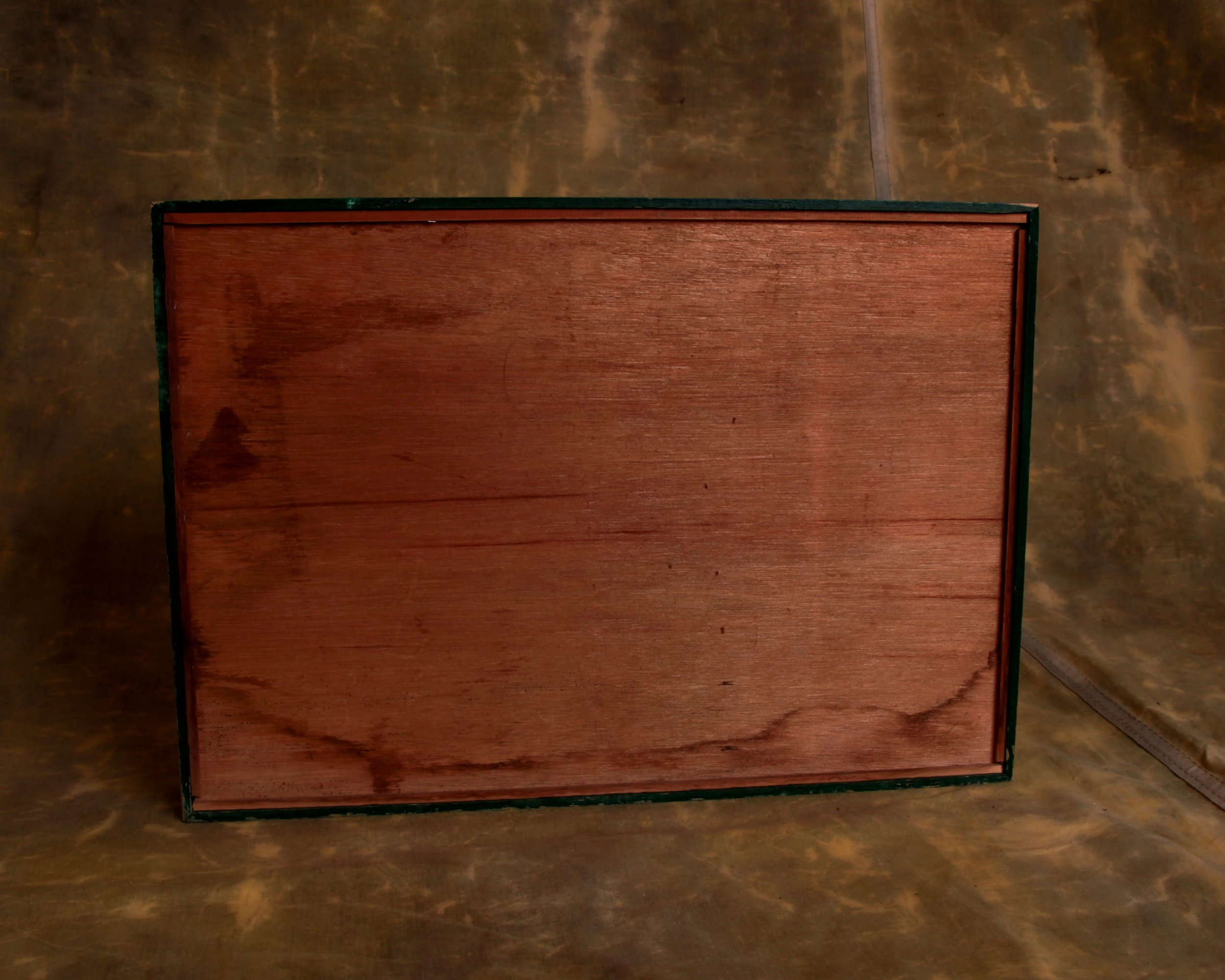
What’s especially nice here is the wear. The edges show honest scuffing, a bit of paint loss along the corners, just enough to soften the graphic sharpness. The surface still holds its color beautifully, with only light marks that come from use rather than neglect. The back is simple, unfinished wood, stained and aged in a way that tells you it’s been around long enough to see a few seasons come and go.
Mid-century trays
Mid-century trays sit at that intersection where utility met a newly confident sense of design. In the 1940s through the 1960s, the idea of entertaining at home shifted. Casual hosting, backyard gatherings, and TV dinners all nudged everyday objects to become more visually engaging. The tray, once purely functional, turned into a kind of portable canvas.
Manufacturers leaned into new materials and techniques. Laminates, molded plywood, fiberglass, and early plastics allowed for bold color, smooth surfaces, and easy cleaning. At the same time, advances in screen printing and lithography made it possible to apply graphic designs at scale. That’s why you see everything from atomic patterns and abstract forms to playful fruit, cocktails, and kitschy scenes.
A mid-century serving tray built around a bold, graphic watermelon slice, all clean arcs and saturated color. The composition is simple but confident: deep red field dotted with black seeds, a crisp white band, and that unmistakable green rind fading outward into a darker edge. It’s the kind of design that feels pulled straight from a 1950s picnic ad, where everything was bright, optimistic, and just a little stylized.
The construction leans practical. A solid wooden frame surrounds the panel, painted in a deep green that ties the whole thing together. Cutout handles on either side are shaped with a slight curve, comfortable in the hand and clearly meant to be used, not just looked at. The tray has a good weight to it without feeling heavy, the kind of piece you could actually carry out loaded with drinks and not think twice.
What’s especially nice here is the wear. The edges show honest scuffing, a bit of paint loss along the corners, just enough to soften the graphic sharpness. The surface still holds its color beautifully, with only light marks that come from use rather than neglect. The back is simple, unfinished wood, stained and aged in a way that tells you it’s been around long enough to see a few seasons come and go.
Mid-century trays
Mid-century trays sit at that intersection where utility met a newly confident sense of design. In the 1940s through the 1960s, the idea of entertaining at home shifted. Casual hosting, backyard gatherings, and TV dinners all nudged everyday objects to become more visually engaging. The tray, once purely functional, turned into a kind of portable canvas.
Manufacturers leaned into new materials and techniques. Laminates, molded plywood, fiberglass, and early plastics allowed for bold color, smooth surfaces, and easy cleaning. At the same time, advances in screen printing and lithography made it possible to apply graphic designs at scale. That’s why you see everything from atomic patterns and abstract forms to playful fruit, cocktails, and kitschy scenes.